


The task: The task to create the brand of the initiative for the development of natural territories of Russia came from the Agency for Strategic Initiatives (ASI). We should create positioning, naming, design an identity system, the brand logo and give the description of all things in the brandbook.
The brand of the initiative is responsible for state support with setting strategic objectives to independent organizations and teams interested in the development of the tourist infrastructure of nature reservations and volunteers. In the future, nature reservations should grow into real national parks.
The construction of hotels, campings, shops, gas stations, repair and rescue bases, all this is trusted to commercial organizations. Zagorizont Initiative is obliged to monitor, coordinate and finance activist companies. The classic G2B state-business brand.
Naming: According to the task and brief, we have created a pretty wide range of brand names and, together with the customer, decided on the current one–Zagorizont. The meaning of this name hints at the great territory of our country, a huge number of tourist routes. It also encourages businesses to “look beyond the horizon”, assess the prospects and opportunities to grow.
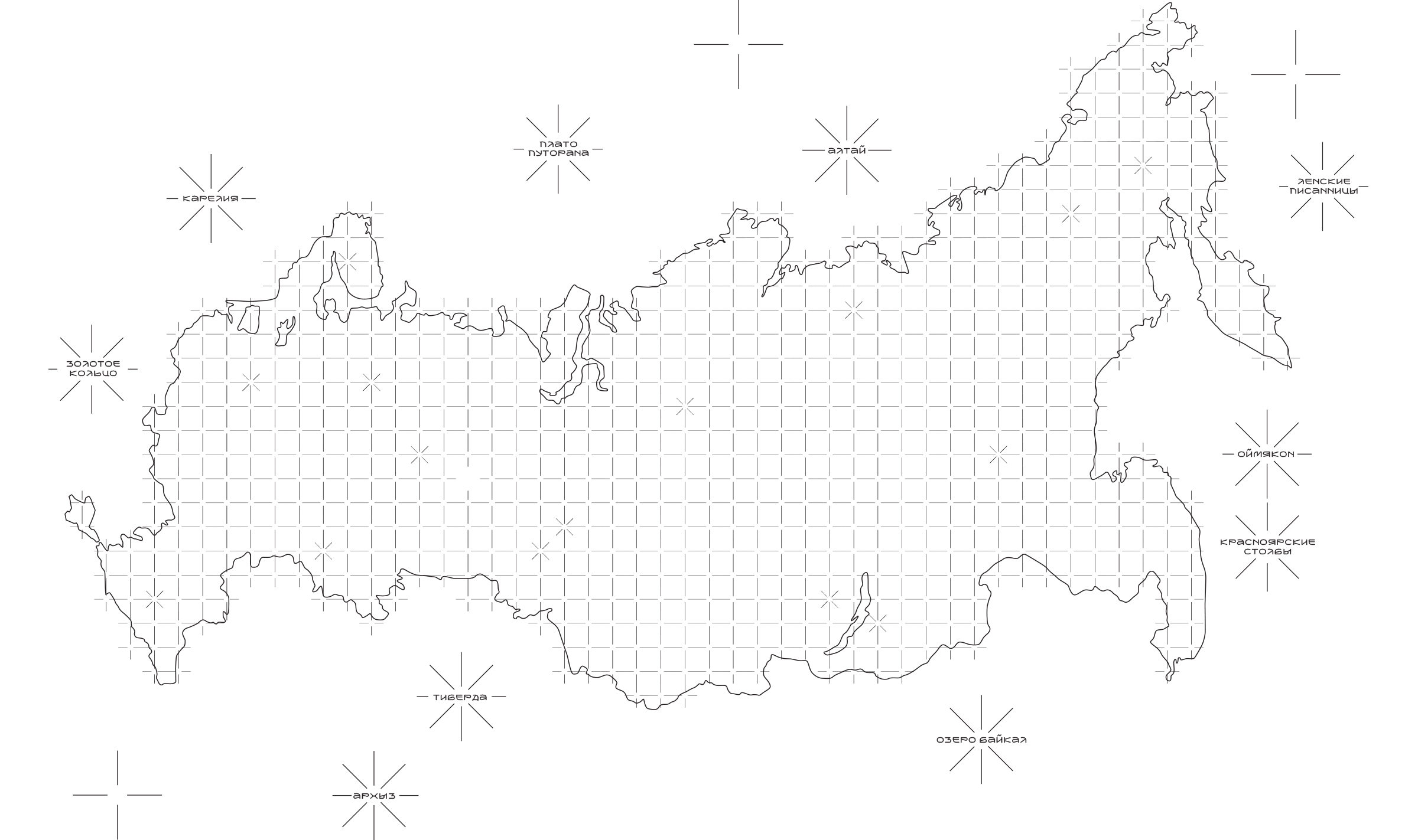
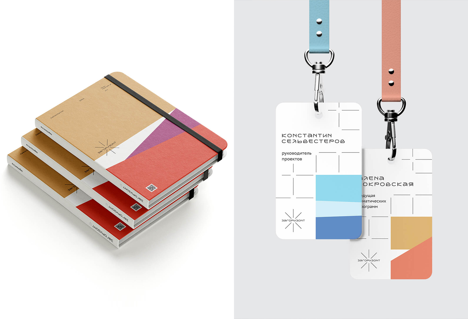
A contour map of Russia with marks of developing natural territories became a visual metaphor or the starting point of the identity for brand creation.
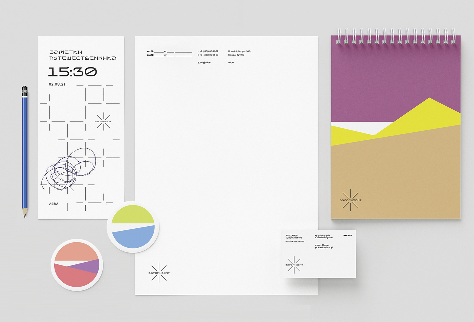
After a logo with a unique lettering was created for the project, the customer wanted to upgrade it to a real font. It’s necessary in order to be able to brand individual national parks by their own names, but within the general style of the Zagorizont initiative.
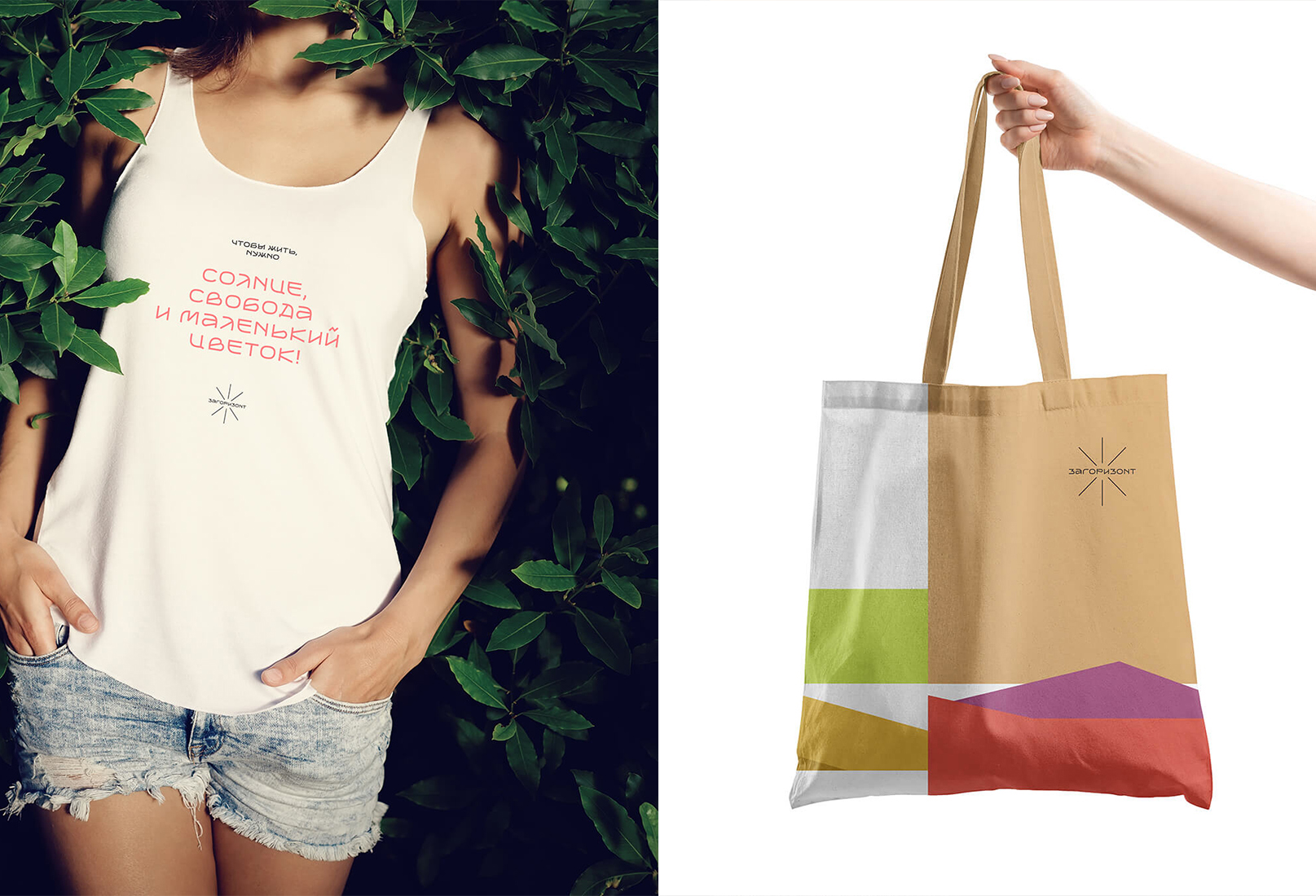
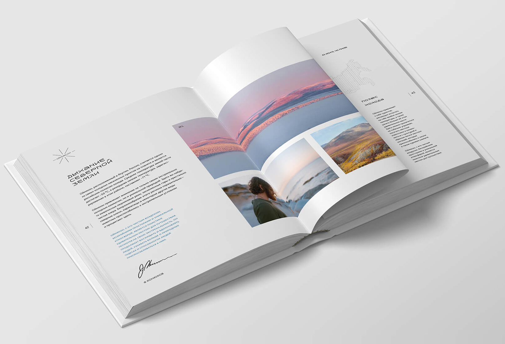
Following the wishes of the customer, an accidental font zagorizont regular was created for the project, that is used to spells the name of the brand, the name of nature reservations, tourist places and routes. The font was also used for headings and unification of the typography of the brand.
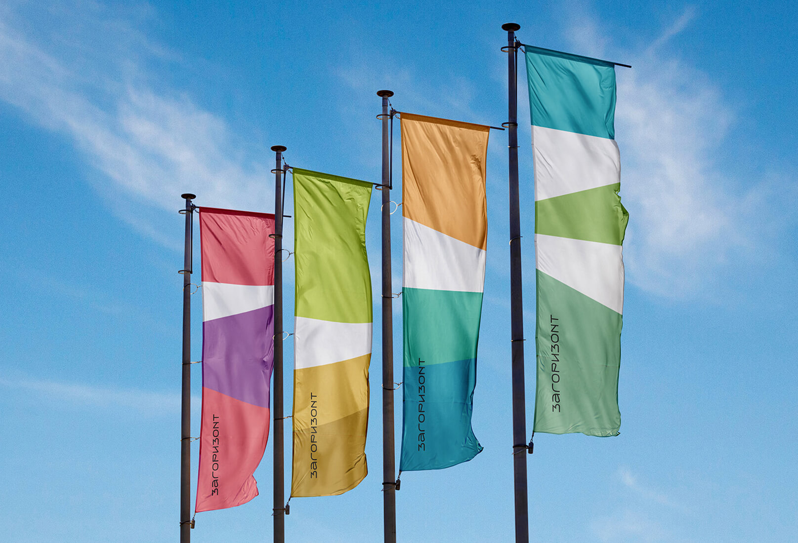
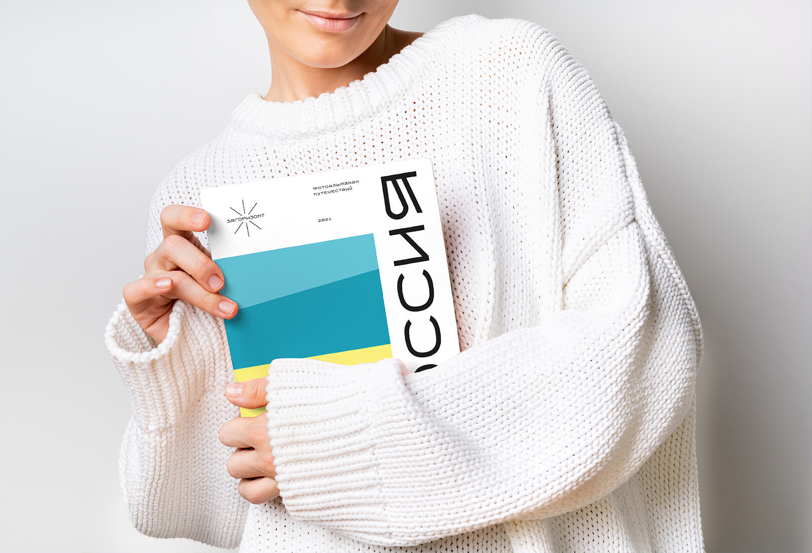
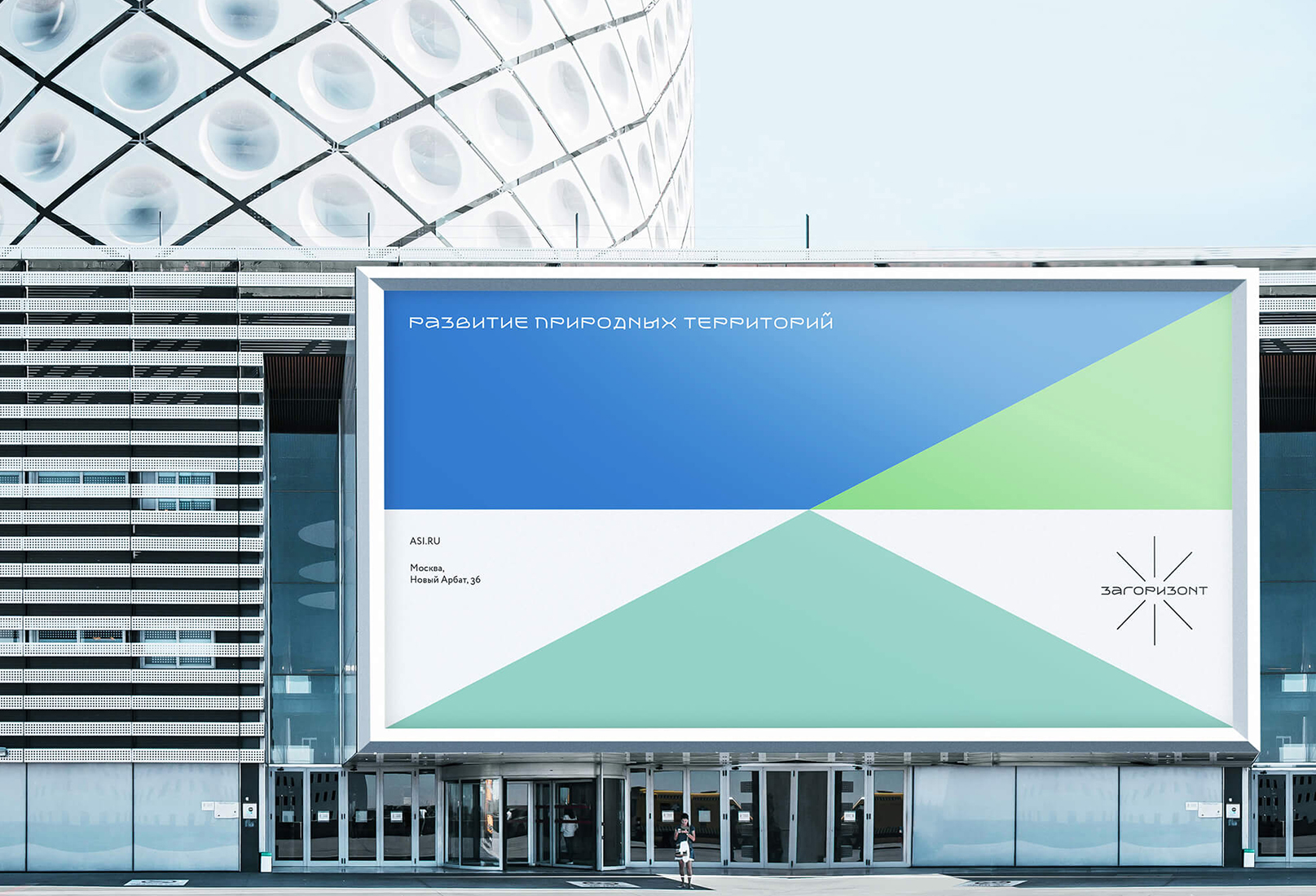
In the identity of the created brand, there is neither a unified color nor a corporate color combination. Stylistic images are endless multicolored patterns. They hint at the picturesque horizons of our country, expanses, opportunities and freedom, and on the other hand they resemble colorful business presentation charts from the usual tools of a business person.


CREDIT
- Agency/Creative: uniqorn
- Article Title: Student Brand Creation Concept for Zagorizont
- Organisation/Entity: Agency
- Project Type: Identity
- Project Status: Non Published
- Agency/Creative Country: Russia
- Agency/Creative City: Moscow
- Market Region: Asia, Europe
- Project Deliverables: Brand Design, Brand Guidelines, Brand Identity, Brand Naming, Branding, Logo Design, Type Design, Typography
- Industry: Information
- Keywords: sunrise ,sunset ,natur,e sky ,tourism ,identity, adventure, branding ,colorful
-
Credits:
Designer: Vlad Mikhailov


