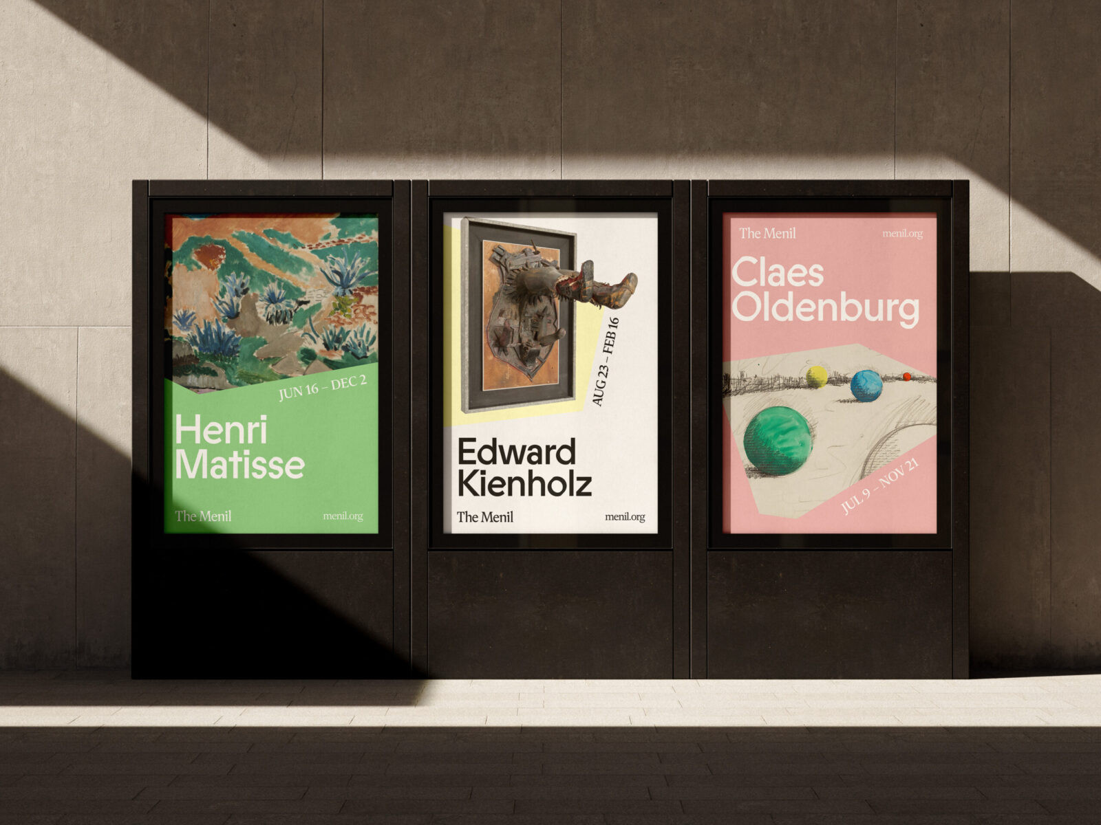
The Menil Collection in Houston is a beloved cultural institution offering free admission to works spanning ancient to contemporary art. Despite its architectural significance and rich history, the museum’s previous visual identity lacked distinctive elements that reflected its true character. This rebrand bridges that gap by creating a cohesive system inspired by the museum’s most defining assets.
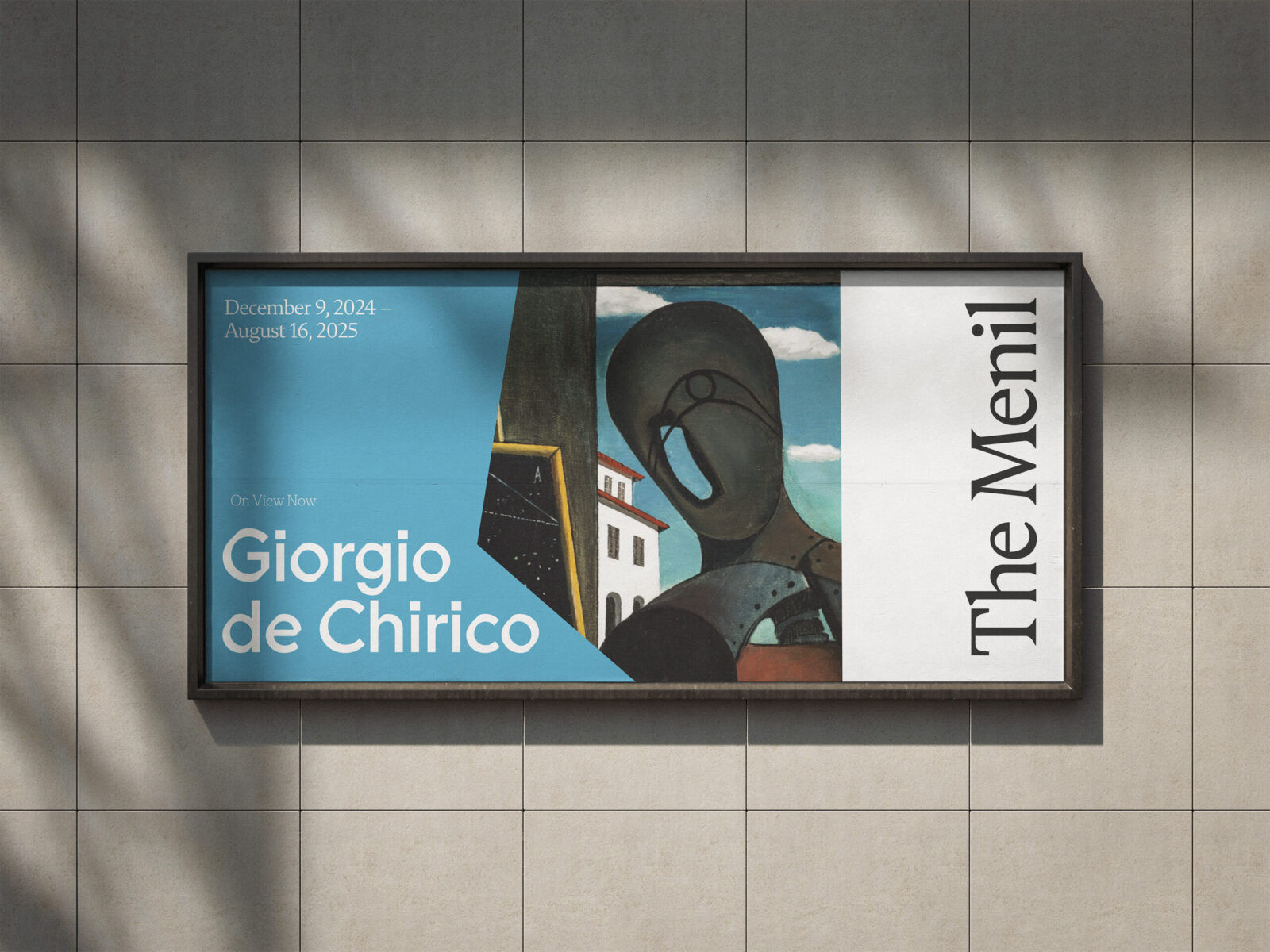
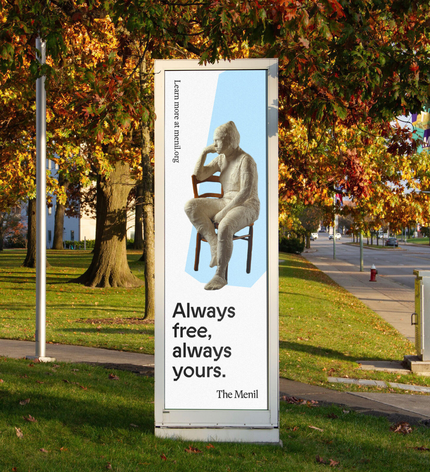
The identity begins with Renzo Piano’s celebrated architecture—a study in simplicity, precision, and restraint. The museum’s clean lines and chiseled angles became the foundation for a core visual motif: “the shape.” This distinctive form, distilled from the building’s geometry, unifies the brand across all touchpoints while allowing for dynamic variation. Whether framing artwork, sculpture, or text, the shape maintains consistency without becoming repetitive.
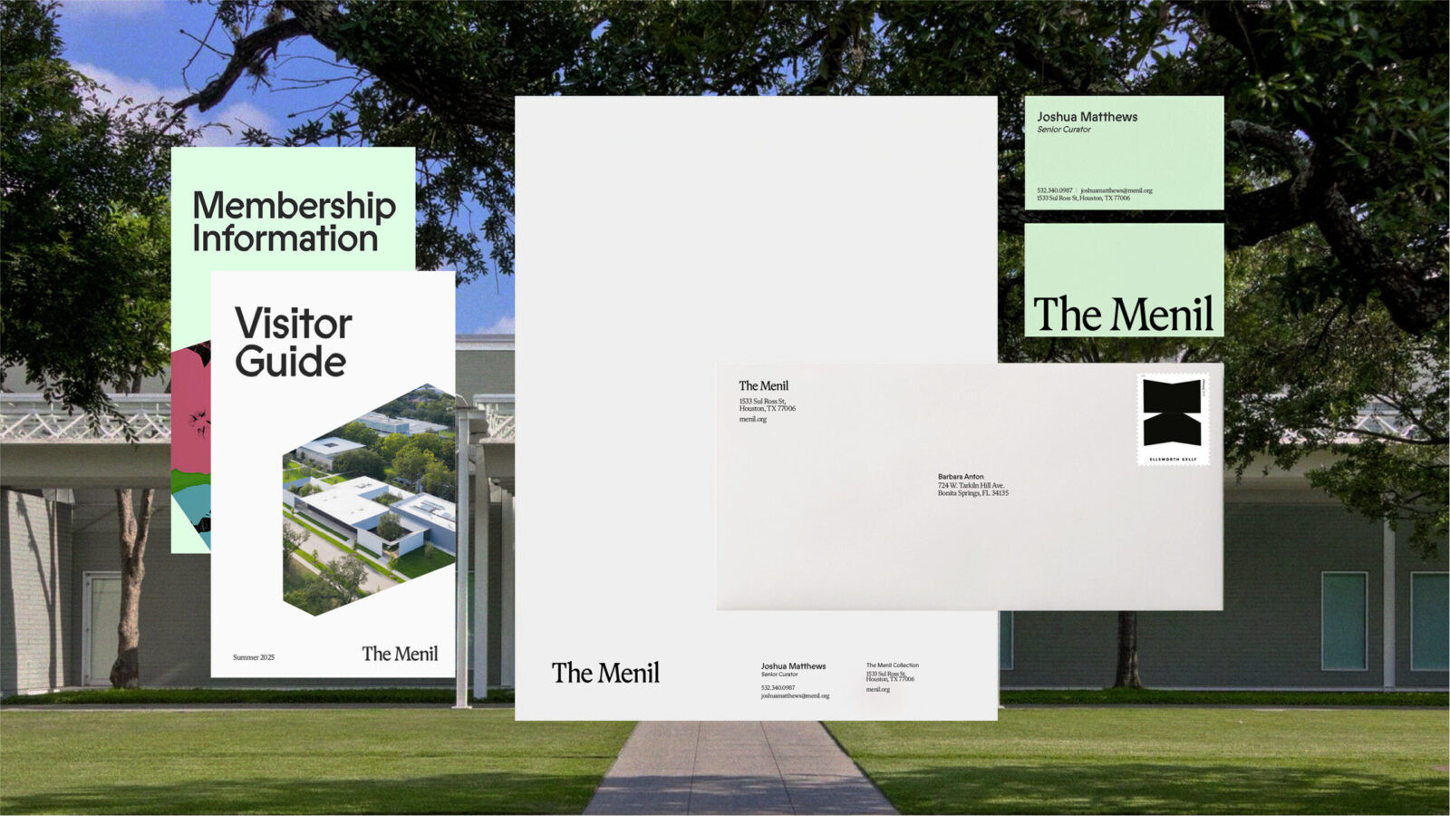
The wordmark reflects the serious, rational spirit of founders Dominique and John de Menil. Built on Martina Plantijn with custom refinements—including flared serifs that reduce visual weight and improved spacing between letterforms—it achieves a timeless quality. The shift from “The Menil Collection” to simply “The Menil” honors how the institution is colloquially known, creating a more intimate and memorable presence.
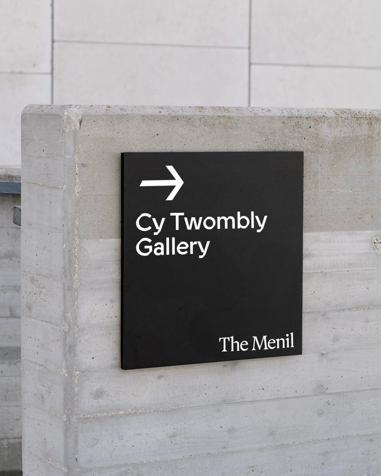
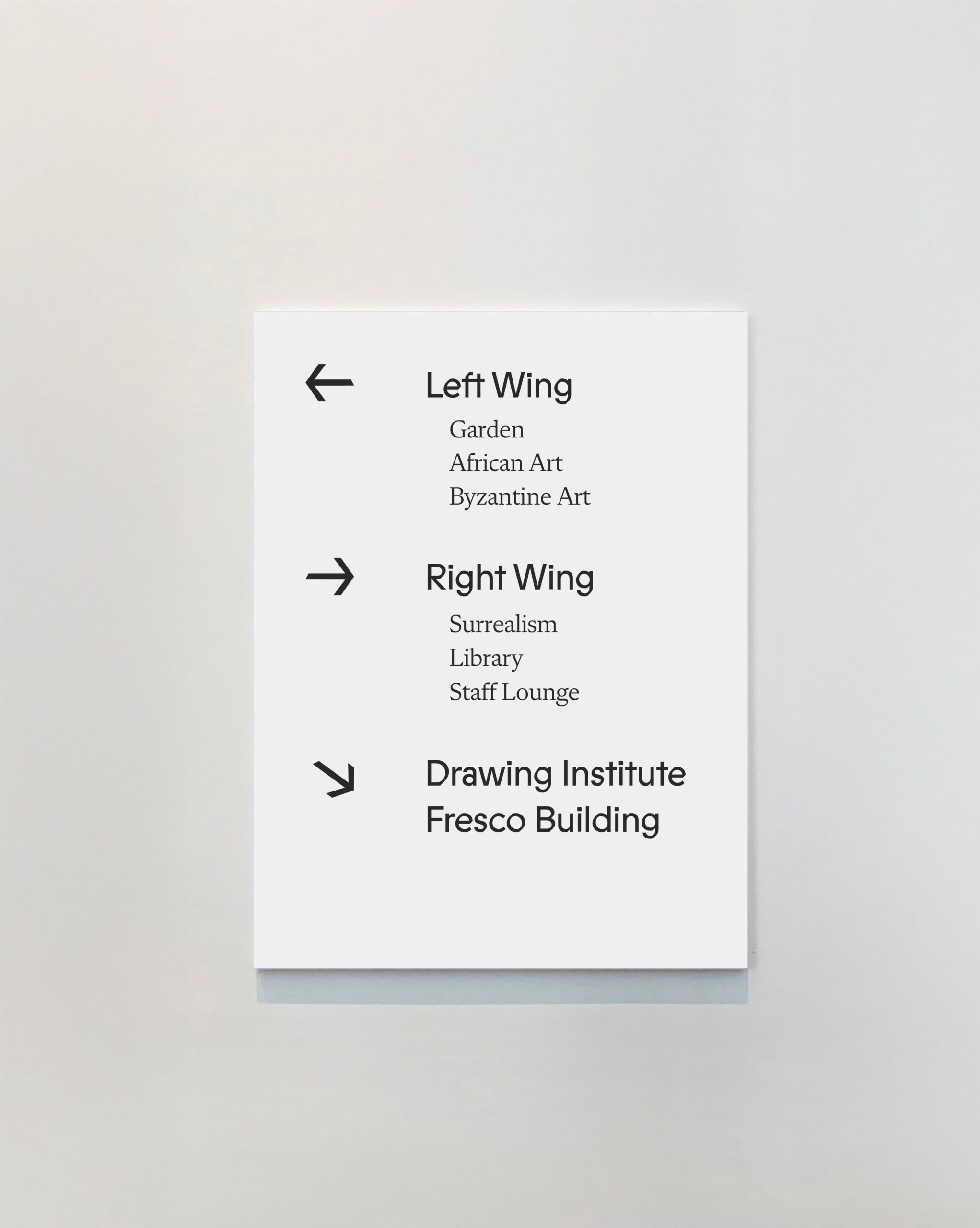
Typography plays a crucial role in expressing the museum’s dual nature. ABC Prophet serves as the primary typeface, its angular cuts echoing the architecture’s chiseled precision while maintaining simplicity. Paired with Flecha, these typefaces embody the museum’s eclectic character—each distinct yet unified through sharp, flat constructions.
The color palette centers on “Menil Mint,” an understated hue that evokes the green spaces surrounding the museum. This calming tone reinforces the institution’s welcoming nature and commitment to serving as “an oasis in the midst of daily life.”
Through thoughtful application across stationery, signage, digital platforms, and wayfinding, this identity captures both the rational elegance and warm eclecticism that define The Menil’s legacy. The system honors the museum’s architectural heritage while celebrating its approachable, community-focused spirit.


CREDIT
- Agency/Creative: Benedict Allen
- Article Title: Student Benedict Allen Designs The Menil Brand Around Architectural Logic and Human Warmth
- Organisation/Entity: Student
- Project Status: Non Published
- Agency/Creative Country: United States of America
- Agency/Creative City: Los Angeles
- Project Deliverables: 2D Design, Art Direction, Brand Design, Brand Identity, Brand Mark, Brand Redesign, Branding, Design, Graphic Design, Identity System, Logo Design, Rebranding, Typography, Web Design
- Industry: Education
- Keywords: WBDS Student Design Awards 2025/26 , branding, identity, museum, gallery, exhibition, catalog, book, publication, signage, wayfinding, typography, grid, modernist, minimal, monochrome, refined, archival, collection, cultural, institution, Houston, art, posters, print, editorial, layout, visual, systems, timeless


