


Known for science-backed advocacy and unapologetic persistence, the Center for Biological Diversity has protected hundreds of species and millions of acres of land since 1989. With a reputation for being as stubborn as they are effective, the organization has earned a strong position in conservation, driven by data, legal action, and a deep commitment to protecting life on Earth. The challenge for this rebrand was to modernize the identity while broadening its appeal to a wider audience without losing the boldness that defines the Center’s work.
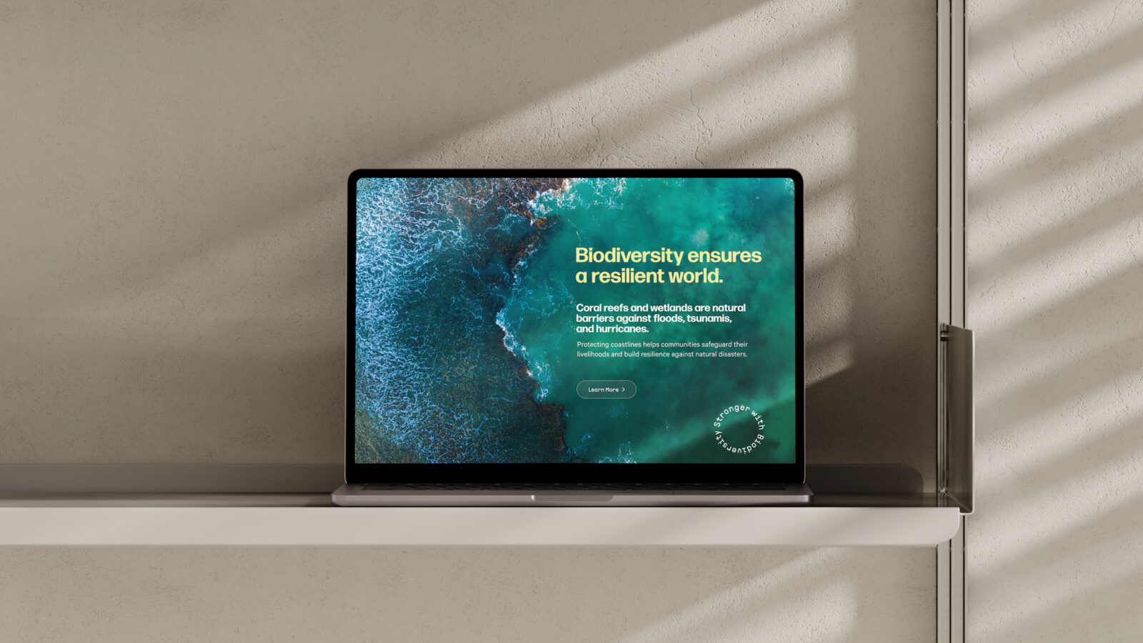
The new identity brings together two core elements: powerful videography of wildlife and habitats, and messaging that connects biodiversity directly to everyday human needs. Clean water, food security, and flood protection become tangible outcomes that make conservation feel relevant to people who may not see themselves reflected in traditional environmental messaging. The goal was to shift biodiversity from an abstract concept to an urgent, personal issue.
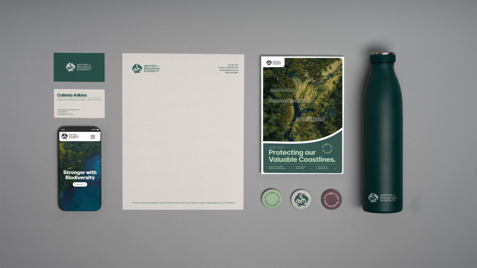
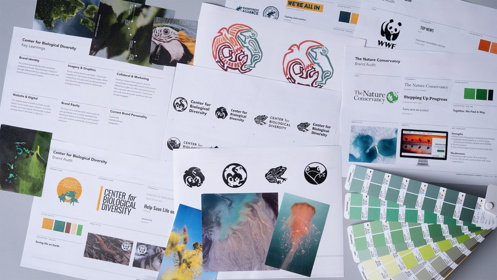
During the brand audit, I uncovered a retired logo from 2001 that still held strong conceptual potential. I rebuilt the mark with clearer hierarchy and simplified forms, introducing more balanced spacing to create a symbol that feels modern yet rooted in the organization’s history. This refreshed mark anchors the identity and reinforces the idea that biodiversity is our greatest investment.
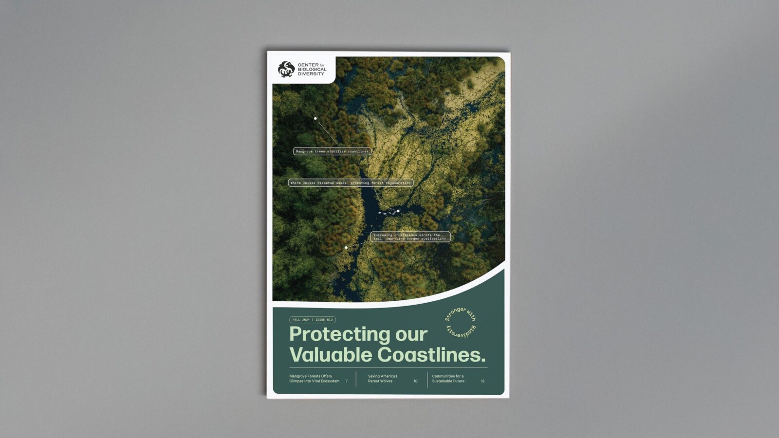
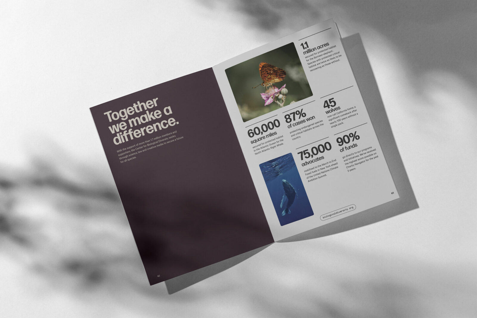
Legal-facing materials are designed to be clean and restrained, reinforcing the Center’s credibility in policy, science, and litigation. Donor-facing touchpoints lean more expressive, highlighting the interconnectedness of life. The redesigned donor magazine cover visualizes ecological relationships through annotated illustrations that show how species depend on each other to keep ecosystems in balance. If one organism disappears, the entire system shifts. Interior spreads continue this approach by focusing on real-world impact, helping supporters understand the tangible outcomes of their contributions.
Video serves as the primary storytelling tool, capturing attention and revealing the interdependence that defines biodiversity. Photography supports this by shifting between intimate species-level details and broader ecosystem views, reinforcing the message that everything in nature is connected.
Overall, the rebrand strengthens the Center’s authority while making biodiversity feel relevant, urgent, and deeply human.
![]()
CREDIT
- Agency/Creative: Anna Barnett
- Article Title: Student Anna Barnett Redesigns the Center for Biological Diversity to Make Conservation Personal
- Organisation/Entity: Student
- Project Status: Non Published
- Agency/Creative Country: United States of America
- Agency/Creative City: San Diego
- Project Deliverables: Brand Design, Brand Guidelines, Brand Identity, Brand Mark, Brand Redesign, Brand Strategy, Brand Tone of Voice, Branding, Creative Direction, Design, Graphic Design, Identity System, Interaction Design, Logo Design, Typography, User Experience, User Interaction, Web Design
- Industry: Non-Profit
- Keywords: WBDS Student Design Awards 2025/26 , non-profit, conservation


