


shy is a minimalist cosmetic brand inspired by natural processes and the skin’s response to cold.
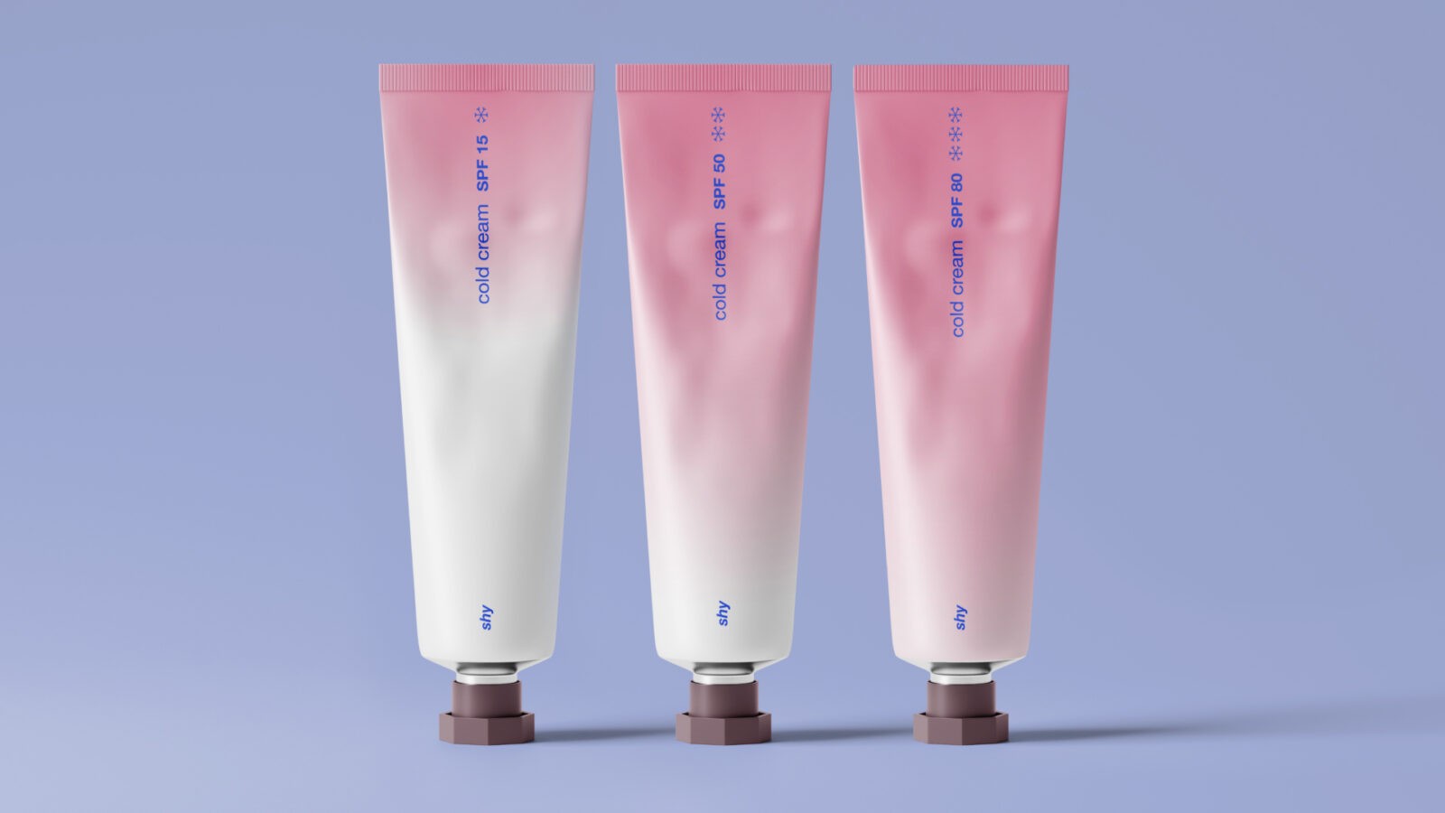
The core visual symbol is a gentle blush on the cheeks that appears after exposure to frosty air. This warm, lively tone becomes a symbol of tender care for the skin under harsh weather and active sun conditions.
When we head to the mountains or spend time outdoors in winter, the skin faces a double challenge: cold winds dry and damage it, while sunlight reflected off snow intensifies UV exposure. Sun protection is often associated only with hot climates, but mountainous and winter environments demand no less attention. The skin needs a special product that both nourishes, restores, and protects it against aggressive elements.
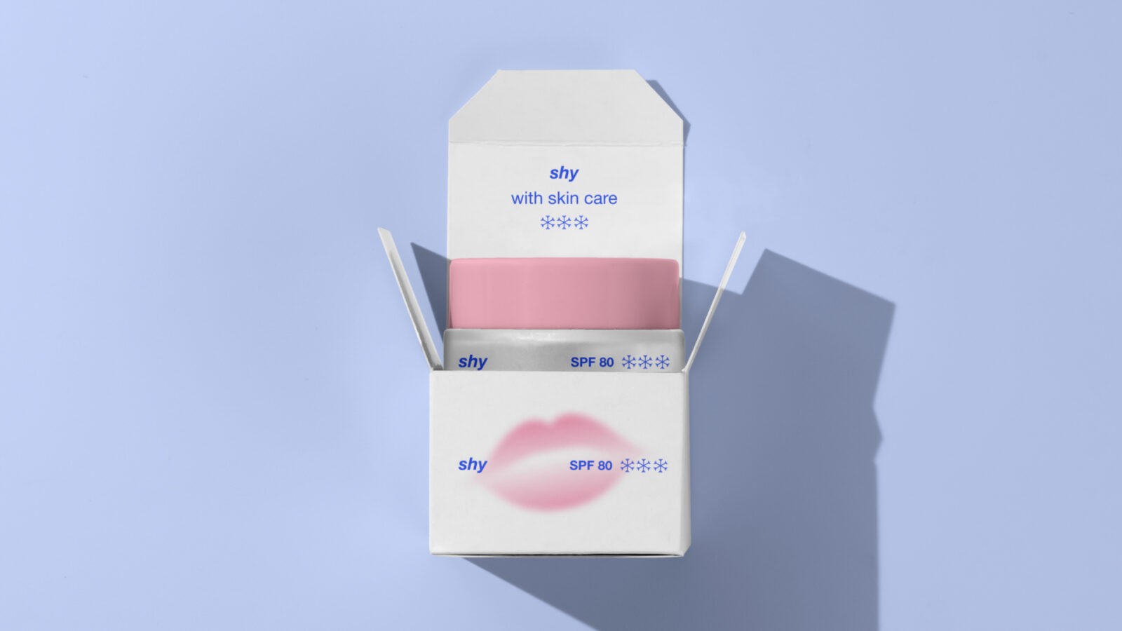
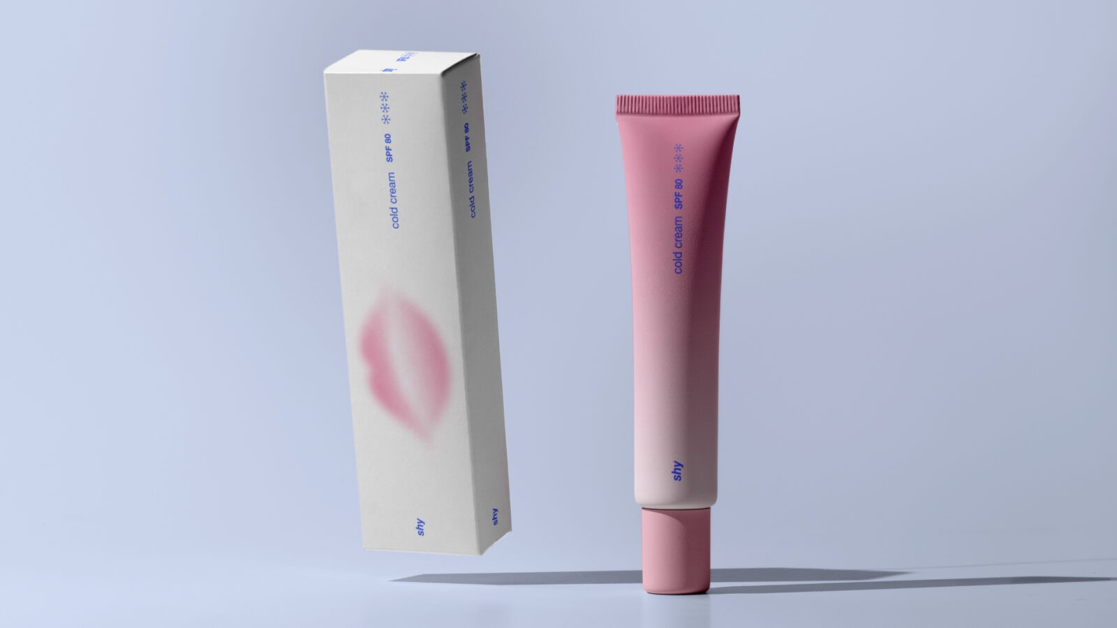
Cold cream shy is a modern take on the classic cold-protection cream.
Its formula is specially designed to lock in moisture, repair the skin’s barrier, and provide reliable SPF protection, even in extreme weather conditions.
The cream acts as an invisible shield, helping the skin maintain its natural glow while preventing dryness, flaking, and early signs of photoaging.
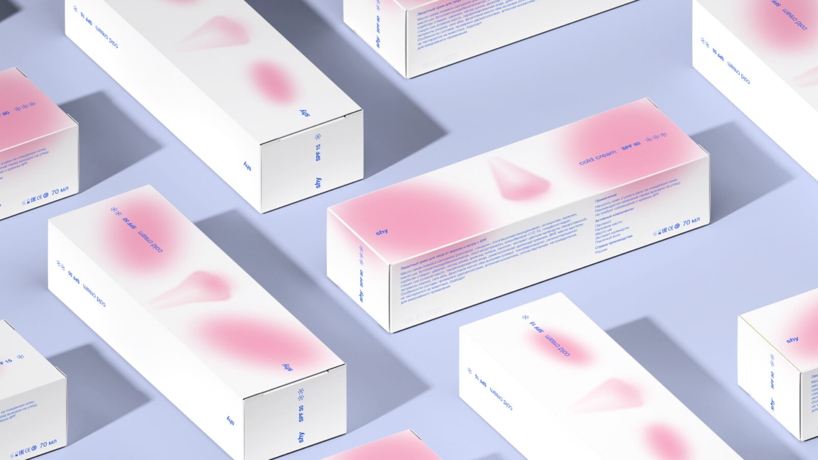
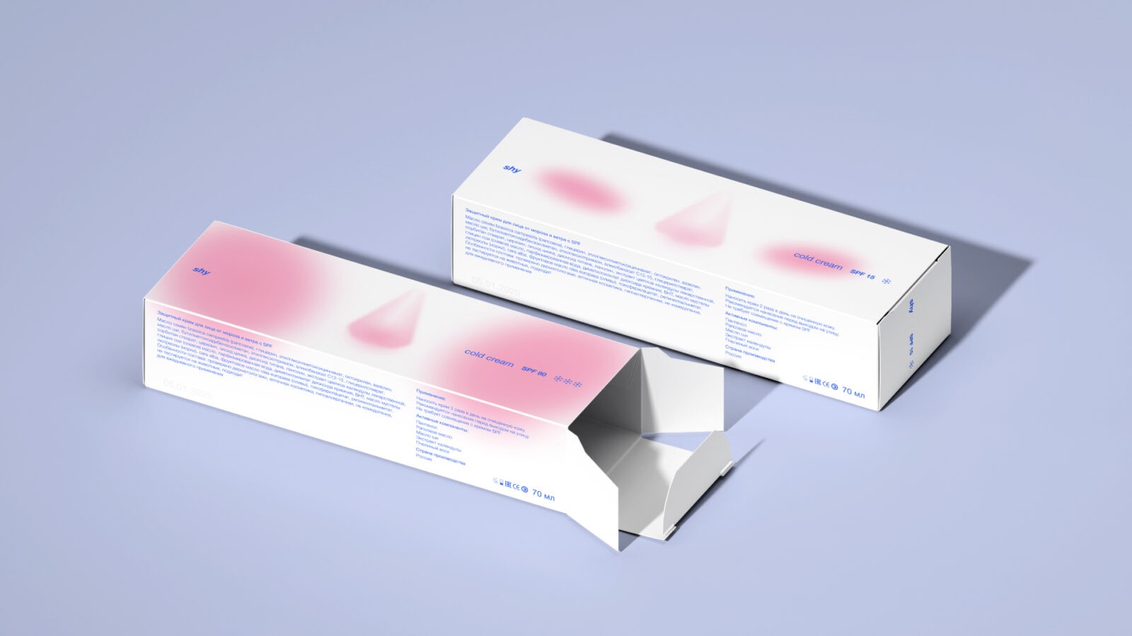
The shy design code reflects the brand’s philosophy: simplicity, honesty, sensuality.
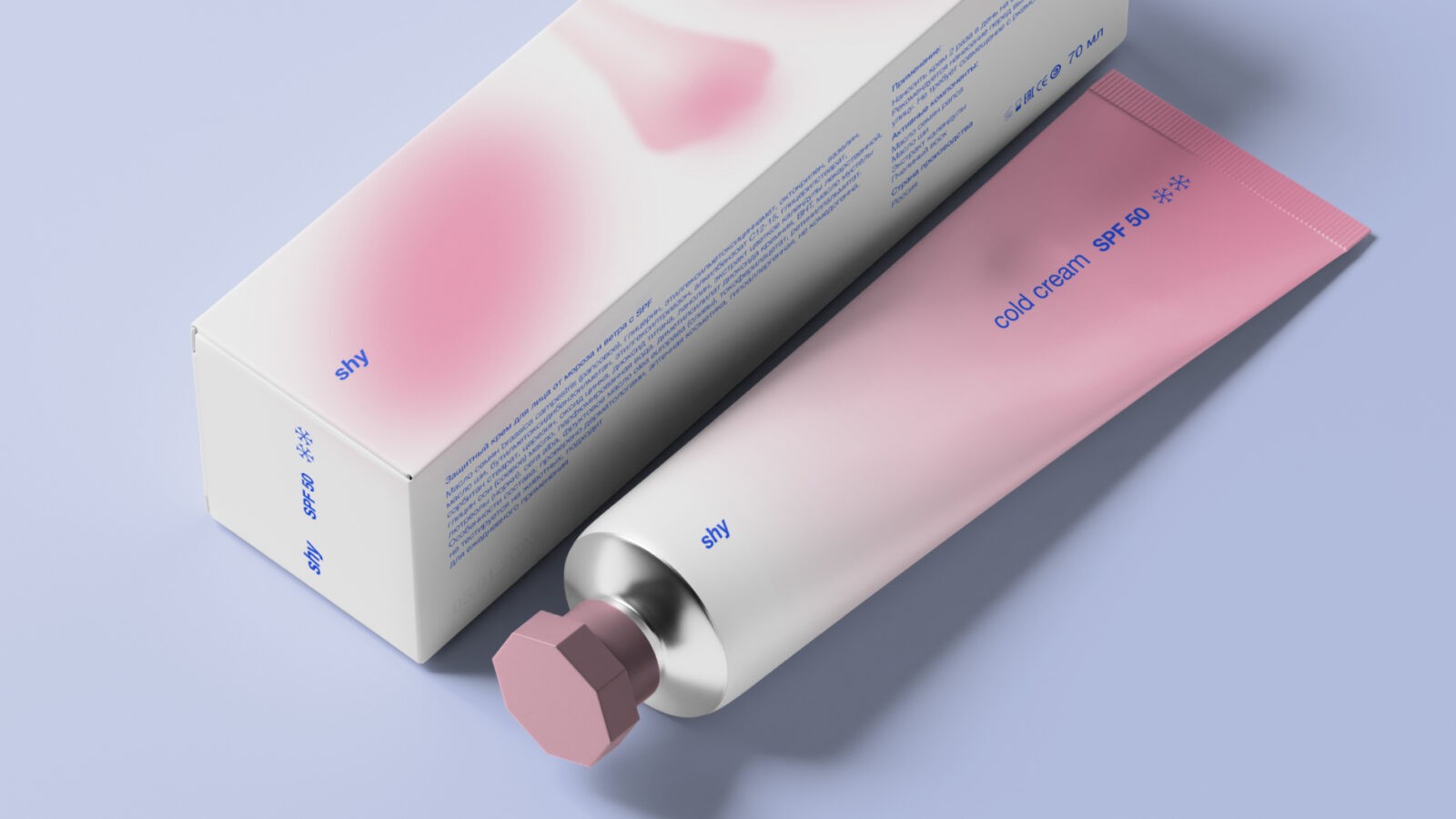
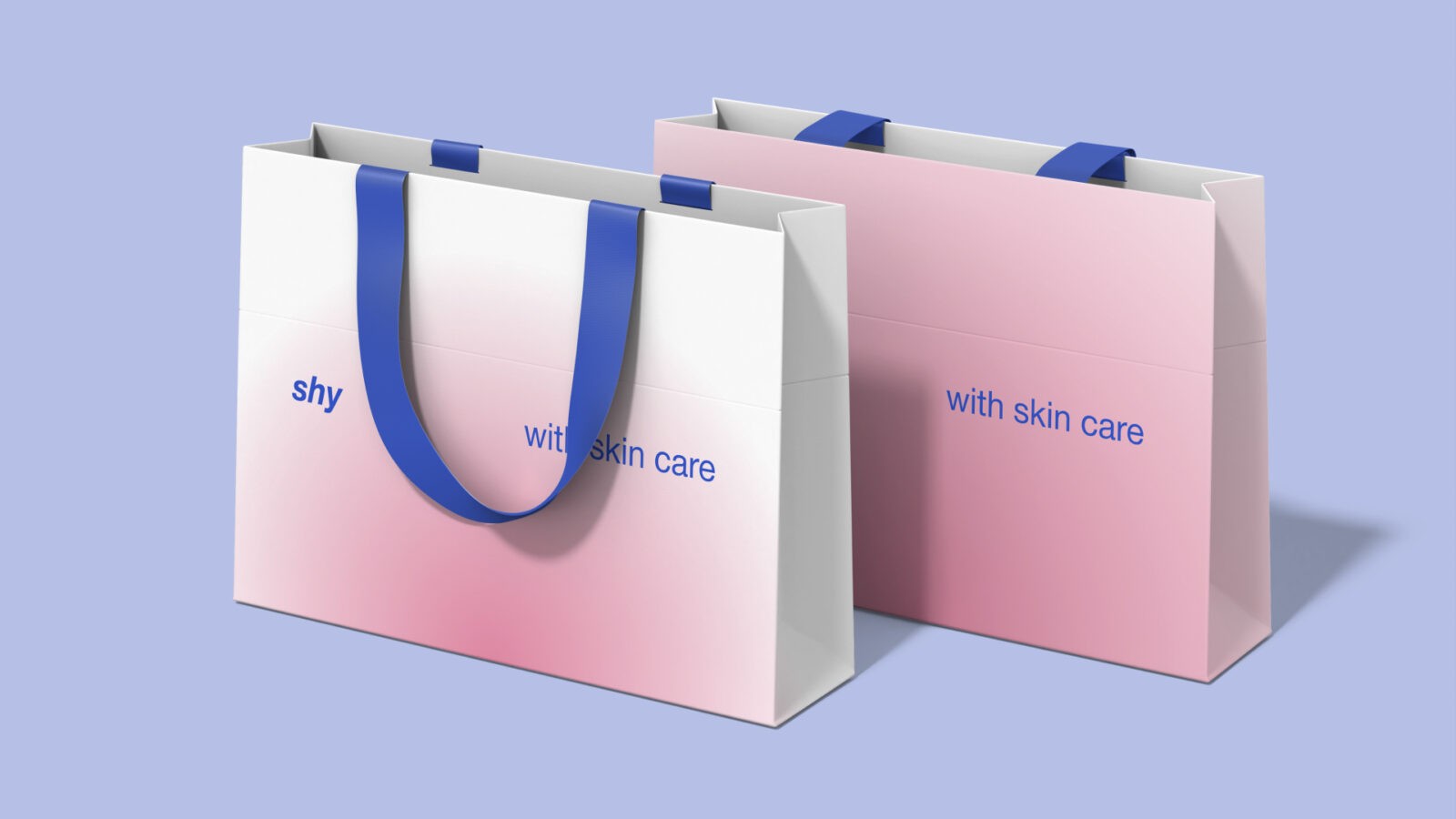
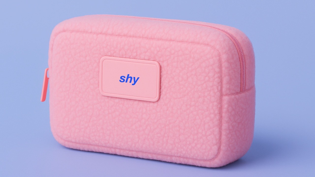
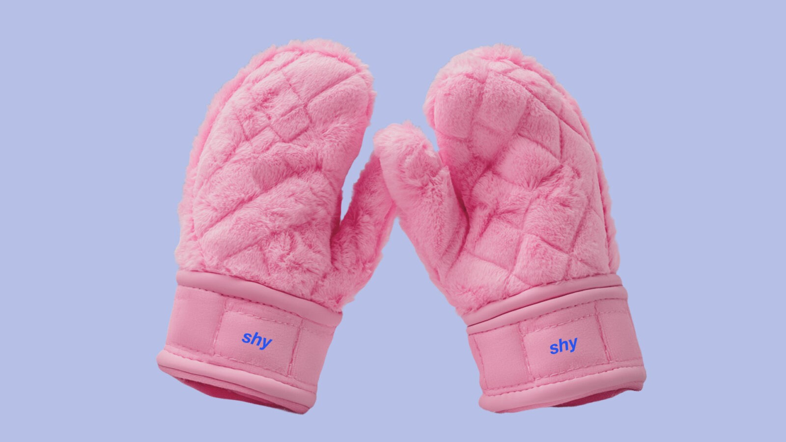
Minimalistic packaging and a soft color palette — from muted pinks to pearlescent whites — echo the subtle changes that occur on the skin in the cold. Here, blush is not just an aesthetic element but a metaphor: it signals how vulnerable the skin is and how well it is protected.
We deliberately avoid aggressive visual codes typically associated with extreme protection: no heaviness, no harsh lines, no dark tones.
Instead — subtlety, lightness, transparency.
shy promotes the idea of gentle self-care and respect for nature: being present with the wind, sun, and cold not through resistance, but through acceptance — respecting the natural state of the body and the environment.
Every detail of the project supports this concept:
Packaging shape — rounded, muted, fitting comfortably in the hand to create a sense of intimacy and care.
Typography — soft, almost weightless, emphasizing the delicate character of the product.
Color — varies depending on the product line: soft pink for basic protection, deeper shades for enhanced protection.
shy is a cosmetic line for those who value inner harmony, natural beauty, and comfort.
It’s a product for people who do not want to hide from the cold but want to embrace it as part of their experience, remaining beautiful, healthy, and happy.
CREDIT
- Agency/Creative: Valeria Gorbacheva, Anastasia Alekseevskaya
- Article Title: Students Anastasia Alekseevskaya and Valeria Gorbacheva Design a Gentle and Modern Identity for shy Cold Cream
- Organisation/Entity: Student
- Project Type: Packaging
- Project Status: Published
- Agency/Creative Country: Russia
- Agency/Creative City: HSE
- Market Region: Europe
- Project Deliverables: Art Direction, Brand Design, Design, Graphic Design
- Format: Box
- Industry: Health Care
- Keywords: WBDS Student Design Awards 2025/26 , packaging cold cream identity branding merch pink blush
-
Credits:
Designer: Valeria Gorbacheva
Designer: Anastasia Alekseevskaya


