Nexus
Conference Rebrand
Overview
The National Biotechnology Conference is an annual event that delves into the latest advancements in technology and biology. The theme for this year’s conference, Nexus, served as the foundation for my rebranding approach. Nexus symbolizes the interconnectedness and convergence of various disciplines within the biotech industry, a concept that I sought to embody in the conference’s new identity. By leveraging the Nexus theme, I integrated both graphic and interaction design elements to create a revitalized brand that not only captures the essence of the conference but also elevates user engagement across multiple platforms.
Approach
The design challenge was to craft a brand identity that seamlessly blends the realms of technology and humanity in an authentic, yet unconventional manner. The resulting brand strikes a delicate balance between innovation and groundedness, catering to the diverse audience of the Nexus conference, which spans ages 25 to 55. The brand embodies a forward-thinking vision while remaining accessible and relatable.
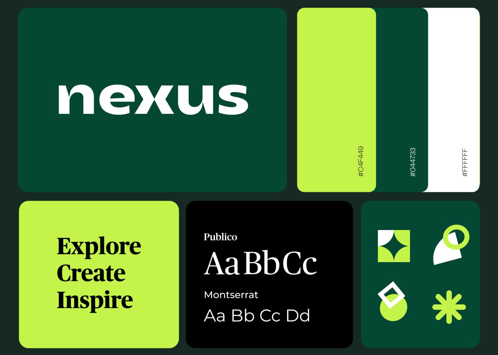
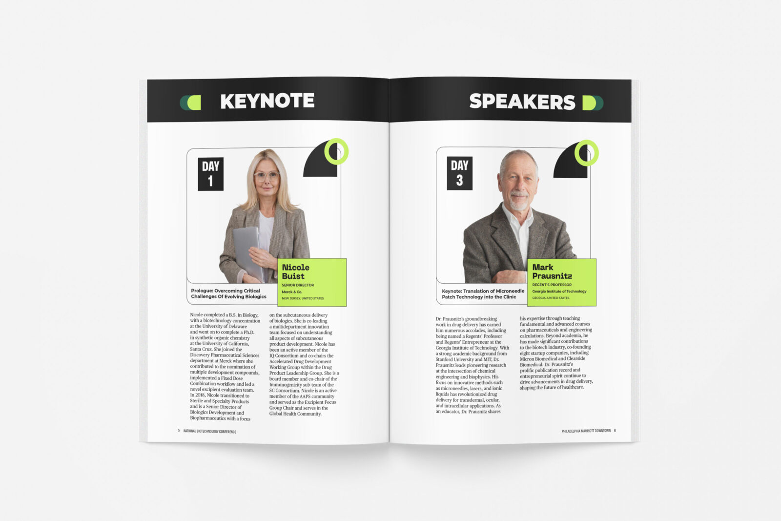
The Nexus brand is characterized by a fun and humanistic wordmark, imbued with quirks and a bold voice that reflects the conference’s innovative spirit. To balance this playfulness, I chose the typeface Publico for headings, offering a refined yet charming personality. The Montserrat typeface serves as the utility font throughout the brand, providing clear readability with its simplicity and clean lines. This typographic combination ensures that the brand is both approachable and professional, resonating with a wide audience.
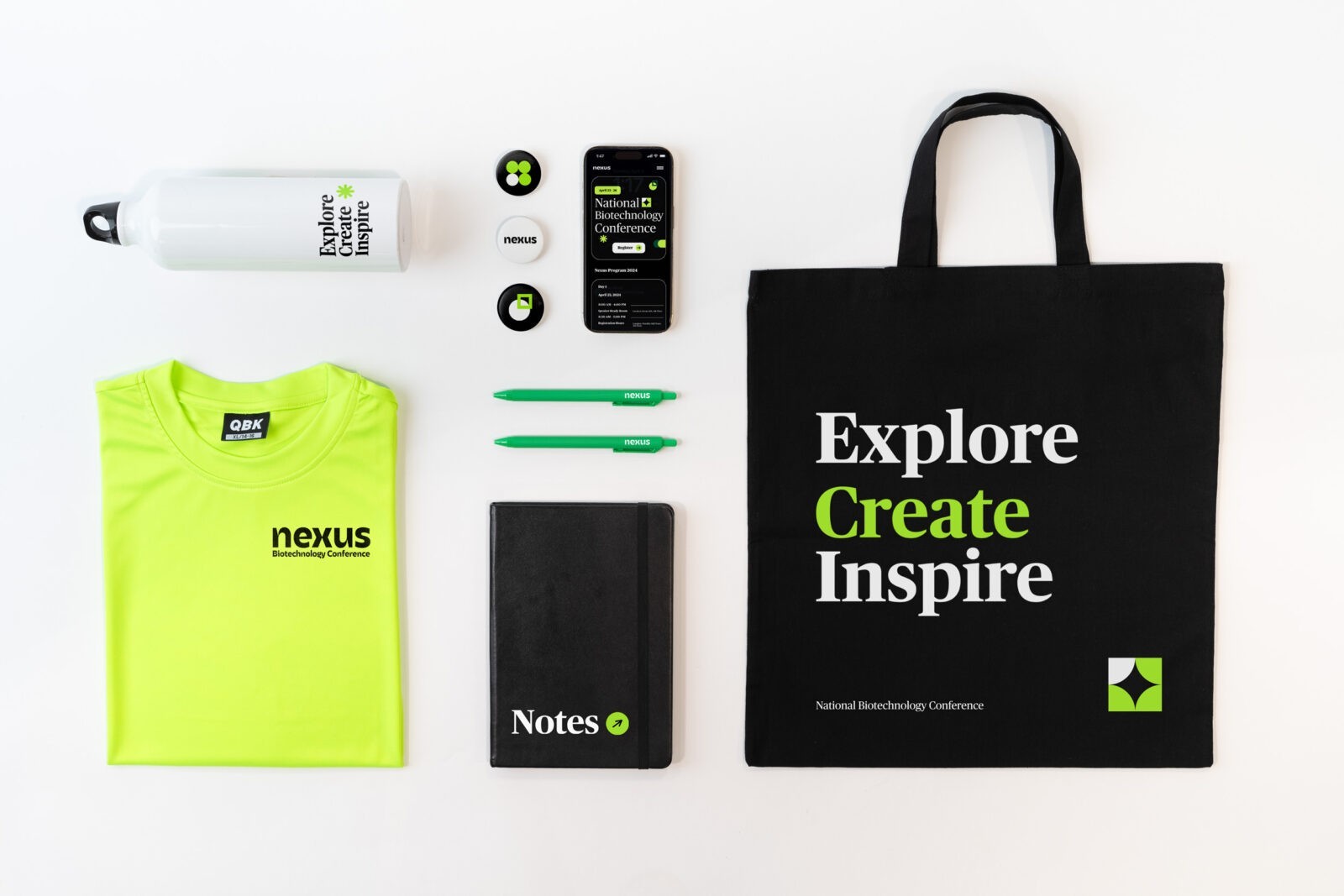
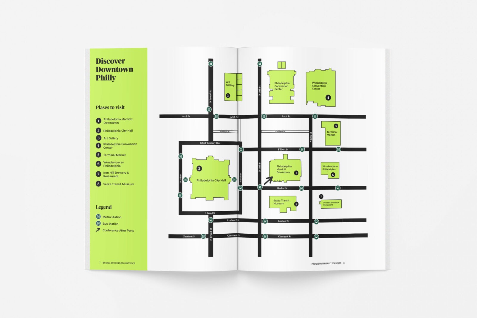
Custom geometric icons and shapes punctuate white space within the design, adding layers of visual interest and reinforcing the theme of interconnectedness. These elements are strategically placed to enhance the overall aesthetic without overwhelming the user. The color palette plays a crucial role in establishing the brand’s identity, with a heavy emphasis on black and white neutrals complemented by a bright green accent. This vibrant green offers instant recognizability and injects a bold, dynamic energy into both digital and print materials.
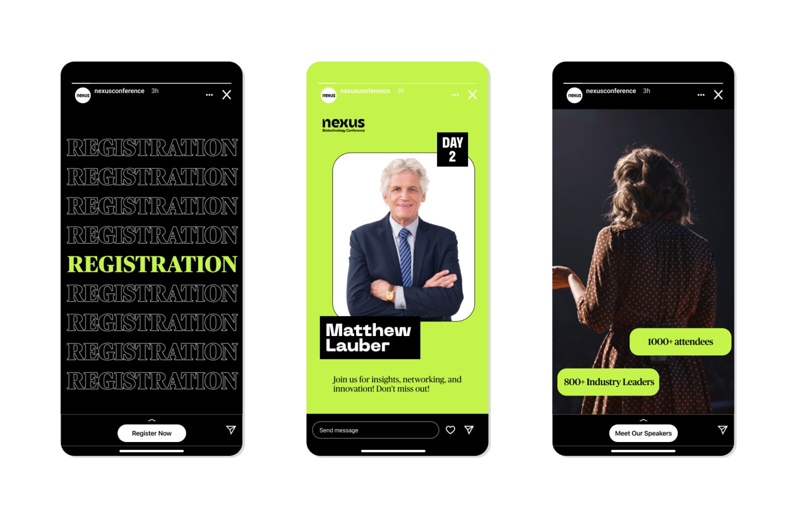
The conference website is designed to be dynamic, featuring numerous micro-interactions that keep the user engaged and encourage exploration. Social media marketing for the event is thoughtfully balanced, showcasing a mix of speaker information, promotional material, and inspirational imagery that collectively inspire potential attendees to register. Each post is crafted to convey the innovative and forward-thinking nature of the conference while remaining visually consistent with the brand.
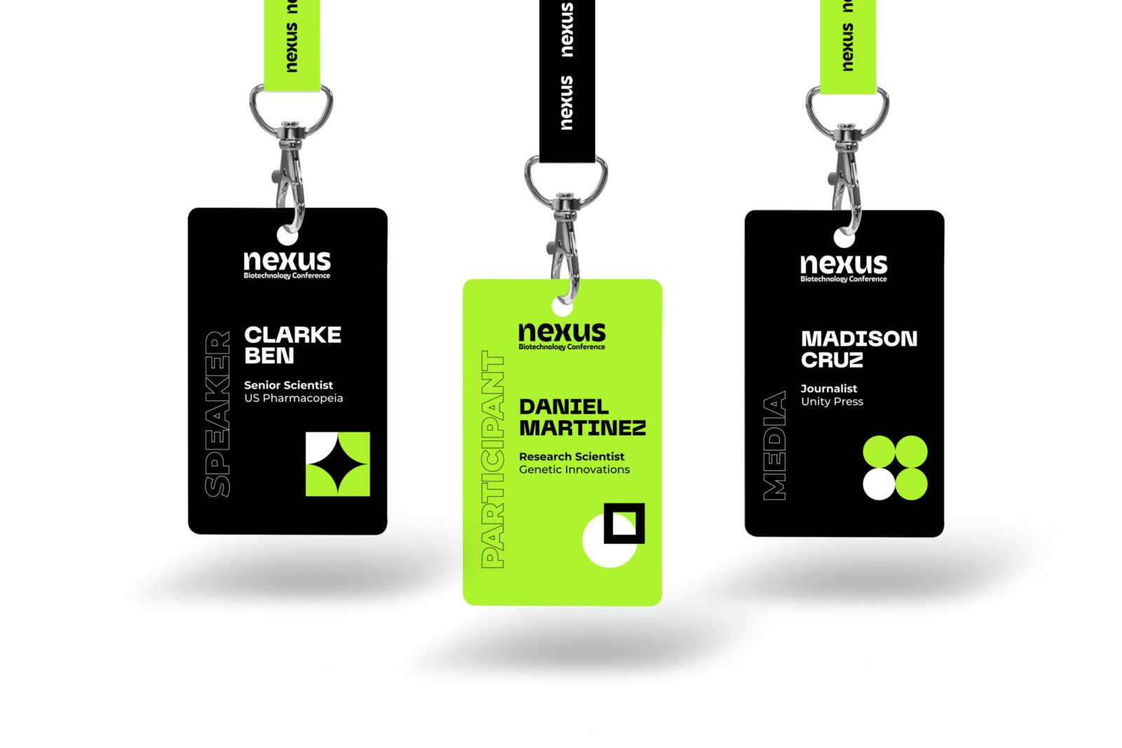
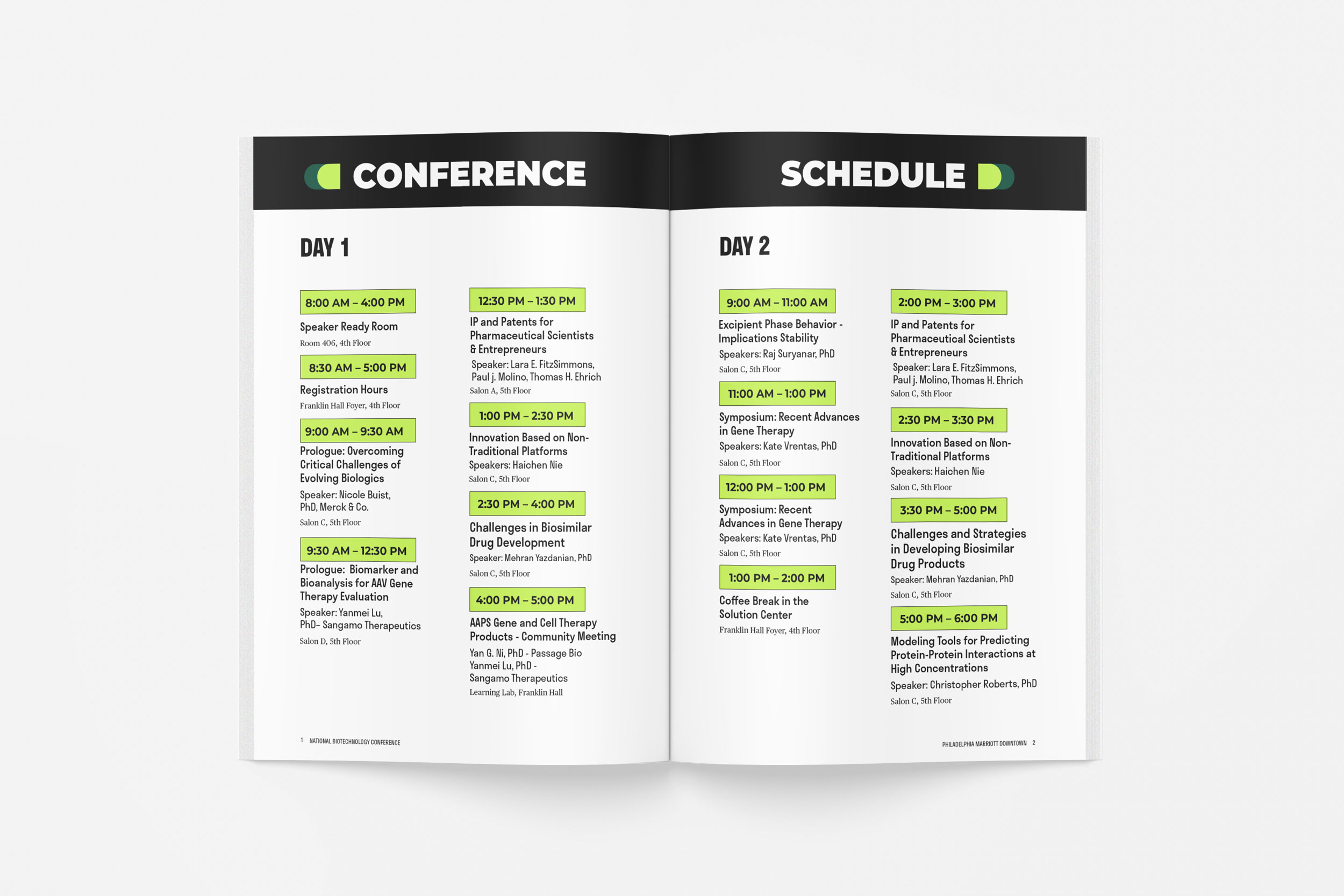
To ensure accessibility, we prioritized creating tangible applications with a clear hierarchy. Structured columns and color-coding systems facilitate easy information absorption, enhancing the overall user experience. This meticulous approach not only makes the brand visually compelling but also ensures that it is functional and inclusive, appealing to a diverse audience while maintaining the core values of the Nexus conference.



CREDIT
- Agency/Creative: Alfiia Osipova
- Article Title: Student Alfiia Osipova Creates Graphic Design for Nexus Conference Rebrand
- Organisation/Entity: Student
- Project Status: Non Published
- Agency/Creative Country: United States of America
- Agency/Creative City: San Diego
- Project Deliverables: Graphic Design
- Keywords: Graphic Design, WBDS Student Design Awards 2024/25
- Keywords: WBDS Student Design Awards 2024/25


