


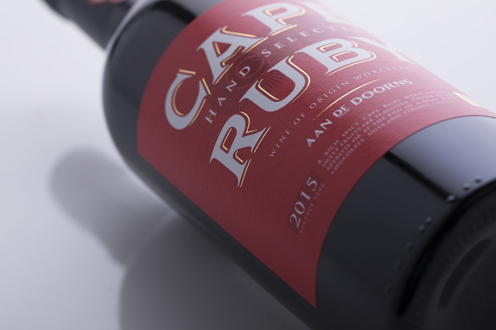
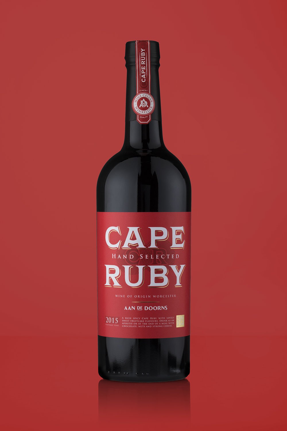
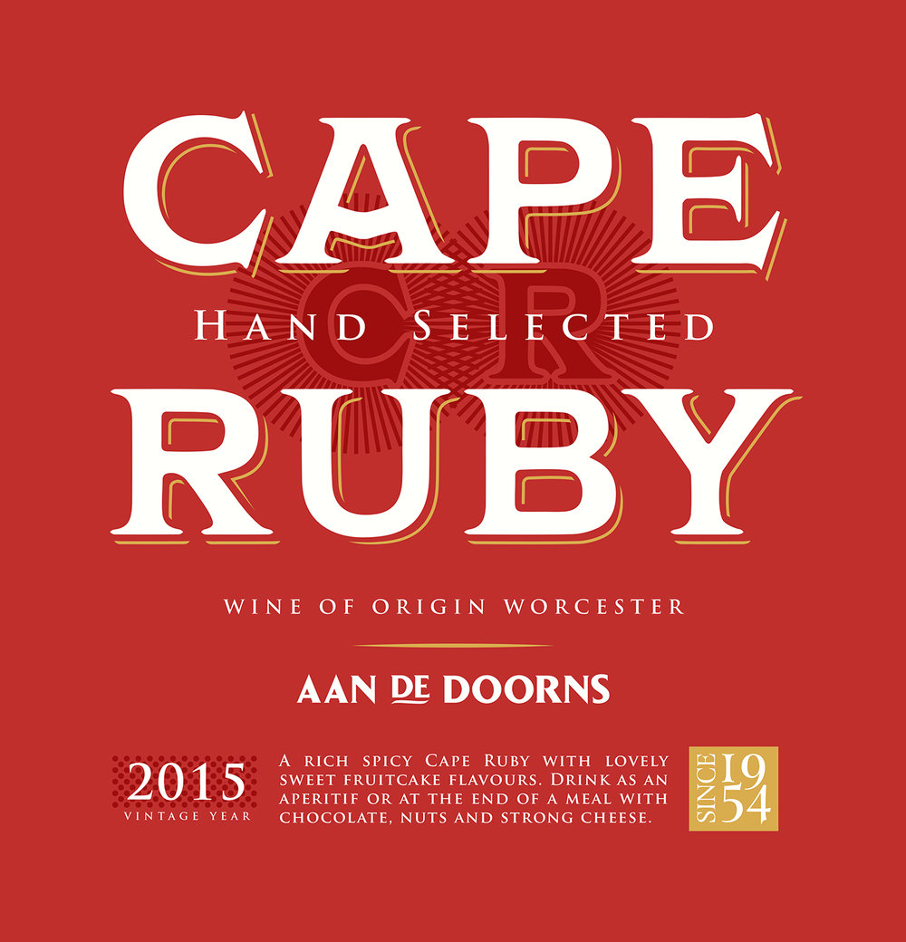
The MARK Studio – Aan de Doorns Cape Ruby Port
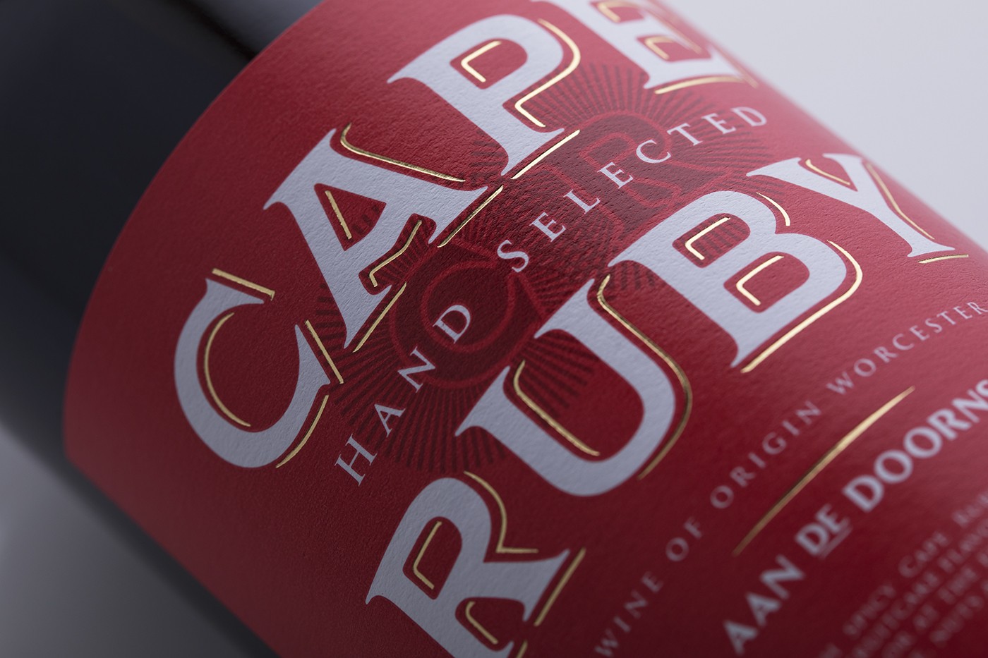
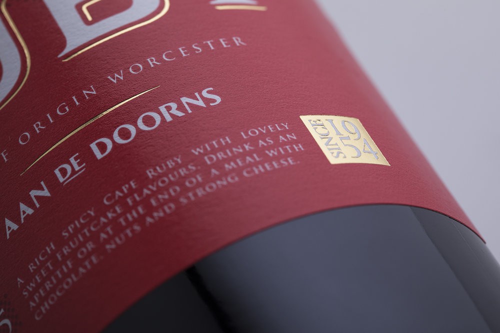
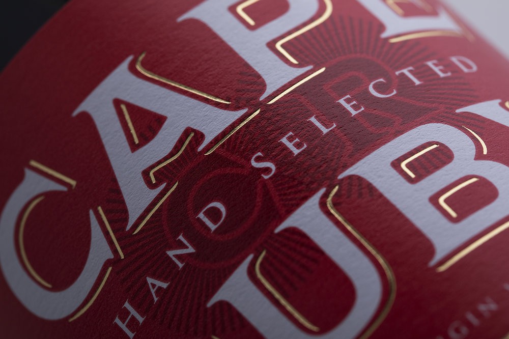
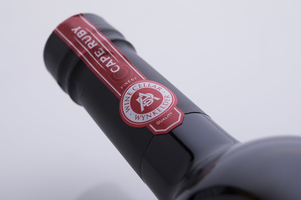
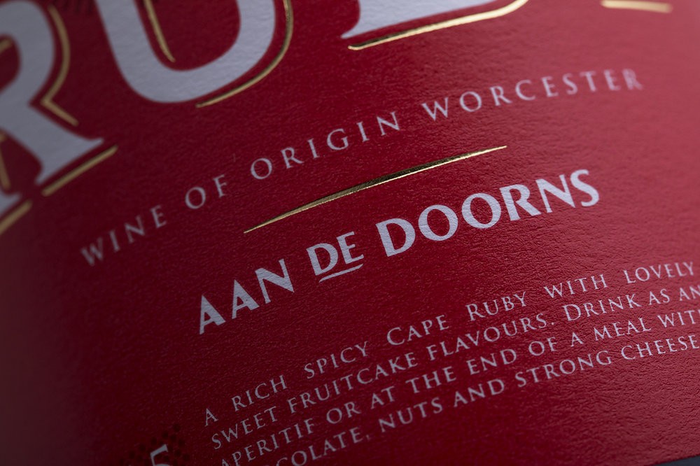
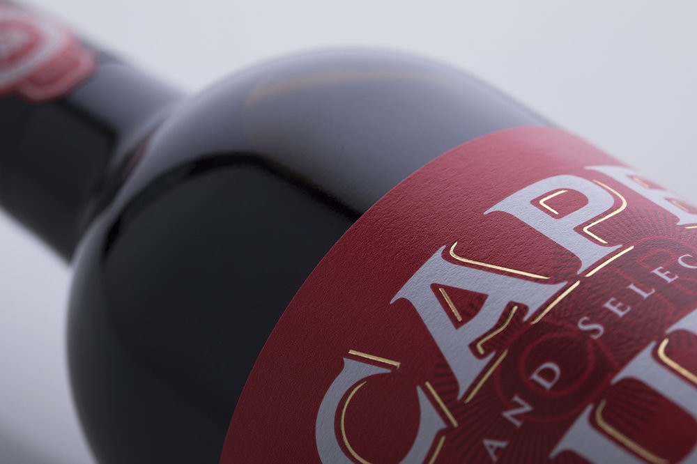
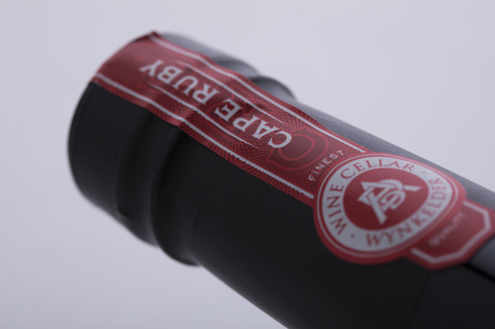
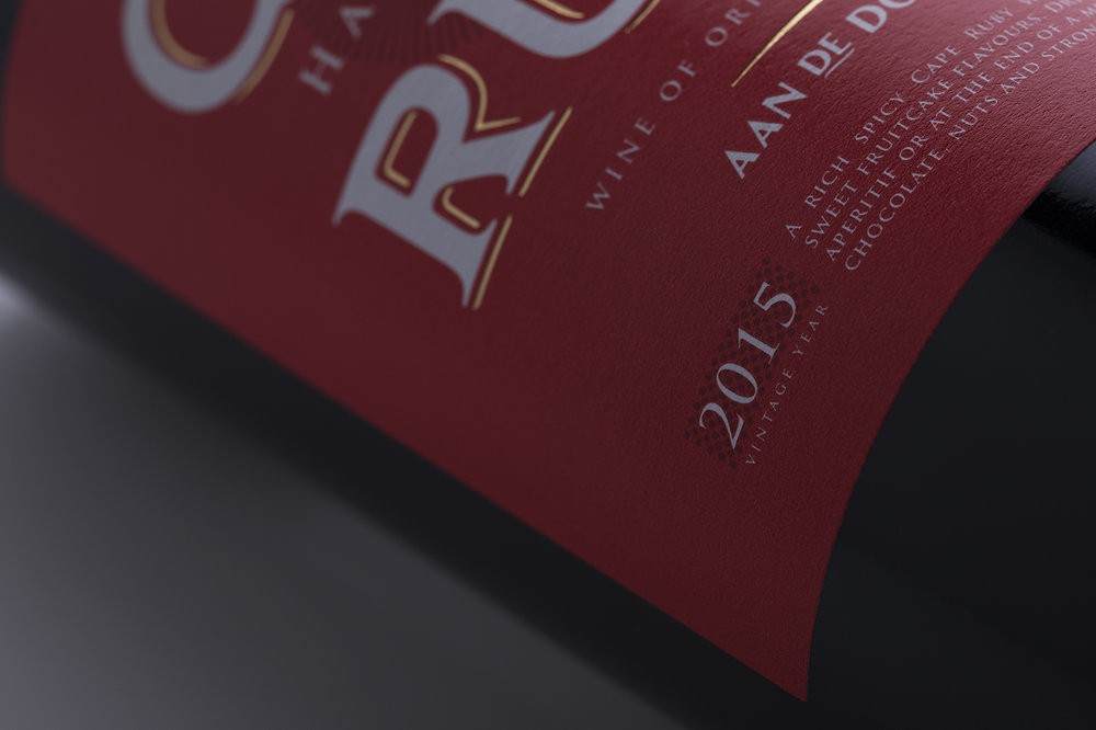
“Aan de Doorns cellar has been producing fine wines since 1954. Introducing their Cape Ruby Port with its distinct bold ruby colour label and beautiful gold foil stamping which greets you with a striking shelf presence.Immediately after its launch, the revitalised Cape Ruby packaging was met with enthusiasm from distributors and key accounts. The new contemporary look allowed the winery to raise pricing, increase production and expand distribution.”

CREDIT
- Agency/Creative: The MARK Studio
- Article Title: Stronger Shelf Presence with Packaging Design Revitalisation of South African Cape Ruby Wine Brand
- Organisation/Entity: Agency Commercial / Published
- Project Type: Packaging
- Agency/Creative Country: South Africa
- Market Region: Global
- Format: Bottle
- Substrate: Glass


