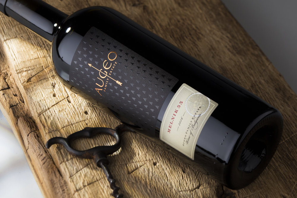
the Labelmaker – Augeo Family Estate Wine Range
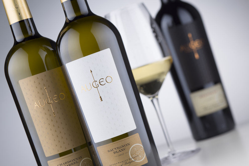
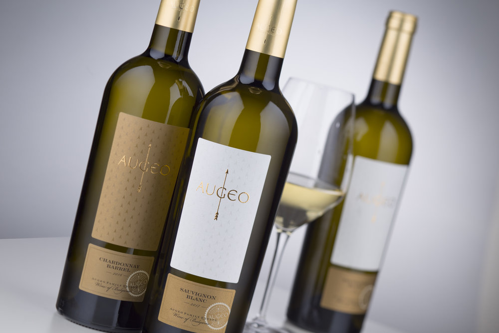
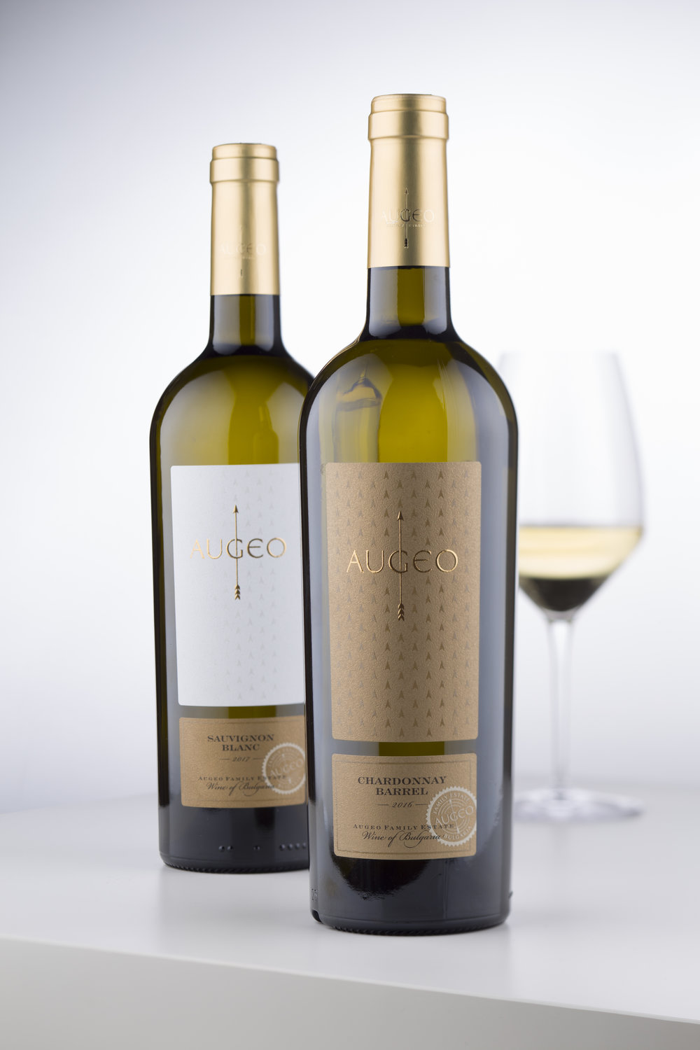
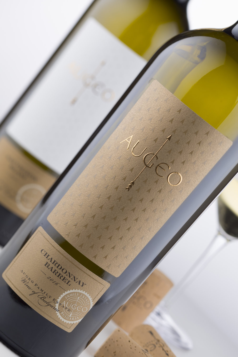
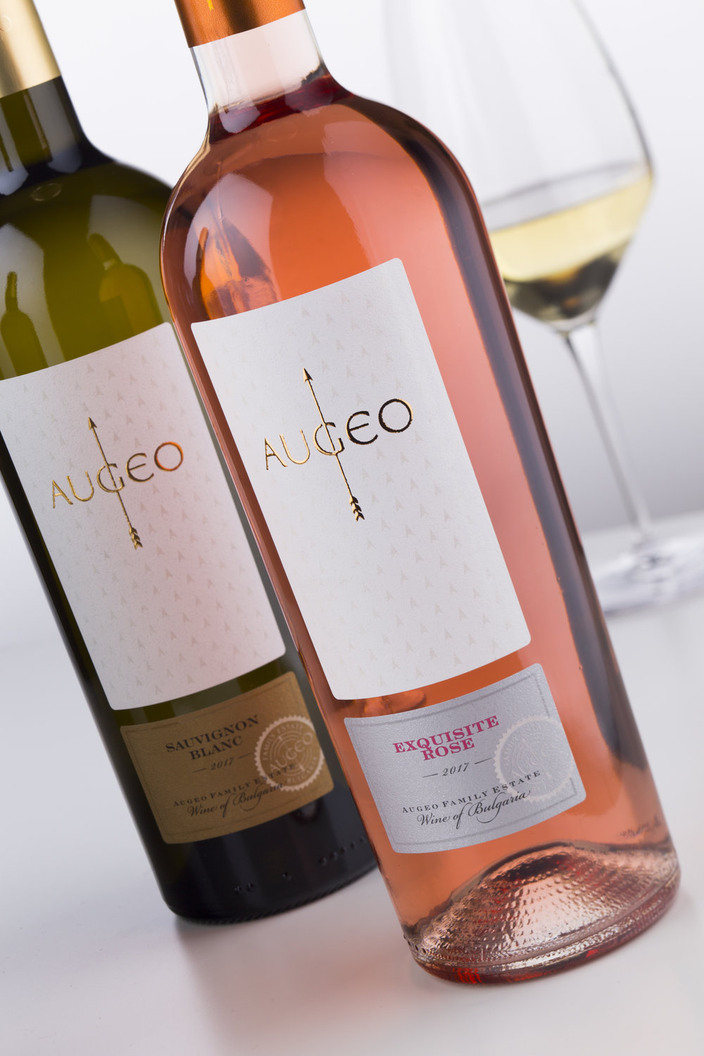
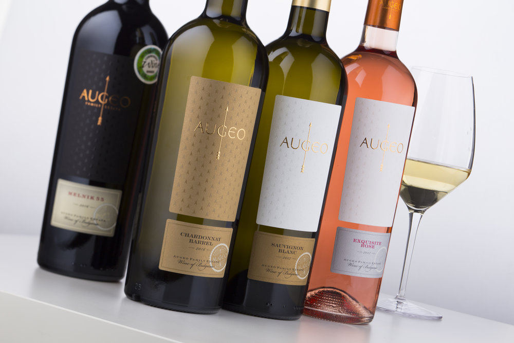
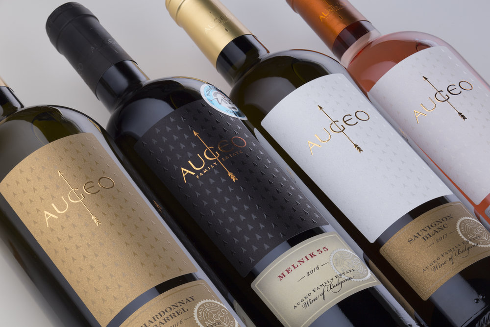
“ Augeo was the first name in my list when I started working on the project back in 2017. We got absolutely nothing except enthusiasm and ideas. In the beginning we were talking about only one wine and label for it but in very short time it got quite clear I would have to create name for the winery, logo and right after that the label itself.I started with a short list of names from which AUGEO was my favorite. It was very easy with such meaningful and memorable word to create strong winery logo design.AUGEO comes from Latin – probably my favorite language – and it means to grow, expand, develop etc. It was absolute hit for me because I really felt inspired by this word. I was thinking of keywords like direction, strength, expansion. At the very same time I was thinking of very simple and legible typography for the name. The answer came easy and quickly to me – I decided to use an arrow as key element of this strong winery logo design and wisely modified version of the amazing Optima typeface by Herman Zapf. I tried to keep the organic link between name’s Latin roots and the classic roman Capitalis typography without breaking the connection of my design with modernity. Optima was a perfect match for this because it is liaison between old and modern days. Of course, I love to make custom type and in this logo, I was looking for more oval elements while trying to keep the ‘A’ as the only pointed element in the letters, I changed the classic ‘E’ to a round version made by me. Played a little with hidden serifs and geometry and the type for AUGEO was done. The arrow was the easier part and while doing it I already knew how to combine it with letters to receive strong winery logo design.My next step was to focus on bottle, paper and label. We picked classic conical bottle for all AUGEO wines that I was really happy with. Bold, masculine yet elegant bottle shape was in perfect harmony with such strong winery logo. I was pretty much convinced I need very clean label with a lot of free space around the logo. The bottle has good vertical surface and I started creating a taller label made of two parts. Top part was reserved for the AUGEO logo and the bottom part was for the variety, vintage, winery name etc. I also wanted to have fine textured paper – like in many other projects done by me, I chose Constellation Snow Country by Arconvert. It is a paper easy to work with and it also looks very classy. Last but not least – AUGEO’s strong winery logo was stamped with silk foil and it looked gorgeous against paper’s smooth surface. A nice play between gloss and matt was achieved. I also took the arrow head from the logo and created a pattern around the logo with arrow heads. They were overprinted with transparent raised varnish and delicately enhanced the meaning and strength of the logo. Since I was aiming at classic design for AUGEO wine labels I decided to use very simple color scheme for each of the wines. This made the whole brand look more strong and consistent on the shelf. Capsules I did were very clean and simple too – in fact they were another good focal spot to place my strong winery logo design. I used black, gold and copper solid matt background color capsules with elegantly positioned AUGEO logo overprinted with same colors gloss hot foil.The wine range consists of 5 wines at the present moment with good perspective to expand with 2-3 reds in the next couple of months.The focus I put on AUGEO’s strong winery logo design emphasized the brand strength and also let me create very elegant classic label touched by modern print technology for more sensitive personality and unique style.”
CREDIT
- Agency/Creative: the Labelmaker
- Article Title: Strong Winery Identity Design for European Market
- Project Type: Packaging
- Agency/Creative Country: Bulgaria
- Market Region: Europe
- Format: Bottle
- Substrate: Glass


