


Robot Food has rebranded Harringtons pet food, modernising and clarifying its positioning and visual identity.
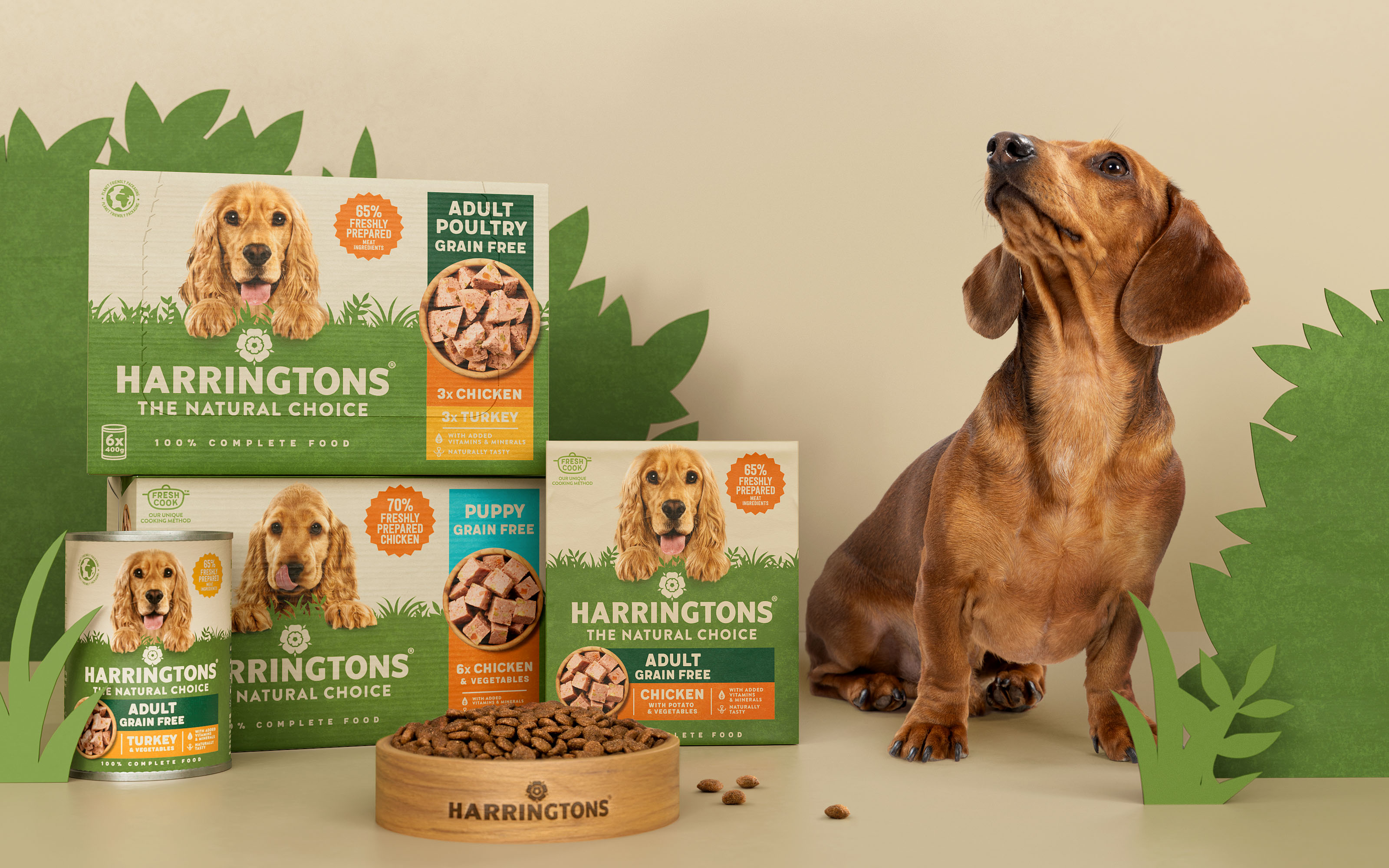
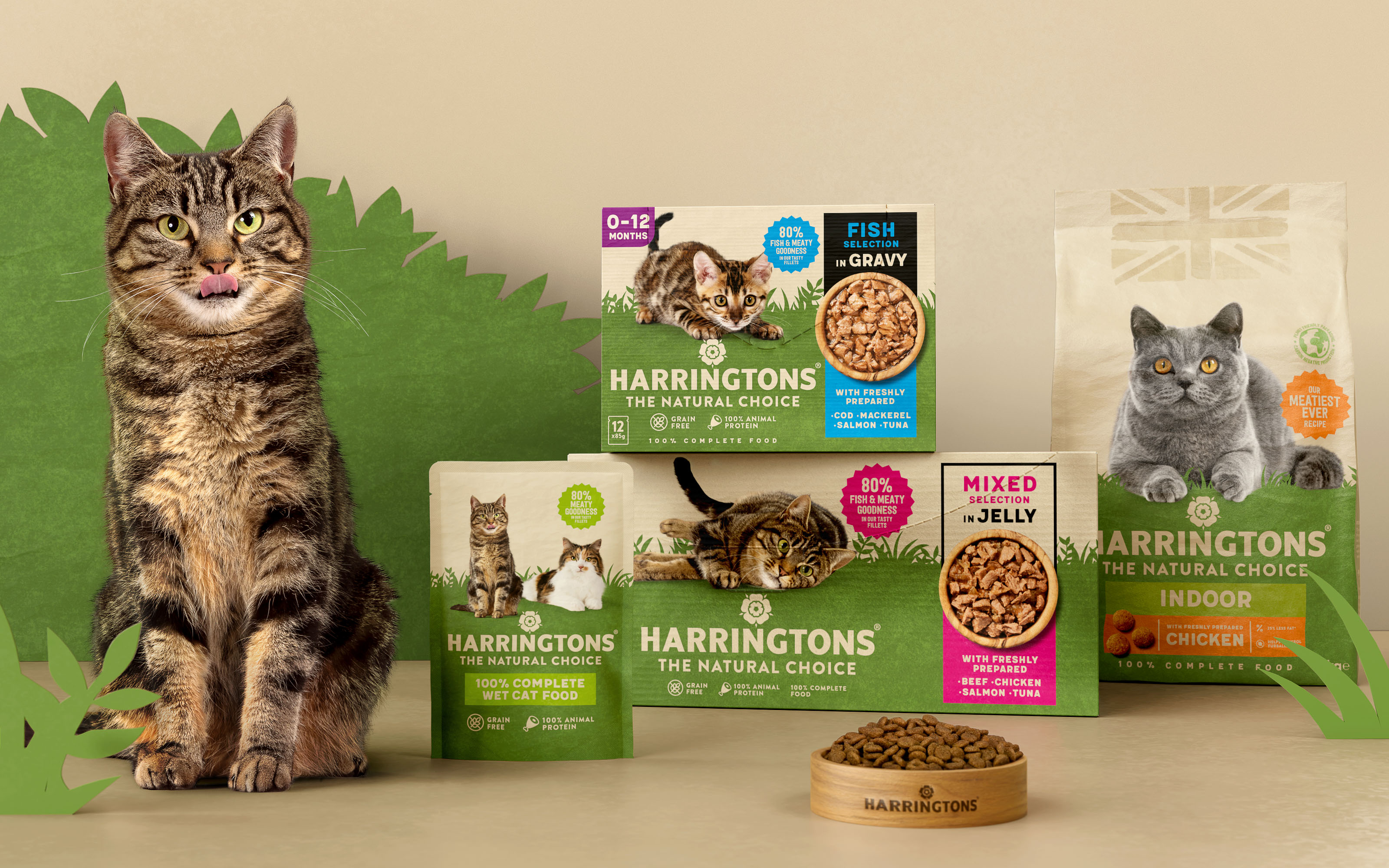
The agency was brought in to retain Harringtons’ leadership position in a rapidly shifting category; as well as setting up their cat range for increased success. The new designs are used across wet and dry food and treats for dogs and cats.
“Harringtons was the most overtly natural product in the category in mainstream retail, but the boom in dog ownership has meant that the consumer landscape has changed and Harringtons wanted to make sure they remain ahead of the competition,” says Jess Cook, Robot Food client director.
“It needed to evolve with customers’ needs, finding relevancy with the new audience of pet owners with more of an emotional hook. They’d relied on trading on quality and price, but that only scratched the surface of the brand – we needed more for people to connect with.”
Will Bushell, Head of Marketing, Inspired Pet Nutrition, Harringtons manufacturer adds: “Despite the brands positive performance, we needed to ensure we stay fit for the future and meet the more emotional needs of new ‘pet parents’ with higher expectations of what their beloved pets deserve. We knew we couldn’t rest on our laurels and worked with Robot Food to help us simplify and amplify our design system and set us up for long-term success across the entire portfolio. The key for us was modernising, without losing the essence of who we are.”
Fewer claims, communicated better
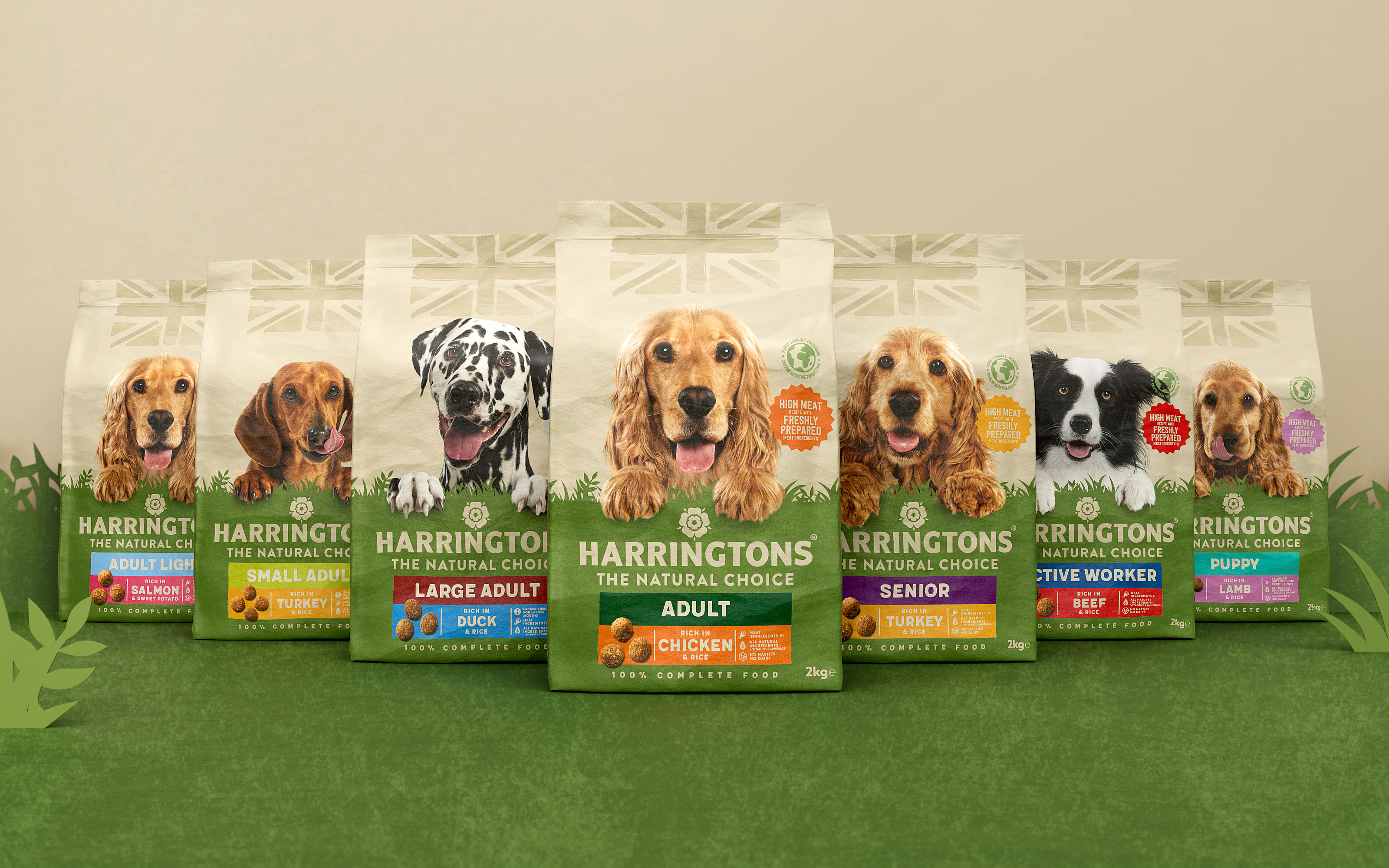
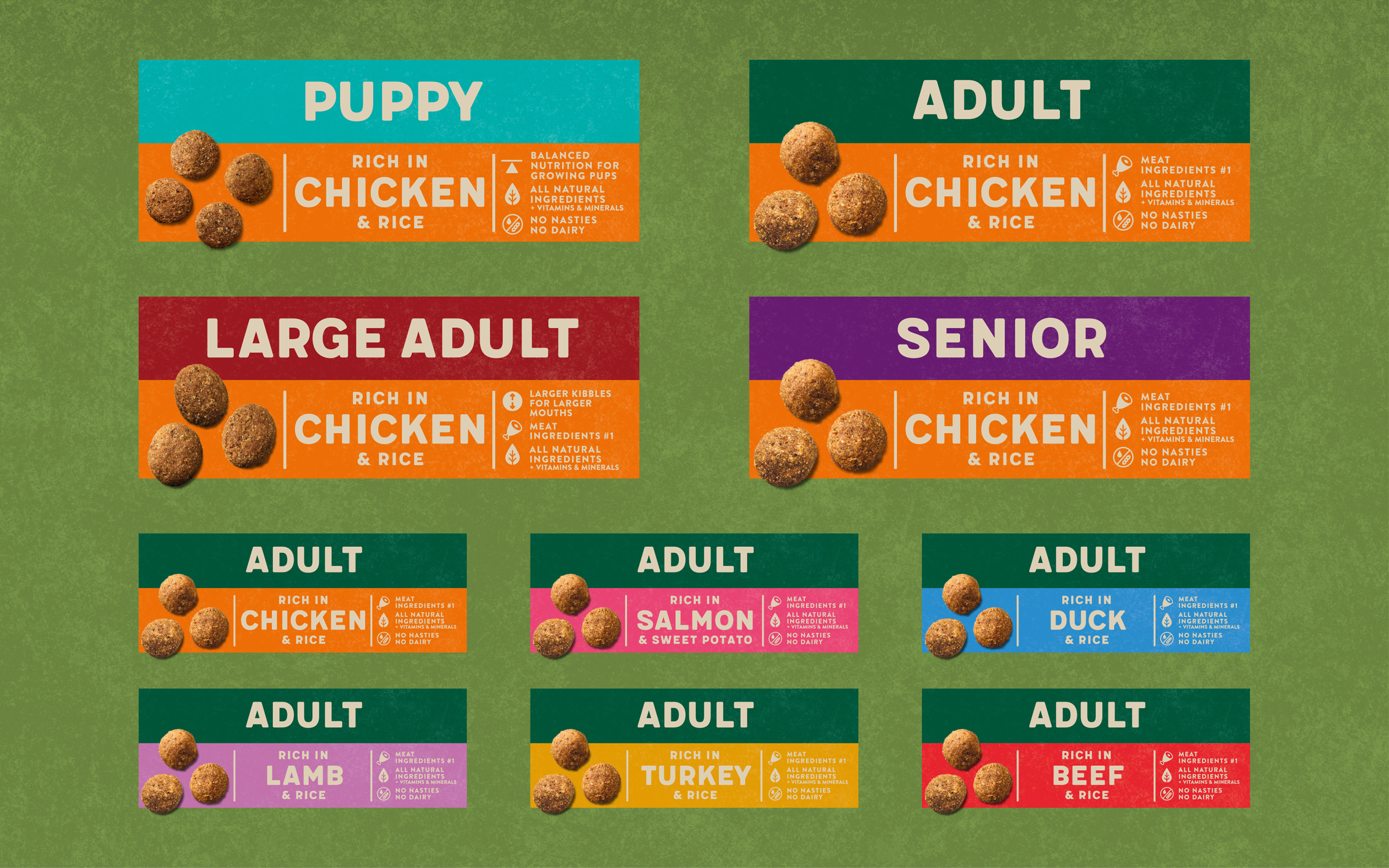
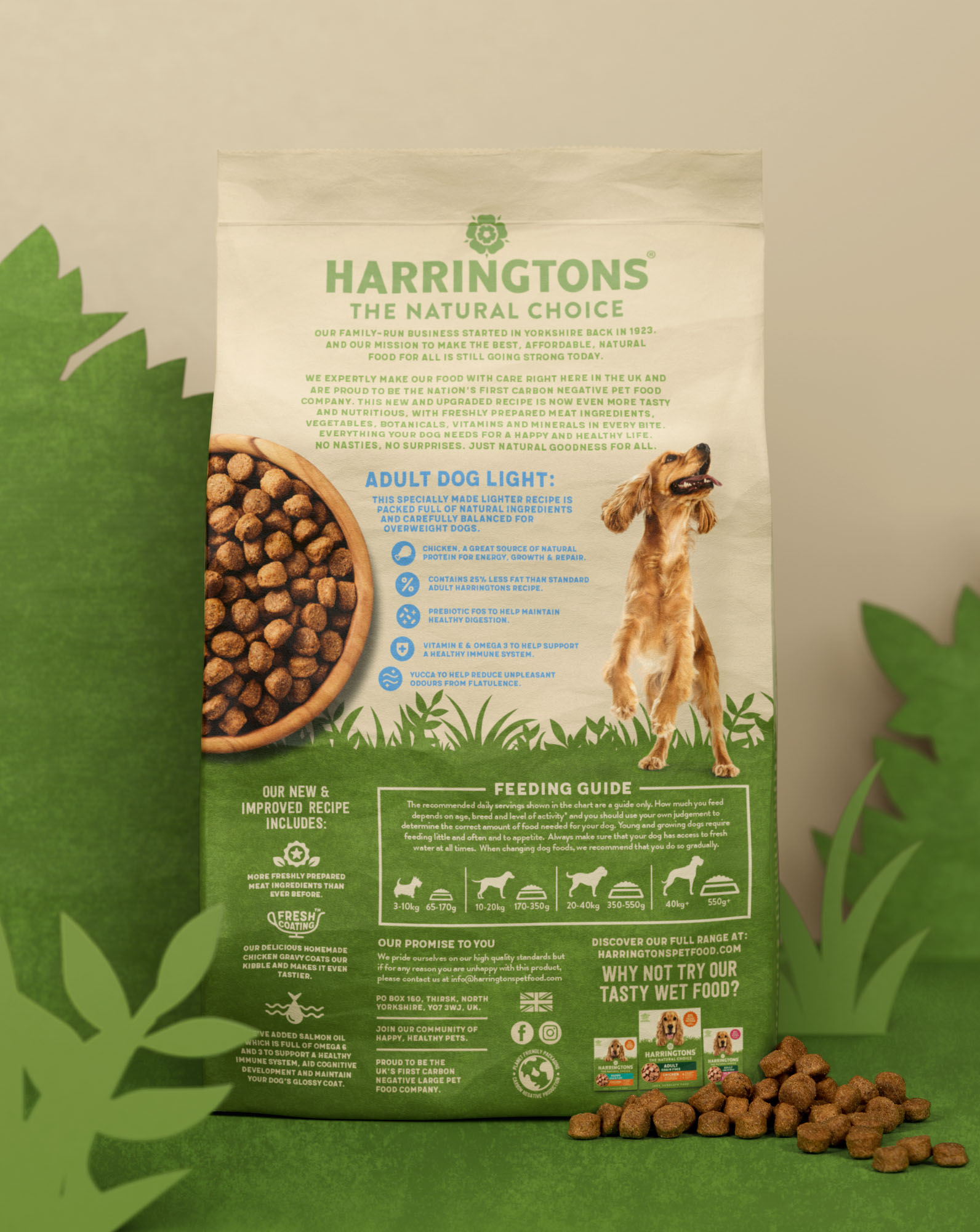
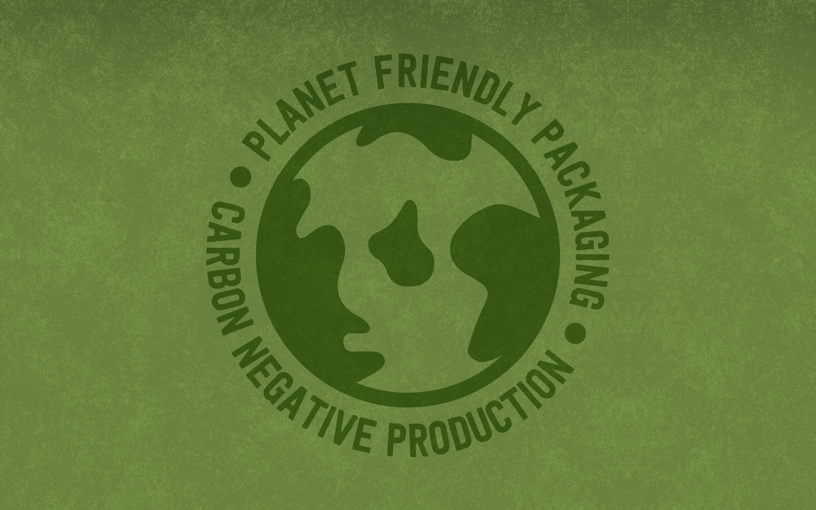
Distilling Harringtons’ personality as straightforward, inclusive, all-natural, and friendly, the new packs needed to communicate with a clear information hierarchy and better on-shelf standout. Robot Food worked to eliminate problems like a lack of clarity across the brand’s various products and subbrands, and create a stronger, more unified look and feel that better reflected its expertise and history, which stems back to 1923.
“There was an overall lack of clarity and authority being projected by the brand, despite it’s category leading status”, says Cook. “We had to remove the barriers to consumers and evolve the brand – show that it’s premium quality, but accessible to all walks of life.”
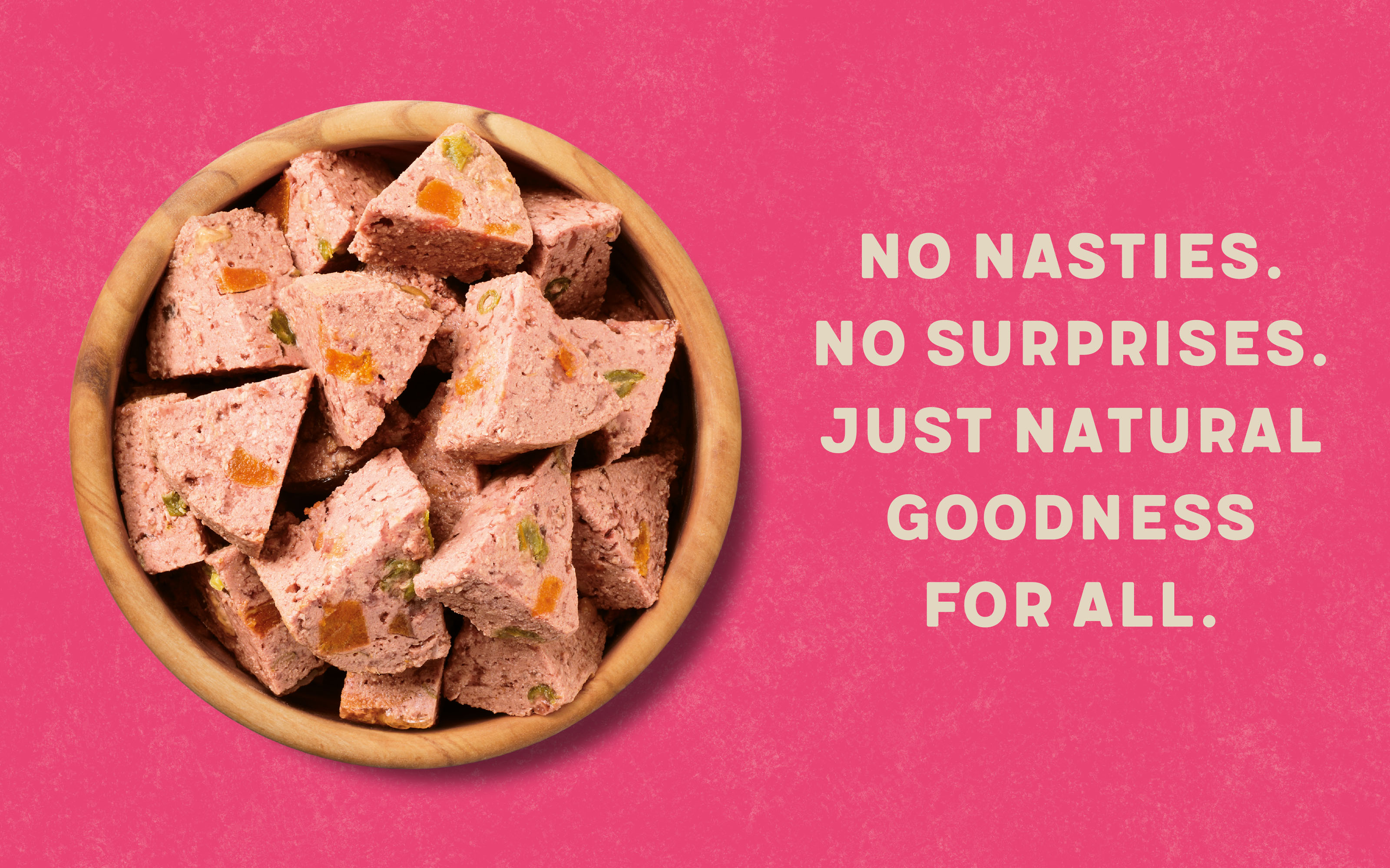
The new designs unite each of the products in the range under a single, simplified design system; stripping the front of pack information down to its most essential details. “It was all about real food, real choice, and real pets, because previously it had been a bit disconnected,” says Cook. “In terms of the design, everything was about clarity & impact – we had to look at how we unified the full portfolio of products so that the brand appeared stronger.”
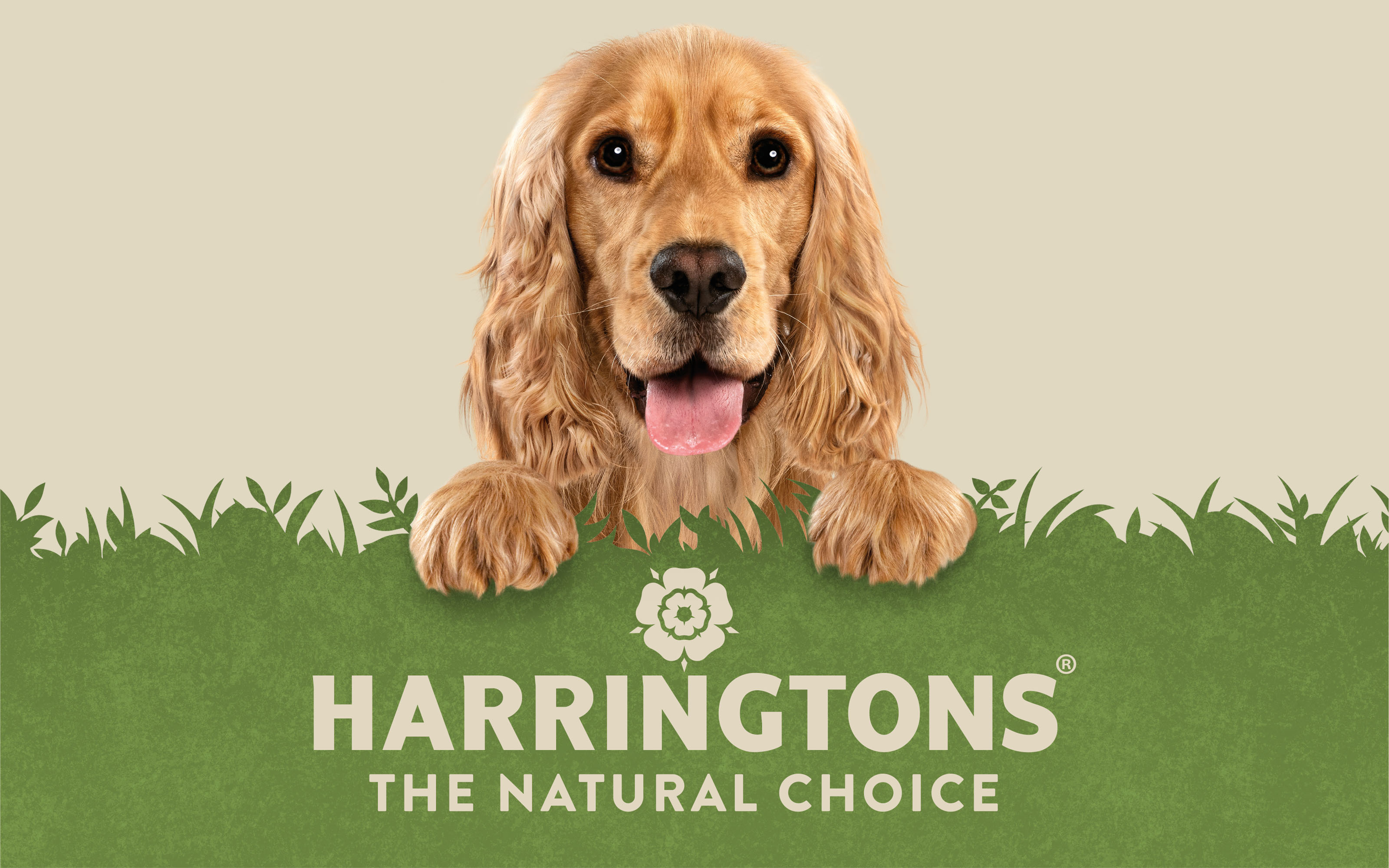
The height of the former packs meant that they were often folded over on shelves, obscuring the brand name. These have now been moved down the packs, which use a ‘horizon of grass’ that’s consistent across dog and cat products. “These are relatively simple design updates, but they were essential to create a much prouder, more united brand, with greater impact on-shelf,” says Simon Forster, Robot Food founder and executive creative director.
Natural credentials and emotional connections
Robot Food based the new positioning and visual identity around the idea ‘it comes naturally’; building on the natural credentials of the product and redefining what made it a market leader by amplifying the connection between owner and pet.
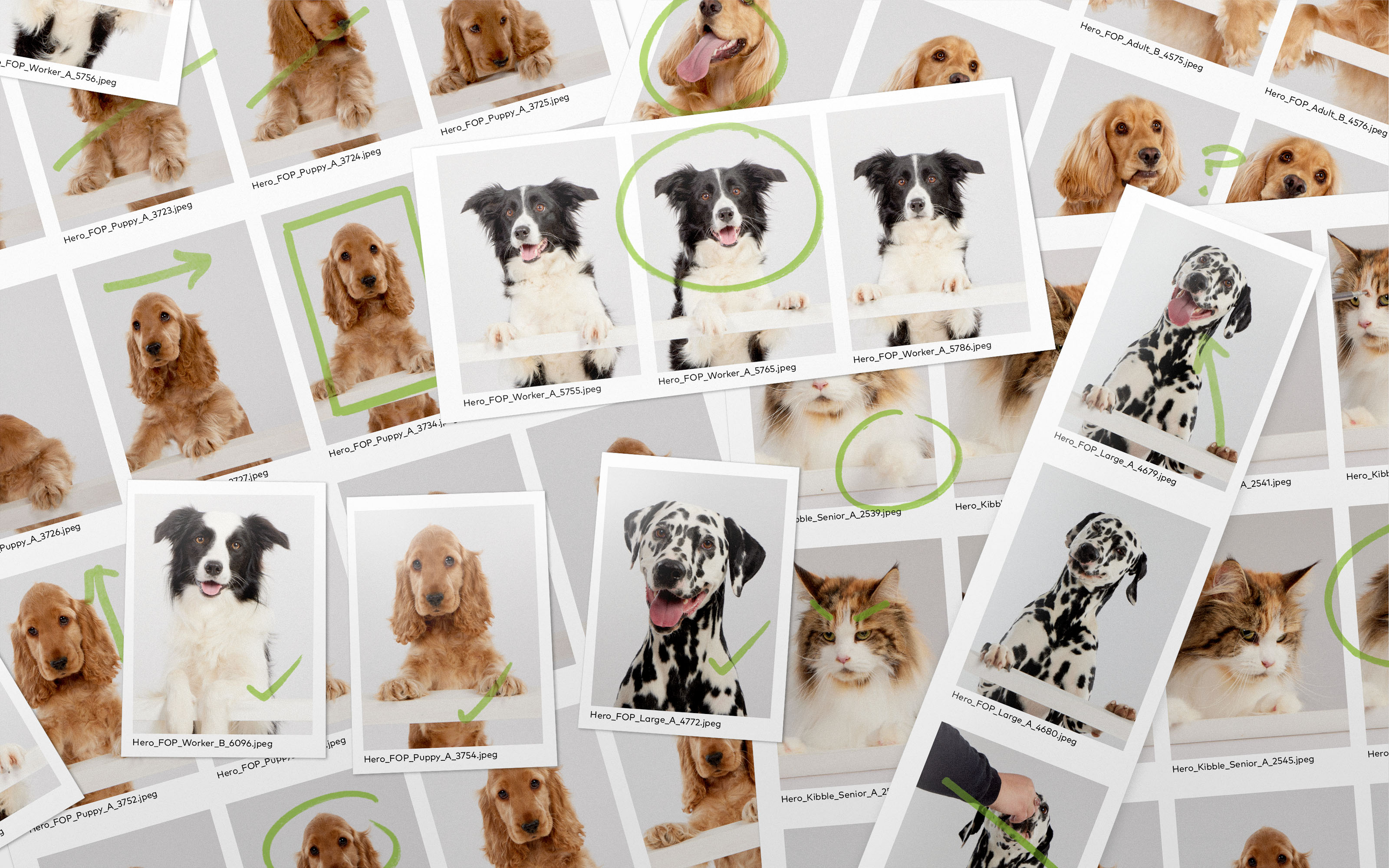
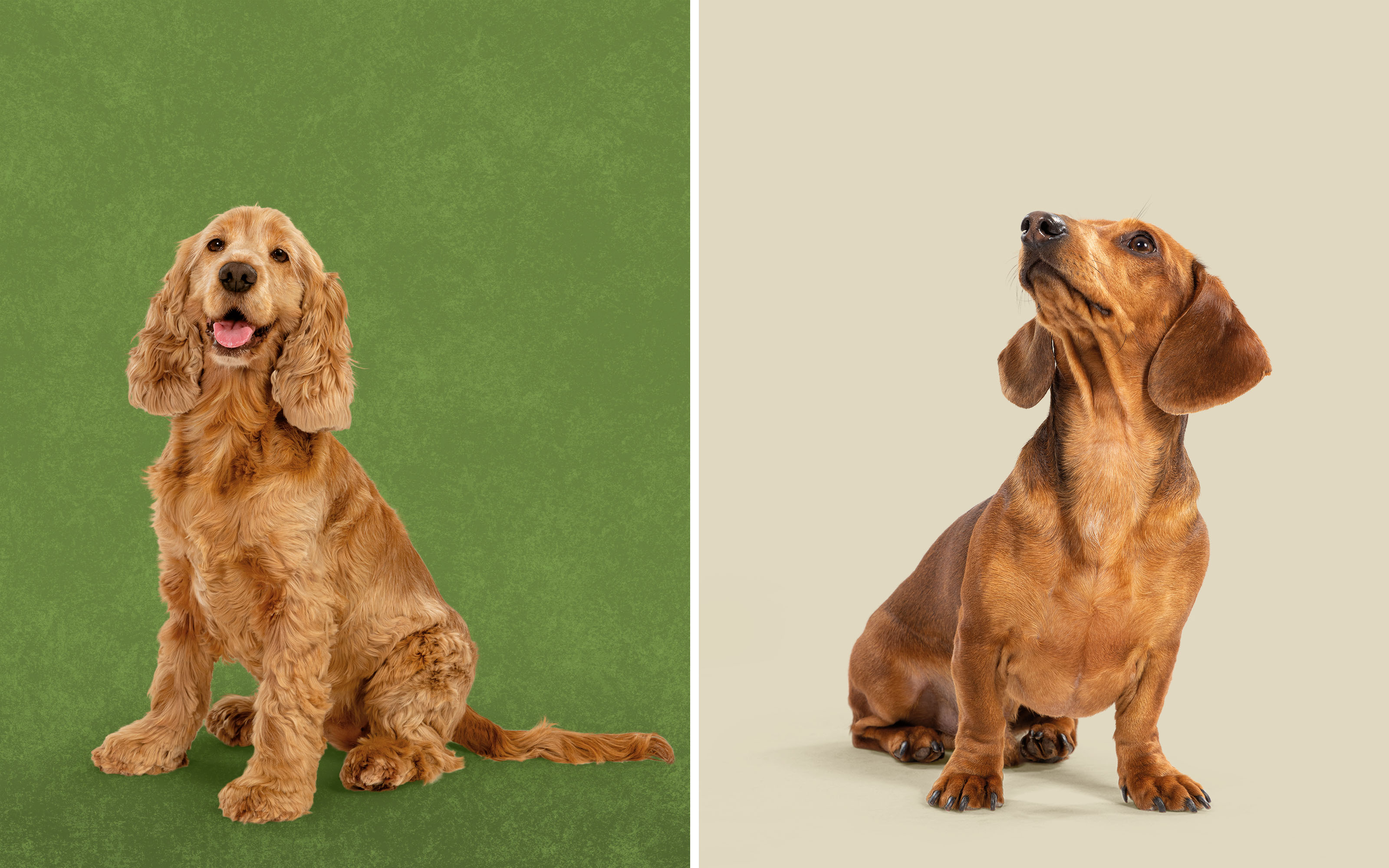
Newly commissioned photography, art directed by Robot Food of both the pets and the products creates a stronger emotional pull, with the animals’ faces taking centre stage. “That’s what draws people in and creates a much quicker connection,” says Forster.
While pet photoshoots require more time, budget, and specialist skills than using stock photography, it ensured that Harringtons’ imagery was unique to the brand, further re-establishing its position as the category leader.
“The photoshoot was quite an undertaking, but it was such a key part of the project,” says Cook. Every dog ‘model’ needed an understudy, for instance; and specialist photographers are required, so it was vital Robot Food took Harringtons “on a journey” to show that the shoot was worth the budget.
“We’ve shown them our working and our thinking leading up to that point of arriving at a more simplistic design, so that when they see the solution, they just know it’s better than previous,” says Forster of the rebrand.
“We’ve achieved a huge amount without throwing the baby out with the bathwater. The DNA of the brand is clearly carried over, but presented in a bolder, more impactful and more emotionally robust way,” adds Cook. Harringtons’ green colour has been retained but made more vibrant, for instance, and the former wordmark remains, with its rose icon tightened up and the pinstripe background pattern removed.
She adds, “It still feels like Harringtons, but it’s easier to shop. Especially at times like this, brands can’t rest on their laurels: they have to think about the future, and not wait until they get to the point of decline to take action.”
The new designs are currently rolling out across the UK.
CREDIT
- Agency/Creative: Robot Food
- Article Title: Strengthening a Leading Pet Brand for the Future: Robot Food Rebrands Harringtons
- Organisation/Entity: Agency
- Project Type: Identity
- Project Status: Published
- Agency/Creative Country: United Kingdom
- Agency/Creative City: Leeds
- Market Region: Global
- Project Deliverables: Brand Identity, Brand Redesign, Brand Strategy, Identity System, Packaging Design, Photography
- Industry: Retail
- Keywords: Rebrand, Modernising, simplify, amplify, positioning, Design System, Packaging, Photography, Strategy, Unity
-
Credits:
Strategic branding agency: Robot Food


