


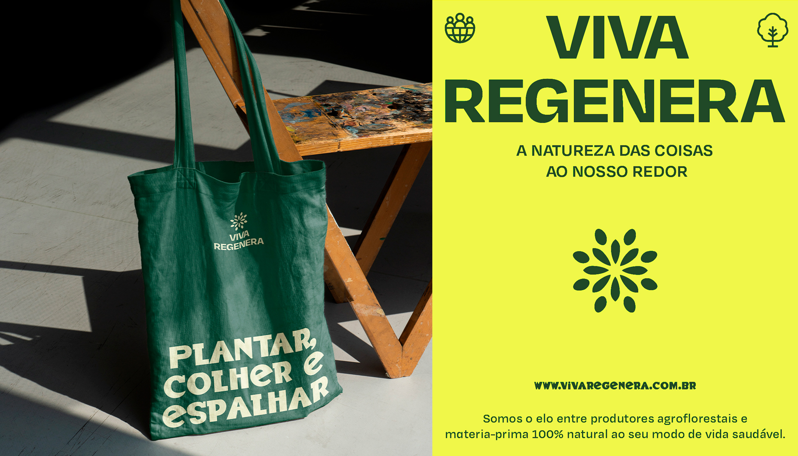
Plant, harvest, and spread. Since 2019, Brazilian duo Move has collaborated with clean food marketplace Viva Regenera to create a brand system as organic and unique as their products.
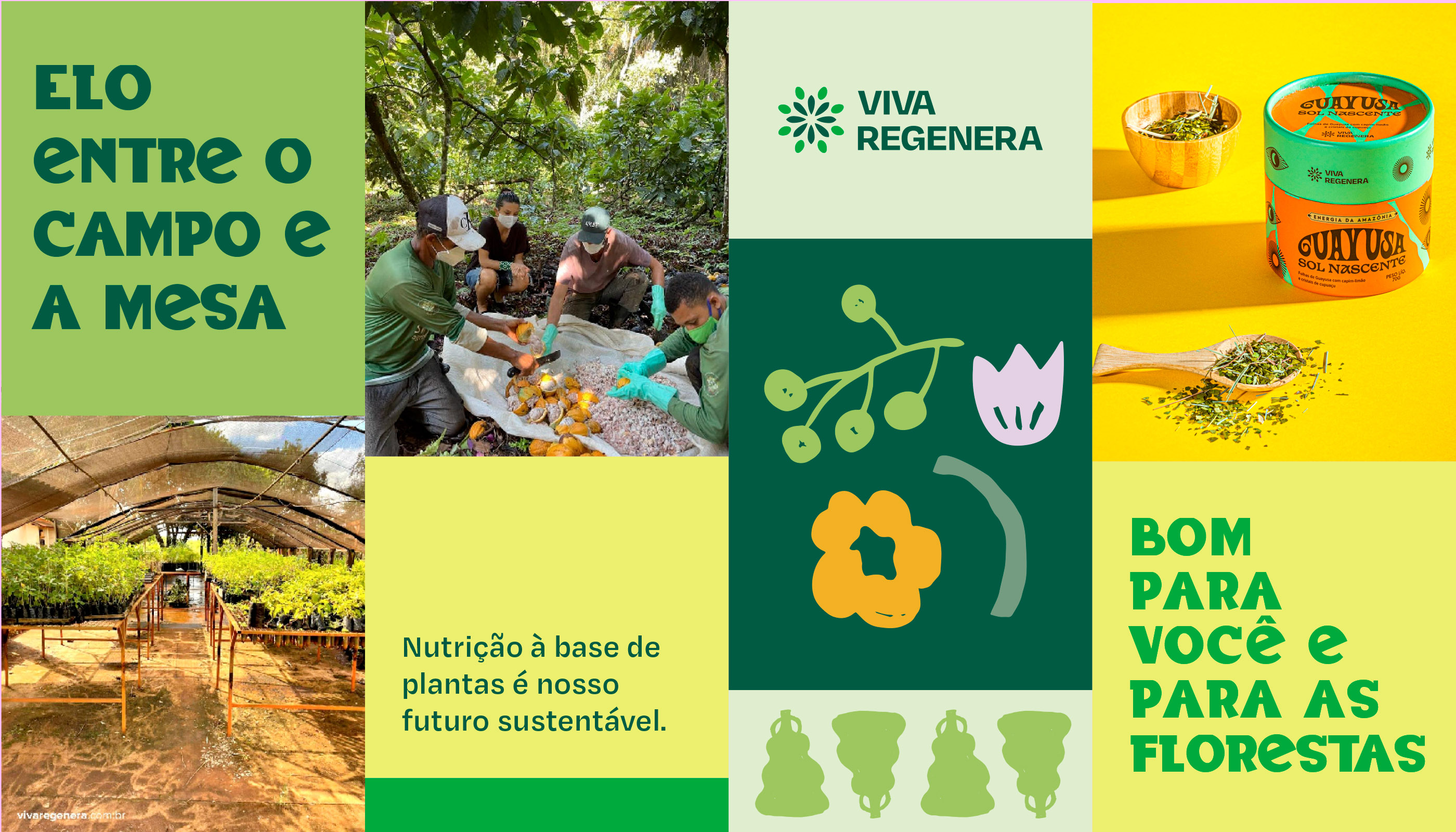
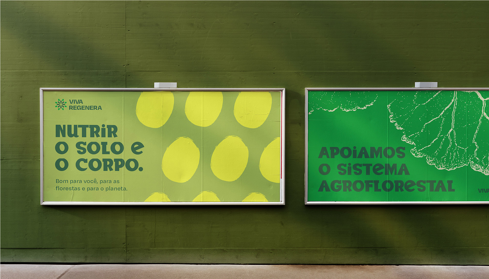
Viva Regenera is a low-impact food brand that uses raw materials from small cooperatives that grow organics in the wild, in oppose to large-scale monoculture. Agroforestry is a sustainable planting system based on growing different species together with forest vegetation, which keeps away pests and predators while recovering the soil.
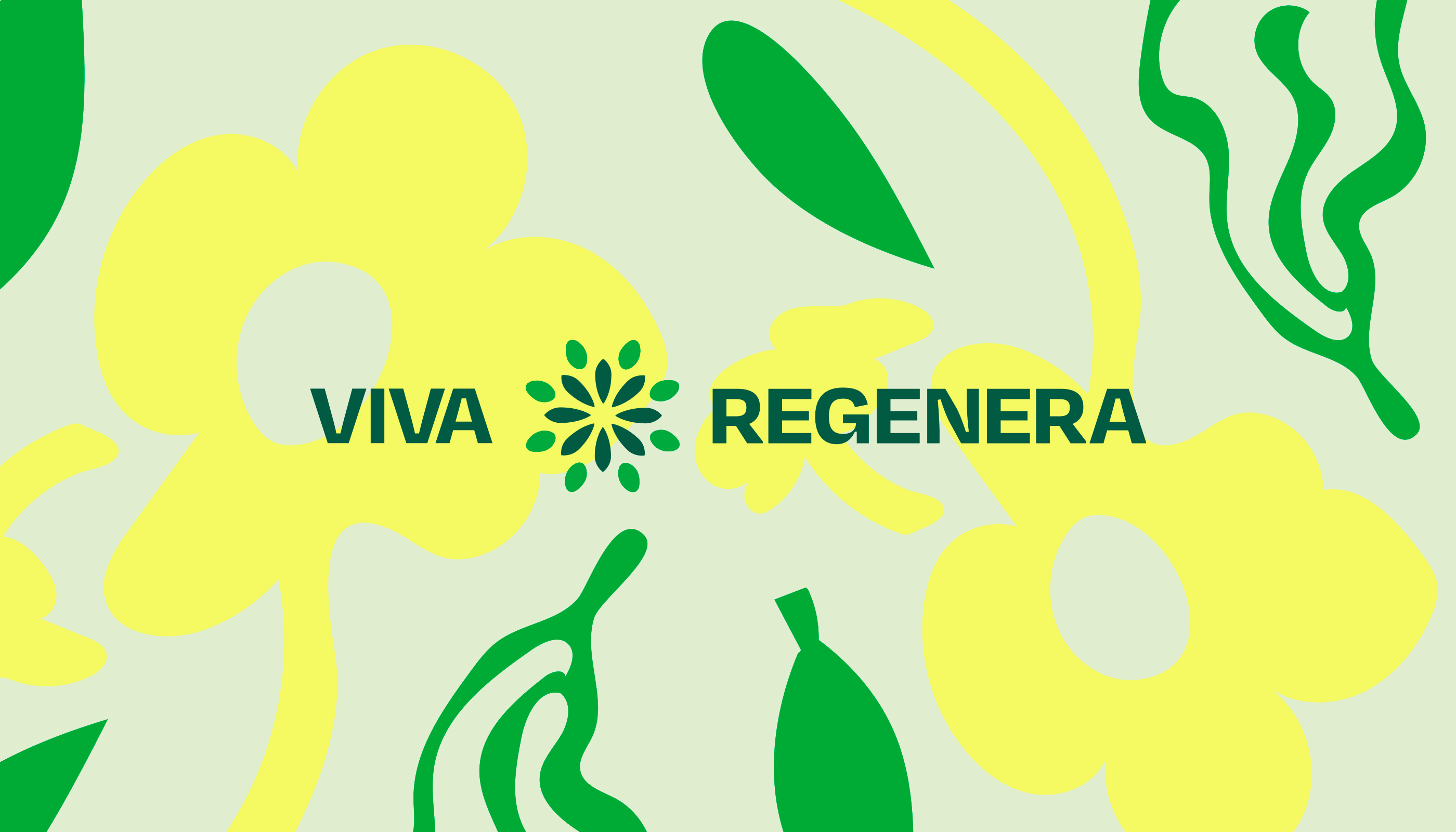
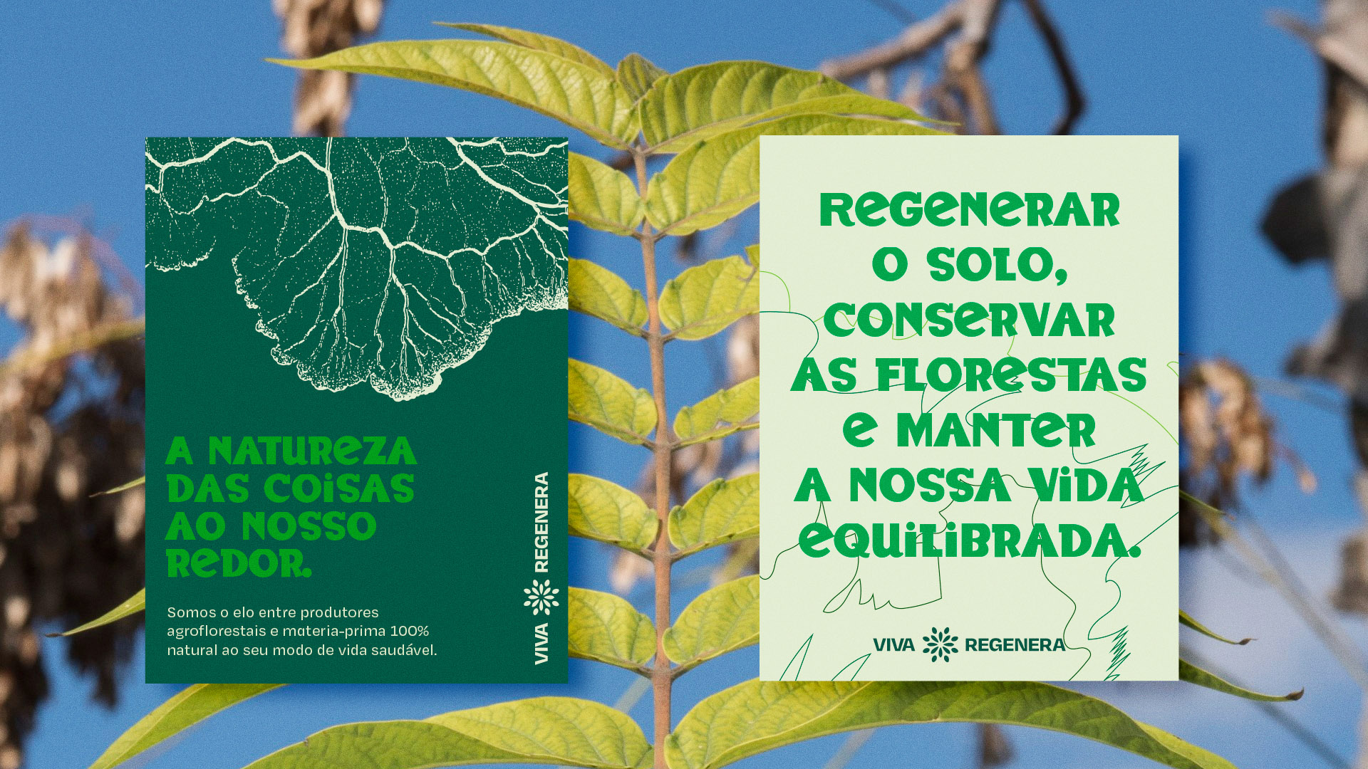
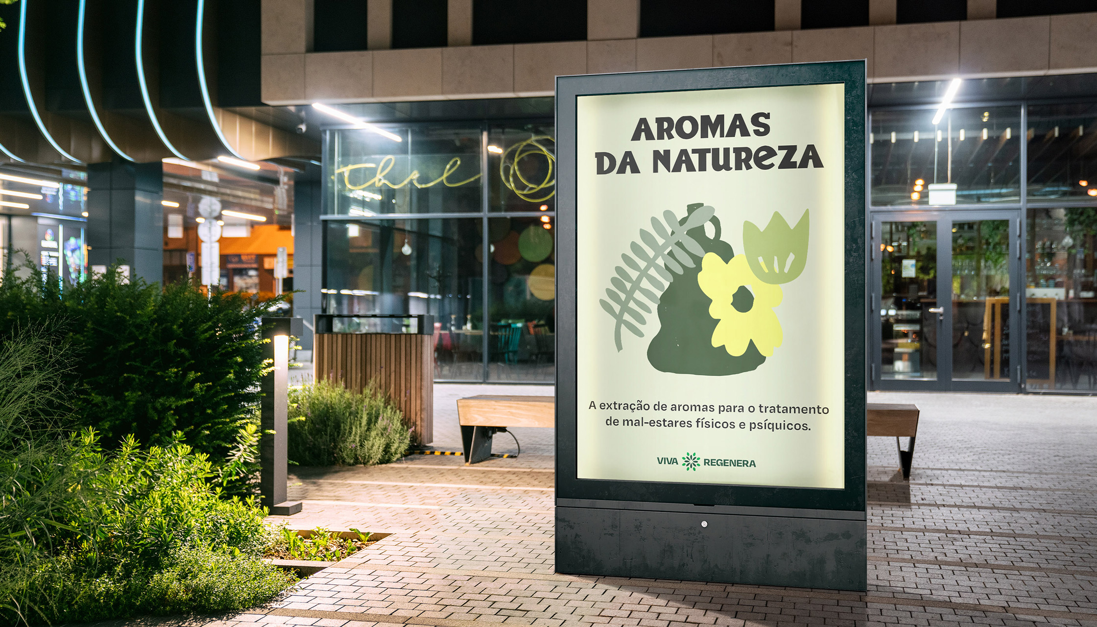
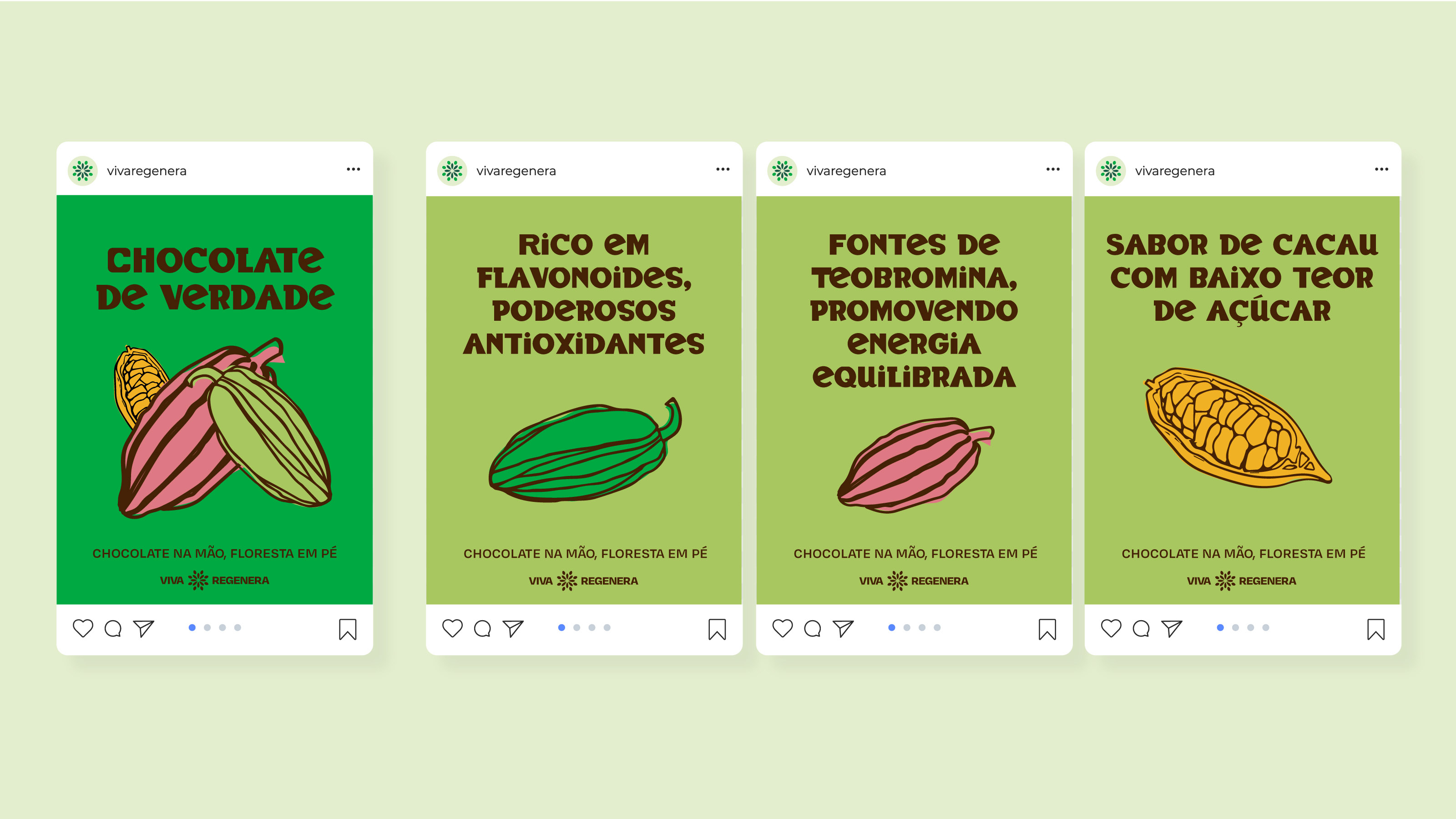
Vivid colors and graphic elements inspired by the shapes of nature create a strange harmony with the unusual-looking typography. The BadTyp typography (@typenetwork) has a vernacular style, mixing uppercase and lowercase letters with different weights, thicknesses, and all sorts of irregularities characteristic of street posters.
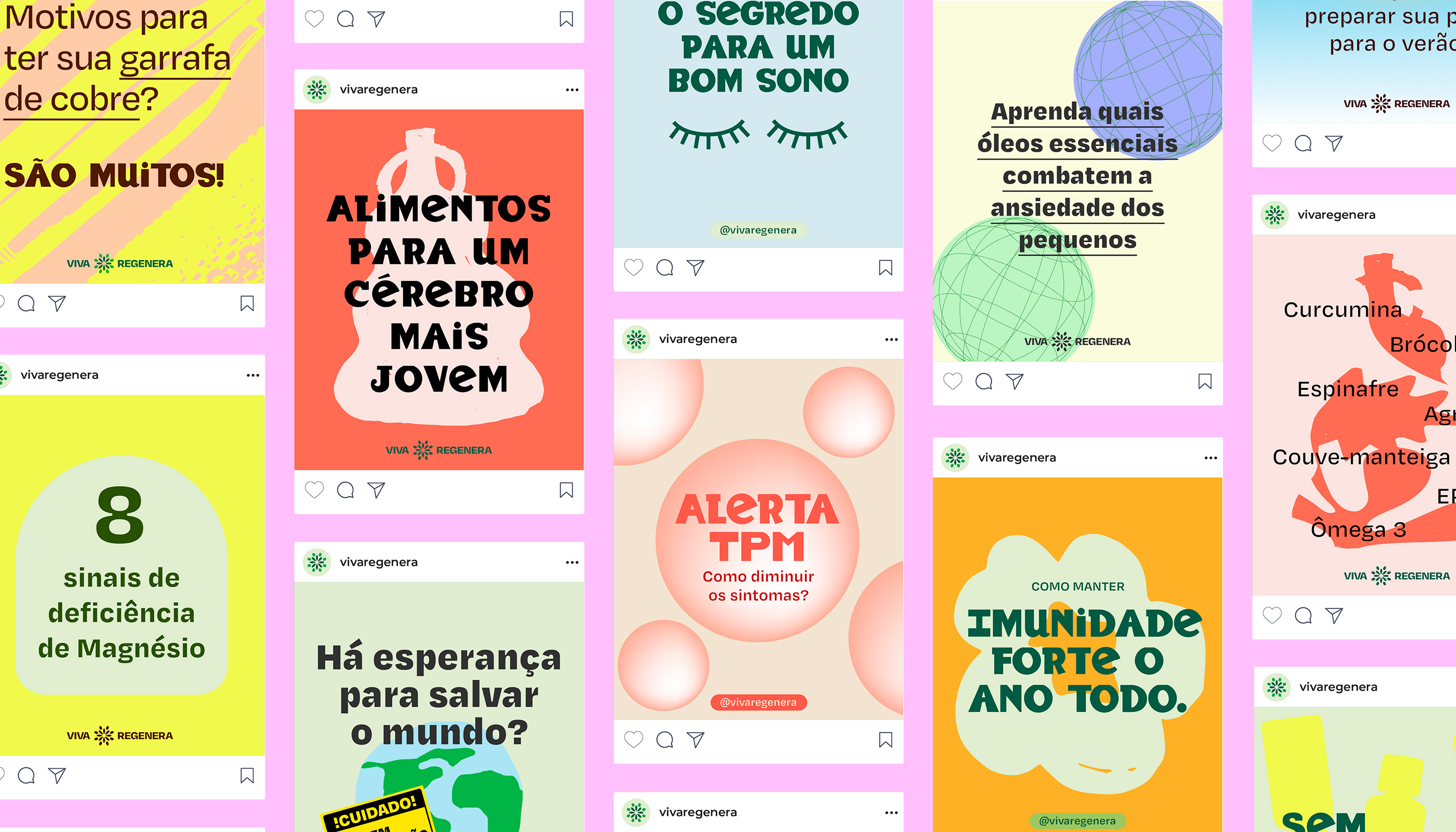
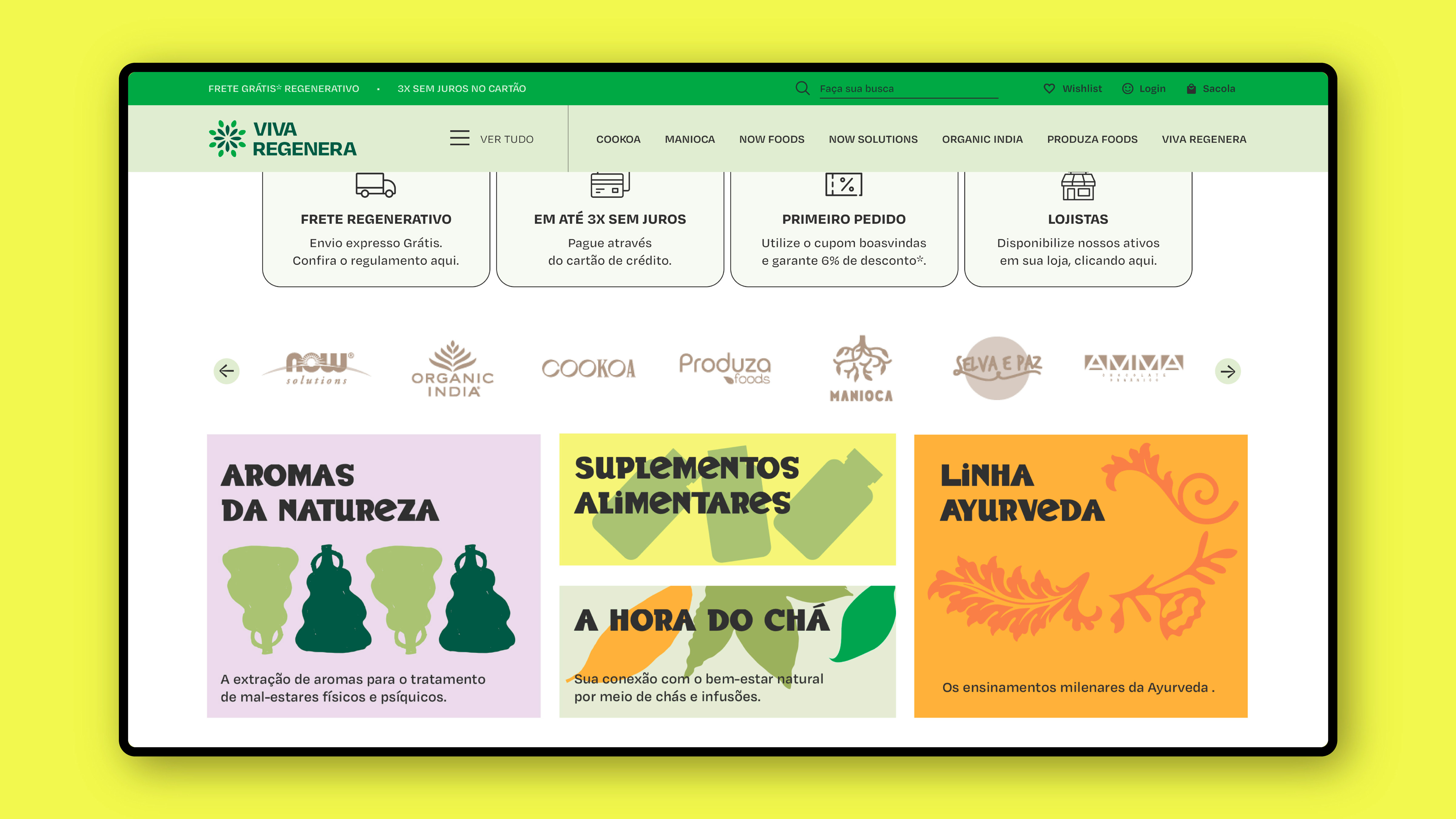
Move’s creative direction for texts and images expresses the collaborative character of the Viva Regenera brand, which works with farmers, nutritionists, and consumers to create natural supplements, whole foods, and extracts actives from the forest to nourish people and regenerate the soil.
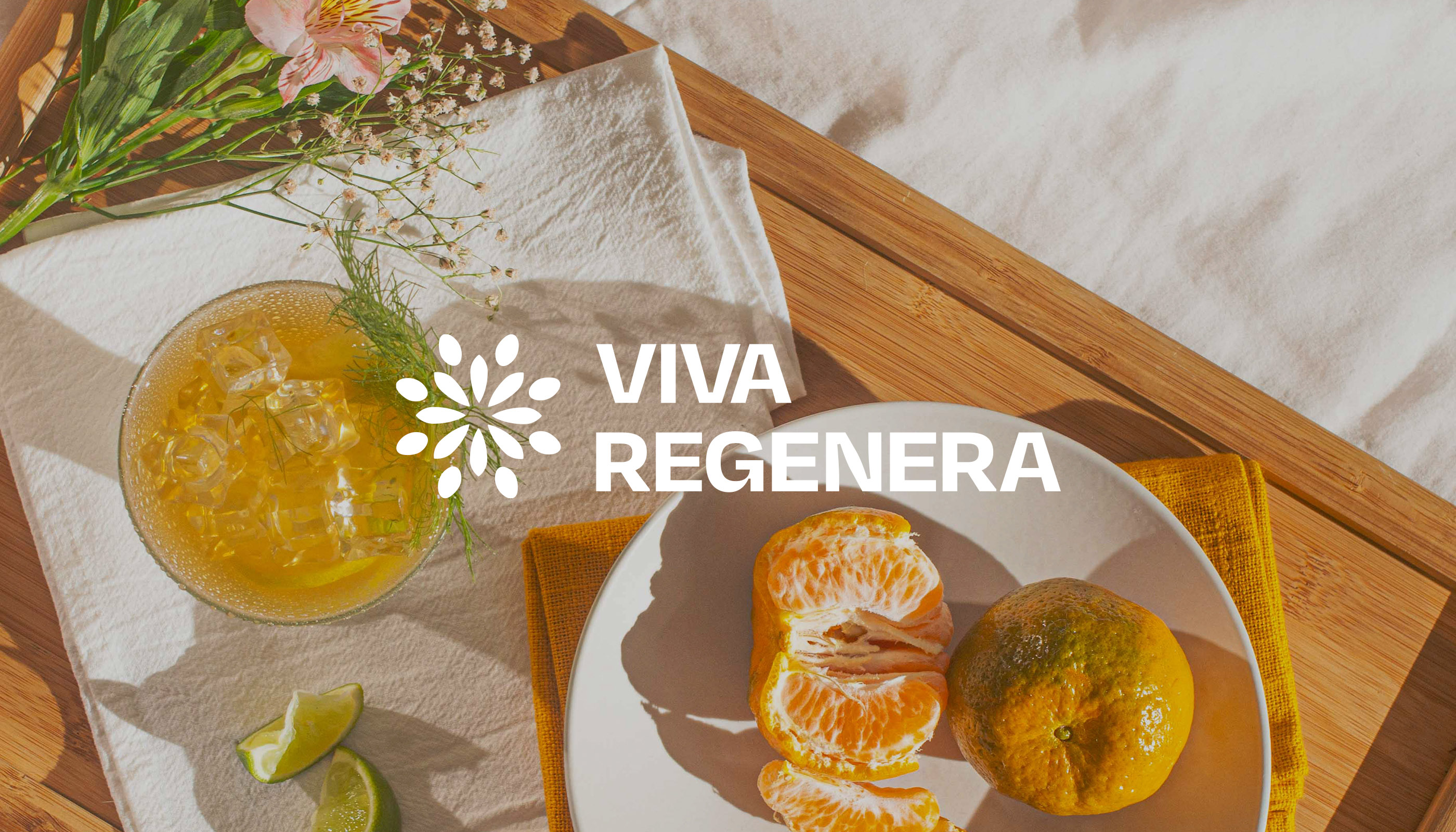
Viva Regenera’s visual identity is a lively and dynamic design system that mimics natural colors and shapes. As seen in nature, each brand expression promotes a unique visual experience, creating a counterpoint to the industry’s perceived standardization.
Bold hues and strong typography are signature elements used by the designer’s duo, currently working from an island in south Brazil. Inspired by their tropical surroundings, Caique Sanfelice and Claudio Mendes designed a wide range of graphics in a multiple-layer collage of digital and manually crafted elements, as wild and diverse as nature itself.
CREDIT
- Agency/Creative: Move
- Article Title: Strategy And Visual Identity for Viva Regenera
- Organisation/Entity: Agency
- Project Type: Identity
- Project Status: Published
- Agency/Creative Country: Brazil
- Agency/Creative City: Florianópolis
- Market Region: South America
- Project Deliverables: Brand Design, Brand Identity, Copywriting, Identity System
- Industry: Food/Beverage
- Keywords: identity, nature, agroforestry, rituals, sustainable, grocery store, e-commerce
-
Credits:
Creative Direction/Designer: Caique Sanfelice
Creative Direction: Cláudio Mendes


