


Lotmore is a furniture brand that aims to solve the problem of space utilization in small homes & apartments through highly engineered and functionally designed furniture solutions. Practical and form-changing, they are designed to solve real pain points, so that their customers can thrive in every moment and make space for life. We worked with them to coin the brand name, define a clear narrative that articulates its positioning, and create a distinctive identity and design system that truly embodies the idea of space-saving.
We crafted Lotmore’s brand purpose to address the long-term worries of shrinking urban spaces with future-ready, convenient, and highly functional offerings – so people can focus on what matters most, living life worry-free.
Through immersive workshops with the founding team, we uncovered a simple truth: as homes get smaller, people crave more space and flexibility at every stage of life. This insight shaped Lotmore, a name chosen from over a hundred contenders for its understated simplicity, effortless recall, and promise that goes beyond furniture. It reflects a functional, beautifully engineered offering that adapts to changing needs, giving customers not just smart solutions, but a world of possibilities within their own four walls.
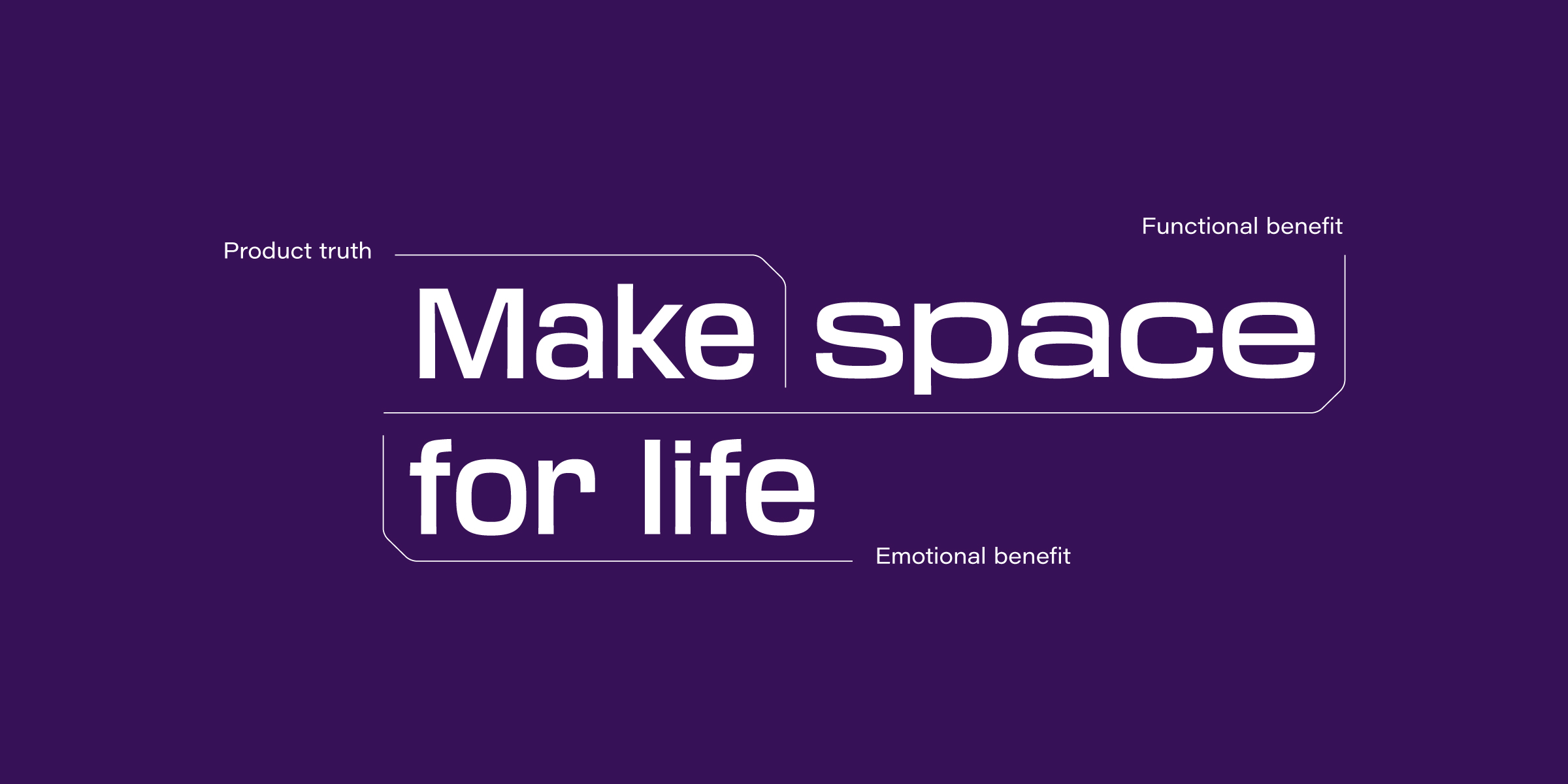
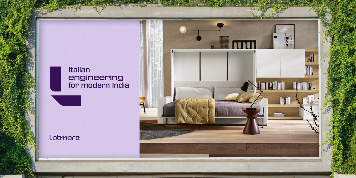
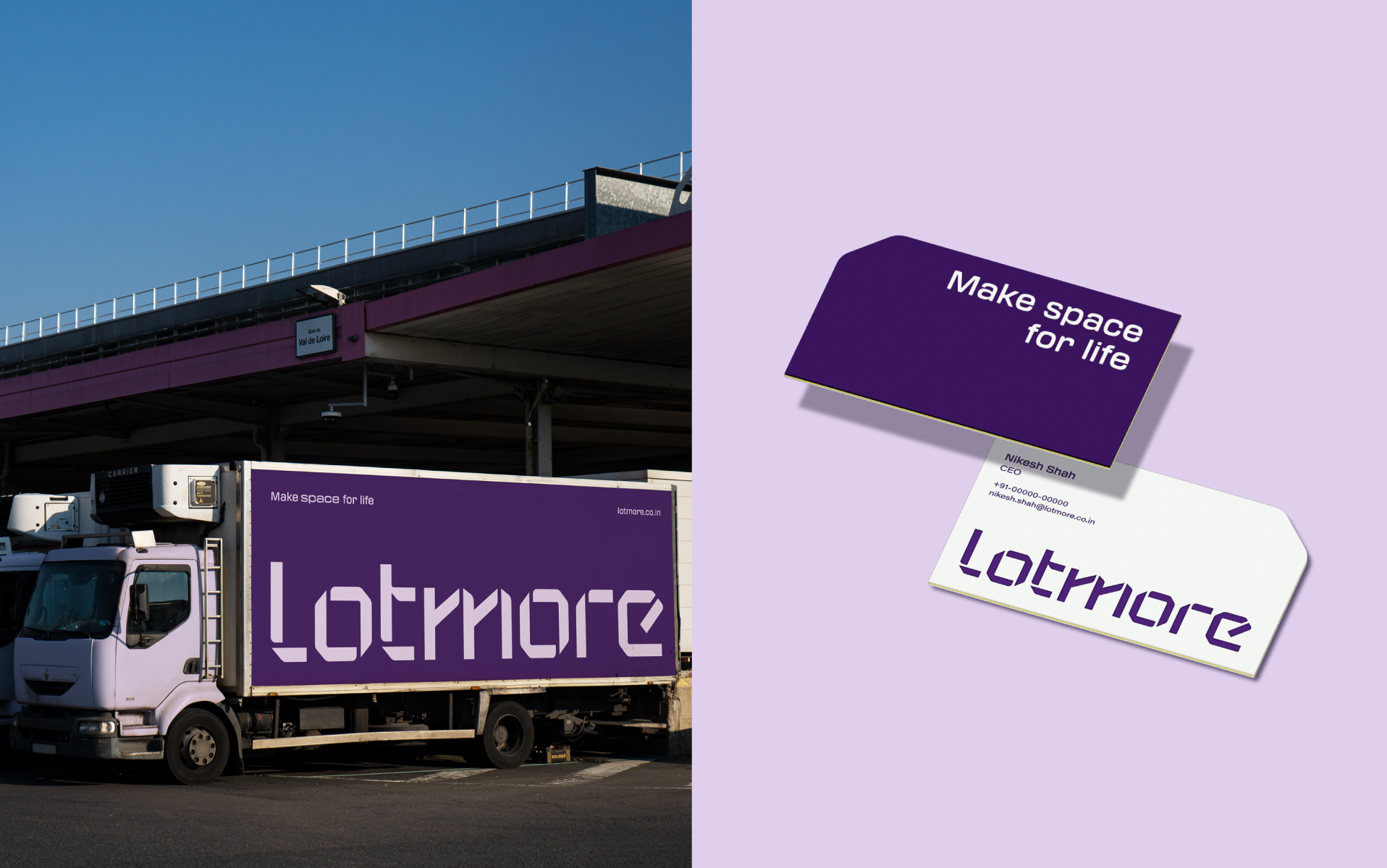
The brand promise “Make space for life” carries both a functional and an emotional message, while setting a clear direction for the brand. Every word was intentionally chosen to convey the core offering and the benefits at the heart of Lotmore.
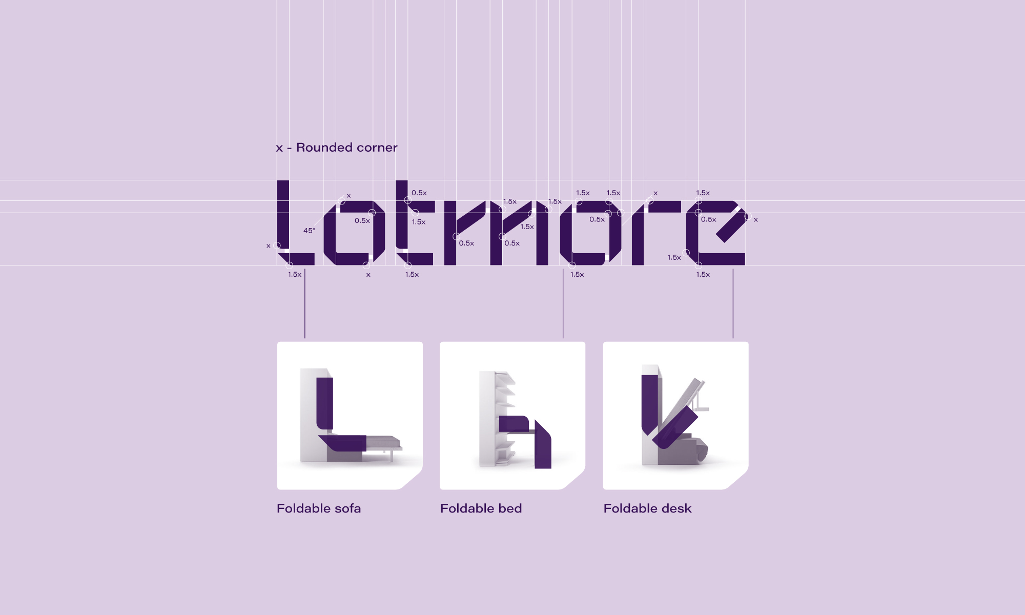
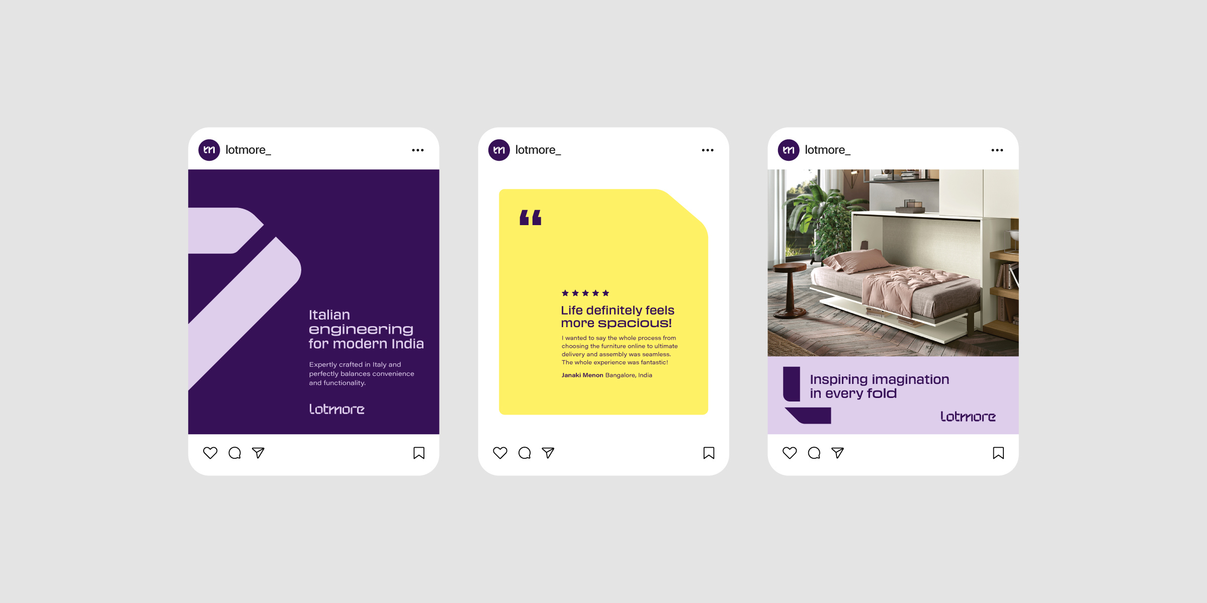
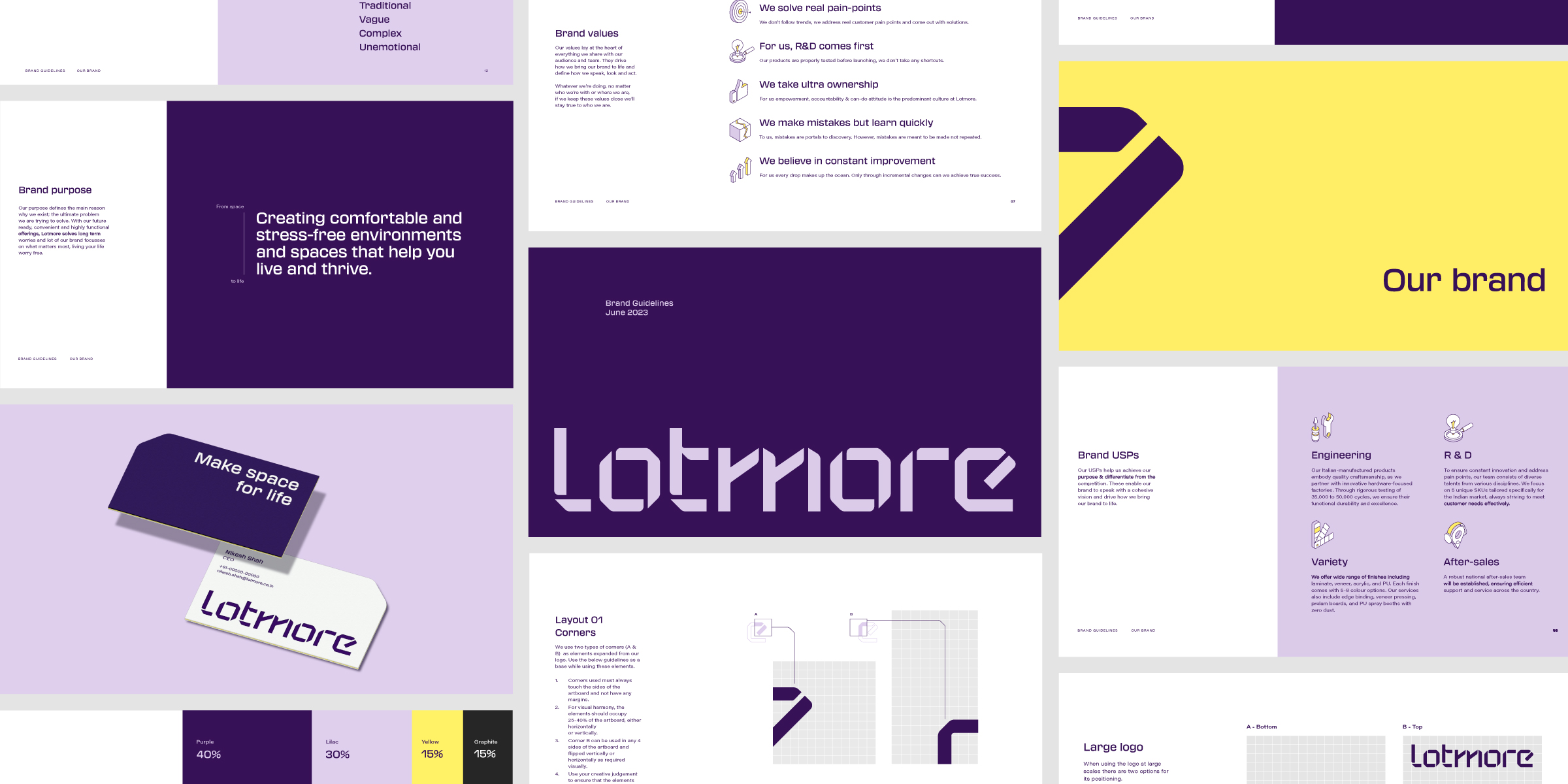
Lotmore’s logo draws inspiration from the transformable nature inherent in the products. The negative space in each letter mirrors the way the furniture folds, while the form has been meticulously optimized for clarity and impact, performing seamlessly across both large and small sizes.
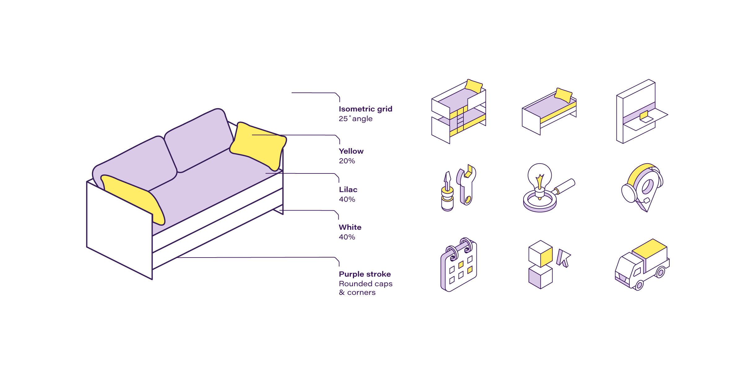
Lotmore’s confident, spirited personality gave us the foundation to craft a visual language that is playful yet distinctly ownable. The brand colours were chosen to reflect Lotmore’s commitment to innovative solutions and high-quality engineering, while also creating a visually striking and memorable identity.
Typography is a foundational pillar in the visual language. Transducer was selected as the headline typeface for its mechanical construction and extended style, bringing dynamism to communication. To balance its boldness, we paired it with Acumin Wide, establishing a clear visual hierarchy and distinction.
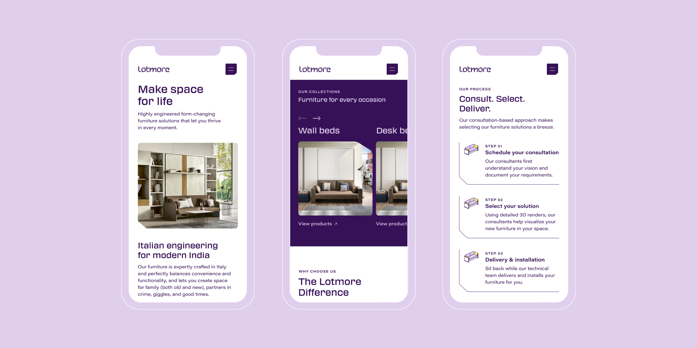
Illustrations were built on a 25° isometric grid to highlight the functionality of the offerings and add a sense of space and dimension. Folds and sharp corners became core brand elements, forming versatile design systems that could expand and adapt. These were thoughtfully integrated with negative space across applications to reinforce the brand’s central idea of creating space.
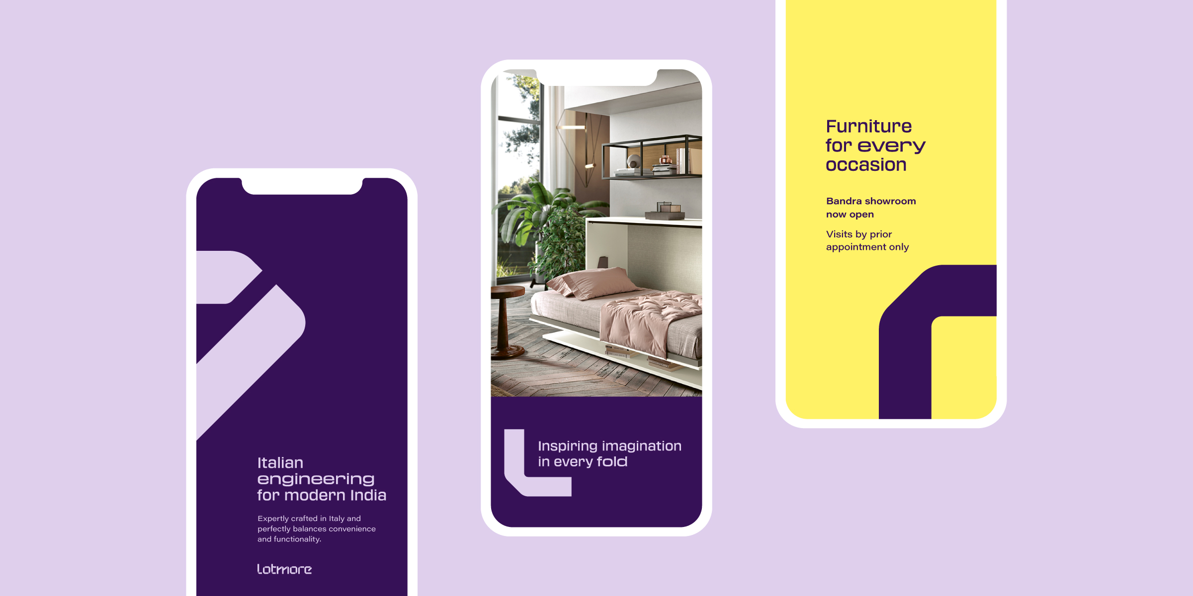
Our team saw months of strategy, positioning and designing come alive as we created the Lotmore Website. A dynamic isometric illustration system, coupled with simple yet brand specific iconography, micro interactions that were a delight to animate, and visual treatments and graphics that expanded the identity seamlessly, were a few such details that we believe allowed us to pour life into this website design.

CREDIT
- Agency/Creative: Small Town Folk
- Article Title: Strategy and Brand Identity for Lotmore by Small Town Folk
- Organisation/Entity: Agency
- Project Type: Identity
- Project Status: Published
- Agency/Creative Country: India
- Agency/Creative City: Bangalore
- Market Region: Asia
- Project Deliverables: Brand Creation, Brand Design, Brand Experience, Brand Guidelines, Brand Identity, Brand Naming, Brand Strategy, Brand Tone of Voice, Branding, Illustration, User Experience, Web Design
- Industry: Manufacturing
- Keywords: #furniturebranding #brandidentity #visualidentity #logodesign #brandstrategy #brandnaming #brandtoneofvoice #iconillustration #webdesign #
-
Credits:
Brand Design & Strategy: Small Town Folk


