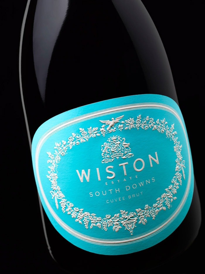
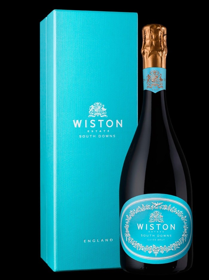
This is just mesmerising work by Stranger and Stranger. Where do you start? From the colour to the choice of illustration style and the subtle usage of that deep warm gold foil top. There might not be any real iconic brands in the English Sparkling wine market, but they might have just changed that. A big WPDS favourite from 2012.
“We were surprised that everyone was apologetically trying to copy French or new world sparkling brands – despite England winning best in the world awards – and that no brand had really taken the high ground and was proud of it’s provenance.”
The decoration on the label is all taken from the stucco work in the country house and the evolved crest reflects the marriage between the English and South African families.


CREDIT
- Agency/Creative: Stranger and Stranger, London and New York
- Article Title: Stranger and Stranger – Wiston Sparkling Wine
- Project Type: Packaging
- Substrate: Glass, Pulp Paper
FEEDBACK
Relevance: Solution/idea in relation to brand, product or service
Implementation: Attention, detailing and finishing of final solution
Presentation: Text, visualisation and quality of the presentation


