Blue Thunder: How Stormbrands revitalised PepsiCo’s No.1 energy brand with an electrifying new variant
Summary
PepsiCo continues to innovate to hold its place as leader in the thriving energy drinks sector. When the global drinks firm sought to launch an electrifying new variant of its no.1 energy brand, Sting, it enlisted the skills of Stormbrands to lead the visualisation’s creative direction and ignite excitement across different national markets.
The work has driven awareness and trial of a new variant – Sting blue – among Gen Z consumers in Pakistan and supported its rollout in other territories.
Building on foundational work for the Sting brand family, Stormbrands defined a distinct role and proposition for Sting blue based on flavour, occasion and sensation. ‘Sting Blue Thunder’ brings flavour, energy and refreshment cues together in an exhilarating depiction of energy using distinct assets that flex for different territories; extending the brand’s relevance with Gen Z across markets.”
The agency expertly blended different media and creative visualisation techniques, collaborating with production partners at Bolder Creative to deliver a sensational TV commercial, supported by a suite of social assets and key visuals.
Background
The global energy drinks market is booming, valued at $90.5bn in 2022, it’s projected to reach around $173.8bn by 2030 according to Zion Market Research.
Sting is one of PepsiCo’s fastest growing beverage brands, sitting in a unique position between carbonated soft drink and energy drink. Pakistan is a key market for Sting, where its core variant, Sting Red, is the market leader.
Energy drinks are a both replacement for alcohol in Pakistan in terms of pleasure and sociability, and play a functional role in daily life, aiding work and study. The key target market for Sting is Gen Z males who consume the drink on the go throughout the day.
Localised marketing is very important to the Sting brand, helping it feel accessible and aspirational for consumers, underpinned by distinct global vision to help it stand above numerous ‘me-too’ brands.
Brief
As the number one energy drink in Pakistan, the brand needed to maintain its position and continue to drive incremental growth of Sting via new consumers and consumption moments. Introducing Sting blue, a new flavour proposition, which needed a distinct and complimentary story of its own, beyond just a flavour change, in order to gain traction without cannibalising Sting red.
PepsiCo required a range of dynamic launch assets, primarily including a hero TV commercial and digital content for all social media channels. After launching in Pakistan, Sting blue needed to roll out with impact across other key markets in Asia and the Middle East.
It needed to create excitement within the affordable energy segment for Gen Z consumers and expand PepsiCo’s portfolio beyond the core product and into new demand spaces, to position itself as a ‘range brand’ to support future growth.
Creative Approach and Concept
The agency anchored its work for Sting blue not just on flavour, but on occasion and sensation, to avoid cannibalisation of red. They strategically positioned Sting blue a ‘top-up’ to Sting red; ensuring that consumers will continue to buy Sting red, and when they need a lift to keep them powered, they then buy blue. This strategic approach and proposition informed the creative concept:
Sting Blue Thunder – Charge the Day.
When I want to feel on top of my game, I need a sweet, refreshing lift that elevates me from the ordinary and makes me feel like I am operating at full charge. Introducing Sting Blue Thunder. Electric Blue flavour and sweet refreshment with the energy to keep me powered.
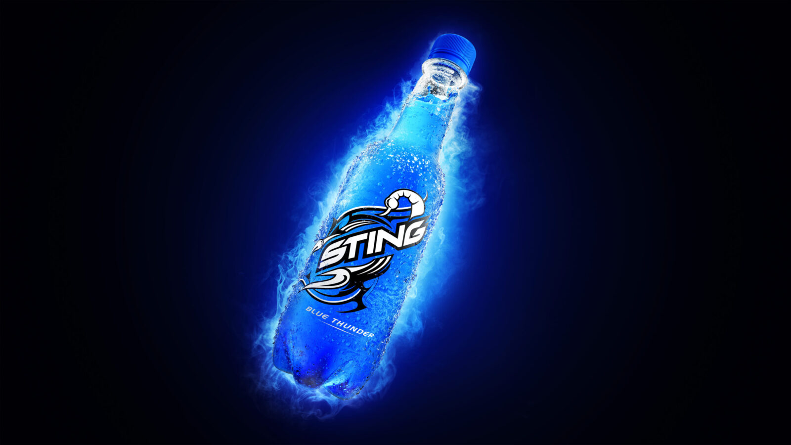
The creative concept reflects the core brand purpose ‘igniting you to electrify the moment’ by leveraging the brands’ distinct assets: electrifying lighting, ownable product angle and treatment, iconic logo and typography, and vibrant liquid colour. These express the brand’s energy, taste and refreshment credentials which Sting Blue Thunder levels up through ‘fully charged’ motion behaviours to bring the concept to life.
Design Process
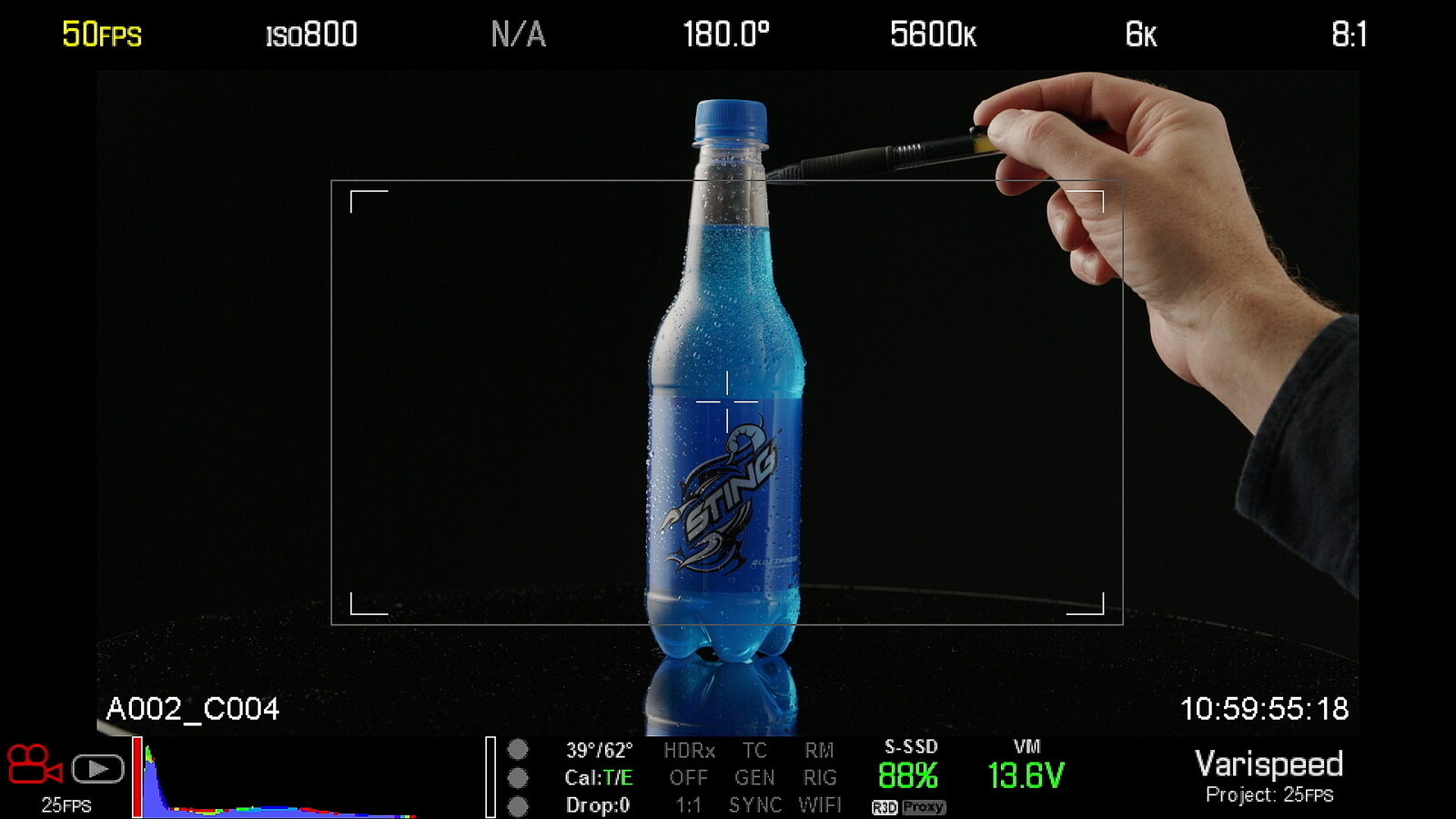
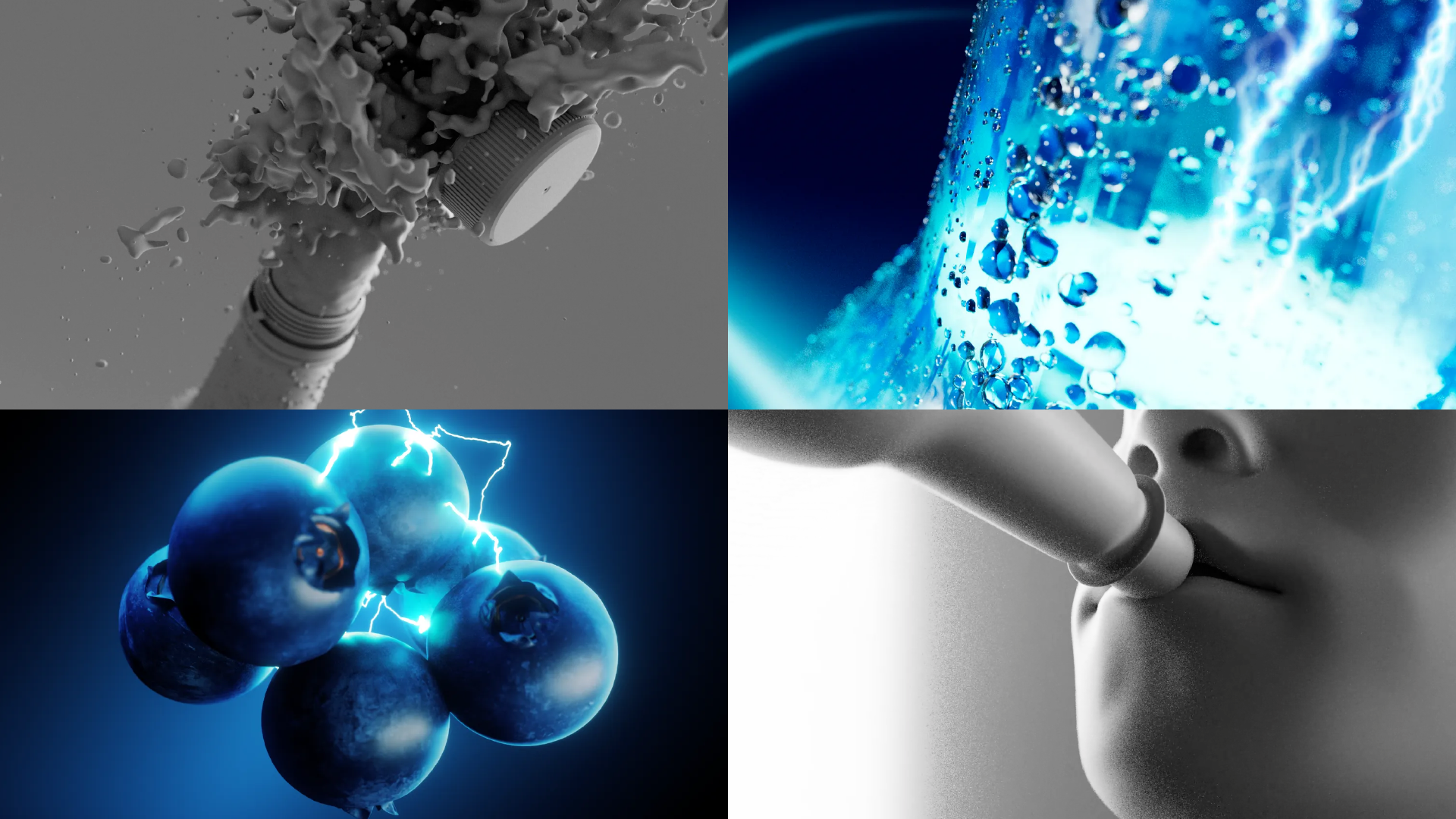
Leading the project’s creative direction, Stormbrands blended different media and creative visualisation techniques for maximum sensory effect. Careful planning and pre-production enabled a blended production process between live action, CGI and motion graphic animation, sound design and SFX. The agency collaborated with production partners Bolder Creative and sound designers Sound Canvas to deliver the concept through a TV commercial for the launch of Sting blue in Pakistan, supported by a suite of social assets and key visuals. In post-production assets were expertly edited, colour graded and mastered, with electrifying results.
Assets
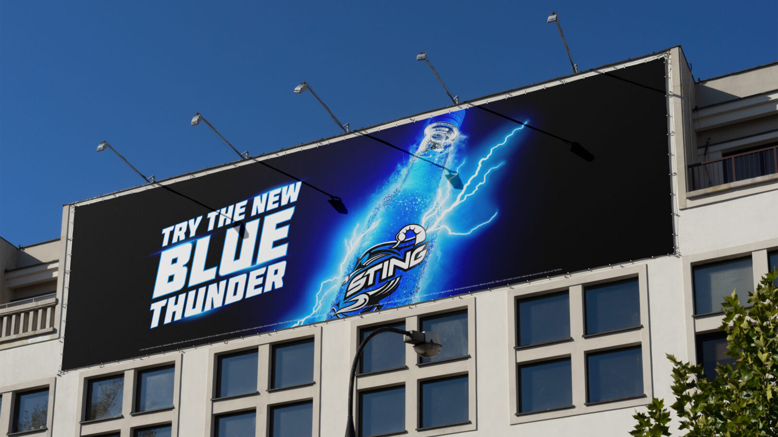
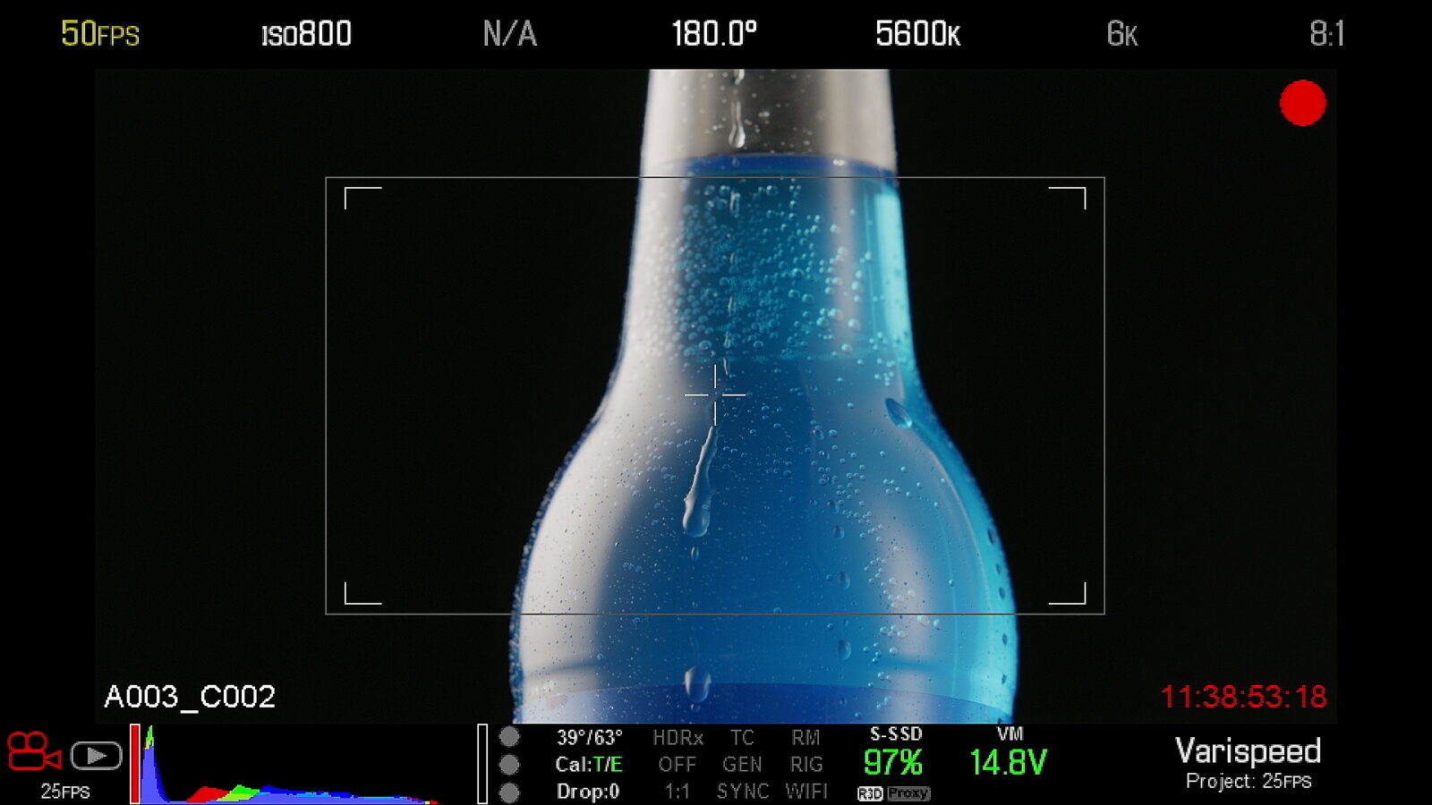
The dynamic product renders were given an icy spritz and extra condensation to further push the appetising refreshment cues. The environment was given a richer sense of depth, and dramatic thunderous atmosphere to elevate the new flavour and allow it to shine, centre stage. The lighting charge was transformed to electrify the liquid from the base up, charging the sweet blue liquid inside, until it was fully charged and pulsing with energy ready to power up whoever drank it. Headlines were given a dynamic flared effect to provide maximum impact across communications.
The agency also brought in live action, to substantiate the reason to believe, utilising the brand’s iconic consumption sound effects.
All of these different elements were designed to adapt and scale locally to meet different market’s needs, such as communicating different levels of energy, or depicting local pack formats.
Deliverables
Proposition development (Stormbrands) A bank of product-centric launch assets:
– Product launch key visuals for digital & print applications including POSM & OOH (Stormbrands)
– 15-second TV commercial (Stormbrands + Bolder Creative)
– Social media content for Instagram, TikTok and Snapchat to support the TV commercial (Stormbrands + Bolder Creative)
– Style guide including brand assets and guidelines, motion behaviours, and activation ideas (Stormbrands)
Results
“Stormbrands has been a great partner, providing strategic thinking, solid execution, and seamless coordination with our key markets to deliver impactful creative assets for Sting.”
Rajat Sachdeva, Global Senior Marketing Manager, Energy, PepsiCo International Beverages.
Sting blue is now set up for success as part of the PepsiCo’s brand’s portfolio. After its electrifying launch in Pakistan, the Sting Blue Thunder assets were tailored for launches in the important markets including India, with additional markets on the future roadmap. Consumer testing for the TV commercial showed strong and sustained viewership, 100% unaided brand recall, and high emotional engagement.
Sting (the brand) and Sting red had operated as one intrinsically linked brand proposition. Following Stormbrands work on the new variant, Sting blue, the overarching brand is evolved to cover the expanding range. The different products can now be separated out with different characteristics and benefits, underpinned by a defined story for Sting blue, all laddering up to the global visual identity and toolkit.
Stormbrands’ work drives Sting forward as a global PepsiCo brand that stands apart from growing ‘me too’ copycats, whilst remaining relevant to local markets, by supporting innovative NPD with a defining story and global-quality creative. It uses Sting Blue Thunder to set the standard and codify creative principles for Sting’s unique position in the energy category.
The work builds relevance with Gen Z through passion points – from environments and settings to cues and codes – and tailored communications to meet their needs.
CREDIT
- Agency/Creative: Stormbrands
- Article Title: Stormbrands Ignites Sting Blue Thunder with a Powerful Brand Redesign for PepsiCo
- Organisation/Entity: Agency
- Project Status: Published
- Agency/Creative Country: United Kingdom
- Agency/Creative City: London/Leeds
- Keywords: WBDS Agency Design Awards 2024/25
- Keywords: WBDS Agency Design Awards 2024/25
-
Credits:
Business Director - Stormbrands: Ellie Harris
Account Director - Stormbrands: Catherine Longbottom
Strategy Director - Stormbrands: Katie Collins
Senior Creative Director - Stormbrands: Richard De Hoxar
Creative Director - Stormbrands: Zoe Phillipson
Senior Designer - Stormbrands: Stephanie Buck
Creative Services Manager - Stormbrands: Andy Marran
Creative Director/Director - Bolder Creative: David Farquharson
Producer - Bolder Creative: Sophia Lengui


