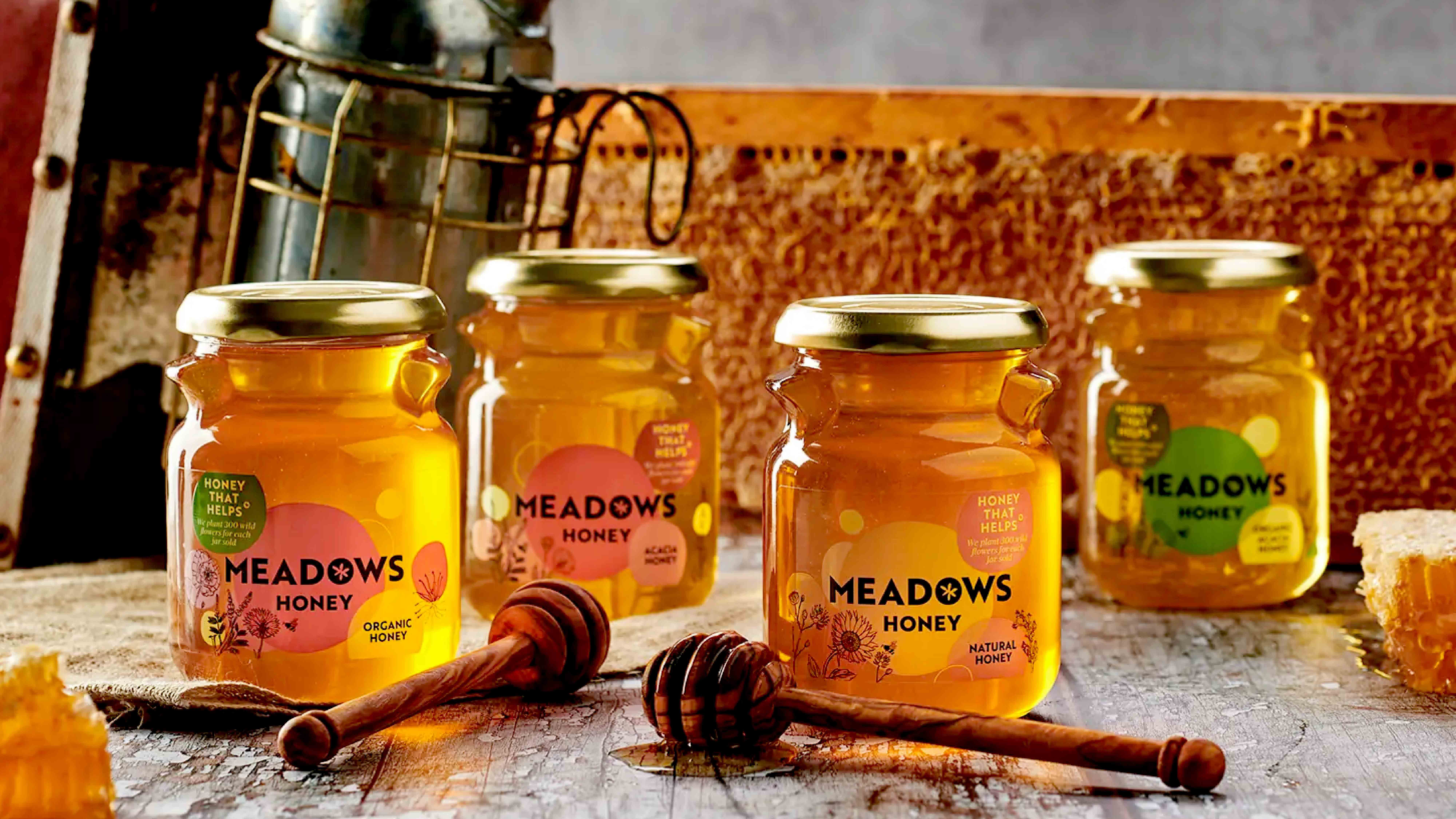
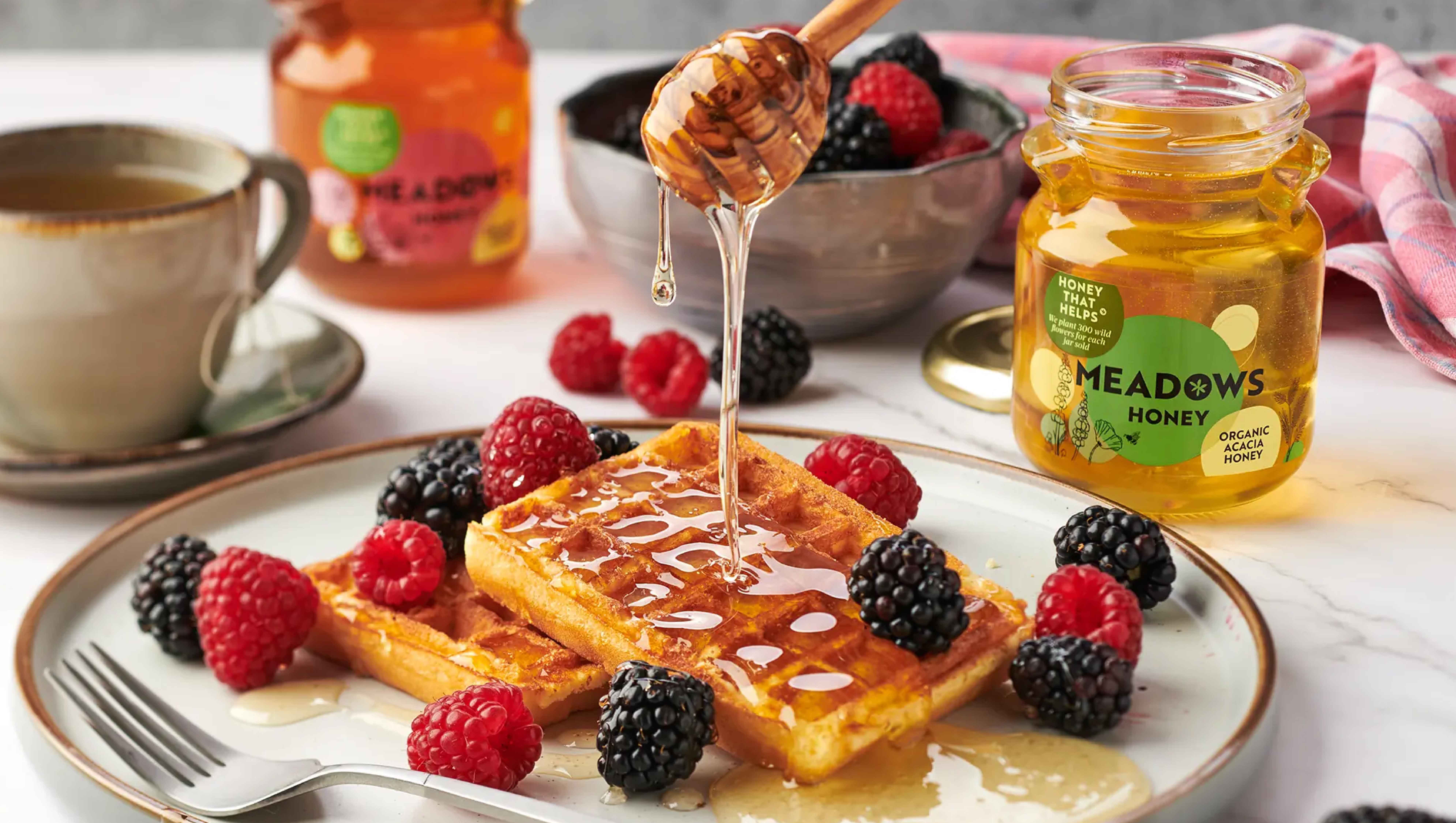
Brand and design consultancy, StormBrands has crafted the name, visual identity and packaging range design for ‘Honey that Helps’ start up, Meadows Honey.
Meadow Honey’s ambition is to create a honey collection that gives back to the bees themselves, focusing on the health of their environment and colonies, as well as ensuring that the bees that create the honey enjoy a high standard of wellbeing.
Passionate about bees, meadows and creating high quality honey that showcases nature’s beautiful flowers, the Meadows Honey business was born from a desire to protect the environment and landscape where bees thrive. Native wildflowers and our local bee species have been developing and coexisting together for thousands of years. Our wildflower meadows are therefore perfectly suited for bees and are important for our pollinators and our ecosystem at large, both for sustenance, as well as to provide a place to shelter and breed. In return, insects help these beautiful floras to flourish in other areas by pollinating the wildflowers so they can grow and distribute seeds.
StormBrands was briefed to create a name, brand identity and packaging range design that fully articulated the brand’s story. The agency was also tasked with defining the brand’s purpose to drive consumer awareness and engagement beyond a competitive price point.
The team worked closely with the Meadow’s Honey founders to truly understand their vision and bring it life through the new brand. StormBrands approaches each new piece of work through the lens of its own purpose: “Energising brands to move mindsets, markets and culture.” In the case of Meadows Honey, “Honey that Helps” informed both the brand’s design aesthetic as well as its brand partnerships.
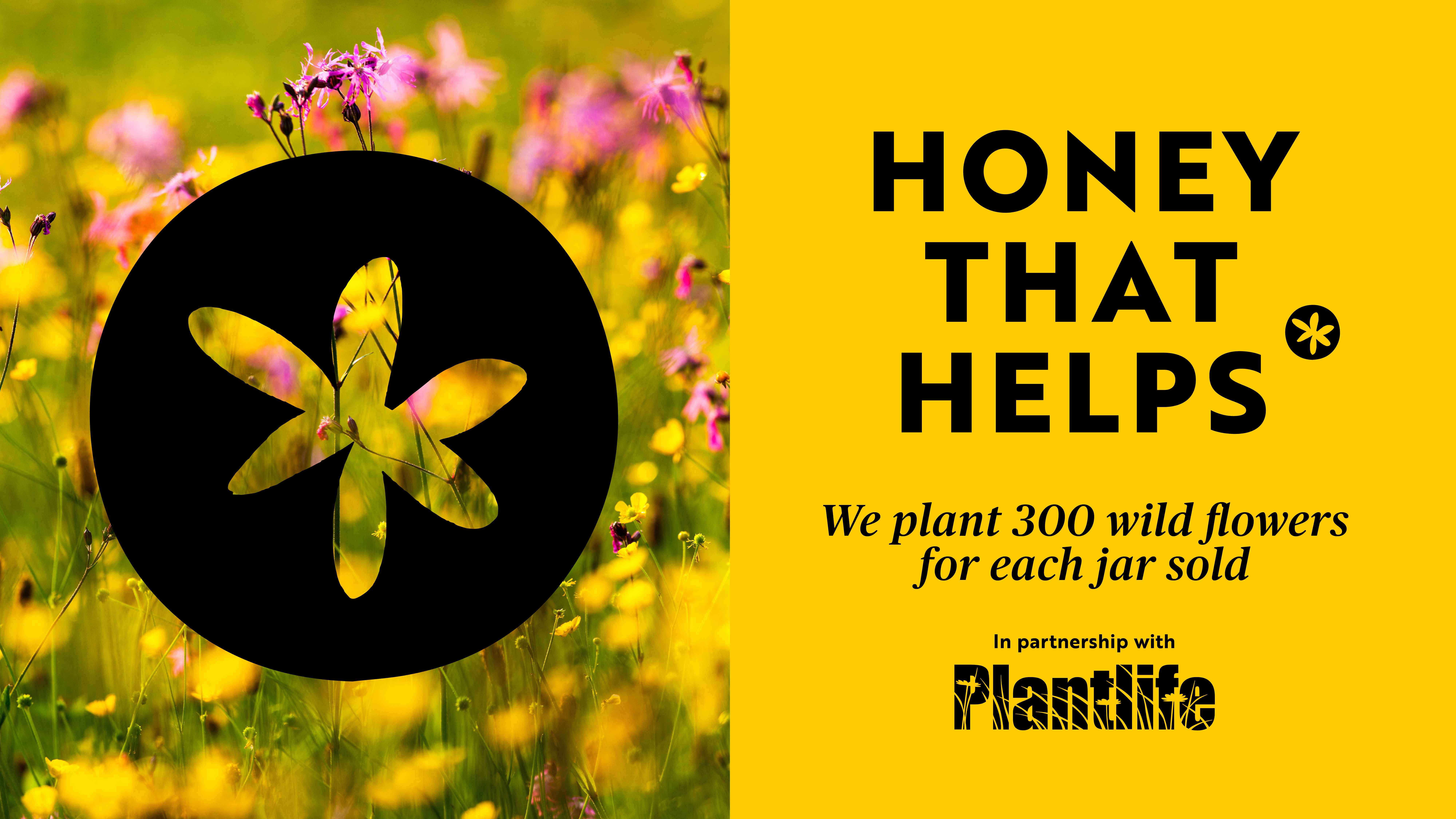
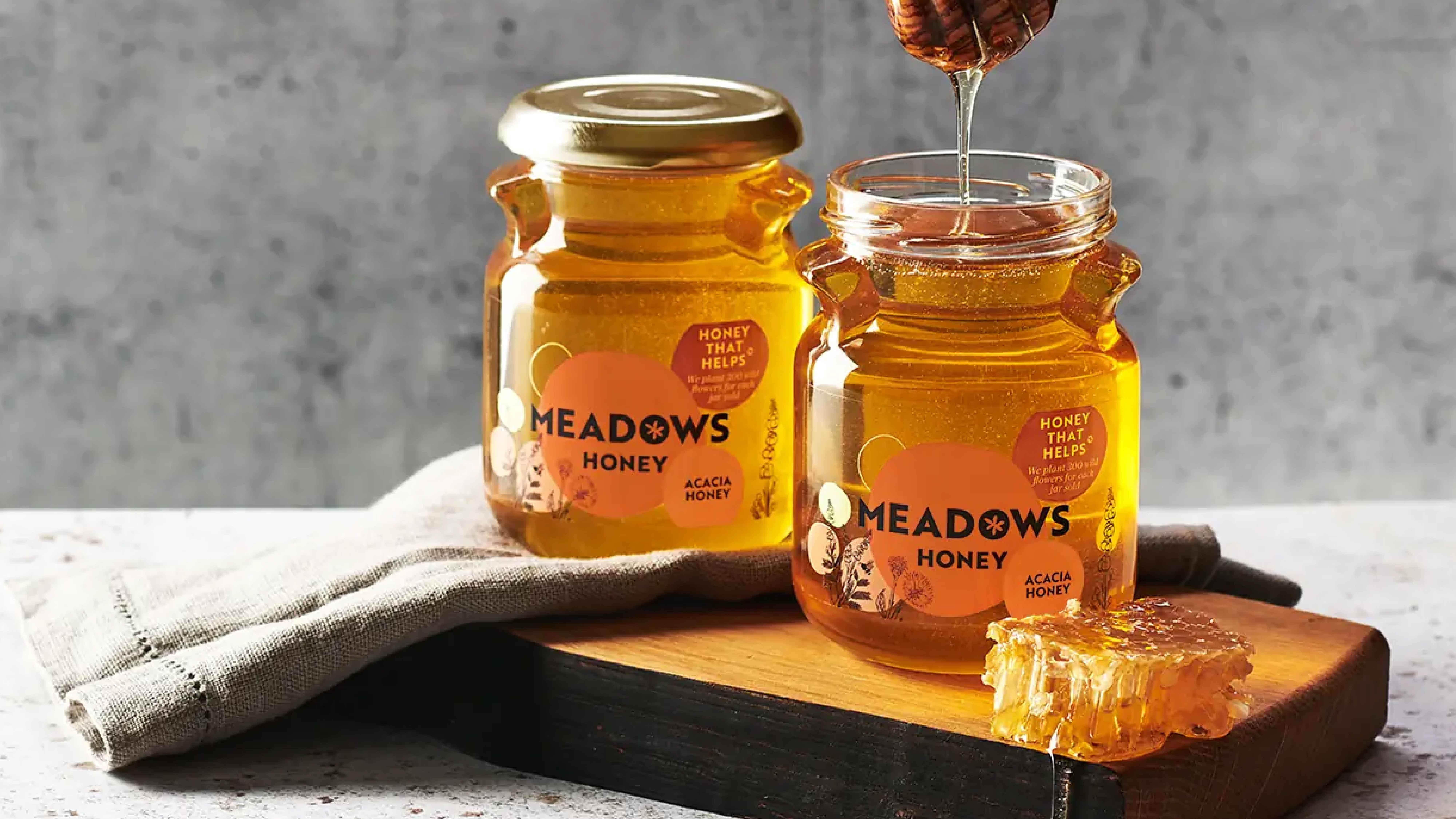
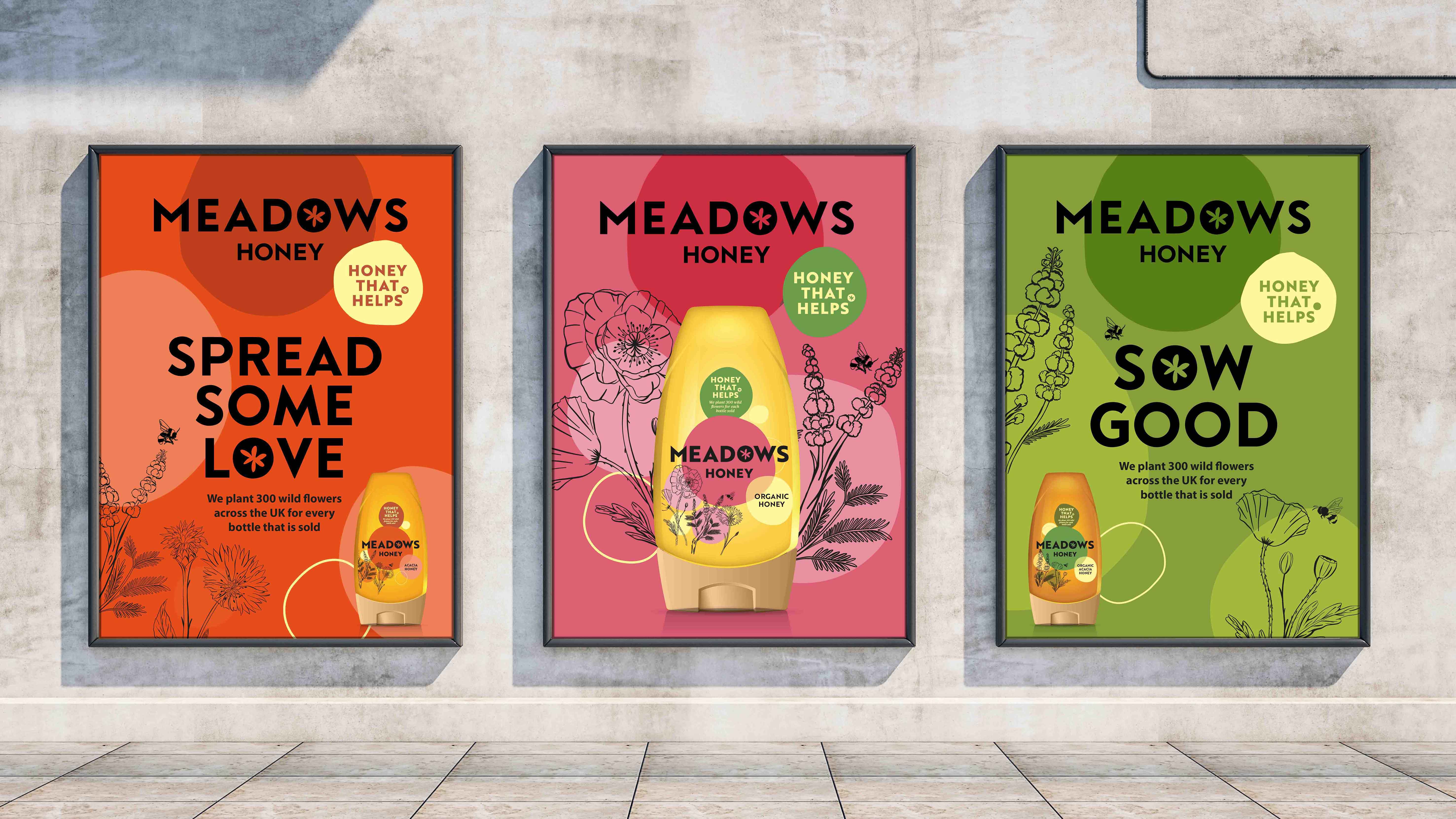
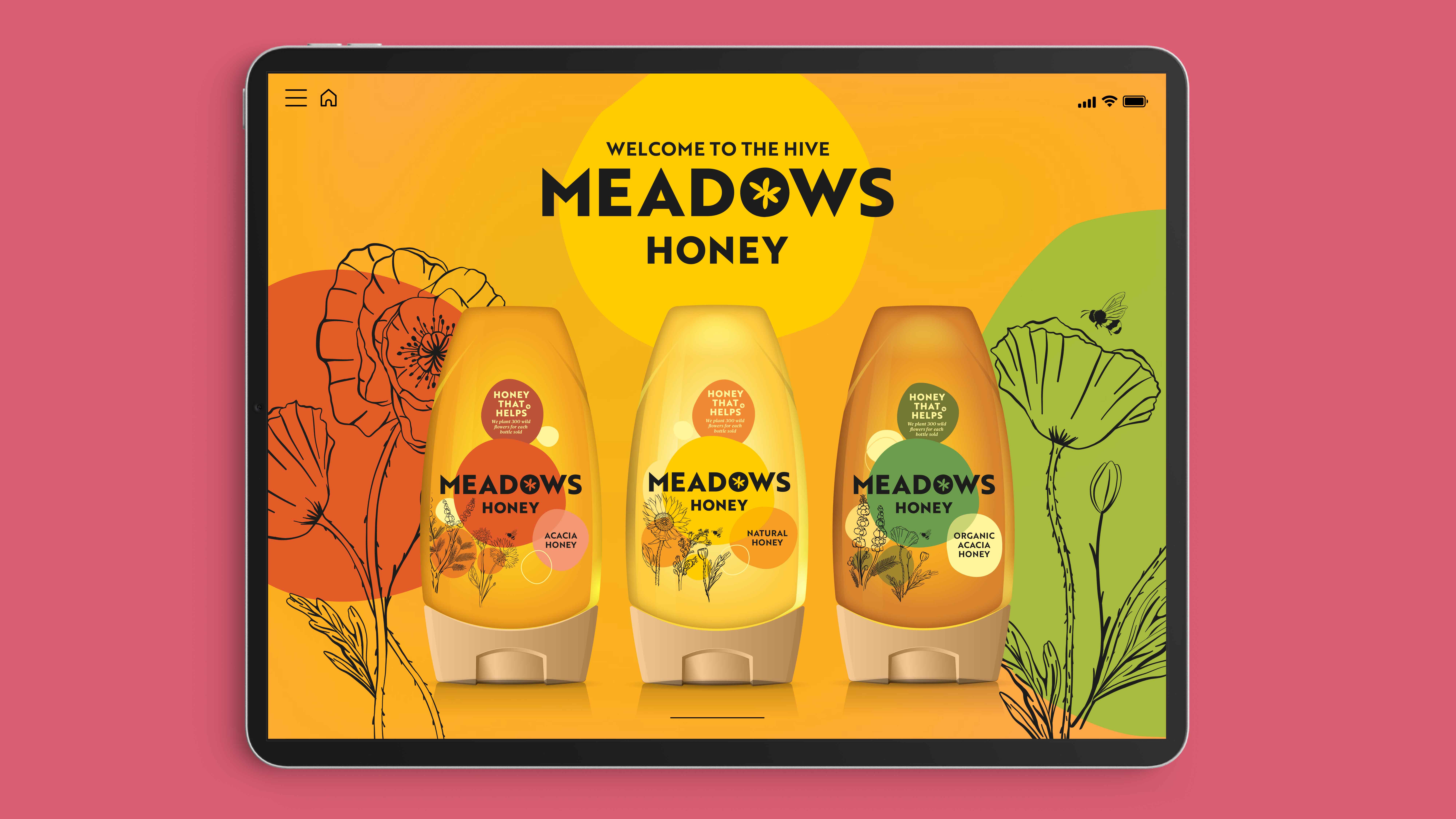
Wildflower meadows have inspired the new brand name and visual identity which has been applied across the range’s four variants: natural honey, acacia honey and organic certified natural and acacia honey. To celebrate and support the meadows’ coexistence with the bees, Meadows Honey has partnered with Plantlife, a wild plant conservation charity, and for every jar or bottle of Meadows Honey sold, Plantlife will plant 300 wildflowers.
Zoe Phillipson, Creative Director at StormBrands commented:
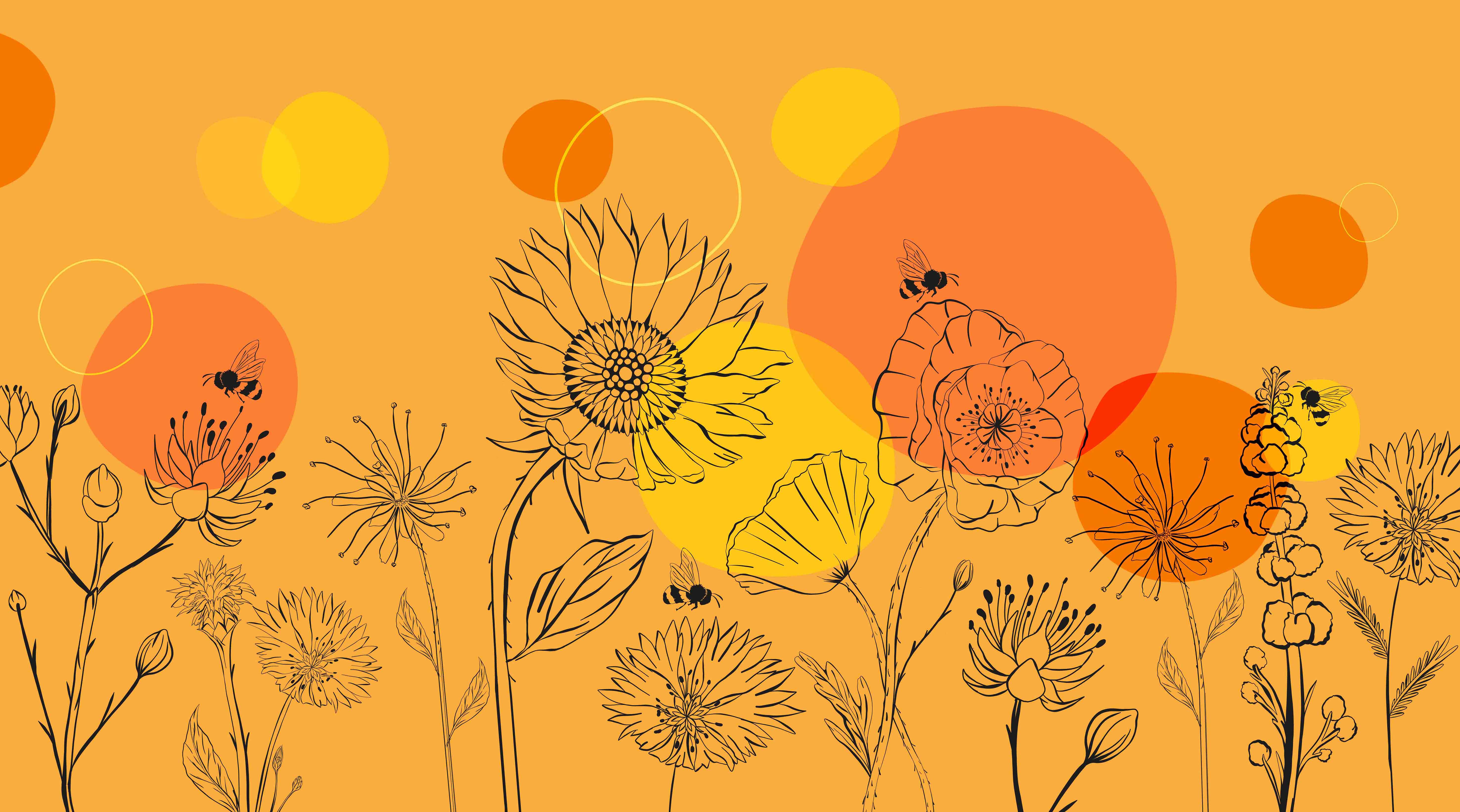
“Our new, fresh, and contemporary visual identity for Meadows Honey communicates the brand’s story through whimsical native wildflower illustrations imbued with summer’s warm rays. The bold, modern wordmark adds character and clarity to the identity, creating a sense of design harmony, while each variant retains its own unique colour coding and accompanying organic form, signifying both the honey type and the distinct flowers used to make it.”
Rachel Wheeler, Operations Manager at Meadows Honey added:
“We all know how important bees are – not only do they produce delicious honey, but they are also one of the most crucial pollinators of many crops that we rely on for our food. Right at the start, we decided that it was hugely important for us to create a premium, high-quality product. However, it’s also a goal of ours to make sure that our product is accessible to all, without a premium price tag. As our strategic design partner, Storm really understood our vision and have completely succeeded in bringing it to life authentically, which has now (very excitingly) resulted in a listing in Sainsbury’s.”

CREDIT
- Agency/Creative: StormBrands
- Article Title: StormBrands Creates New Visual Identity for Meadows Honey
- Organisation/Entity: Agency
- Project Type: Packaging
- Project Status: Published
- Agency/Creative Country: United Kingdom
- Agency/Creative City: London
- Market Region: Europe
- Project Deliverables: Brand Identity, Brand Naming, Graphic Design, Illustration, Packaging Design
- Format: Bottle, Jar
- Substrate: Glass Jar, Plastic
- Industry: Food/Beverage
- Keywords: StormBrands, Meadows Honey, Food and Beverage, retail, organic, brand naming, brand identity, packaging range design
-
Credits:
Development Director: Velda Croot


