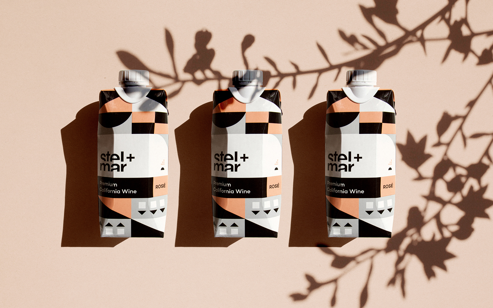
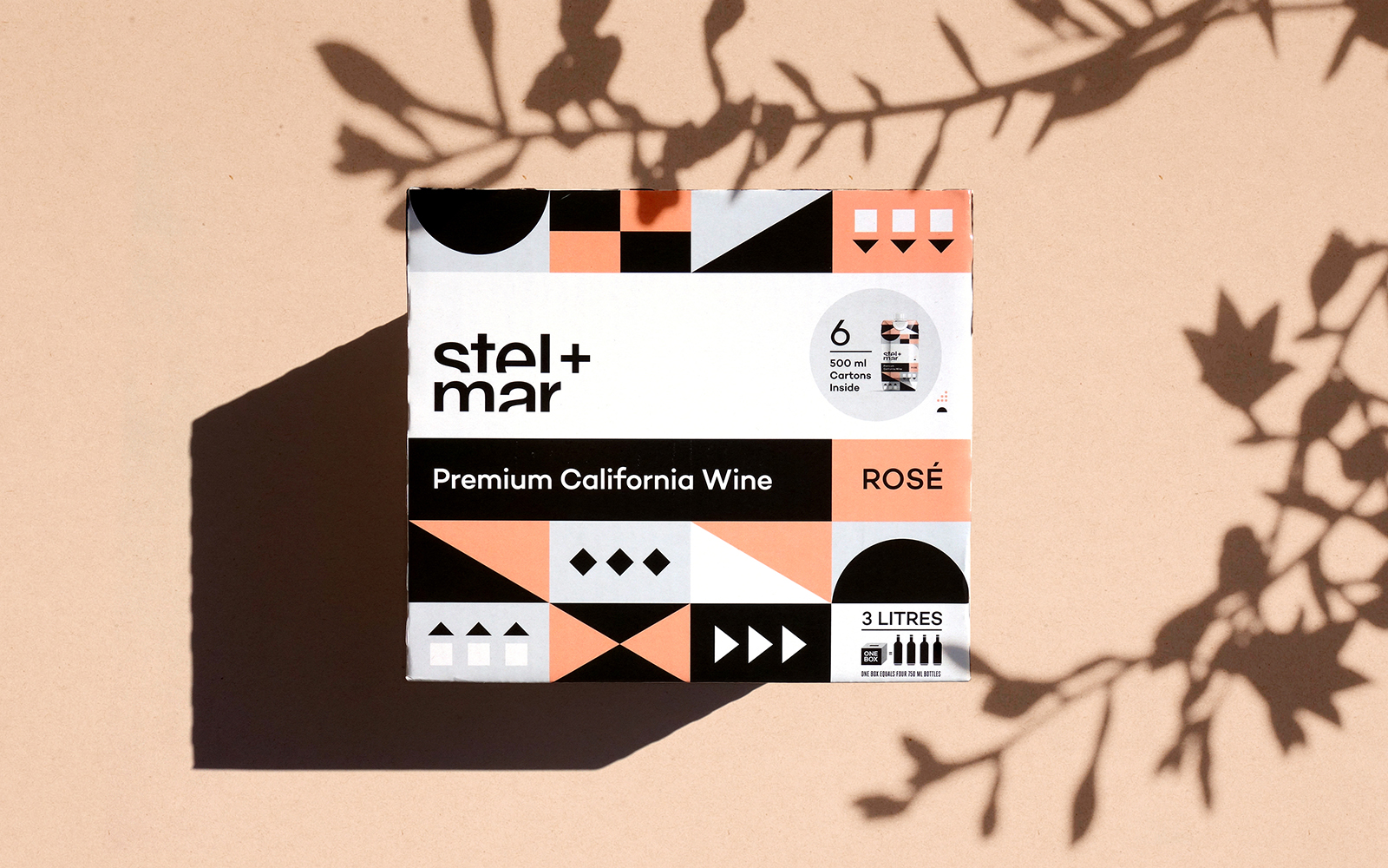
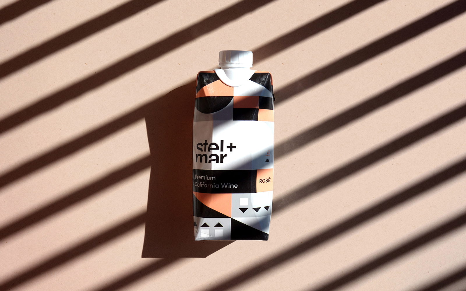
As part of stel+mar’s premium canned wine product line-up, they also recently released their California Rose in a tetra pack unit. The challenge was adapting the geometric pattern and branding that works so well on a can to wrap around a multi-dimensional box. The result turned out be an excellent adaptation that not only lives well on a can but can also translate well onto other packaging shapes. This product was intended to offer portability along with the option of closing the boxed wine once a glass has been poured. This project has been part of an on-going branding and design exploration that requires the brand to adapt beyond stel+mar’s original can line-up to potentially other products.


CREDIT
- Agency/Creative: ZOCA
- Article Title: stel+mar California Rose Tetra Designed by Zoca
- Organisation/Entity: Agency, Published Commercial Design
- Project Type: Packaging
- Agency/Creative Country: Canada
- Market Region: North America
- Project Deliverables: Brand Architecture, Brand Strategy, Graphic Design, Identity System, Packaging Design
- Format: Box
- Substrate: Plastic, Pulp Carton
FEEDBACK
Relevance: Solution/idea in relation to brand, product or service
Implementation: Attention, detailing and finishing of final solution
Presentation: Text, visualisation and quality of the presentation


