


Engineering isn’t just about putting steel beams together or calculating load factors. It’s about shaping skylines, creating foundations for growth, and building legacies that outlive generations. BAC India Pvt. Ltd., a trusted name in engineering, fabrication, and erection, has been doing just that for decades. With a specialization in structural steelwork, they’ve contributed to some of India’s most critical infrastructure developments—quietly, reliably, and consistently.
But times change. As the industry embraces new technologies, higher standards, and faster timelines, the brands that shape it must evolve too. BAC recognized that their visual identity—though built on a strong reputation—no longer matched the scale of their ambitions. They needed more than just a new logo. They needed a visual transformation that reflected the strength of their work and the vision they carry forward.
The Challenge
BAC was not a startup looking to disrupt—they were a established brand looking to grow responsibly and be recognized as a strategic industry leader. Their ask was simple but ambitious: craft a modern, cohesive brand identity that matches the scale, expertise, and quality they bring to their work. It had to be professional, timeless, and above all, built to endure—just like their structures.
Our Role at Sunday Design
Sunday Design was brought in to help rethink BAC’s identity from the ground up. We started by immersing ourselves in their world—understanding their projects, their internal culture, their clients, and their long-term goals.
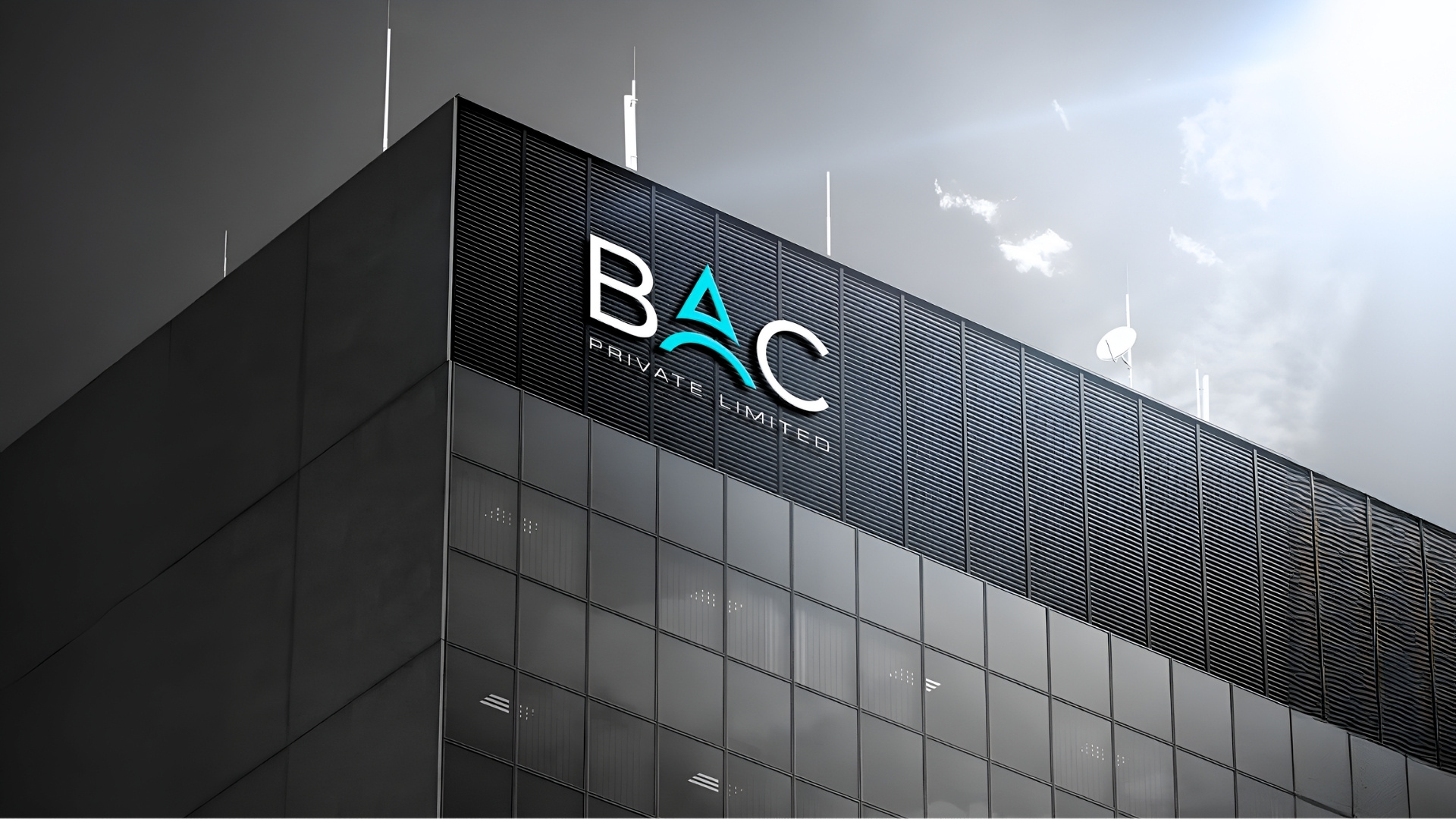
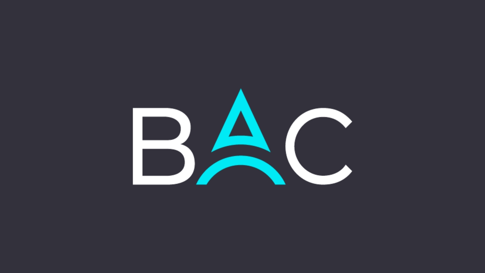
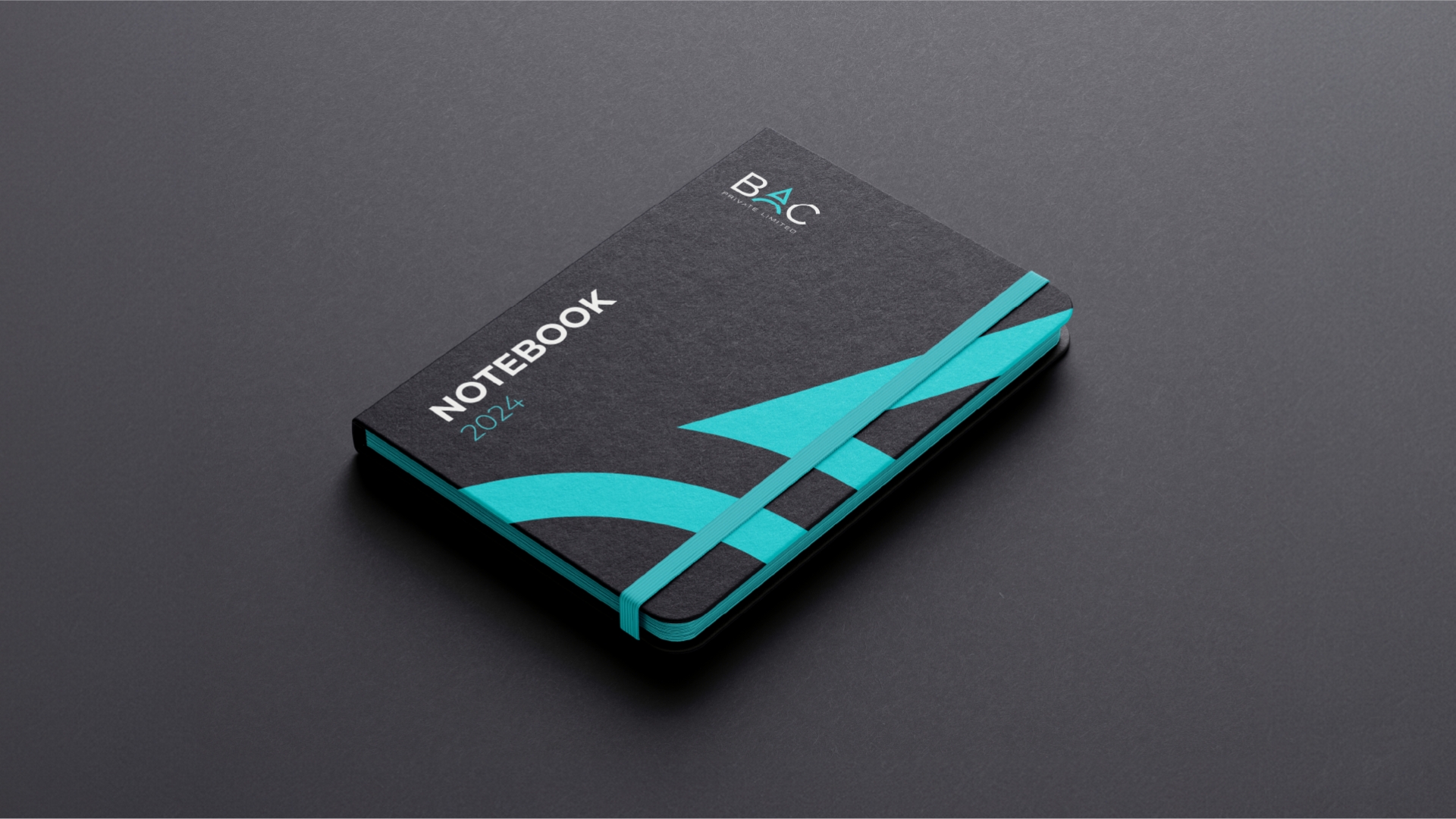
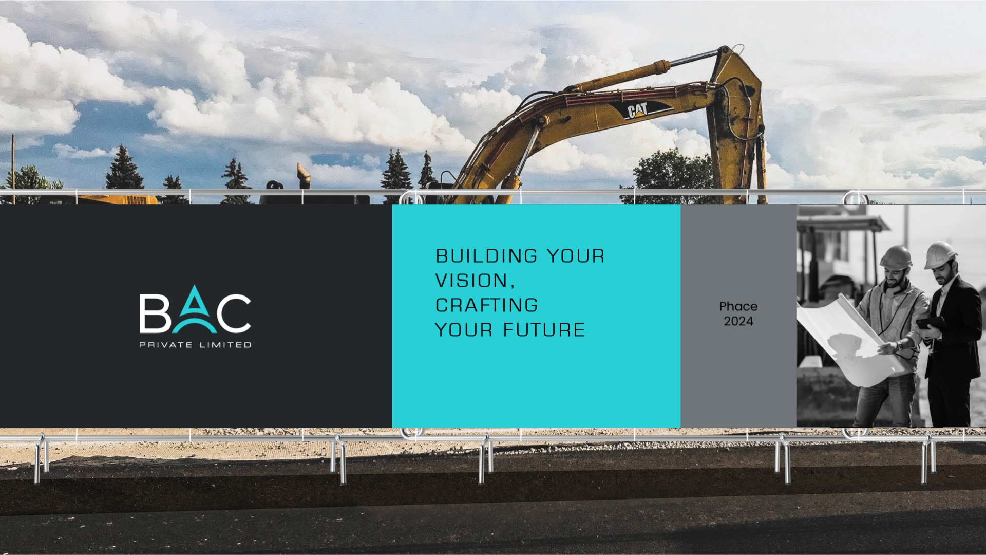
From there, we developed a brand system that balanced legacy with modernity. The refreshed logo is sharp, minimal, and rooted in geometric precision—echoing the structural integrity of BAC’s engineering solutions. The accompanying symbol draws inspiration from structural frameworks and beam intersections, symbolizing connection, support, and forward momentum.
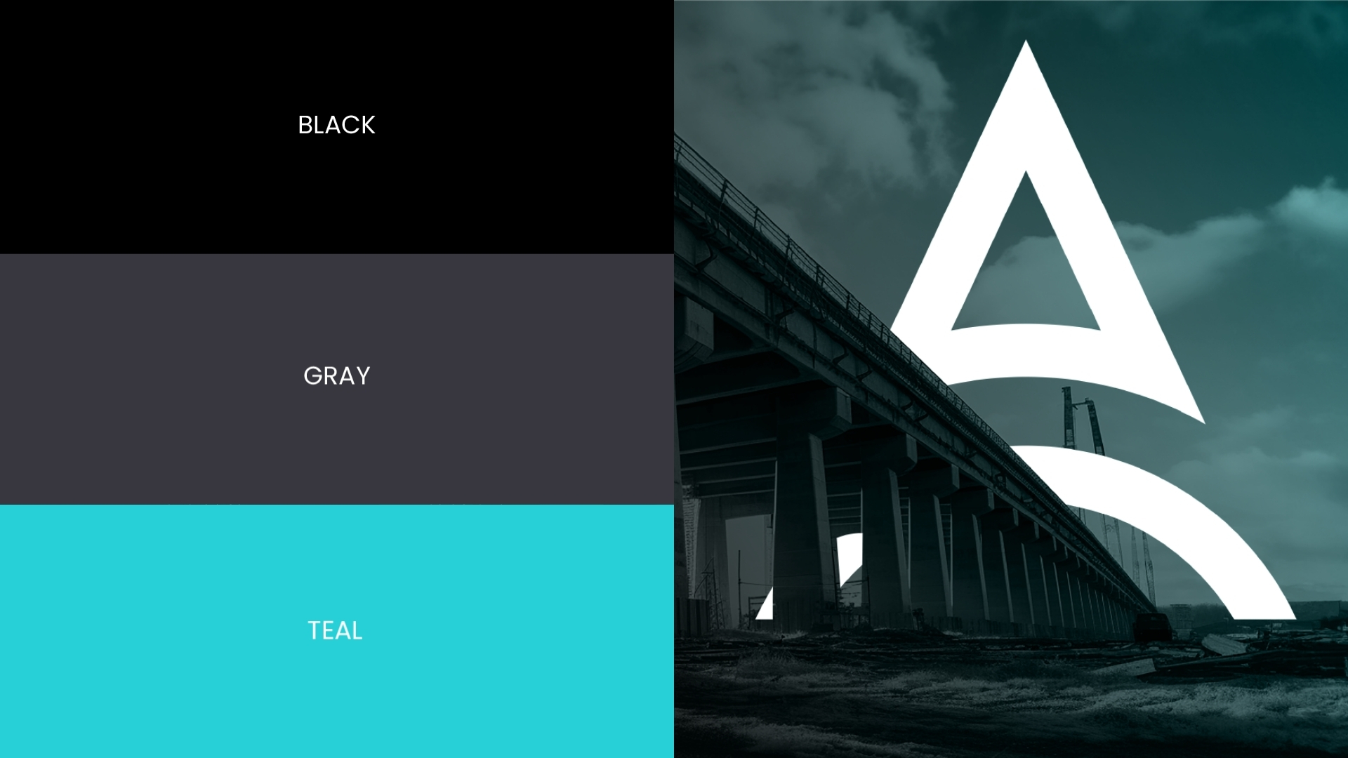
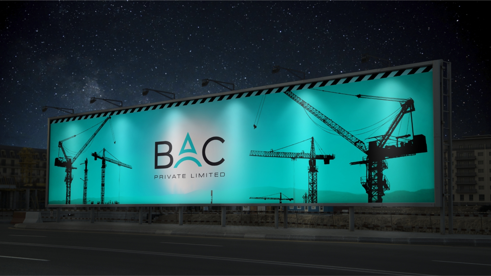
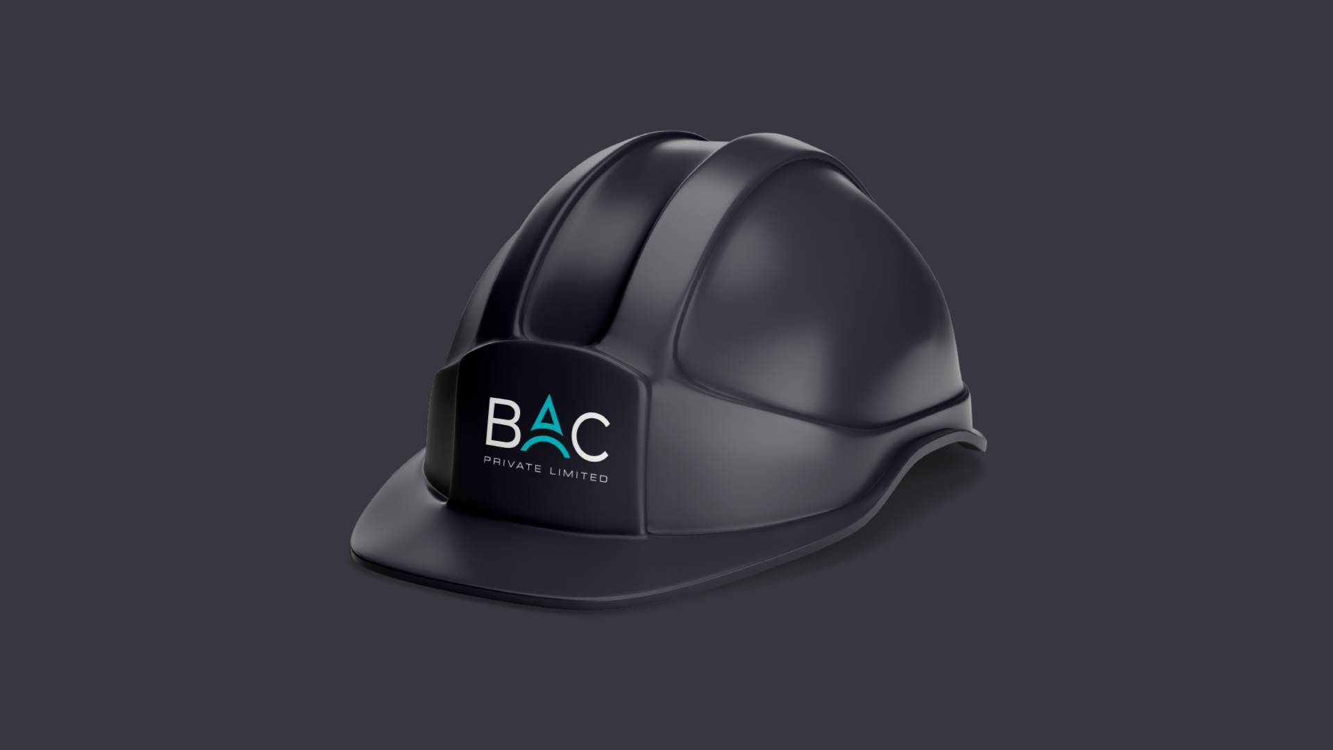
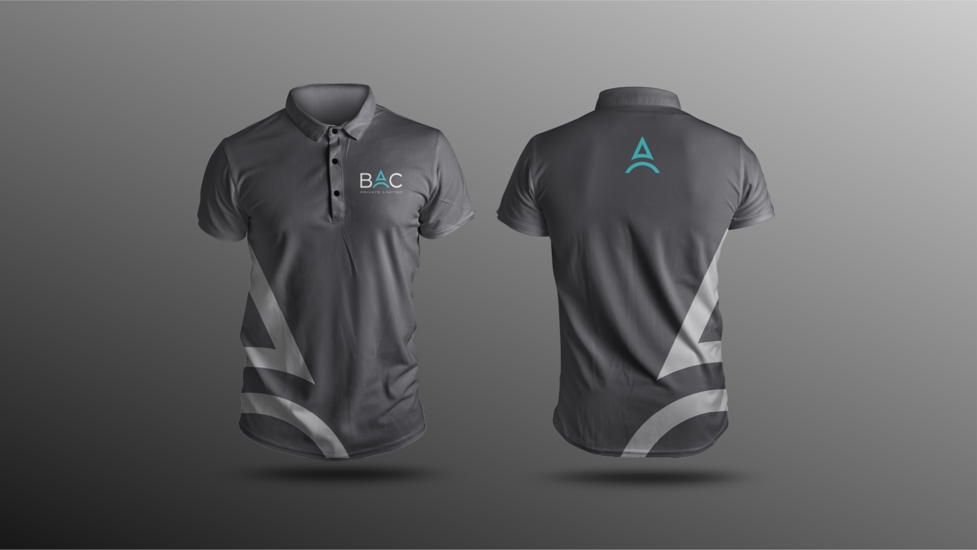
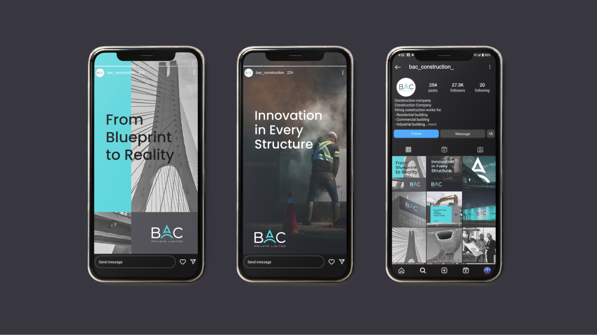
We introduced a versatile color palette dominated by deep steel blues and industrial greys, paired with a clean, assertive typography system. Together, these elements established a brand that communicates confidence, clarity, and capability across every platform—from helmets and hoardings to proposals and presentations.
The Outcome
BAC’s new brand identity does more than modernize their image—it elevates their entire market perception. It positions them not just as builders, but as strategic partners in India’s infrastructure growth. Internally, it gave their team renewed confidence. Externally, it opened new conversations and opportunities.
The result is a brand that reflects the scale of BAC’s impact and sets a solid foundation for future growth. With this transformation, BAC India isn’t just building stronger structures—it’s building a stronger brand.
CREDIT
- Agency/Creative: Sunday Design
- Article Title: Steel, Structure, and Strategy: BAC’s Brand Identity Designed by Sunday Design
- Organisation/Entity: Agency
- Project Type: Identity
- Project Status: Published
- Agency/Creative Country: India
- Agency/Creative City: Mumbai
- Market Region: Asia
- Project Deliverables: Brand Design, Brand Guidelines, Brand Identity, Brand Mark, Branding, Creative Direction, Identity System, Logo Design
- Industry: Construction
- Keywords: Sunday Design, Brand Design, Logo Design, Brand Guidelines, Civil Engineering, Infrastucture, Construction, Visual Identity
-
Credits:
Creative Direction: Sailee Sanaye
Senior Brand Designer: Manoj Kumar


