


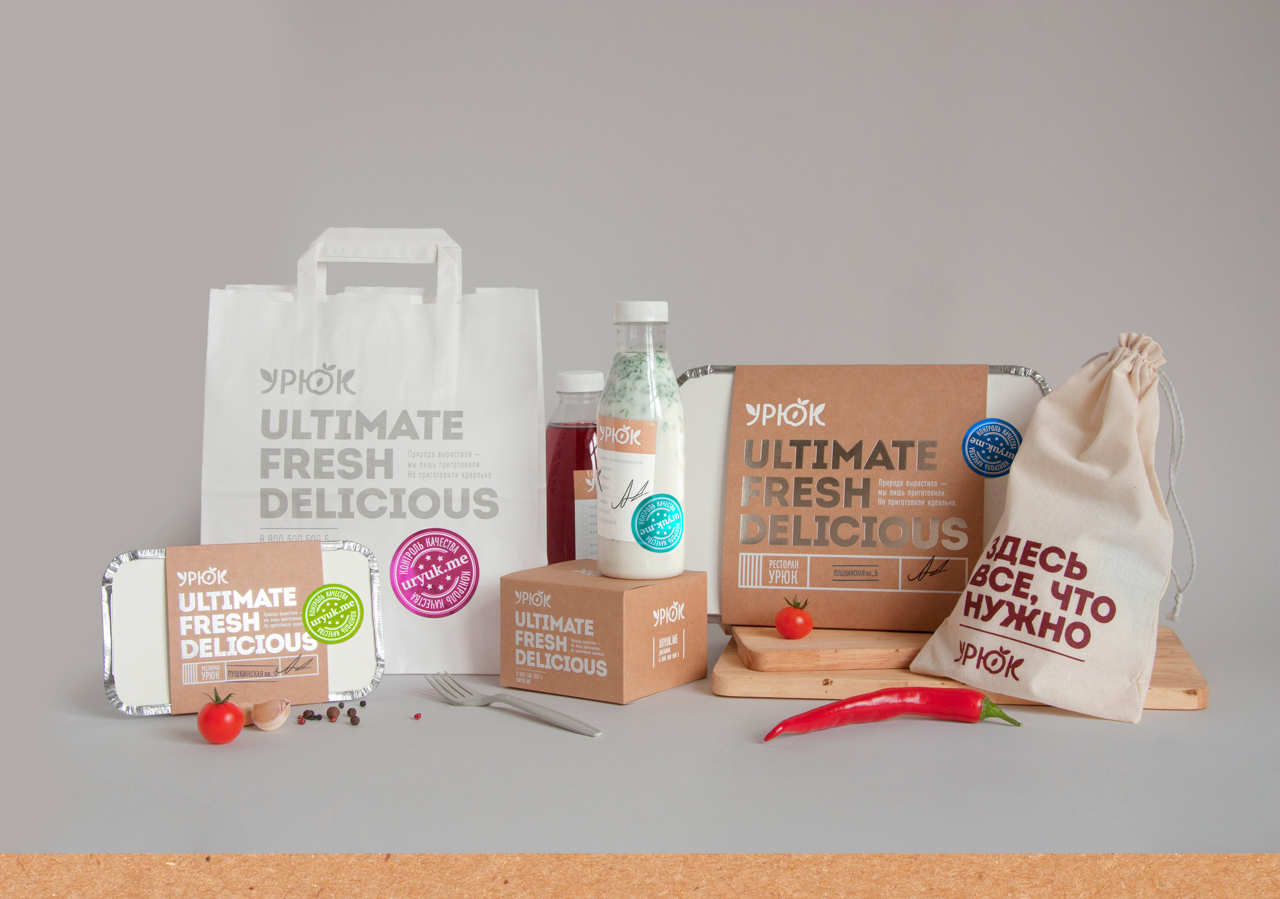

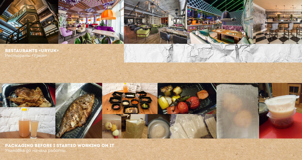
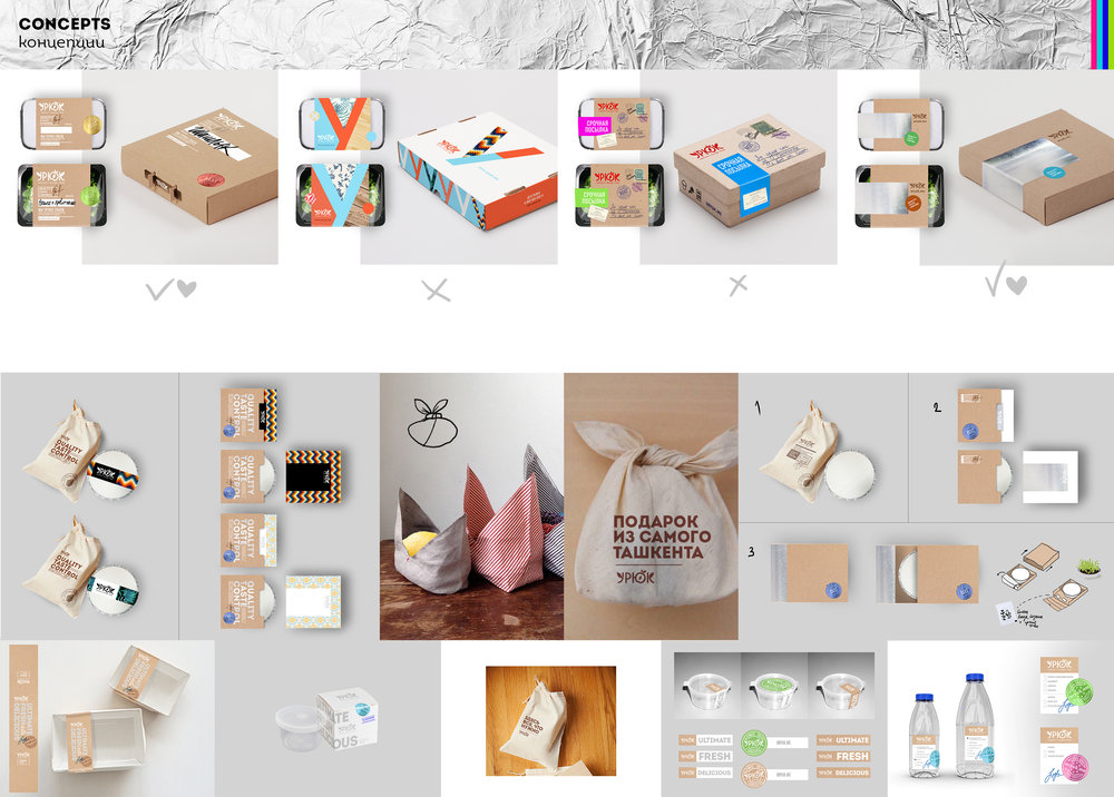
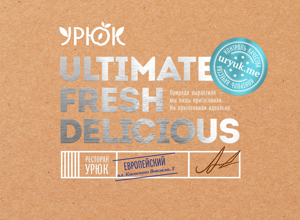
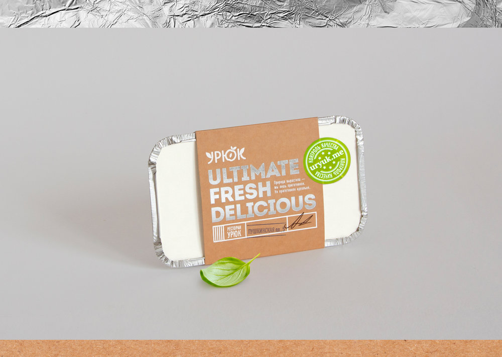
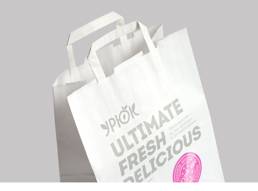
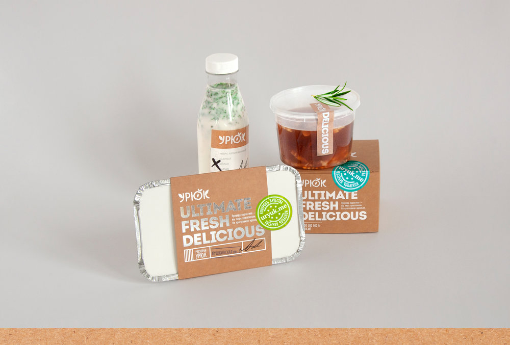
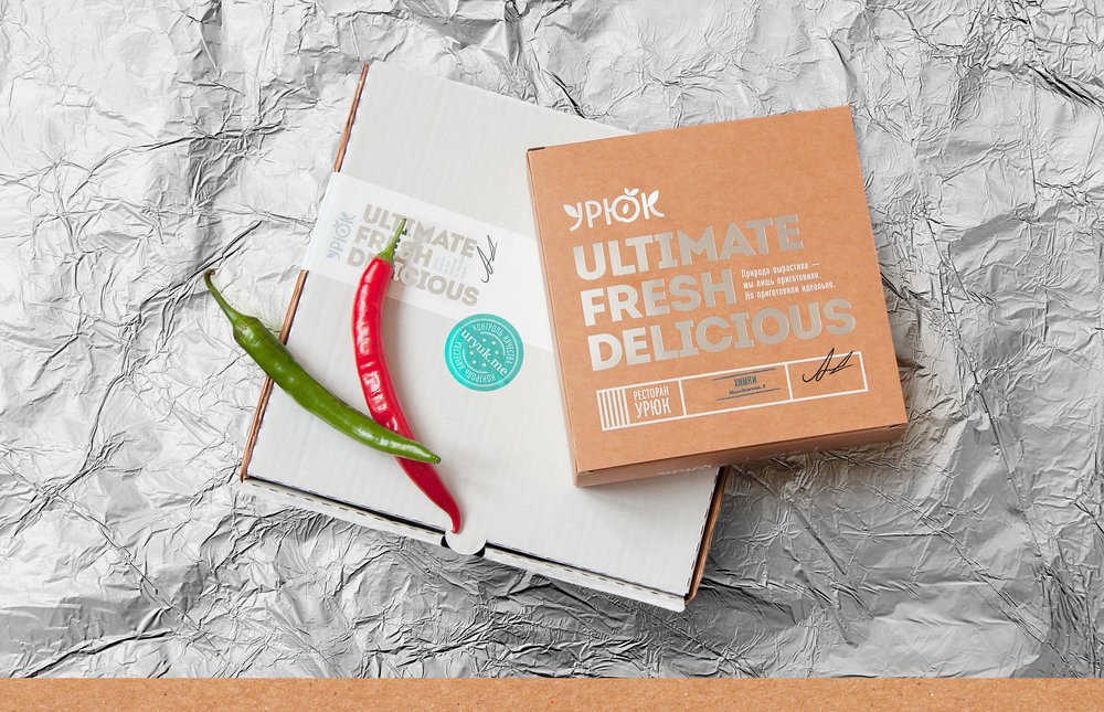
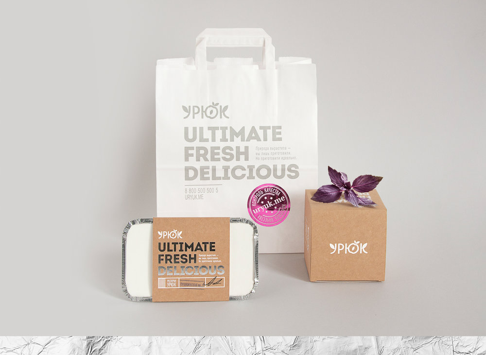
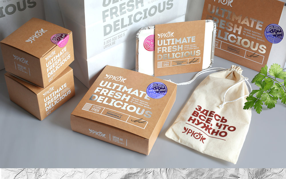
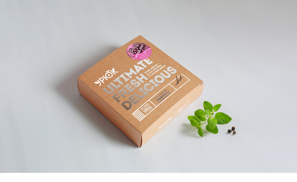
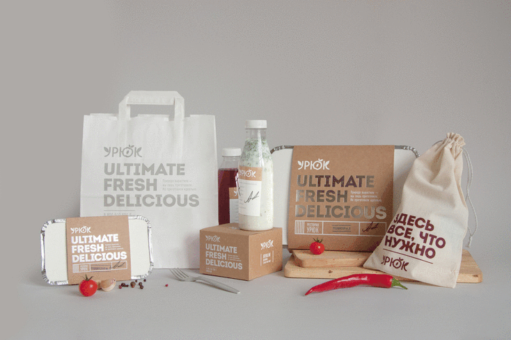
” «Uryuk» is a network of restaurants in Moscow with national Uzbek and European cuisine. I had a task to create packaging for delivery and I was aiming to stay away from overusing national motifs while putting more emphasis on the modern chic feeling of the restaurant and highlighting preference of natural ingredients. Choosing the right materials and a certain set of colors were the way to implement this feeling: natural and rough looking card paper makes a good contrast against silver foiled letters. Cutlery is packed into a small natural linen bag. The packaging fonts remind of a parcel from Tashkent — everything is fresh, delicious and cool and delivered to your house. There’s also a spot for a stamp where each restaurant puts its own stamp and the chef signs it. And a glowing sticker, a quality mark of the restaurant, tops it all off.”

CREDIT
- Agency/Creative: Stas Neretin
- Article Title: Stas Neretin – URYUK
- Project Type: Packaging
- Format: Bag, Bottle, Bowl
- Substrate: Metal, Plastic, Pulp Carton


