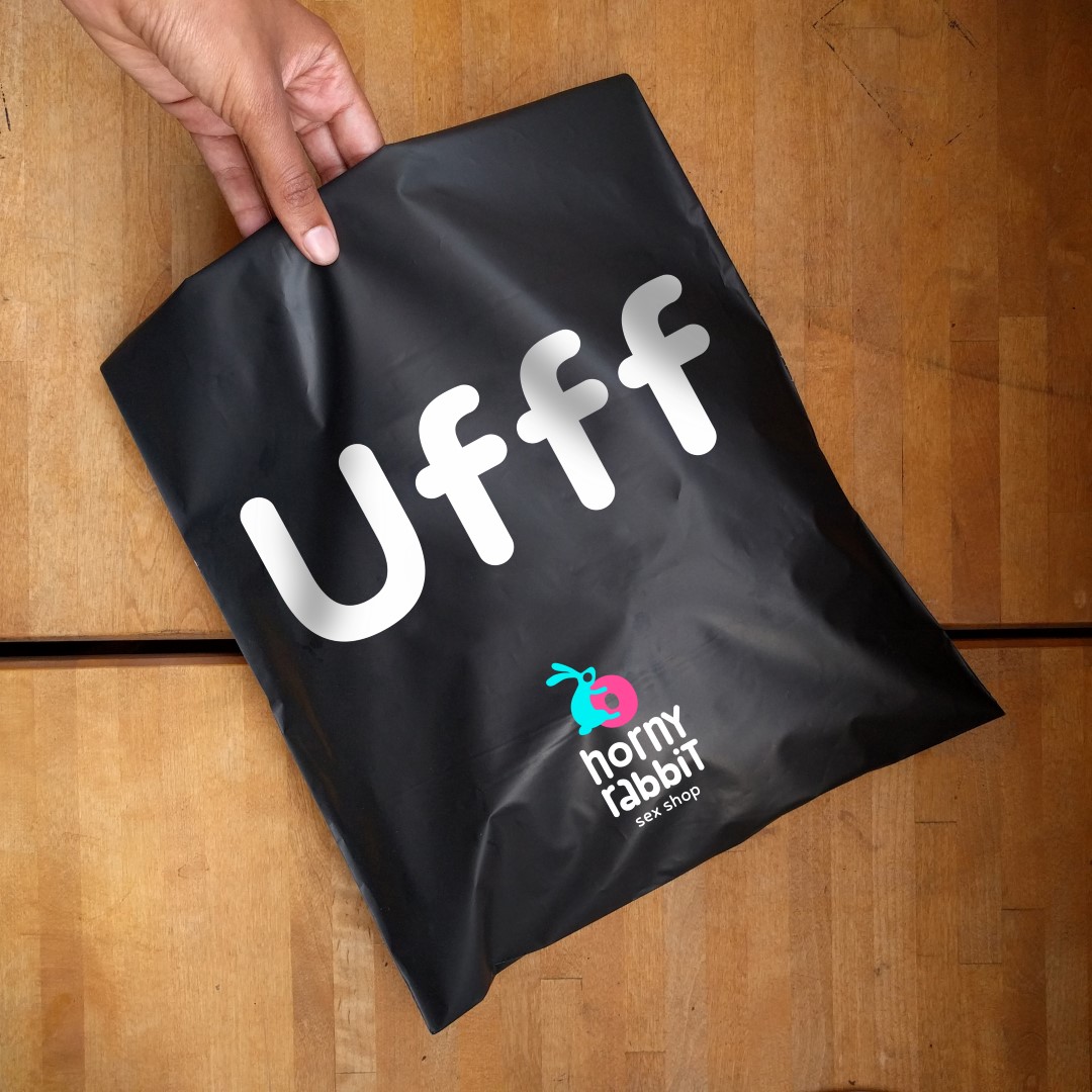
” With the advent of the era of Tinder and dating for fun, sex ceased to be treated as something secret or forbidden. Sex has become easier and more fun. Its existence is openly acknowledged. But the visual codes of sex industry haven’t yet adjusted. Majority of sex shops still look vulgar and outdated – muted light and red neon make them look like a hideaway for perverts. Sex products are designed in such a way that they are simply indecent to carry along the street.
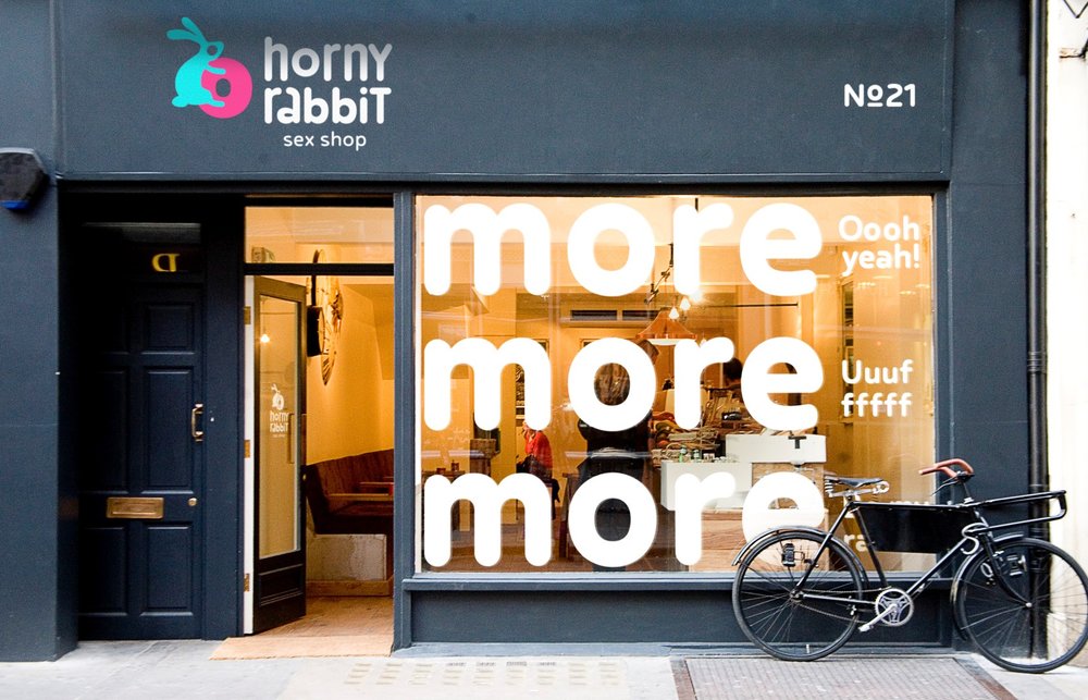
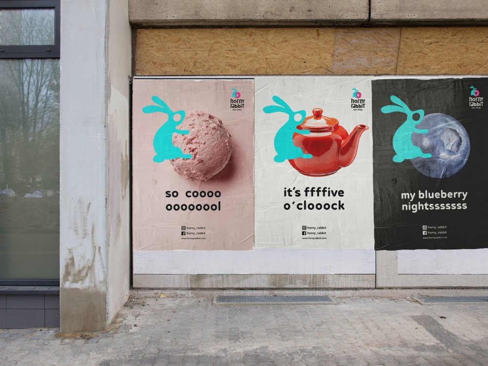
Horny rabbit is a concept of a sex shop of a new era. Its design says: “Times have changed – it’s time to drop down red velvet veils and welcome new sex shops without excessive theatrical decoration.”
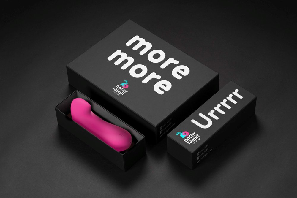
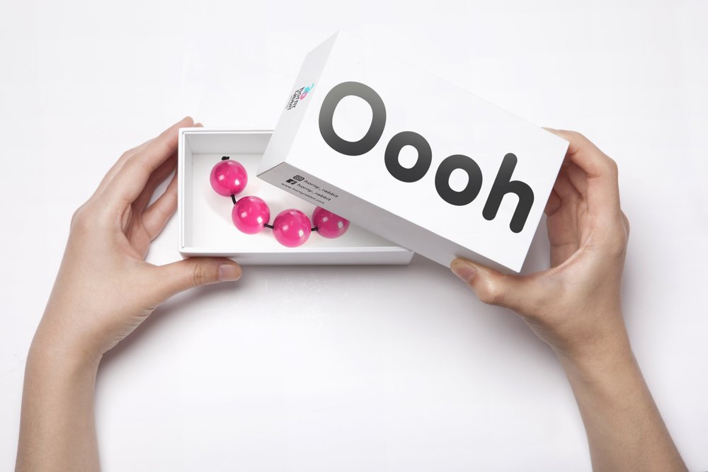
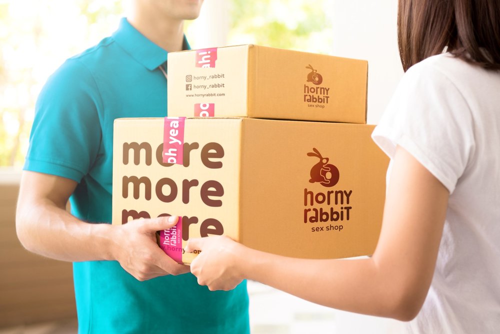
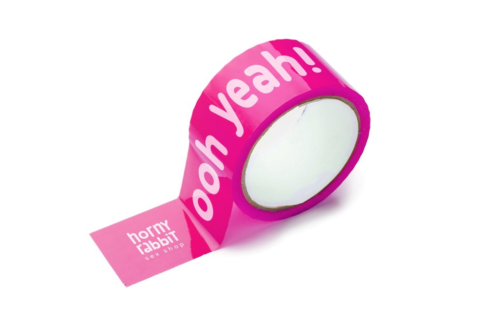
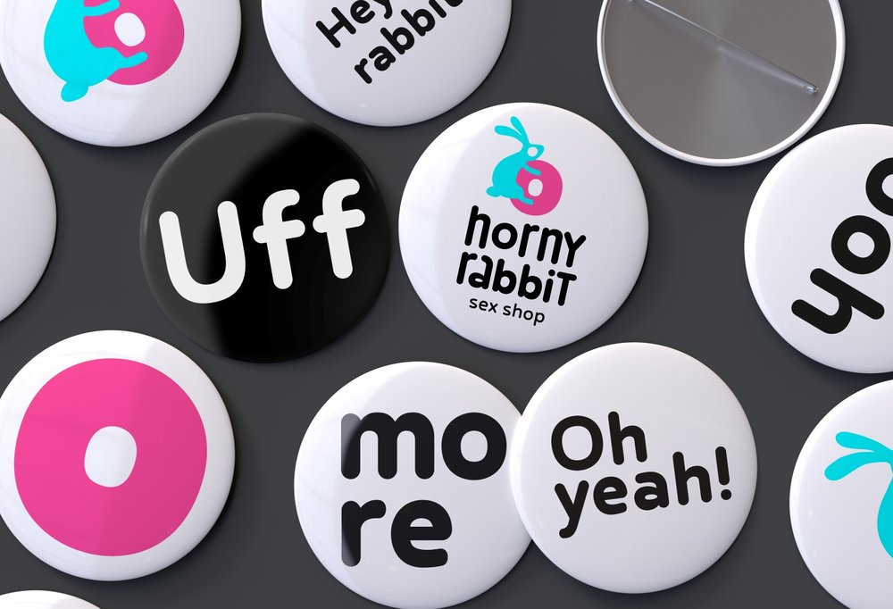
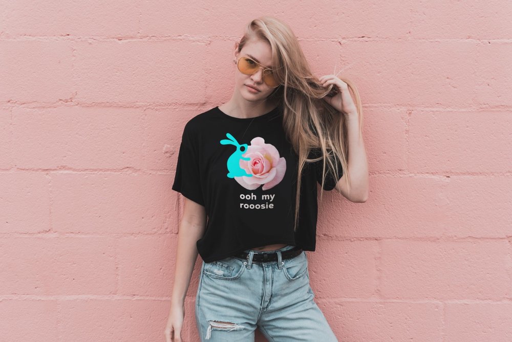
Packaging is minimalist but at the same time screams with pleasure. The irony in packaging and advertising communications is created by a simple technique: when adding a corporate character, a rabbit, to any subject the design starts having sex! Rabbit can fuck anything, if only it is funny, simple and beautiful! Bright colors, simple graphics, nice and simple font and short copyright – that’s all you need to create a playful and modern image.”





CREDIT
- Agency/Creative: Stas Neretin
- Article Title: Stas Neretin – Horny Rabbit (Concept)
- Project Type: Packaging
- Format: Bag, Box
- Substrate: Pulp Carton, Pulp Paper


