The phrase “Starve the worm” — an exact translation of the russian phraseology, which means to have a little snack. An example is the english idiom “To stay the pangs of hunger”.
“Starve the worm” — a family restaurant for fish аt the bottom of the ocean, here everyone can find a dish to their liking, both small and adult sea inhabitants.
The aim of the project was to create a universal and understandable identity reflecting the theme and concept of the restaurant.
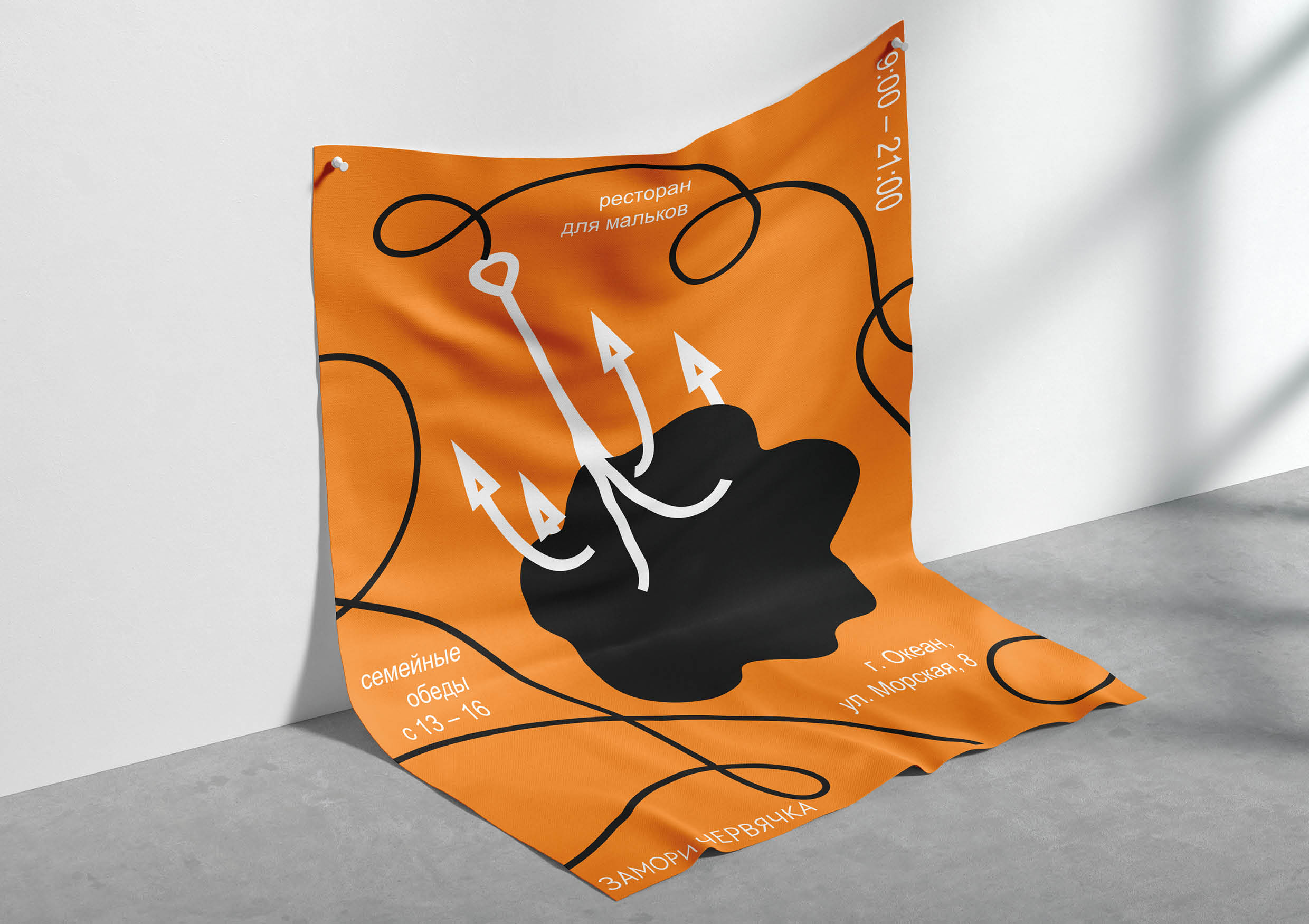
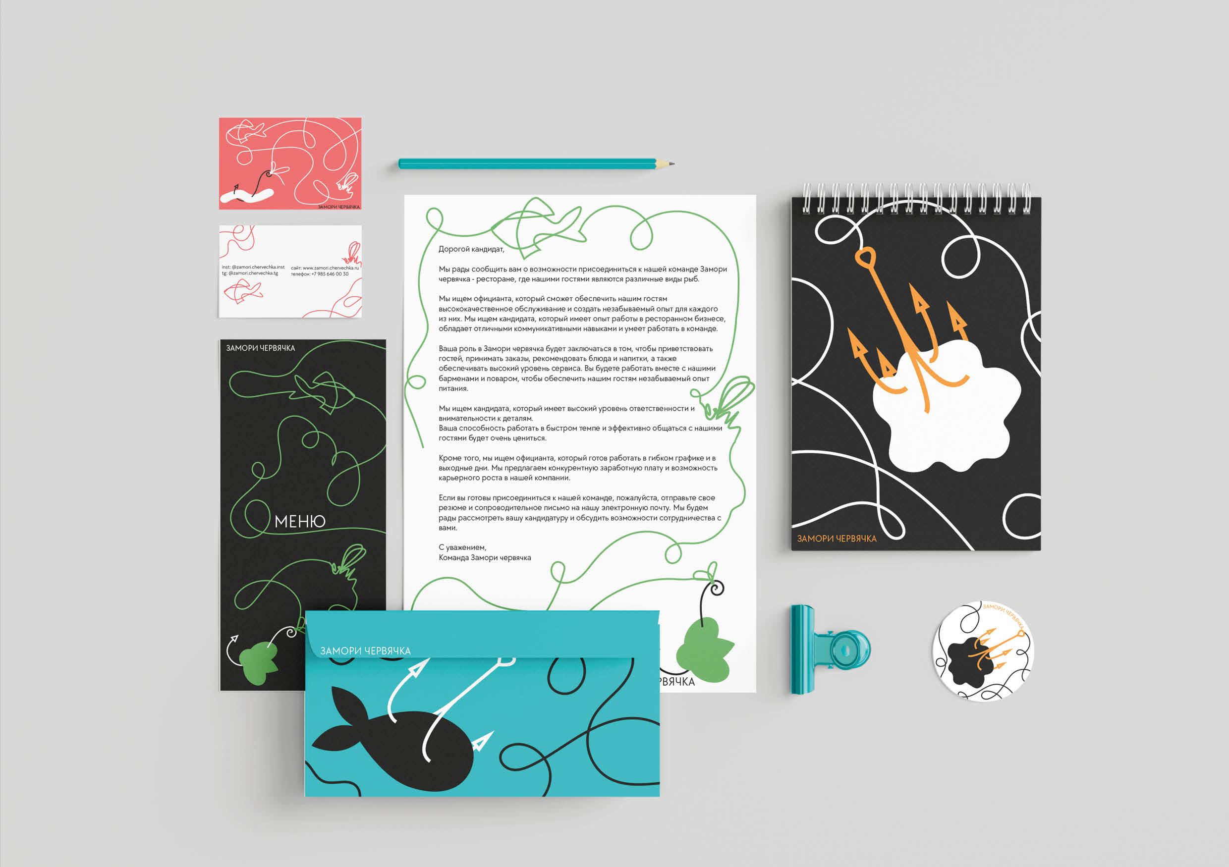
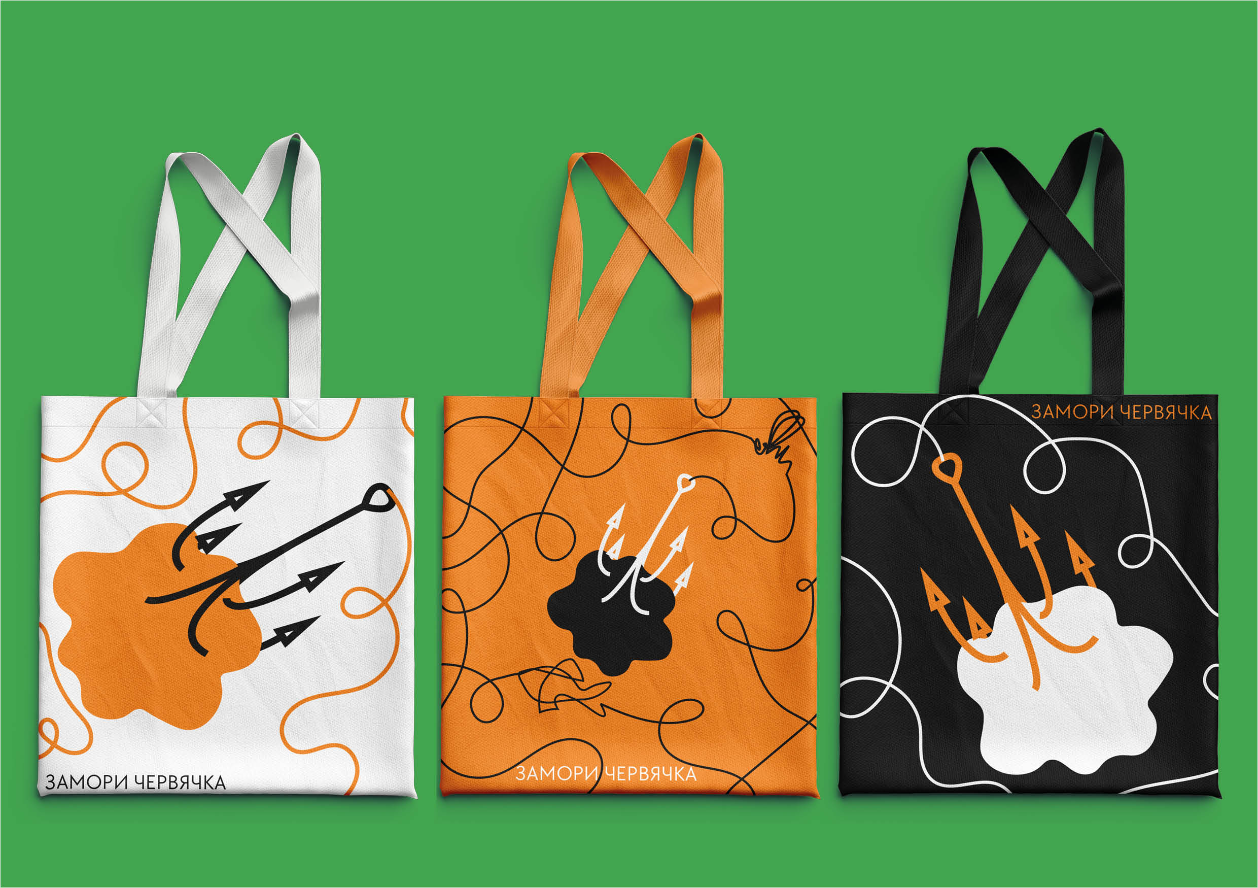
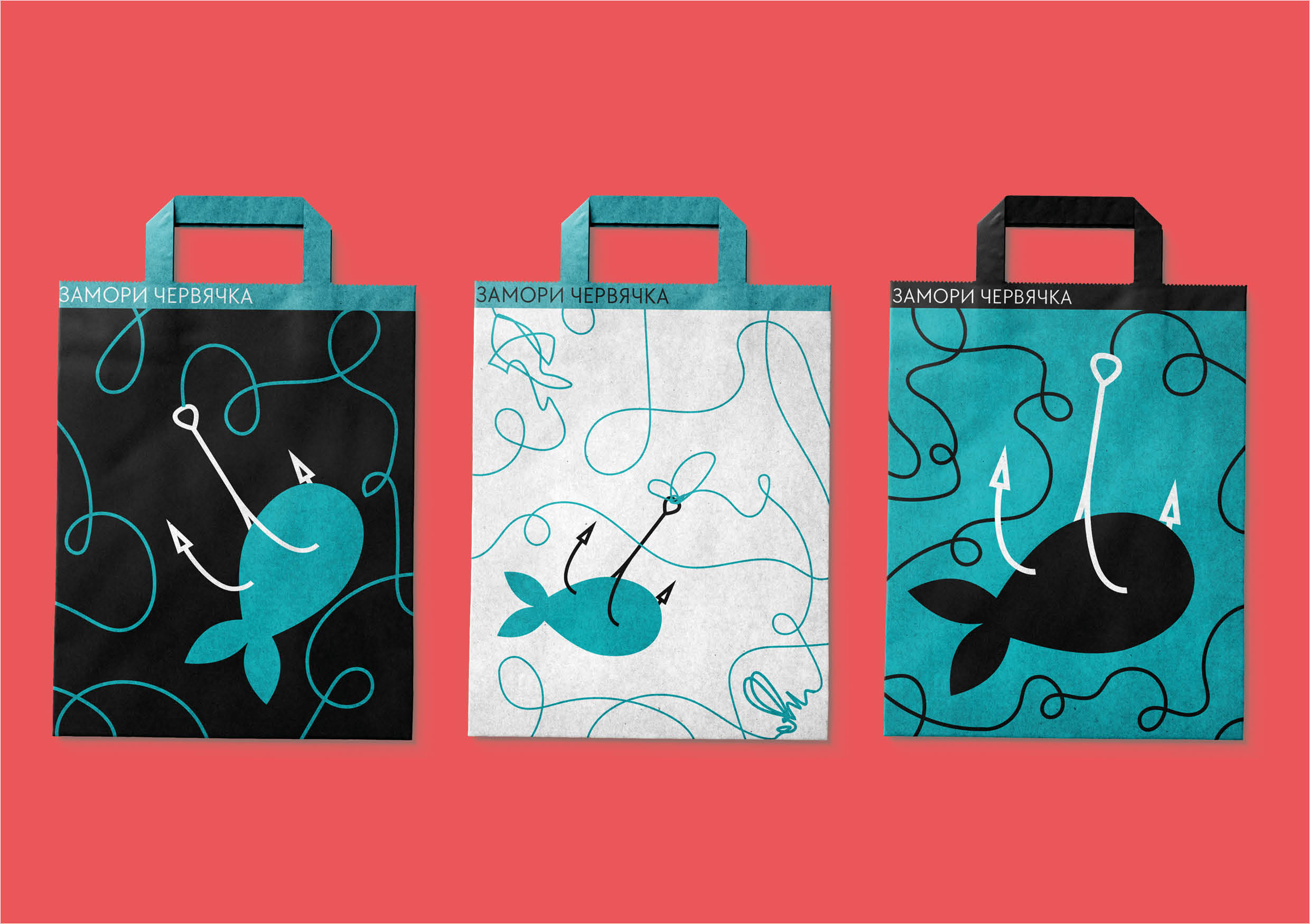
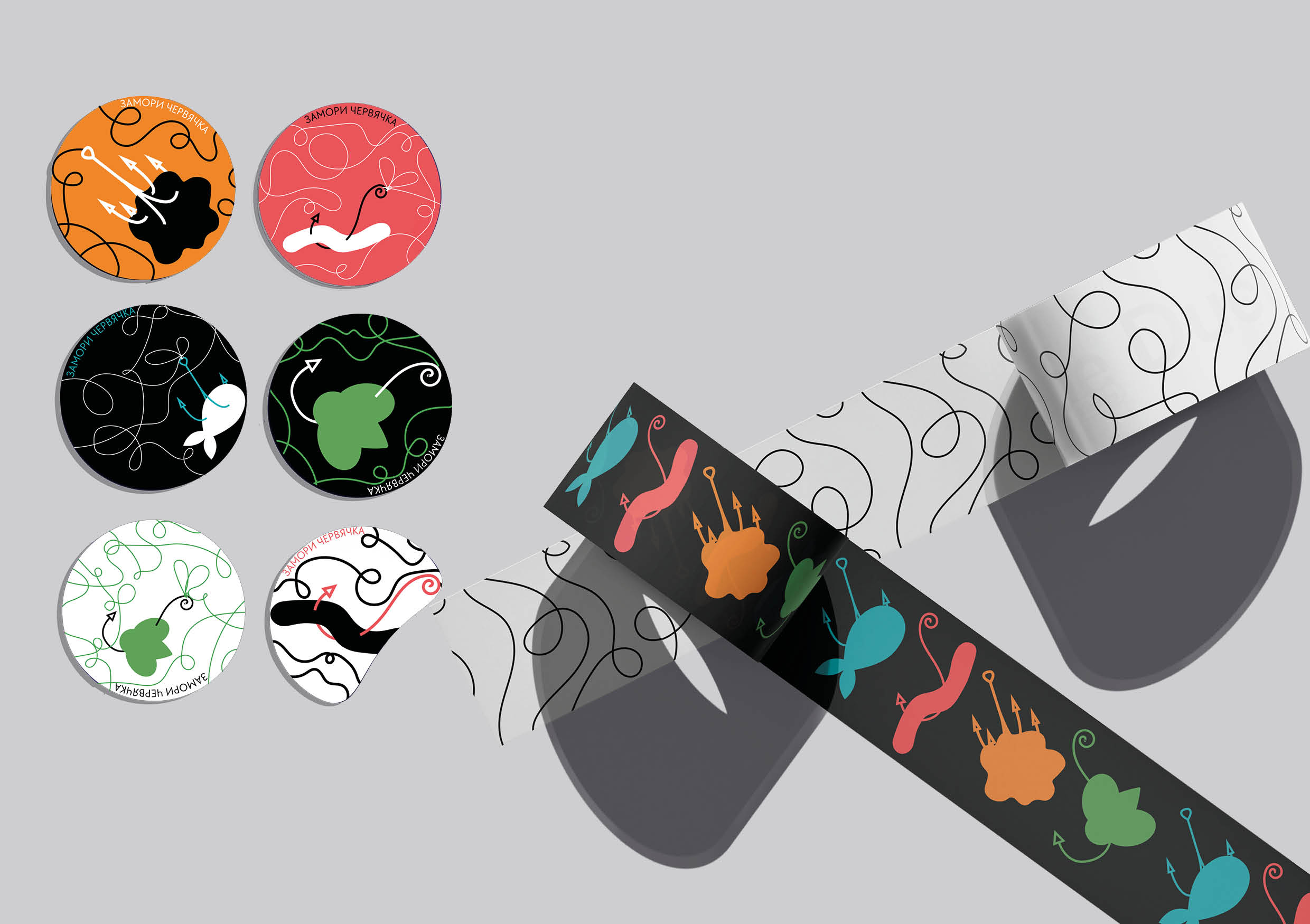
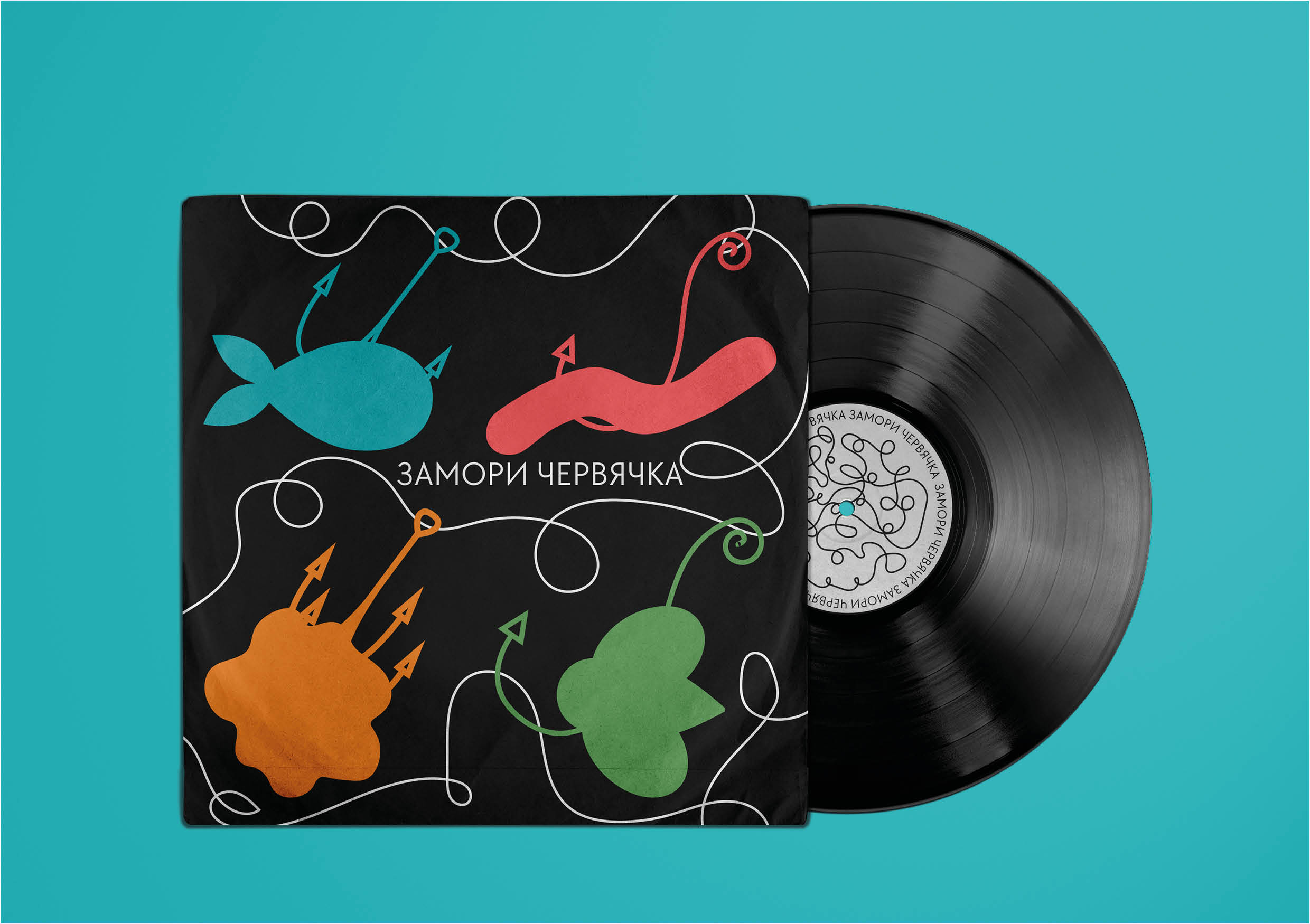
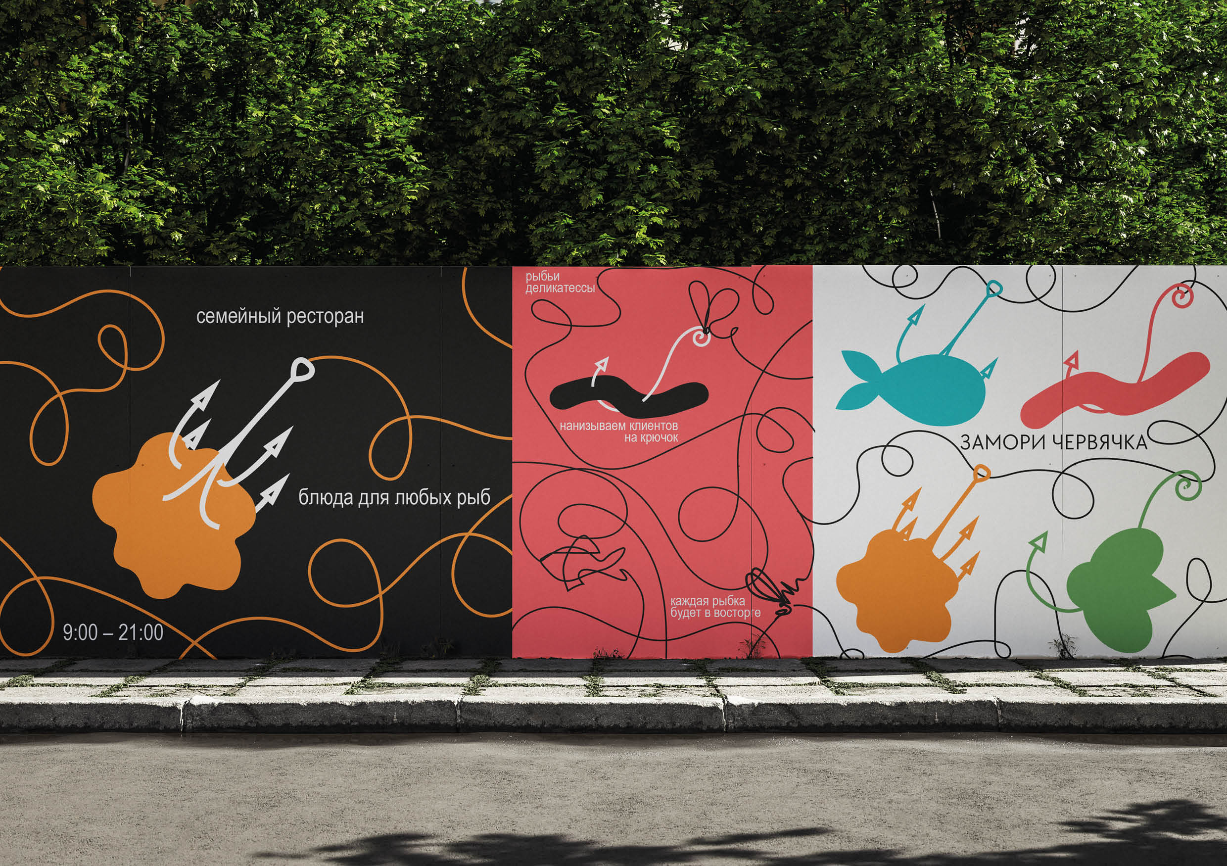
A key element of the identity has become a fishing line, which transforms into a corporate identity, demonstrating the size and diversity of the media. Words can be laid out from the line or silhouettes can appear. This concept assumes high variability and adaptability in design.
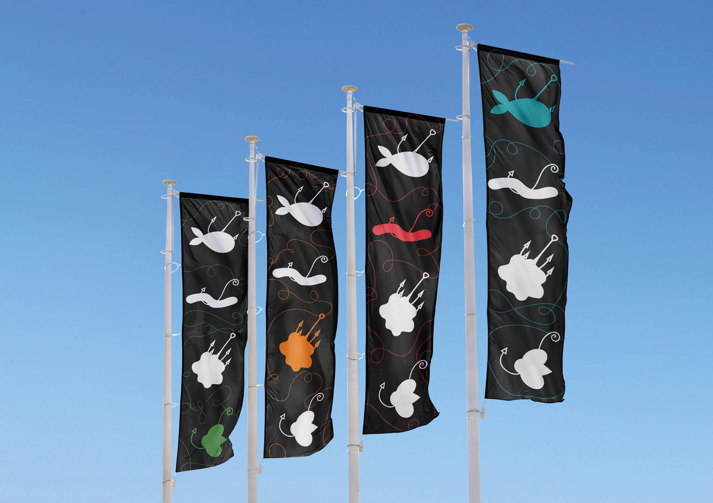
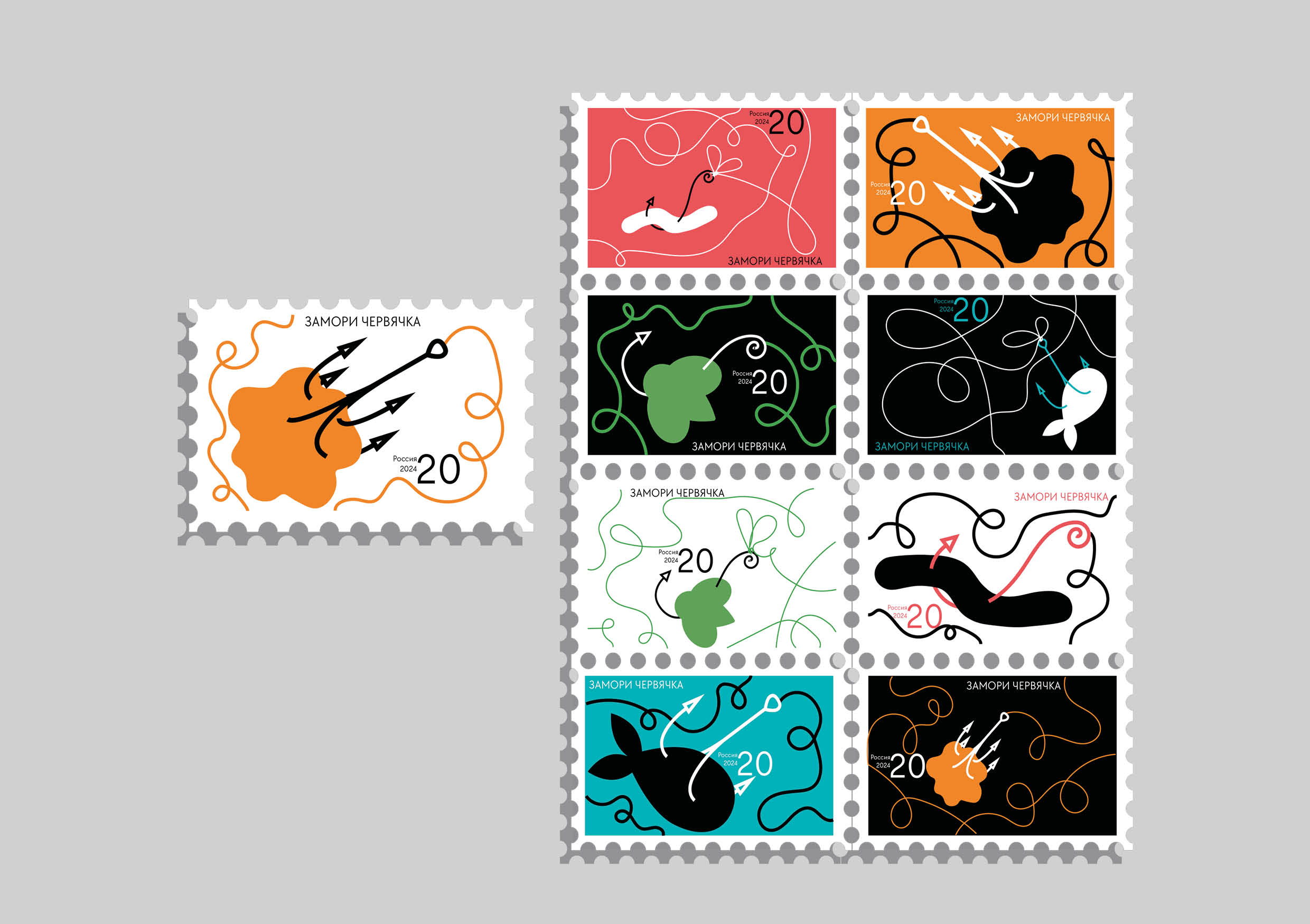
Also, different logos appear on the media — fish hooks with strung “food”. They can scale: move away or get closer.
The brand’s colors are bright and catchy, reflecting a family atmosphere and suitable for a multi-age target audience. Each color has its own meaning. red is the color of worms, blue of water, green of algae, and orange is associated with fish scales.
I demonstrate various media, basic typographic, merch, which can be purchased at the restaurant. Also I show how the style will work in the city.
“Starve the worm” — a fantastic restaurant for underwater families, it attracts customers just like a fish is lured with a hook. A large Variety of dishes from all kinds of fish delicacies. The open staff will help you choose what any family member will like. Every fish will be happy, welcome!

CREDIT
- Agency/Creative: Arina Taratuta
- Article Title: “Starve the Worm” Student Brand Identity That Combining Reality and Fantasy by Arina Taratuta
- Organisation/Entity: Student
- Project Type: Identity
- Project Status: Published
- Agency/Creative Country: Russia
- Agency/Creative City: Moscow
- Market Region: Europe
- Project Deliverables: Brand Identity, Identity System
- Industry: Food/Beverage
- Keywords: brand identity, typography, graphic design, restaurant
-
Credits:
Designer: Arina Taratuta
Tutor: Pavel Borisovsky
Educational institution: HSE ART&DESIGN SCHOOL


