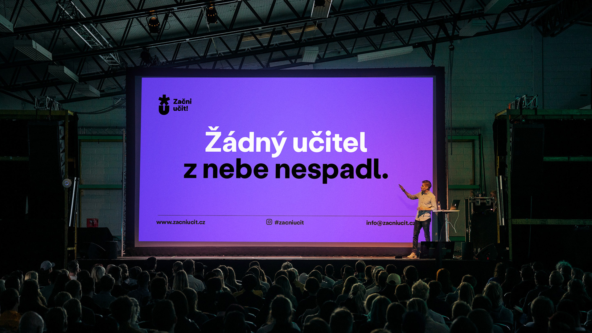
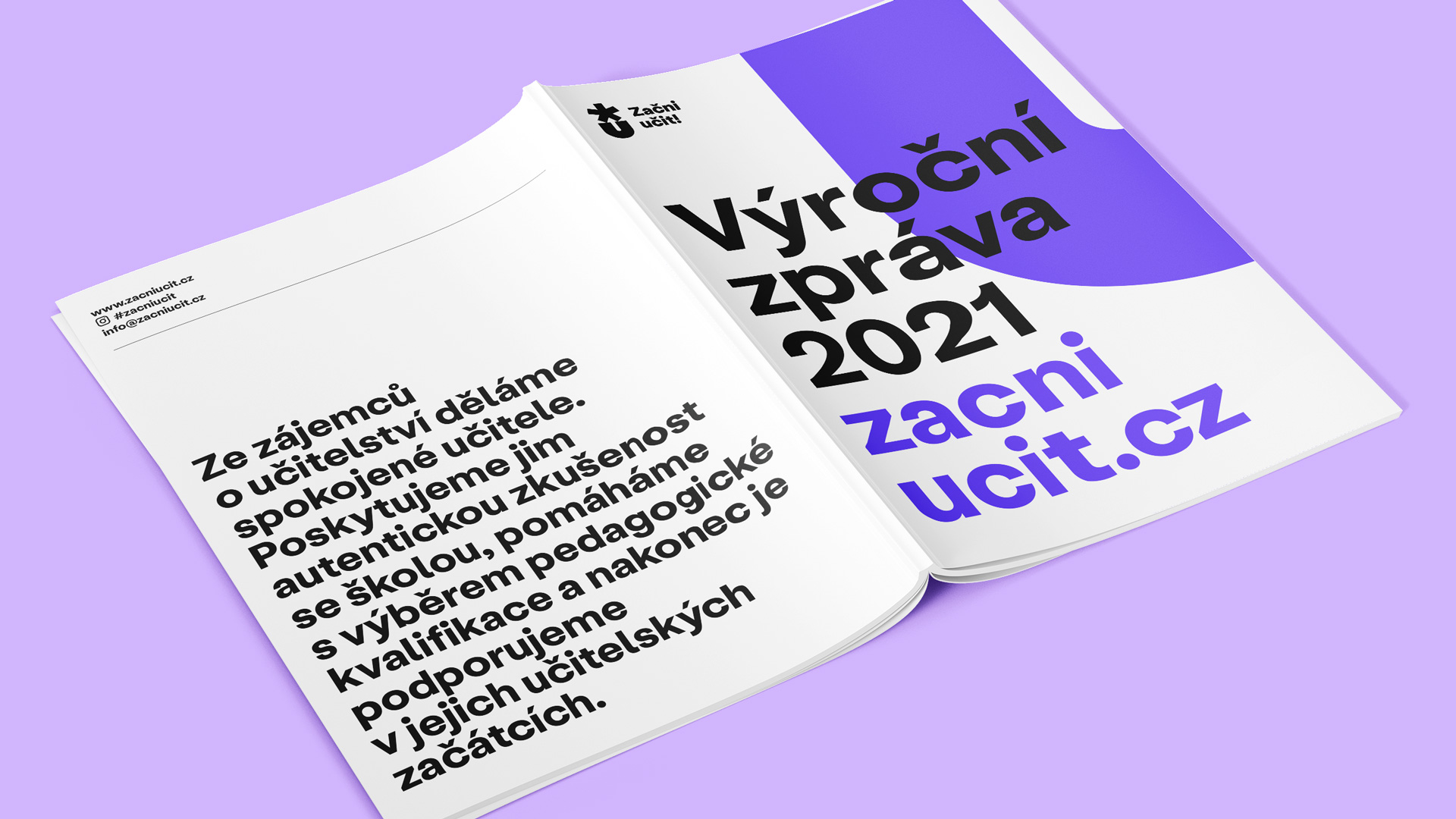
Start Teaching! is a non-profit organisation that helps trainee teachers. When it outgrew its old brand (named Výluka), the team decided to communicate individual projects under their own names and asked us to set a visual style for the new brand system.
We worked on the assumption that, in the future, more projects will be added to the current ‘Start teaching!’, ‘Try teaching!’ and ‘Get training!’ projects. That’s why we agreed that we need to design a strong symbol that interconnects the brand system.
The main challenge was to find the right degree of abstraction. We wanted to avoid visual clichés (such as the motif of a book) which, in the case of teaching, often connotes swotting up rather than the development of intellect. Finally, in the logo, we combined the star (as a symbol of beginning) with ‘U’ – the first letter of the word učit (‘teach’), which is the basis of the names of all the projects. An arrow that appears in the space between them symbolises the path that new teachers can be guided on.
Our common goal was to set up a visual language that, with its playfulness, builds on the tonality of the old brand but, at the same time, will be mature enough to stand alongside important partners.
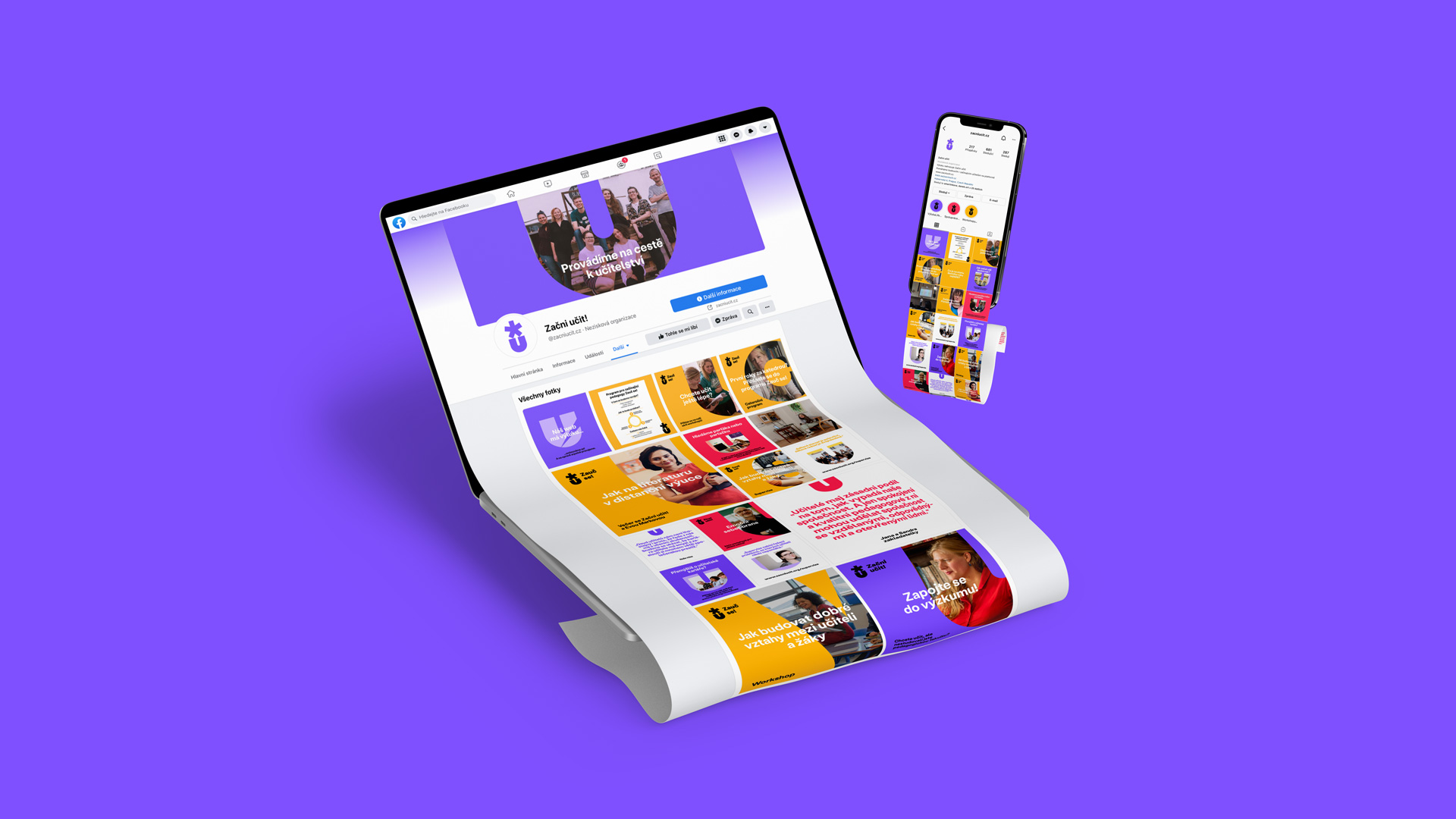
We connected the communication of all projects with photo masking and Stabil Grotesk from KOMETA Typefaces. To differentiate the individual brands, we used a colour palette which we immediately prepared for future expansion.
As part of the design, we devoted a lot of energy to social networks, which are the main communication channel. By designing a large number of templates, we provided a foundation to easily work with the visual style, but we also made sure to leave enough space for creative applications.


CREDIT
- Agency/Creative: Semibold
- Article Title: Start Teaching! Visual Identity by Semibold
- Organisation/Entity: Agency
- Project Type: Identity
- Project Status: Published
- Agency/Creative Country: Czech Republic
- Agency/Creative City: Prague
- Market Region: Europe
- Project Deliverables: Brand Design, Brand Identity, Brand Redesign, Design, Logo Design
- Industry: Non-Profit
- Keywords: education, teaching
-
Credits:
Designer: Pavel Holomek
Art Director: Štěpán Landa


