


Starbucks today launches a bold and distinctive redesign of its Refreshers drink to maximise its impact in the Chinese RTD market, with an innovative new bottle shape and striking visuals designed by global creative agency Marks.
Pioneering a new category with its blend of Arabica green bean extract and real fruit juice, Refreshers is a fan favourite in US retail and has been identified as a key driver for Starbucks China in their mission to diversify and modernise their RTD portfolio amid stiff competition and shifting tastes. Following impressive initial consumer response to the product, Starbucks wanted to amplify its appeal and captivate a new audience through a fresh look and feel that dials up attitude and individuality.
Catrina Xiaoyu Wang, Senior Manager, Starbucks China says: “RTD is a crucial sector for us to reinforce our coffee leadership position in China. As an exciting and disruptive extension to our line that breaks away from the more functional mindset of competitors, Refreshers is designed to drive penetration, recruiting new users and boosting our ambition to become the most loved RTD coffee brand in the market.”
Bold and confident, the redesign speaks to a young generation of self-expressive trendsetters – ‘life autonomists’ who live to the maximum and believe “I am what I drink and eat”. Delving into the target audience, Marks identified that consumer’s personality as confident and authentic, with an emphasis on visual appeal and a lifestyle embracing individuality, community and experimentation.
Danny Lye, Vice President, Design Greater Asia, adds: “Disruptive and eye-catching, the new design adds striking personality that is uniquely appealing to the younger generation of Chinese consumer. Tapping into the target audience’s pursuit of personal style and attitude, it brings elegance and a premium touch through the sensory and bold design, both in structure and graphics.”
The design draws inspiration from emergent semiotic trends of abstract patterns and vibrant colour that cue optimism. It also nods to a whimsical, illustrative emergent style that signals more expressive and evocative narratives. Through these cues, it pushes the intersection of refreshing juice and RTD, to evolve the category and drive emotional resonance, providing a product that reflects Gen Z’s personal style and attitude.
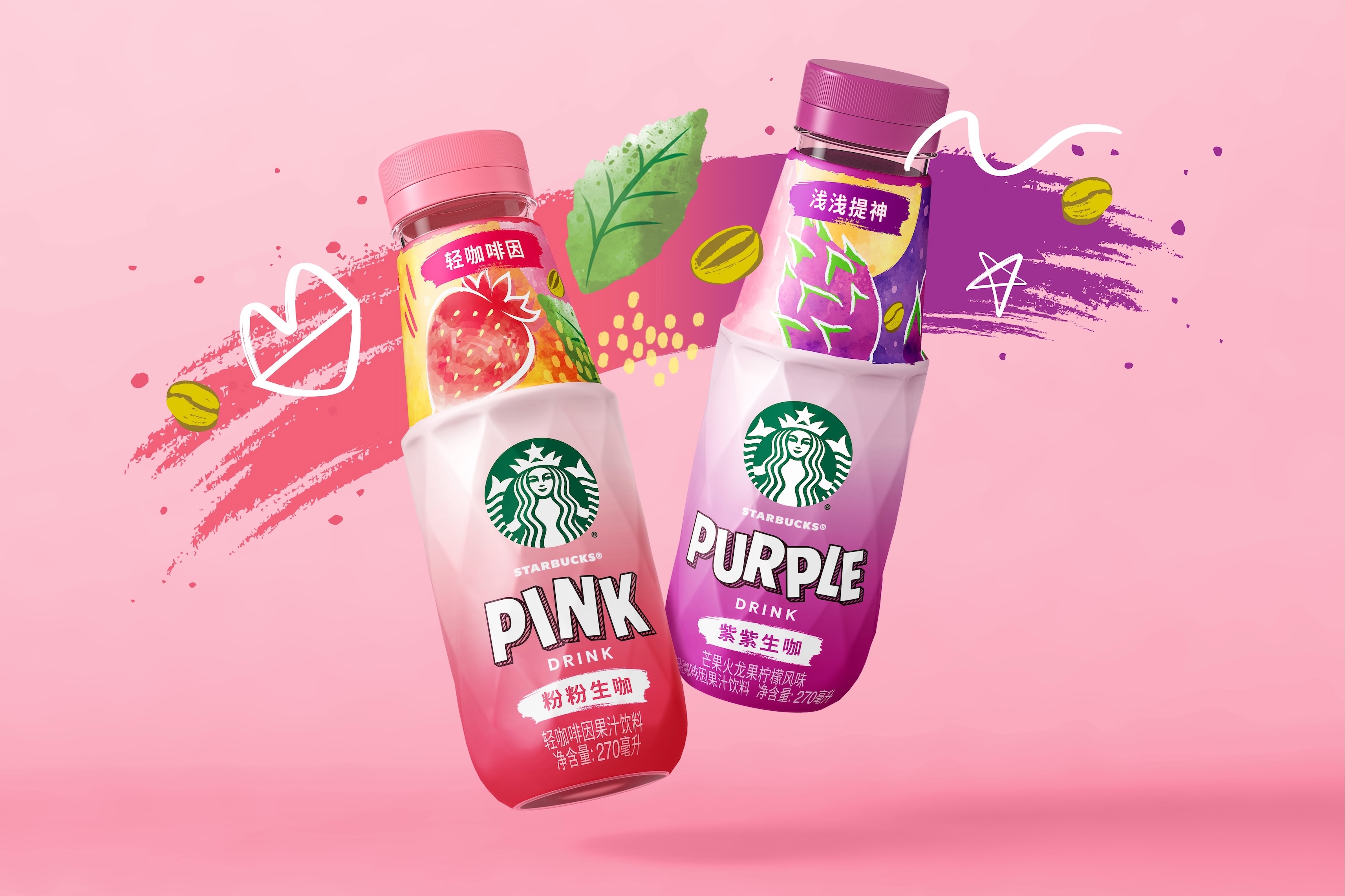
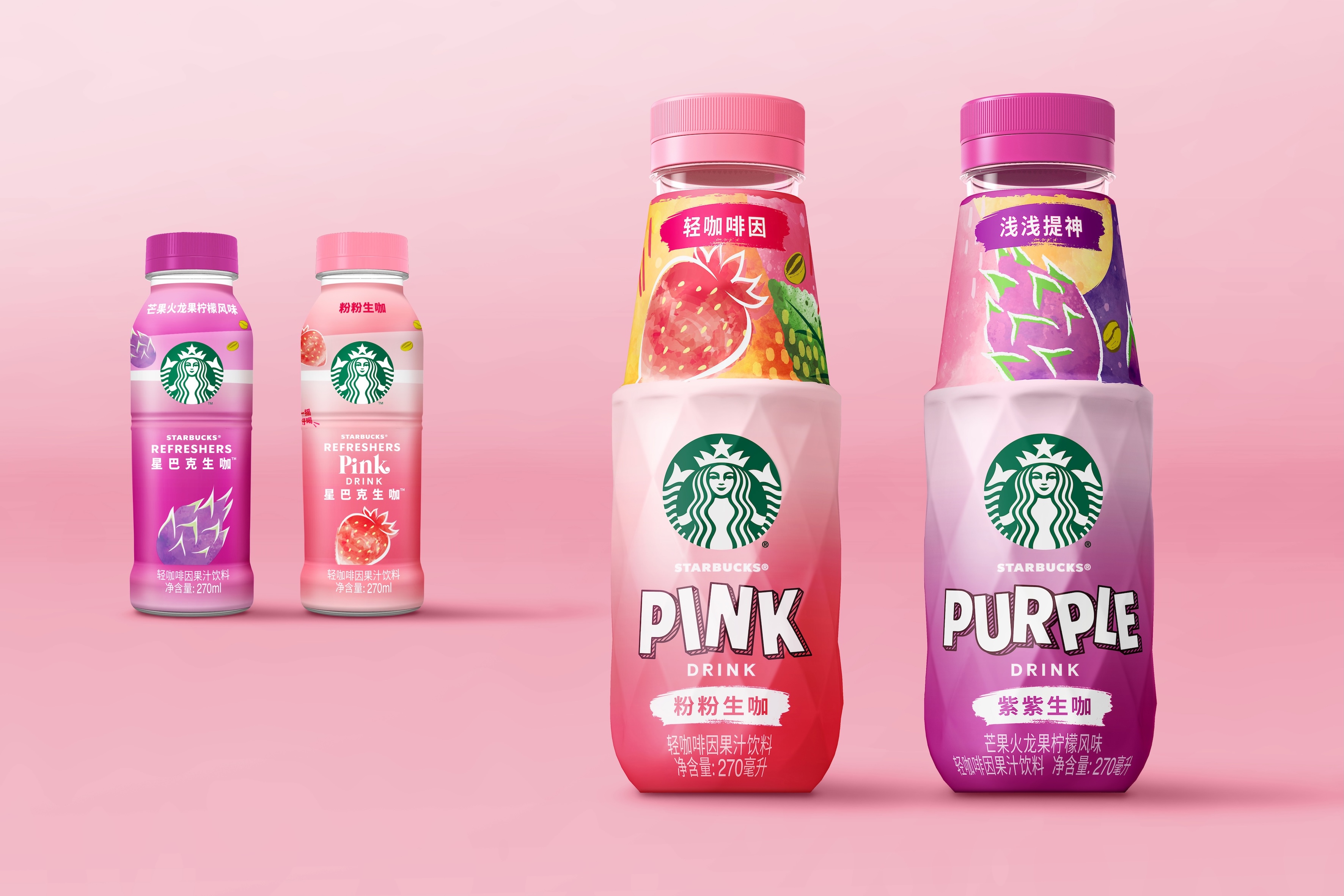
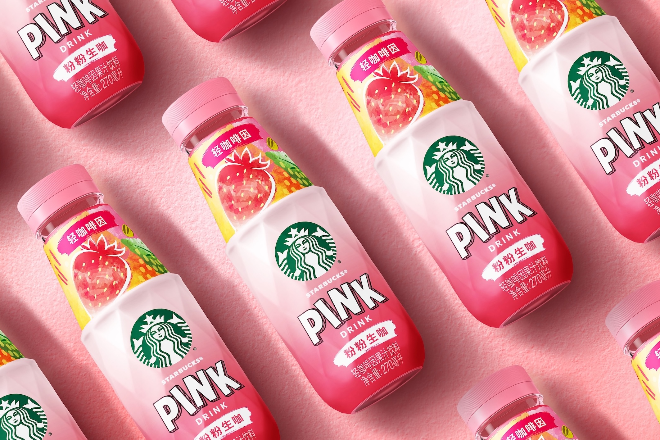
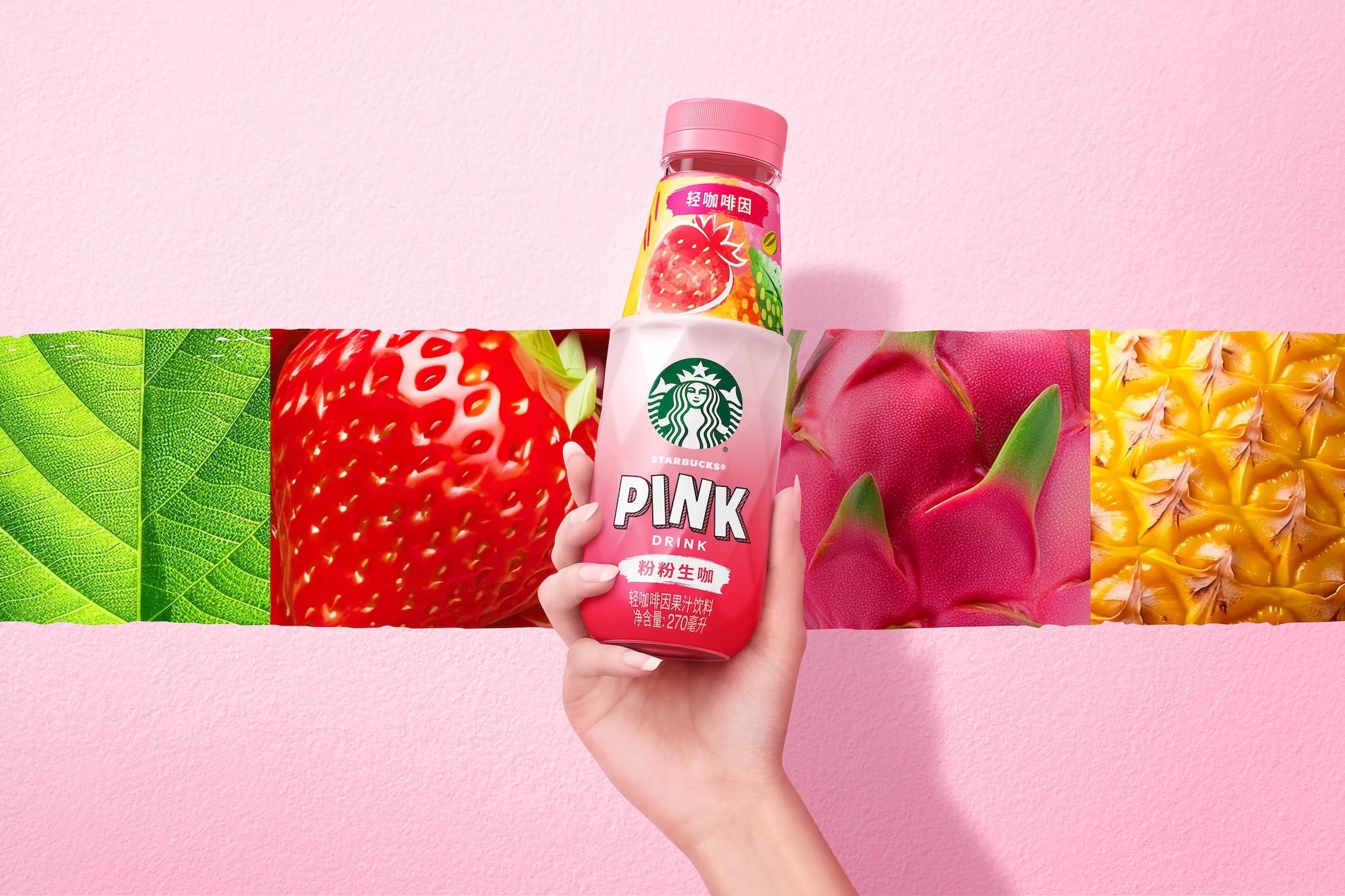
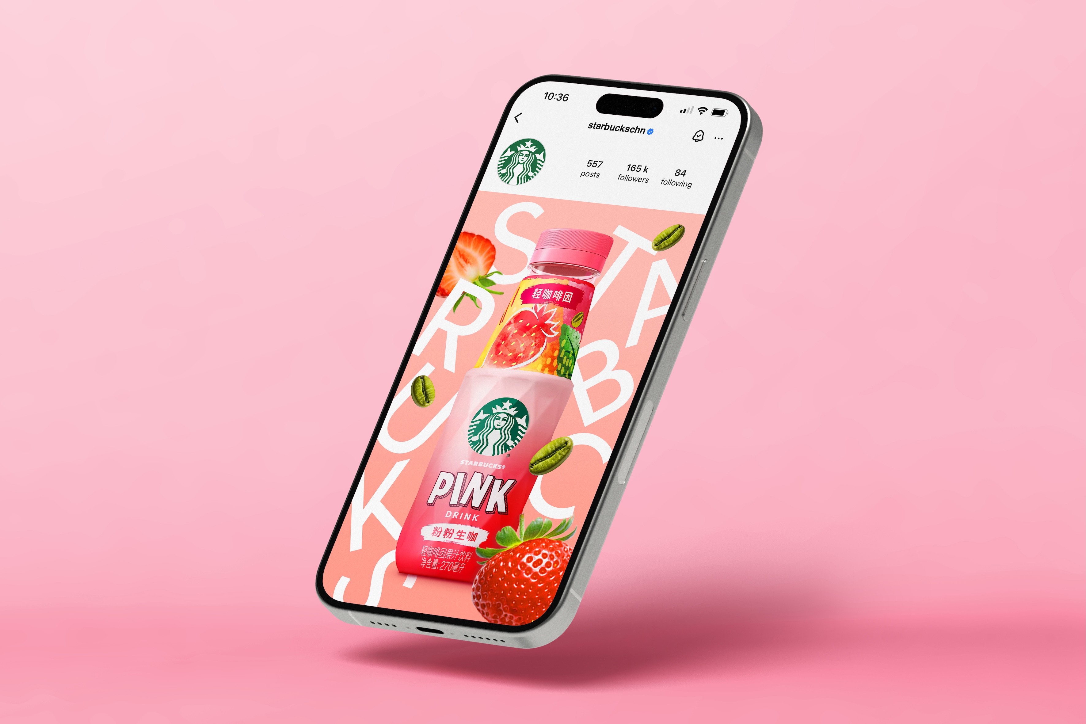
The innovative bottle shape exudes personality, reflecting the refreshing qualities of the juice through its dynamic texture inspired by fruit and signalling freshly squeezed goodness. The instantly iconic new shape also takes inspiration from the clean lines, tactility, precision and boldness of traditional coffee making accessories and equipment, such as the classic Italian stove-top Moka pot.
The label maintains key brand equities to tie in with the Starbucks RTD line while introducing distinct new elements: hand-drawn lettering for flavour names that brings a playful aesthetic to the bottle that fits more closely with the target audience’s tastes and sensibilities; abstract modern flavour patterns that enhance the bottle neck; and stronger colours for shelf impact and to suit local preferences.
“At Marks, our greatest strength is our holistic approach, combining brand strategy, semiotics, identity design and structural expertise with the ability to build cultural resonance,” adds Lye. “It’s what makes the Refreshers project so impactful. Together, bottle and graphics deliver an unexpectedly refreshing visual and sensory experience. They mark a significant investment to position the product as a disruptor in RTD beverage, offering excitement and newness in an extremely competitive environment.”
The new design is being launched today through the ecommerce campaign, Morning Coffee Afternoon Refreshers.
CREDIT
- Agency/Creative: Marks
- Article Title: Starbucks Redesigns Refreshers RTD to Maximize Impact in China and Reach a New Audience with a Bottle Shape and Graphic Identity by Marks
- Organisation/Entity: Agency
- Project Type: Packaging
- Project Status: Published
- Agency/Creative Country: Singapore
- Agency/Creative City: Singapore
- Market Region: Asia
- Project Deliverables: Art Direction, Brand Identity, Brand Redesign, Packaging Design
- Format: Bottle
- Industry: Food/Beverage
- Keywords: Starbucks, RTD, China, Fruit juice, Refreshers, Branding, Packaging, Design, Refresh, Redesign, Art Direction, Beverage, Marks
-
Credits:
Vice President, Design Greater Asia: Danny Lye


