Design Bridge – Starbucks Mooncakes
‘‘Design Bridge Shanghai create disruptive design for Starbucks Mooncakes
– Design balances bold disruption with cultural sensitivity to achieve standout and appeal to the next generation of Chinese consumers during the Mid-Autumn festival.
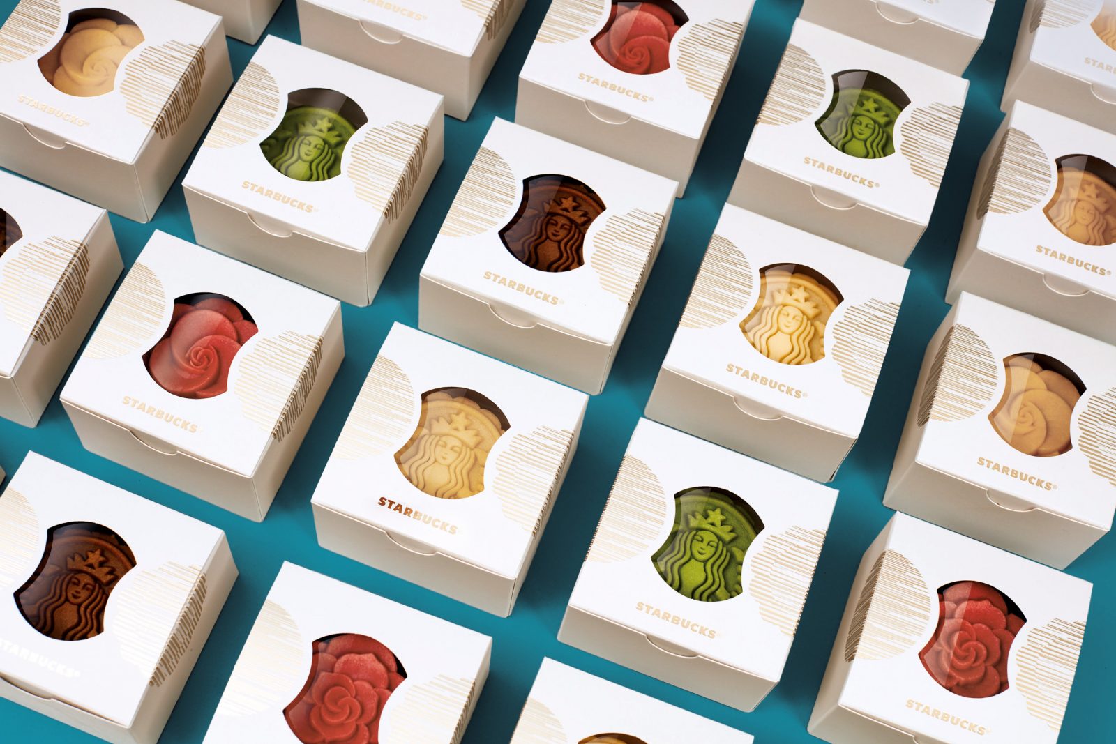
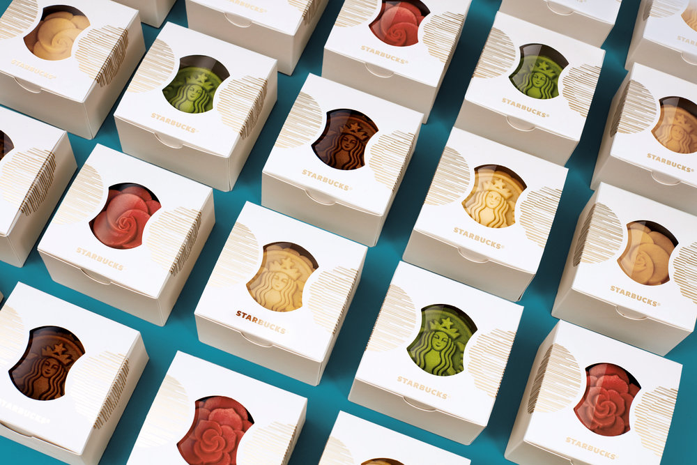
Shanghai, September 18th 2018: Design Bridge Shanghai has created a bold new graphic identity and packaging for Starbucks Mooncakes to build emotional connections with younger consumers across China. The new packaging uses a striking colour palette to disrupt traditional design codes while remaining culturally relevant, achieving crucial standout in the market during the Mid-Autumn festival, one of the most important Chinese festivals of the year.
Tom Gilbert, Creative Director of Design Bridge Shanghai, commented, “The Mid-Autumn festival is an annual harvest celebration centred around the moon and people coming together. Sharing mooncakes with your family and loved ones is an integral part of the festival, so it’s really important that your brand’s mooncakes stand out. Our challenge was to bring something new and exciting to the market that disrupted tradition whilst remaining culturally relevant and true to the Starbucks brand.”
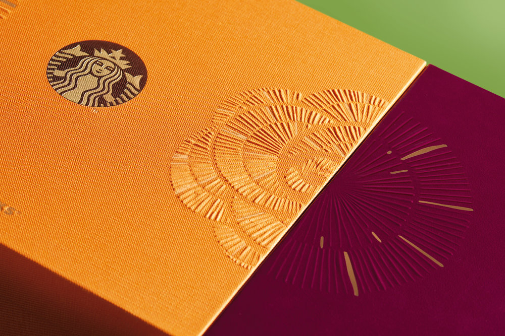
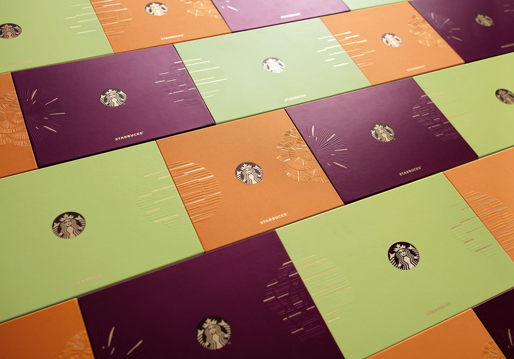
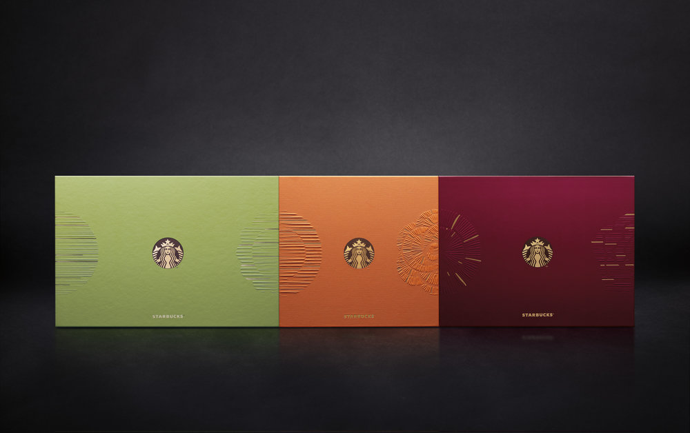
Design Bridge’s familiarity with local traditions and intuitive understanding of the Starbucks brand allowed them to take risks that others may not have dared to. For example, they chose a strikingly contemporary colour palette of lime green, rich orange and purple that challenges traditional design cues yet appeals to younger audiences seeking something new.
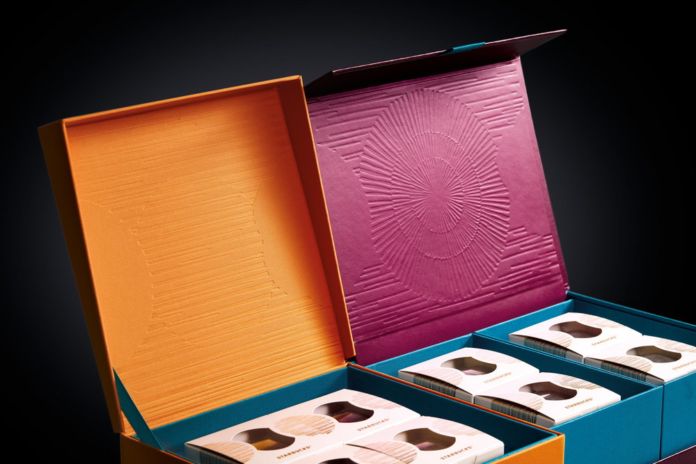
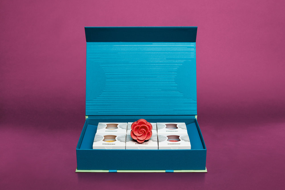
This has been balanced with a sensitivity to the cultural traditions of the festival. For example, the Chinese saying of “人月两团圆”, which translates to “The moon and the people are one”, inspired the creative idea throughout the project; bringing the moon, people and Starbucks together in one design. The packaging features circular ‘wood-cut’ designs, inspired by intricate hand-carved wooden mooncake moulds, which tessellate to make new circular patterns when boxes are displayed side-by-side. Meanwhile a menu card inside each box displays the two halves together as one. These details symbolise the idea of people gathering together with their loved ones during the Mid-Autumn Festival.
Tom Gilbert, Creative Director of Design Bridge, commented “Creating a design that combines cultural sensitivity and bold design choices has enabled us to create a genuinely distinctive offer for Starbucks in China. Our design adds something truly unique to the tradition of sharing mooncakes during the Mid-Autumn festival and enables Starbucks to build deeper emotional connections with a younger group of consumers.”
Starbucks Mooncakes is the first project to launch from Design Bridge’s Shanghai Studio, which opened earlier this year. The mooncakes are in store now, ready for the Mid-Autumn Festival on September 24th.”
CREDIT
- Agency/Creative: Design Bridge
- Article Title: Starbucks Mooncakes for Chinese Market
- Organisation/Entity: Agency Commercial, Published
- Project Type: Packaging
- Agency/Creative Country: United Kingdom
- Market Region: Asia
- Format: Box


