


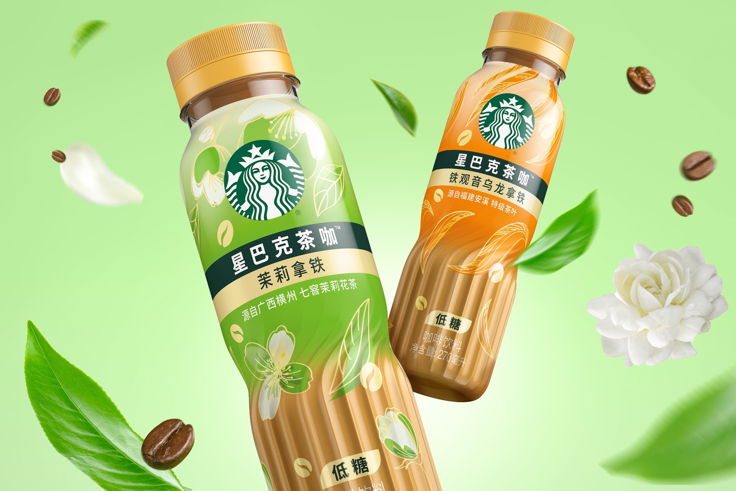
Starbucks is introducing an innovative and disruptive addition to its ready-to-drink (RTD) coffee line-up in China, featuring a new bottle design and visual identity created by global creative agency Marks. Starbucks Coffee Tea brings the emerging Coffee Tea category into the RTD mainstream by blending the finest coffee with the finest tea.
The goal is to disrupt the RTD sector, drive sales and adoption, and elevate brand awareness and equity—particularly around quality, authentic ingredients, taste appeal, and innovation. The new product series reinforces Starbucks’ coffee leadership across the region, while directly appealing to a discerning and quality-conscious audience.
Danny Lye, Vice President, Creative, Greater Asia at Marks, says: “Younger generations have evolving and diverse preferences, constantly looking into different flavours, occasions and trying to create new rituals. This has a huge impact on the RTD coffee category in China, making it fluid, hybrid and super competitive. Brands have to constantly think of new ways to engage consumers; whether through a new format, new bottle design or new extension into premium or innovative flavours.”
Appealing to refined tastes:
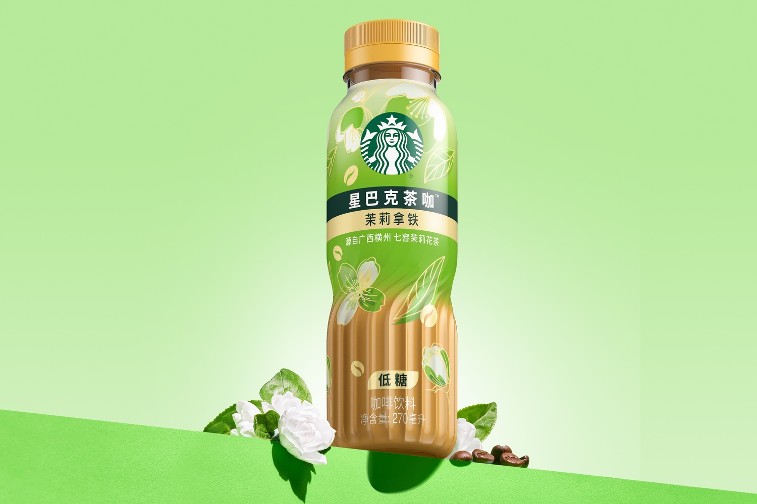
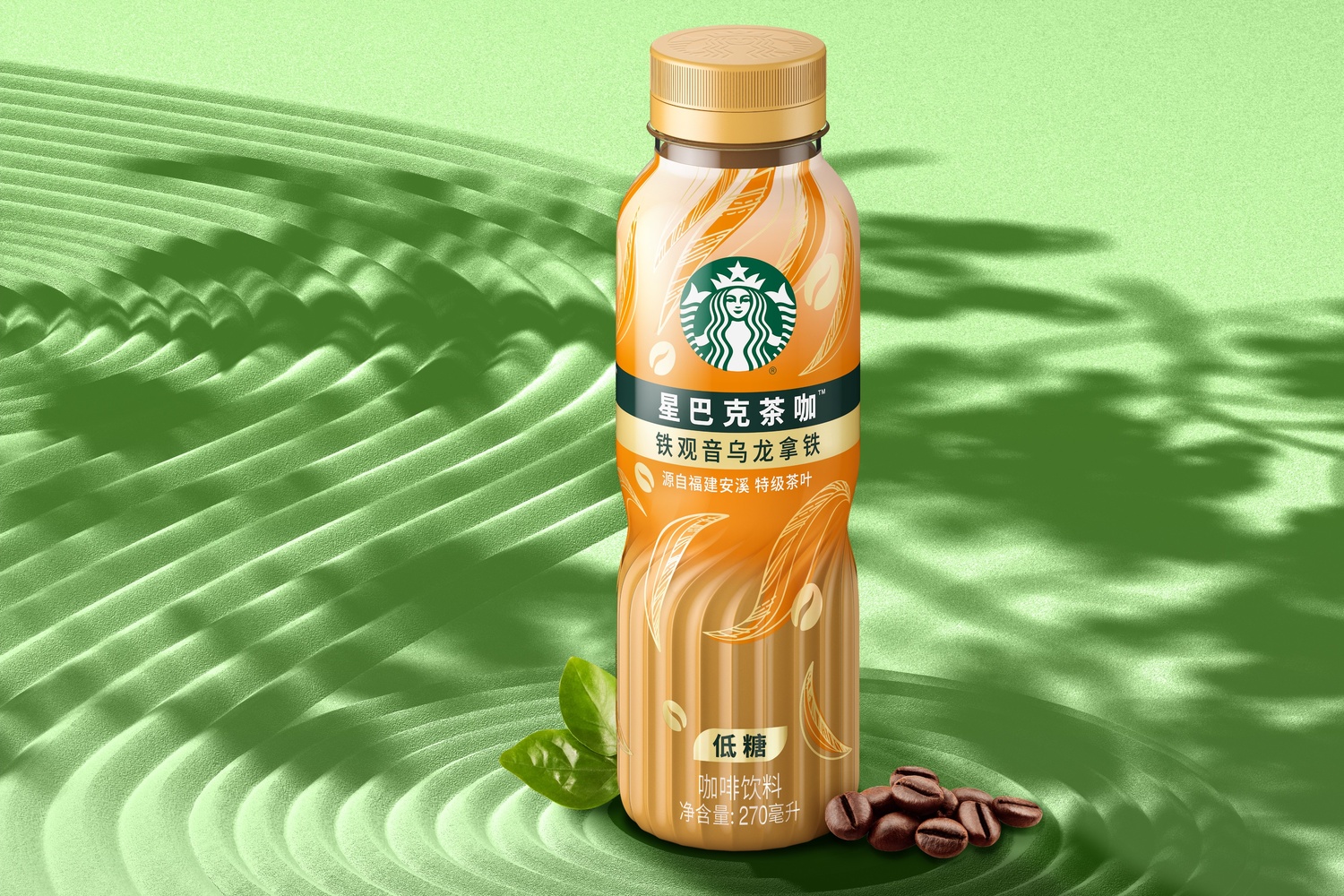
Unique and eye-catching, the design for Coffee Tea combines a sophisticated new bottle shape and elegant graphics to appeal to the target audience’s refined tastes and passion for simplicity and self-expression.
The textured base invites touch, adding depth and sophistication, with structural and graphic elements symbolising the fusion of two worlds: The transparent label, the blending of colours and the tactile twist in the bottle bring to life the subtle flavours and the vibrant dance between tea leaves and coffee beans.
The design includes visual elements such as a modernised depiction of tea leaves wrapping round the bottle to lend a refined touch; strong colours that add differentiation; a gold line to elevate and add a sense of premium; a translucent label that heightens elegance, boldly revealing the product colour to deliver significant cut-through compared to competitors. The label also reflects the product’s selling points, with a clear information hierarchy, while maintaining a cohesive family look with the existing Starbucks RTD portfolio.
Designed intentionally to trigger the senses, the bottle structure in hand conveys the movement, the blend of ingredients and flavours in a gentle swirl. The consumer can feel the texture and almost taste the product inside.
Lye adds: “Coffee Tea uses refined authenticity, a simple, pure, premium expression to minimise the noise and connect with consumers. It clearly conveys the flavours, the ingredients story and premium-ness of the product to drive differentiation in the market. It also shows the power impact of a holistic approach that considers structure and graphic design hand-in-hand.”
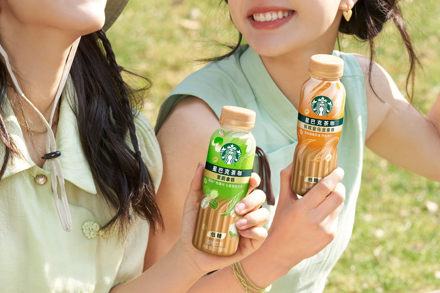
Coffee Tea is being launched this month through the brand’s digital channels.
CREDIT
- Agency/Creative: Marks
- Article Title: Starbucks Launches RTD Coffee Tea in China, With Bottle Shape and Visual Identity Designed by Marks
- Organisation/Entity: Agency
- Project Type: Packaging
- Project Status: Published
- Agency/Creative Country: Singapore
- Agency/Creative City: Signapore
- Market Region: Asia
- Project Deliverables: Brand Identity, Packaging Design
- Format: Bottle
- Industry: Food/Beverage
- Keywords: Starbucks, Coffee, Tea, RTD, China, Packaging Design, Brand Identity, Bottle Design
-
Credits:
Vice President, Creative, Greater Asia: Danny Lye


