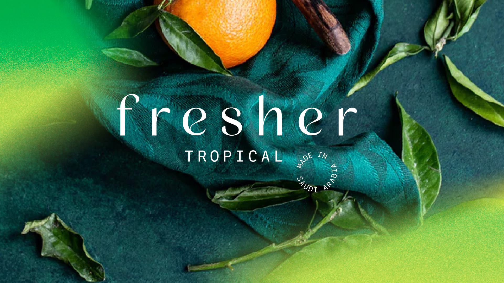
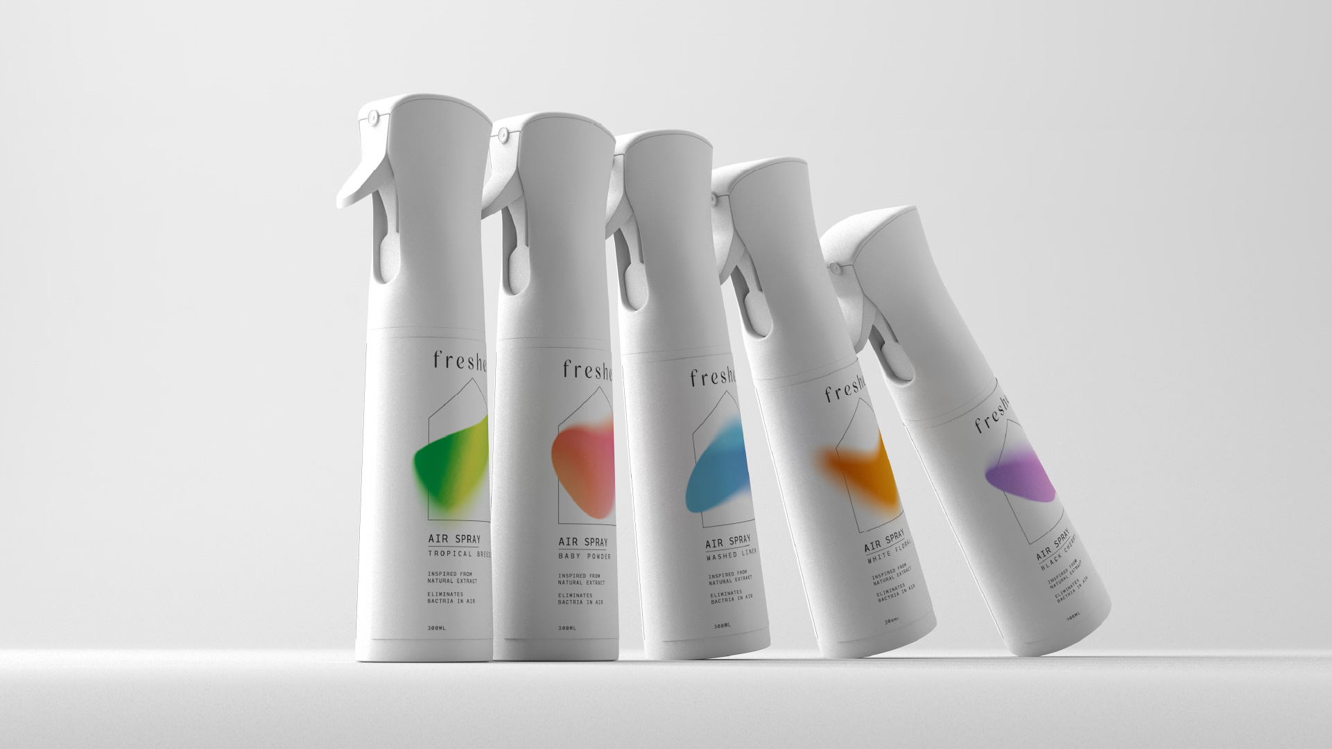
The fresher approached us to do the packaging and brand identity for them. Liquid scent is mixed by the local fragrance company in Jeddah, which was unique in the market. We wanted to highlight it as it was important for the owner of the brand. All the competitors on the shelf is the big well known brands with the quite generic and crowded design. We wanted to penetrate the market with minimalistic design that speaks directly to the consumers. With the tone of voice, we tried to be very informative and direct. We don’t talk about the unnecessary sales person talk. We wanted to show and tell how it is.
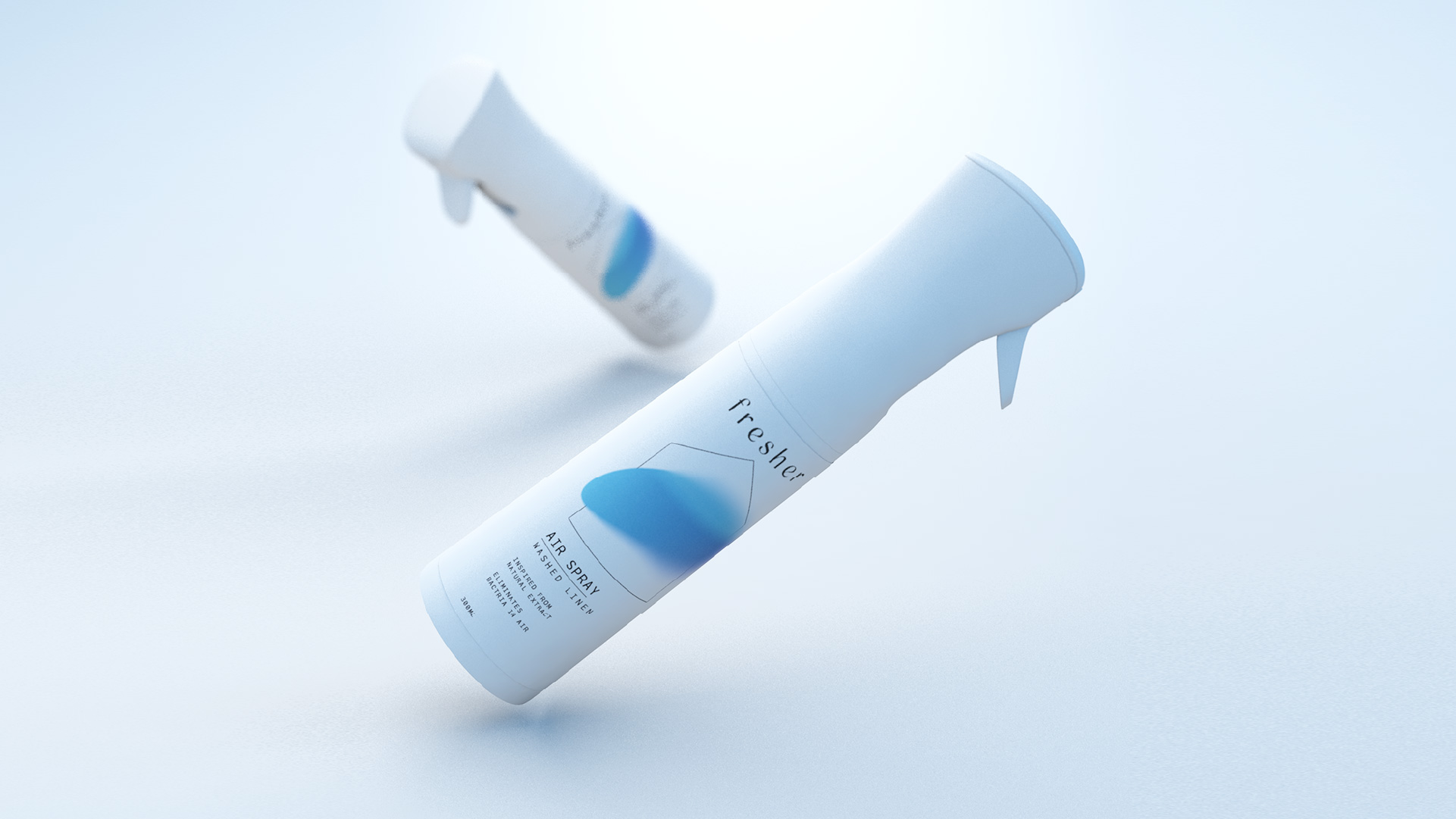
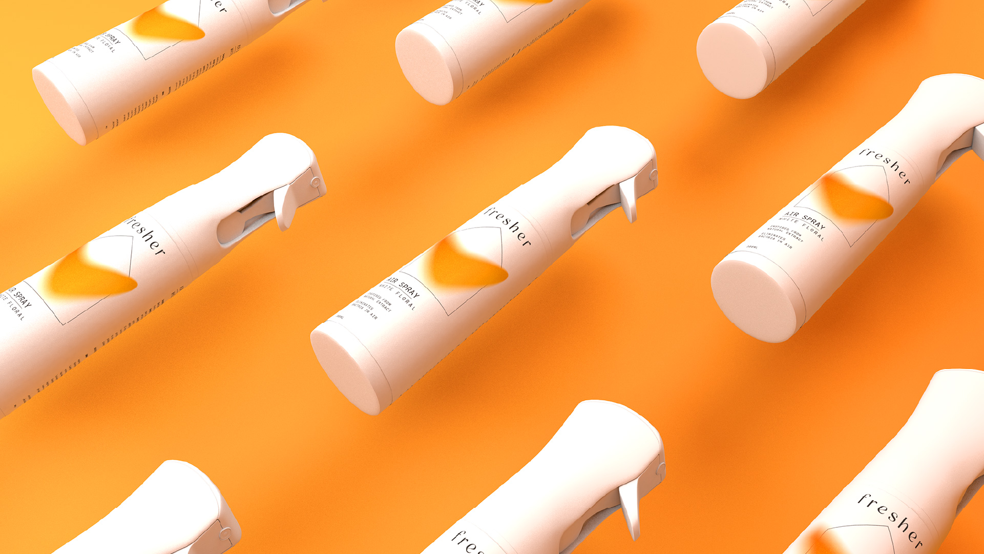
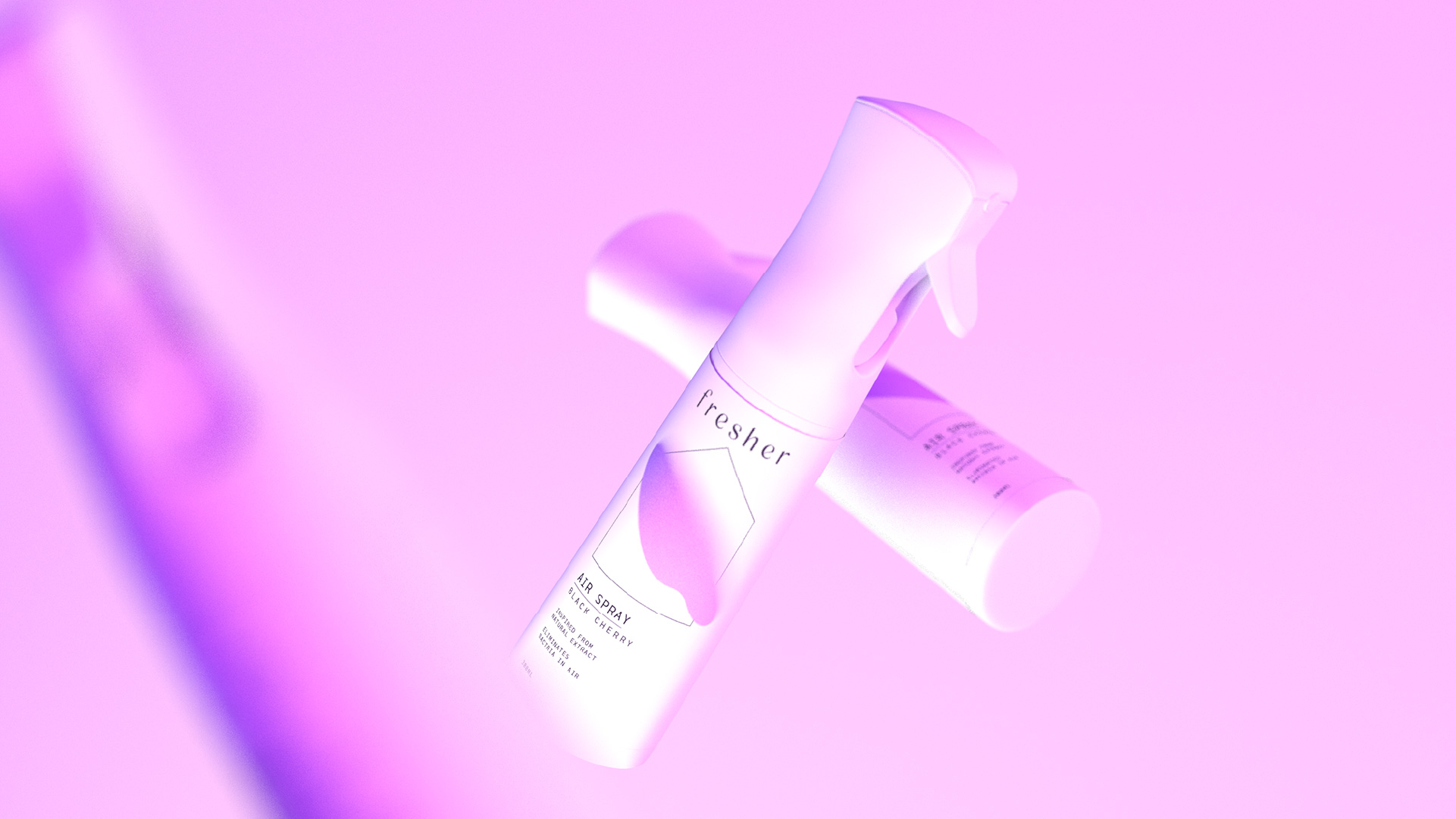
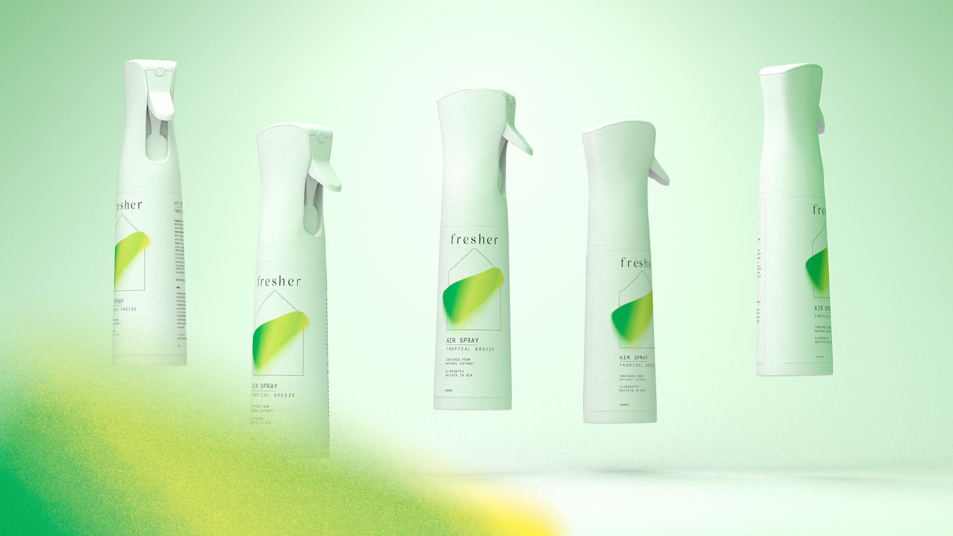
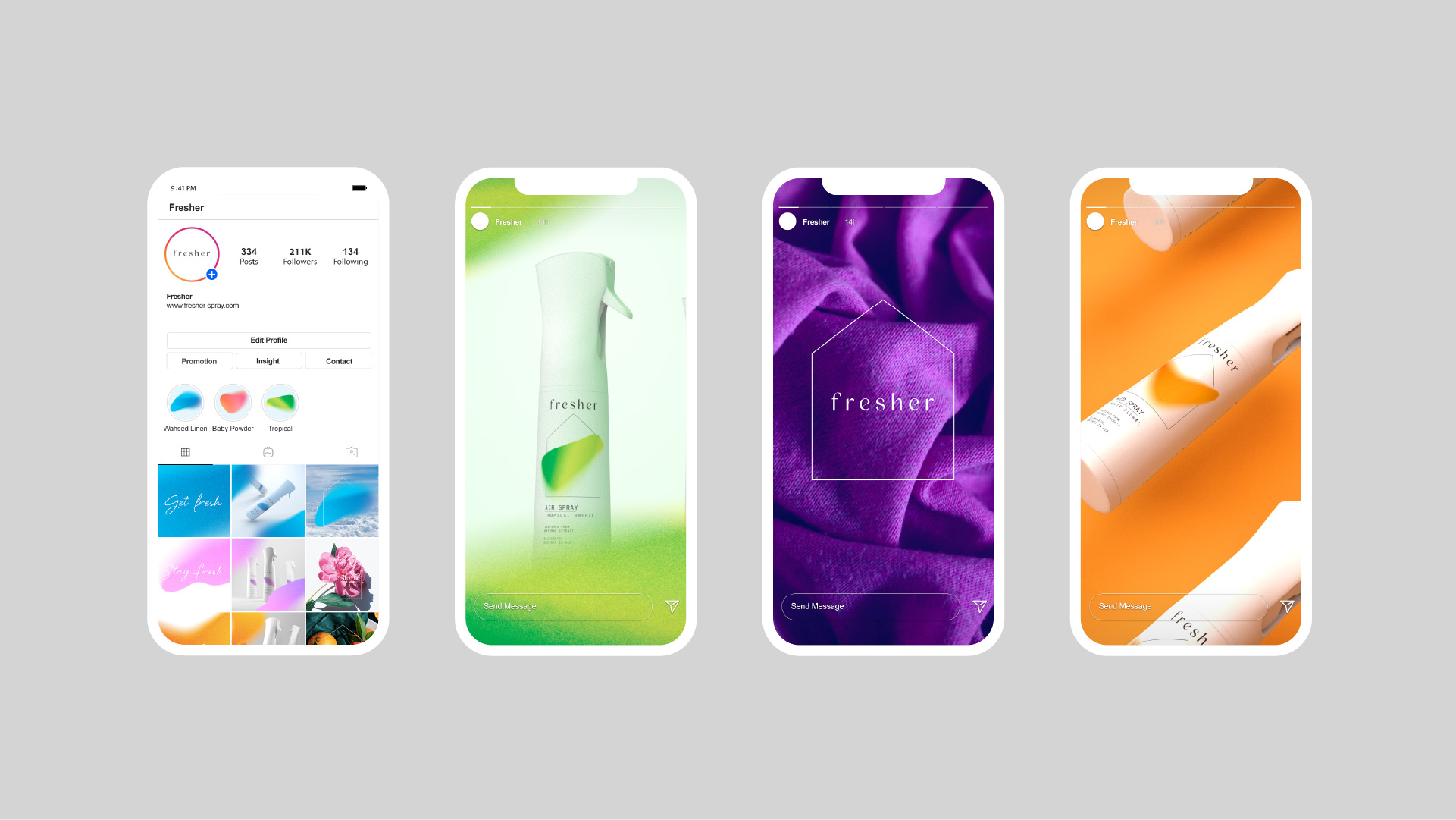
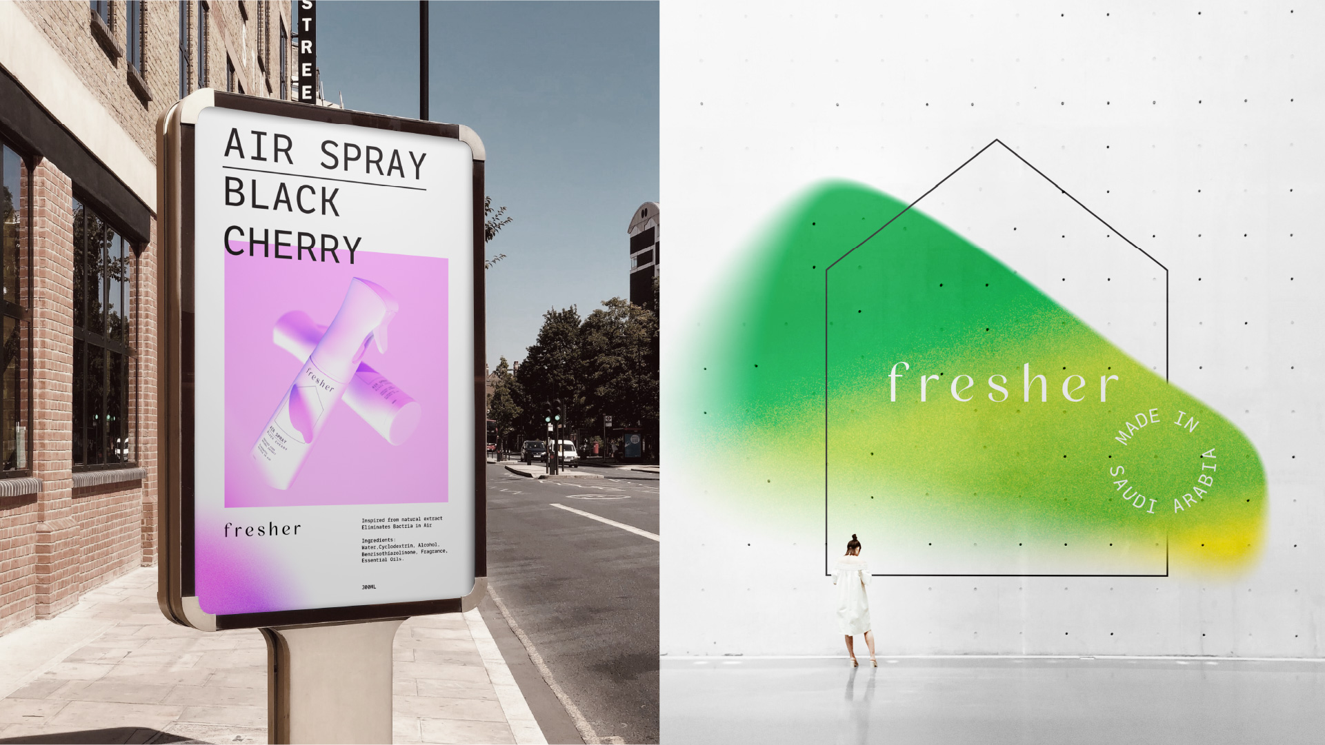
We designed Fresher to be simple and easy to understand what it is used for but also stand out in the shelf. That’s why we used simple line drawing house icon in the middle of the package. On top of the we added gradient / splash to capture the product itself and a lot of flavour scents. Spray paint gradient created not only the great contrast with the simple design but also the modernity and show how we do different things compared to the big brands. We are proudly produced locally, and we are honest about our ingridients.
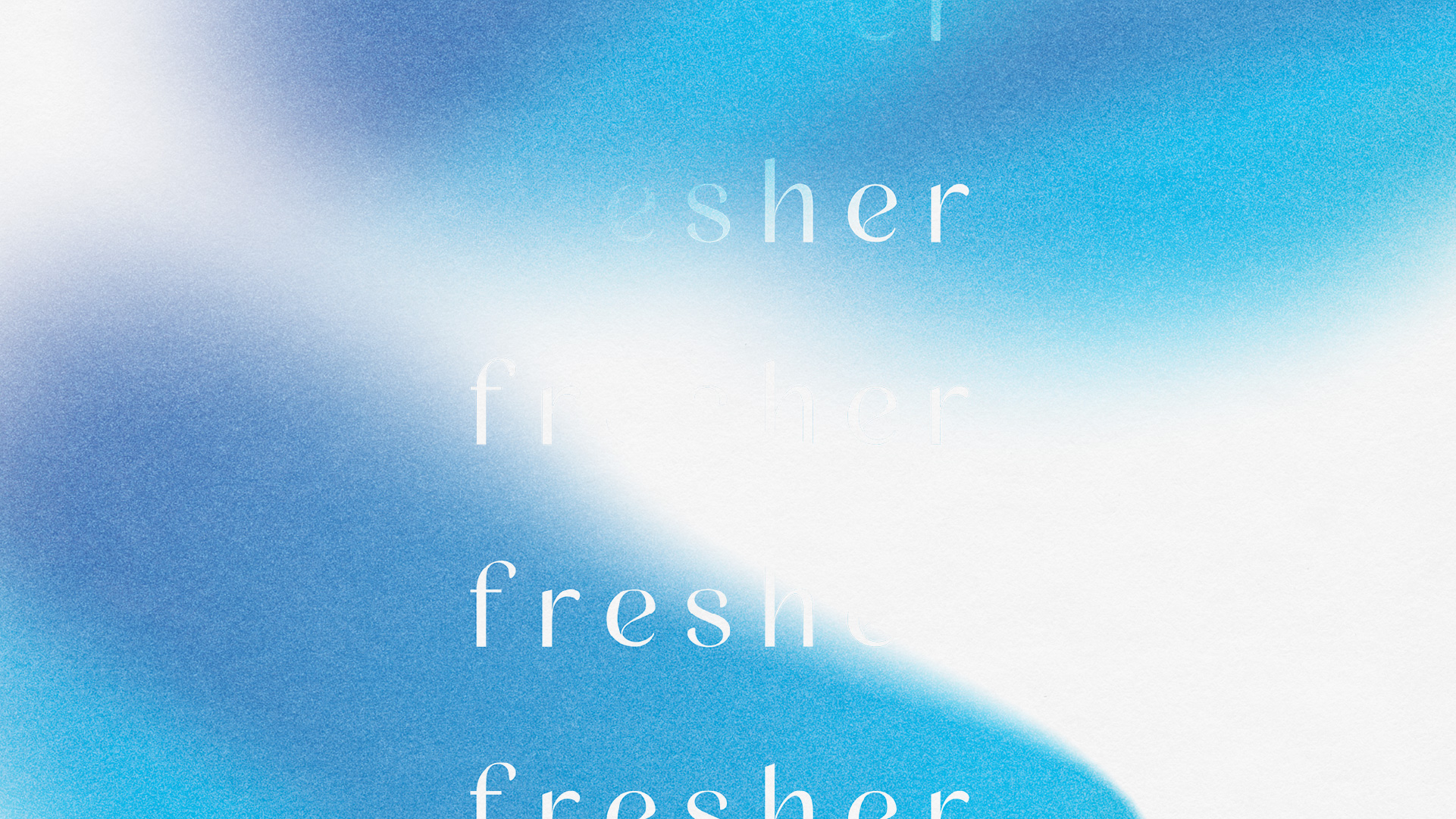
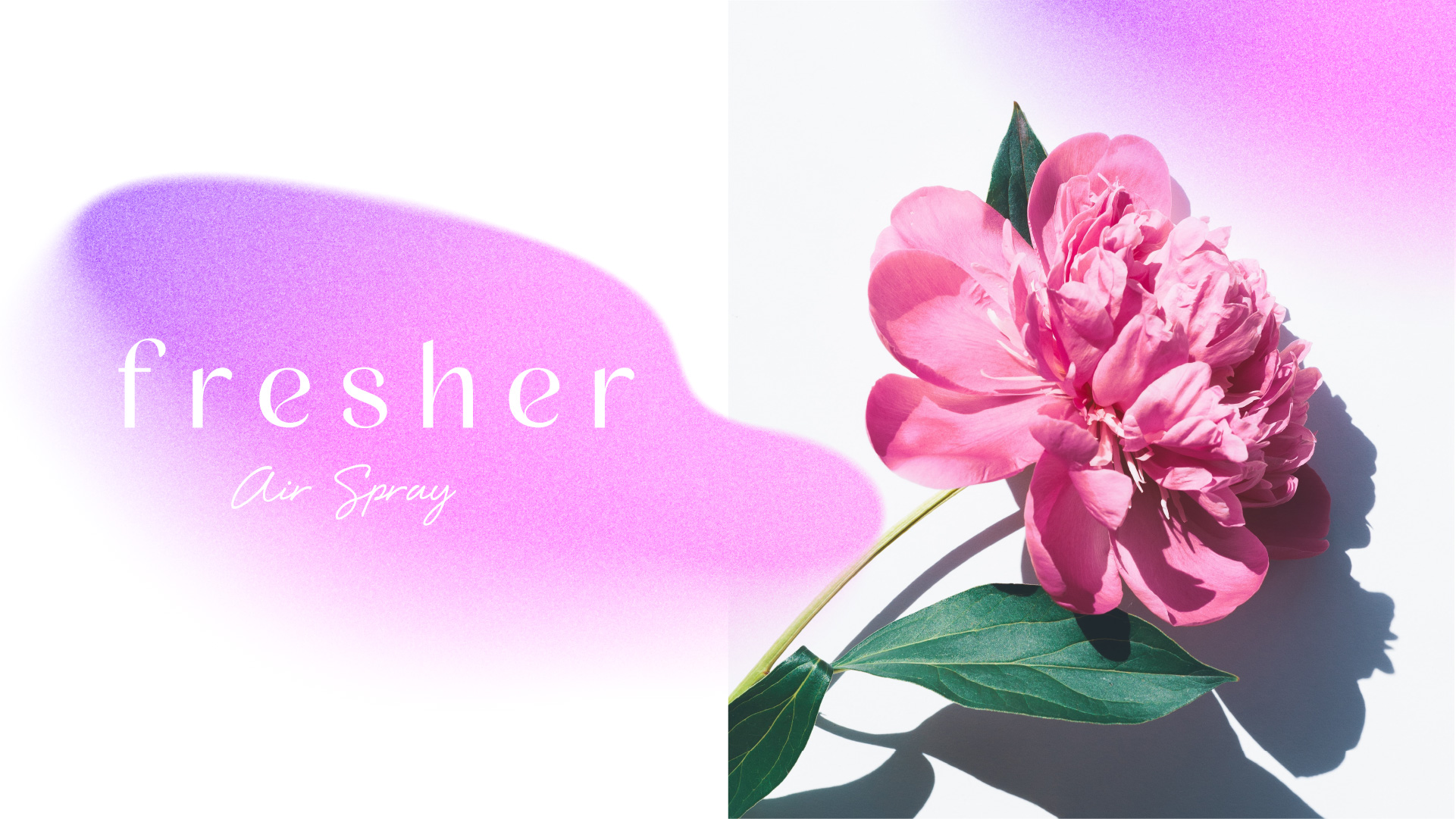
We crafted our logo to feel smooth, modern, and elegant which great contrast against systematic typography layout of information.
Especially on the letter “e”, we added nice curve to give more character to the logo. By using the simplifying to amplifying method of design thinking, we created something elegant yet bold that stand out in the market with modern twist.
CREDIT
- Agency/Creative: Stamp Works
- Article Title: Stamp Works Designs Fresher Air Spray for Fragrance Company
- Organisation/Entity: Agency
- Project Type: Packaging
- Project Status: Published
- Agency/Creative Country: Japan
- Agency/Creative City: Okayama
- Market Region: Middle East
- Project Deliverables: Brand Design, Packaging Design
- Format: Bottle
- Substrate: Plastic
- Industry: Hospitality
- Keywords: Simplify to amplify
-
Credits:
Designer: Jin Fujiwara


