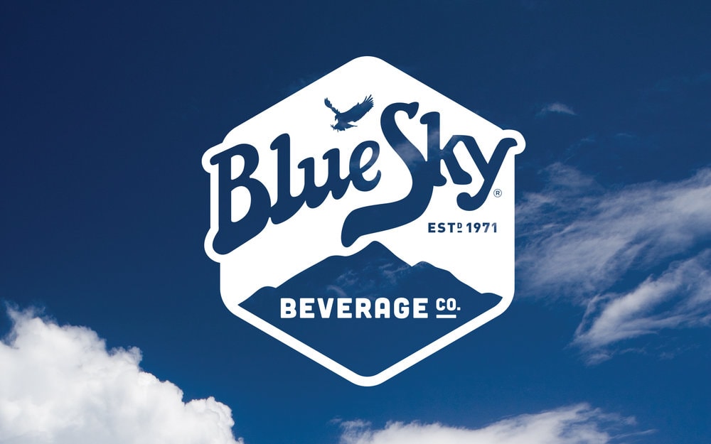
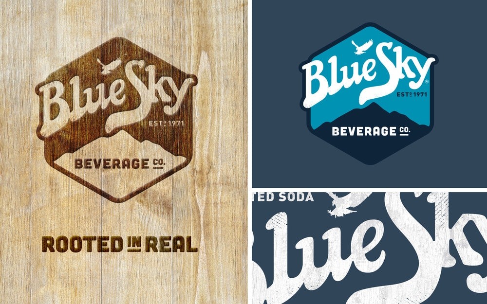
” Stag&Hare was challenged to create a platform for Blue Sky soda, a regional brand with heritage in the American Southwest, to communicate its unique craft story to a national audience.
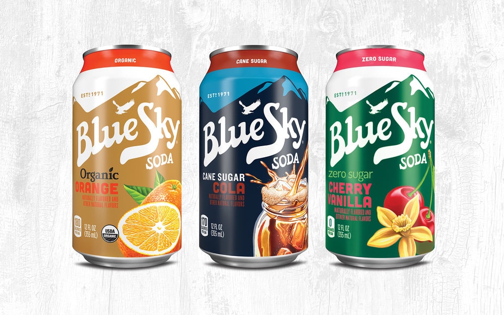
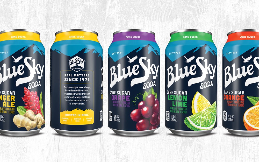
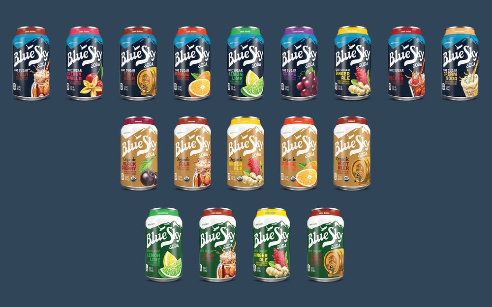
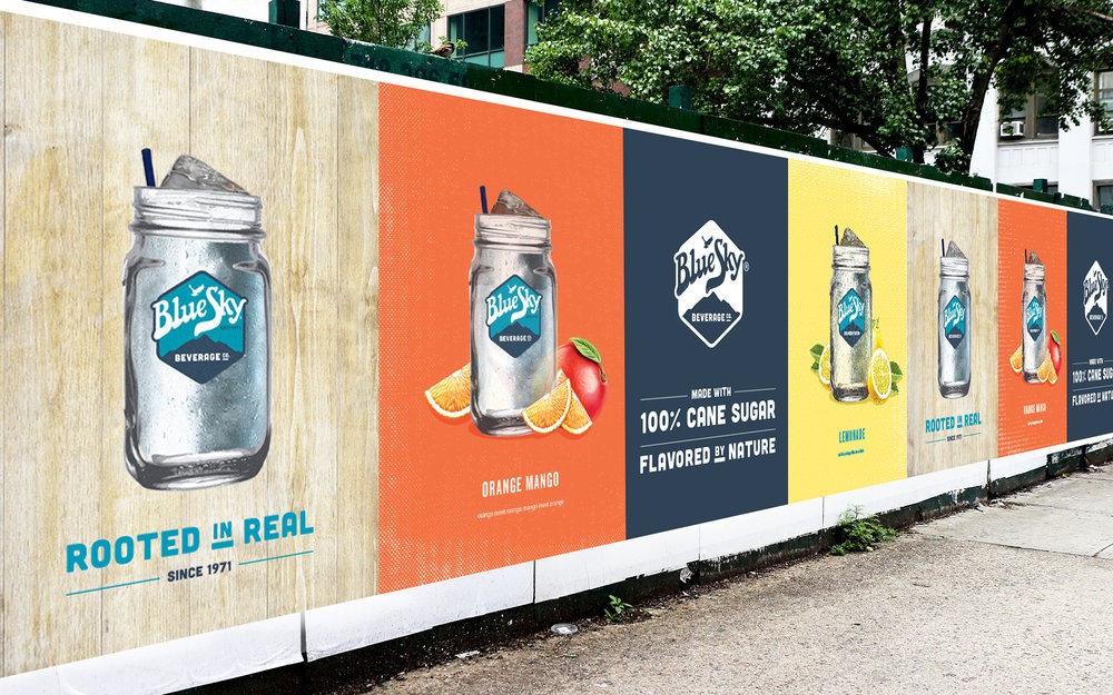
Understanding the consumer climate is increasingly focused on authentic, quality experiences the brand’s all-natural ingredients – pure cane sugar, natural fruit extracts, essences, and oils – allow the brand to fit within consumers’ “Better For Me” lifestyles. So, we crystallized Blue Sky’s brand idea as “Rooted In Real.”
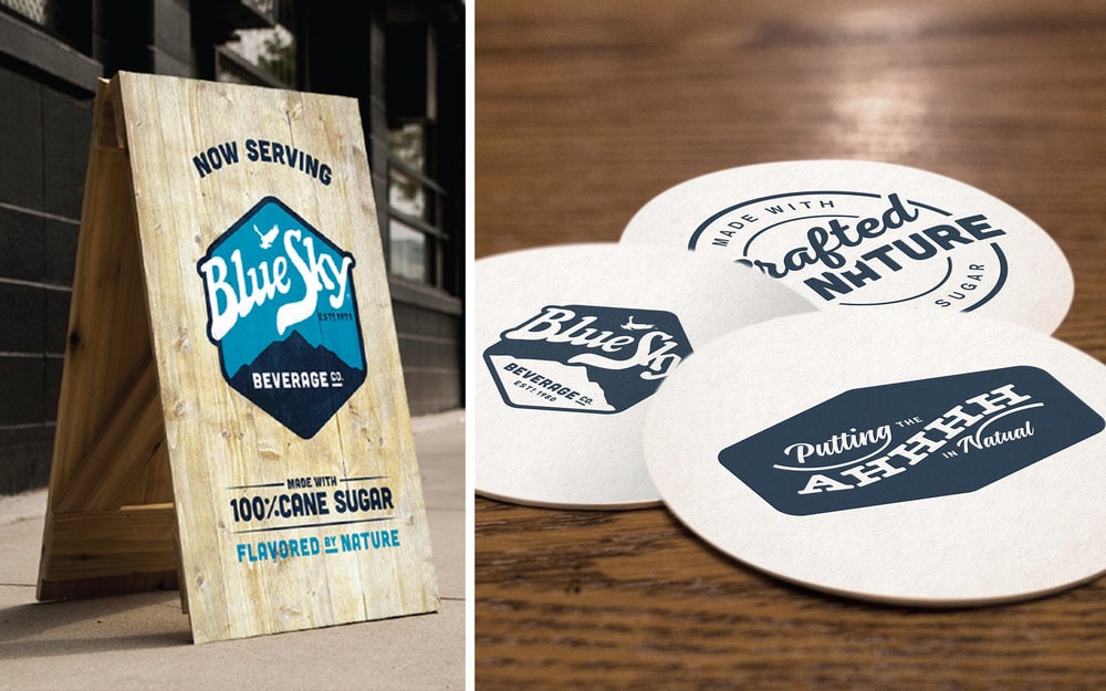
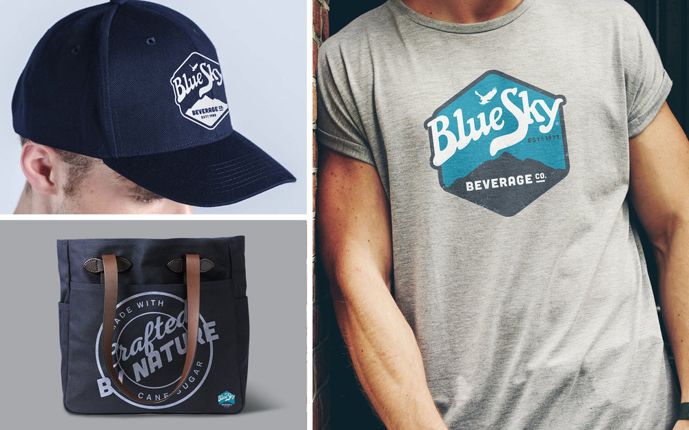
To give power to that idea in the marketplace, Stag&Hare developed a 360-degree expression of ‘real’ through a design language that included materials and finishes, color palettes, typography, photography, and illustration, as well as tone of voice.
“The design language,” says Andrew Kibble, Stag&Hare Founder and Creative Lead, “helps to bring to life the story of honest ingredients and true to nature philosophy at the heart of the brand. The identity expresses a spirit of freedom while retaining the longstanding heritage of the brand. The design system is anchored in a hand-crafted look and feel, evoking quality and simpler times.””