Introduction:
With a century-old legacy, Stadyard stands as a premier shipyard in Norway, specializing in the production of fishing vessels. Rooted in a hundred years of expertise, the shipyard has cultivated a unique “Sea Sense” — an intrinsic understanding of the sea’s nuances. The fusion of engineering prowess, shipbuilding craftsmanship, and the experience of seafarers is pivotal in creating vessels that embody sustainability. Stadyard’s brand essence is deeply entrenched in the spirit of the ocean and its formidable forces.
Visual Identity:
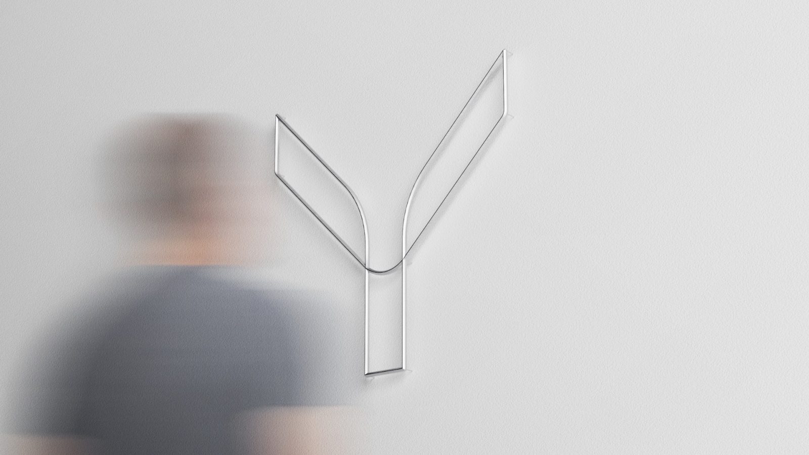
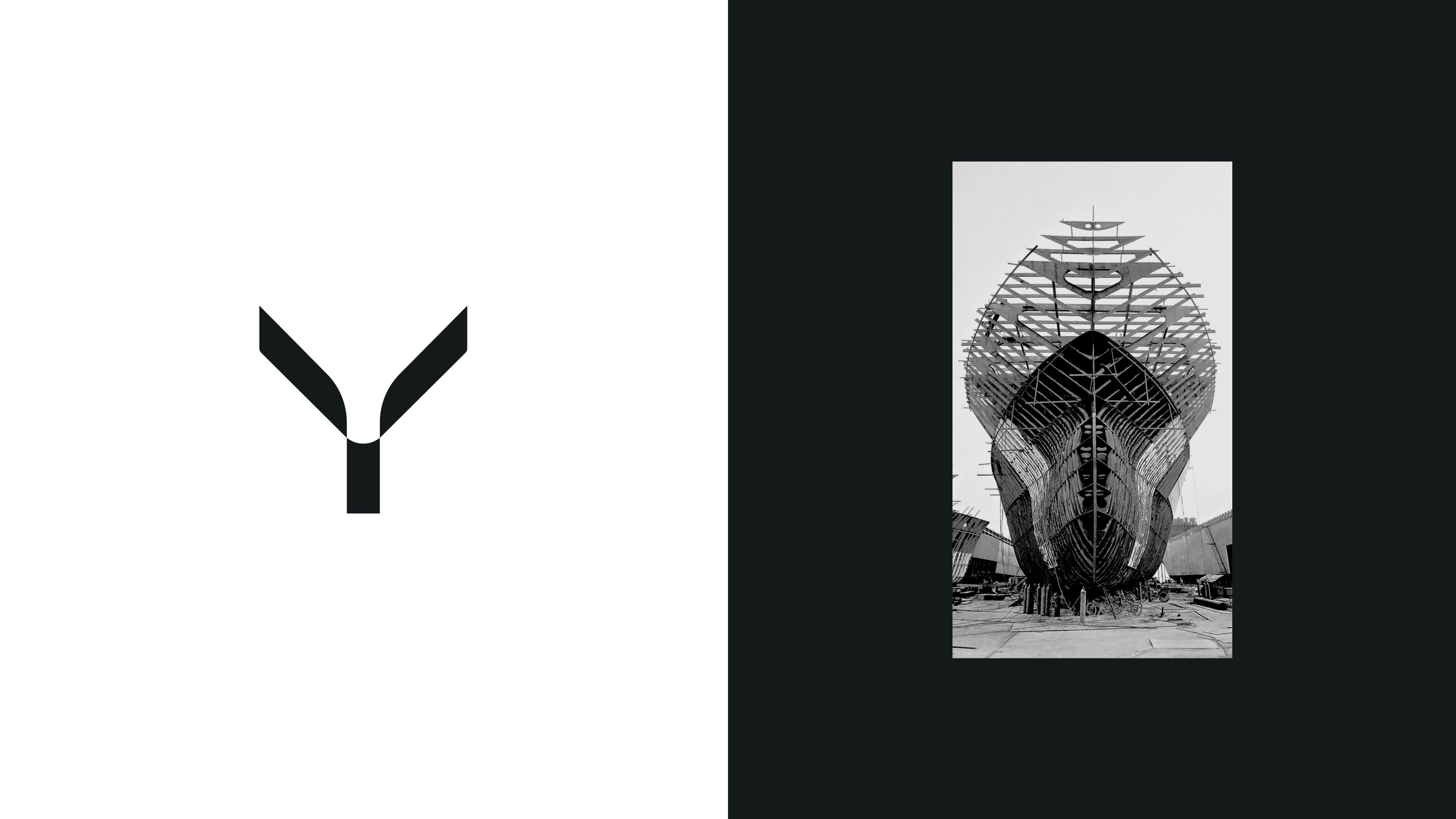
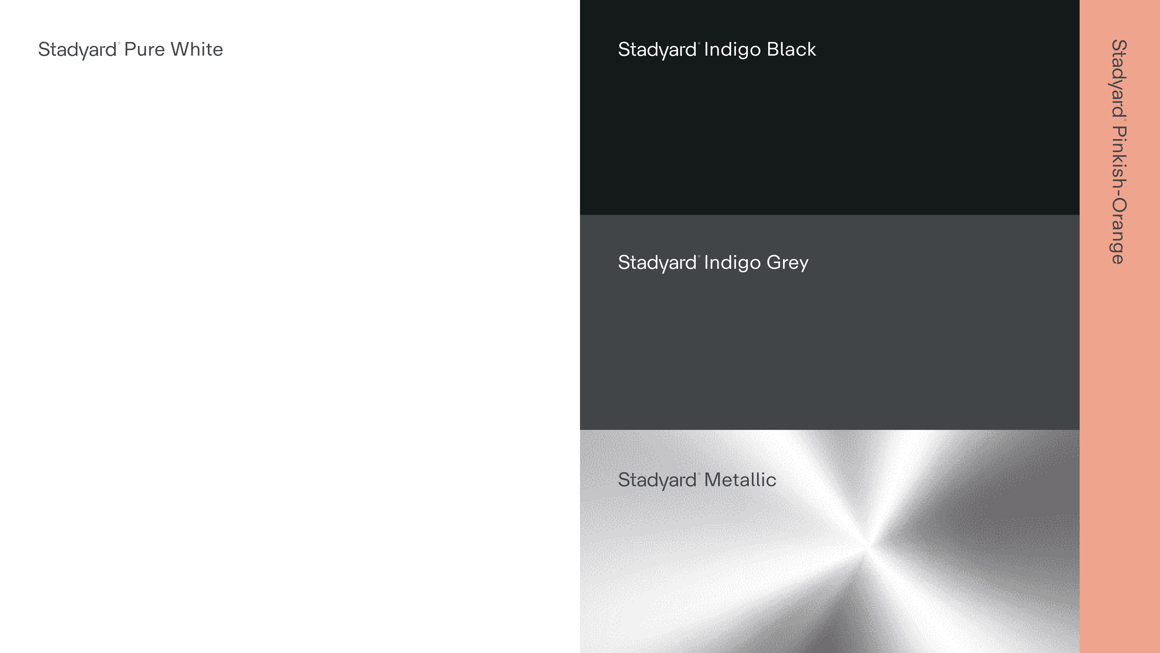
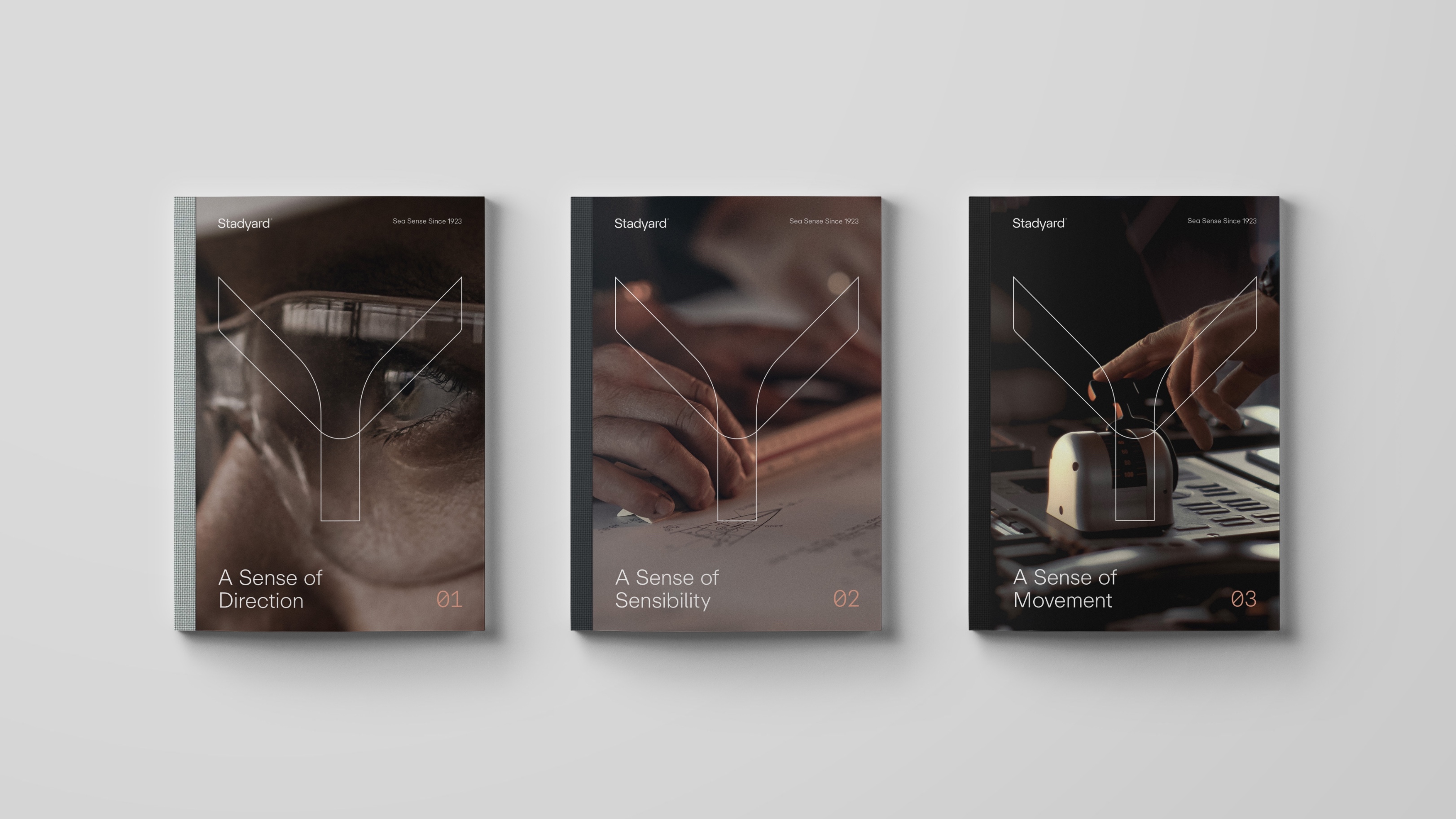
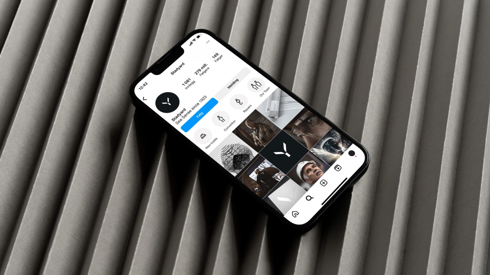
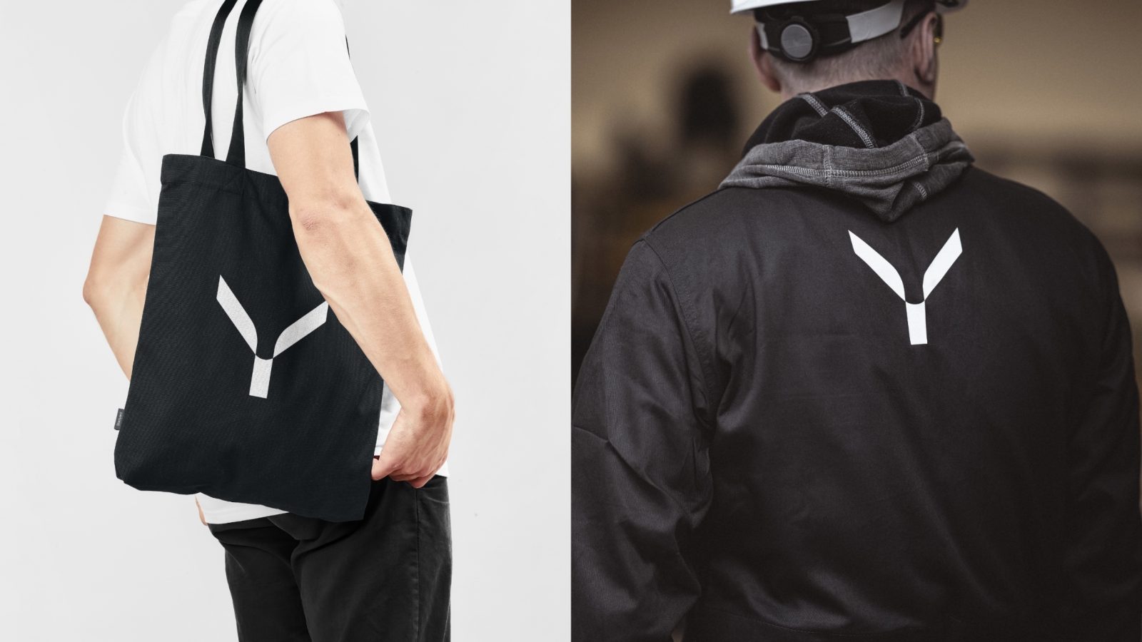
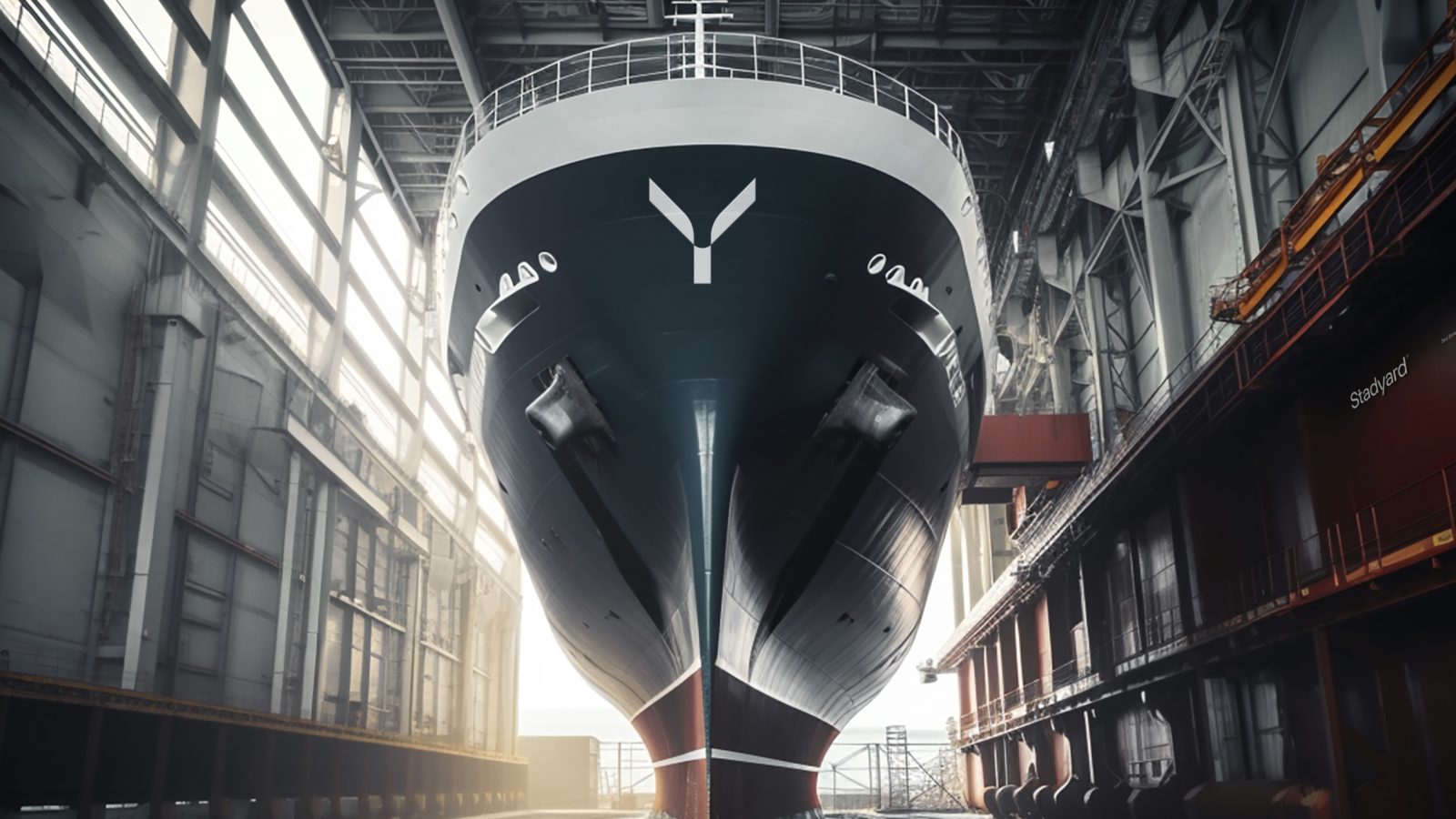
Stadyard’s iconic logo, shaped like a bow, serves as a visual representation of the backbone of boat construction. The custom typography complements the logo, creating a cohesive brand identity. The logo, whether in outline or filled form, captures the structural essence of a vessel’s construction. The color palette, featuring Indigo Black, Indigo Gray, and Silver, drawn from the shipyard’s palette, is accentuated with a warmer salmon pink, infusing a touch of warmth alongside skin tones in photography. The picture mark draws inspiration from ship bows, structural ribs, and breaking waves, symbolizing progress and determination.
Typography and Layout:
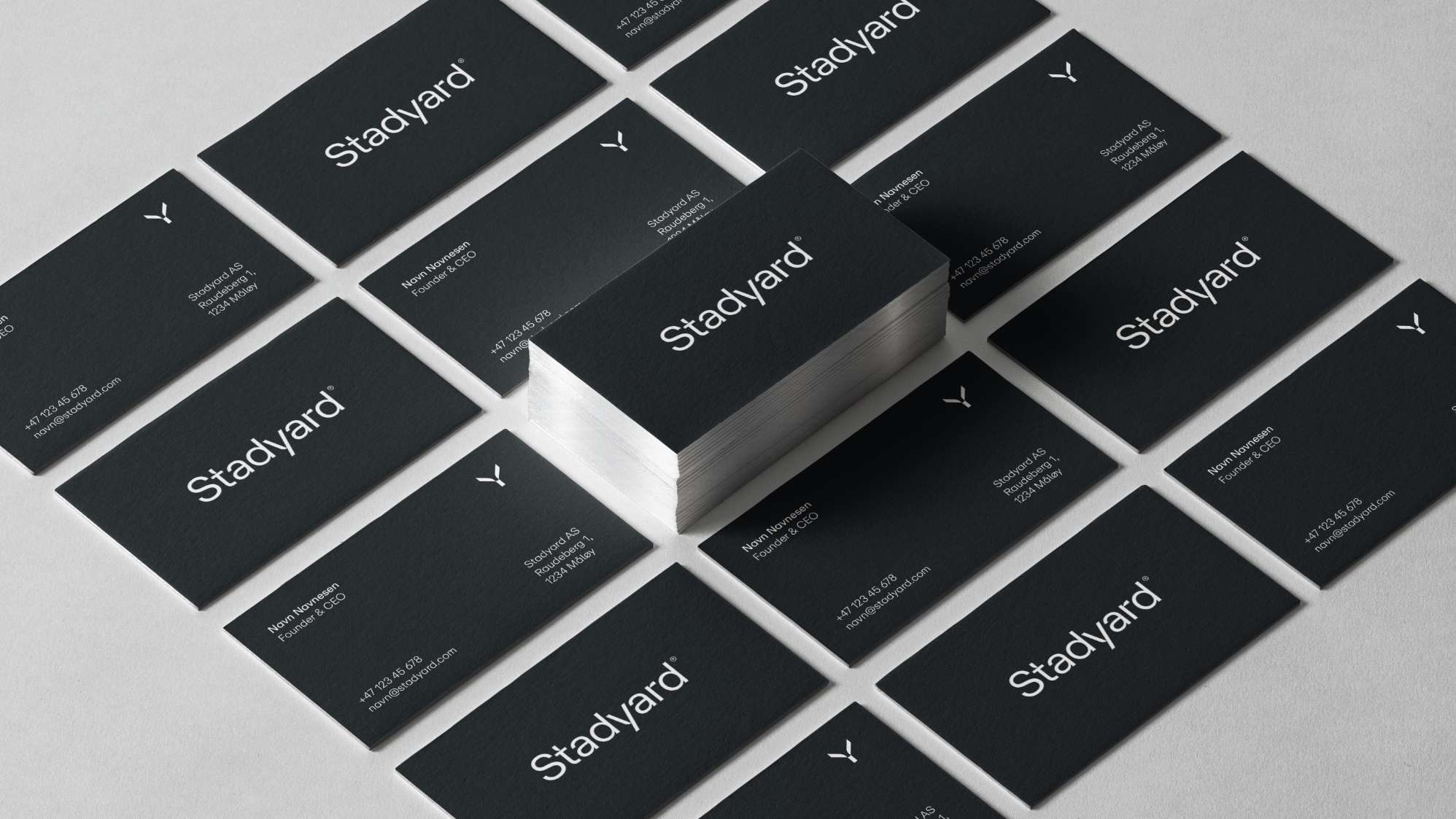
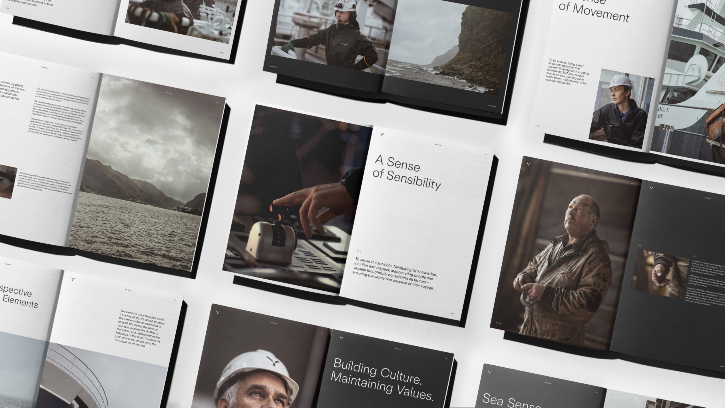
The logotype mirrors the structural build-up of the picture mark, constructed like building blocks to form an iconic wordmark. The chosen font, Repro, is a friendly and flexible sans serif inspired by signage and digital operating systems. It seamlessly merges clean design with intricate font engineering. The layout system adopts a structural square pattern, achieving a balance between structure and agility.
Image Style:
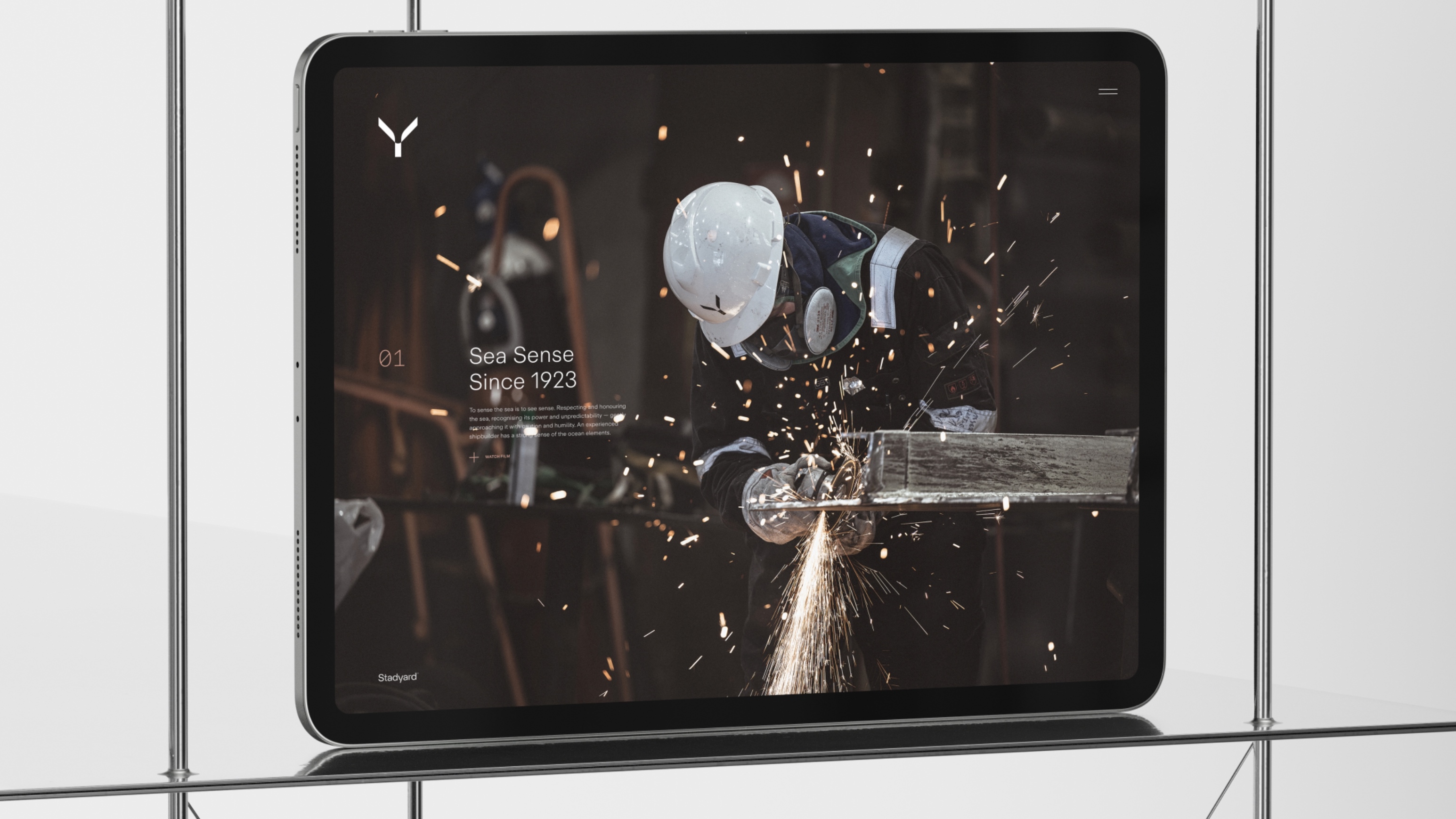
The image style focuses on the duality of a human-centric and product-oriented approach. The warm and pleasant grading enhances the visual narrative, bringing out the essence of craftsmanship and maritime heritage.
Communication and Slogan:
“Sea Sense Since 1923” encapsulates Stadyard’s enduring connection with the sea and the wealth of knowledge accumulated over a century. This succinct slogan communicates not just a legacy but an ongoing commitment to maritime excellence.
In summary, Stadyard’s branding journey is a testament to a rich maritime heritage, encapsulating the craftsmanship, engineering prowess, and Sea Sense that define its century-long legacy. The visual identity, typography, and communication strategies harmoniously come together, creating a timeless brand that echoes the enduring spirit of the sea.


CREDIT
- Agency/Creative: KIND (Conceptual Branding AS)
- Article Title: Stadyard Brand Redesign
- Organisation/Entity: Agency
- Project Type: Identity
- Project Status: Published
- Agency/Creative Country: Norway
- Agency/Creative City: Bergen
- Market Region: Europe
- Project Deliverables: Brand Identity
- Industry: Food/Beverage
- Keywords: WBDS Agency Design Awards 2023/24
- Keywords: Identity, Brand Redesign ,
-
Credits:
Chief Creative Director: Tom Emil Olsen
Design Director: Knut Harald Longva
Senior Designer: Bju00f8rn Ivar Thomassen
Senior Designer: Agnieszka Gawlik
Senior Designer: Emil Olsen
Senior Designer: Saurabh Kumar
Senior Designer: Lorenzo Galbiati
Graphic Designer: Mihail Mihaylov
Graphic Designer: Tiare Hernández Payano
Graphic Designer: Clara Auda
Graphic Designer: Piotr Deres
Video/Photographer: Isak Norum
Cinematographer: Stian Servoss
Director of Photography: Christoffer Meyer
Key Account Manager: Beate Myren Romslo
Key Account Manager: Marianne Erdal Holm
Project Manager: Laure Mediavilla
Strategic Brand Director: Thomas Danielsen
Strategic Brand Consultant: Jan Willy Skjølberg
Strategic Brand Consultant: Brede Lie Reime


