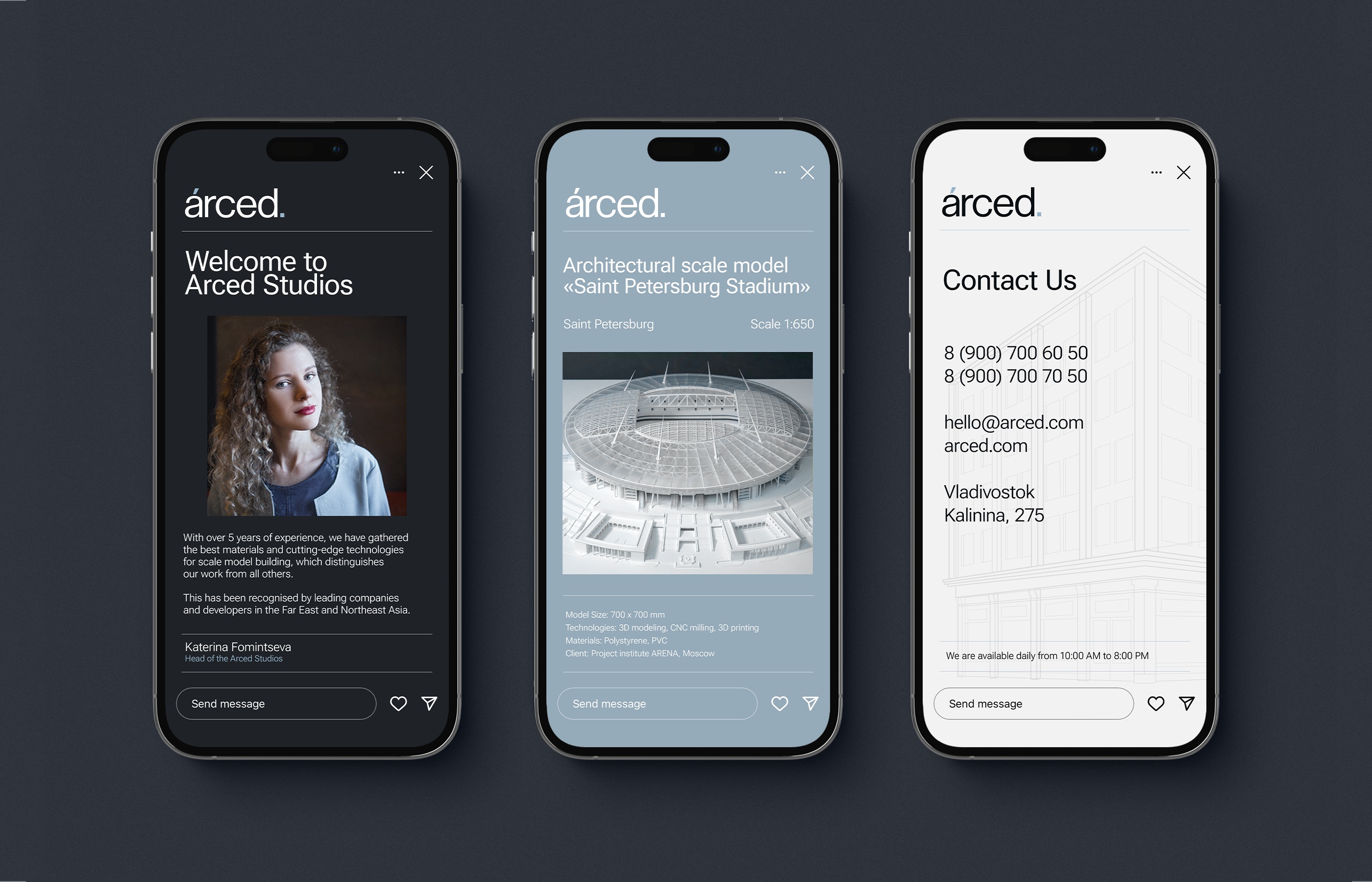
Arced is a renowned scale model-making studio based in Vladivostok. With over 5 years of experience, they have gathered the best materials and cutting-edge technologies for scale model building, which distinguishes their work from all others. This has been recognised by leading companies and developers in the Far East and Northeast Asia.
Throughout the extensive work on this project, there have been crafted both a new catchy, memorable brand name and an impactful modern visual brand identity.
The brand name “Arced” directly translates from English as “in the shape of an arch”. The arch itself always symbolises elegance, a celestial vault, and the beginning of something new — just as a scale model often represents a project of future realisation. Also, the name combines “Arc” from Architecture with “Ed” — a suffix that conveys ownership or affiliation. Thus, ‘Arced’ carries the meaning of “architectural” or “related to architecture.” The name is concise and elegant because of its open vowels, and has a solid feel due to the resonant consonant ‘d’ at the end.
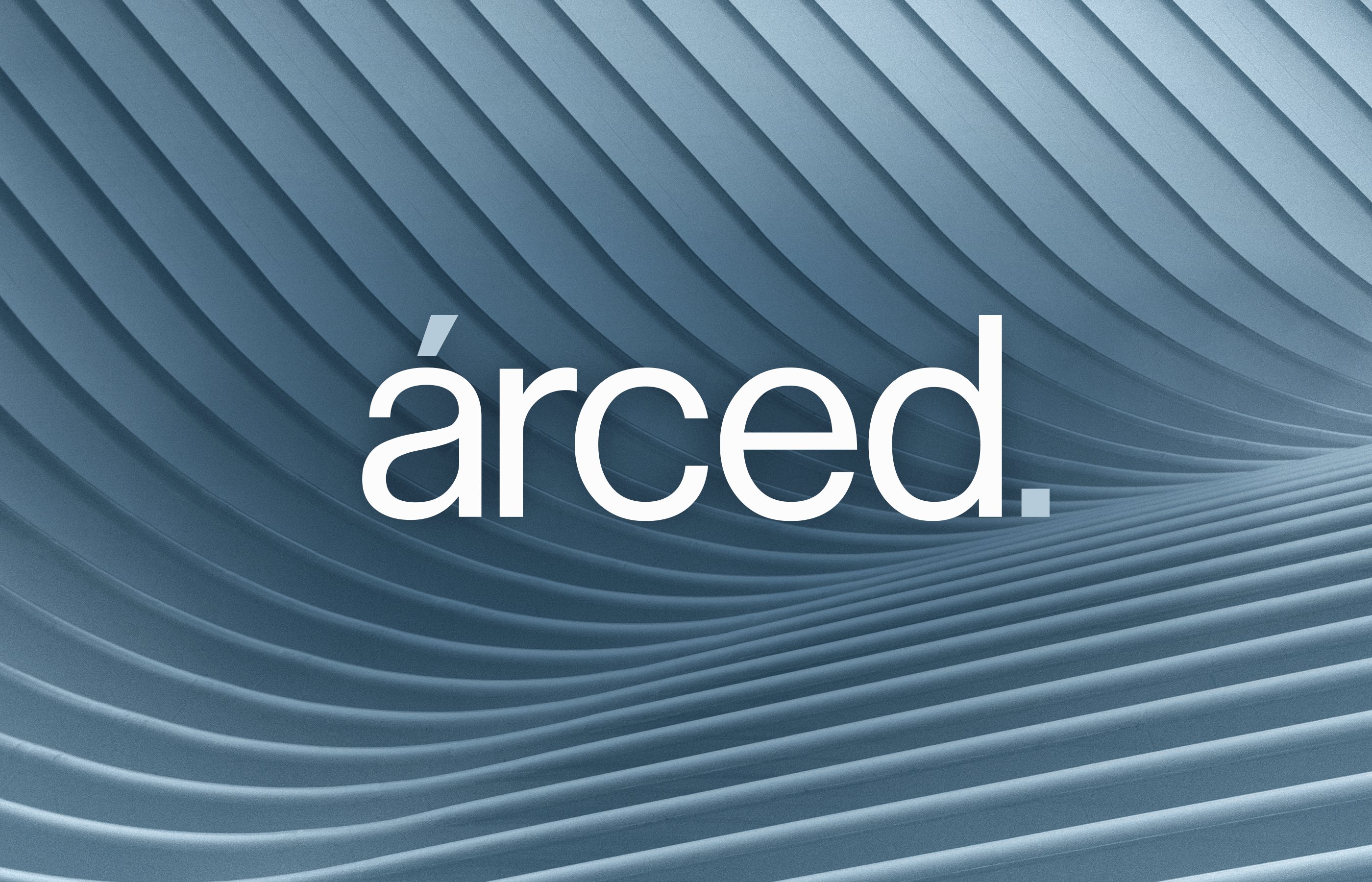
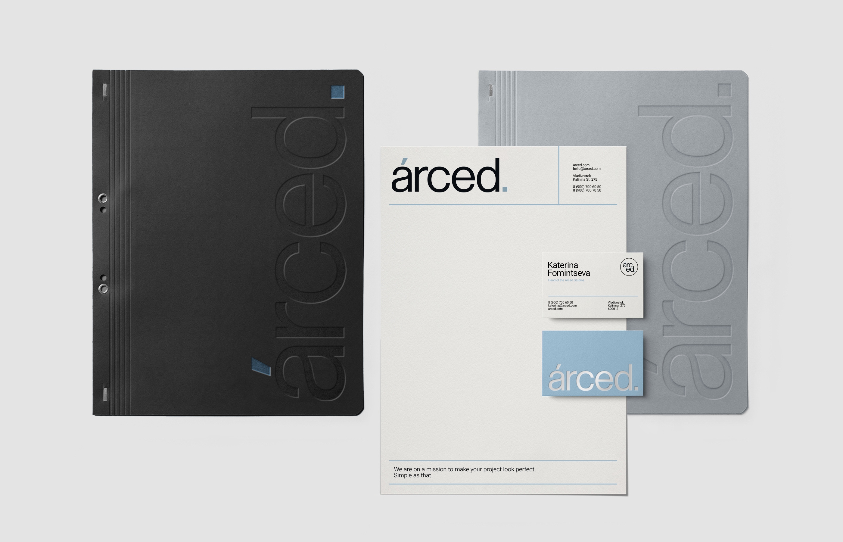
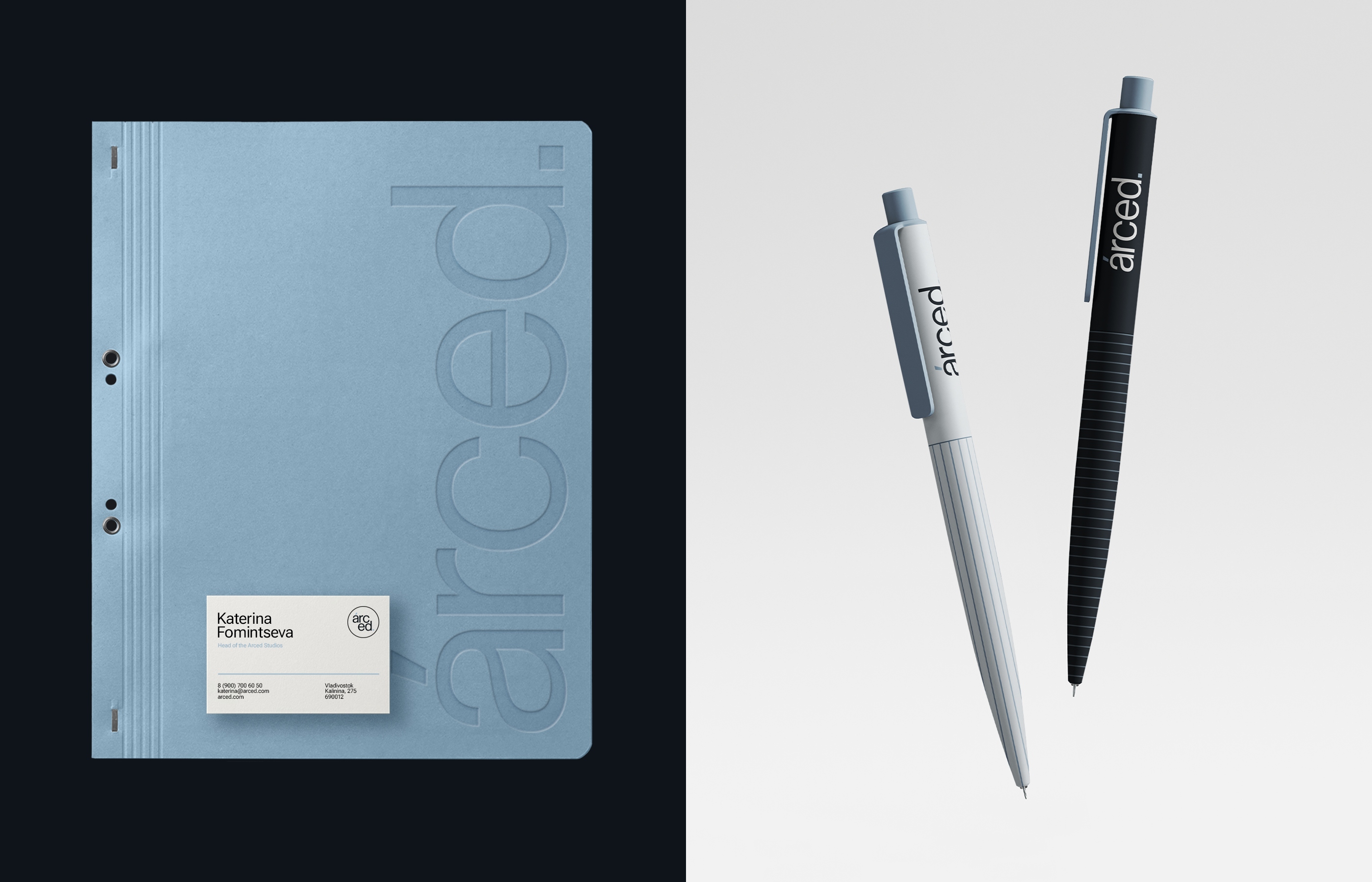
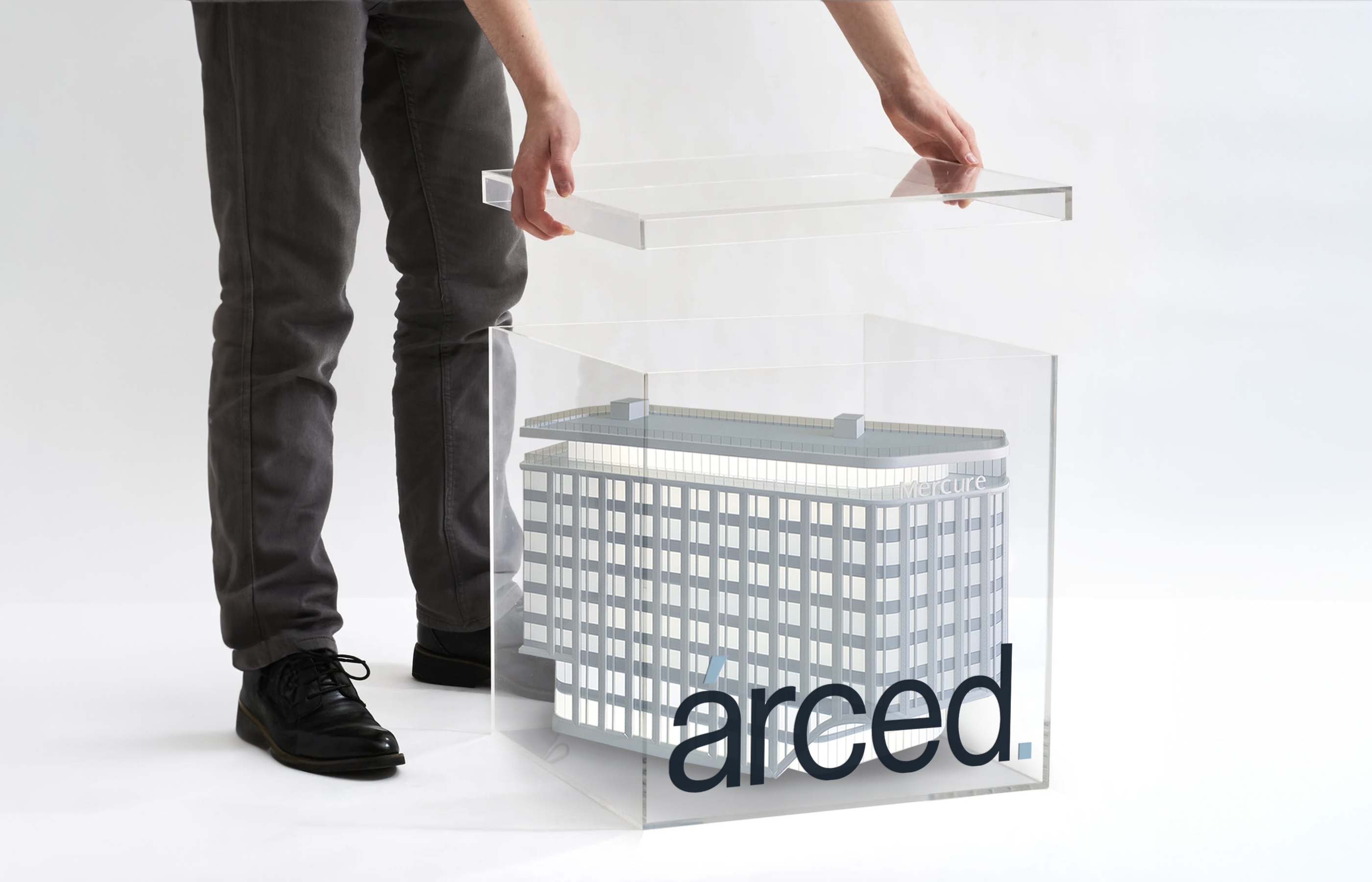
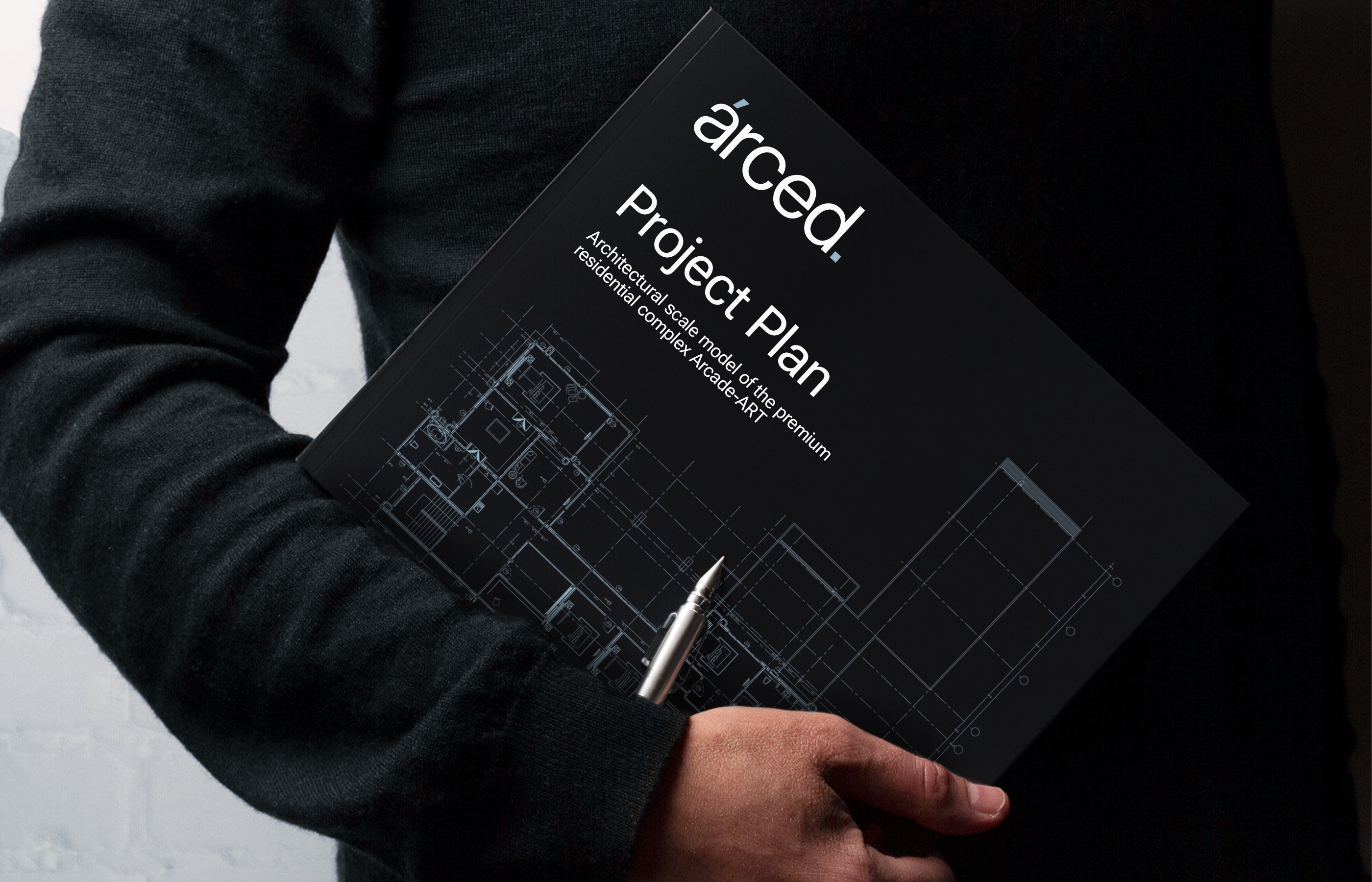
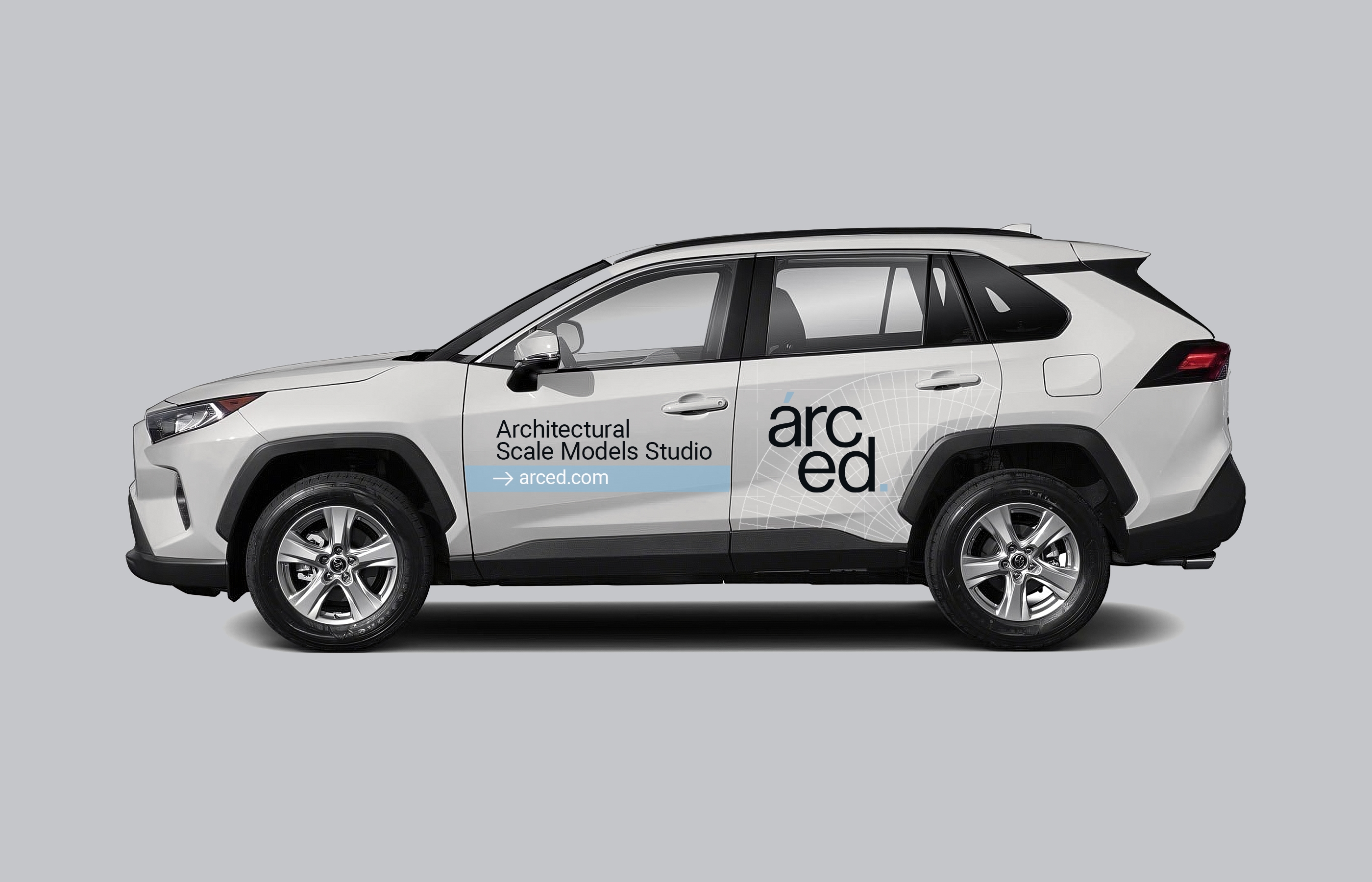
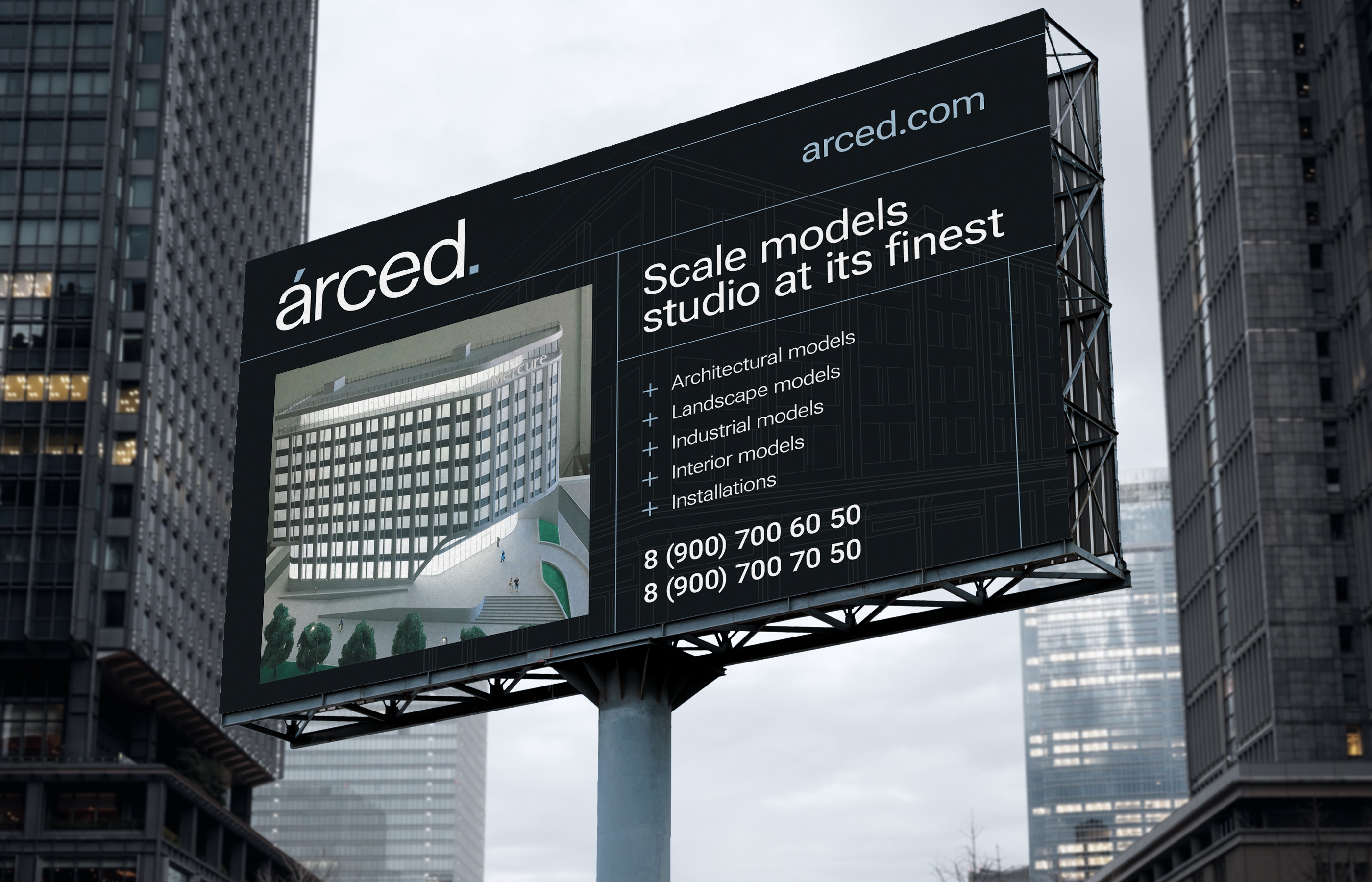
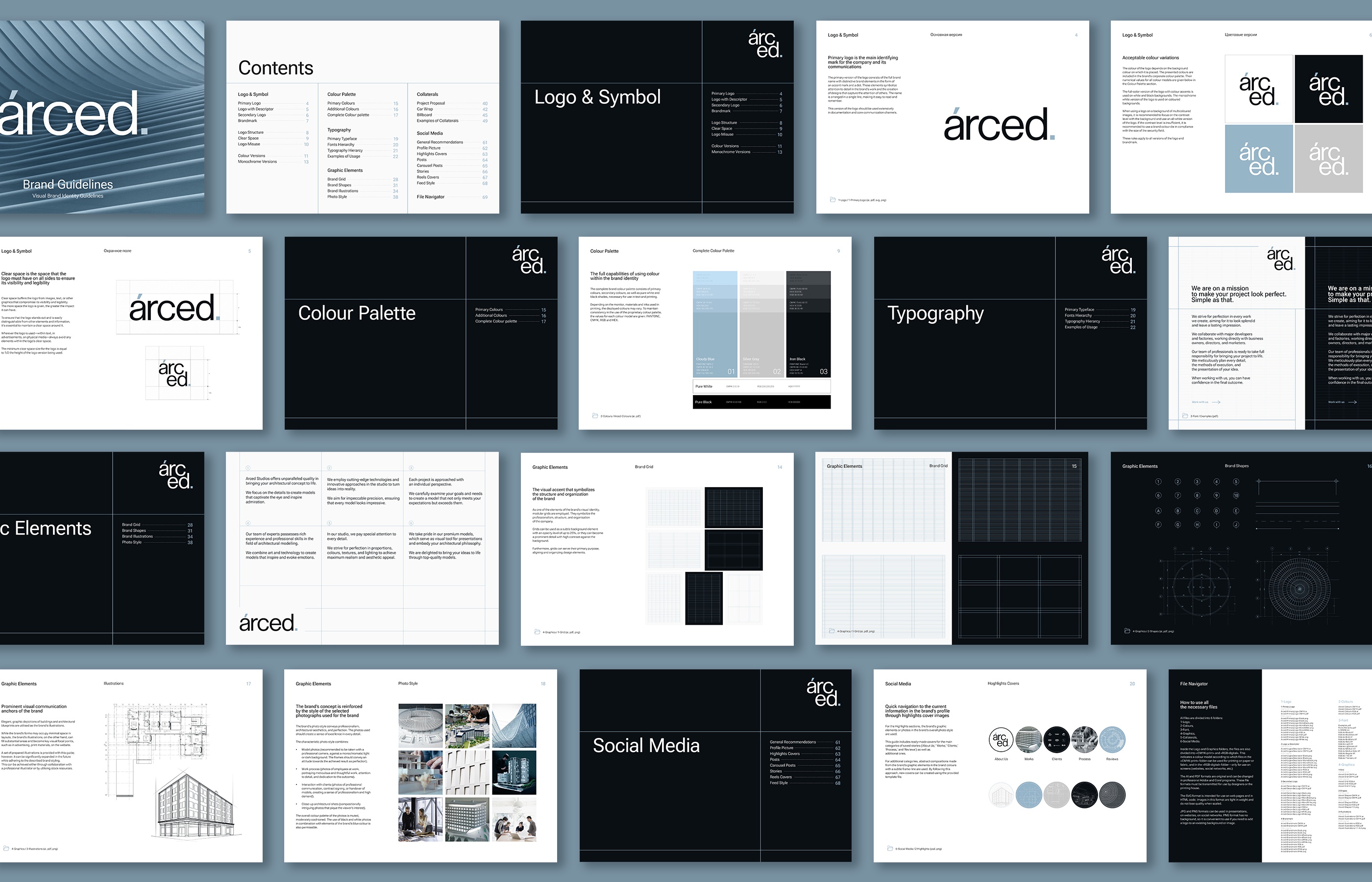
The brand visual identity concept extends the idea encapsulated in the brand name, emphasising architectural precision, flawlessness, and attention to detail. The central visual motif is the refined lines reminiscent of architectural blueprints. These lines are used both in illustrations and brand grids, which are a standalone graphic element, symbolising meticulous precision and impeccable craftsmanship.
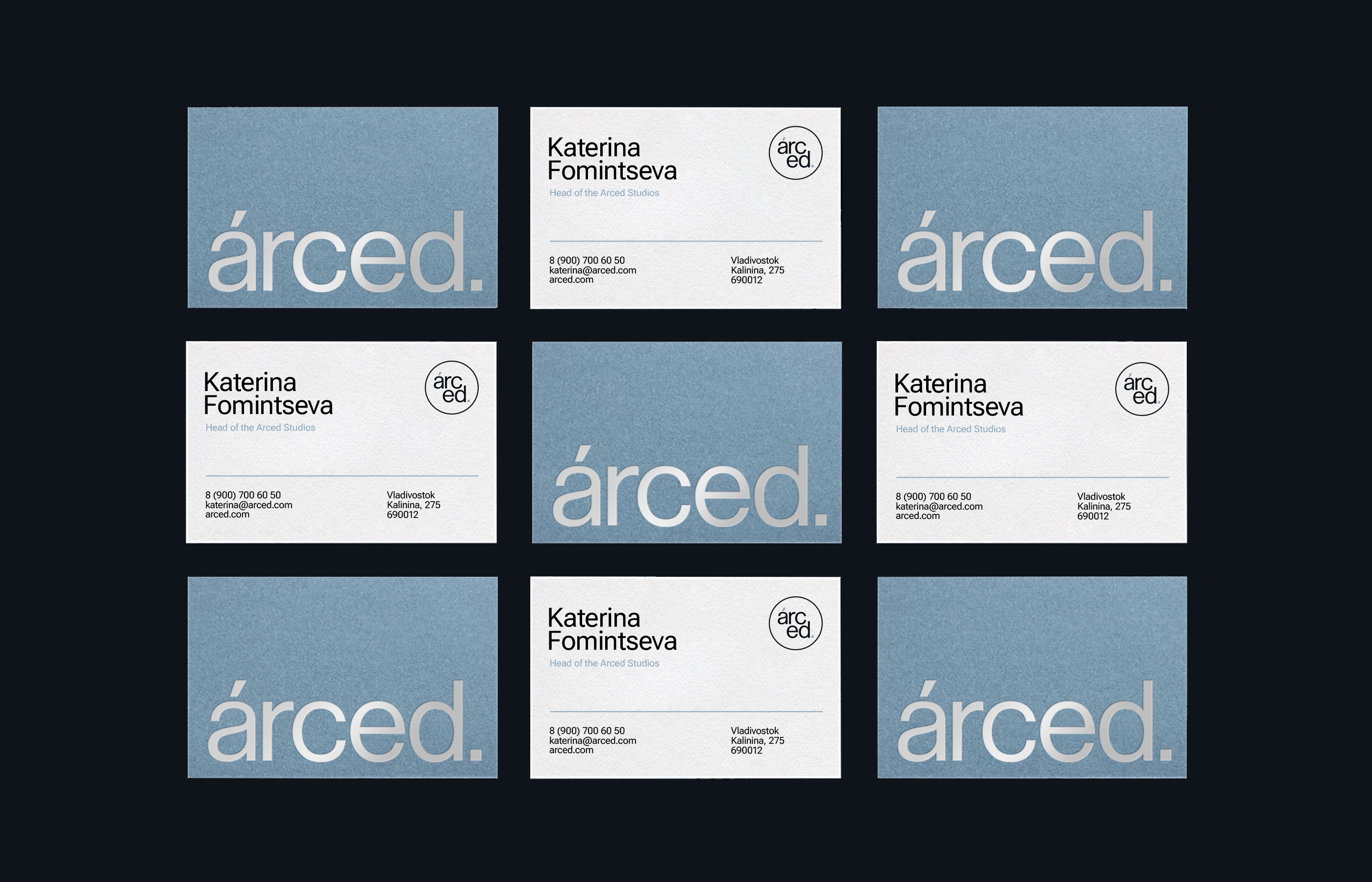
As for typography, the foundation of the design is a sans-serif geometric typeface. It’s light in its “weight”, precise in its details, and geometrically exact. Thus, it continues the overarching concept of perfection, maintaining a balance between the ‘industrial’ application and aesthetic refinement.
The core of the colour palette combines a serene and trustworthy blue, a versatile and neutral grey, and a touch of dark iron for depth and contrast. Being picked strategically, this combination creates a brand identity that is both dependable and adaptable, while also possessing a sense of sophistication and intrigue.
CREDIT
- Agency/Creative: Stacy Saturday Studio
- Article Title: Stacy Saturday Studio’s Naming and Branding for Arced: Redefining Architectural Identity in the Fusion of Technology and Tradition
- Organisation/Entity: Agency
- Project Type: Identity
- Project Status: Published
- Agency/Creative Country: United Kingdom
- Agency/Creative City: London
- Market Region: Asia, Europe, Global
- Project Deliverables: Animation, Art Direction, Brand Creation, Brand Design, Brand Guidelines, Brand Identity, Brand Naming, Brand Redesign, Branding, Design, Graphic Design, Logo Design, Rebranding
- Industry: Construction
- Keywords: Architecture, Scale Model, Brand Identity, Mininmalism, Rebranding
-
Credits:
Art Director & Designer: Stacy Saturday


