


An inclusive rejuvenation of one of Norway’s most iconic products, Stabburet Liver Pâté!
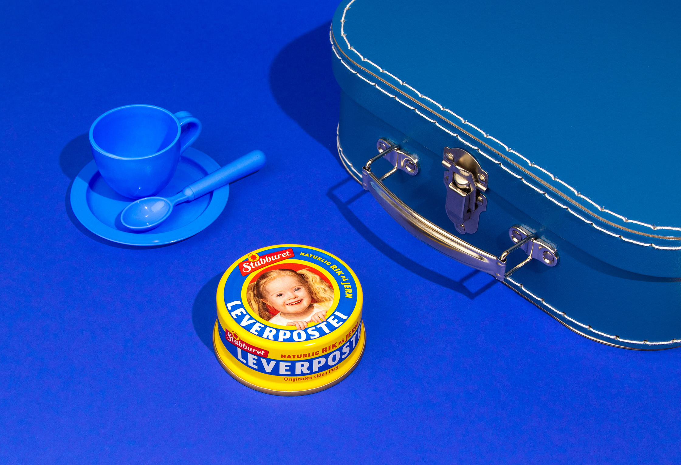
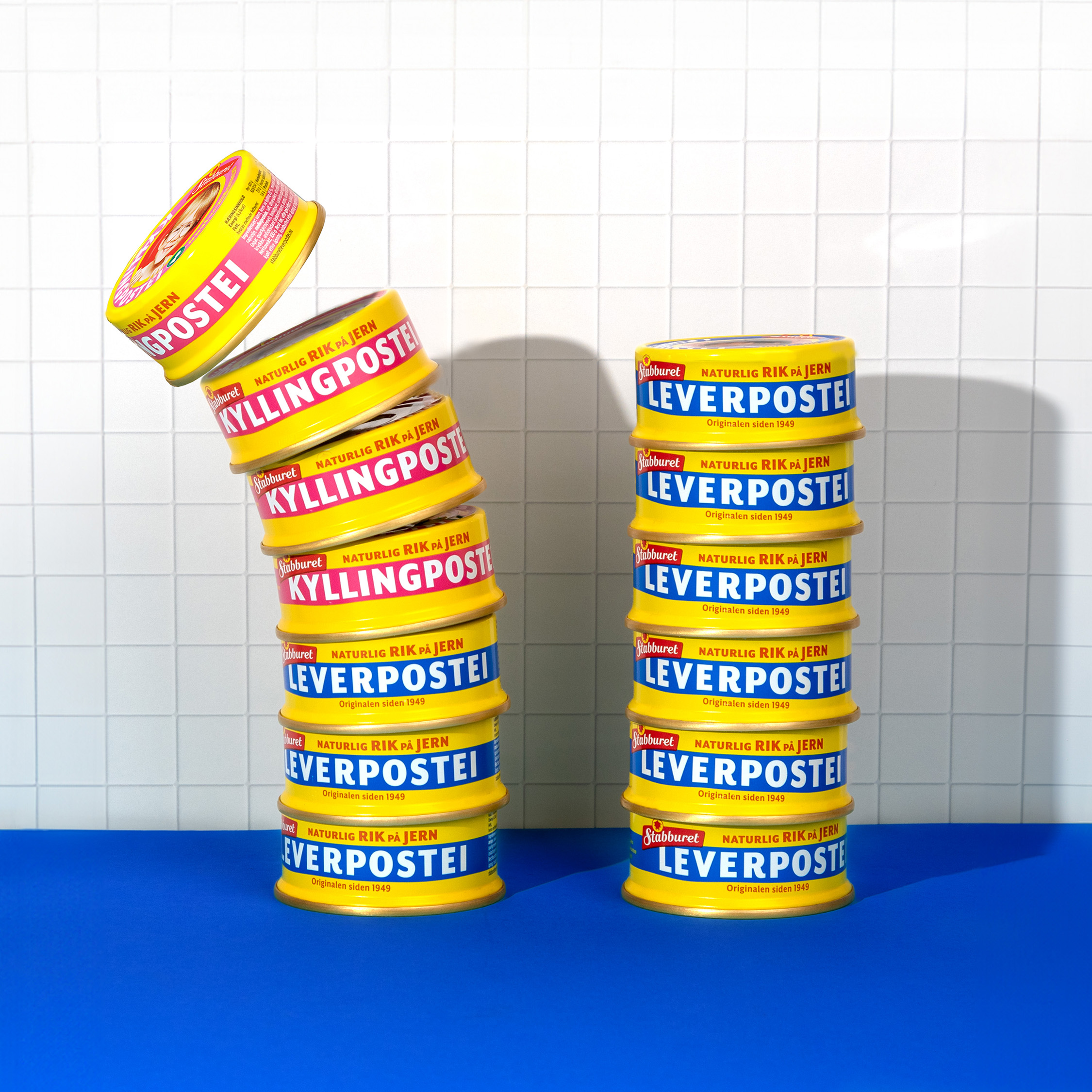
Since its launch in 1949, Stabburet Liver Pâté has been a beloved staple in Norwegian homes. The product’s iconic yellow and blue tin, adorned with smiling children, has become a symbol of tradition, comfort, and familiar taste. Over generations, families have cherished it, making it Norway’s most recognized liver pâté.
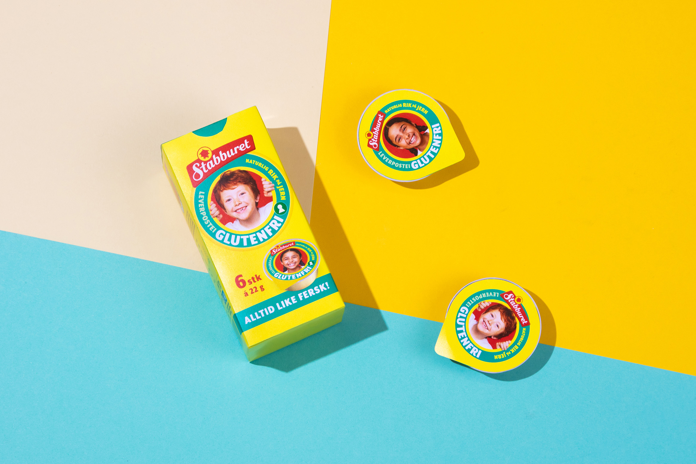
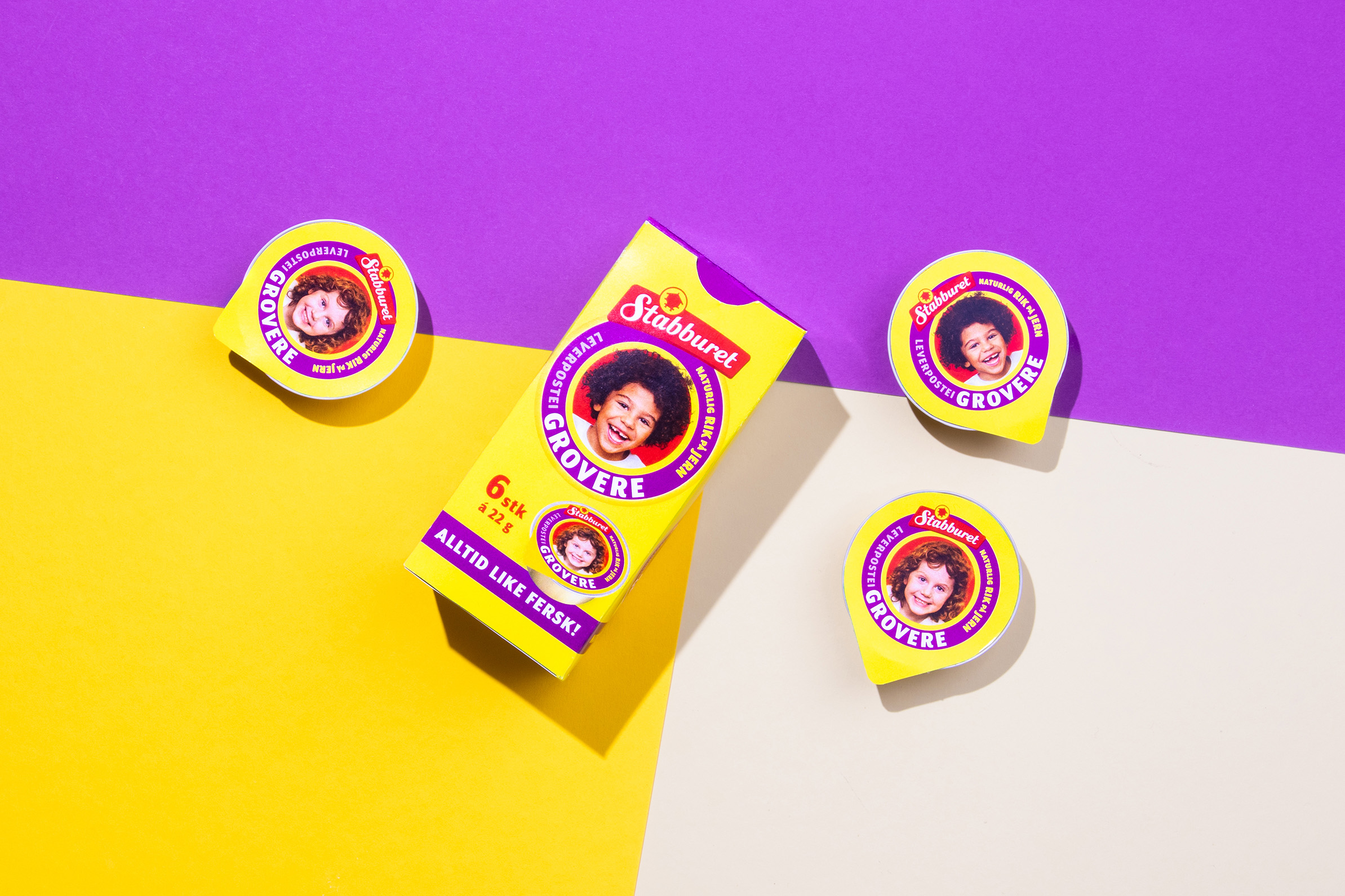
However, the packaging hadn’t been updated since 2012, and no longer reflected the diversity of Norwegian children today. In addition, certain outdated elements had begun to distract from the product’s core identity, creating noise around the brand and diminishing its appeal to a broader audience.
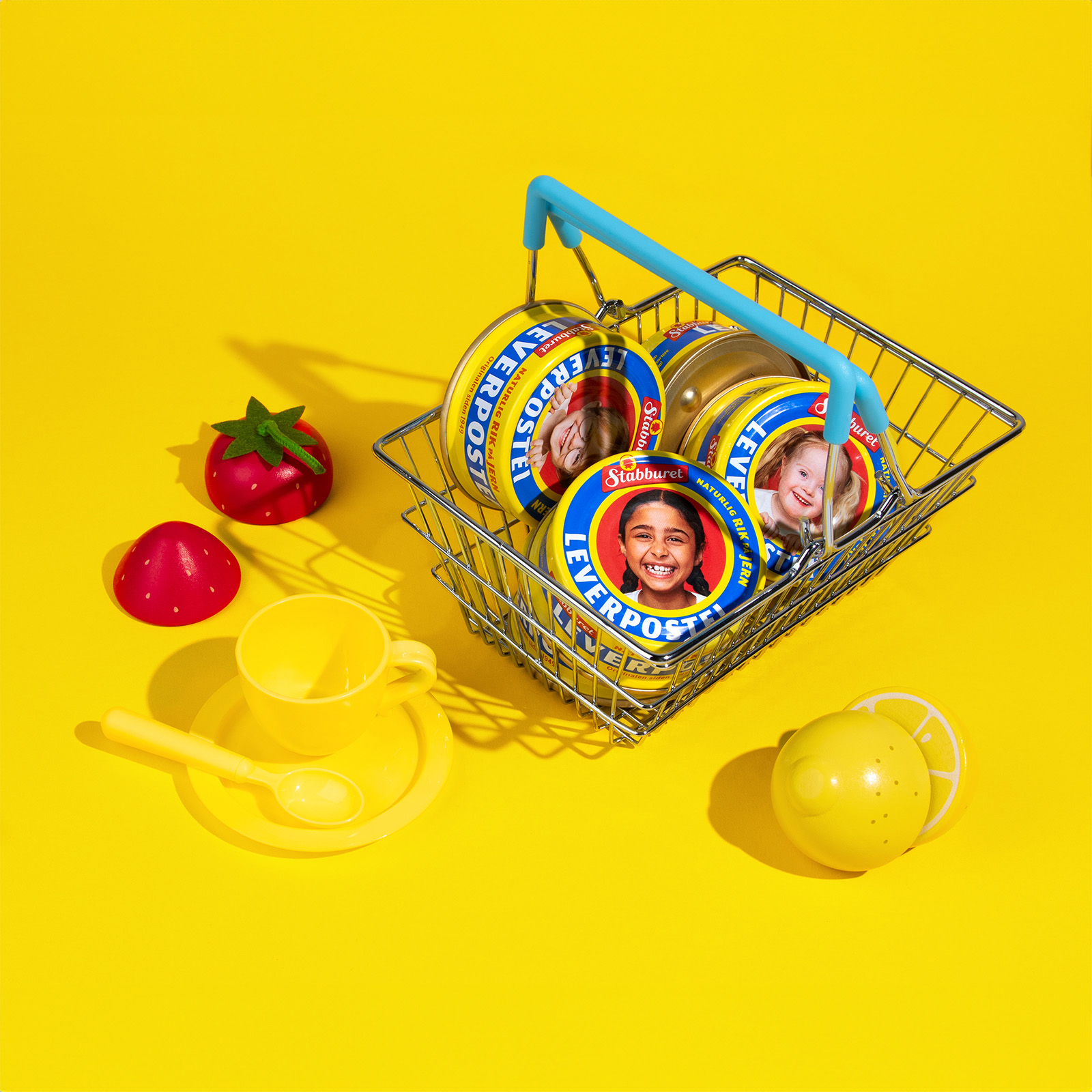
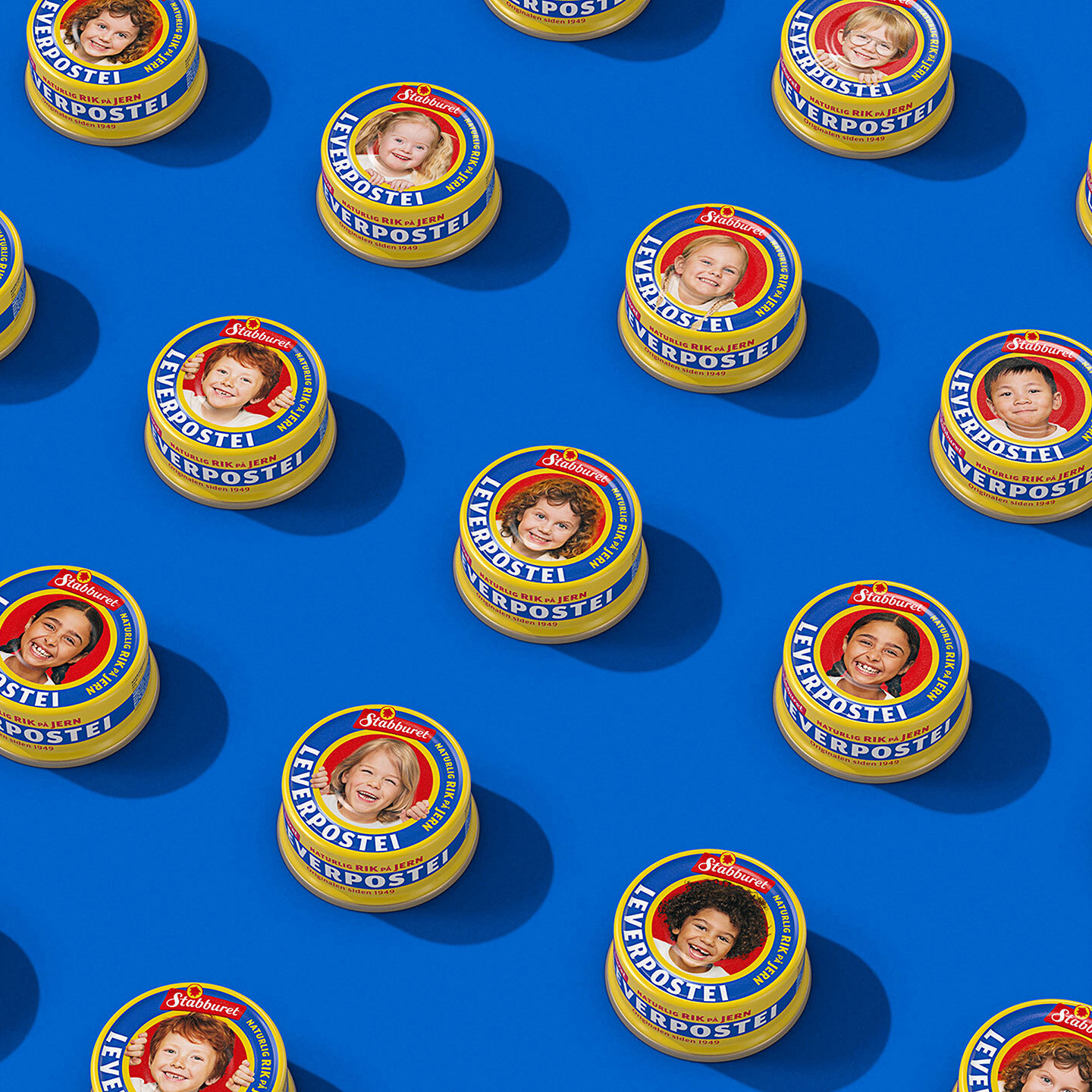
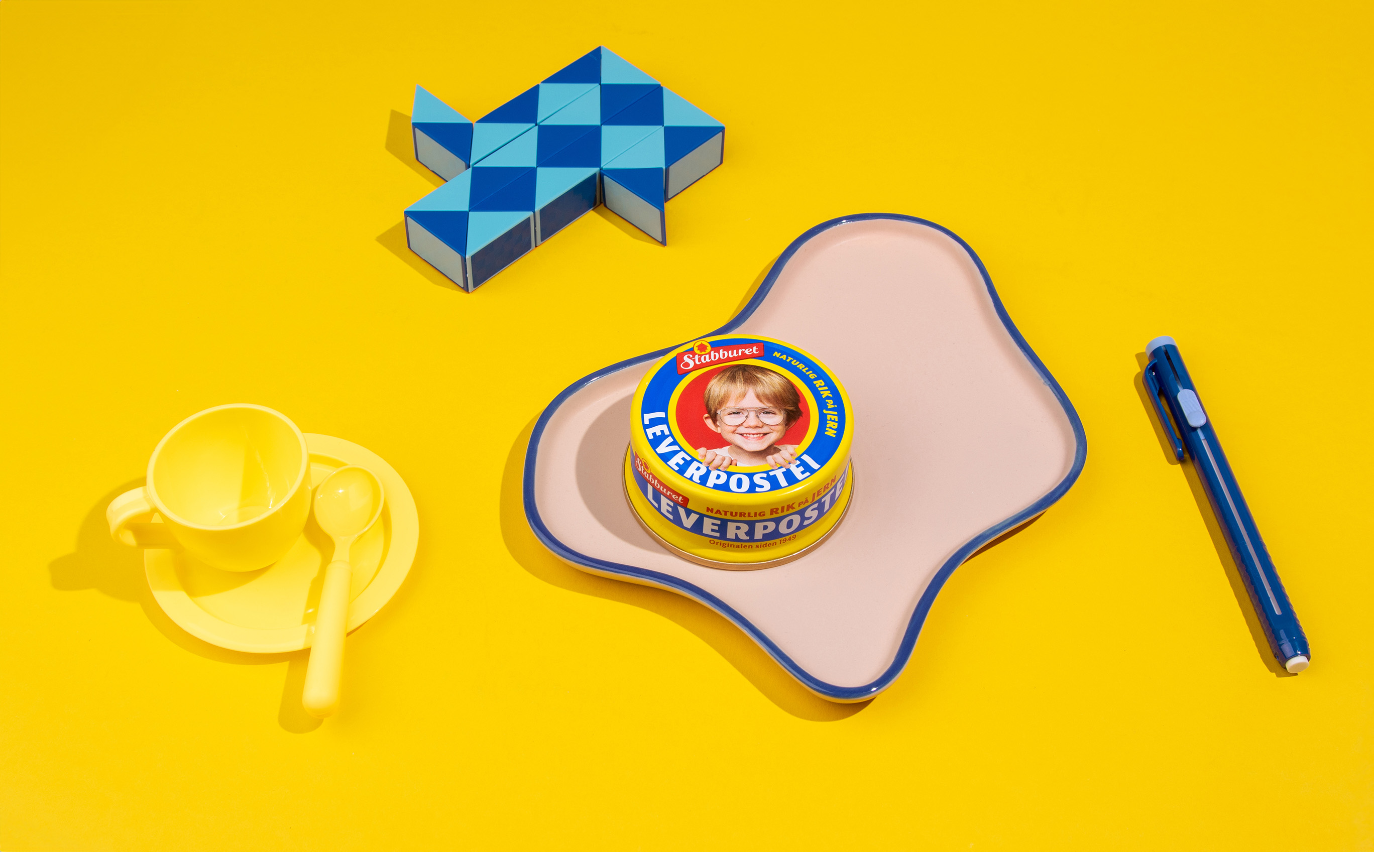
Our goal was to revitalize the design in a way that both celebrated its heritage and embraced a more inclusive, modern image. We simplified and refined the packaging, allowing the distinct features of Stabburet Liver Pâté to shine while respecting its long history. One key change was the introduction of 10 new children’s faces, making the brand more relatable to a wider audience and allowing more kids to see themselves represented on the packaging.
This contemporary update ensures that Stabburet Liver Pâté remains just as relevant today as it was 50 years ago. In collaboration with photographer @lassefloede, we photographed the children to ensure they seamlessly integrated into the design, becoming a natural and authentic part of the packaging’s look.
The revamped design has received positive attention in the press, reflecting the warmth and care that Stabburet/Orkla have invested in this project. This thoughtful transformation not only honors the product’s rich legacy but also ensures its continued presence as a beloved part of Norwegian culture.

CREDIT
- Agency/Creative: Cretalux
- Article Title: Stabburet Liver Pâté Inclusive Redesign by Cretalux
- Organisation/Entity: Agency
- Project Type: Packaging
- Project Status: Published
- Agency/Creative Country: Norway
- Agency/Creative City: Oslo
- Market Region: Europe
- Project Deliverables: Brand Redesign, Packaging Design, Rebranding
- Format: Tin
- Industry: Food/Beverage
- Keywords: Revitalised, diversity, iconic, liver pâté, packaging
-
Credits:
Photographer, childen faces: Lasse Fløde


