


At its core, Square1 embodies a philosophy rooted in journey, discovery, adventure, and embracing risk.
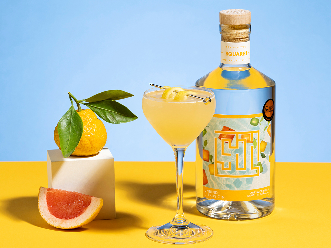
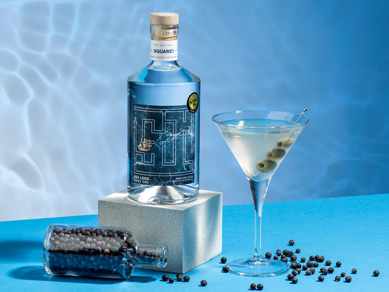
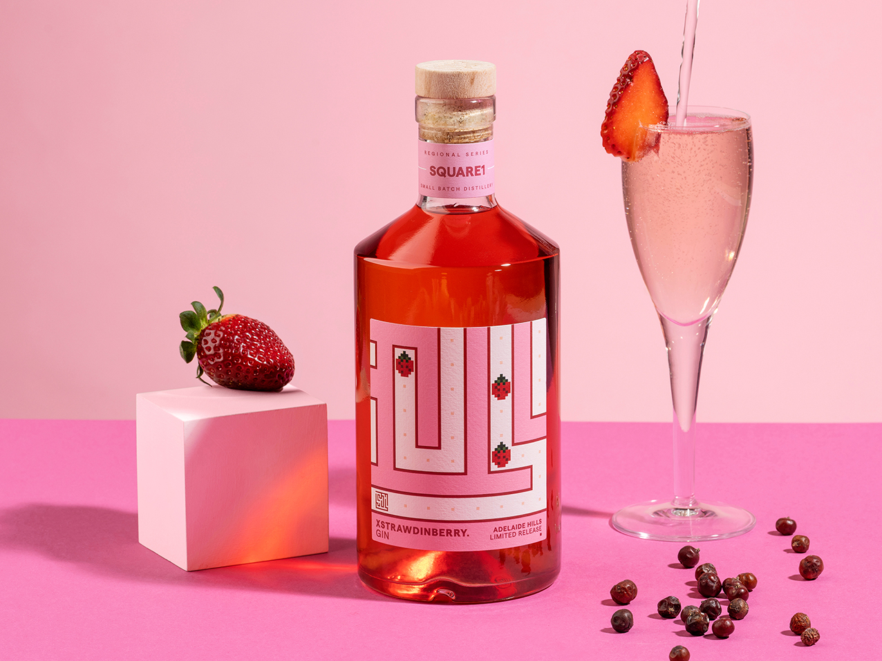
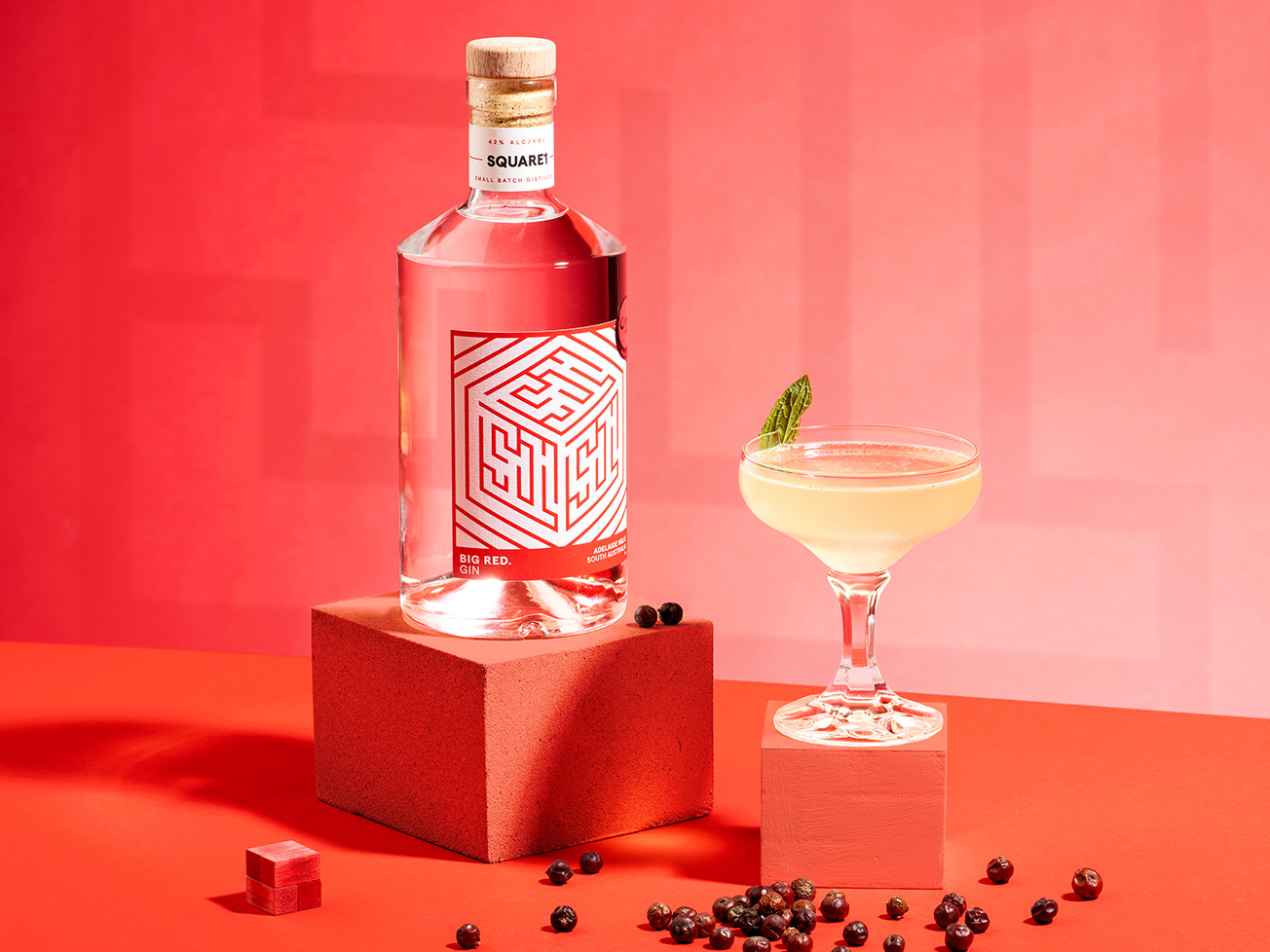
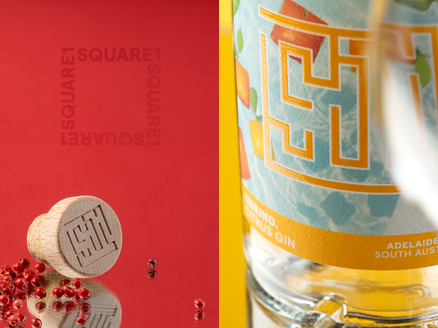
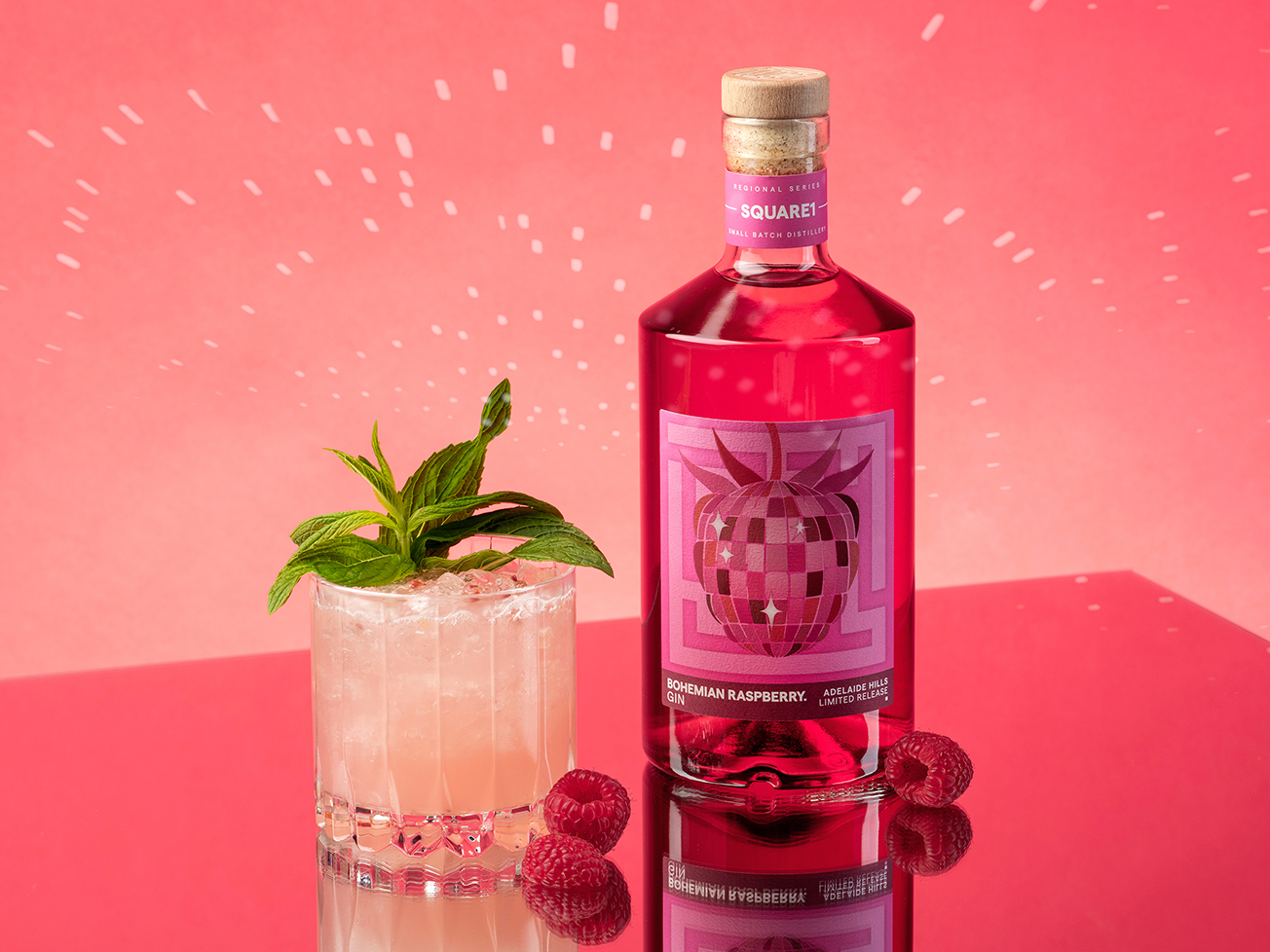
In crafting the expression for their packaging, the central idea was to grant each gin the platform to showcase its individuality. In essence, everyone embarks on a distinct journey through the maze of life. The focal point became a unique branding mark, fashioning a maze within the open-ended negative space of the ‘S & 1’, encapsulating the overarching brand messaging. Each label design takes on a distinctive persona from bottle to bottle, whether it’s the buoyant square citrus fruit or a ship navigating a maze of turbulent seas. Each gin invites enthusiasts on a sensory expedition, offering a blend of quirk and humor, encouraging consumers to engage with the brand through smell, taste, touch, and sight.
This exploration journey is highlighted by quirky names that underscore the illustrative direction of the labels. The logo mark is seamlessly woven into each design, evolving as an integral part of the narrative while embracing the square theme. The logo’s presence varies, at times subtly incorporated with a varnish, or manifesting in a complex interaction across the label. Every aspect of the package design is meticulously considered, from the engraved timber closure to the colorful neck label, ensuring a cohesive integration with the main feature label.
To maintain brand recognition and a prominent shelf presence, the range is characterized by a consistent color strip across the bottom. This thoughtful approach extends to the engraved timber closure and colorful neck label, tying together the entire presentation. The end goal is to establish a seamless connection between the consumer and the brand, making the exploration of each gin a distinctive and memorable experience.
“Starting from Square one” suggests that the journey is not confined to a linear path. It raises questions about whether the journey is beginning, ending, or perhaps restarting. The acknowledgment that the end always carries the potential for a turnaround adds an intriguing layer to the narrative. Each phase, be it a beginning or an end, holds the promise of new possibilities, turning the journey into a dynamic and perpetual adventure.
CREDIT
- Agency/Creative: Black Squid Design
- Article Title: Square1 Gin: Embark on a Journey of Discovery Through Creative Packaging Design by Black Squid Design
- Organisation/Entity: Agency
- Project Type: Packaging
- Project Status: Published
- Agency/Creative Country: Australia
- Agency/Creative City: Adelaide
- Market Region: Global
- Project Deliverables: Advertising Photography, Brand Identity, Branding, Logo Design, Packaging Design
- Format: Bottle
- Industry: Food/Beverage
- Keywords: Gin label, Gin packaging, Spirit packaging, Brand Identity
-
Credits:
Creative Director: Derek Butler


