


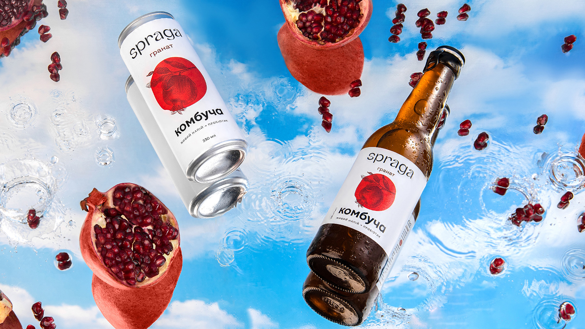
Spraga Kombucha is Perfect
Everything is Simple:
Eat Easy, a natural drink manufacturer, turned to us for a new brand identity and a slight packaging redesign. At the start, the company focused on manufacturing healthy products, which gave it a food-related name. When it later refocused on beverages, it became the leading kombucha manufacturer in Ukraine. The company sought to develop exports and thereby created the Spraga brand.
Kombucha Is Perfect
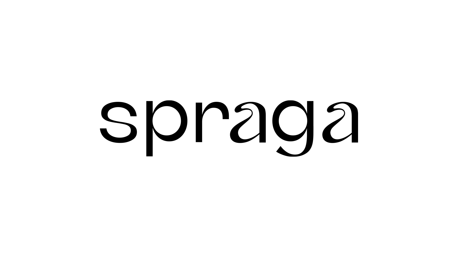
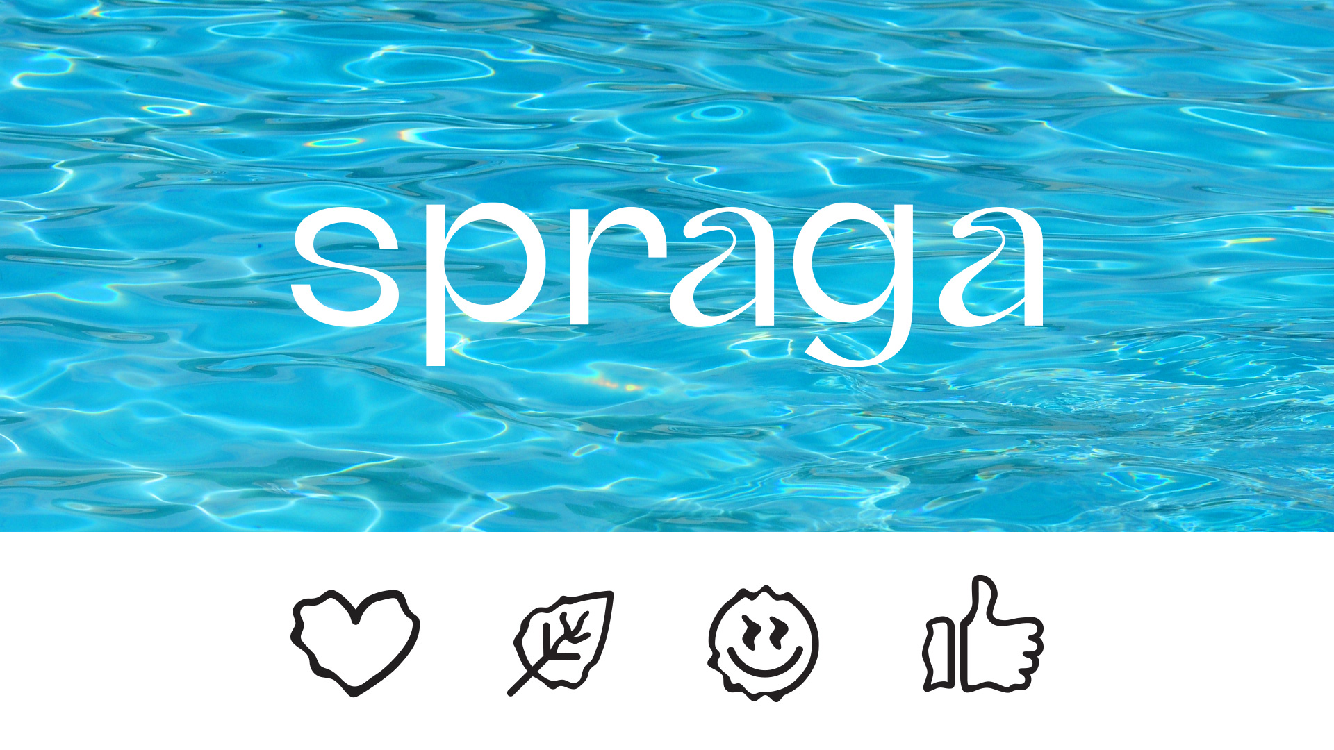
for quenching thirst. It’s a completely physiological feeling. But we also relied on a semantic layer of thirst as a thirst for life and freedom to underline the positioning. We even came up with a legend about it for the client. When creating the logo, we were inspired by two things: the effect of mirages and the play of light in transparent water. For that reason, the letters in the logo are flexible and fluid. Besides, we offered the Liquify effect to support the idea visually; it works perfectly as a tool for conveying the nature of the liquid in various carriers of identity, e.g., the iconography system.
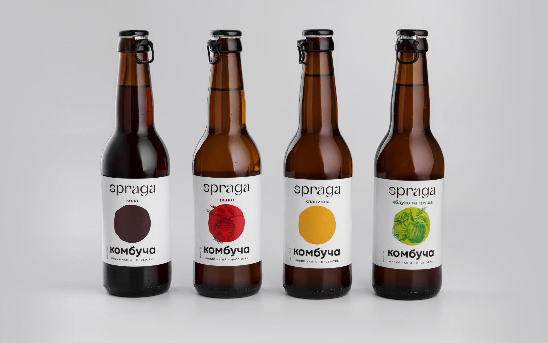
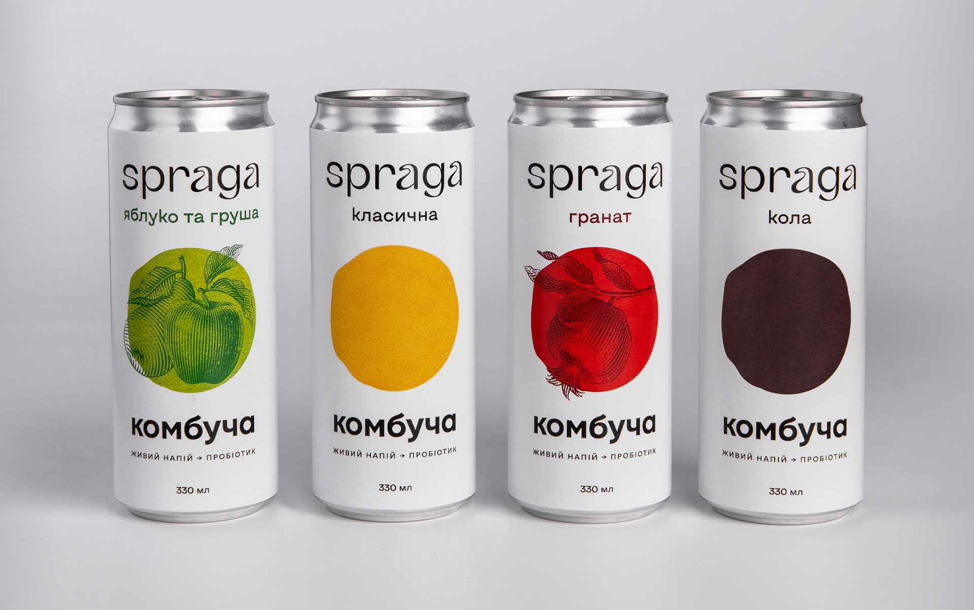
Spraga’s Portfolio is Super Diverse
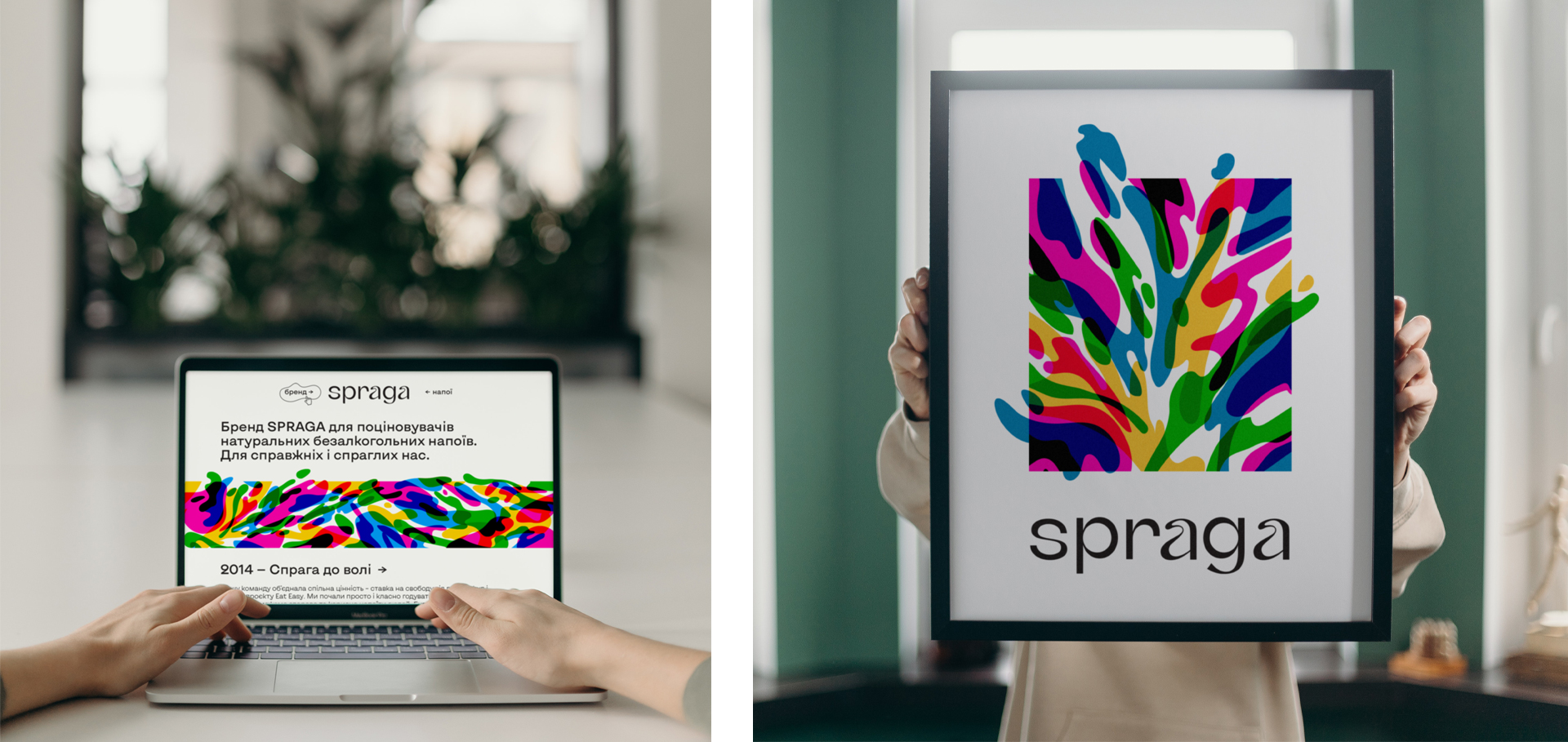
in terms of contents and even the colors of drinks within the line. Well, we wanted to convey the love of freedom and multifacetedness through bright splashes and spots going beyond the framework of limitations. This multi-colored dynamic flow laid the foundation for the signature pattern. Various consumers, various flavors, various products, and various feelings… But it’s all for real! We put together all the elements united by one idea to create its corporate identity and helped the client integrate it into its new website design.
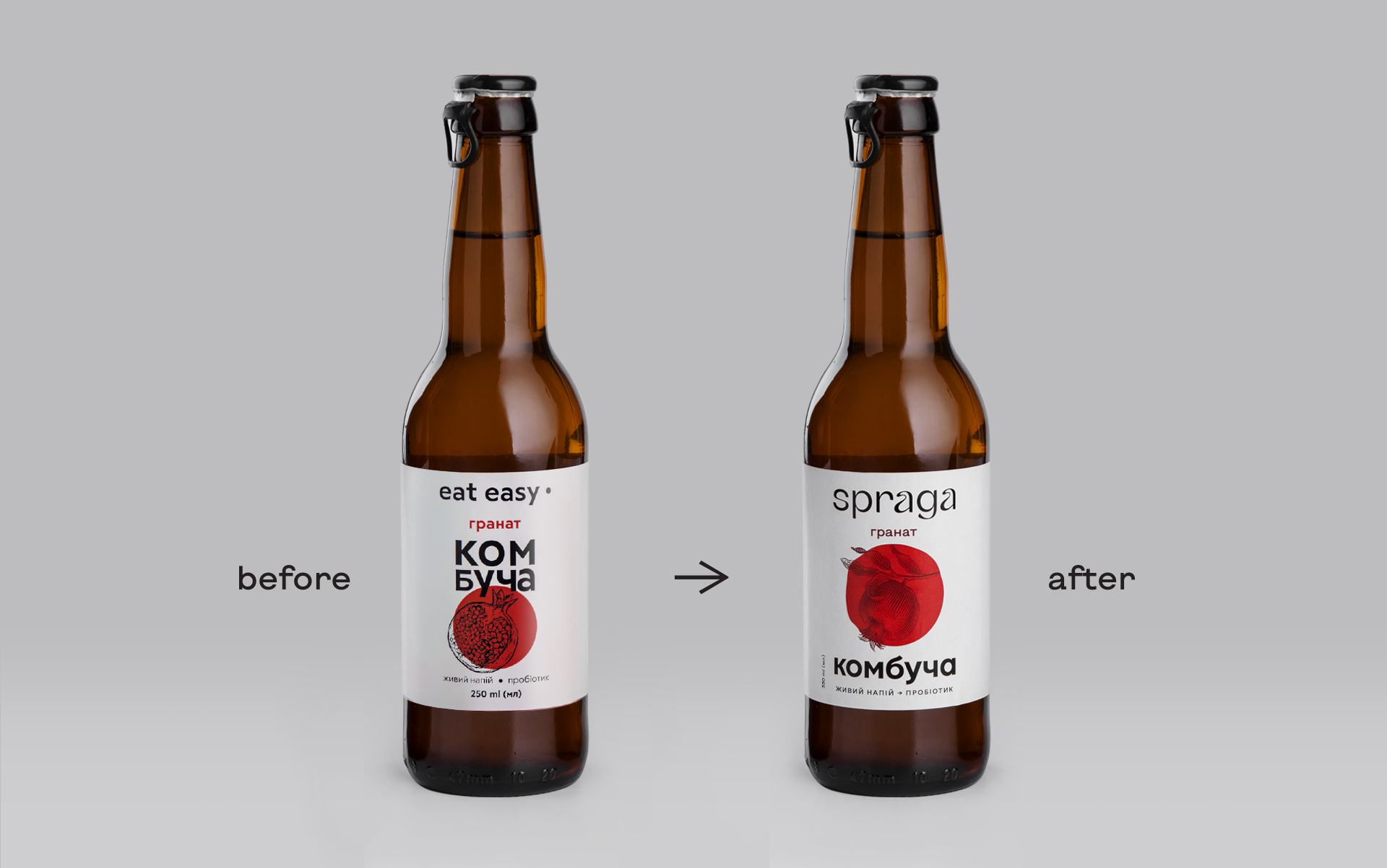
Between “Before” and “After”
you won’t notice much of a difference on the label. Our task was to update and modernize it without changing the existing look. Actually, brand recognition was already secure and backed by its army of fans, and only the name got renewed. All in all, we replaced the logo and harmonized the overall composition. The shape of kombucha was still the main character and eye-stopper, but—unlike the mechanical circle it was before—it became a living spot with free natural contours.
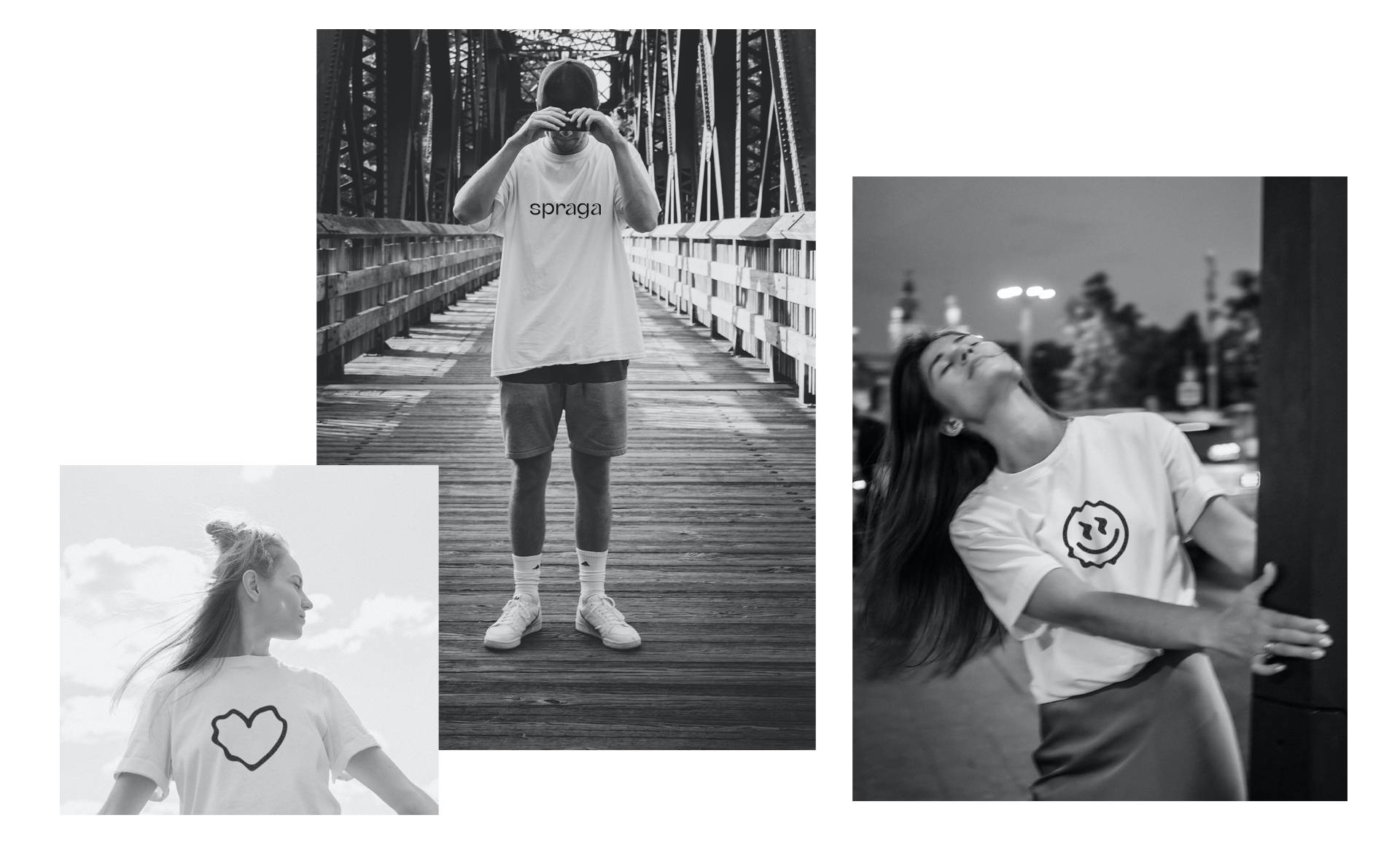
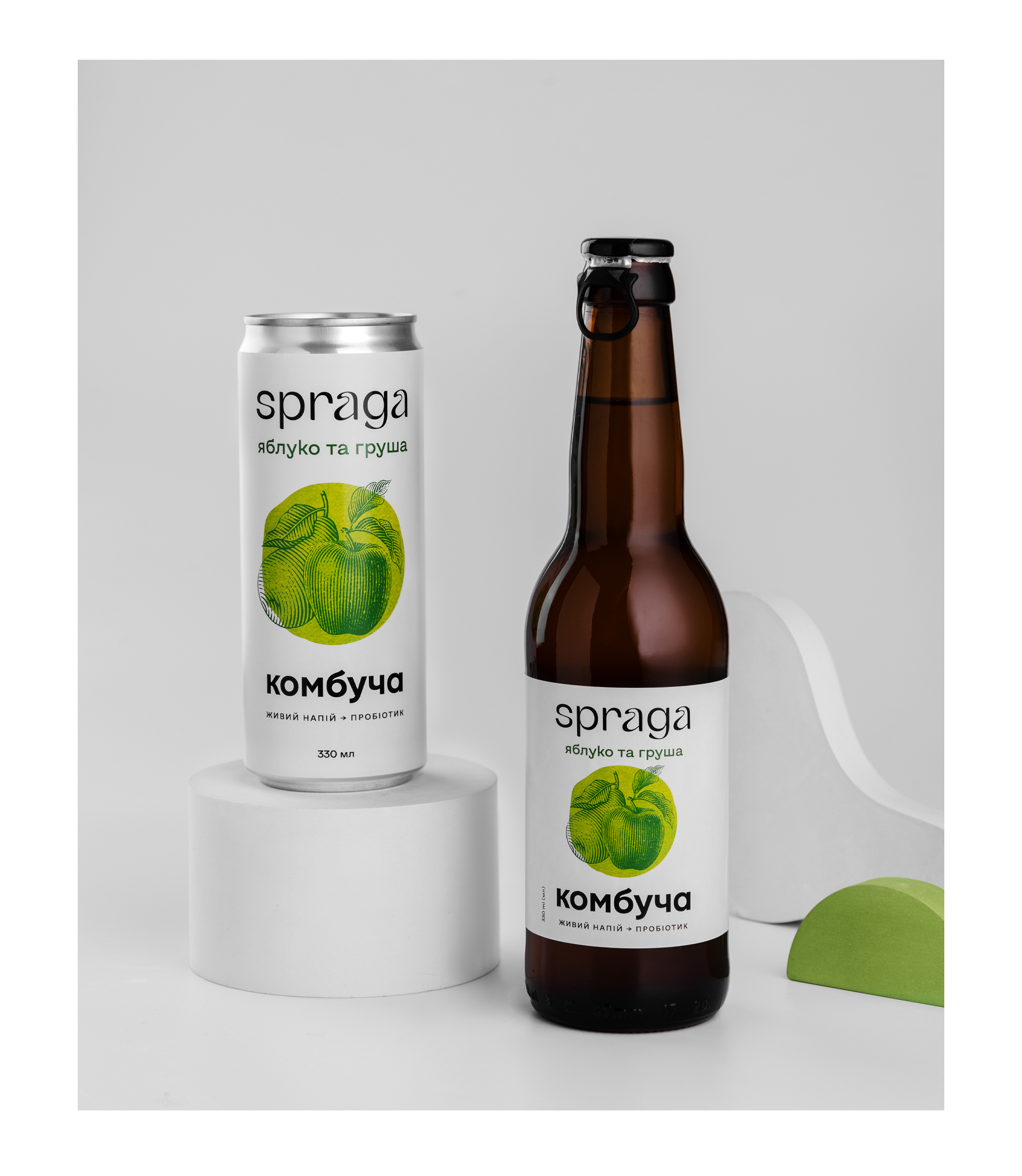
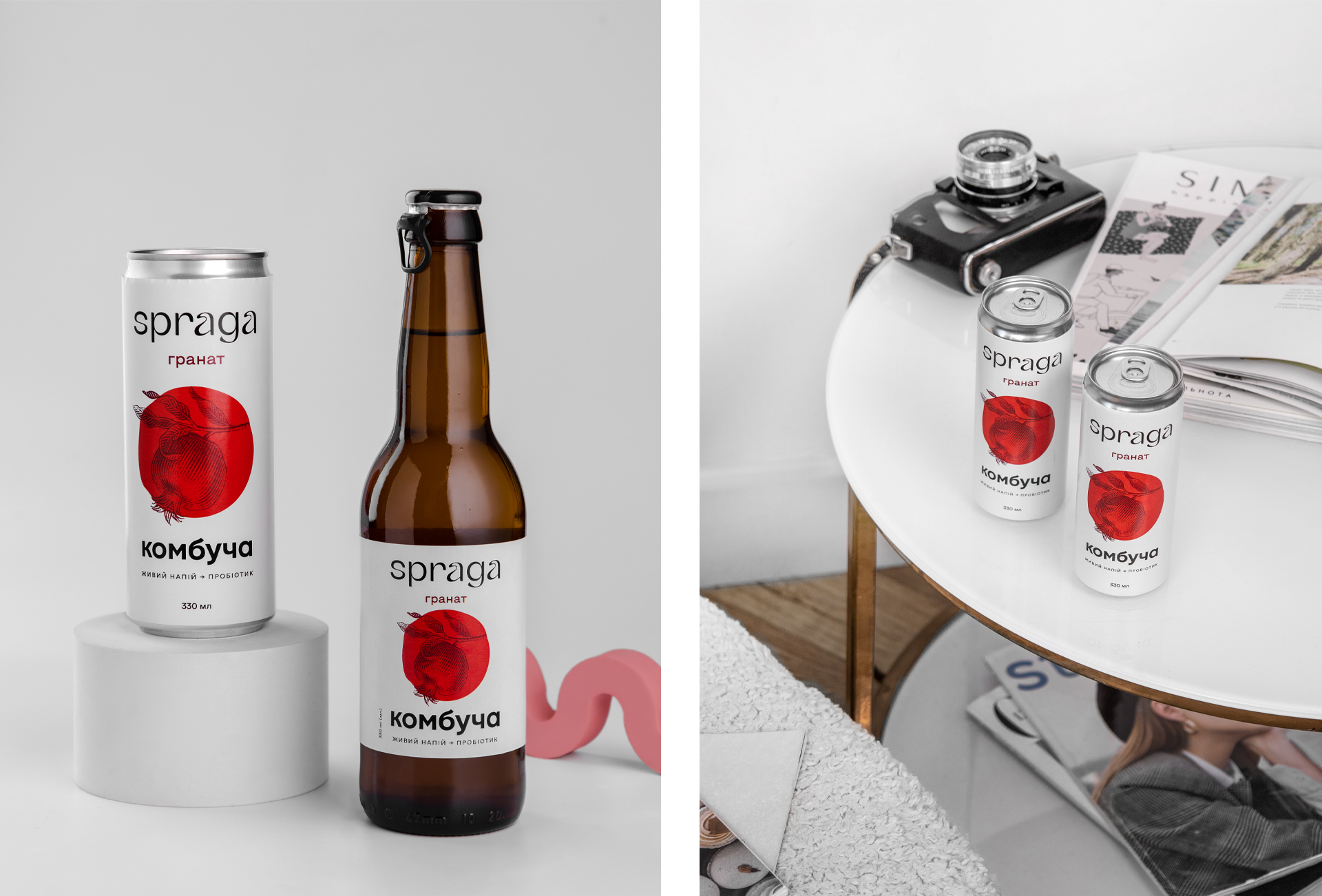
The Bottle
means the can. We made designs for Spraga’s canned drinks as well. By adapting the approach to fit the style of fruit flavors, we offered an engraving to emphasize naturalness. The client can develop other flavors independently by involving an illustrator or using stock photos.
You Can Watch Forever
the water flowing and Spraga’s new flavors and products manufactured at the modern factory. So, we don’t stop here. To be continued.
CREDIT
- Agency/Creative: Dozen Agency
- Article Title: Spraga Kombucha Packaging Design by Dozen Agency
- Organisation/Entity: Agency
- Project Type: Packaging
- Project Status: Published
- Agency/Creative Country: Ukraine
- Agency/Creative City: Kyiv
- Market Region: Europe
- Project Deliverables: Illustration, Logo Design, Packaging Design, Web Design
- Format: Bottle, Can
- Substrate: Glass Bottle, Metal
- Industry: Food/Beverage
- Keywords: packaging, design, logo, Ukraine, Kyiv, kombucha, glass bottle, label design
-
Credits:
Art Director: Elena Gavrilyuk


