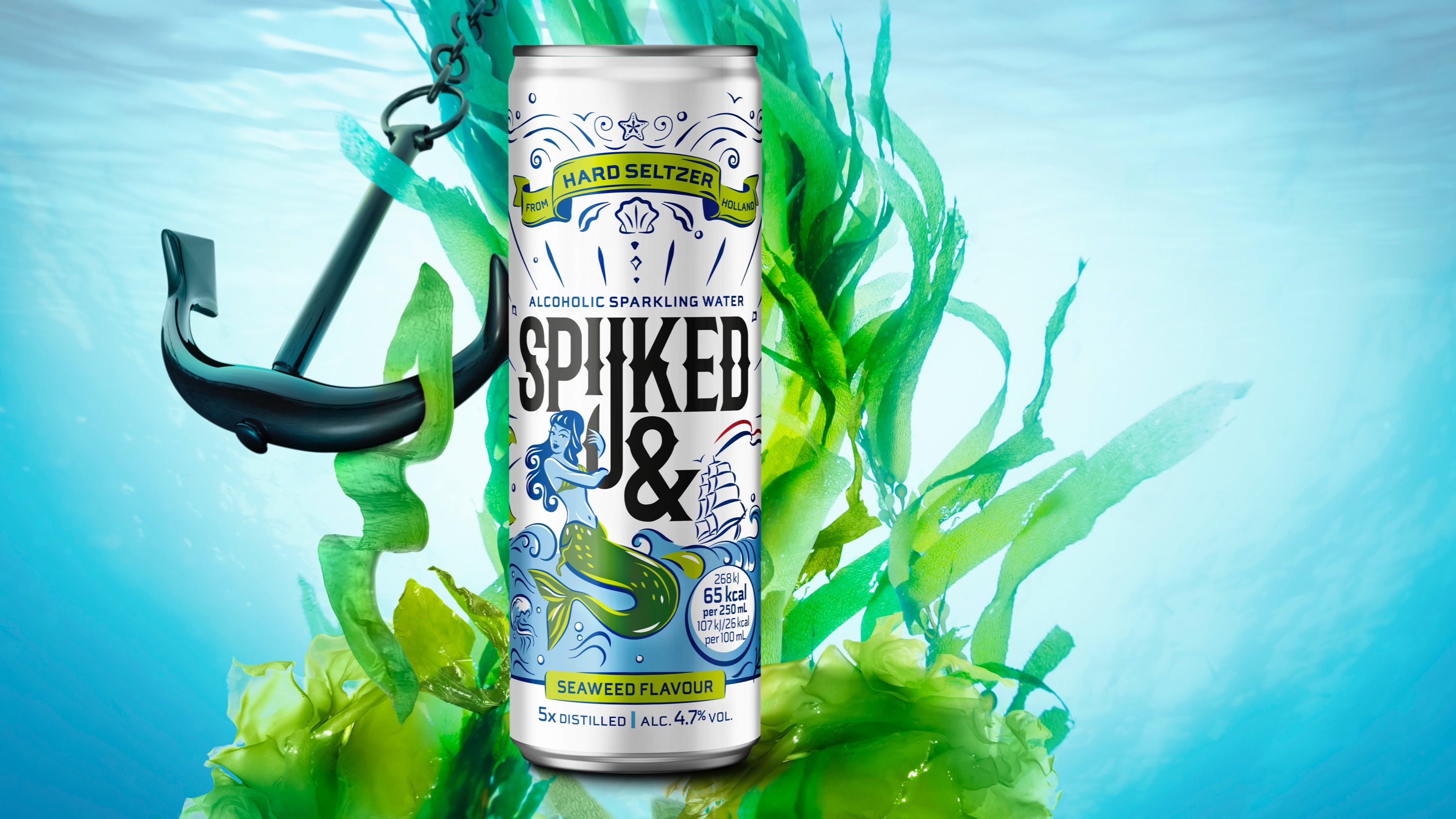
The project is the design of a brand identity for a Dutch hard seltzer range with various flavours. The design will mostly be used on cans and for communication.
Hard seltzer is a sparkling water infused with low-calorie natural fruit flavourings spiked with alcohol. It is positioned for increasingly diet conscious millennials and, having taken over the US, hard seltzers have dropped anchor in Holland.
The Swinkels Brewery Family developed and produced a hard seltzer range IN Holland FOR Holland and eventually the rest of the world. This new product should appeal to the target group but
also, it should bring out Dutch identity without becoming boring or too orange. (Yes, we can get too orange).
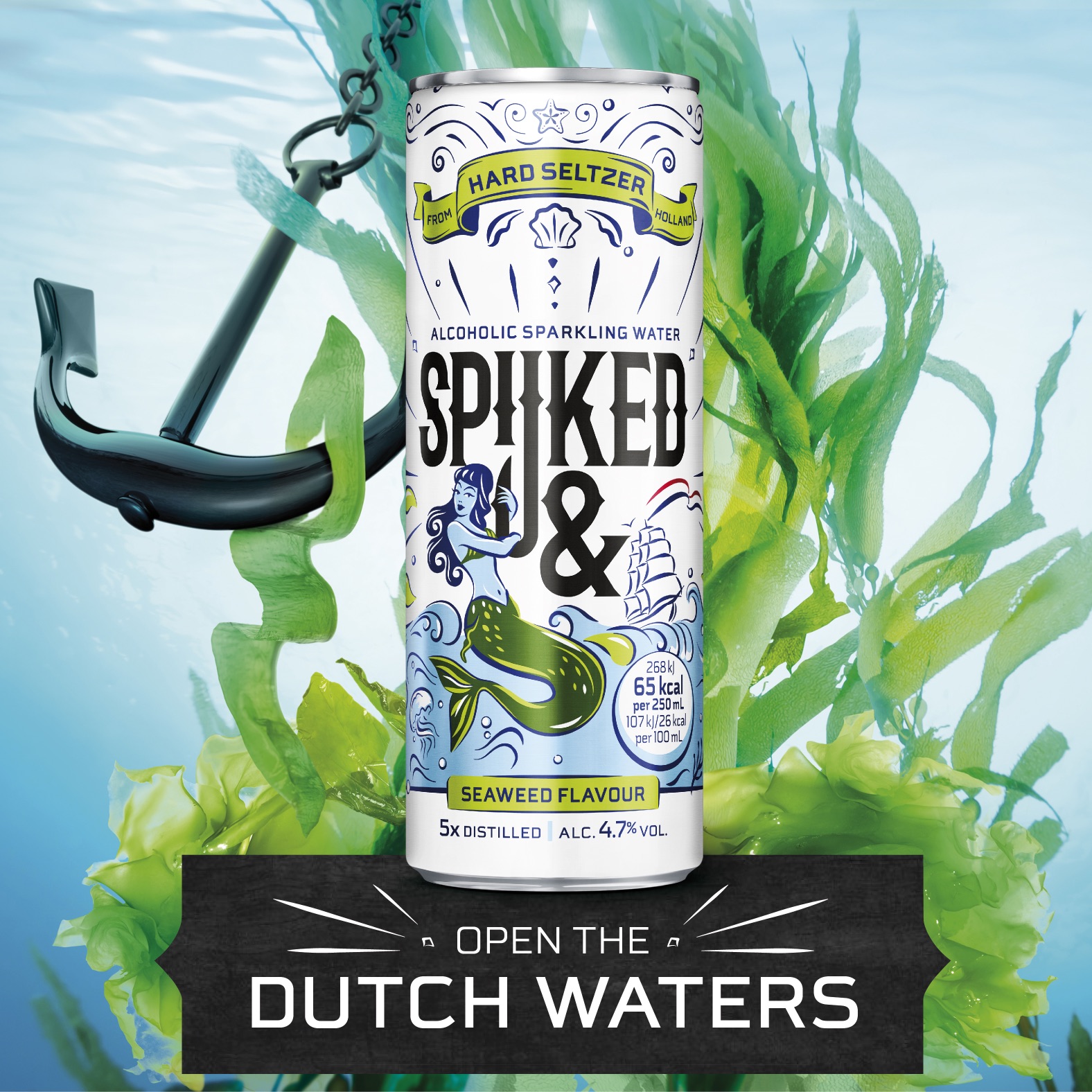
As the sea is and always has been a big part when it comes to “Dutchness”, the design concept “open up the Dutch waters” hit the nail on its head.
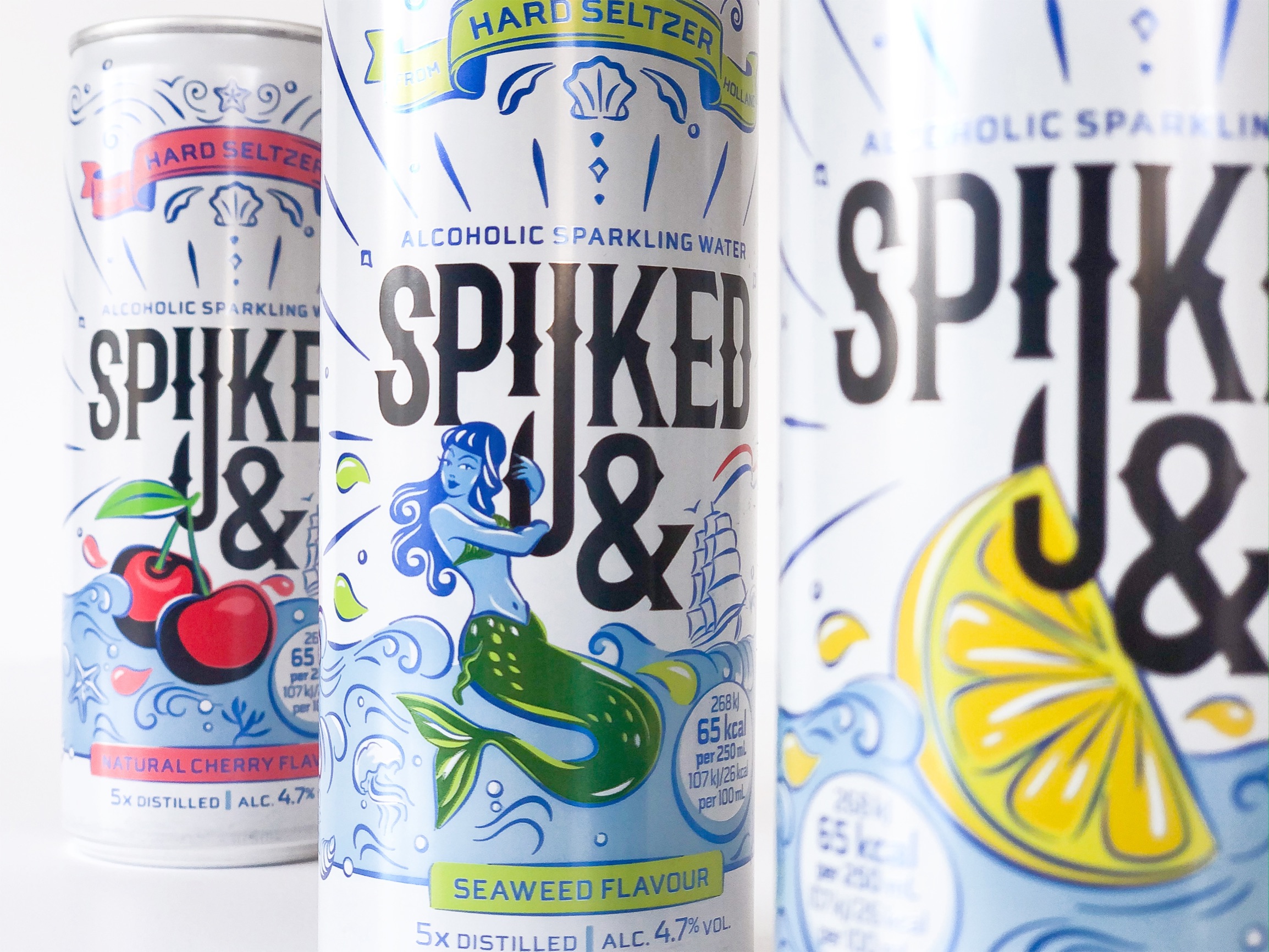
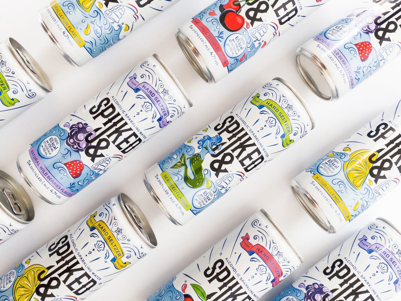
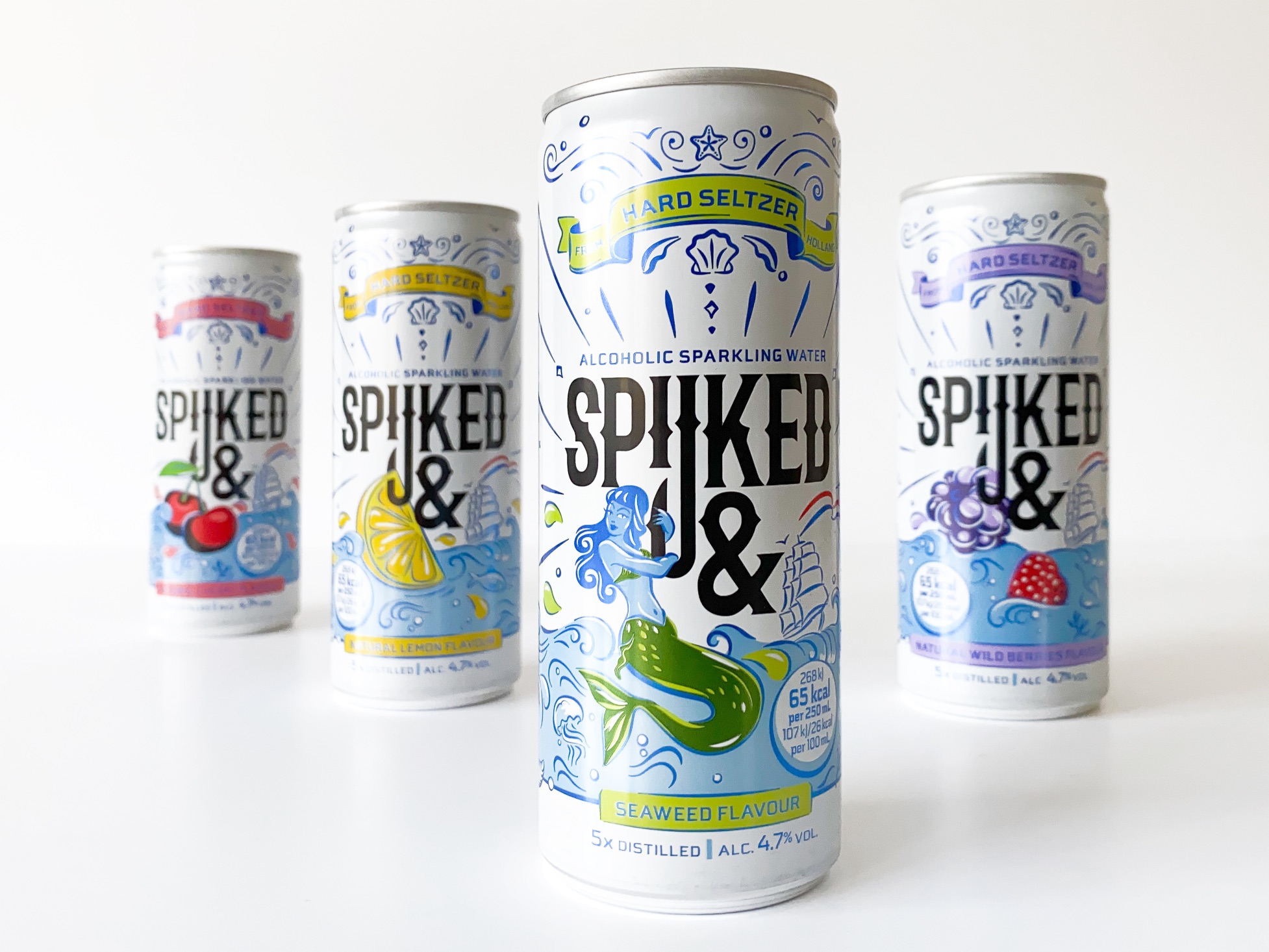
Spijked& creates a visual link of the ‘&’ logo with juicy hooked fruit. Just like Dutch sailors shared their stories through tattoo’s, Spijked& shares its story with illustrations. The Delft Blue colour palette strengthen the Dutch visual heritage. Spijked& has a strong visual language with room for differentiation of the flavours: Lemon, Cherry, Wild Berries and the first-of its-kind, Seaweed.
The illustrations have all been handmade especially with the eye on printing technique for cans.
Furthermore, the flavour “Seaweed” has been developed in collaboration with The Seaweed Company in Schiedam.
And not only that, for every can Spijked& sold, seaweed is planted on an area of 21/29 cm to contribute to the restoration of the oceans.
“Made in Holland” at its best!
CREDIT
- Agency/Creative: Yellow Dress Retail
- Article Title: Spijked& Packaging Design by Yellow Dress Retail
- Organisation/Entity: Agency
- Project Type: Packaging
- Project Status: Published
- Agency/Creative Country: Netherlands
- Agency/Creative City: Amsterdam
- Market Region: Global
- Project Deliverables: Packaging Design
- Format: Can
- Substrate: Metal
- Industry: Food/Beverage
- Keywords: WBDS Agency Design Awards 2021/22
-
Credits:
Designer: Hayden Roberts
Creative Director: Michelle Romeo-Wiegman
Illustrator: Willemijn de Lint
Account Director: Kim Hogenbirk
Global Insight Manager: Sean Durkan


