


Project Title: Spier Creative Block – A Label Redefined
The redesign of our Spier Creative Block range was driven by a broader brand evolution and the introduction of our newly refreshed Spier logo across the full portfolio. Previously, the Spier logo had been screen-printed directly onto the bottle — an iconic design feature that offered a clean, modern look. However, as we reassessed our packaging strategy, we identified an opportunity to bring the logo back into the label itself. This shift allowed for greater cohesion across the range and gave the brand mark renewed presence and clarity within the overall packaging system.
Reintegrating the logo also opened the door for a complete creative refresh. The new Creative Block label was developed to align more intentionally with the heart of what this range represents: collaboration, creativity, and a sense of place. The result is a contemporary design that unifies the story of the wine, the land it comes from, and the artistic initiative it supports.
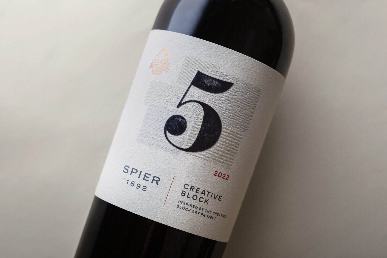
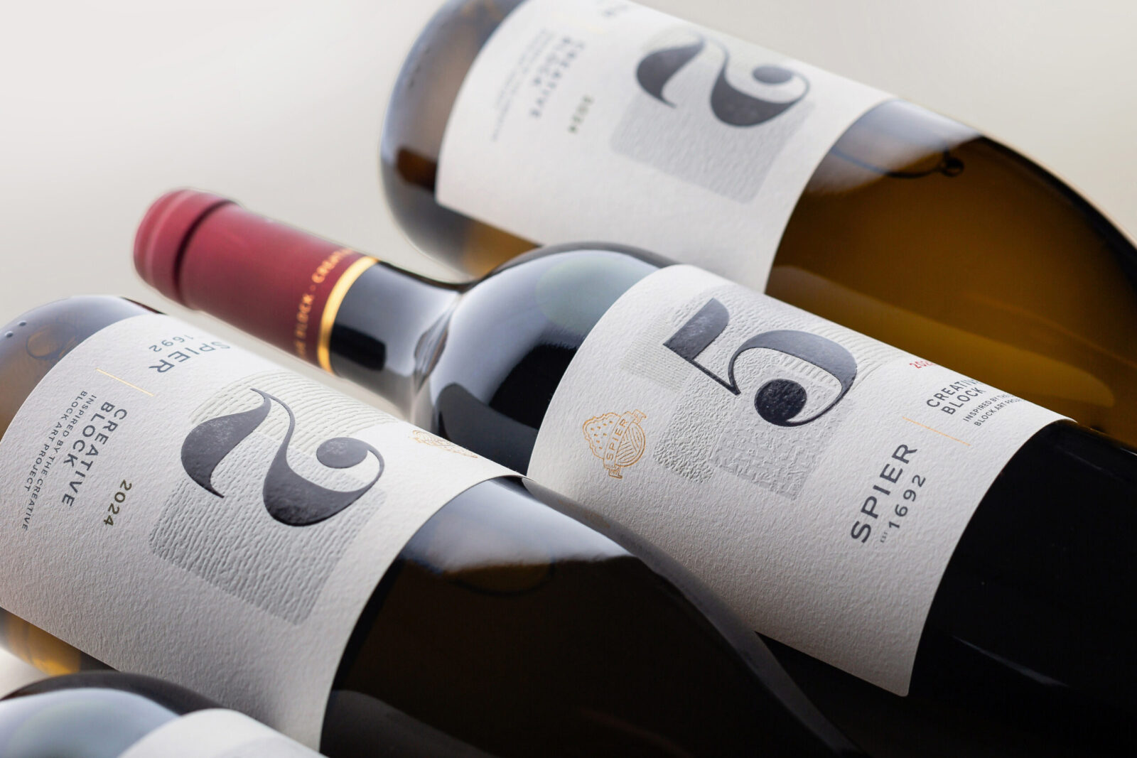
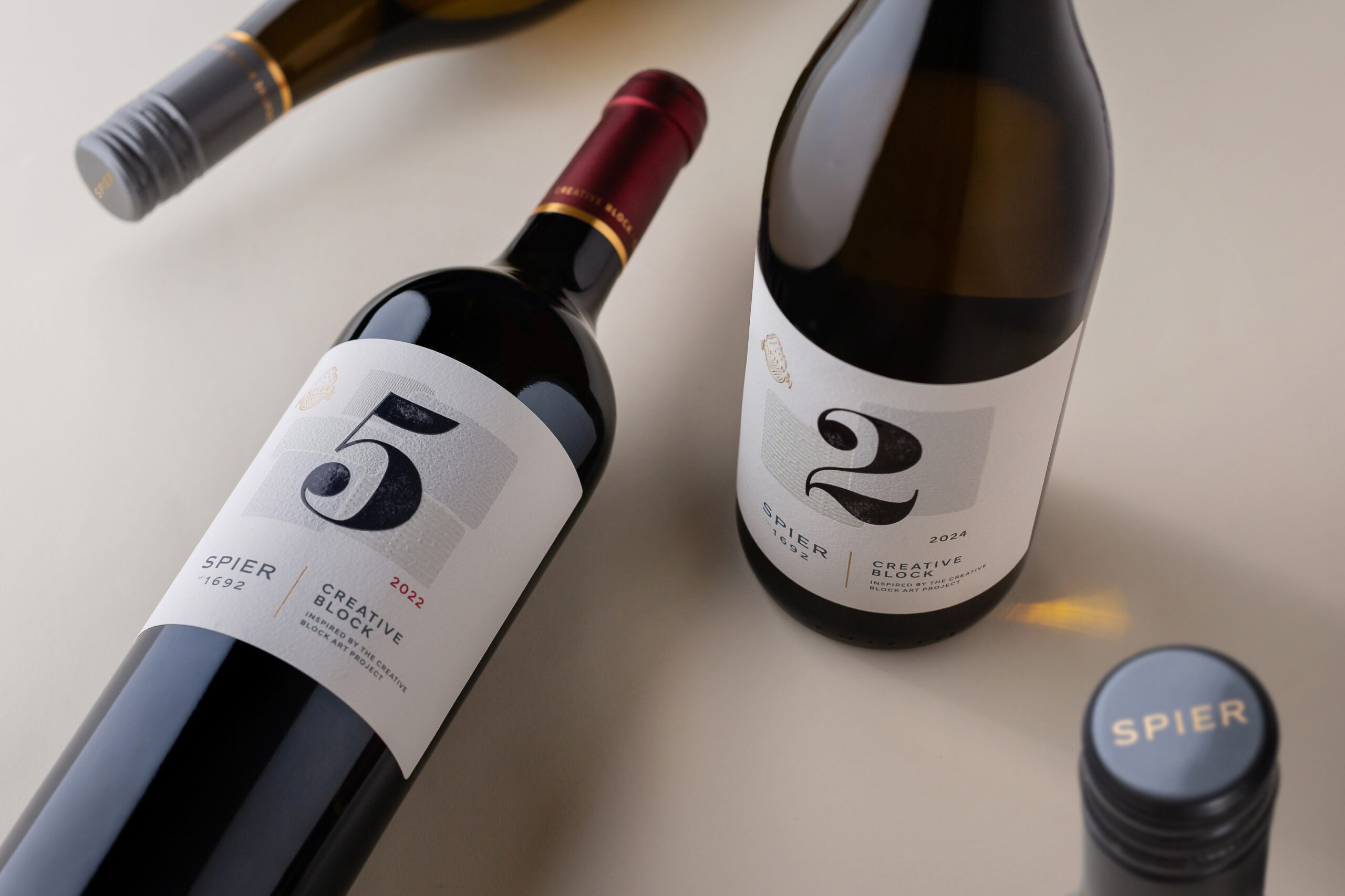
Creative Block is more than just a wine label — it’s a celebration of artistic community. Inspired by the Creative Block Art Project, which has supported emerging South African artists since 2004, the label design pays subtle yet meaningful homage to this initiative. A large, bold number remains the central visual element, denoting the blend number, while the background features layered texture blocks that are both visually and symbolically rich. These debossed patterns echo the patchwork of vineyard blocks that define our farm and form a direct visual metaphor for the land.
A standout feature of the redesign is the use of a single debossing tool to create multiple textures — an innovative and sustainable print solution that ensures precision while minimising material complexity. Premium gold detailing on the capsule and the elegant reintroduction of the Spier 1692 logo complete the package, reinforcing a brand that is rooted in heritage, defined by creativity, and expressed through design.


CREDIT
- Agency/Creative: Spier Wine Farm
- Article Title: Spier Wine Farm Unveils a Contemporary, Art-Led Identity for the Creative Block Range
- Organisation/Entity: Agency
- Project Status: Published
- Agency/Creative Country: South Africa
- Agency/Creative City: Stellenbosch
- Market Region: South Africa
- Project Deliverables: Brand Architecture, Brand Redesign, Design, Graphic Design, Label Design, Packaging Design
- Industry: Agriculture
- Keywords: WBDS Agency Design Awards 2025/26 packaging design in wine and print finishes.
-
Credits:
Design Agency: Gentry Design
Printer: Multi Colour Corporation - MCC


