


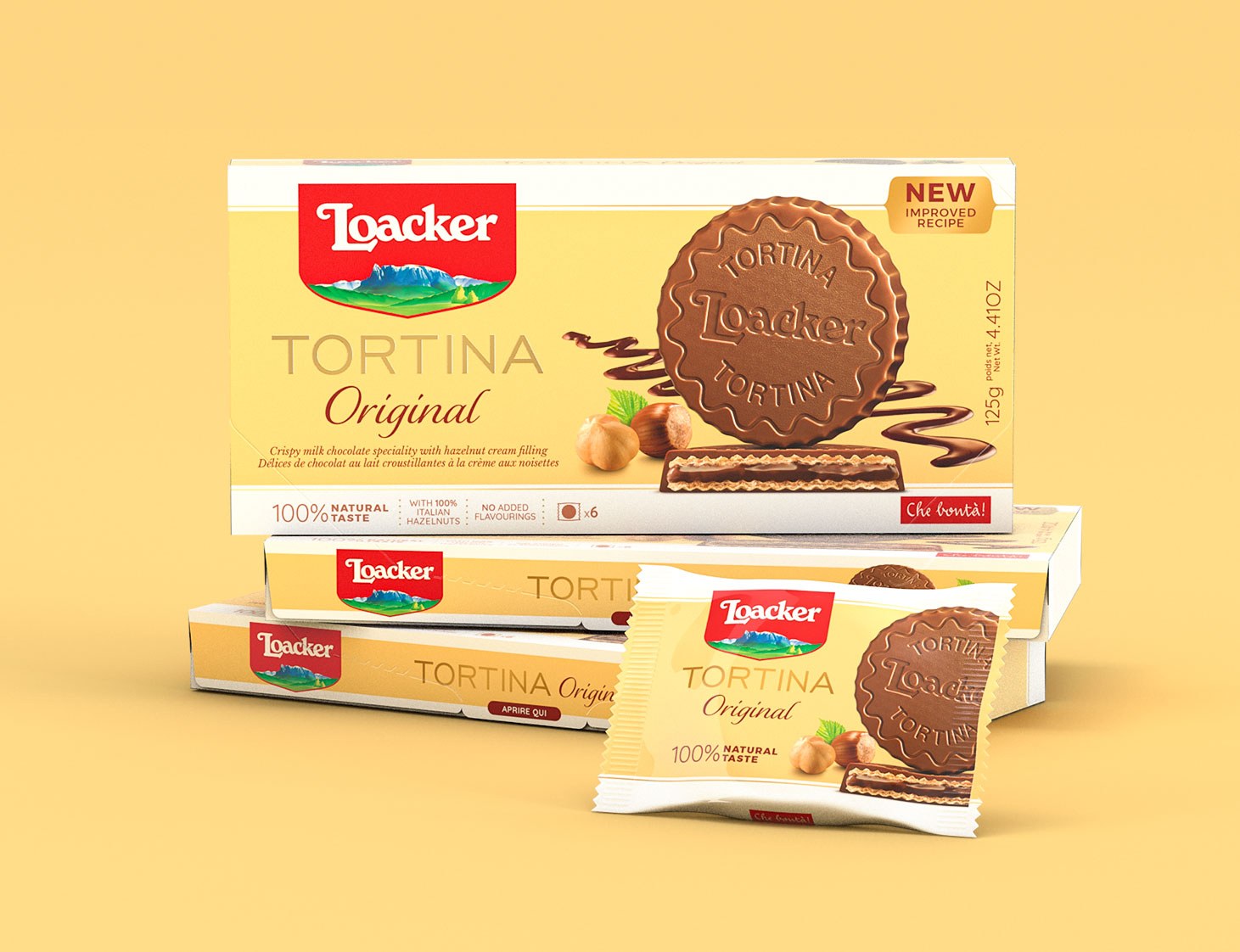
Every Good Idea is a Circle Journey. How to restyle an icon of pure goodness?
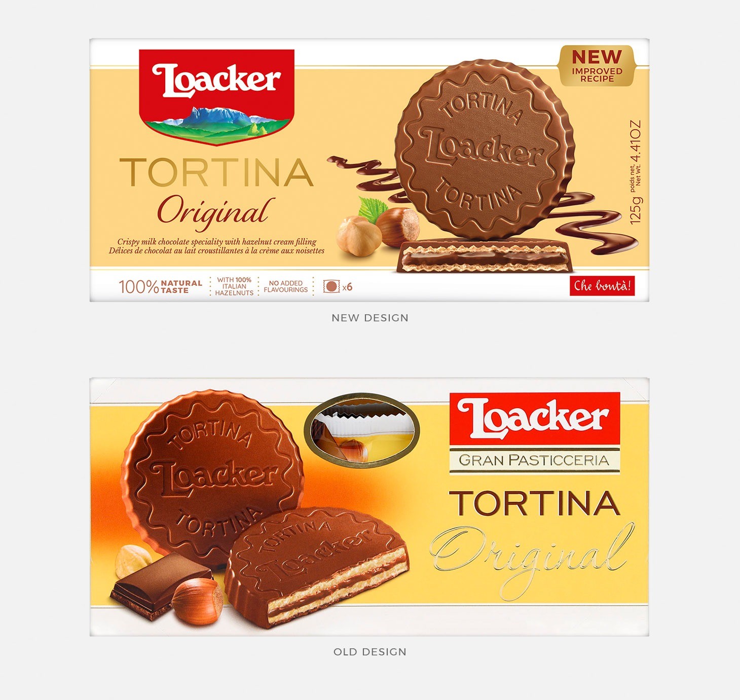
The answer is simple: we started with the recipe to then go back to the..recipe and then we closed the circle. Like that another tasty rebranding project and new pack design for Loacker has taken shape. This time is Tortina, a classic of the finest delicacies with its unmistakable round shape, three layers, three times irresistible: a profusion of fine chocolate, lighter and more fragrant wafers, the delicious filling. A triumph of goodness that we have told within its structure, flavor declensions and formats, always with the aim of emphasise Loacker brand identity whilst describing the product uniqueness.
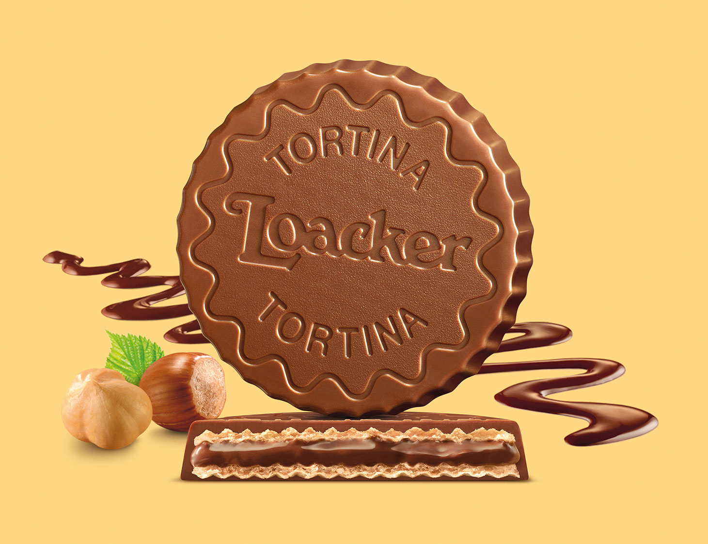
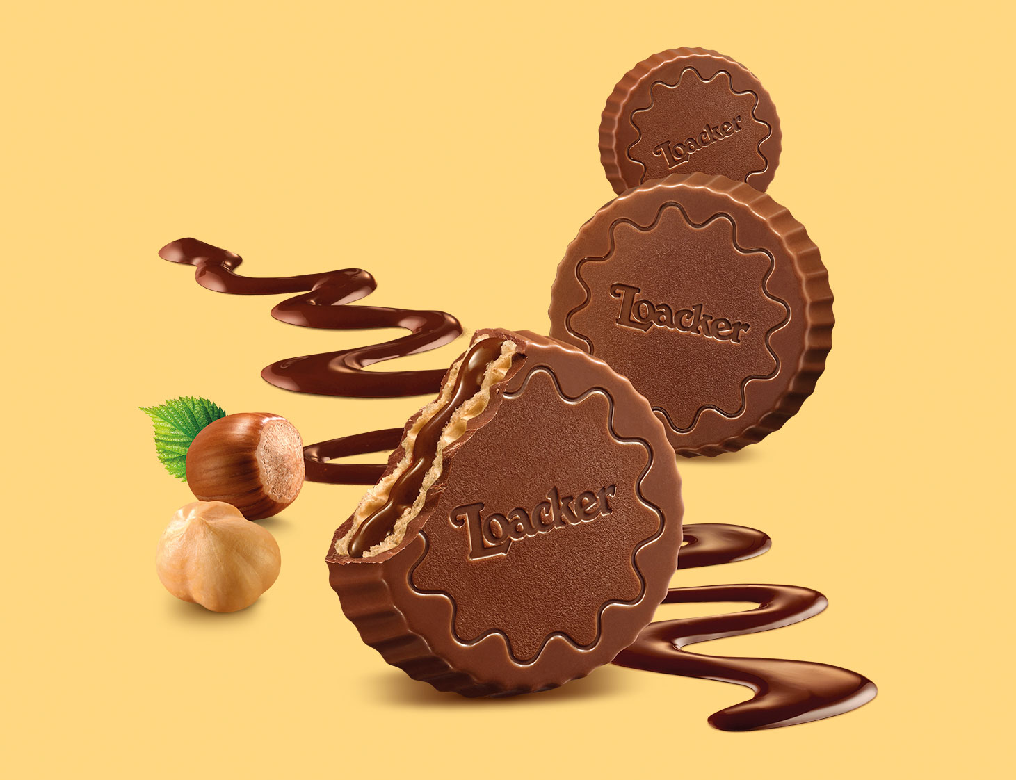
Surrounded by Elegance.
For the new pack of the Loacker Tortina line, we have developed a key visual which associates shape and filling, favoring a premium approach, essential and elegant, but also narrative: the product is clearly shown, the stratification is right there and comes out with all its gluttony, the deliciousness is visually narrated and is attractive at first glance. The logo is enriched by gold and it passes on the appeal of the art of confectionery.
A Very Recognisable Versatility is The Icing on the Tortina.
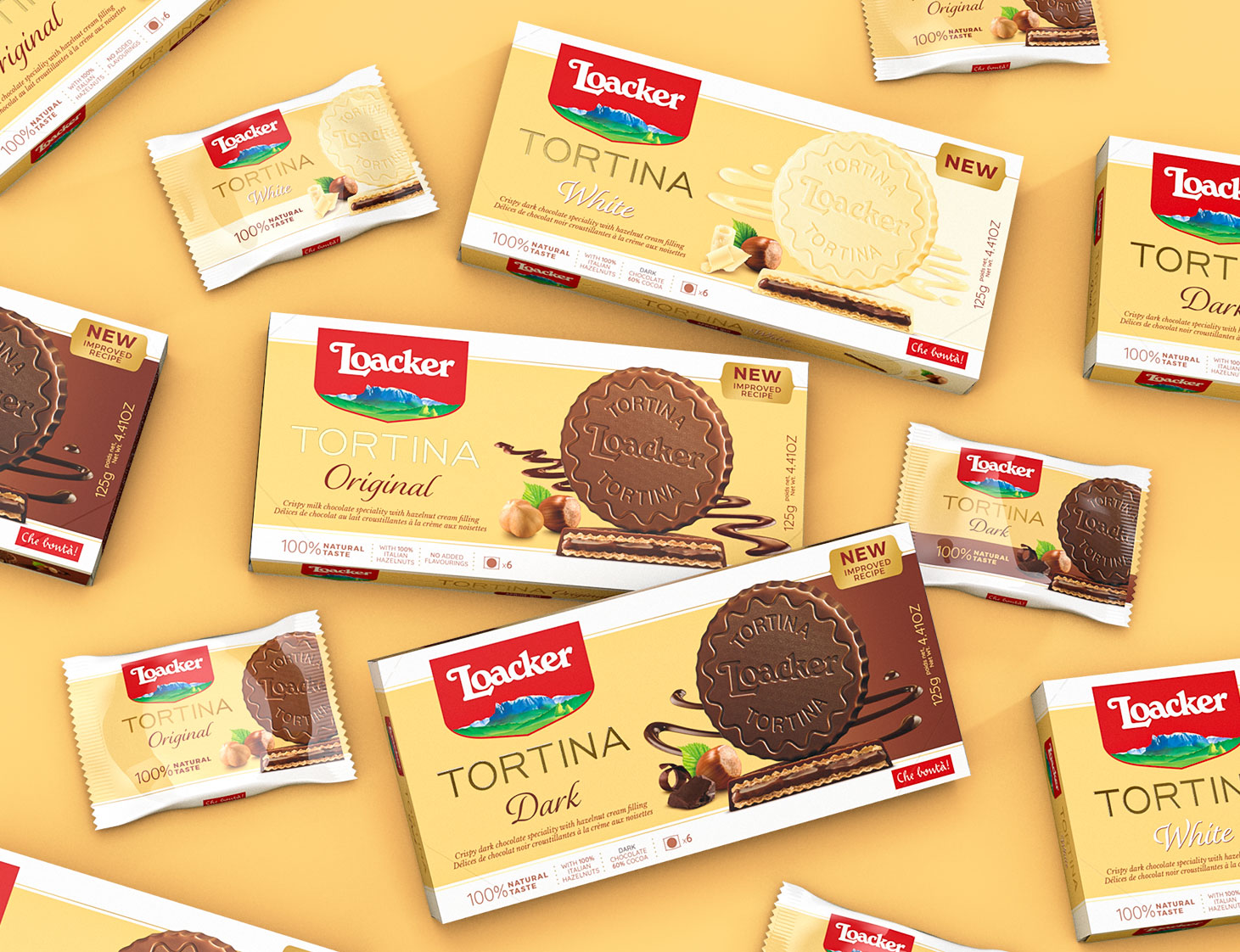
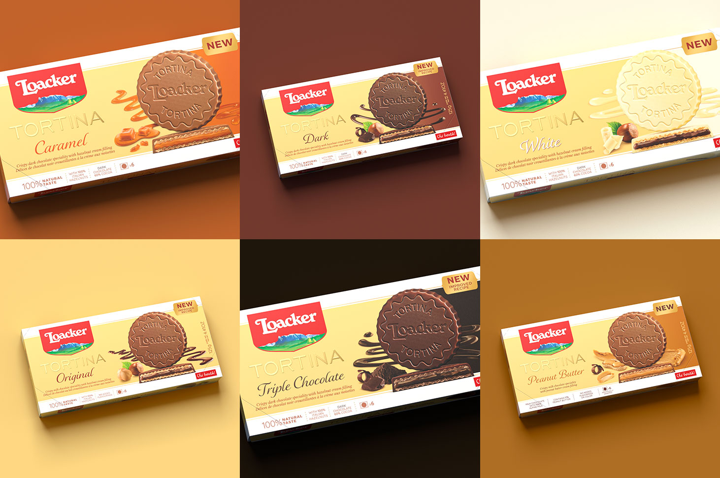
We studied a format able to coordinate whilst also differentiate all flavor declensions, applying dedicated language and visual elements capable of communicating key messages. In doing so the layering in its many forms become the main character, not only through the descriptions and ingredients in the foreground, but also thanks to the zig-zag decoration which varies according to the filling and that recalls the fine incision on the Tortina shape.
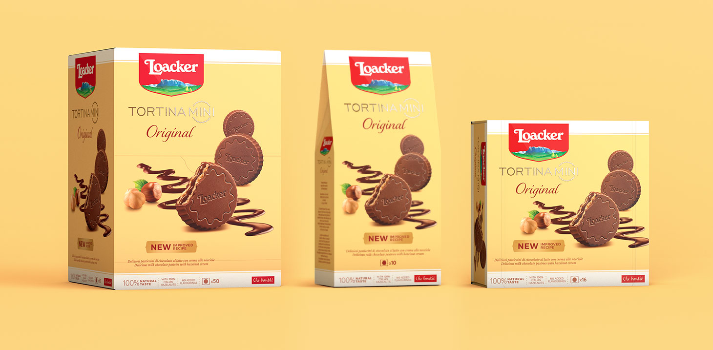
Maxi Goodness in Mini Size.
Adaptations for Loacker Tortina Mini confirm the format declinability, both horizontally and vertically, visually underlining the product guiding-idea: to focus all of Tortina deliciousness into an irresistible mini version capable of gifting us of the same mouthwatering experience of the standard size.
The Evolution Of The Pack.
Different but always familiar, the new pack has been developed to value all plus of the product family coordinately with Loacker new global pack system, yet it still holds the high recognizability of Tortina for the joy of all its amateurs.
CREDIT
- Agency/Creative: Spider
- Article Title: Spider Designs Loacker Tortina Packagings New Look
- Organisation/Entity: Agency
- Project Type: Packaging
- Project Status: Published
- Agency/Creative Country: Italy
- Agency/Creative City: Rivoli
- Market Region: Europe, Global
- Project Deliverables: Art Direction, Brand Architecture, Brand Redesign, Branding, Packaging Design
- Format: Pouch
- Substrate: Plastic
- Industry: Food/Beverage
- Keywords: loacker, spideradv, branding, packaging, wafer
-
Credits:
Food photos: PiuLuce


