After nearly three years of work and consultancy, it finally showed on the shelves of all main markets worldwide, the result of the cooperation between Loacker and Spider. A new rebranding and packaging system design in support of the historical Company from Alto Adige, a major player in the production of chocolate specialties and wafer and the latest task for us to handle. Both Teams, Spider and Loacker, have worked incessantly side by side at every stage, first strategically on the design, next by having a dense analysis of the logo and the packaging redesign, including all graphic details, words and images. We proceeded with tests and some fine-tune, in a steady exchange of ideas, until the final goal was achieved, which now involves a new communication format as well.
The Final Brief’s Evolution
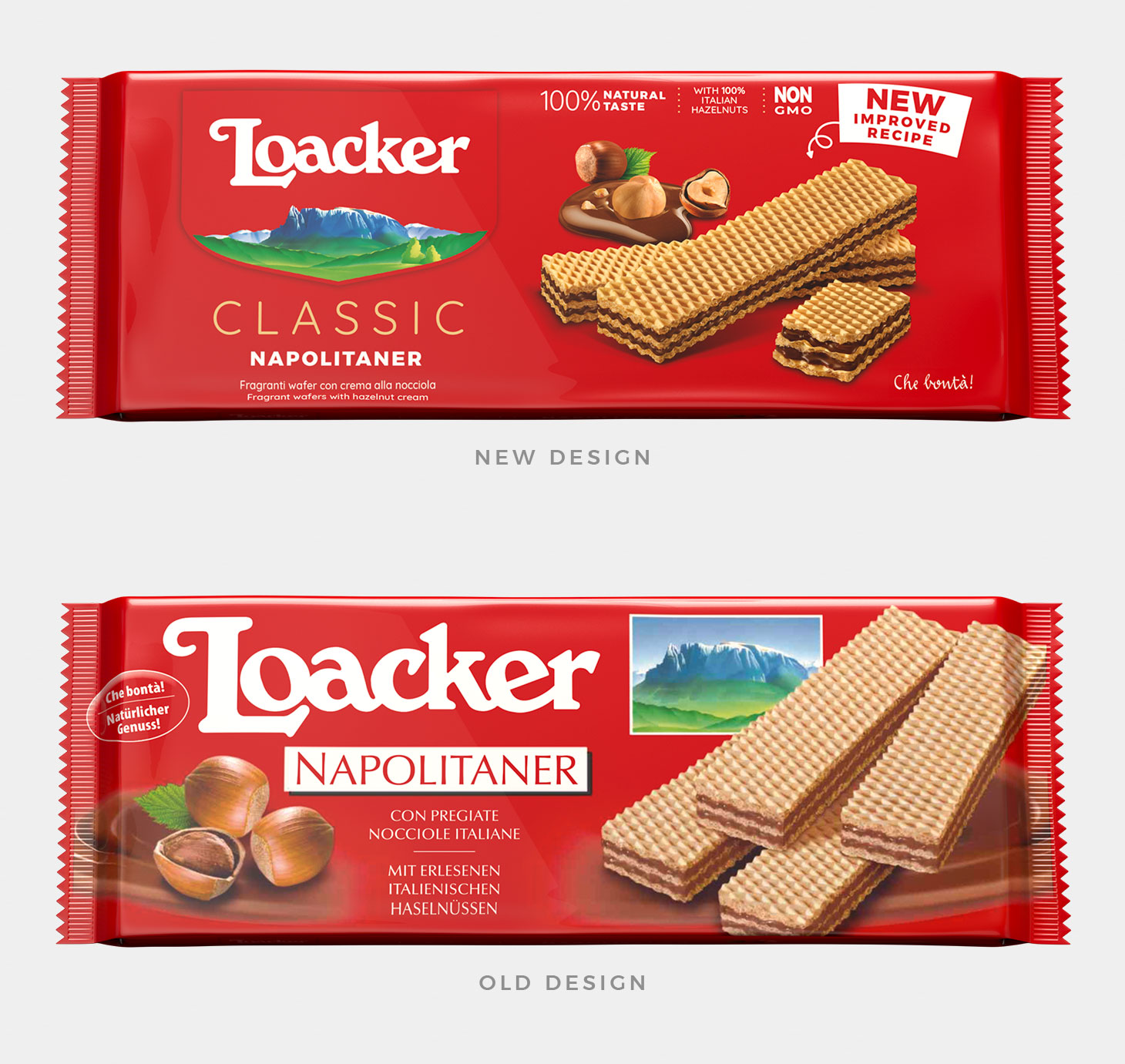
Loacker’s requirement was to communicate on the packs the recipe changeover, highlighting the product new pluses and also by increasing the brand perception; our goal was to find the right balance between the Loacker’s brand vertical integration and the distinction among the diverse product lines. Following many meetings with Spider and several shared assessments, it has been commonly decided to go beyond the starting brief, which lead us to the definition of a global strategy, through rebranding till the establishment of a pack system for each product line and up to the POS’ communication.
The ‘Communication Care’ Method
Spider has faced the challenge using our own method, by joining creative thoughts and strategic thinking. We have interviewed the Company multiple times, we had a chat with consumers, then suppliers. We have analysed all sources: packaging shapes, products structure and their distinctive features. We have gathered maps: conceptual ones, brand architecture maps and competitors’ charts. We have involved the Loacker Team to evaluate the over 200 references and also for purposes of all ranges’ razionalisation; we have offered a definition for all categories and one for each different positioning. The outcome of this work are various paths grounded on different strategic approaches and then declense on reference of representation. All proposals have been tested via means of neuroscience and afterwards, through POS’ market tests, only then we have came to an ultimate choice. From here on we began the whole Loacker’s range packaging development.
The Heritage Shield Making
Loacker is not just a brand, is a family name. Moreover Loacker is on the territory, actually IT IS the territory.
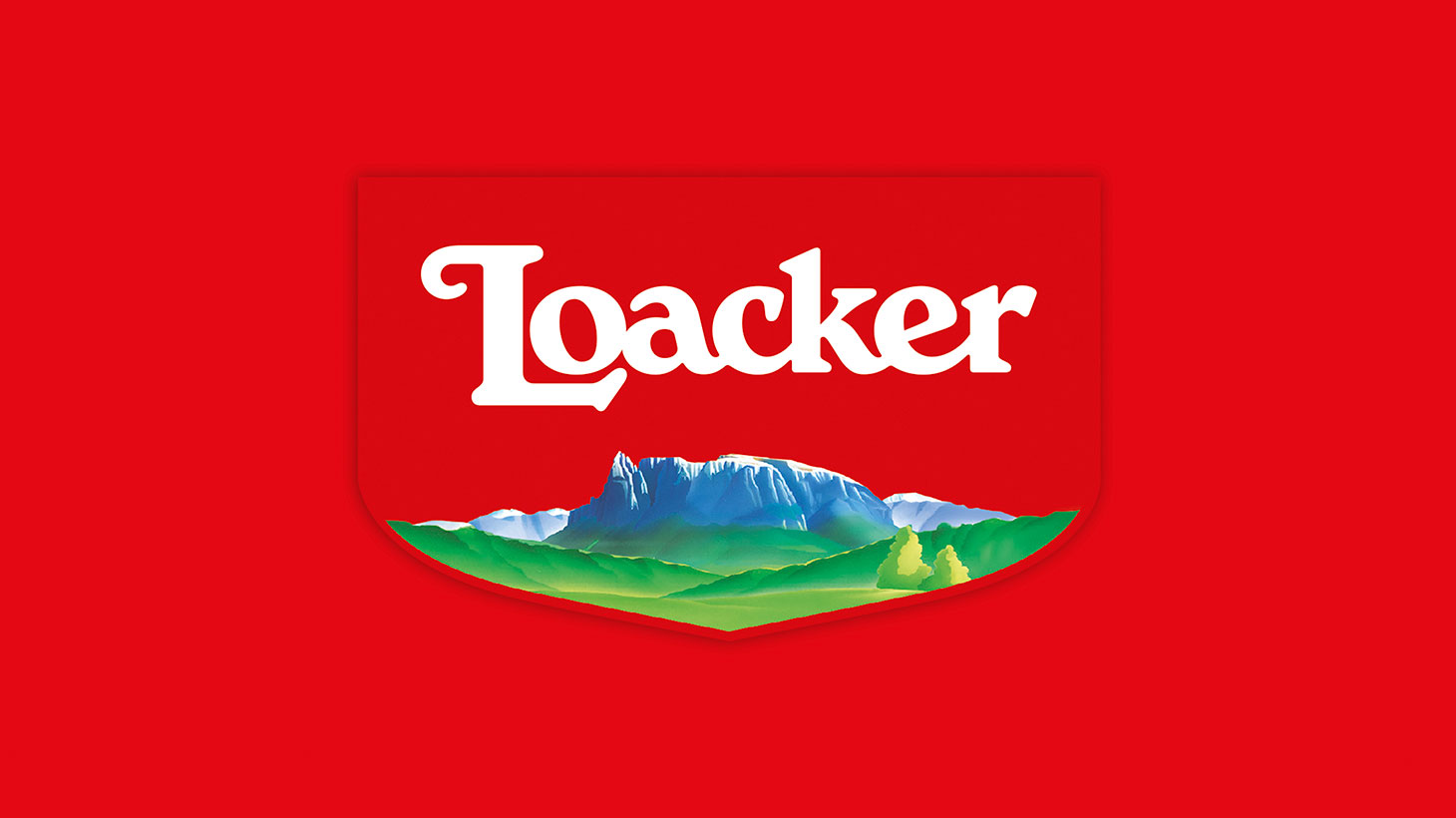
From these considerations, the logo in the shape of a coat of arms was born, Mt. Sciliar has been incorporated on it: please welcome the Heritage Shield, which has been inspired by the historical Loacker crest and that exhaustively expresses the brand’s essence, family name, roots and nature. A company philosophy but especially a way of life that started in 1925, when Alfons Loacker settled to build his plant at 1000 mq of height, he didn’t let himself being stopped by logistical difficulties so as to make his wafers with the purest mountain water, breathing clean air and letting himself being encouraged by the unspoilt nature.
The System Pack: Less is More and Clearance Space
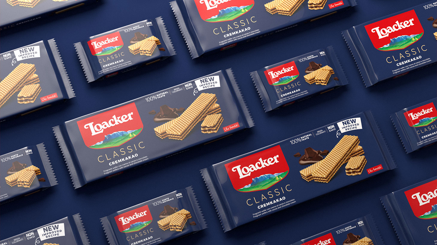
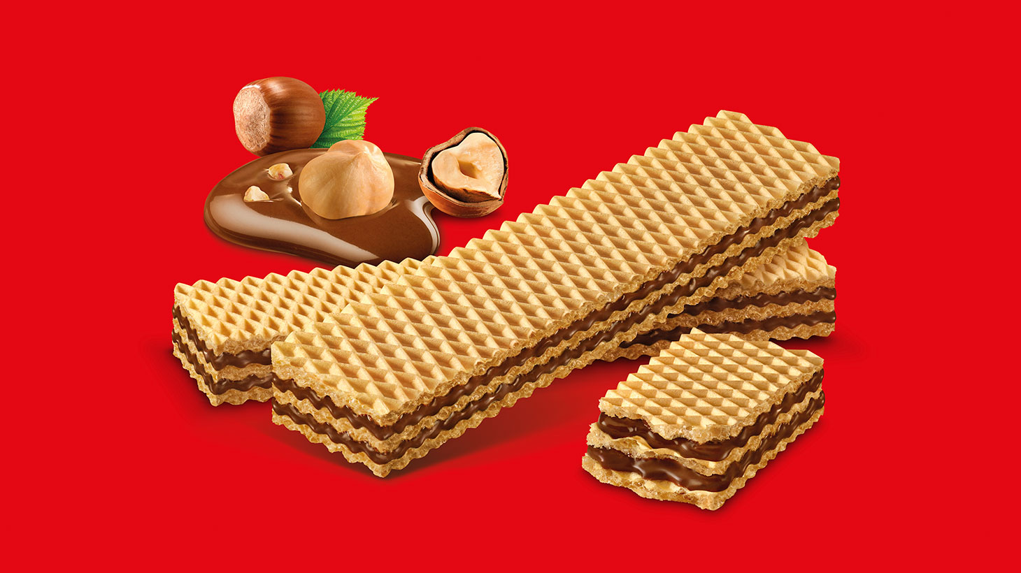
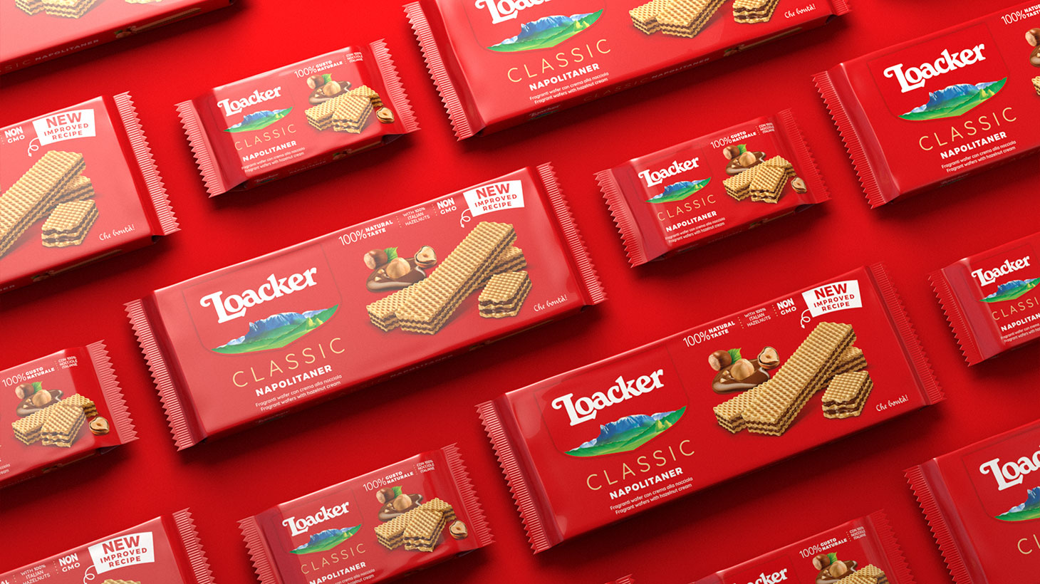
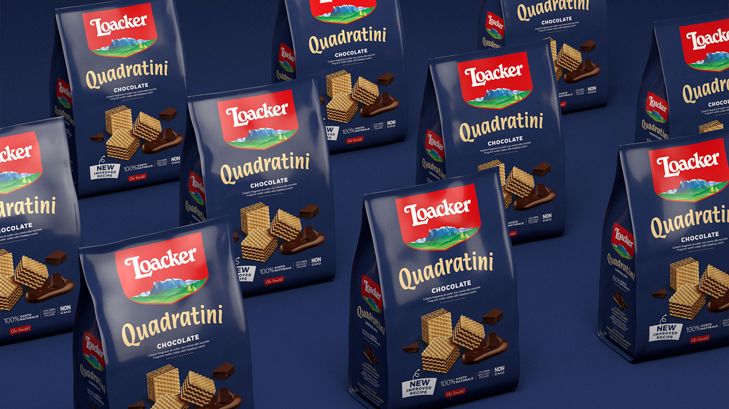
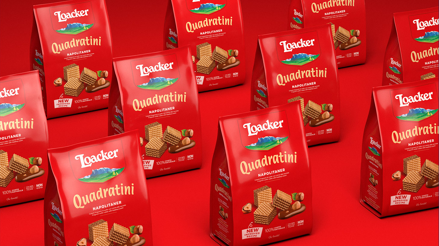
The common goal: to cleanse entirely the packaging of crowding elements. This way the product representation is not in any degree set, but rather realistic and explicit in order to express its natural deliciousness. Each flavour and family product has been delineated, underlining the recipe and the ingredients’ quality, additionally the brand’s and product’s architecture have been redefined. On every referee we have recounted the historic claim “Che bontà” and on the retro pack, along with a short institutional text, the QR code redirects to the video and storytelling about the brand and the specified item.
From the research conducted on about 18.000 consumers, it emerges that the new logo and the new pack design bestowed to all Loacker products the 20% of visibility and recognizability for every range.
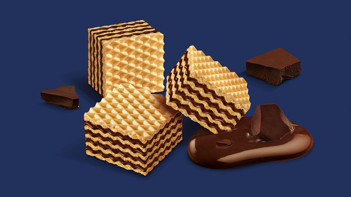
All images were realised featuring studio +Luce.
A New Logo and Packaging in a Condition of Continuity with their Past
As summed by Marco Ventrice, founder of Spider adv: “the Loacker’s logo and packaging, echoed of 30 years of different styles and historical eras. We have worked aiming to make everything new but still recognizable. Familiar, even if quite different. Besides, the Loacker’s packaging redesign has been an essential touch point in order to communicate directly to the consumer. This is the reason why the Company made the decision to invest most of its resources into the analysis and in the makeover of this crucial “media”, which has to be visible on the shelves and that had to be rethought completely for the purpose of revealing the brand’s values, product’s quality and coordinated assortment. Loacker did not want to limit us in any way: this allowed us to redefine the elements hierarchy and gain a clear system capable of declension, making it not only good, but also good-looking.”
CREDIT
- Agency/Creative: Spider
- Article Title: Spider Agency Make Changes to Loacker While Helping Them to Remain Themselves
- Organisation/Entity: Agency
- Project Type: Packaging
- Project Status: Published
- Agency/Creative Country: Italy
- Agency/Creative City: Rivoli
- Market Region: Europe, Global
- Project Deliverables: Art Direction, Brand Architecture, Brand Redesign, Branding, Packaging Design
- Format: Pouch, Sleeve
- Substrate: Plastic
- Industry: Food/Beverage
- Keywords: loacker, spideradv, branding, packaging, wafer
-
Credits:
Product Images: PiuLuce


