SPH.Re is a company that offers creative services in several areas, such as: Art, Photography, Design and Illustration.
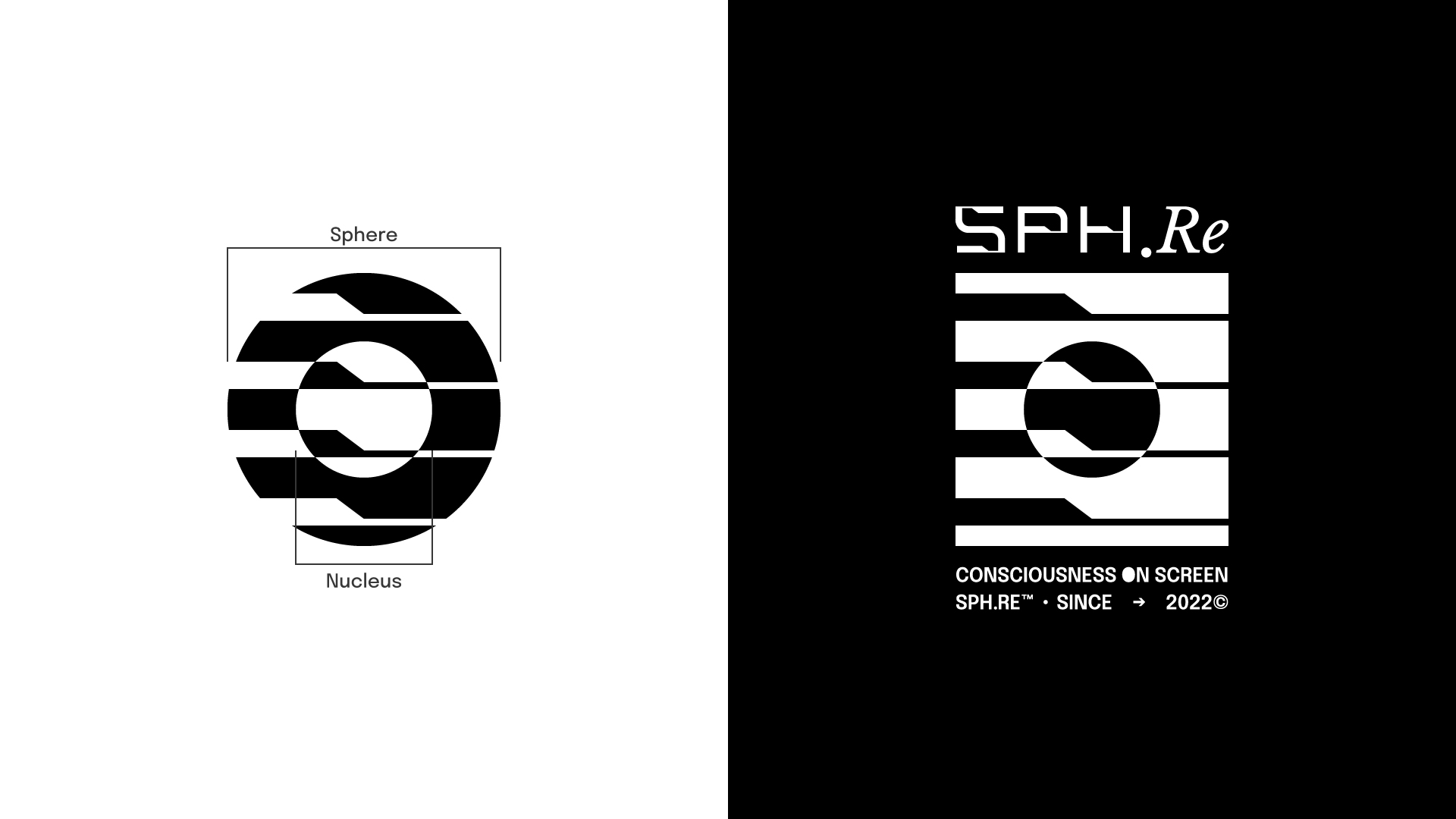
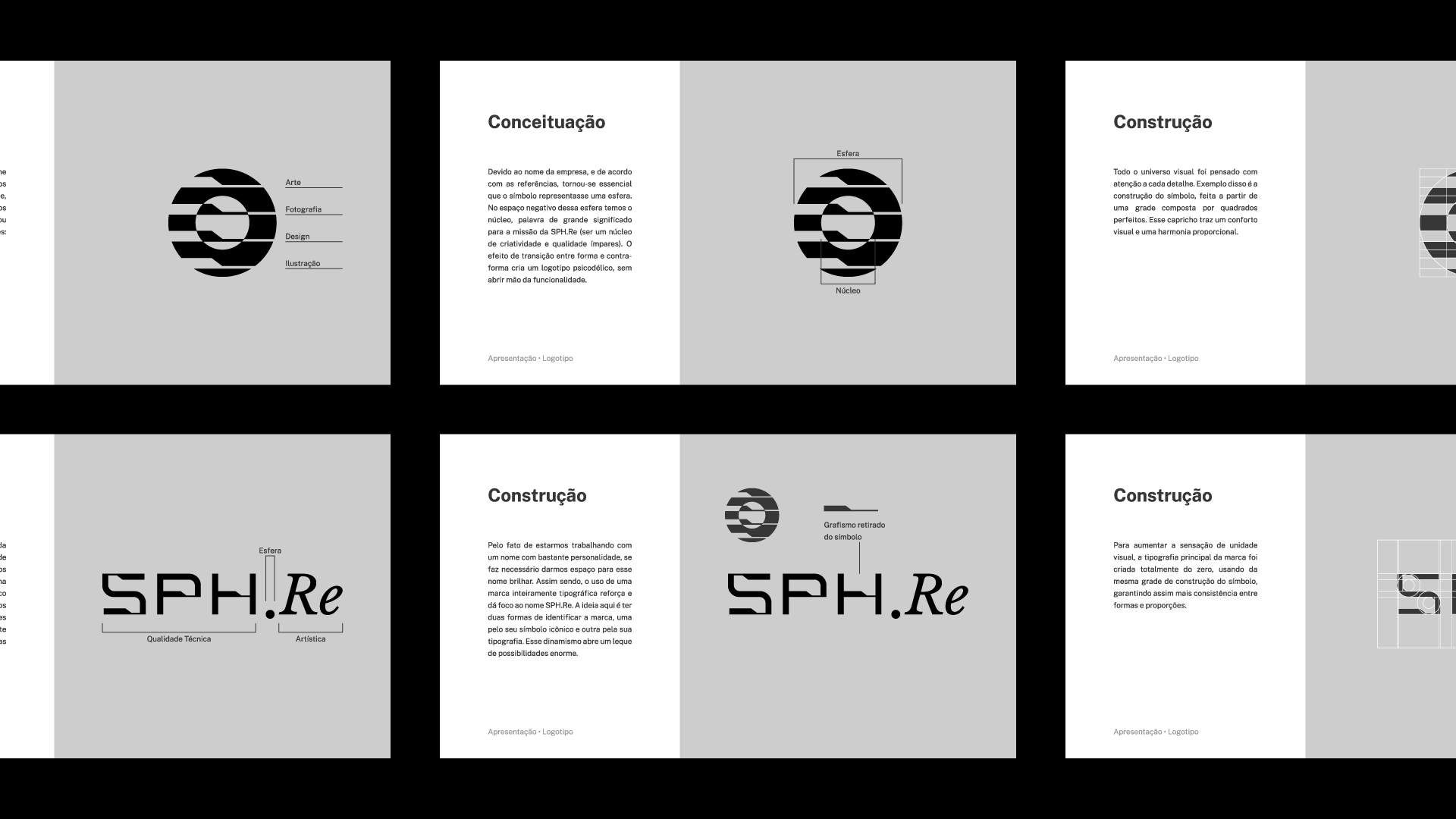
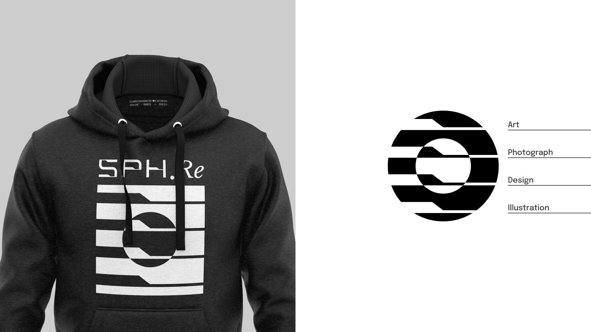
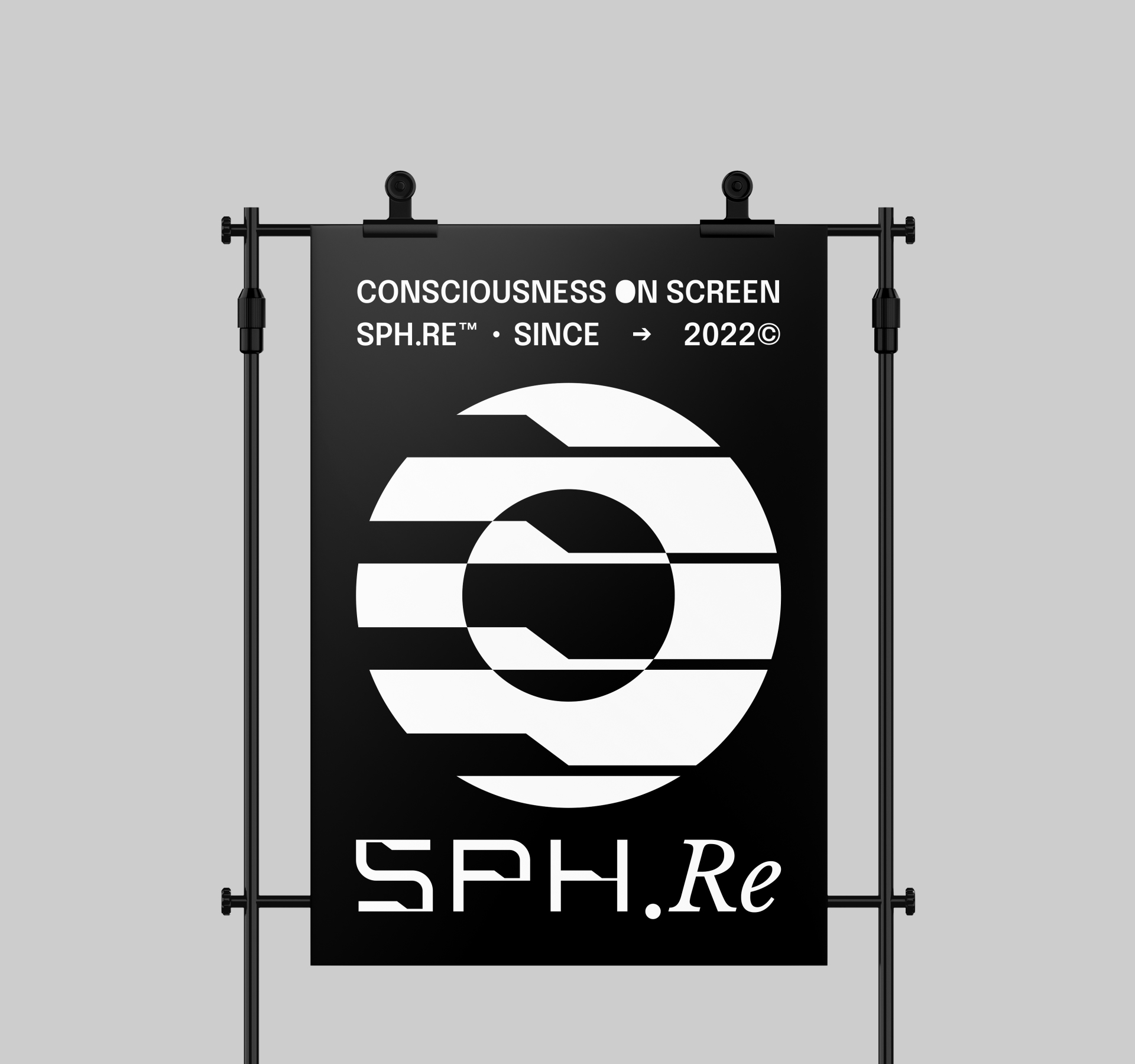
Due to the name of the company, and according to the references, it became essential that the symbol represented a sphere. In the negative space of this sphere we have the nucleus, a word of great meaning for the mission of SPH.Re (to be a nucleus of unique creativity and quality). The transition effect between form and counterform creates a psychedelic logo, without giving up functionality.
Each horizontal cut in the icon represents a pillar of the brand. We’re talking about a creativity company, not just 3D rendering. Therefore, all services provided, in one way or another, will drink from these four sources: Art, Photography, Design and Illustration.
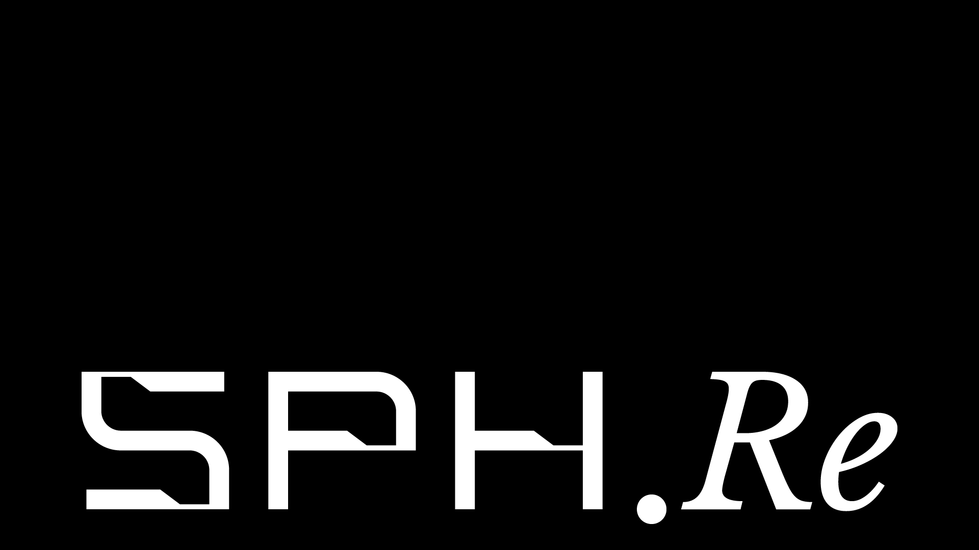
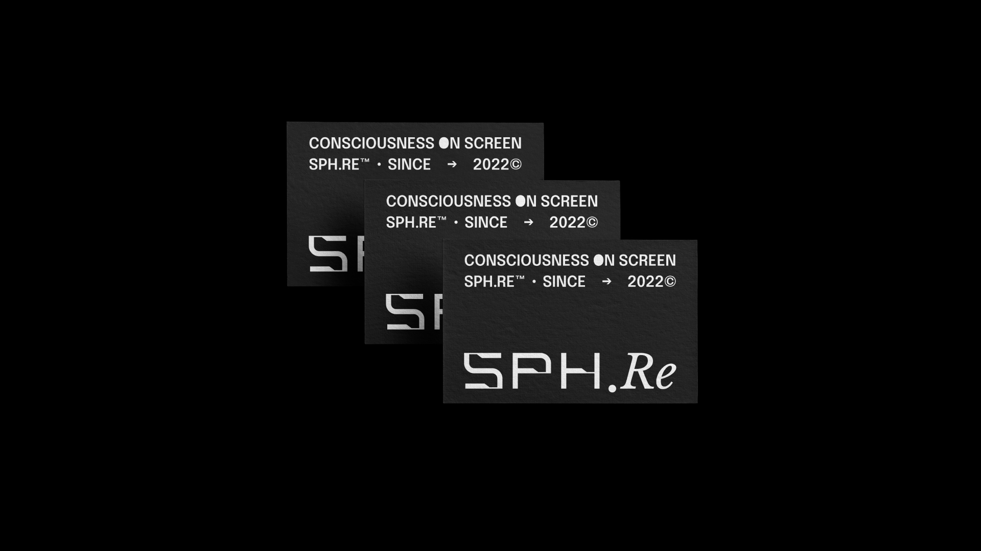
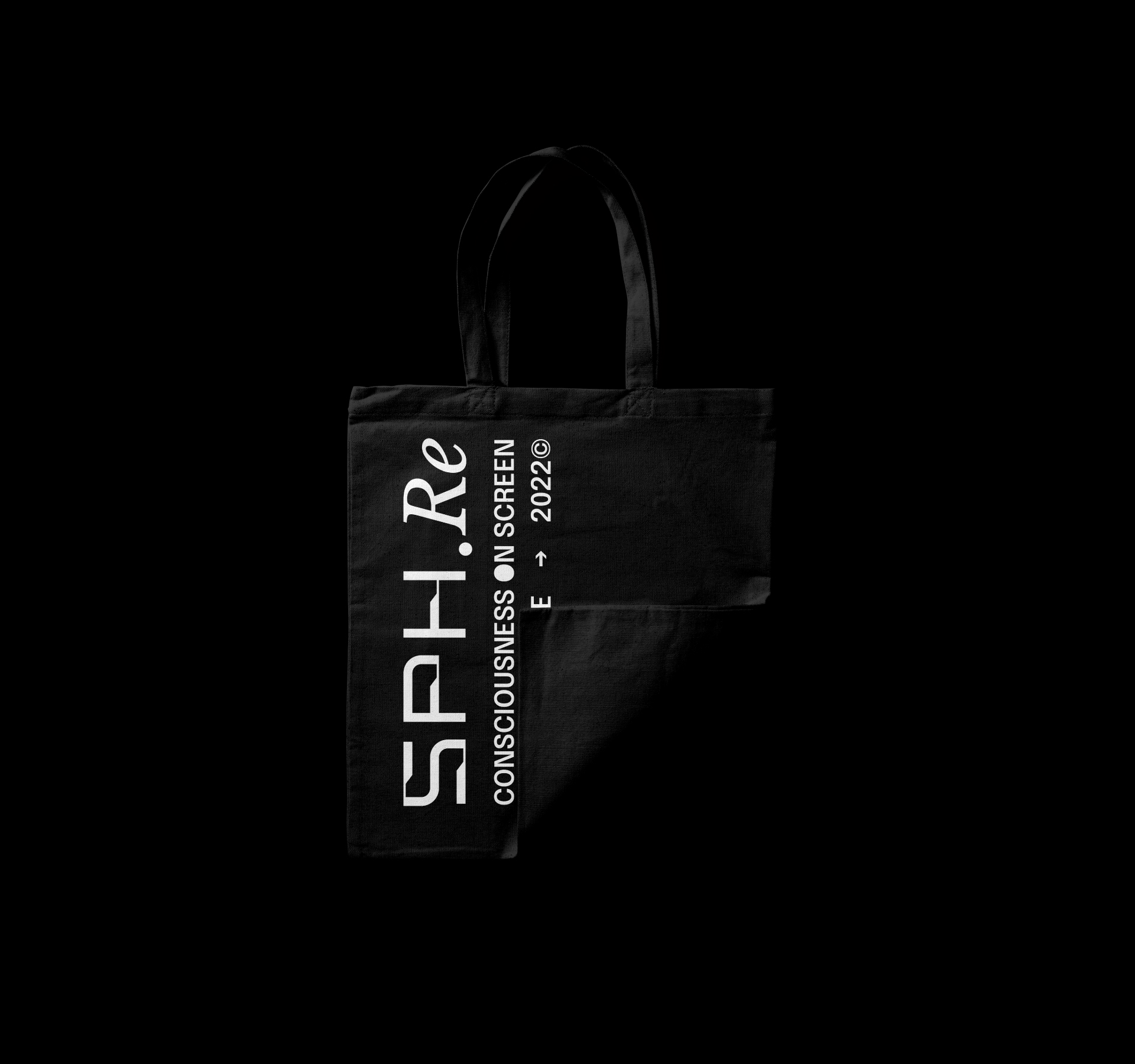
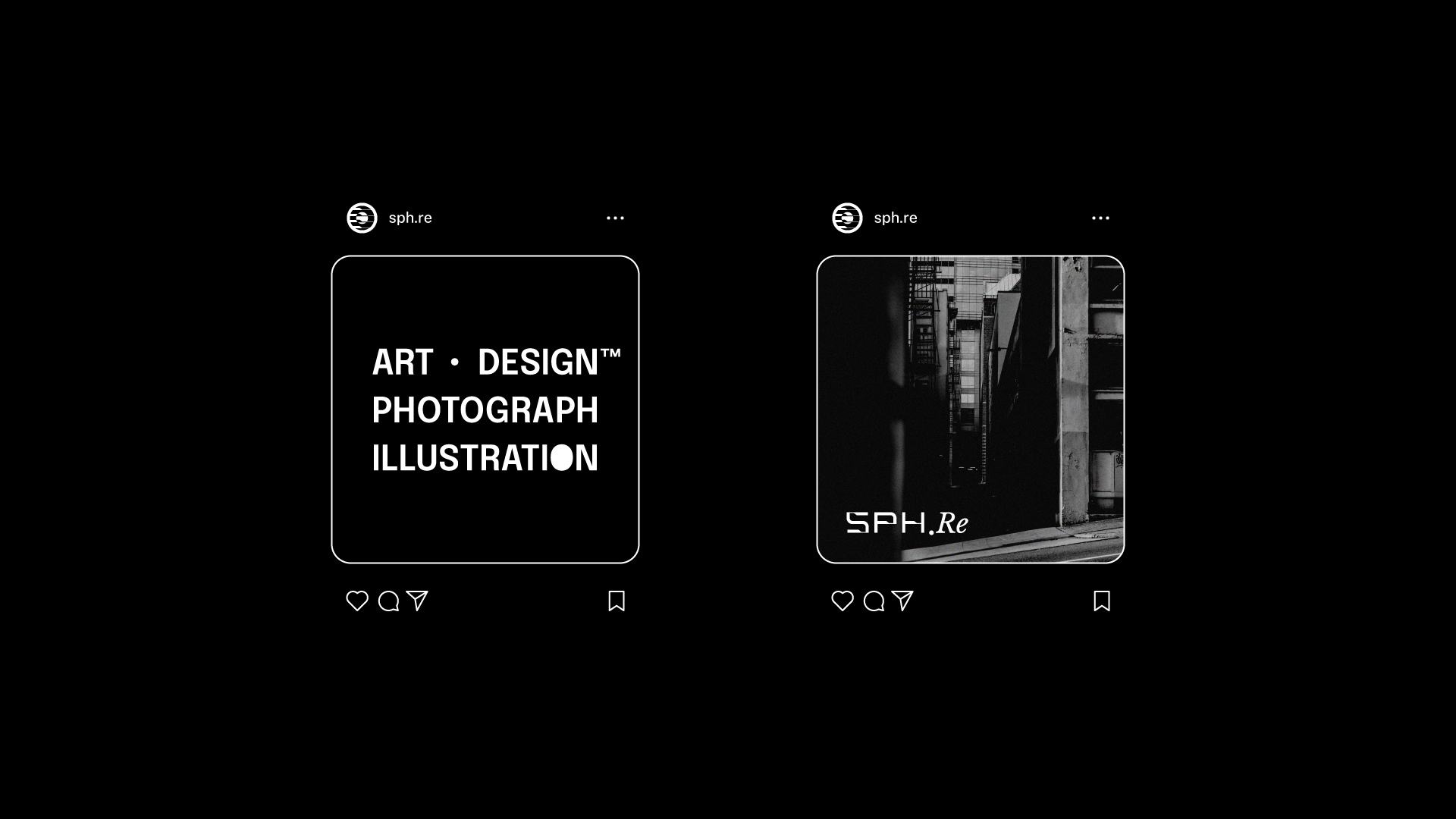
Because we are working with a name with a lot of personality, it is necessary to give that name space to shine. As such, the use of an entirely typographic branding reinforces and focuses the SPH.Re name. The idea here is to have two ways of identifying the brand, one by its iconic symbol and the other by its typography. This dynamism opens up a huge range of possibilities.
Each decision behind building the brand focused on creating a proprietary form of communication. The straight lines present in the letters ”SPH” reflect a company with unquestionable quality and technical refinement. However, in order not to have a very plastered design, the diagonal cuts bring elegance. The contrast provided by the serif font in the letters ‘‘Re’’ is atypical and bold, like art.
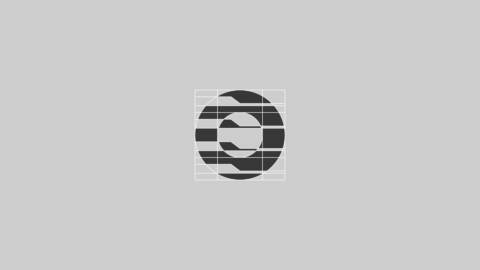
To increase the sense of visual unity, the brand’s main typography was created entirely from scratch, using the same construction grid as the symbol, thus ensuring more consistency between shapes and proportions.
CREDIT
- Agency/Creative: Henrique Nathan Design
- Article Title: SPH.Re Brand Design
- Organisation/Entity: Freelance
- Project Type: Identity
- Project Status: Published
- Agency/Creative Country: Brazil
- Agency/Creative City: Marco
- Market Region: South America
- Project Deliverables: Art Direction, Brand Identity, Brand Redesign, Brand Strategy, Branding
- Industry: Technology
- Keywords: brand, brand identity, branding, corporate, design, identity, logo, logotype, typography, visual identity
-
Credits:
Art Director: Henrique Nathan Silveira Rios


