Leave management: two words that have been the cause of many a headache for countless HR personnel across all industries. It’s lots of complicated paperwork that if not completed properly can end up hurting valuable employees when they’re hurting the most. Sparrow has developed HR software that makes leave management easy for companies and employees.
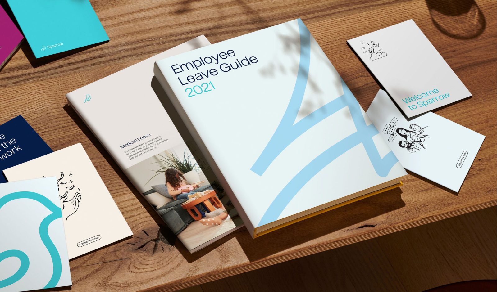
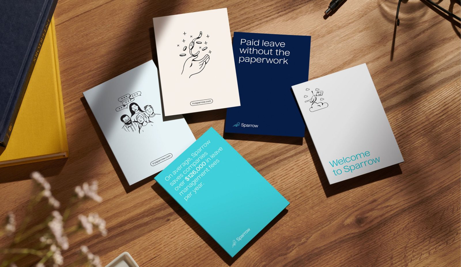
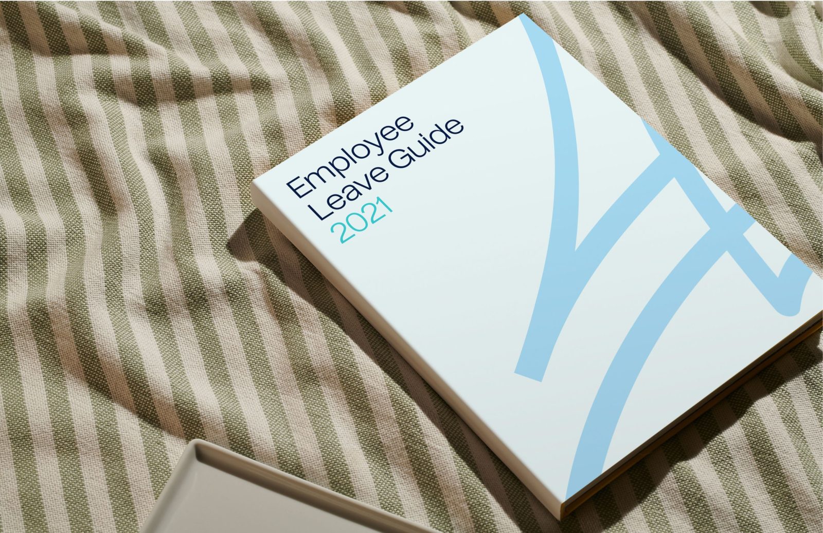
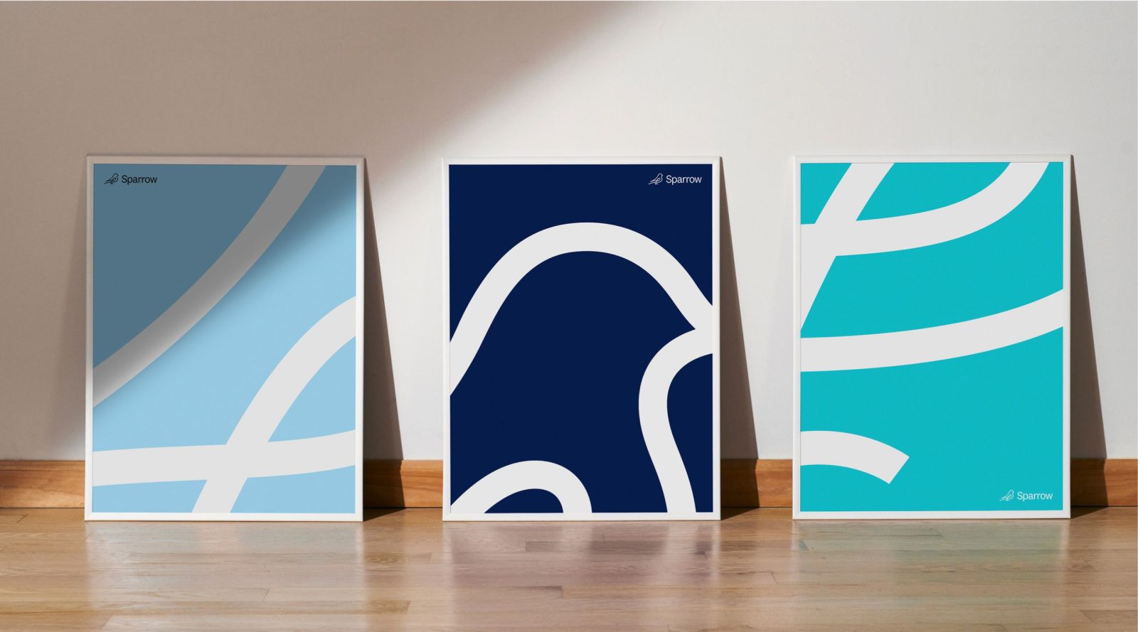
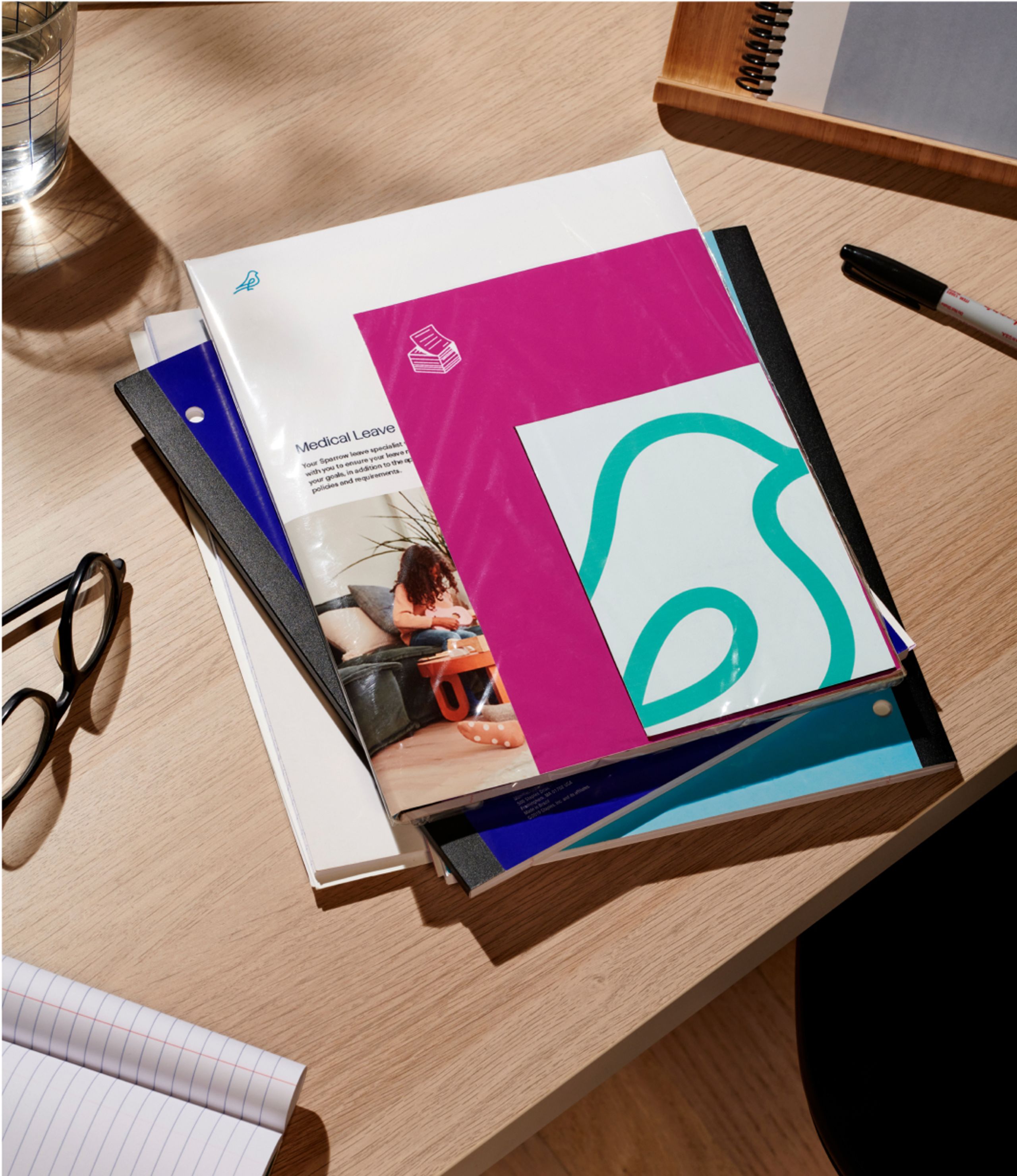
We worked closely with the Sparrow team to build them a new identity system infused with the same compassion and human touch as their beloved product. Every aspect of the art direction, from the warm lifelike photography to the lightly whimsical hand-drawn illustrations, carries with it strong feelings of caring professionalism synonymous with the Sparrow brand.
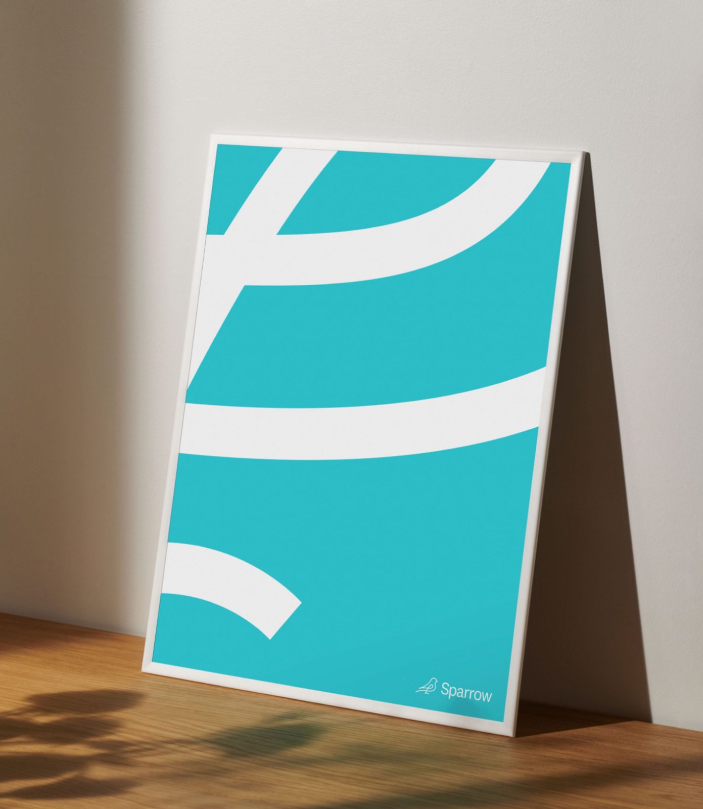
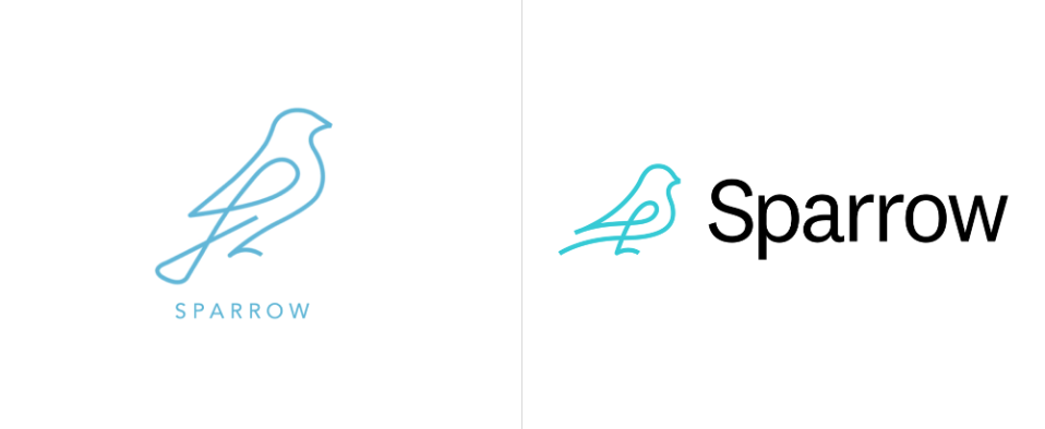
The illustrated logo takes the shape of our fine feathered friend, the sparrow, a species known for its resourcefulness. It’s hard not to feel a sense of relaxation and ease when you see the Sparrow logo. Drawn with a simple single curving line in a soothing turquoise blue, the logo gives a quick read that lets the viewer know they’re in safe care.
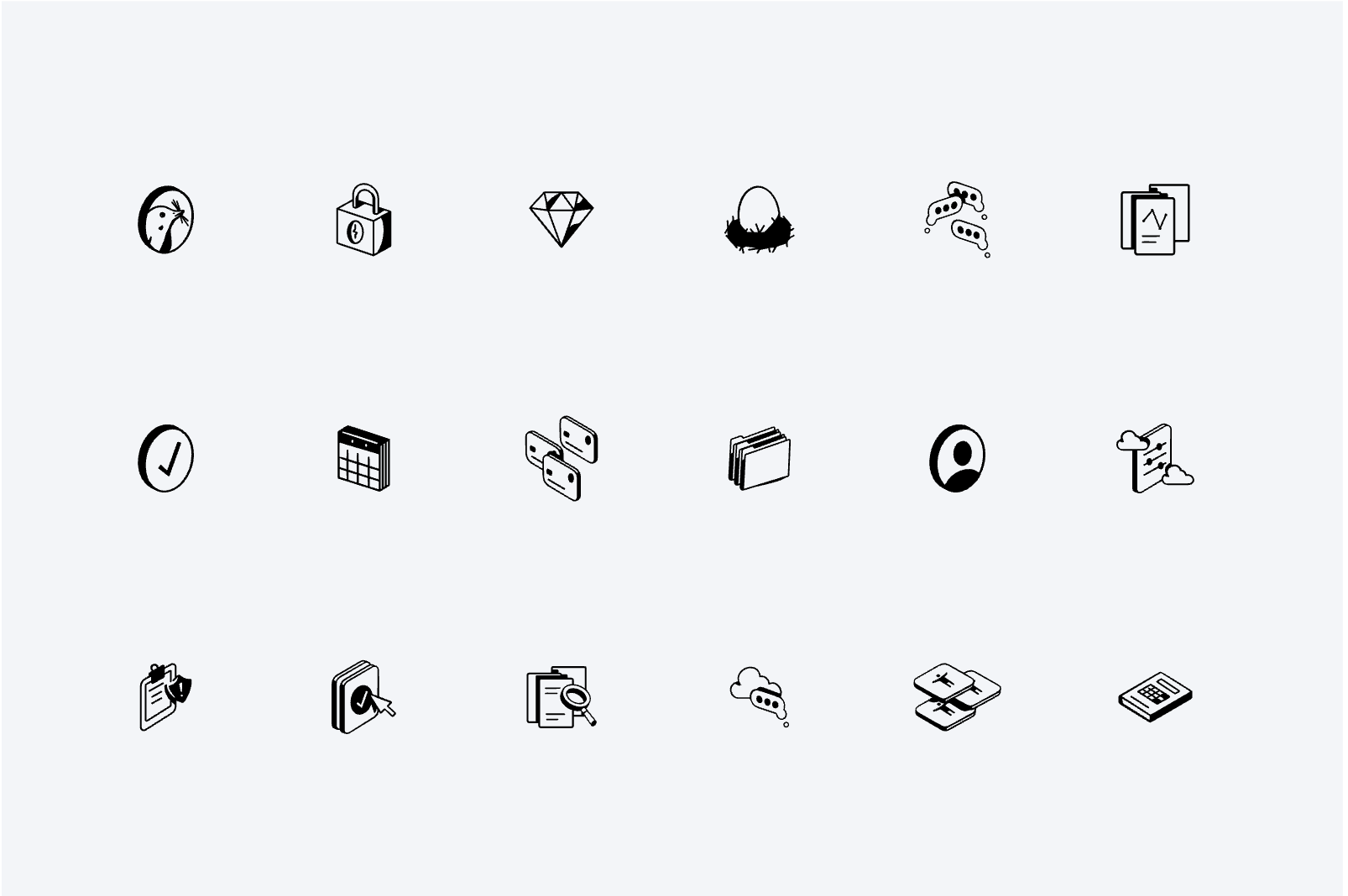
We complemented the sparrow with a series of friendly black-and-white line drawn illustrations. Both the illustrations and logo appear throughout the website to help foster an atmosphere that’s casual and inviting. Demonstrating further how Sparrow makes the leave management process an easy one.
Our color palette runs across a comforting range of hues. The three darker tones of Aqua, Indigo and Ruby are offset by the pastel shades of Carnation, Sky and Eggshell to present an overall look and feel that is gentle yet assertive.
For type we chose two sans-serif fonts for their contemporary and functional look. We utilitzed Nuckle as our primary font and supplemented it with Graphik. Both are quite easy to read. An attribute that fits well with the Sparrow mission.
And that’s our Sparrow brand system. Thank you for reading. You may now feel free to take leave and move on to the next entry.


CREDIT
- Agency/Creative: Play Studio
- Article Title: Sparrow Brand Redesign by Play Studio
- Organisation/Entity: Agency
- Project Type: Identity
- Project Status: Published
- Agency/Creative Country: United States of America
- Agency/Creative City: San Francisco
- Industry: Technology
- Keywords: WBDS Agency Design Awards 2022/23
-
Credits:
Executive Creative Director: Casey Martin
Design Director: Nate Baltikas
Sr. Designer / Illustrator: Ellis Latham-Brown
Sr. Designer: Mauro Bonillo
Sr. Designer: Albert Mestres
Sr. Designer: Kelly Scheurich
Product Designer: Emerson Ward
Designer: Alli Berk
Photographer: Peter Prato
Photographer: Mari Juliano


