


The Peggy Notebaert Nature Museum of the Chicago Academy of Sciences (Nature Museum) has been connecting Chicagoans with nature and science since 1857, making it Chicago’s oldest museum and one of America’s earliest scientific institutions. Following a new strategic plan, the Nature Museum commissioned Nick Adam’s team at Span to evolve its visual identity to broaden its influence in the spheres of environmental action, conservation, and research.
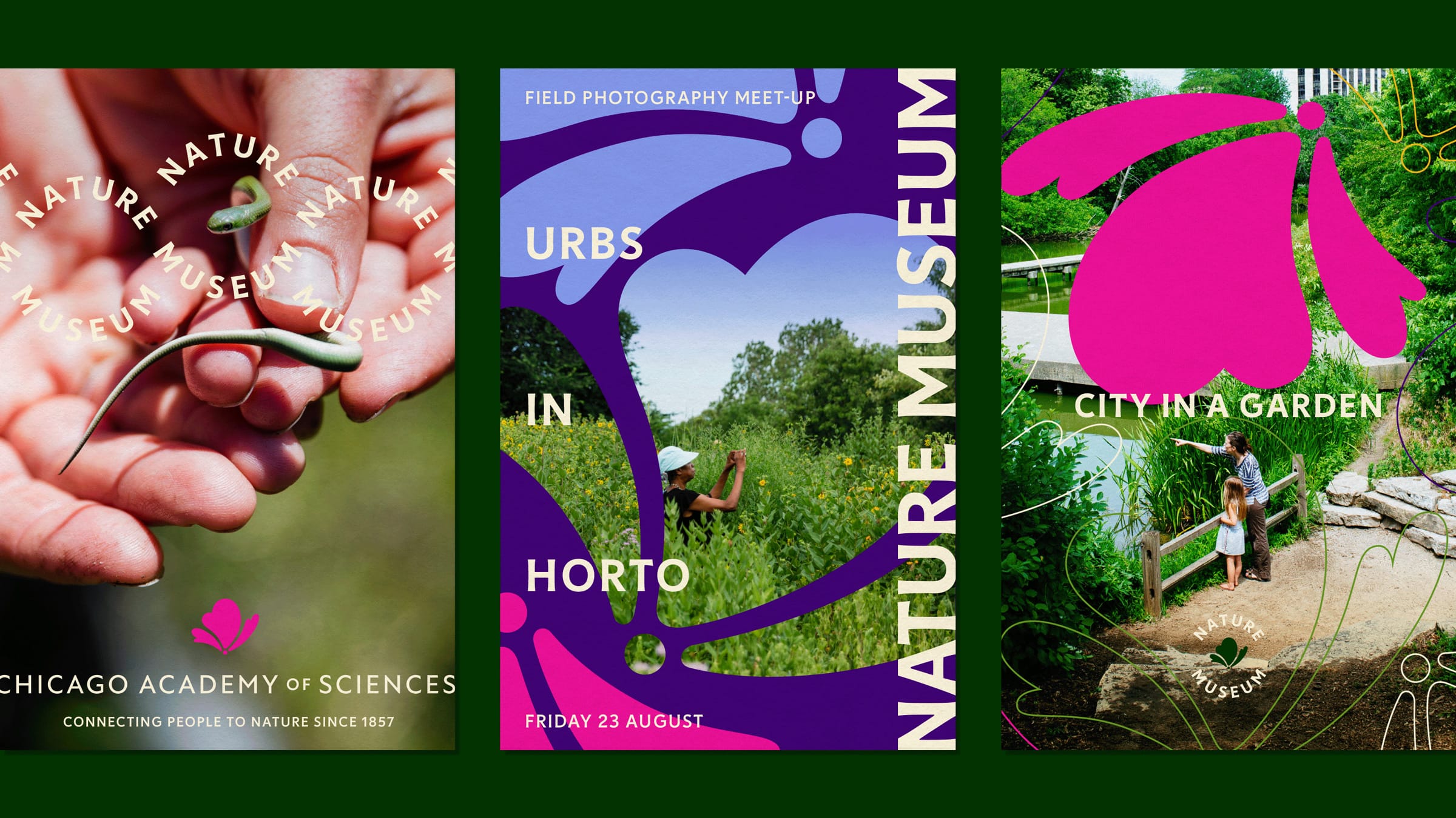
Span worked closely with the Nature Museum to craft a bold new brand identity inspired by native Illinois prairies. The identity system and website were designed to be adaptable to the Nature Museum’s diverse audiences. Visitors get to experience the vibrancy of the Nature Museum as a place to connect with nature, while scientists and researchers can recognize the Chicago Academy of Sciences as a hub for scientific study and public engagement.
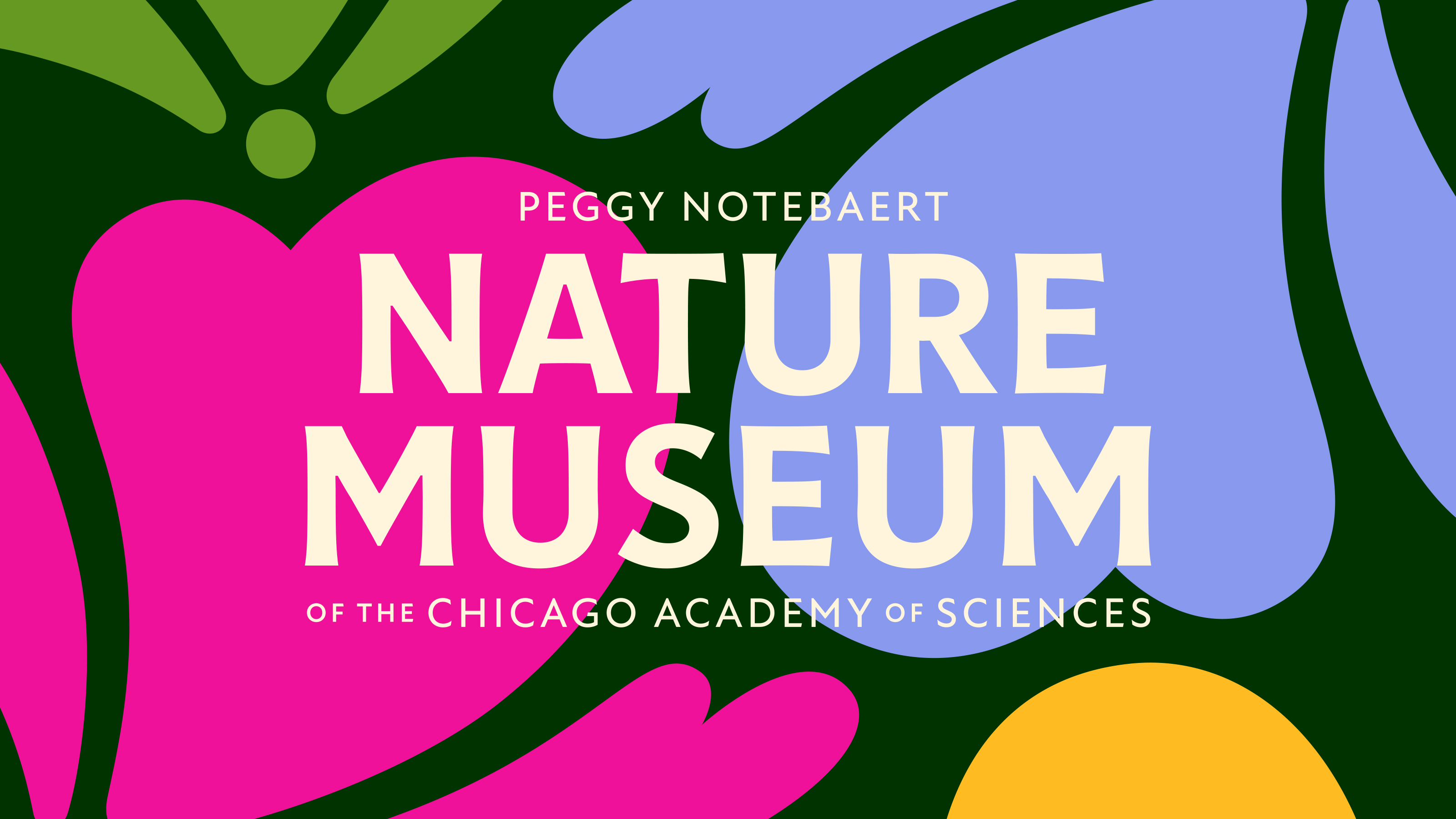
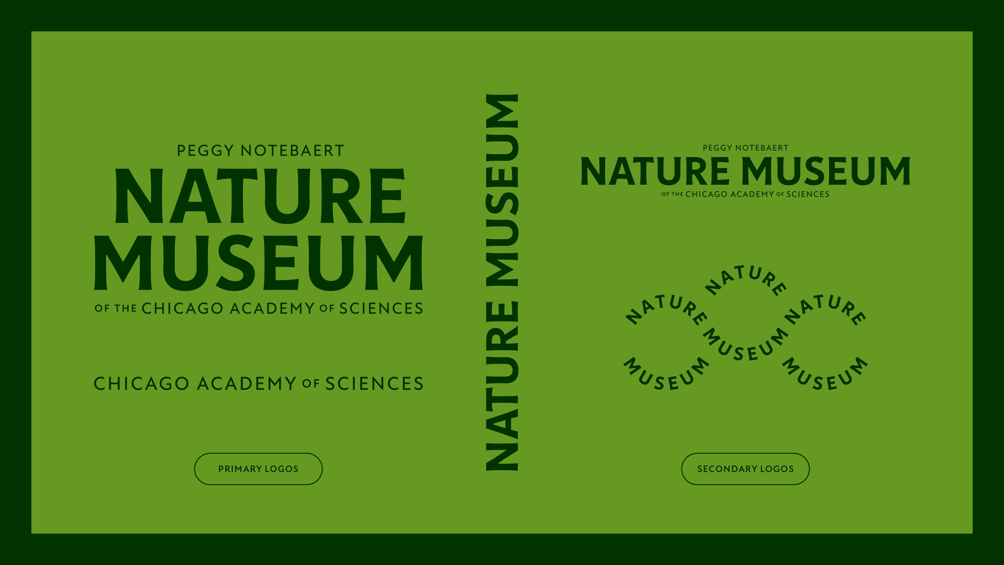
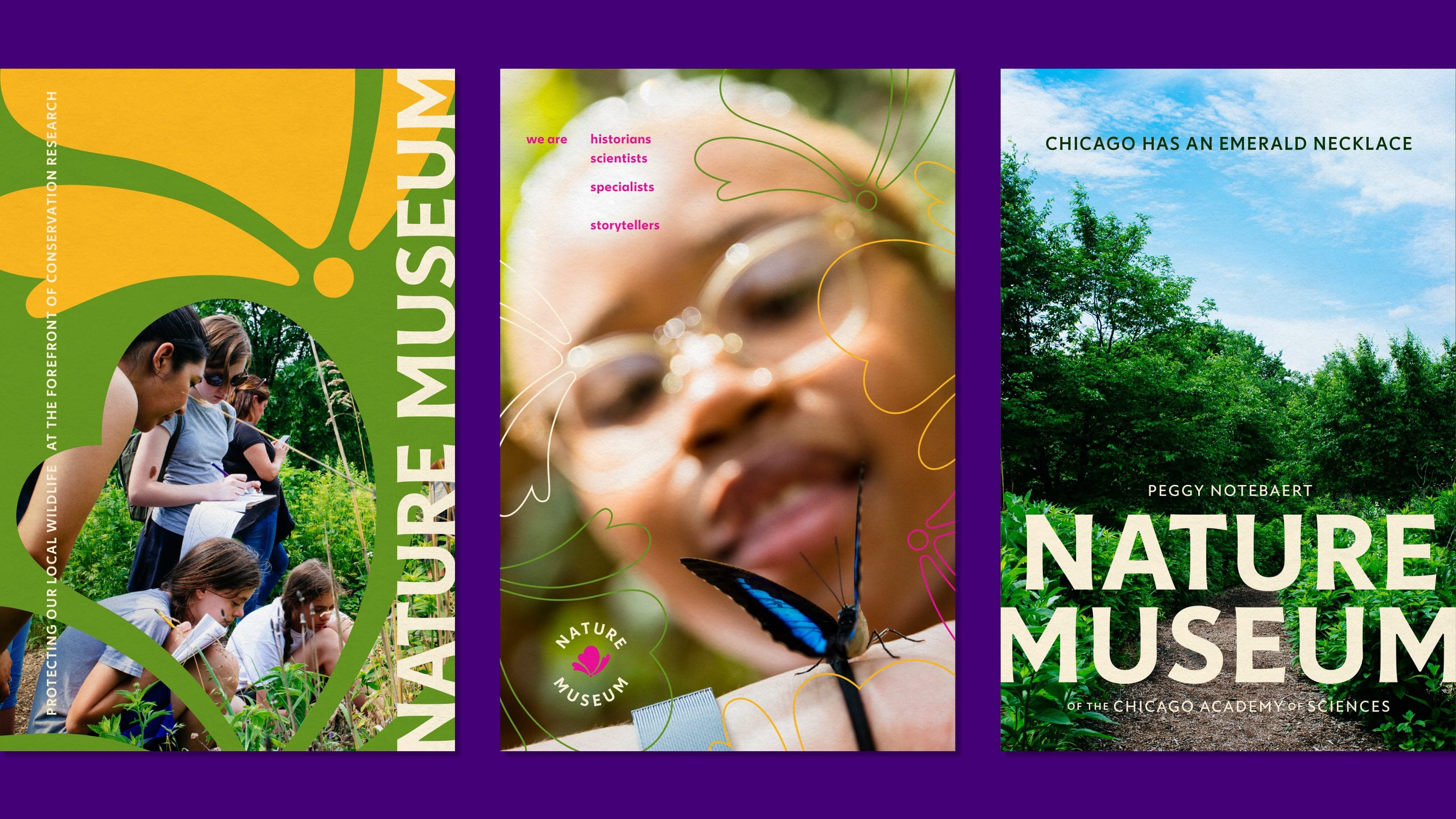
For the wordmark, Span crafted it using Céline Hurka’s typeface Tonka, whose flaring stems convey a historic, organic essence — symbolizing the museum’s dedication to nature and environmental leadership. The complementary font, Miles Newlyn’s New Atten, is a charming humanist sans-serif inspired by the voice of naturalist Sir David Attenborough.
The straightforward, confident logo elevates the Nature Museum’s presence and communicates in an accessible, inclusive voice while linking the museum to the Chicago Academy of Sciences.
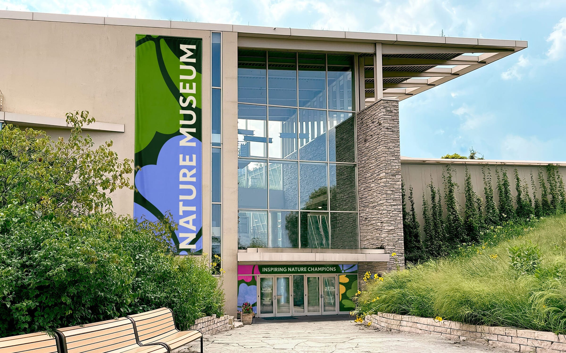
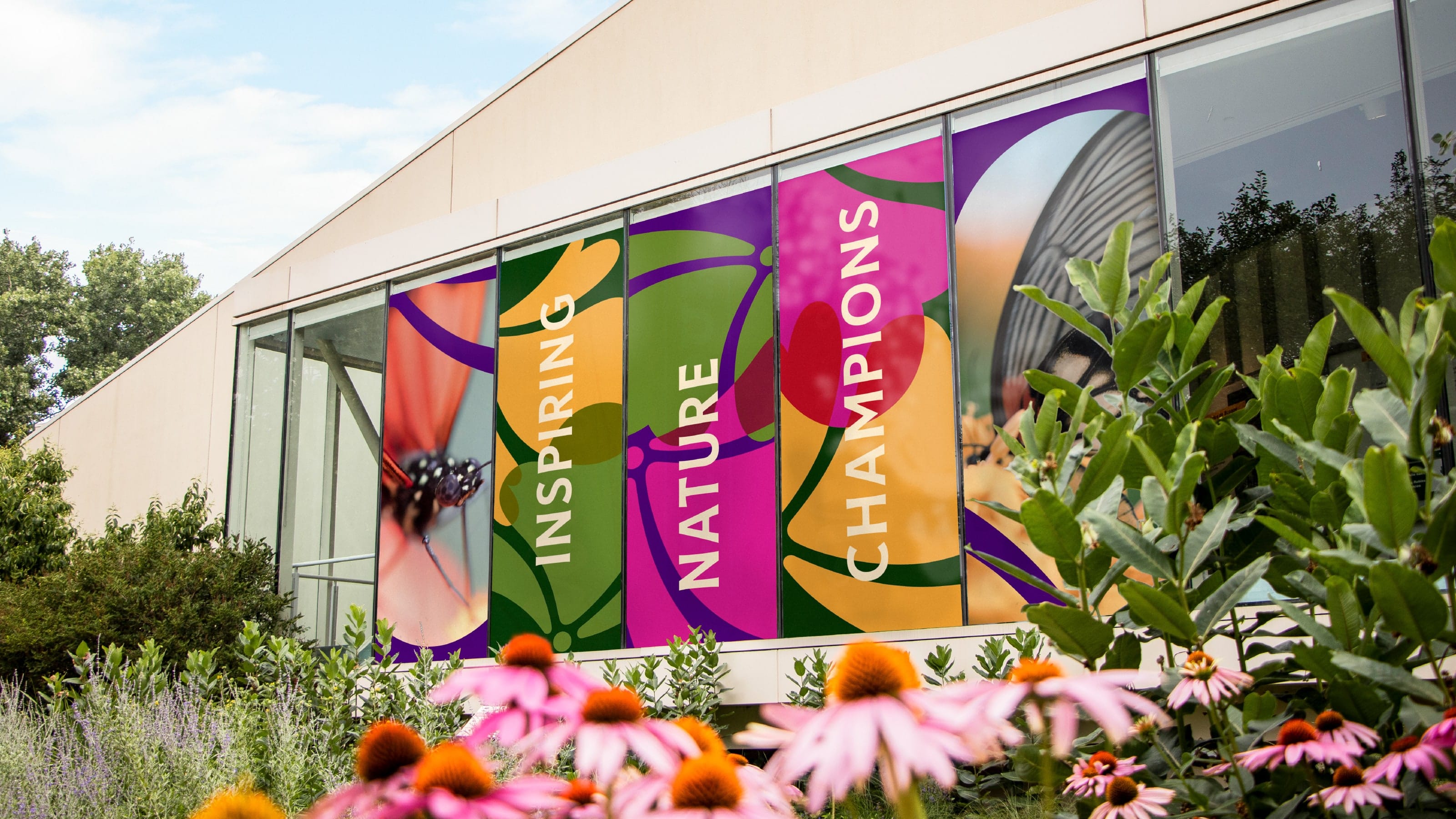
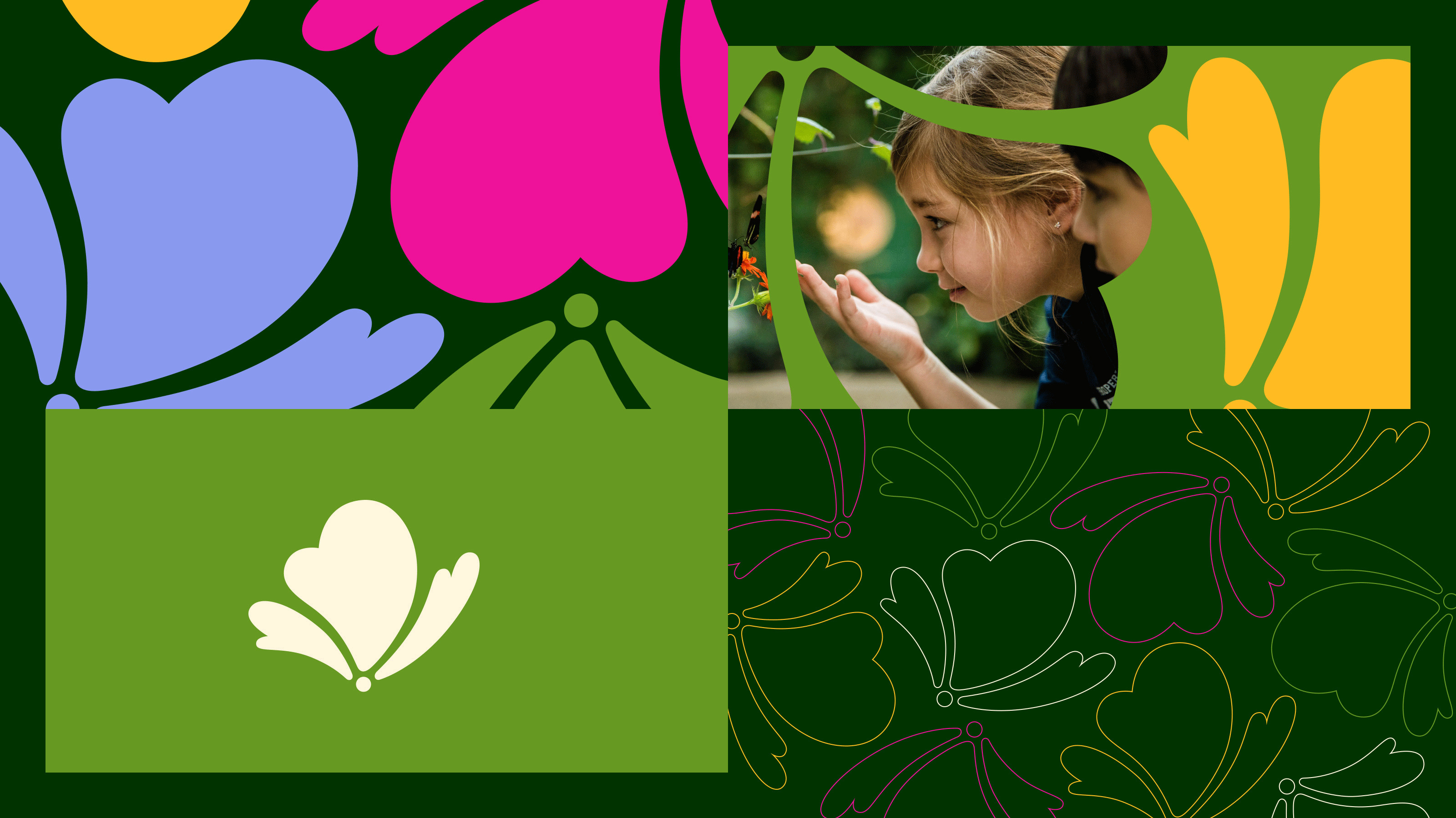
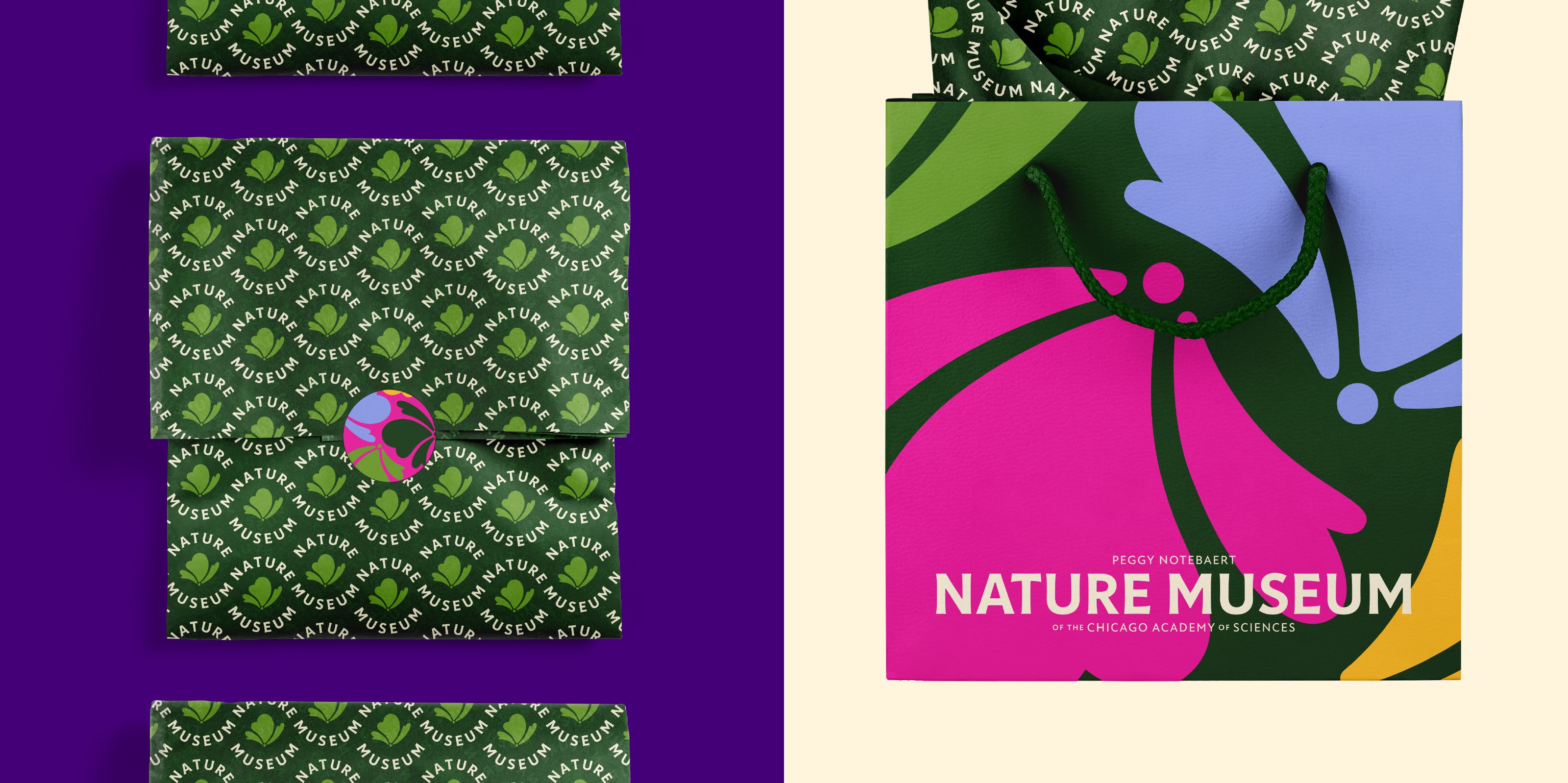
Inspired by the Illinois prairie, the color palette spans catalpa green to columbine pink to milkweed cream—unexpected blends that reflect nature’s diversity and beauty. The abstract icon evokes butterflies, flowers, and clouds—capturing the sense of wonder the natural world inspires. Beyond its official use, the icon serves as a lens to view the world and when composed into patterns, instills a sense of positive activity.
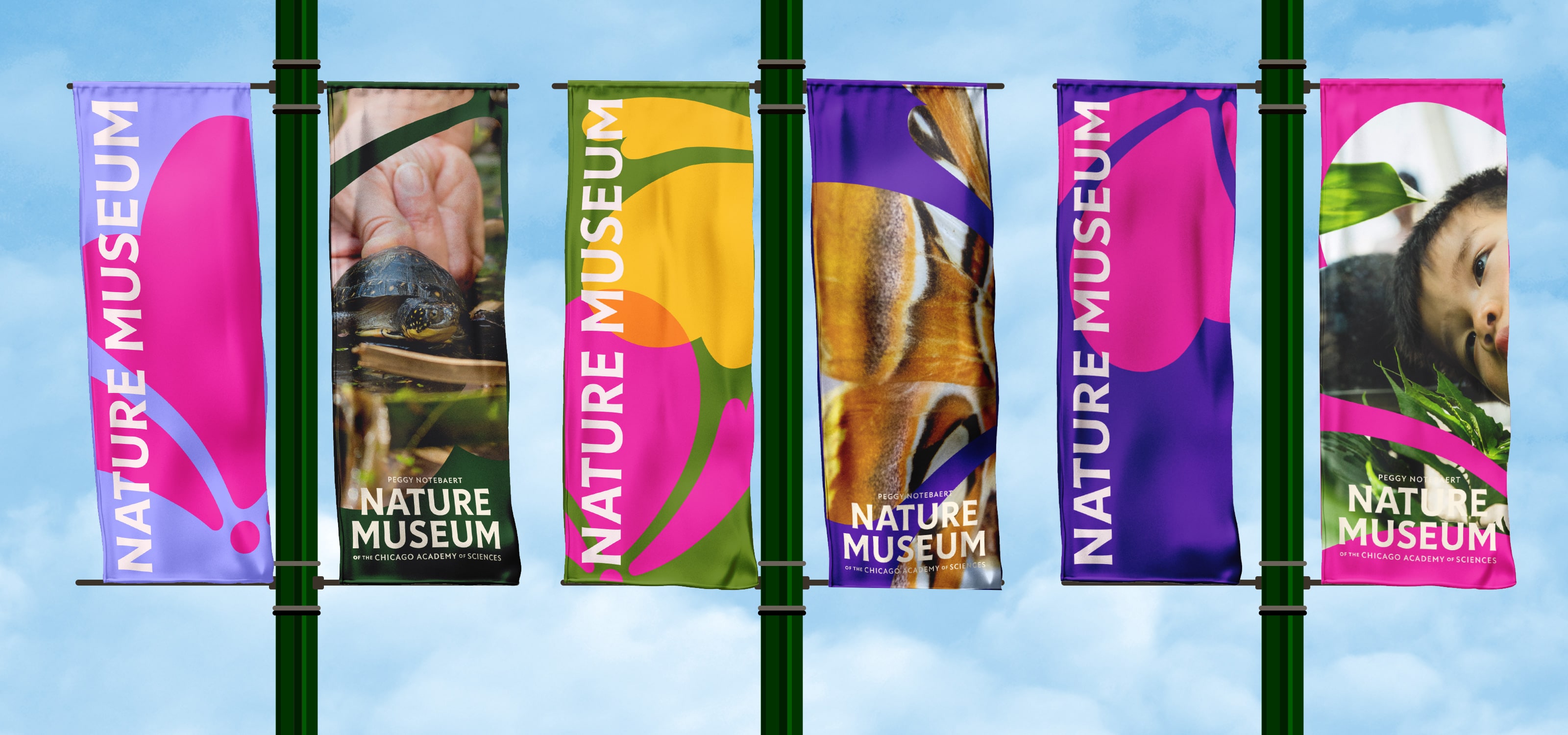
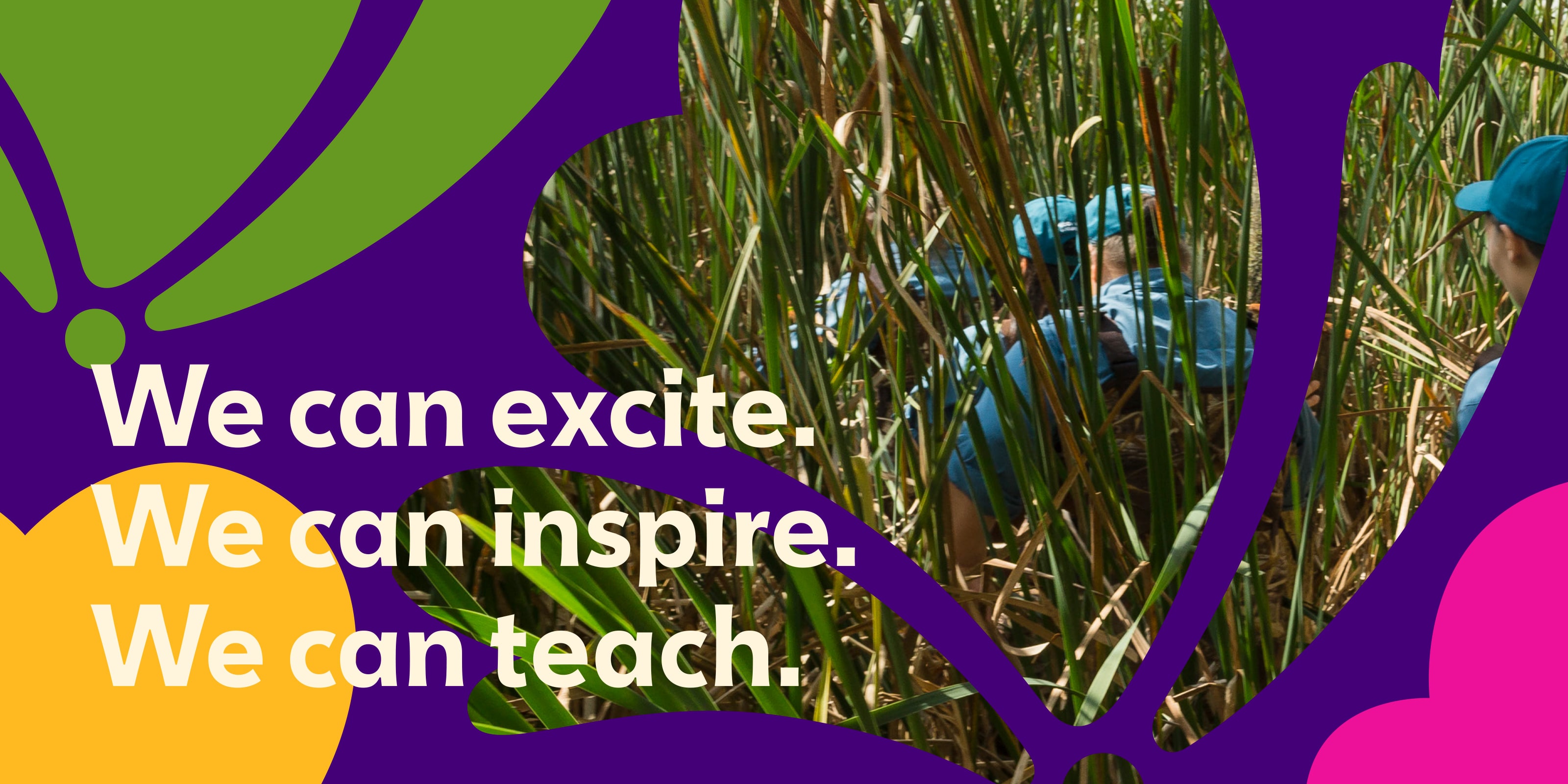
Span’s identity system for the Nature Museum can use the logotype in a manner that stands alone as a mark of leadership or it can dynamically integrate with the organic shapes and imagery. This adaptability suits diverse scenarios, from advising corporations on sustainability to inspiring new nature champions. In addition to the visual identity, Span redesigned the Nature Museum’s website, signage, and other collateral for the museum and its store.
CREDIT
- Agency/Creative: Span
- Article Title: Span Studio Revitalises Visual Identity of Peggy Notebaert Nature Museum
- Organisation/Entity: Agency
- Project Type: Identity
- Project Status: Published
- Agency/Creative Country: United States
- Agency/Creative City: Chicago
- Market Region: North America
- Project Deliverables: Brand Design, Brand Guidelines, Brand Identity, Brand Mark, Branding, Craft, Creative Direction, Directing, Environmental Graphics, Graphic Design, Icon Design, Identity System, Interaction Design, Logo Design, Poster Design, Web Design
- Industry: Non-Profit
- Keywords: Nature, Environment, museum,
-
Credits:
Design Director, Designer: Nick Adam
Designer: Cheryl Kao


