This branding was designed for the Southeast Asian Cafe in Moscow. The strongest association and visual image of Asian cuisine is wok and noodles, so that became the main idea of this project.
Color palette
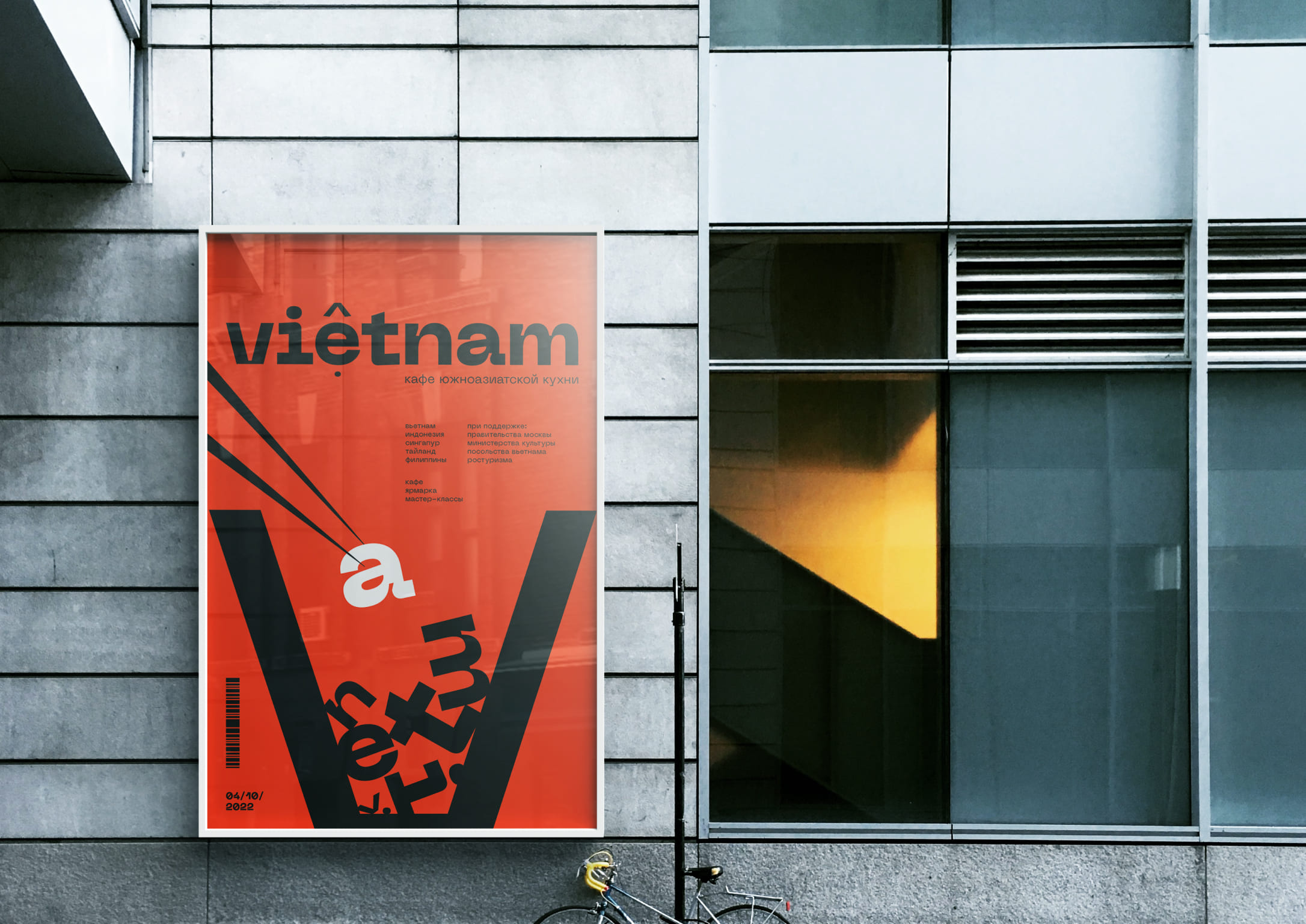
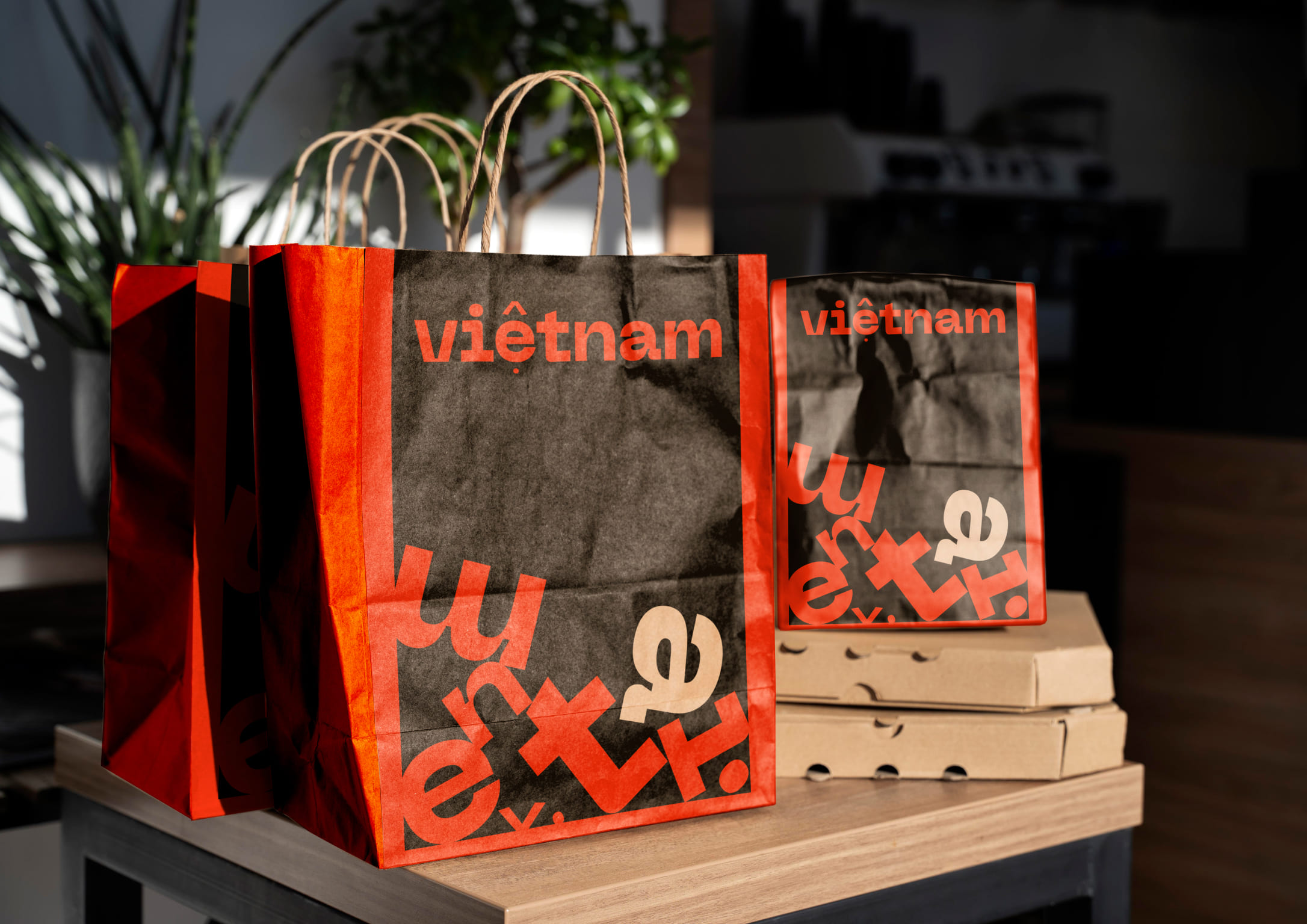
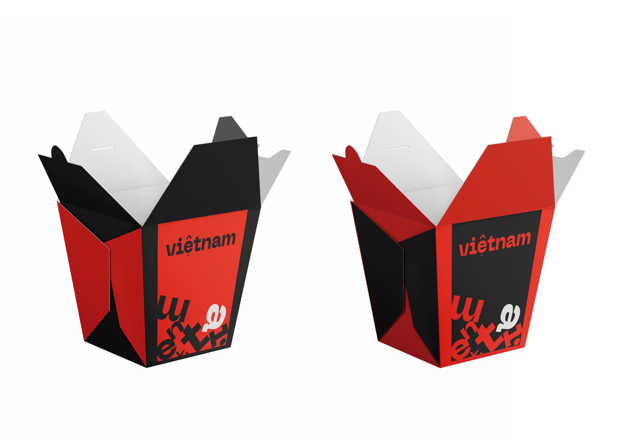
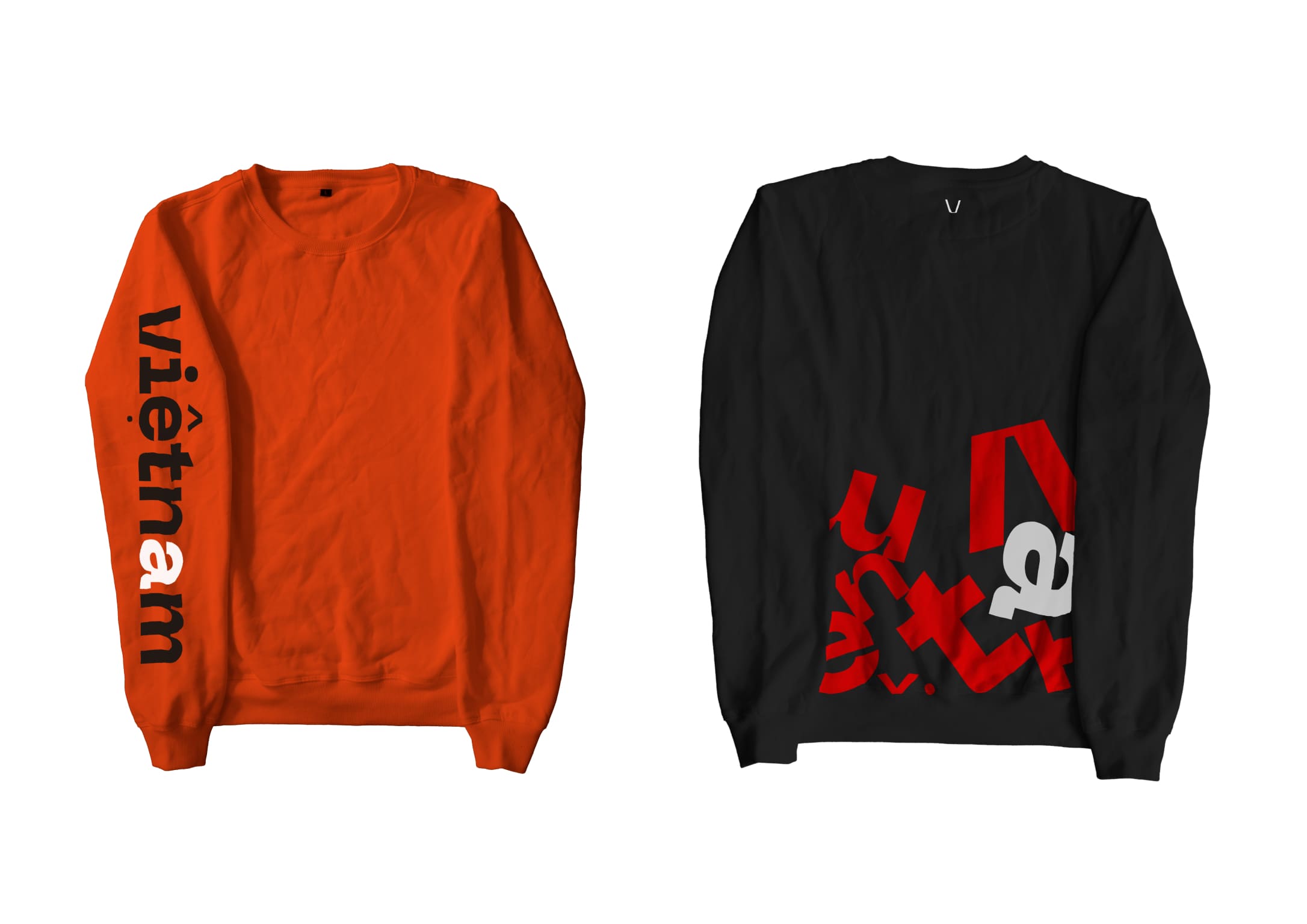
Asian cuisine is about spiciness, unusual combinations and contrasts. That is why a daring and bright color palette was chosen for the cafe, consisting of pure colors: red, which is traditionally associated with Asia, because it is a symbol of good luck and success, and contrasting black and white, which personify the eccentricity and polarity of Asian cuisine.
Visual image
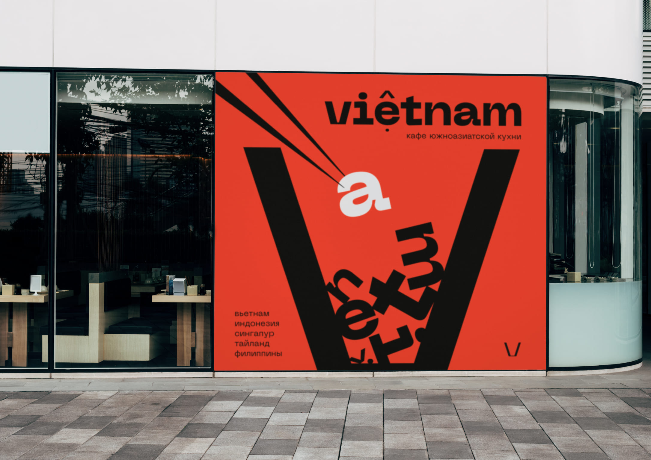
The letter V was chosen as the main image of the project – the first letter of the name, stretched to the size of a wok box. The rest of the letters from the name of the restaurant are placed inside the box. Also, a logo was developed for the cafe in the form of a name typed in the Neue Machina font.
Typography
The Neue Machina font was chosen for the project, which emphasizes the brand’s scope — Asian cuisine and street food. Also, the cafe not only serves dishes of national cuisine, but also holds master classes on Fridays and weekends. Moreover, there is a fair of rare goods and spices from South Asian countries. Therefore, the font also emphasizes an extraordinary approach to the organization of the restaurant.
Scaling
The branding of the cafe is done in the typography format, which makes it different from most other similar restaurants that use illustrations and photos of food. Thanks to this solution, the style is easily scalable and can be used both in pairs — with a container and letters, and separately, and at the same time retain its recognisability.
CREDIT
- Agency/Creative: Veronika Potapova
- Article Title: Southeast Asian Cafe Branding and Promotion by Veronika Potapova
- Organisation/Entity: Student
- Project Type: Graphic
- Project Status: Published
- Agency/Creative Country: Russia
- Agency/Creative City: Russia
- Market Region: Europe, Global
- Project Deliverables: Brand Design, Brand Identity, Design, Graphic Design, Typography
- Industry: Food/Beverage
- Keywords: design, identity, brand design, graphic design, typography
-
Credits:
Tutor: Pavel Borisovsky
Tutor: Yaroslav Subbotin


