


Johnny Kotze – Konijn
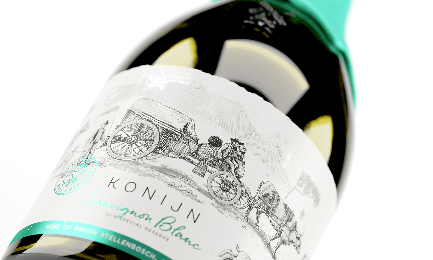
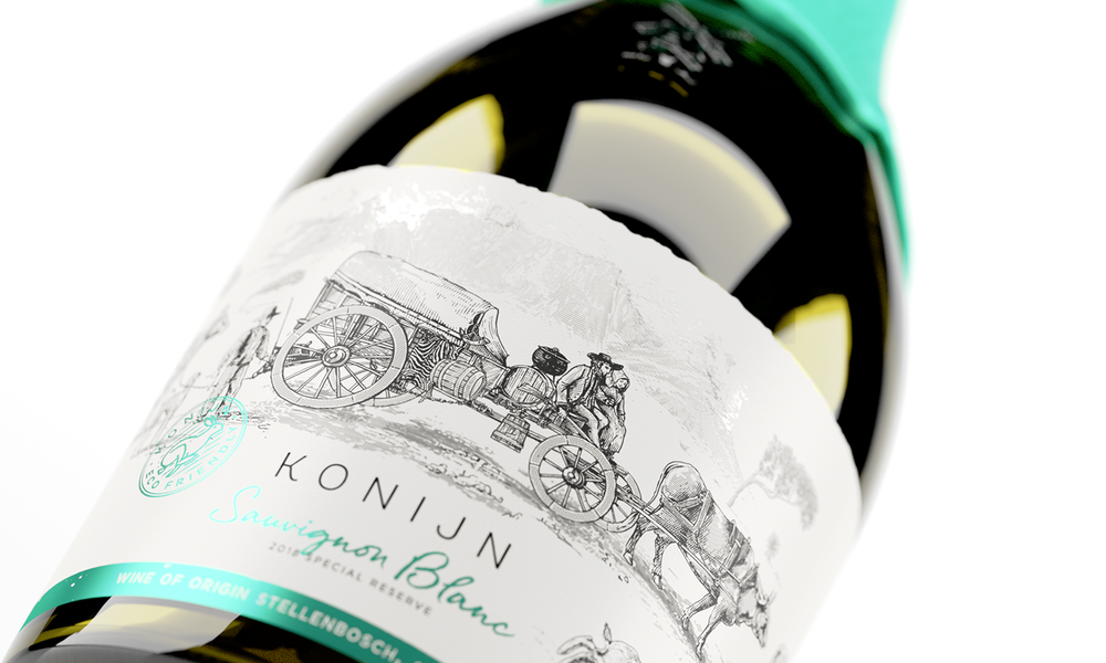
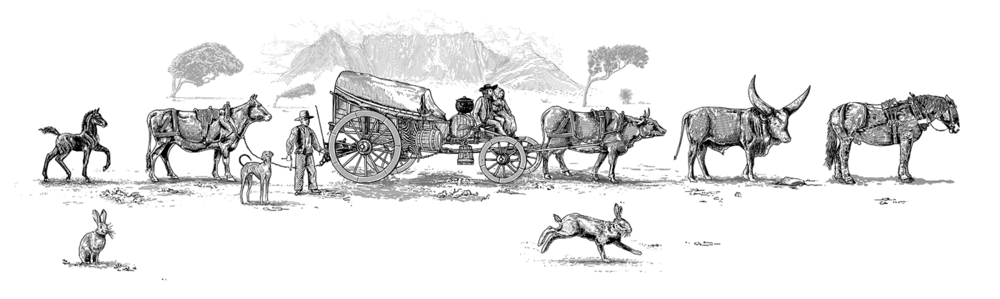
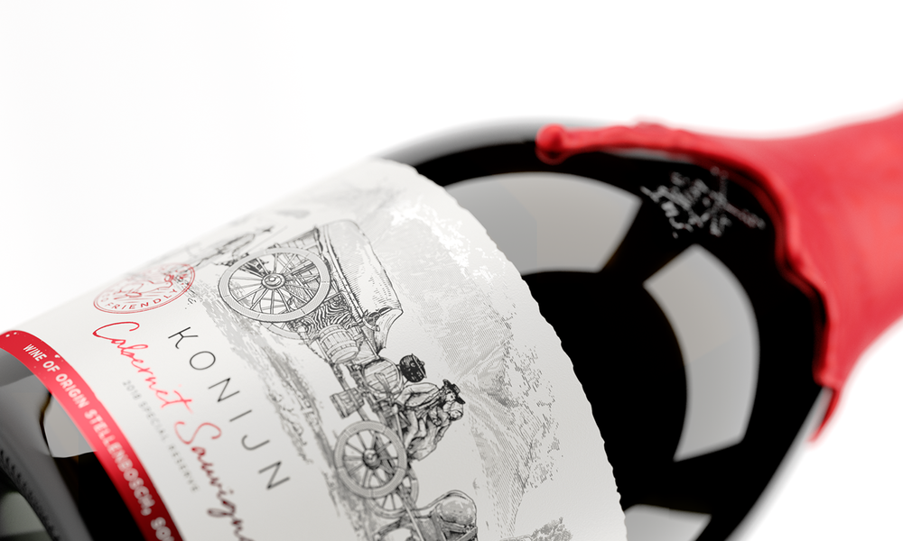
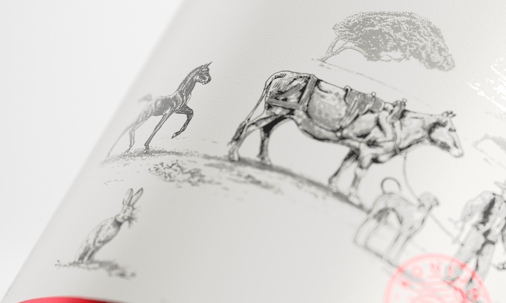
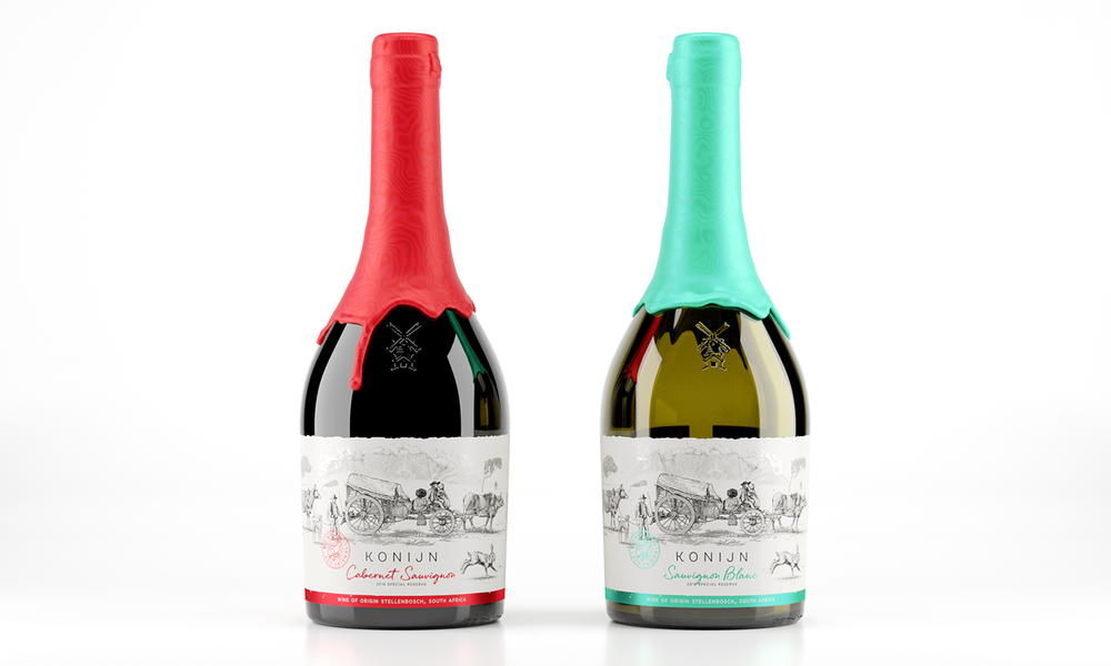
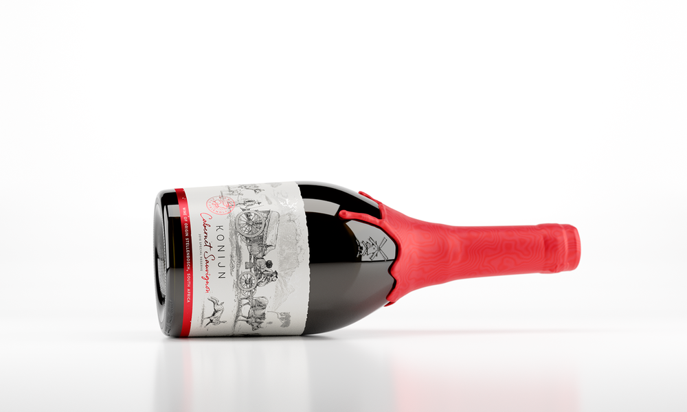
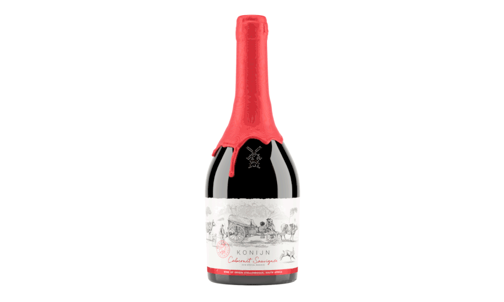
“Konijn, the Dutch word for Rabbit. Inspired by the large population of Cape hares that inhabited the farming area during the late 1600’s. During this period the location served as a much-needed pit stop for weary wagon-travellers and their oxen who were moving along the road from the Cape to Stellenbosch. Providing them with some much-needed respite from the hard journey along one of the Cape’s very first toll roads. This rich history of the farm and it’s origins and geography inspired this concept label. Depicting these travelers with their belongings against the backdrop of Table Mountain. On such cloudless days the mountain’s legendary white tablecloth is suddenly cast over the “table”. According to local myth this cloud is caused by a smoking contest between the devil and a pirate named Van Hunks.”
CREDIT
- Agency/Creative: Johnny Kotze
- Article Title: South African Wine Packaging Design with Illustration based on Inhabitants of the 1600’s
- Project Type: Packaging
- Agency/Creative Country: Cape Town, South Africa
- Format: Bottle
- Substrate: Glass, Pulp Paper


