


Soundle is a company dedicated to enhancing the music listening experience, providing innovative solutions for music lovers of all ages. With a focus on fun, creativity, and cutting-edge technology, Soundle aims to transform how people interact with and enjoy their favorite tunes.
Soundle’s brand strategy revolves around positioning the company as a leading provider of exciting and immersive music experiences. The firm seeks to engage a younger audience by offering innovative and user-friendly technologies that enhance the enjoyment of music. The brand identity aims to convey a sense of playfulness, creativity, and cutting-edge expertise.
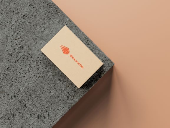
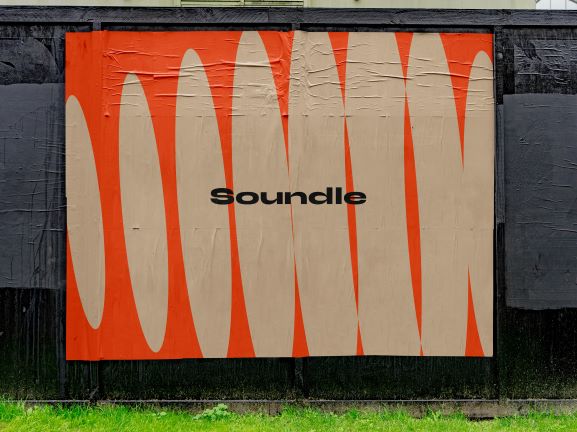
The Soundle logo captures the essence of the brand through a dynamic and visually engaging design. It takes inspiration from the shape of a soundwave, but with a wider and more exaggerated form, representing the company’s focus on enhancing the music listening experience. The bold and fluid lines of the logo symbolize the energy and movement inherent in music, while also evoking a sense of fun and excitement.
The Soundle logo is designed to be versatile and adaptable across various applications. It can be easily scaled and placed on different backgrounds without losing its impact. The logo is consistently applied to various touchpoints, such as the company’s website, mobile app, social media platforms, and promotional materials. Its distinctive and recognizable shape ensures that the brand stands out in the competitive music industry.
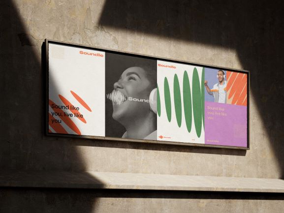
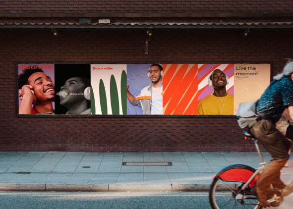
The color palette for Soundle combines bright pastel colors, chosen specifically to appeal to a younger audience and convey a sense of vibrancy and playfulness. The combination of these colors adds visual interest and captures the dynamic nature of music.
Bright pastel colors are known for their youthful and energetic qualities. They create a lively and engaging visual experience while maintaining a soft and approachable feel. The use of pastels also ensures that the colors remain harmonious and do not overpower the overall brand identity.
The typography and layout of the collateral materials are designed to be modern, clean, and visually appealing, ensuring that the brand message is communicated effectively.
CREDIT
- Agency/Creative: Sky Co
- Article Title: Soundle Brand Design
- Organisation/Entity: Agency
- Project Type: Identity
- Project Status: Published
- Agency/Creative Country: Nigeria
- Agency/Creative City: Kaduna
- Market Region: Global
- Project Deliverables: Brand Design, Brand Guidelines, Brand Identity, Brand Mark, Graphic Design, Logo Design
- Industry: Entertainment
- Keywords: Music, youth, listen, song
-
Credits:
Designer: Muhammad Abubakar


