


For 30ML, a modern and dynamic beverage brand, we developed a comprehensive branding and packaging design system built around the core ideas of freshness, precision, and bold flavor. From the very beginning, our approach was strategic and detail-oriented, ensuring every visual and conceptual element aligned seamlessly with the brand’s personality and market positioning. The goal was to create an identity that feels contemporary, confident, and instantly recognizable in a competitive beverage landscape.
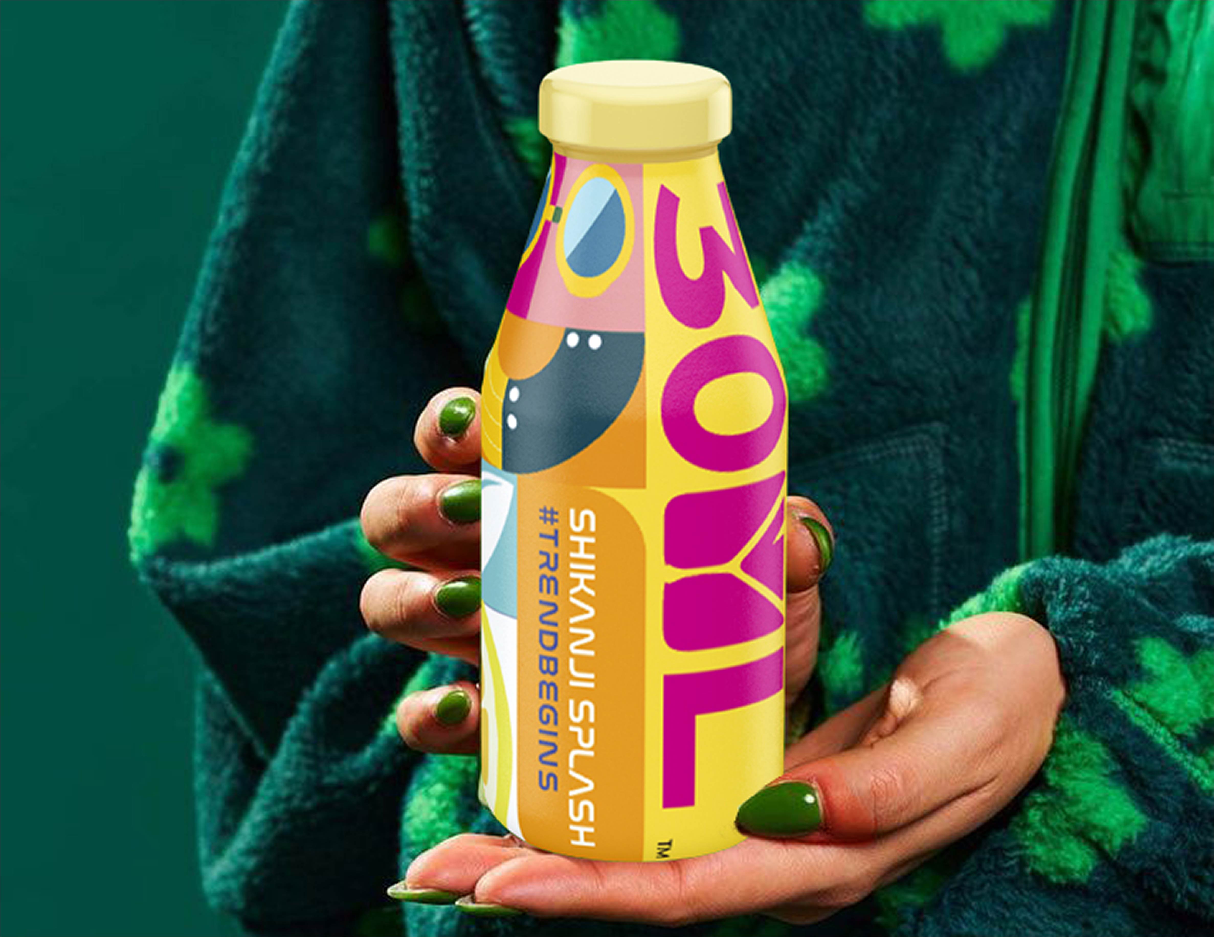
We crafted a distinctive logo that reflects the brand’s name with clarity and attitude, balancing minimalism with strong character. The typography was carefully selected to convey modernity and precision, while maintaining readability across packaging and digital platforms. A vibrant yet refined color palette was developed to express energy and freshness, creating immediate visual impact both on shelves and across marketing touchpoints.
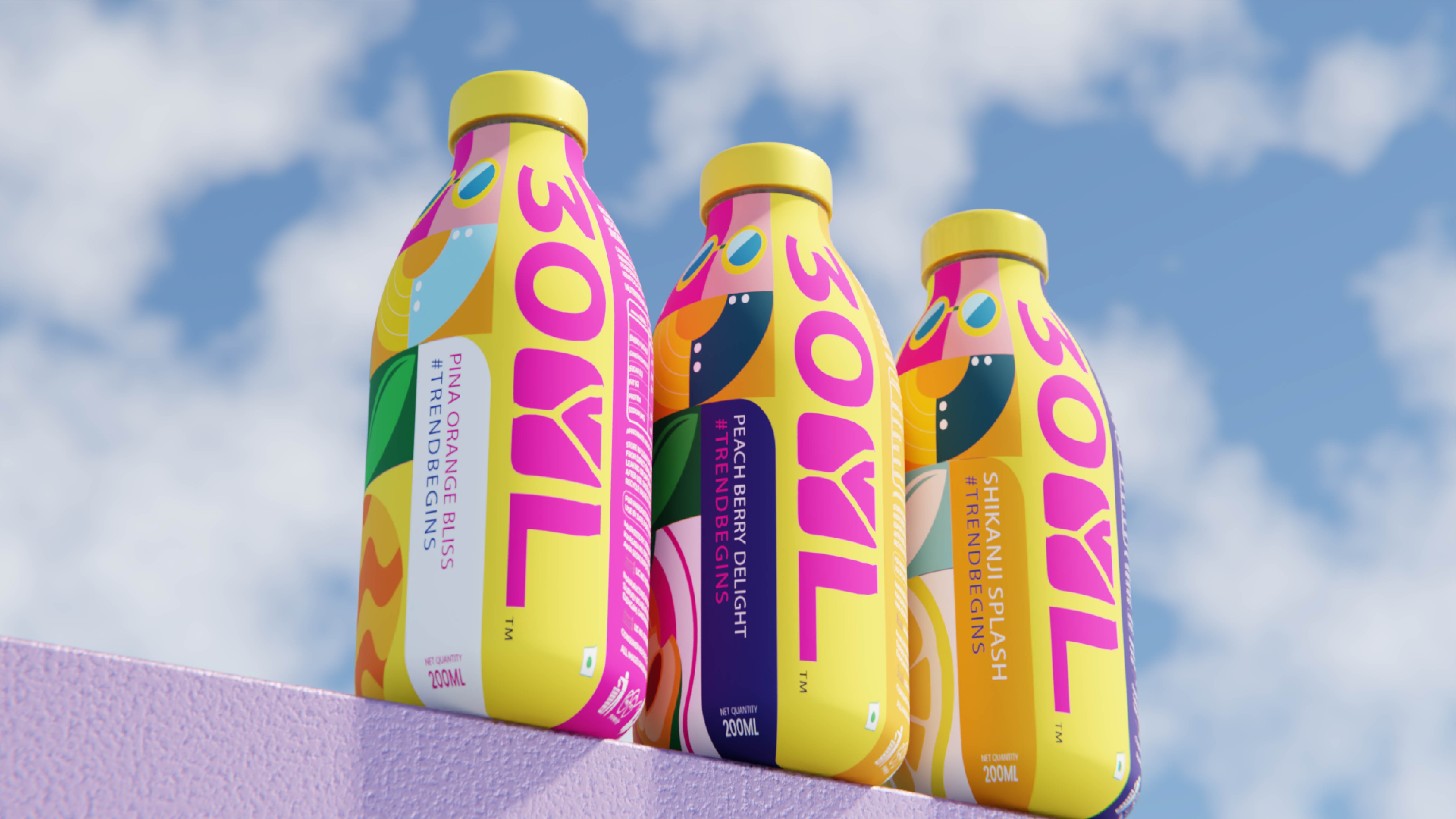
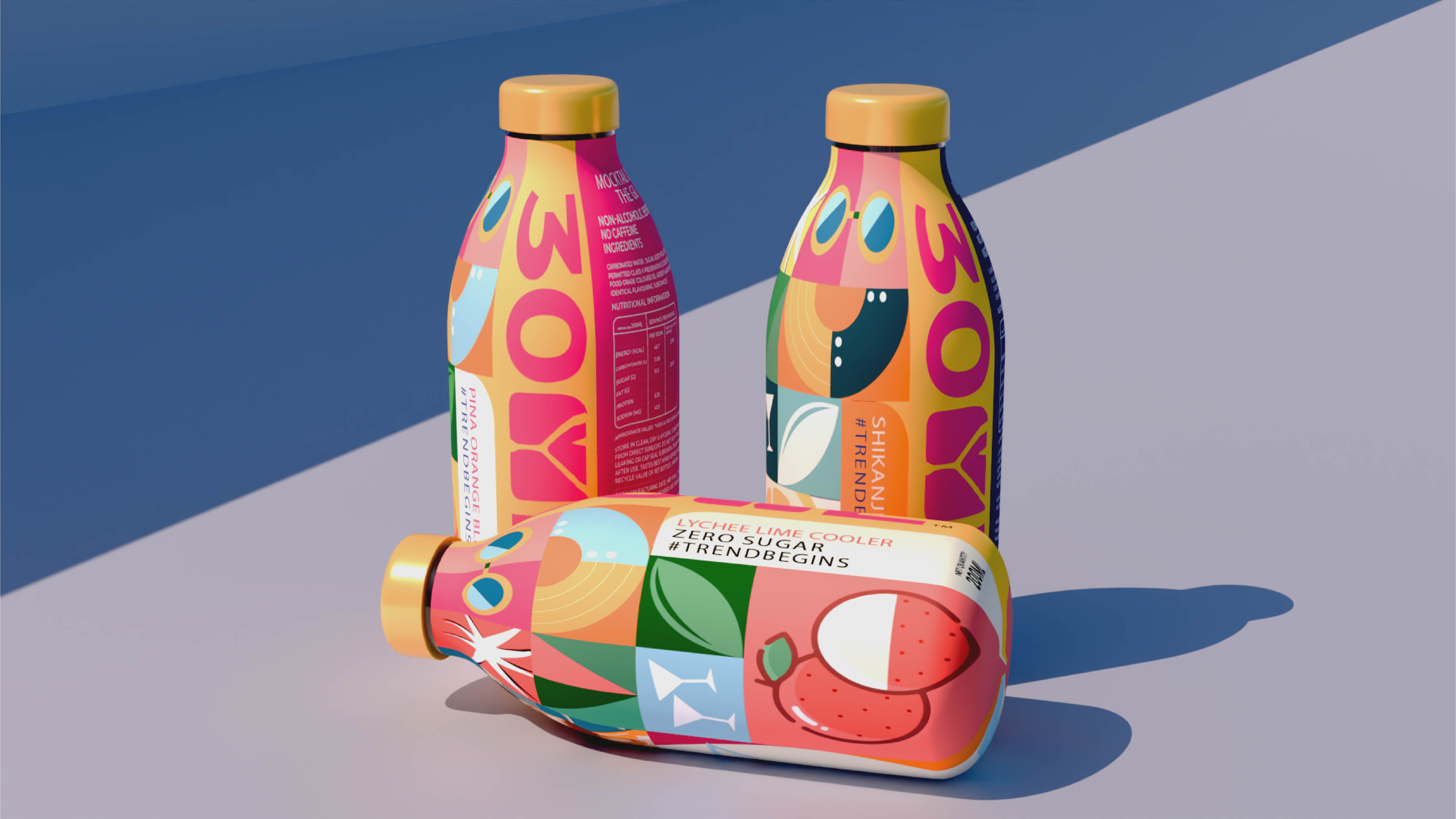
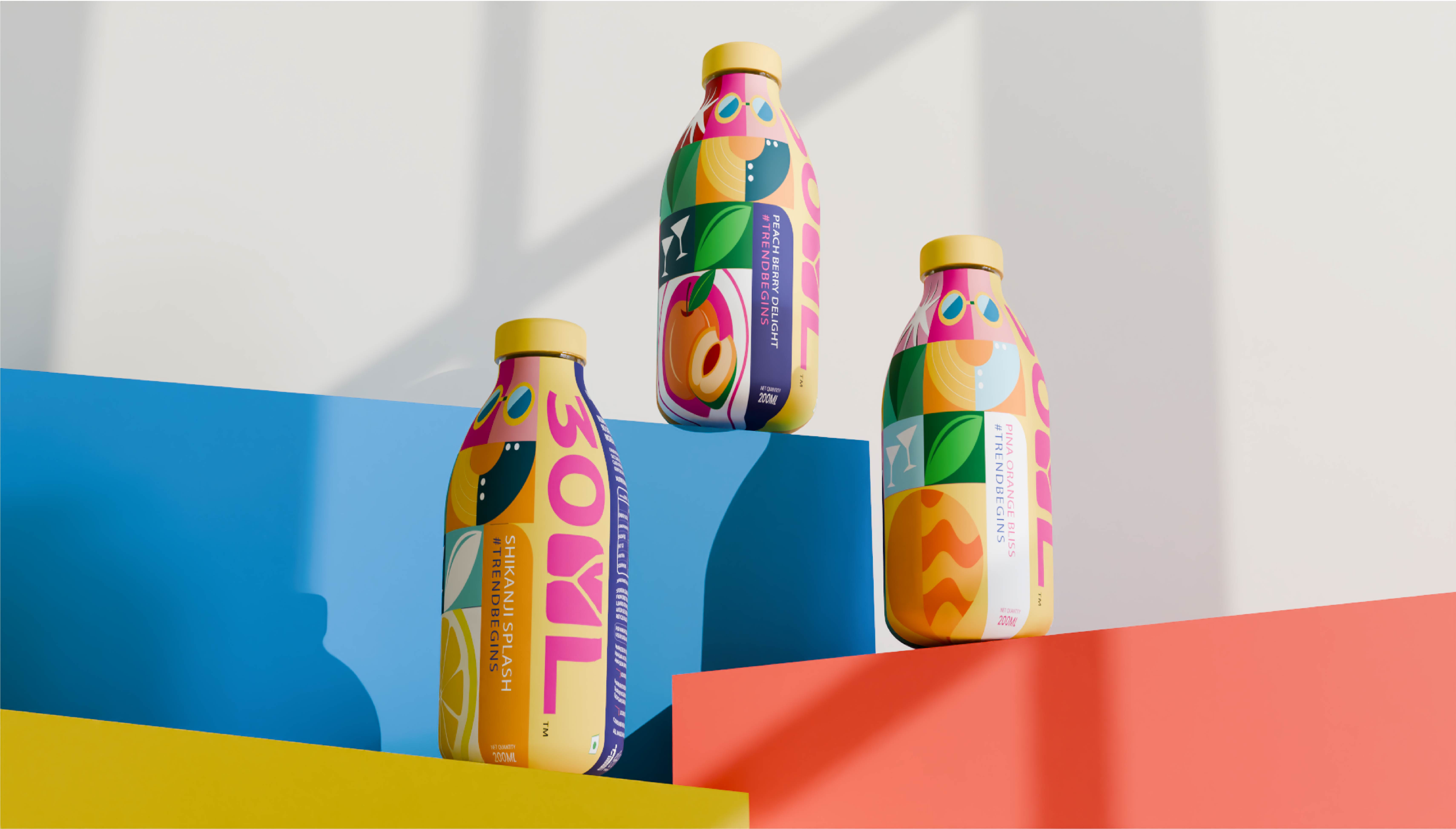
The packaging design was approached with a focus on shelf presence and consumer recall. Clean layouts, bold color blocking, and clear visual cues were integrated to ensure the product stands out in retail environments. Each element – from hierarchy of information to placement of flavor indicators – was thoughtfully structured to enhance clarity and strengthen brand recognition. The design system also ensures consistency across SKUs, allowing for easy scalability while maintaining a cohesive brand language.
Beyond aesthetics, we ensured that the overall branding system is adaptable for future growth, including new flavors, limited editions, and digital extensions. Every touchpoint – from label design to promotional assets – follows a unified visual framework that reinforces 30ML’s bold and modern identity.
The result is a cohesive, memorable, and scalable brand foundation that positions 30ML as a standout player in the beverage market, ready to capture attention, build loyalty, and expand with confidence.
CREDIT
- Agency/Creative: Sorted Branding
- Article Title: Sorted Branding Sharpens 30ML Beverage Packaging With Vibrant Color and Typographic Precision for Instant Shelf Recognition
- Organisation/Entity: Agency
- Project Type: Packaging
- Project Status: Published
- Agency/Creative Country: India
- Agency/Creative City: Mumbai
- Market Region: Asia
- Project Deliverables: Branding
- Format: Bottle
- Industry: Food/Beverage
- Keywords: Packaging design
-
Credits:
Project Manager: Arpika Singh


