


OATEN is a modern porridge oats brand designed to embody the spirit of everyday energy through a minimal yet iconic identity. The vision behind the brand was to create something that feels simple at first glance, yet deeply thoughtful in execution. We focused on building a strong visual language that merges clarity with storytelling, ensuring every touchpoint communicates vitality, nourishment, and authenticity.
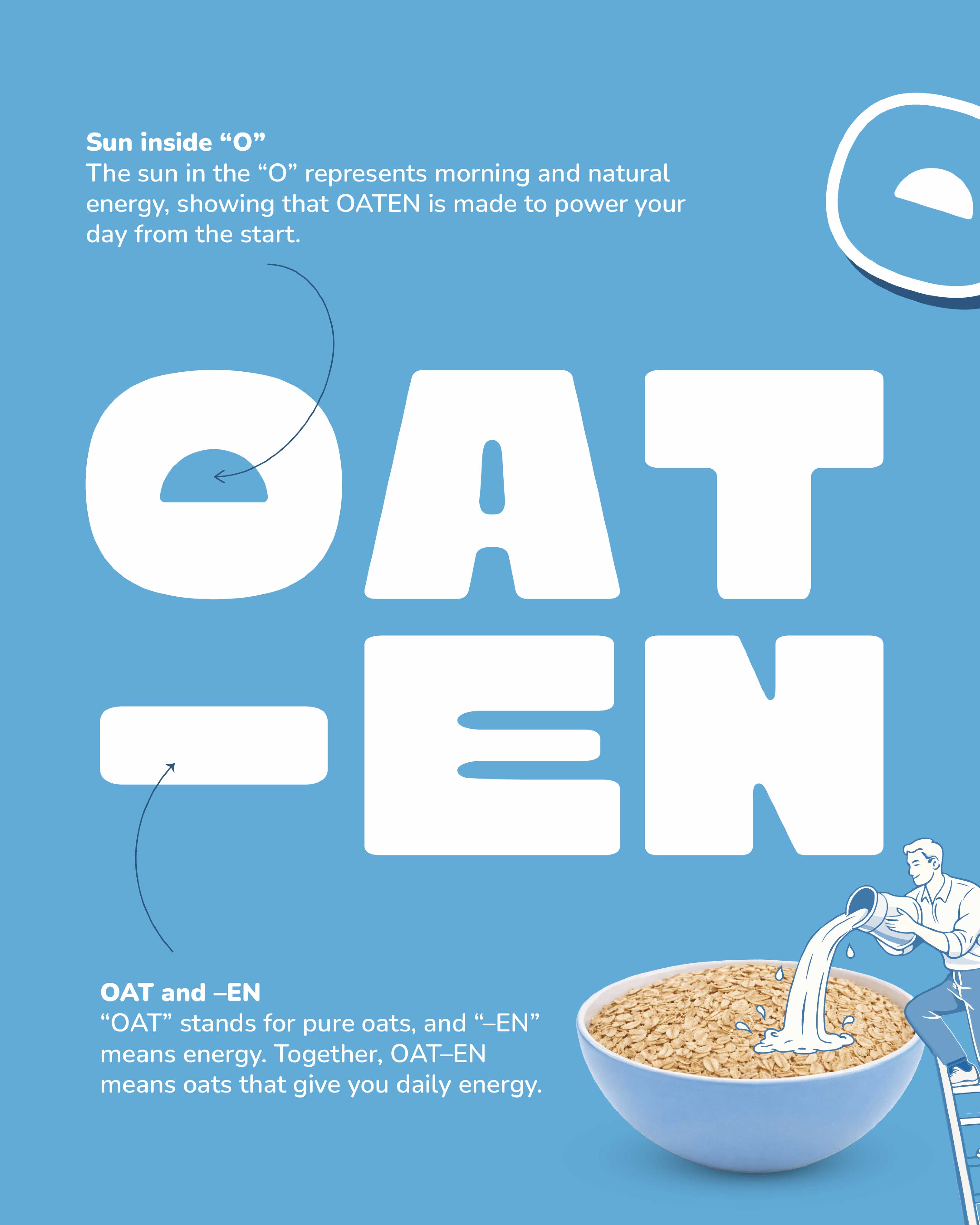
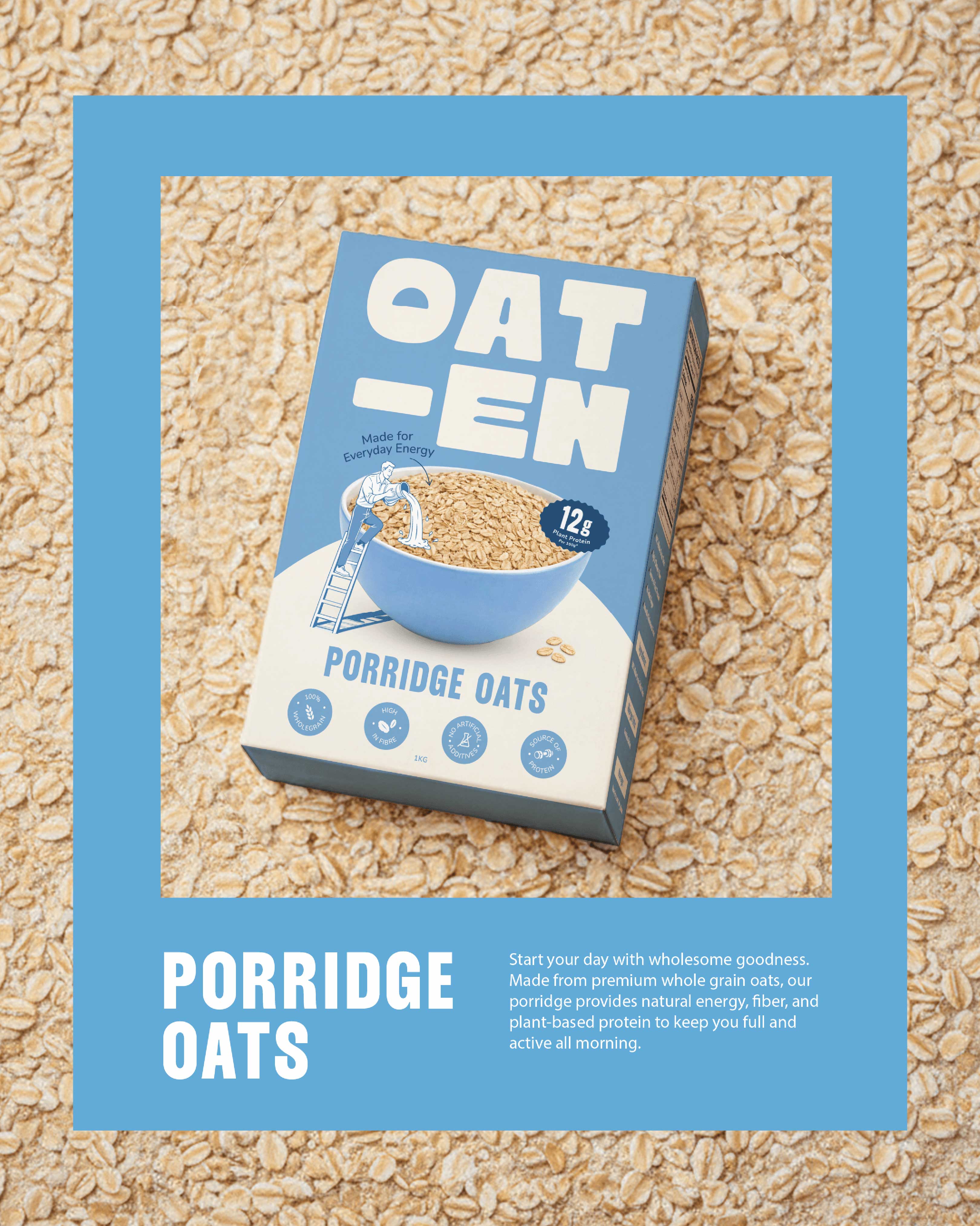
The logo was crafted with symbolic intent – representing movement, flow, and the natural rhythm of daily life. Its clean form reflects purity and wholesomeness, while its bold structure ensures memorability on shelf. The typography balances softness and strength, mirroring the comforting yet energizing nature of oats as a daily staple.
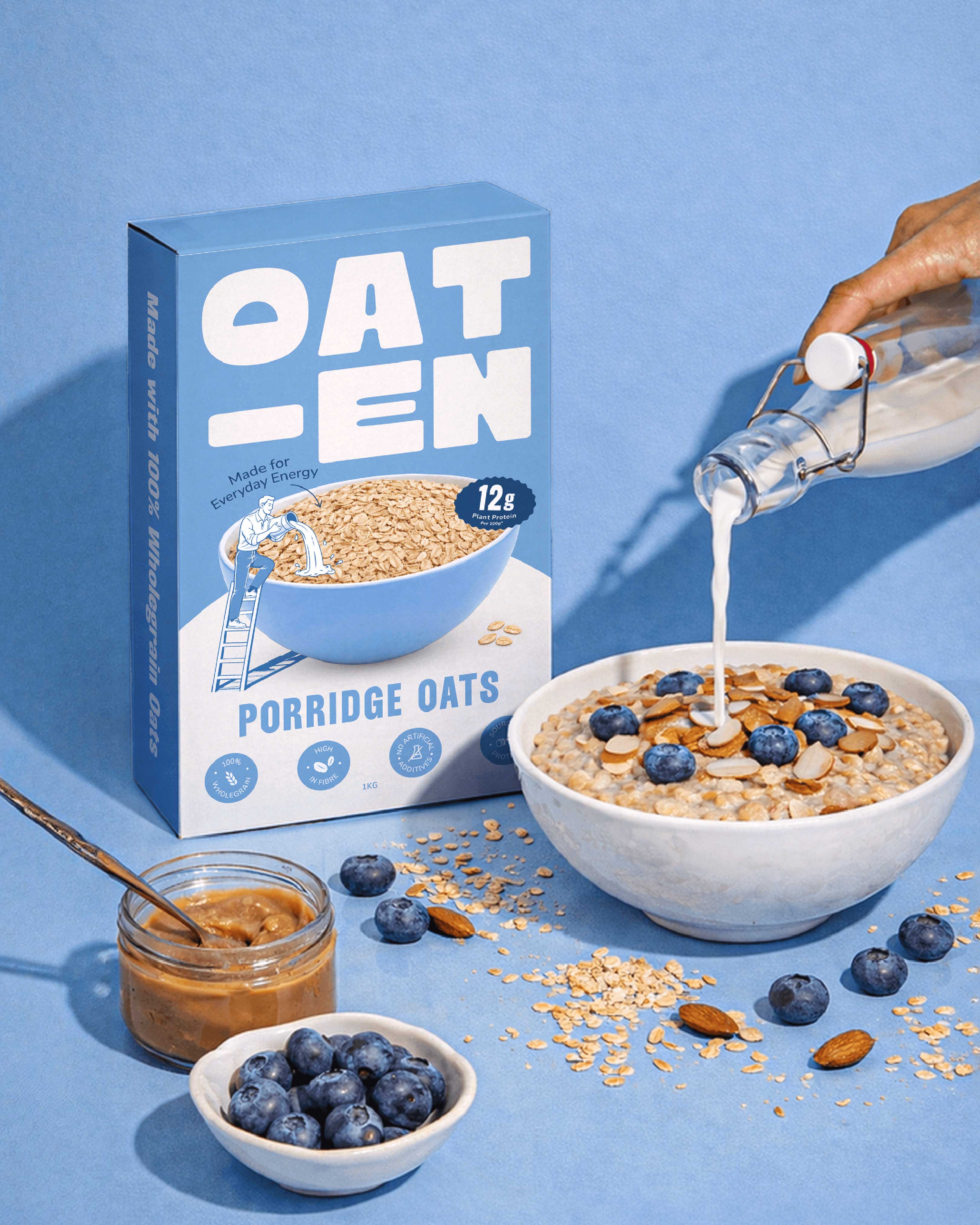
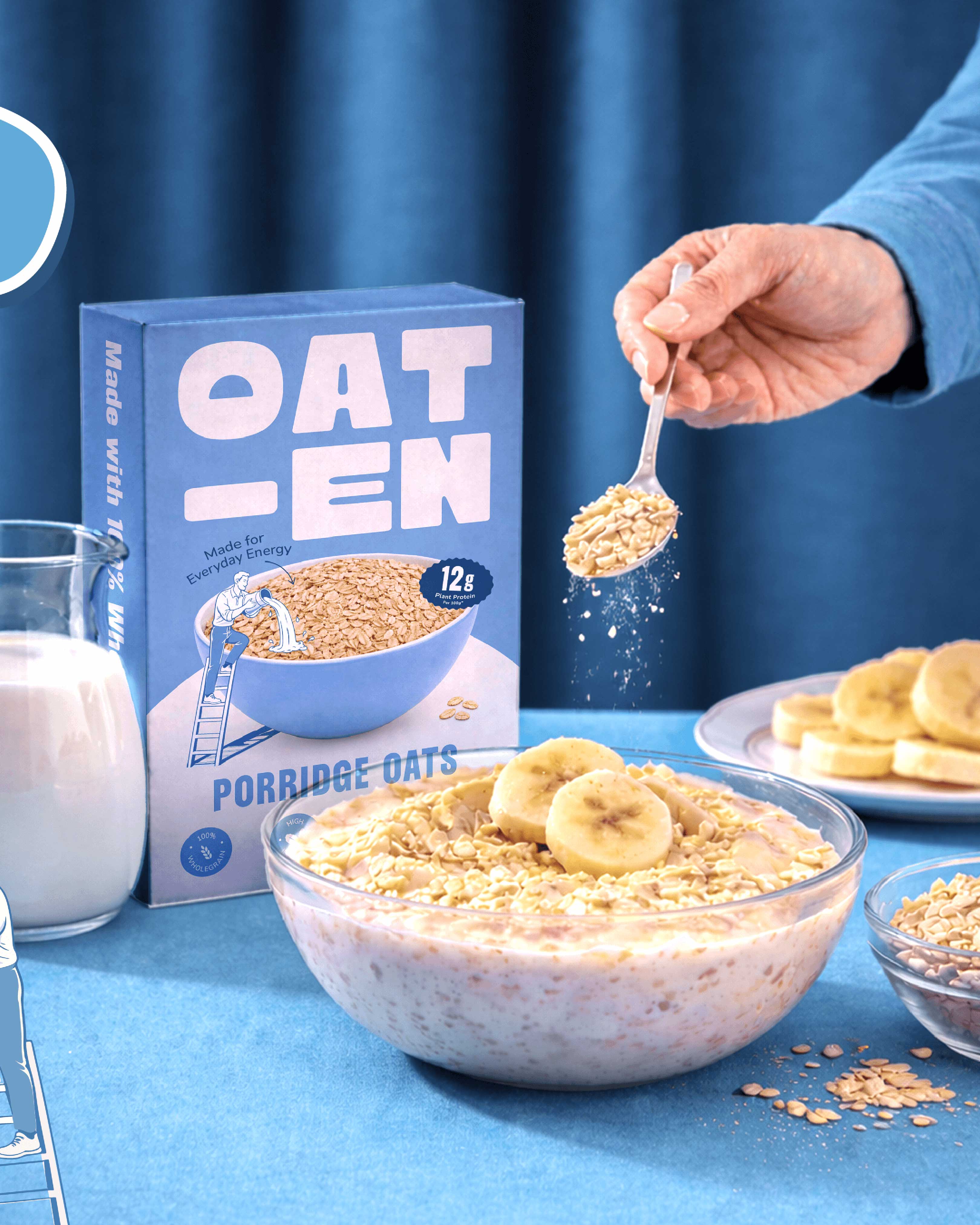
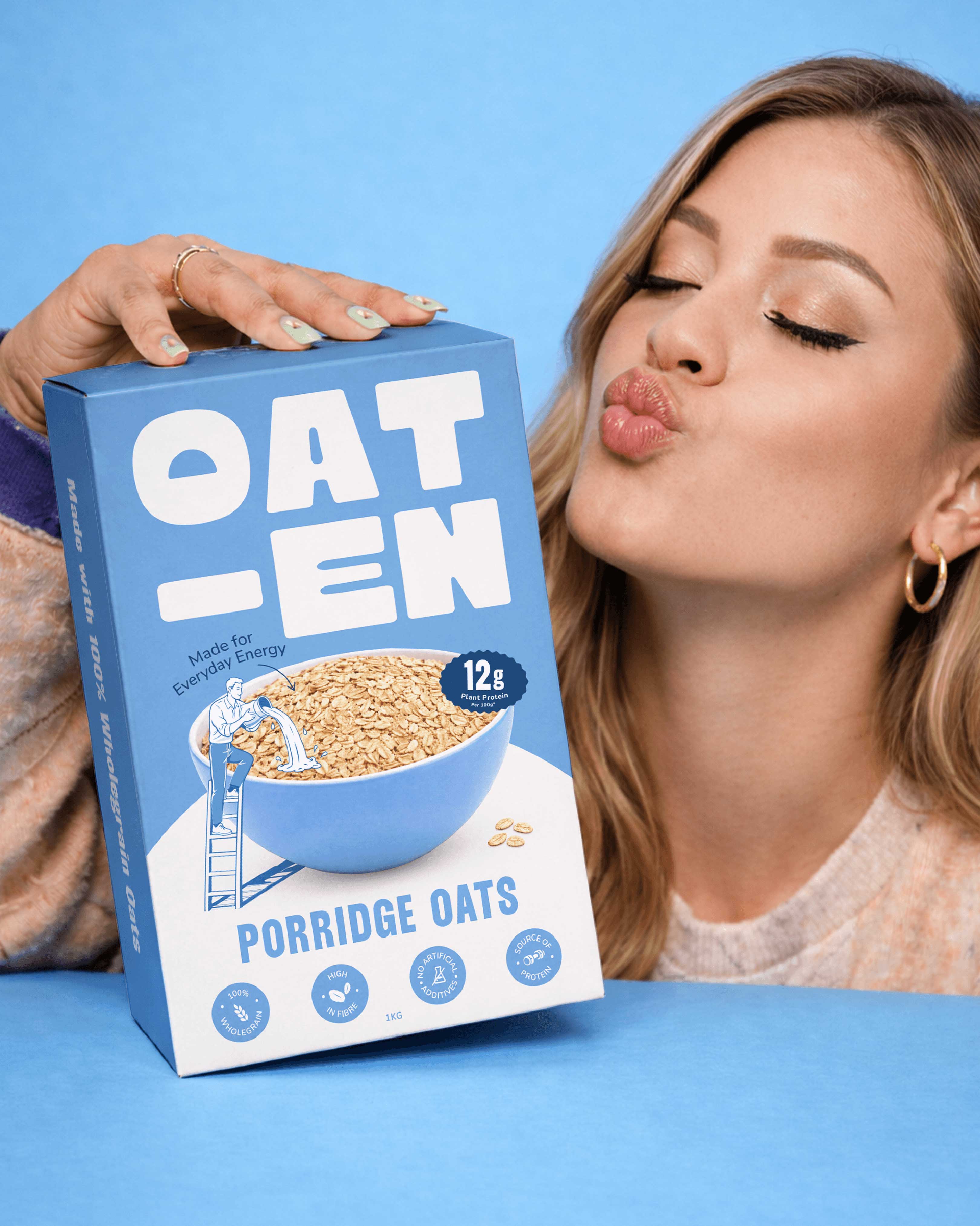
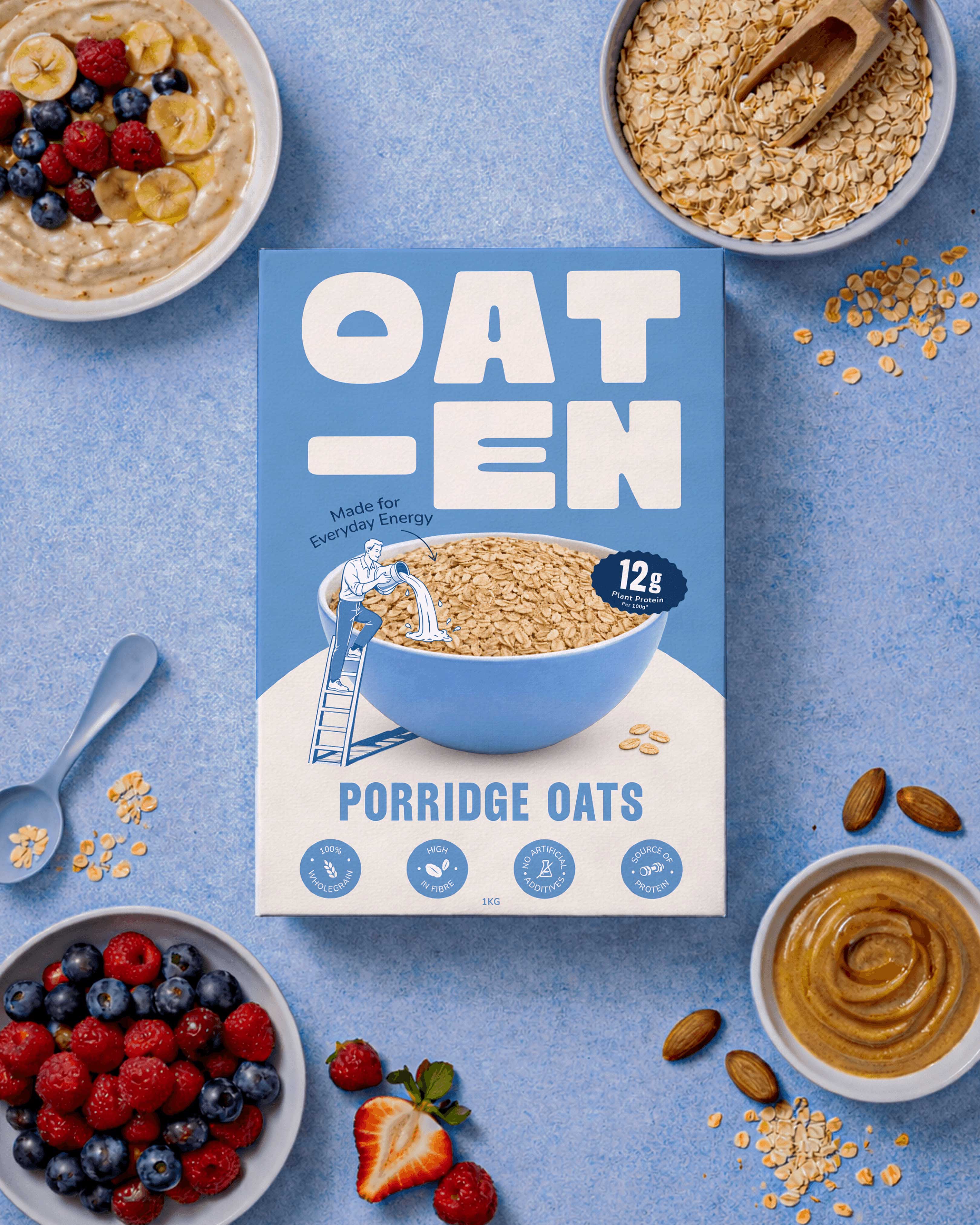
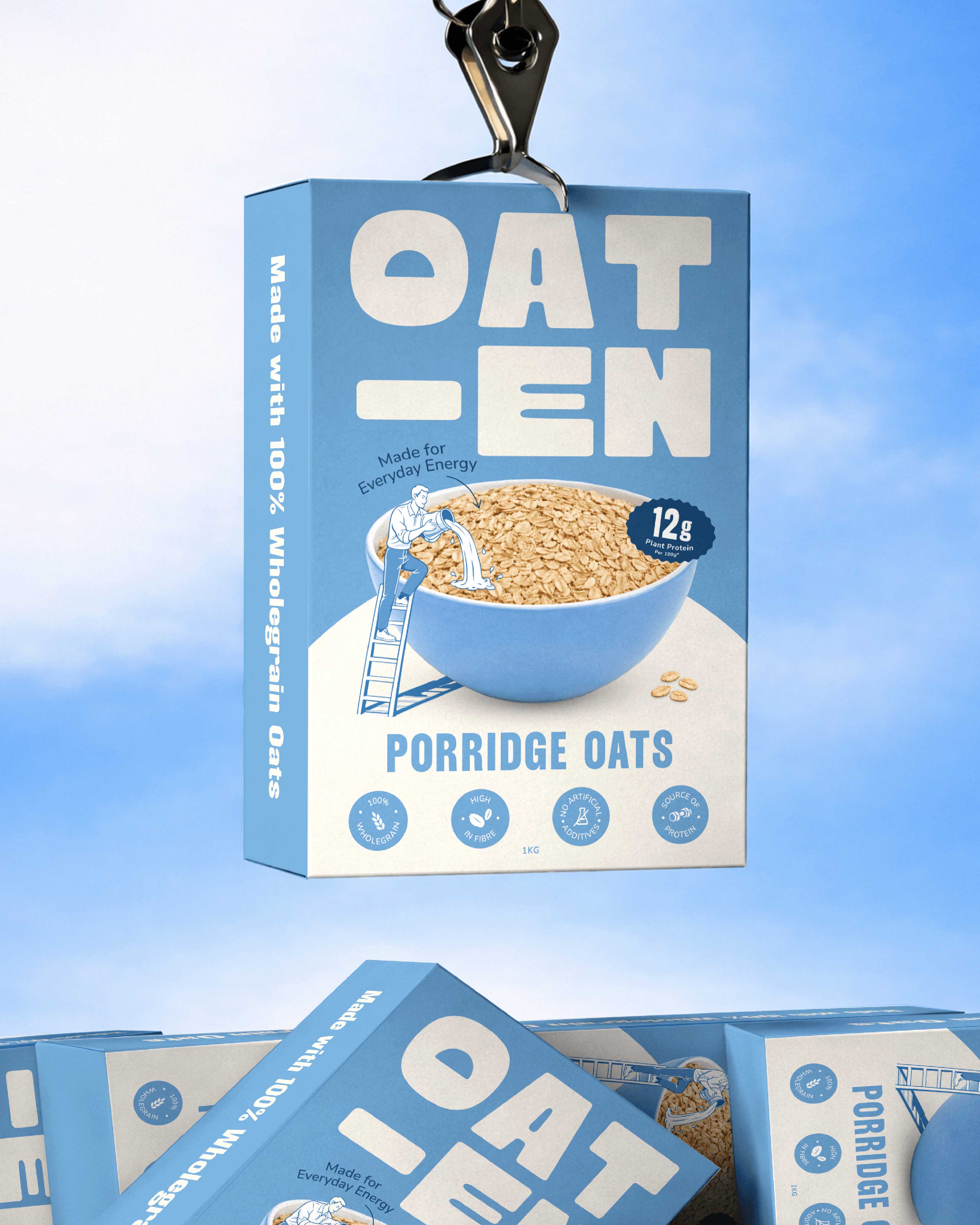
Packaging played a crucial role in shaping the brand’s presence. We designed a structure that feels contemporary and functional, while maintaining a premium appeal. The layout prioritizes breathing space, subtle earthy tones, and controlled bold accents to create a confident shelf impact. Every visual element – from color palette to graphic composition – reinforces the idea of natural energy without overwhelming the consumer.
The storytelling approach highlights oats not just as a breakfast option, but as a symbol of steady, sustained power. The brand voice is warm, motivating, and approachable, making OATEN feel like a trusted everyday companion rather than just another FMCG product.
The final outcome is a cohesive brand ecosystem that blends minimalism with emotional depth. OATEN stands as a clean, impactful identity that feels modern, premium, and accessible – a brand built to energize mornings and elevate everyday routines with quiet confidence.
CREDIT
- Agency/Creative: Sorted Branding
- Article Title: Sorted Branding Gives Oaten a Modern Identity for Everyday Energy
- Organisation/Entity: Agency
- Project Type: Packaging
- Project Status: Published
- Agency/Creative Country: India
- Agency/Creative City: Mumbai
- Market Region: Asia
- Project Deliverables: Branding
- Format: Bag
- Industry: Food/Beverage
- Keywords: Packaging
-
Credits:
Project Manager: Arpika Singh


