


For The Dairy’s, we set out to build a complete brand identity and packaging system that feels rooted in purity, freshness, and everyday accessibility—values that are essential in the dairy category. The challenge was to create a brand that stands out in a highly competitive market while still feeling familiar and trustworthy to the middle-class Indian audience.
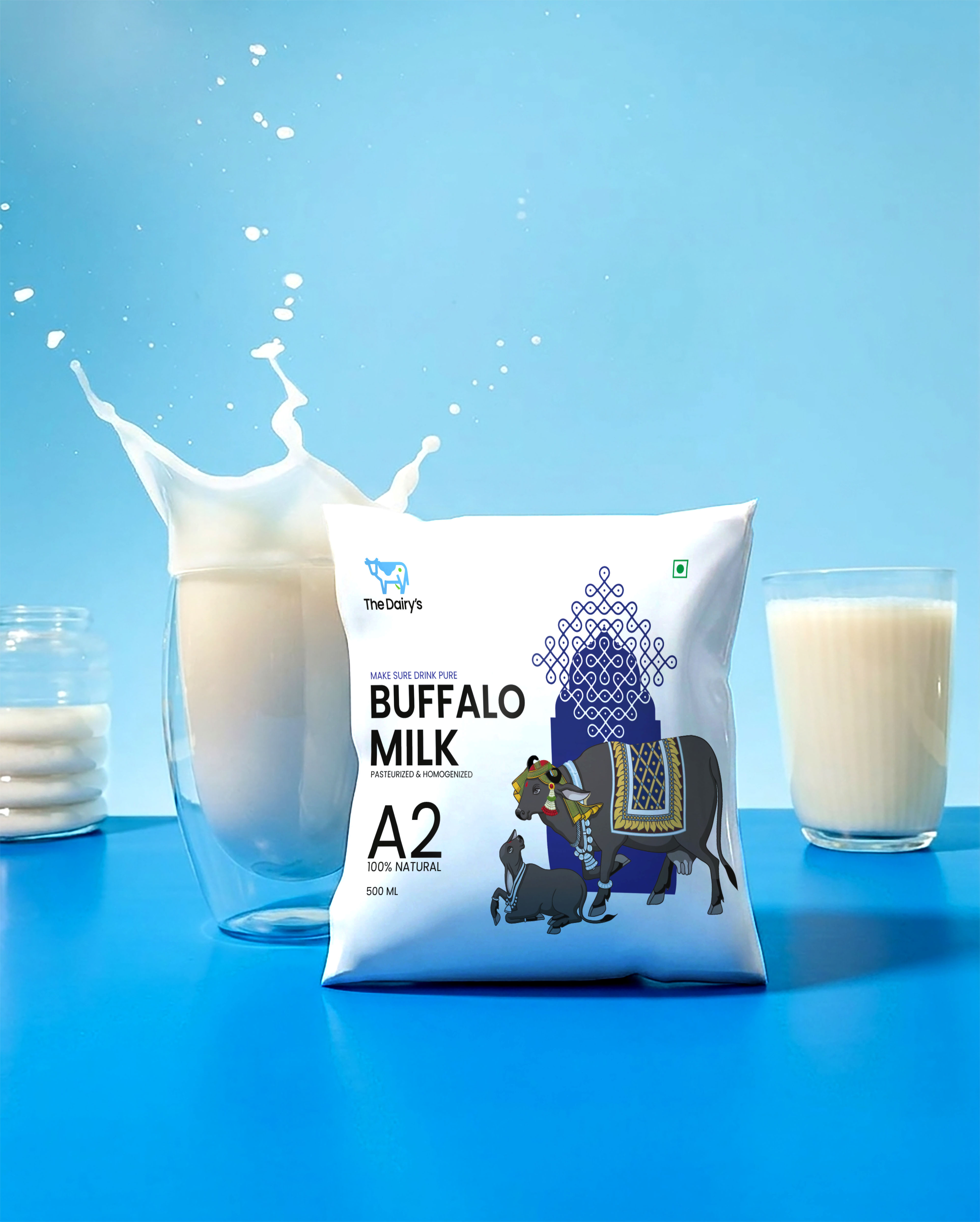
Our approach began with developing a visual language that strikes a balance between modernity and warmth. The identity needed to feel clean and contemporary, yet not distant or overly premium. We crafted a distinctive logo that carries a sense of simplicity and reliability, ensuring it is easy to recognize and recall across various touchpoints. Alongside this, a carefully curated colour palette was introduced—one that subtly reflects freshness and natural goodness while maintaining strong visibility on shelves.
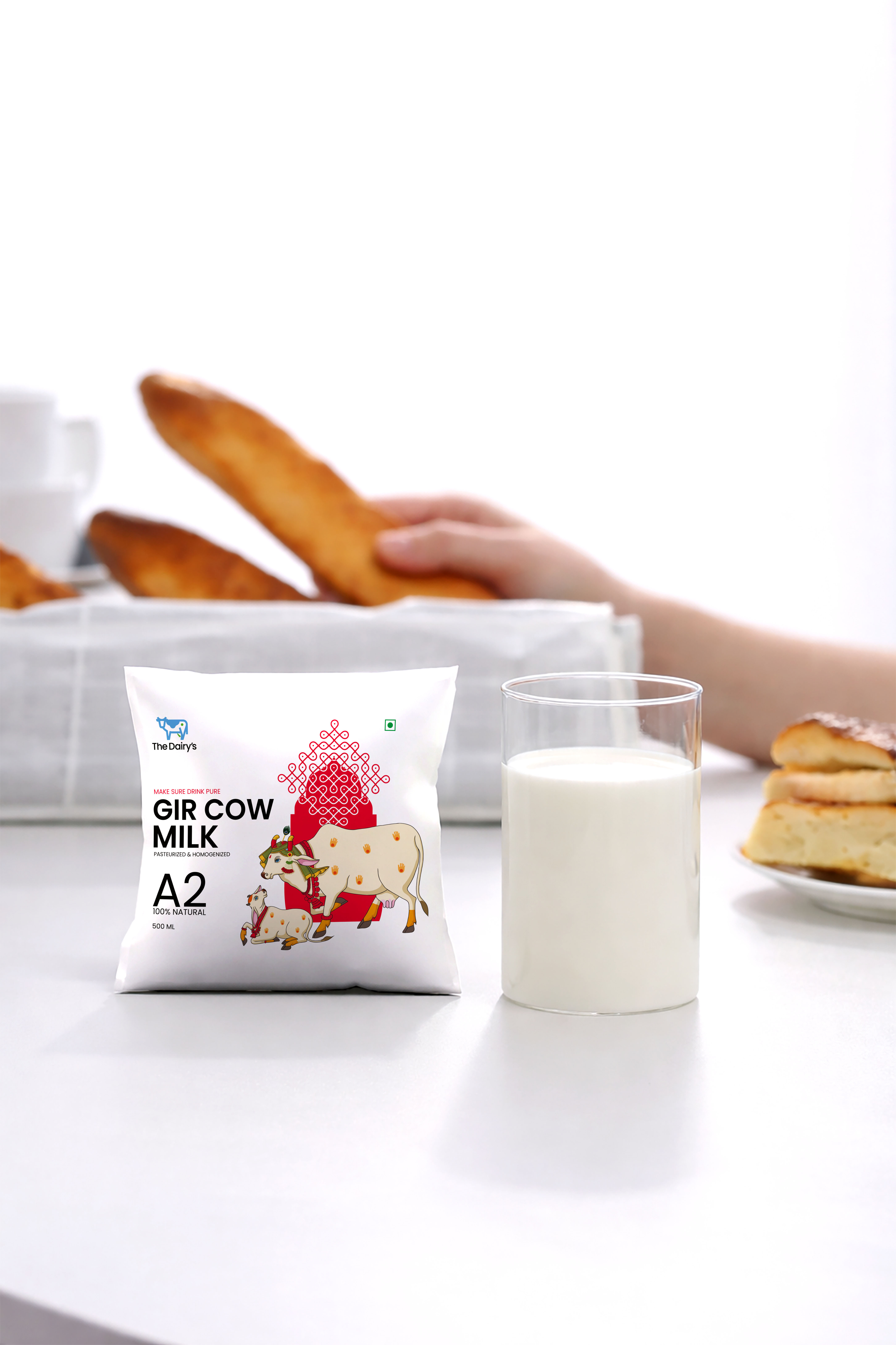
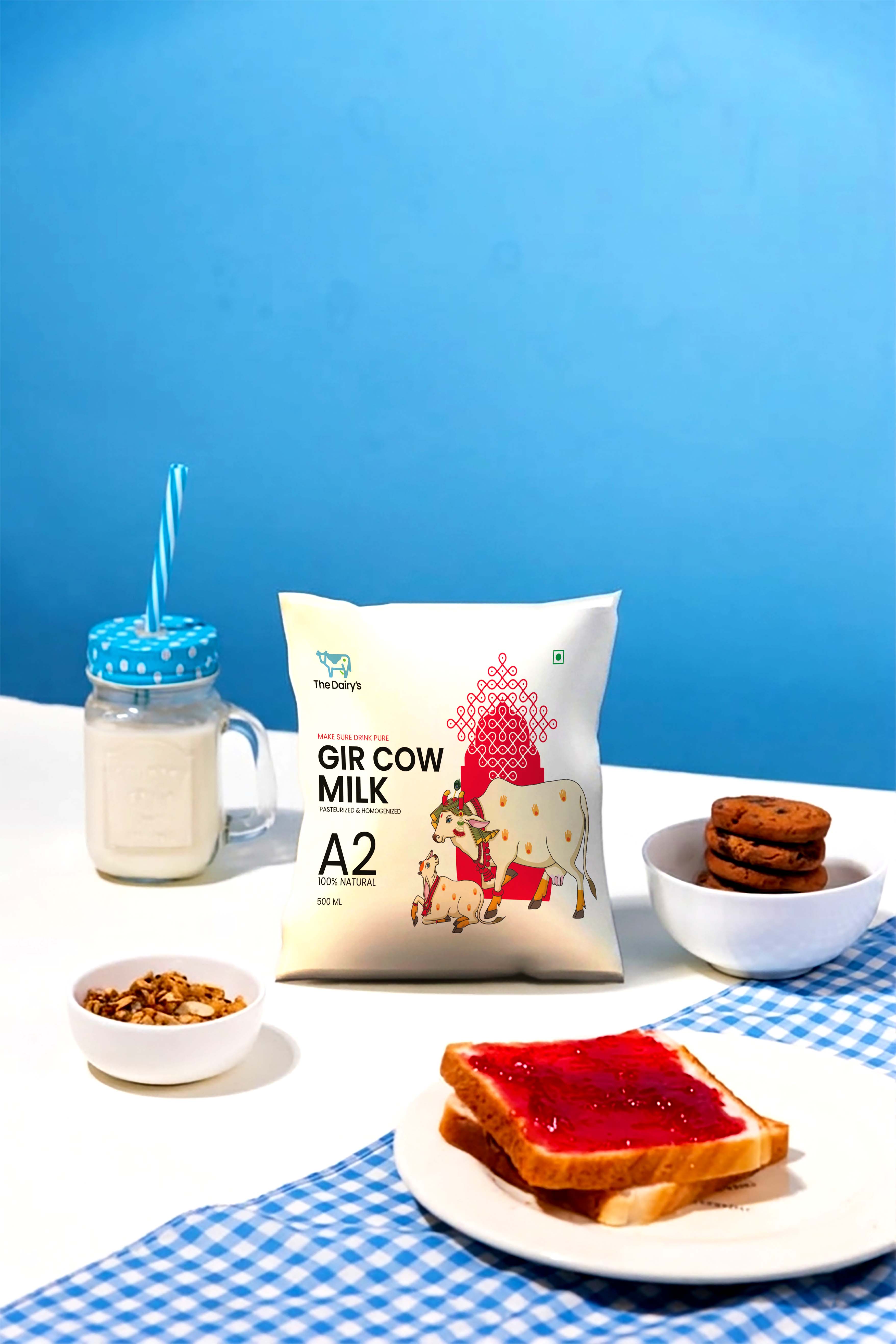
Packaging played a crucial role in shaping the consumer’s perception. Instead of overcomplicating the design, we focused on clarity, hierarchy, and emotional connection. Each SKU was designed to feel part of a unified system while still being easily distinguishable. Thoughtful use of whitespace, structured layouts, and consistent visual cues helped reinforce a sense of cleanliness and quality—key factors when it comes to dairy products.
At the same time, we ensured that the packaging communicates value without losing its premium appeal. The goal was to create designs that feel accessible to everyday consumers while still elevating the brand above generic competitors. Every detail, from typography to graphic elements, was chosen to build a sense of trust and authenticity.
Consistency across all brand touchpoints was central to the process. Whether it’s on-pack communication, retail presence, or future extensions, the identity system was designed to scale seamlessly. This ensures that as The Dairy’s grows, it maintains a strong and recognizable presence in the market.
The final outcome is a cohesive and memorable brand that not only reflects the essence of pure and fresh dairy but also connects deeply with its audience. The Dairy’s now stands positioned as a reliable, approachable, and quality-driven brand—one that consumers can trust as a part of their everyday lives.
CREDIT
- Agency/Creative: Sorted Branding
- Article Title: Sorted Branding Develops The Dairys as a Fresh Dairy Packaging Design System Built on Clarity Trust and Everyday Appeal
- Organisation/Entity: Agency
- Project Type: Packaging
- Project Status: Published
- Agency/Creative Country: India
- Agency/Creative City: Mumbai
- Market Region: Asia
- Project Deliverables: Packaging Design
- Format: Bag
- Industry: Food/Beverage
- Keywords: packaging
-
Credits:
Project Manager: Arpika Singh


