


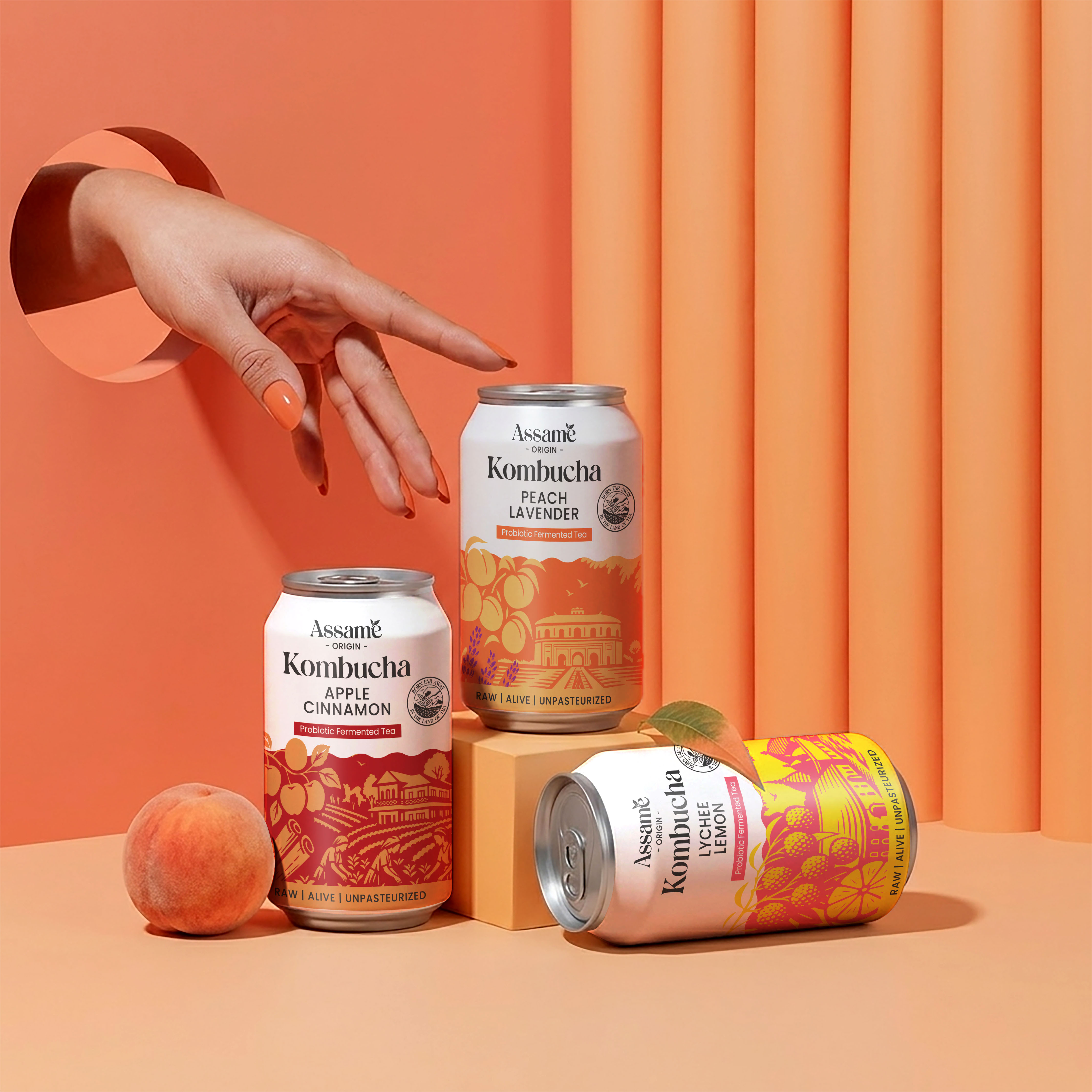
We had the opportunity to collaborate with ASSAME, a vibrant and emerging beverage brand, to design packaging for their expanding kombucha range. From the very beginning, the approach was clear—this wasn’t going to be a standard “one design, multiple color swaps” execution. Each SKU carried its own flavor profile, mood, and sensory experience, and the packaging needed to reflect that individuality while still belonging to a cohesive brand universe.
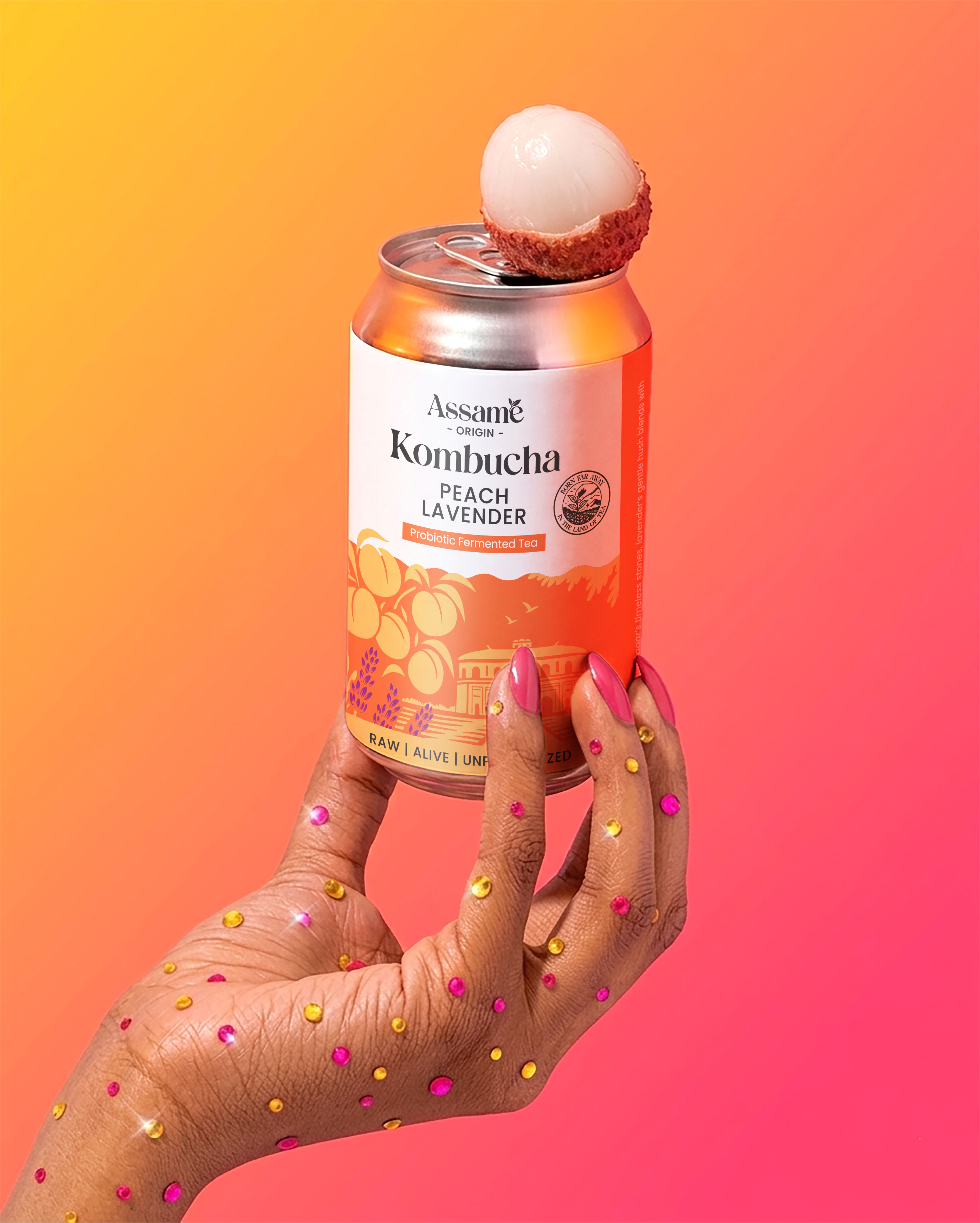
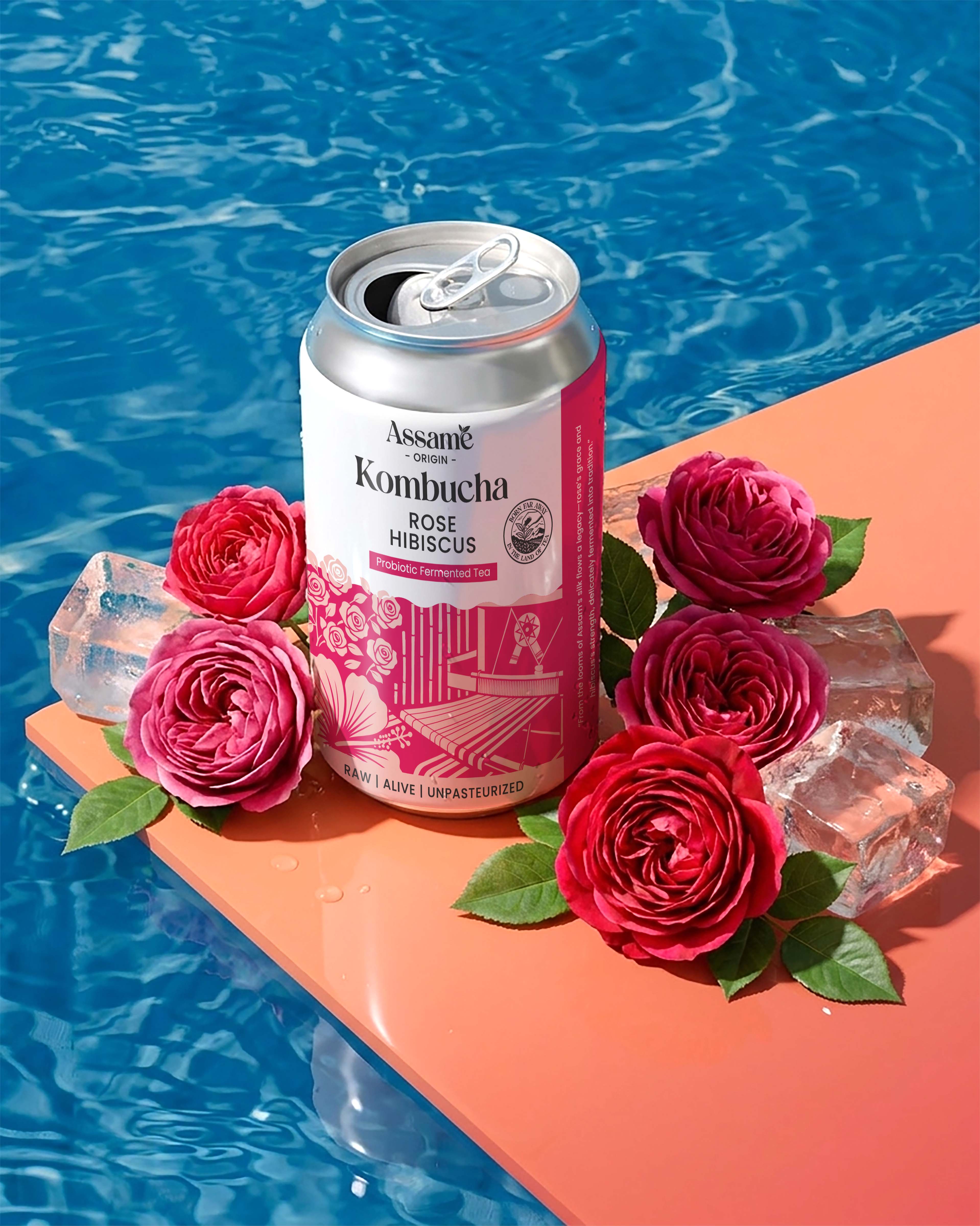
Instead of treating the range as simple variations, we approached each flavor as a standalone story. Every SKU was crafted with a distinct visual language, drawing inspiration from its ingredients, taste notes, and the emotion it evoked. From typography to color palettes, from illustration styles to layout structures, each element was thoughtfully curated to mirror the personality of the drink inside the bottle. This allowed every variant to feel unique and memorable on its own, while still being instantly recognizable as part of the ASSAME family.
A key challenge was balancing differentiation with consistency. While each design needed to stand apart on the shelf, the overall brand identity had to remain intact. We achieved this by building a strong foundational design system—consistent logo placement, structural hierarchy, and subtle recurring elements that tied all SKUs together. This ensured that even with diverse storytelling, the brand presence remained unified and premium.
The storytelling aspect became the soul of the packaging. Instead of just showcasing flavors, we translated them into experiences. Whether it was a refreshing citrus burst, a calming herbal blend, or a bold, fermented kick, each label visually narrated what the consumer could expect even before taking a sip. This not only elevated the aesthetic appeal but also created a deeper emotional connection with the audience.
Through this project, the goal was not just to design packaging, but to build a visual identity system that could scale with the brand as it grows. The result was a kombucha range that stands out in a crowded market—distinct yet cohesive, expressive yet structured, and most importantly, true to the spirit of ASSAME.
CREDIT
- Agency/Creative: Sorted Branding
- Article Title: Sorted Branding Develops Assame Kombucha as a Distinctive Packaging Design System Driven by Flavor LED Storytelling
- Organisation/Entity: Agency
- Project Type: Packaging
- Project Status: Published
- Agency/Creative Country: India
- Agency/Creative City: Mumbai
- Market Region: Asia
- Project Deliverables: Branding
- Format: Can
- Industry: Food/Beverage
- Keywords: Packaging Design
-
Credits:
Project Manager: Arpika Singh


