How do you stand out in a hyper-saturated category?
Simple: be yourself, be bold, have a clear product differentiator, and only promise what you know is true.
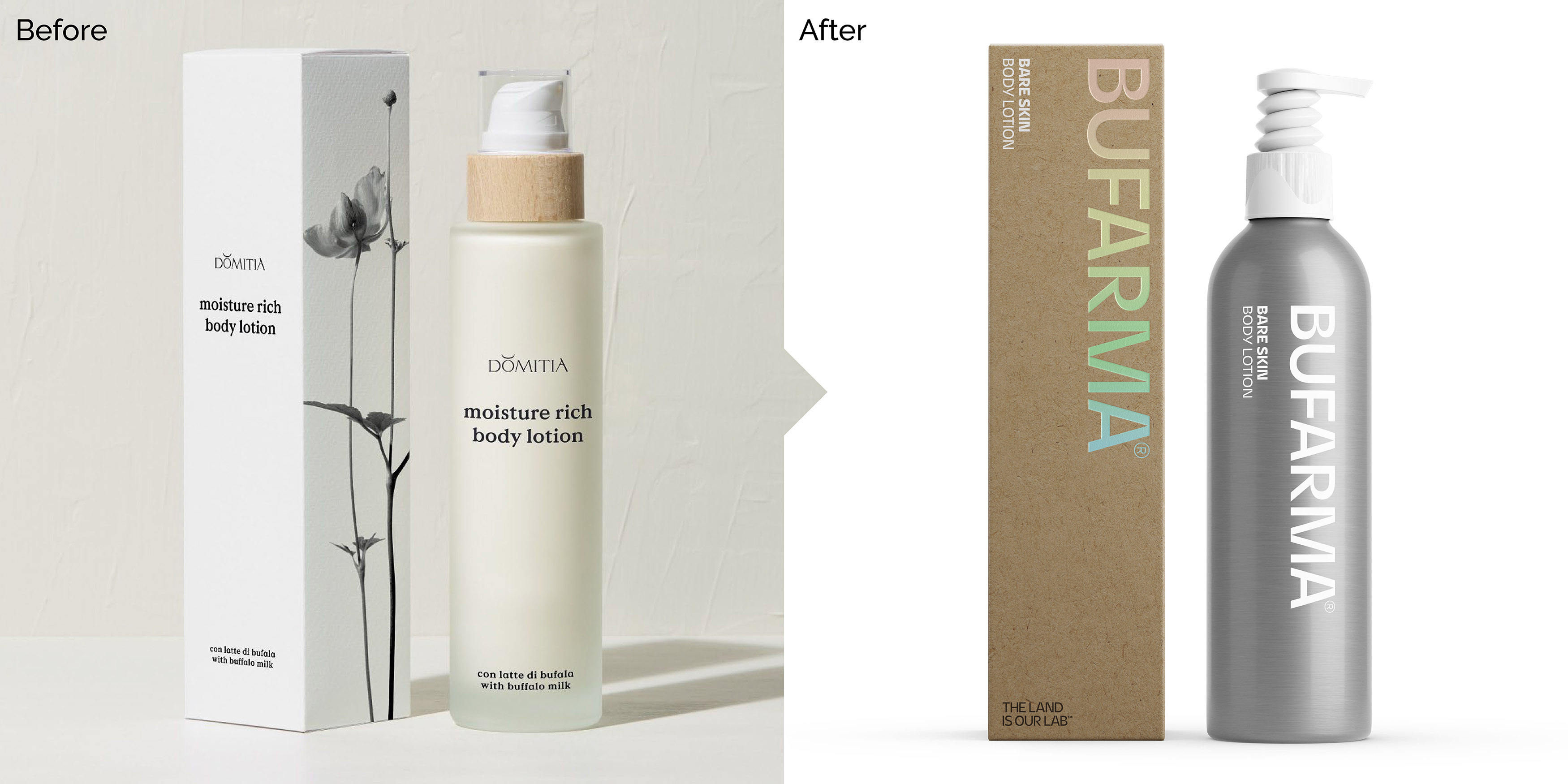
That’s how SoreThumbStudio’s repositioning and rebranding approach helped Domizia find their ‘extra-ordinariness’.
SoreThumbStudio’s challenge was to better align the brand with its expertise in utilising essential ingredients and scientific knowledge to produce high-quality and effective products. This was no mean feat especially as the brand was being soft launched at a trade show just 10 weeks from our briefing. Needless to say, they pulled out all the stops and made it happen, and made sure the client team had a full suite of high quality rebranded product mockups to present to the trade.
Domizia, or Bufarma, as it’s now known, specialises in natural skincare formulations and leverages the skin-repairing properties of organic buffalo milk, alongside responsibly sourced local botanicals from southern Italy.
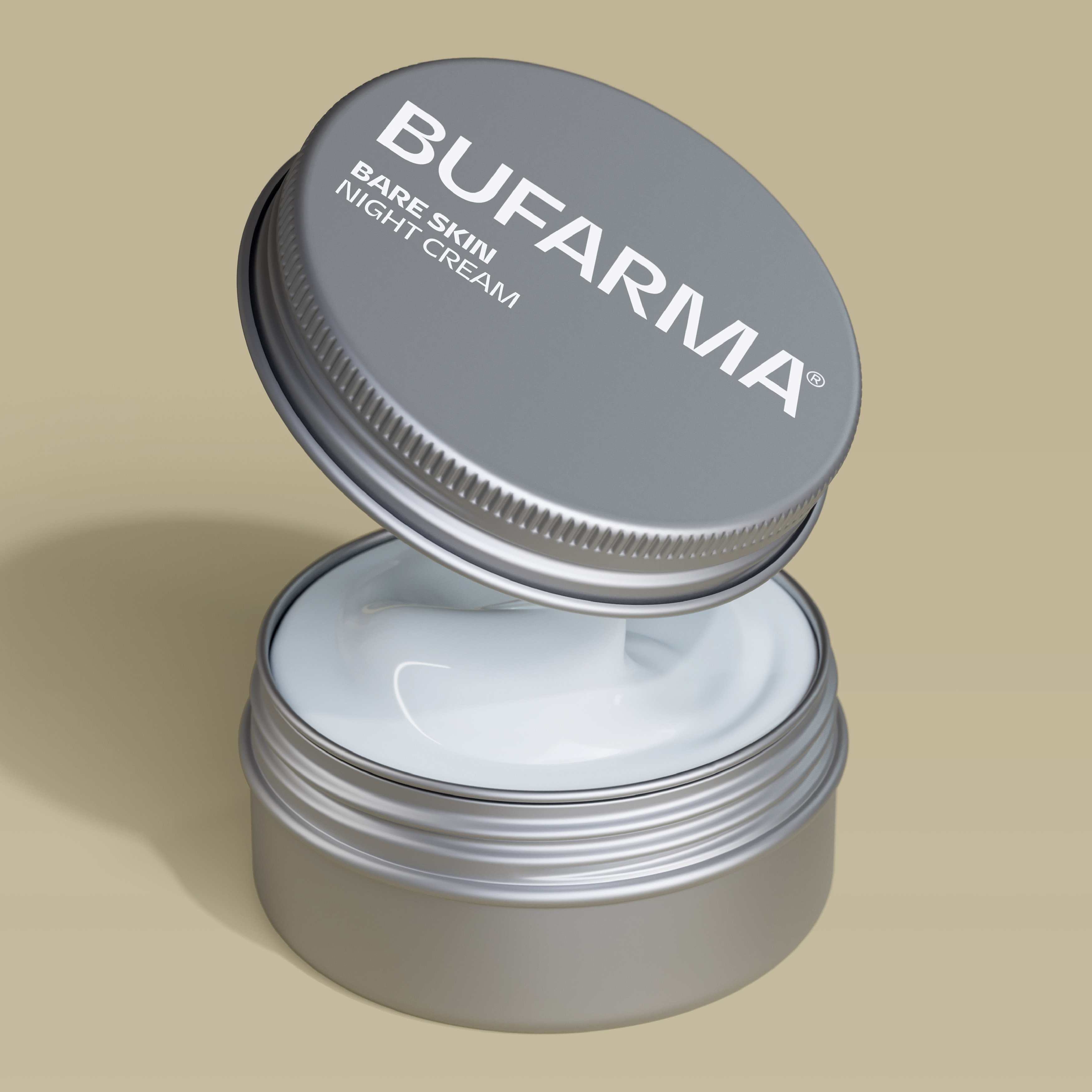
The repositioning strategy aimed to differentiate Bufarma from the rest of the skincare category, which often delivers products in a generic white box and glass container with a minimal black identity.
The Bufarma team wholeheartedly embraced our ‘extra-ordinary’ brand positioning concept and the idea of ‘ordinary’ materials containing products of ‘remarkable’ potential.
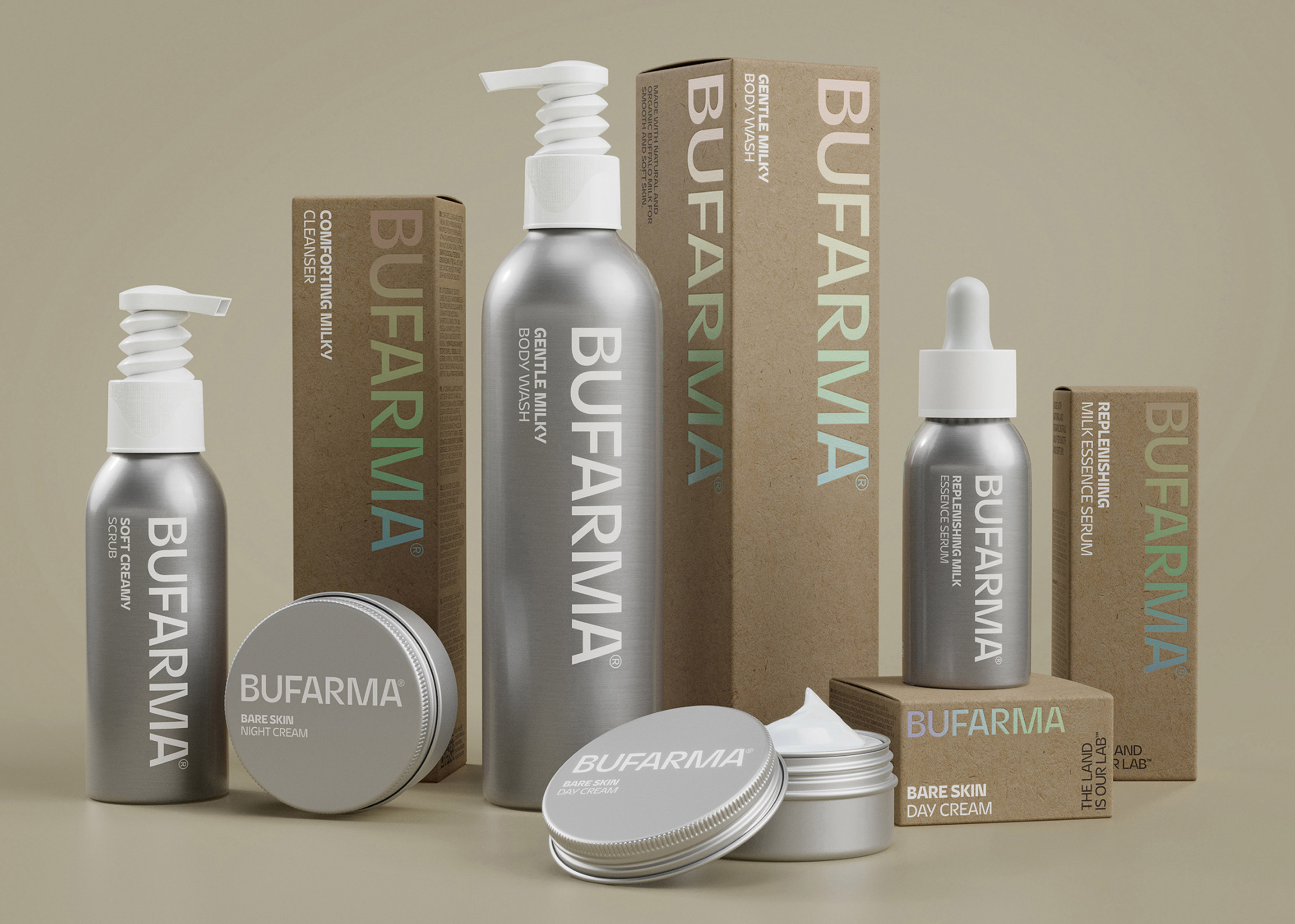
Bufarma’s product packaging drew inspiration from aluminium milk urns traditionally used to store buffalo milk. It is also infinitely recyclable, premium, and lighter and safer than glass to transport.
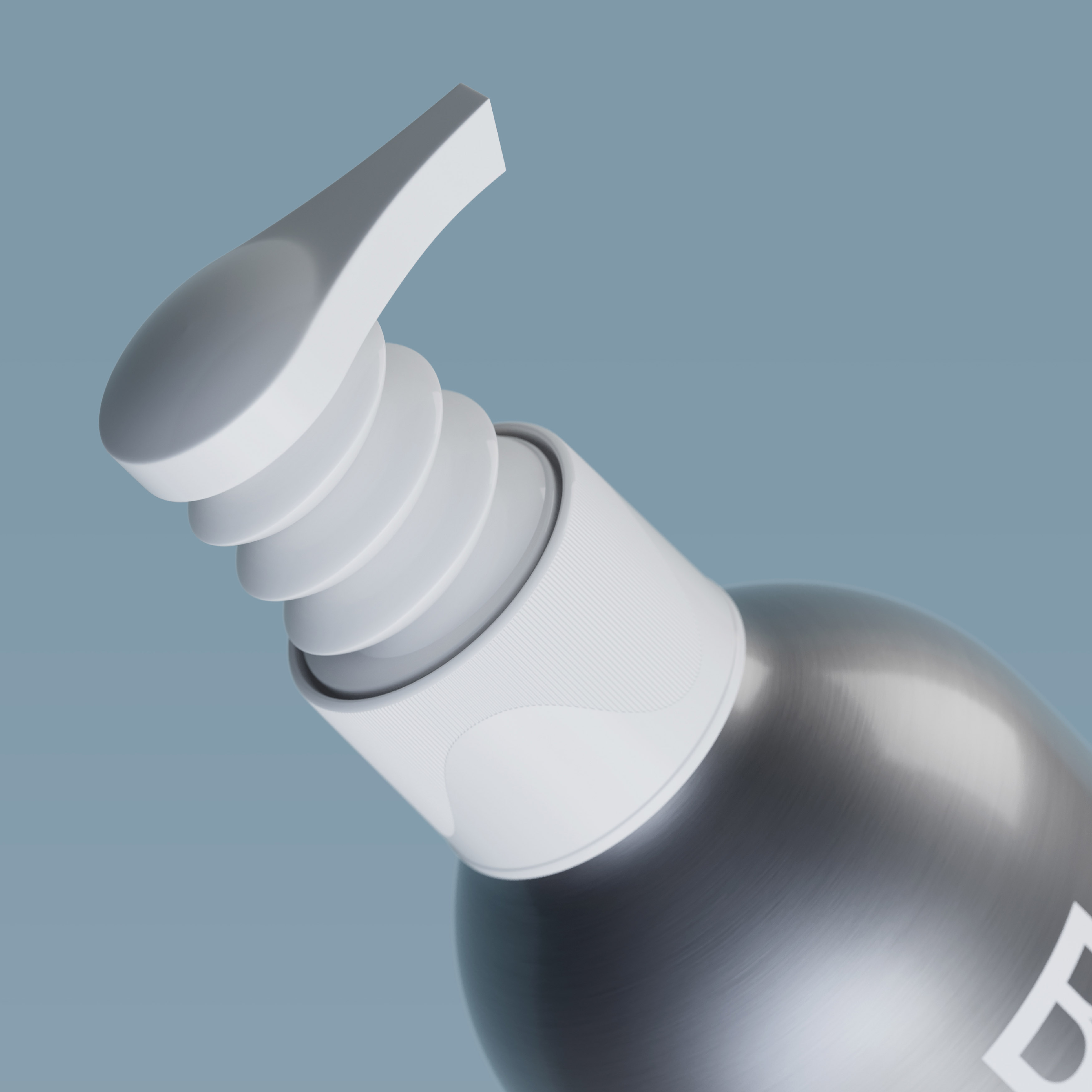
To further enhance Bufarma’s eco-credentials, SoreThumbStudio sourced an innovative single-material bellow pump that doesn’t contain any springs and can be easily recycled without being taken apart.
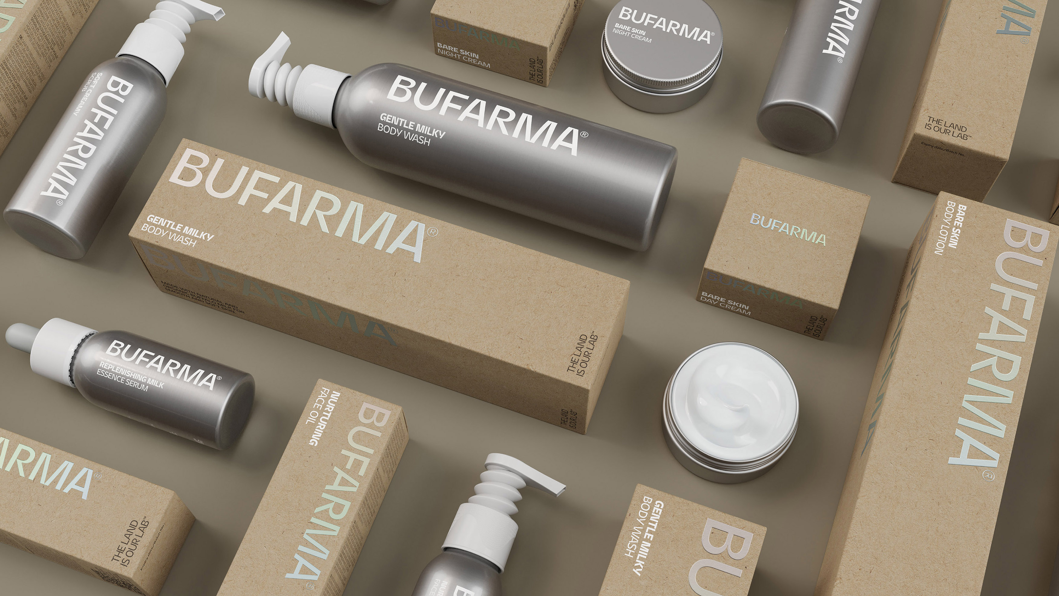
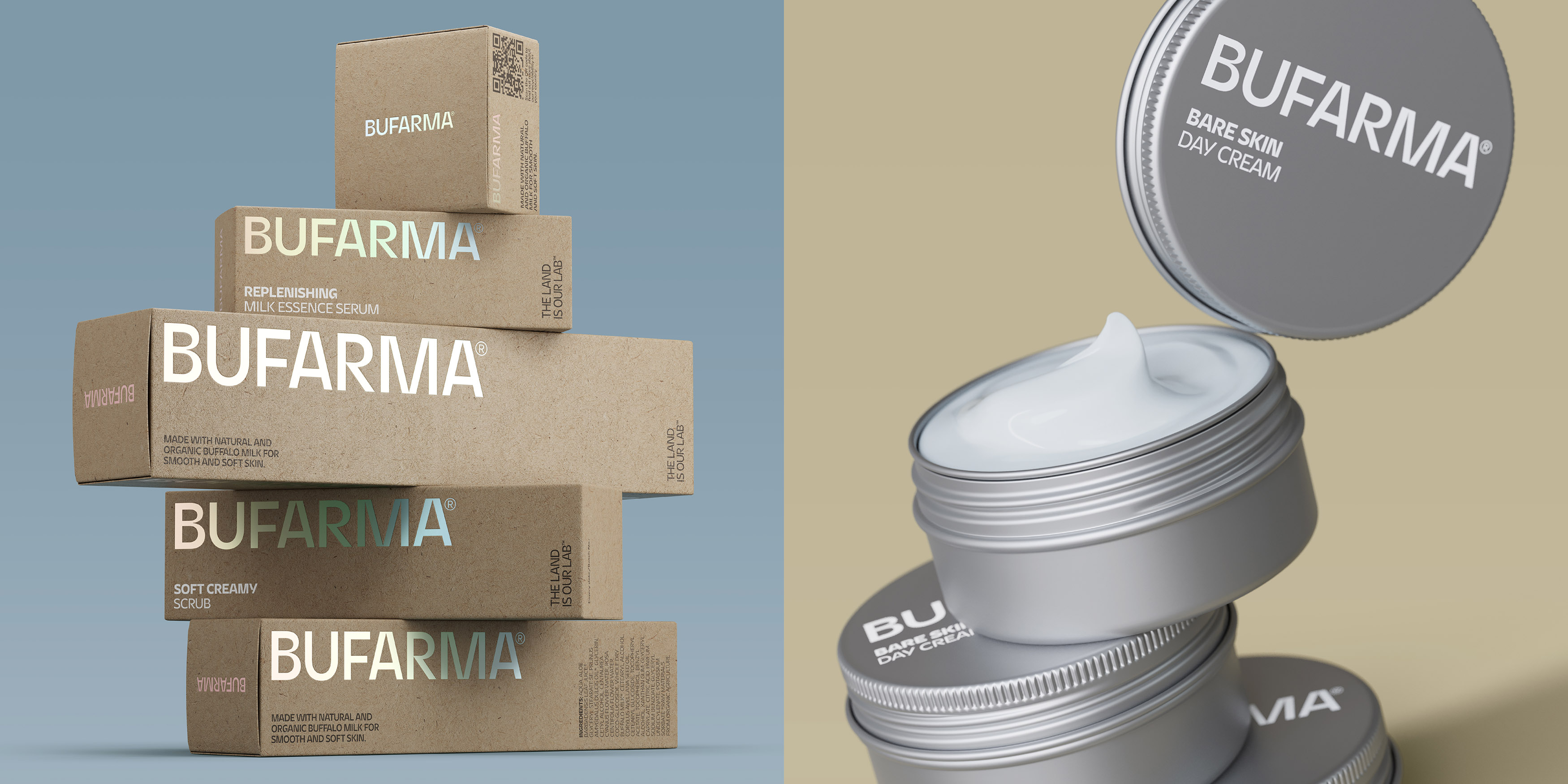
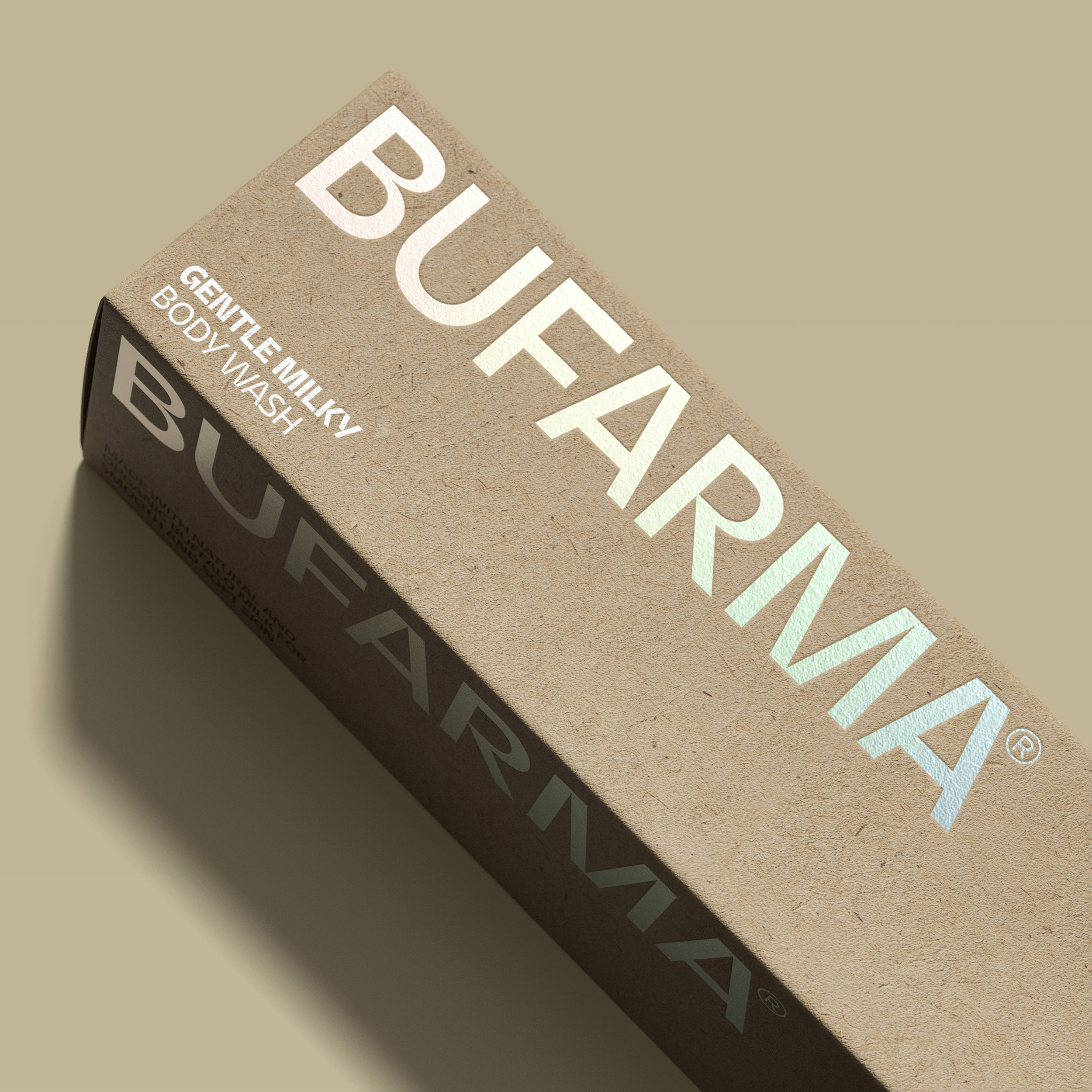
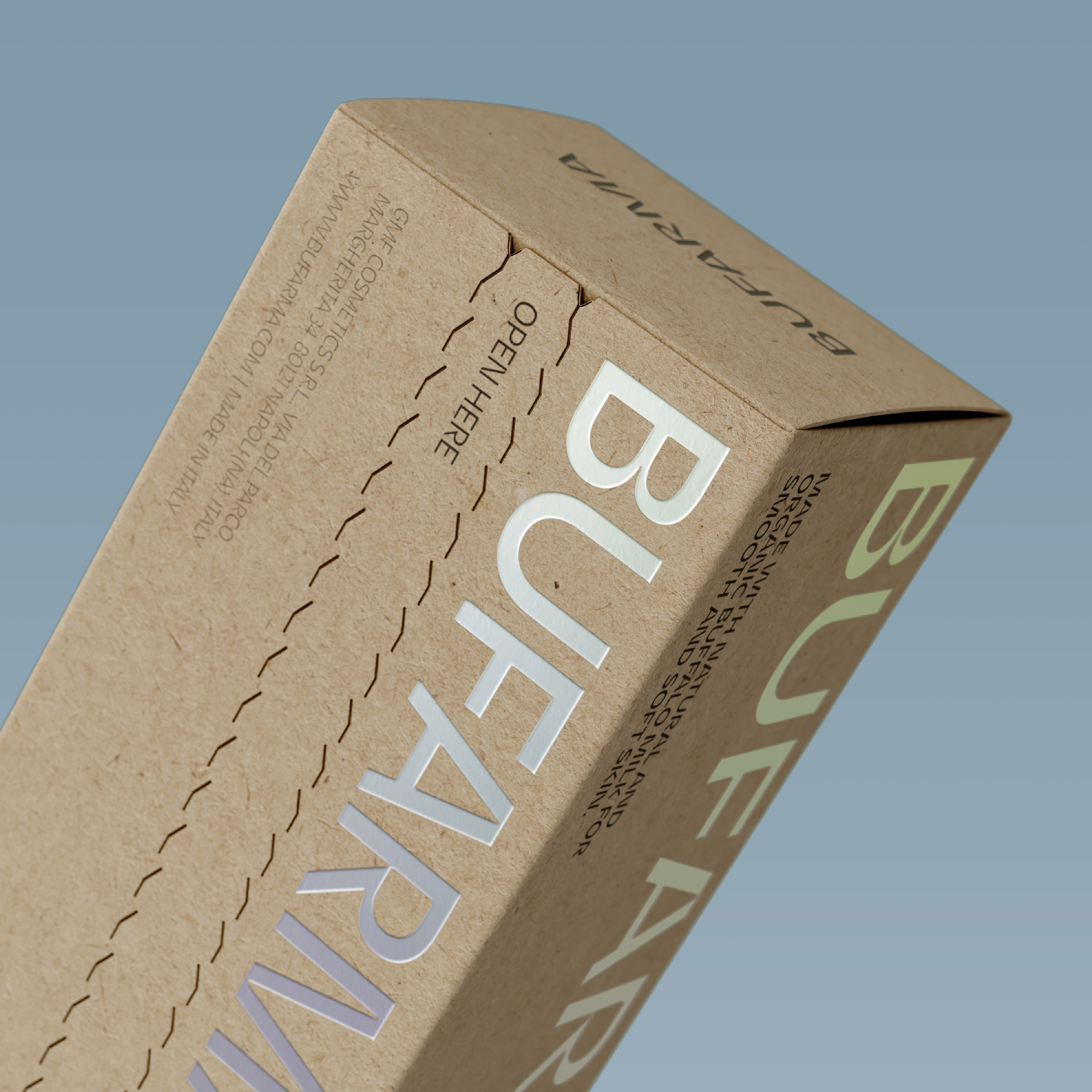
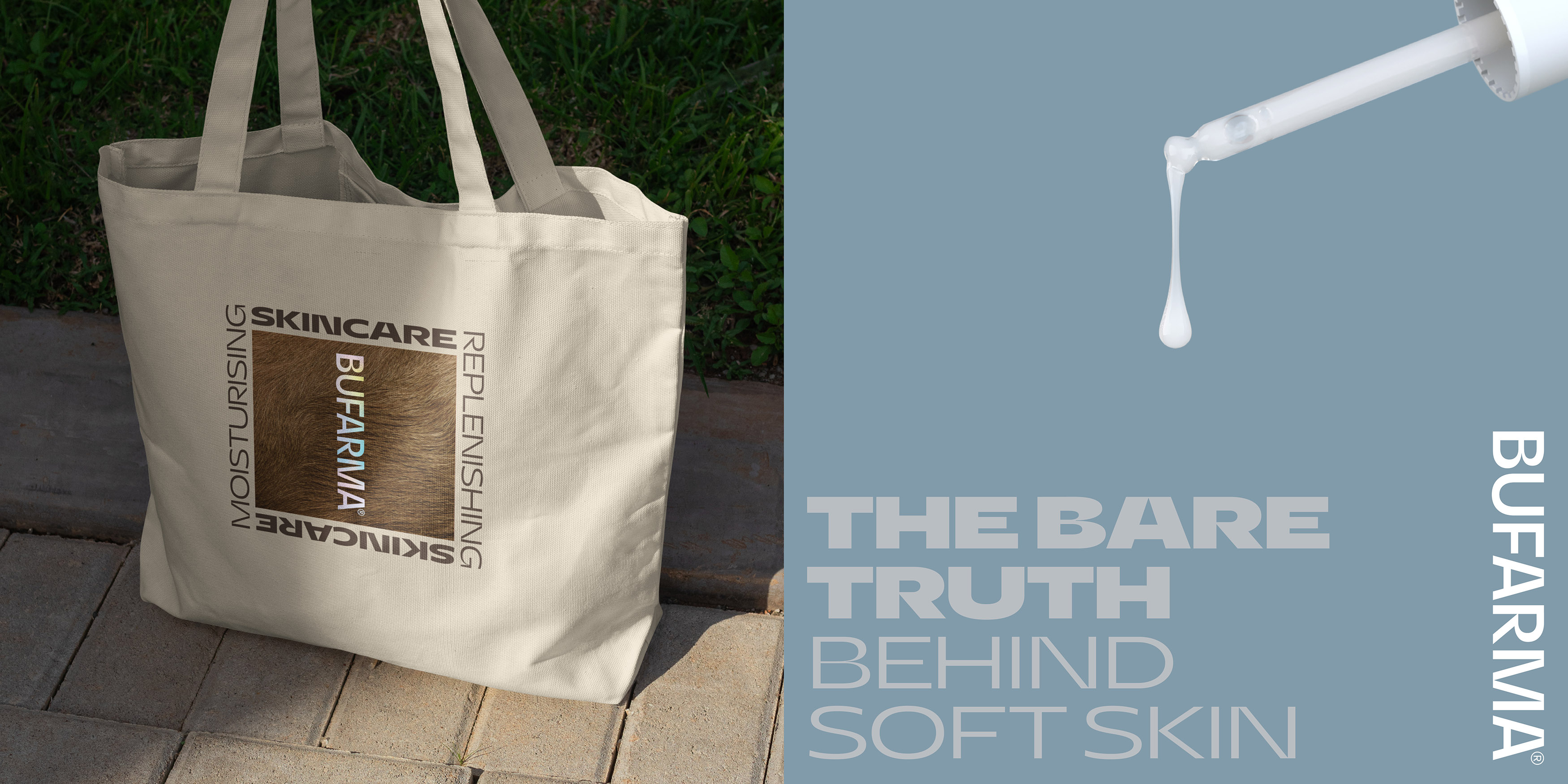
SoreThumbStudio also chose an outer boxboard and added premium iridescent foil-blocked identity details that are all 100% recyclable, reinforcing the ‘extra-ordinary’ brand positioning.
To make the out-of-box experience special, SoreThumbStudio added a tactile tear-open strip that allows customers to unwrap and discover the brand story inside, fostering a deeper connection with the product.
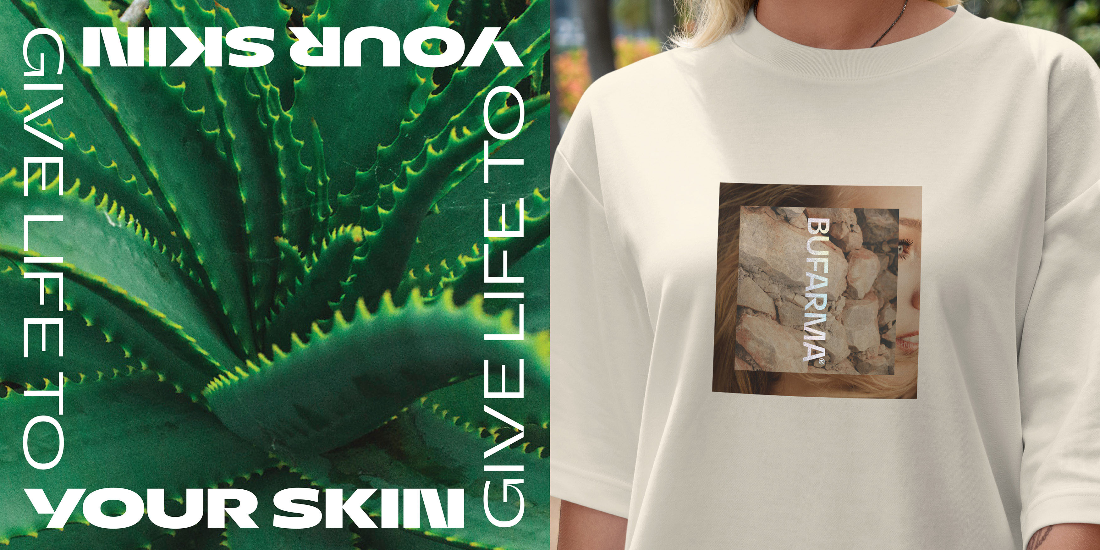
Their brand world development continues the ‘extra-ordinary’ ethos with the use of a muted natural colour palette, straightforward tone of voice, and ‘real’ au naturel imagery.
The product’s launch at one of the industry’s largest European trade shows received overwhelmingly positive feedback from category buyers, resulting in confirmed listings in retail channels in multiple markets and Bufarma has also secured Kiera Chaplin as a brand ambassador.
SoreThumbStudio helped Bufarma with the development of their brand positioning, brand name, brand identity, packaging design, visual language, tone of voice, product imagery, and photographic style.
Bufarma is available in UK, US, European, and West Asian health and beauty stores.
CREDIT
- Agency/Creative: SoreThumbStudio®
- Article Title: SoreThumbStudio Creates Unique Brand Identity and Packaging Design for Bufarma
- Organisation/Entity: Agency
- Project Type: Packaging
- Project Status: Published
- Agency/Creative Country: United Kingdom
- Agency/Creative City: London
- Market Region: Europe, Middle East, North America, Global
- Project Deliverables: 3D Modelling, Art Direction, Brand Architecture, Brand Creation, Brand Design, Brand Guidelines, Brand Identity, Brand Naming, Brand Redesign, Brand Rejuvenation, Brand Strategy, Branding, Copywriting, Craft, Creative Direction, Design, Packaging Design
- Format: Bottle, Box, Pot
- Industry: Beauty/Cosmetics
- Keywords: Bufarma Rebrand Packaging Identity Design Positioning Naming
-
Credits:
Creative Director: Mike Nash


