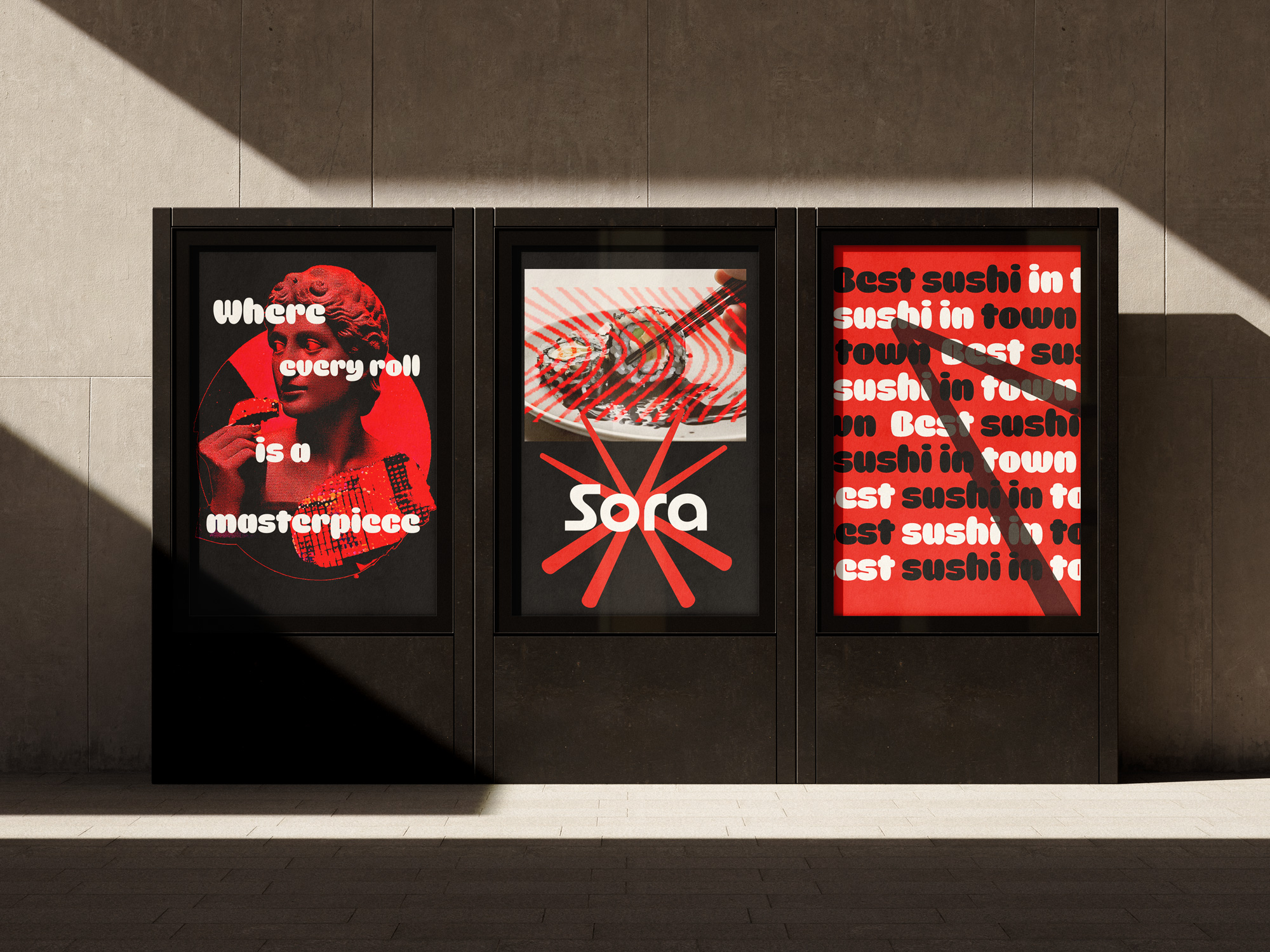
The visual identity for Sora Sushi Bar is a modern, bold representation of the fusion between culinary craftsmanship and creative design. The concept behind the brand emphasizes sushi as an artistic experience, where each roll is treated as a masterpiece. This concept is central to Sora’s identity, which positions the brand as a forward-thinking, vibrant destination for sushi lovers who appreciate both quality and creativity.
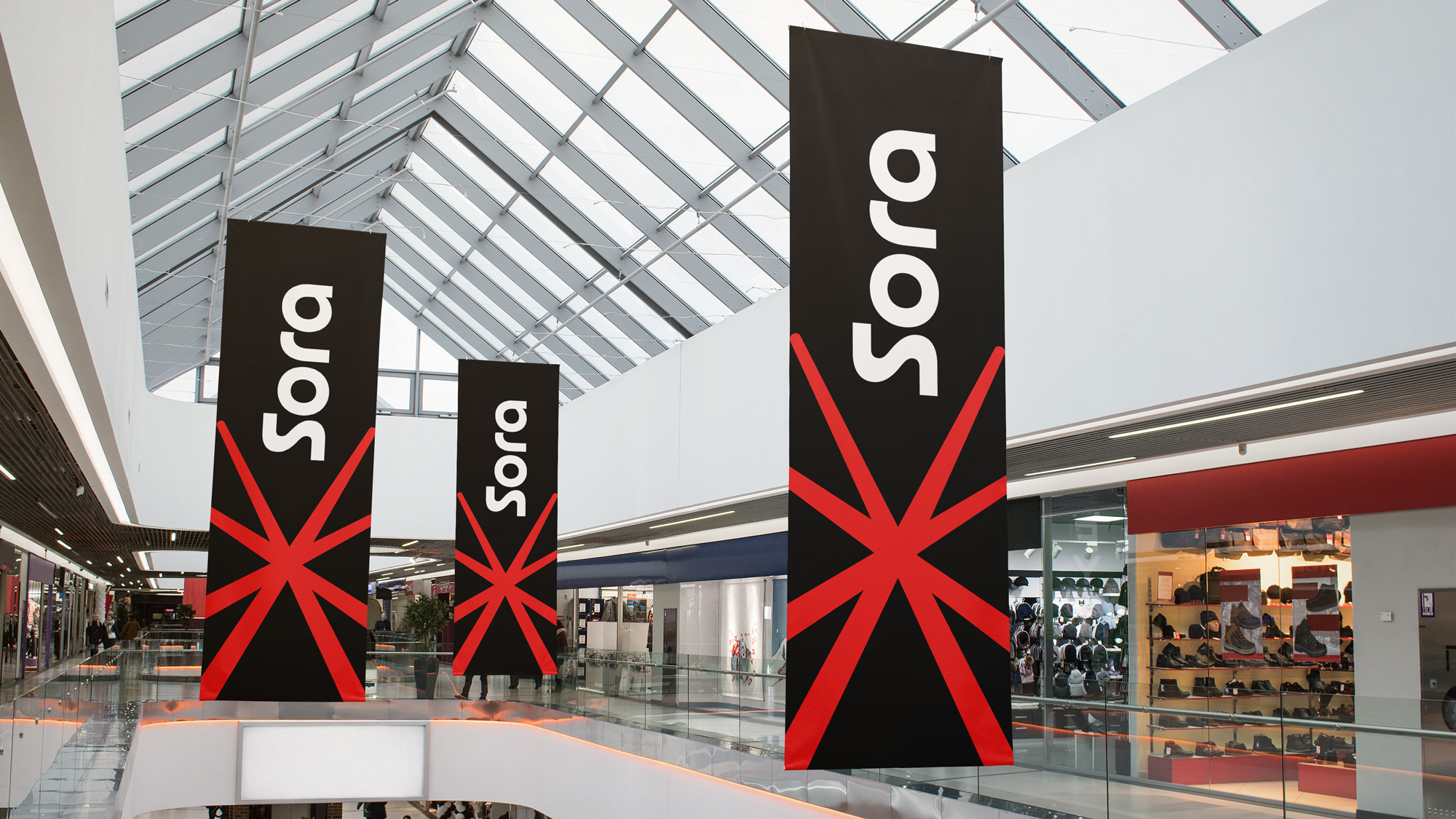
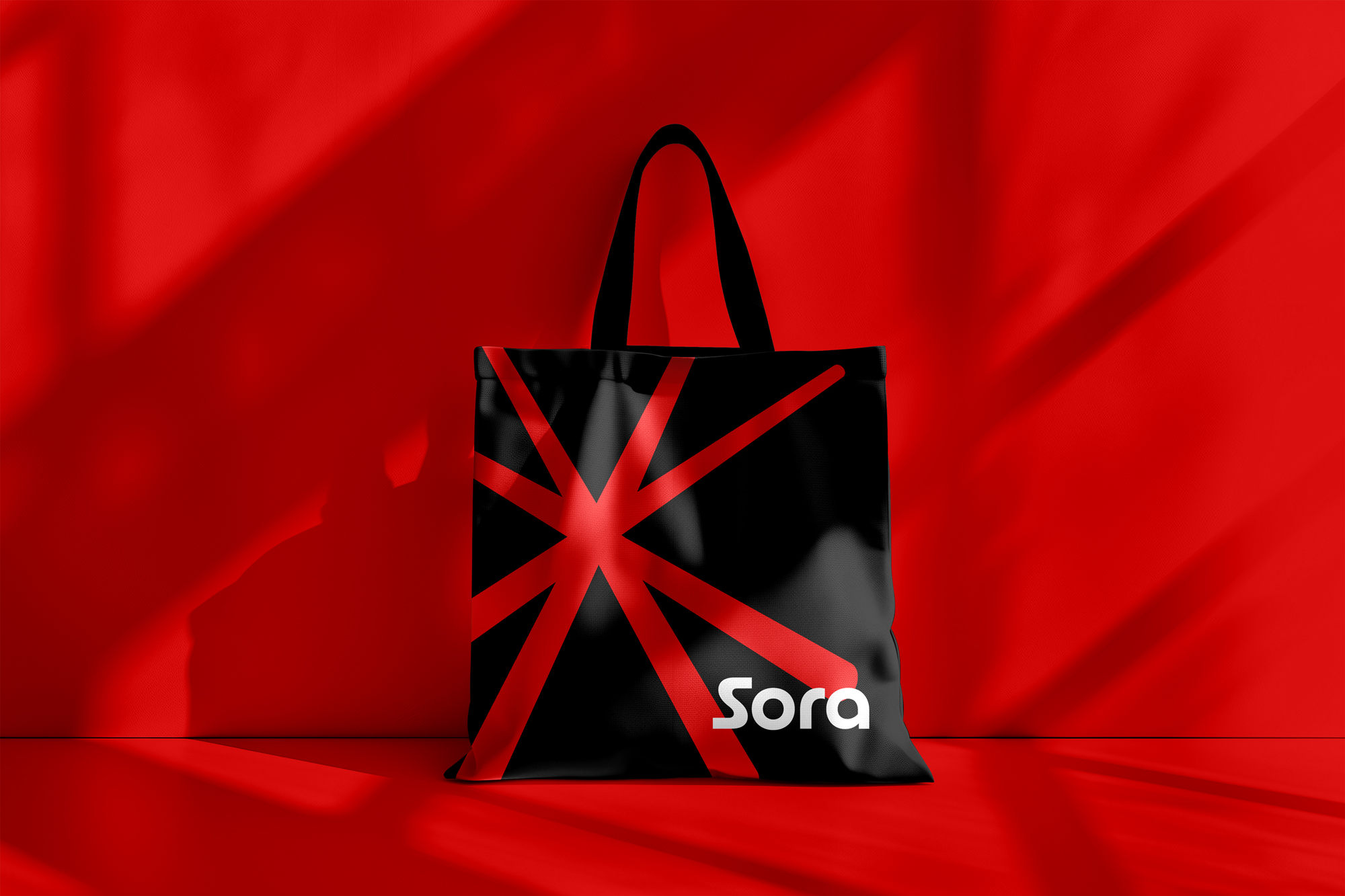
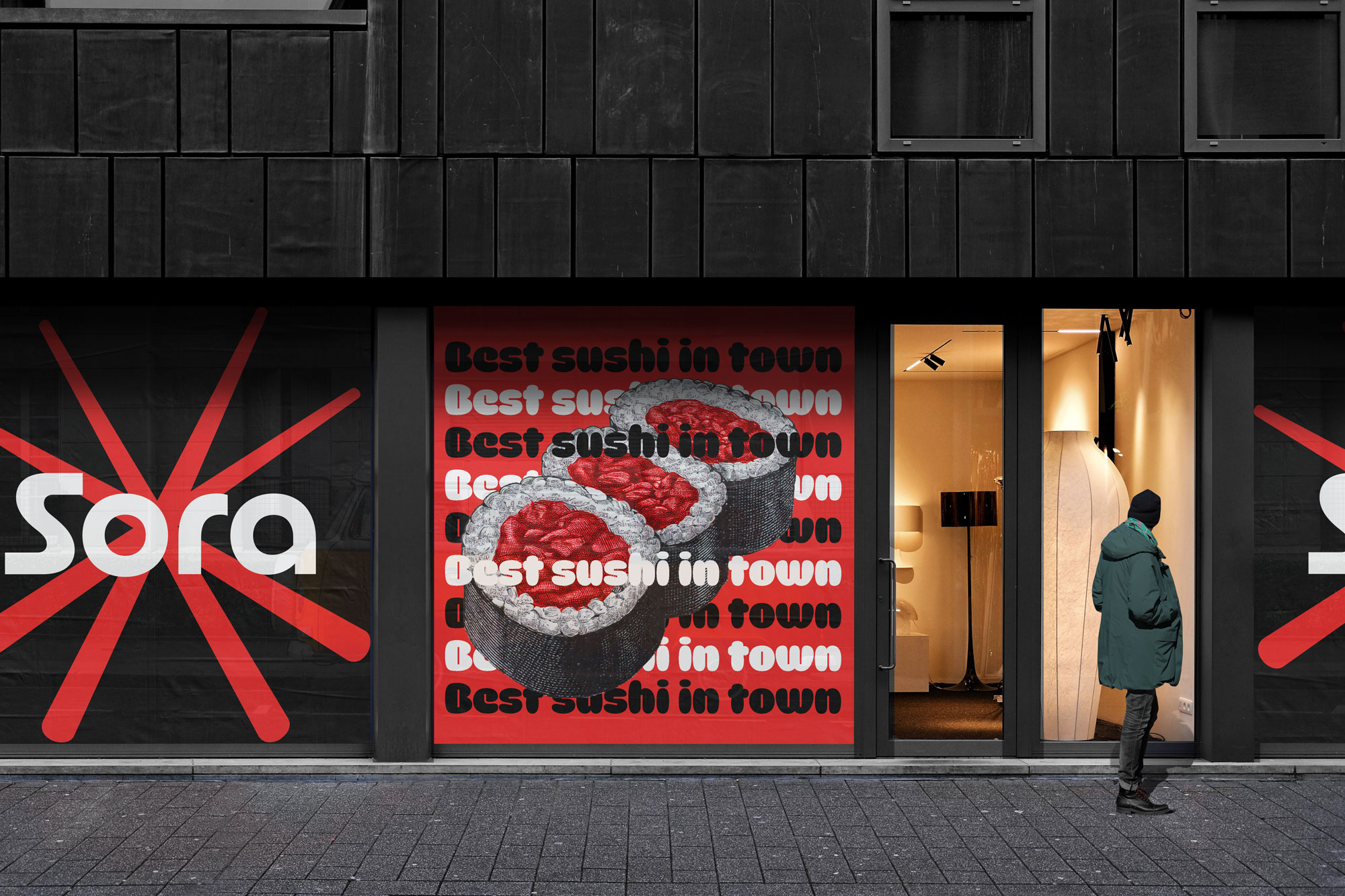
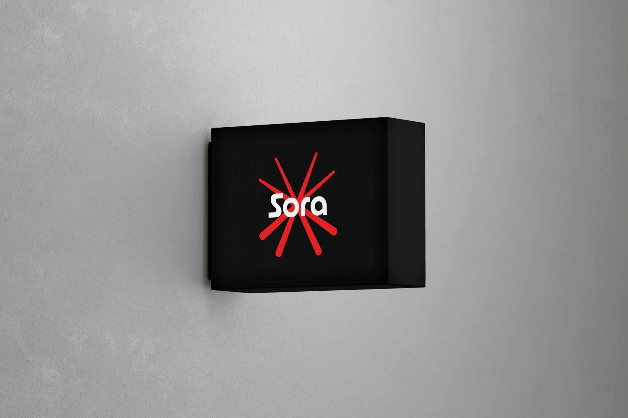
The logo design is the foundation of Sora’s visual identity. The name “Sora,” meaning “sky” in Japanese, is presented in a sleek, contemporary sans-serif font. This clean, modern typeface communicates simplicity and elegance, while the boldness of the design reflects the brand’s dynamic nature. Surrounding the wordmark is a starburst graphic—a striking red design that symbolizes the explosion of flavor, energy, and creativity that Sora brings to the sushi experience. The graphic suggests movement and innovation, which is a key element of the brand’s visual appeal. The color palette of red and black reinforces this boldness, with red representing passion, excitement, and good fortune—central themes in Japanese culture—and black offering sophistication and modernity.
This identity is applied consistently across various touchpoints, ensuring brand coherence. Large banners with the starburst logo are placed in public spaces, making Sora easily recognizable from a distance. “Where every roll is a masterpiece,” reinforcing the idea that Sora offers not just a meal, but a creative and artistic culinary journey.
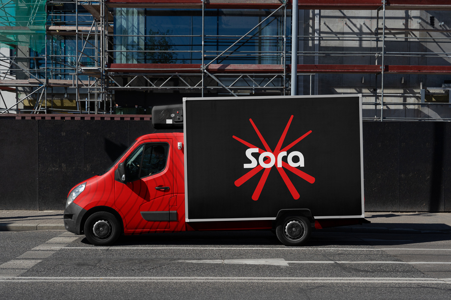
Sora’s visual identity also extends to branded delivery vehicles, creating mobile billboards that spread the brand’s presence throughout the city. The combination of strong design elements, from the striking starburst to the vibrant color palette, helps Sora stand out in a competitive market. It appeals to design-conscious customers seeking a unique and creative dining experience.
In summary, Sora’s cohesive visual identity conveys the brand’s commitment to high-quality, artistic sushi-making while establishing a bold and memorable presence in both physical and digital spaces. This strong brand identity positions Sora Sushi Bar as a leader in the modern, artistic sushi scene, appealing to a discerning and visually savvy audience.
CREDIT
- Agency/Creative: Beáta Szőcs
- Article Title: Sora Sushi Bar Logo and Visual Identity
- Organisation/Entity: Freelance
- Project Type: Identity
- Project Status: Non Published
- Agency/Creative Country: Hungary
- Agency/Creative City: Mosonmagyaróvár
- Market Region: Europe
- Project Deliverables: Brand Design, Brand Identity, Branding, Design, Logo Design
- Industry: Food/Beverage
- Keywords: visual identity, logo design, branding
-
Credits:
graphic designer: Beáta Szőcs


