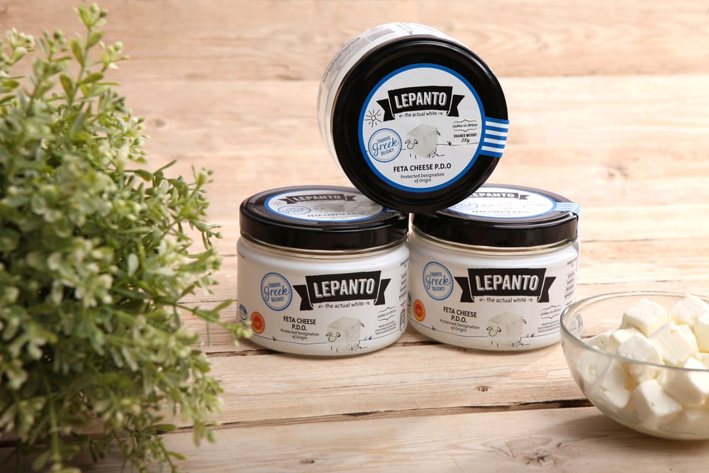
“The Brief
The company
To create a brand identity & packaging for the start up Lepanto Dairies, specializing in Greek traditional dairy goods. The target audience is mainly young urban professionals keen to a healthy lifestyle and who value authenticity and traditions.”
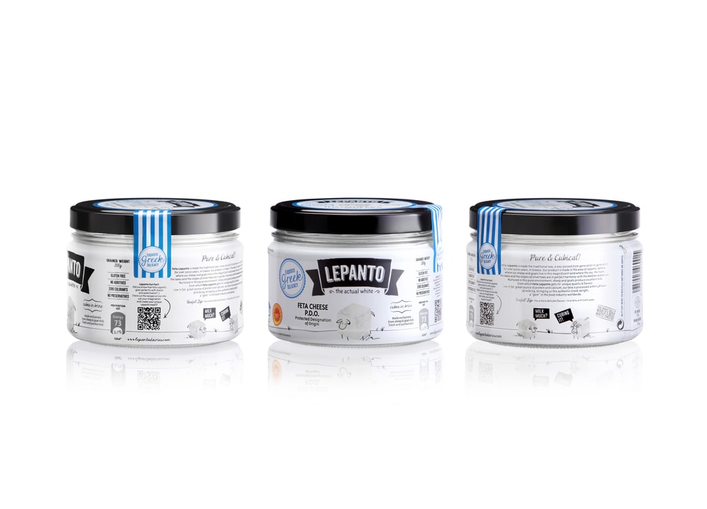
“The Product
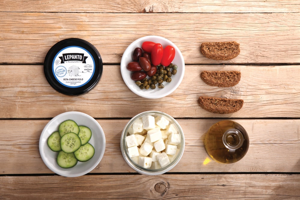
Feta, the pure, the authentic white cheese made the traditional way, full of health benefits.
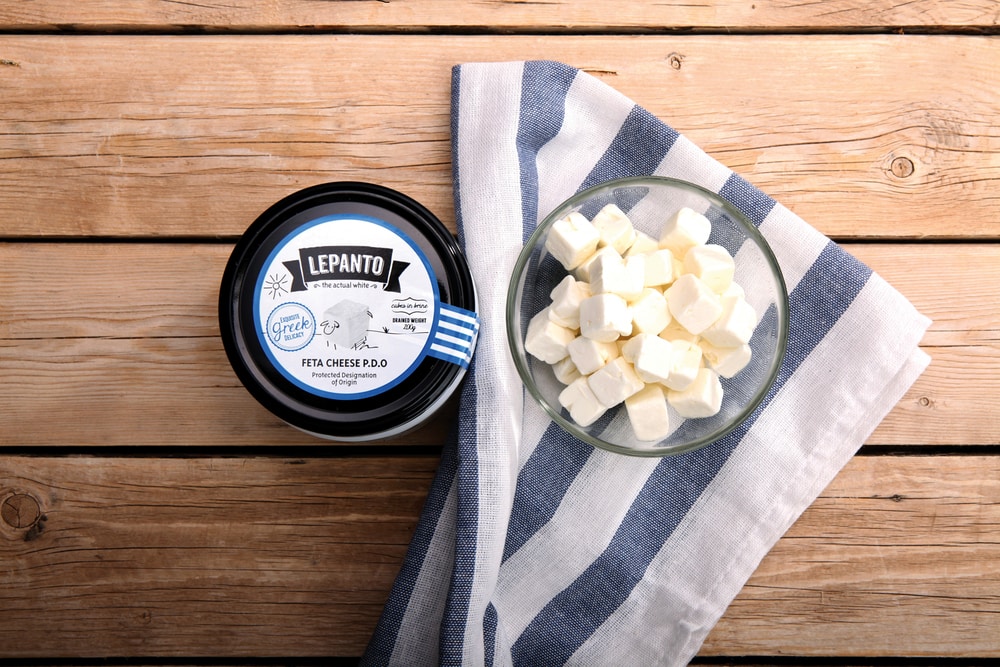
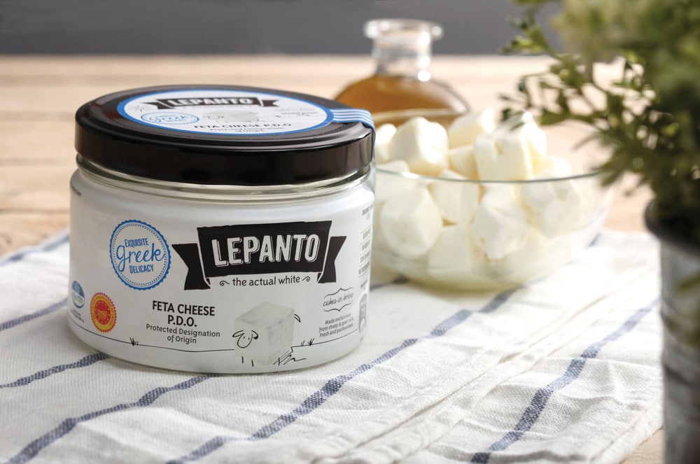
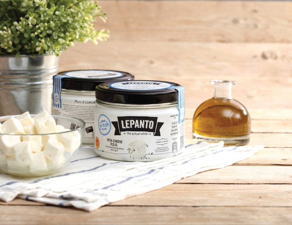
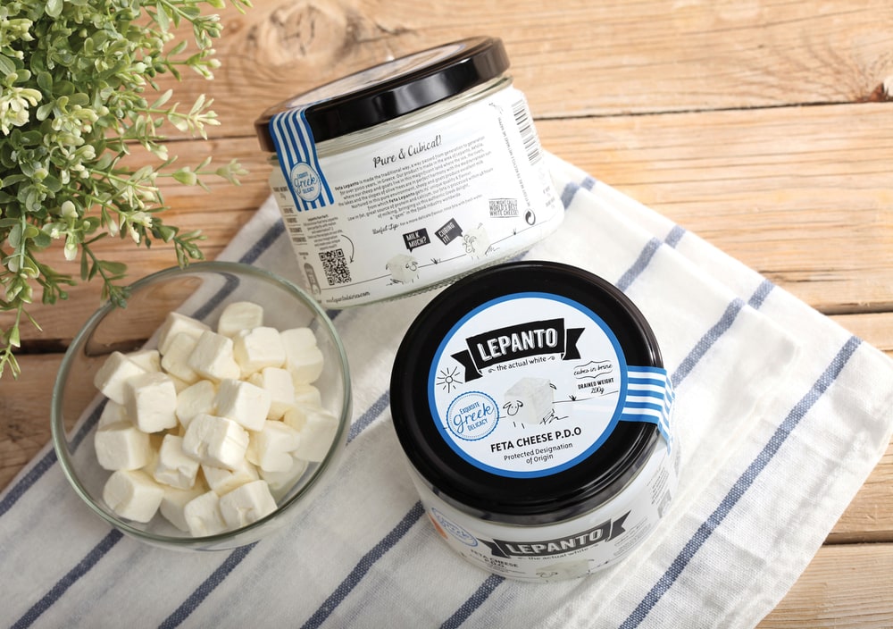
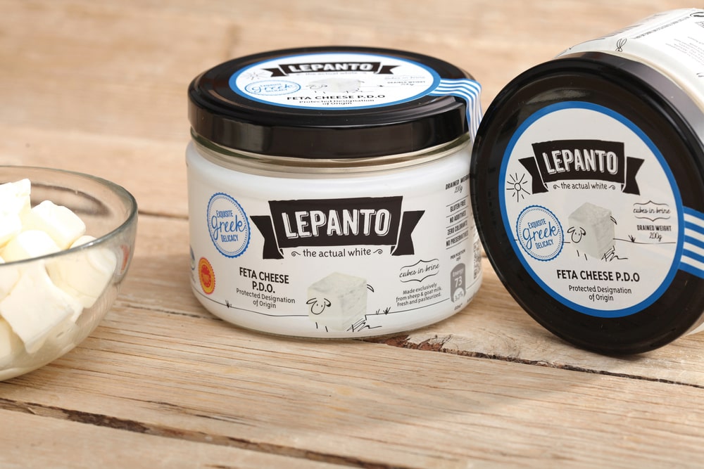
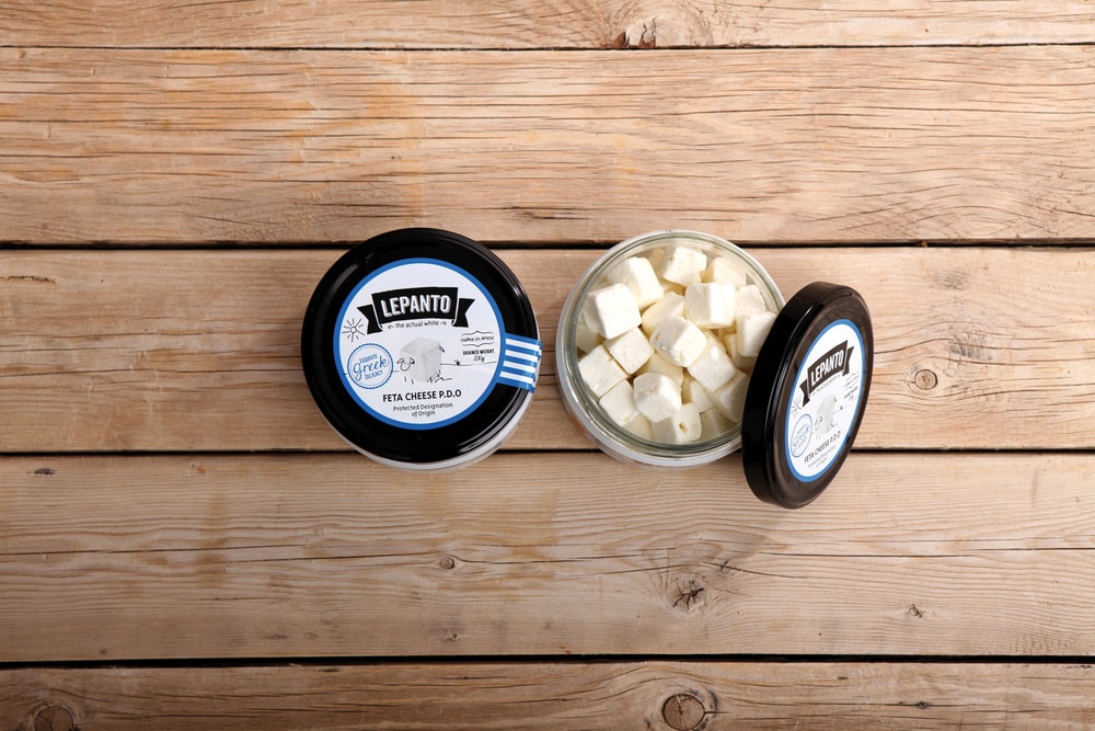
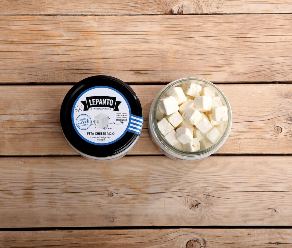
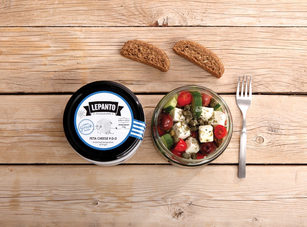
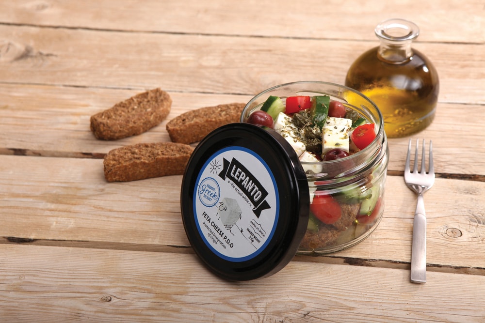
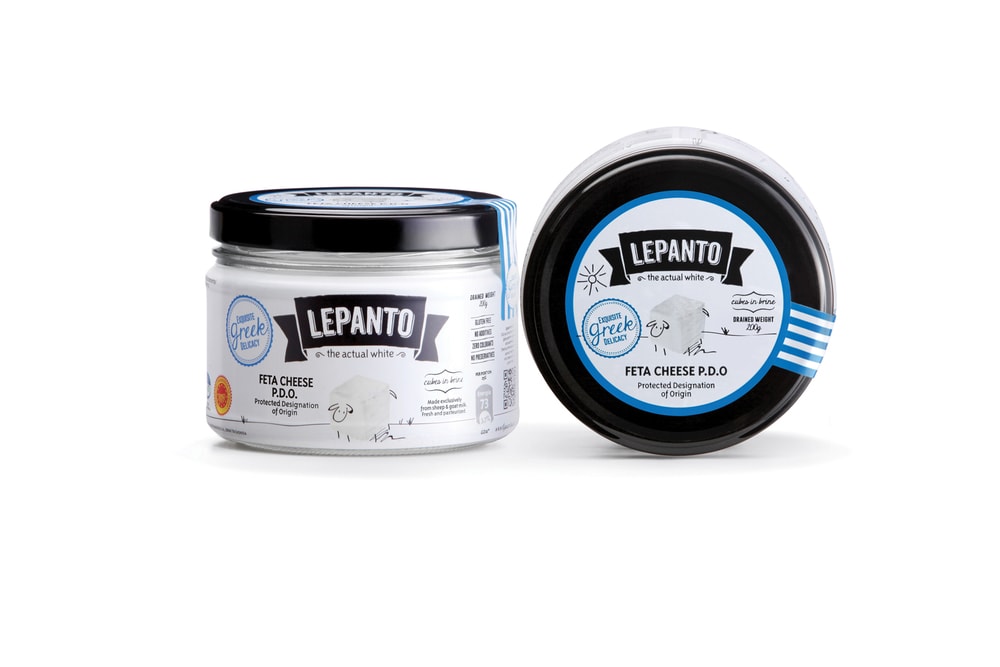
Comes in cubes, inside a glass jar to make it easy for consumption which makes it a friendly
product to new triers. Feta Lepanto is the new trend of healthy lifestyle, a premium delicacy for those who are willing and able to appreciate quality and fine goods.
The Concept
A combination of the old and the new, of traditional and new trends.
The premium, the authentic, the actual white.”
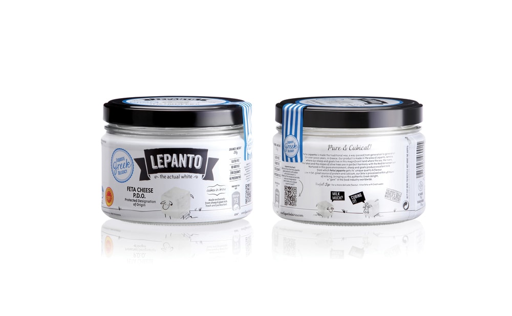
“The Creative Rational
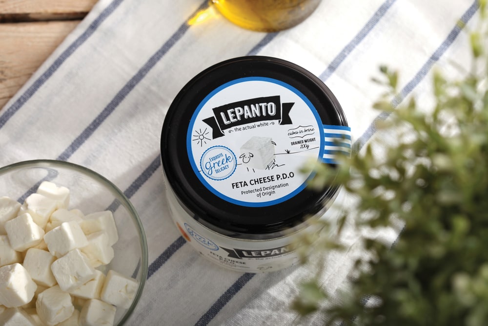
The logo is of a vintage style but the rest of the package design is of a minimal, hip style
with simple lines to project the aesthetics of the now.
Sketches of farm animals who can talk project the healthy, the fresh as well as the fun & friendly ethos of the easy-to-try product.
The colour palette is based on white and black, to symbolize both the purity as well as the high-end orientation of the product. The use of blue as a secondary colour is there to symbolize the land of origin, Greece.”

CREDIT
- Agency/Creative: Sophia Georgopoulou , Tagline & Copy: Evita Skourleti (All That)
- Article Title: Sophia Georgopoulou – Lepanto
- Project Type: Packaging


