


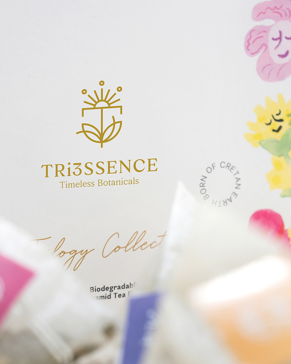
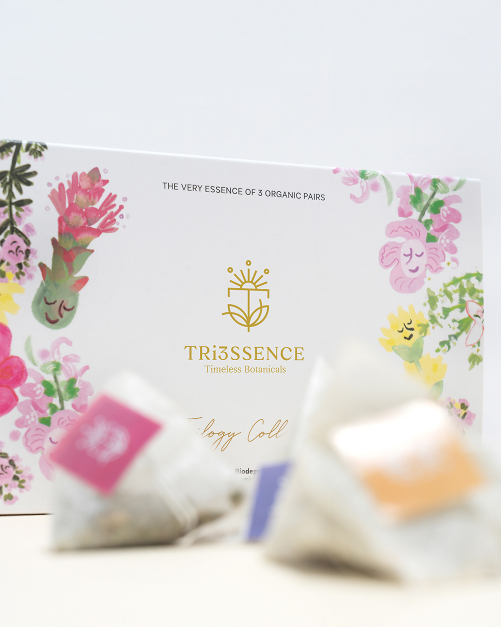
TRi3SSENCE Timeless Botanicals
“A botanical love story”
TRI3SSENCE is a premium botanical brand inspired by the ancient herbal heritage of Crete and the idea of meaningful union.
The branding concept is built around the belief that true value is created through synergy, not simple combination.
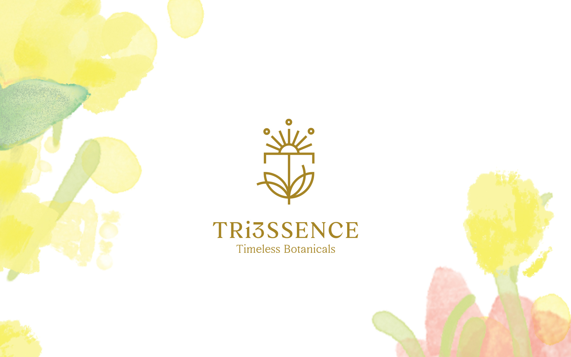
The logo is a symbolic composition that reflects the brand’s essence.
The letter T stands for Timelessness and Truth, grounded by two botanical leaves that represent the pairing of herbs and the philosophy of harmony. These curved forms emphasize balance, elegance, and organic flow.
At the top of the mark, the Cretan sun acts as a symbol of life, origin, and Mediterranean vitality. Its rays conclude in three subtle dots, representing the brand’s three core promises:
Vitality – Passion – Eternity.
The use of gold reinforces the premium positioning of the brand, referencing quality, warmth, and the enduring value of traditional wisdom translated into a contemporary visual language
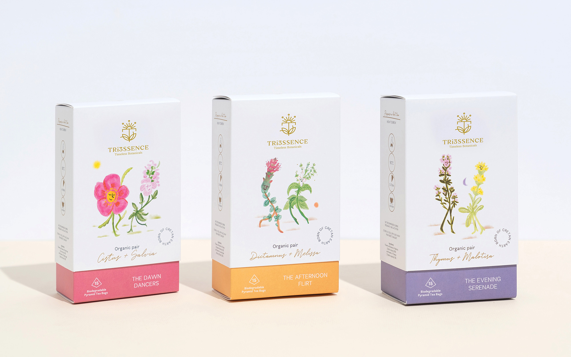
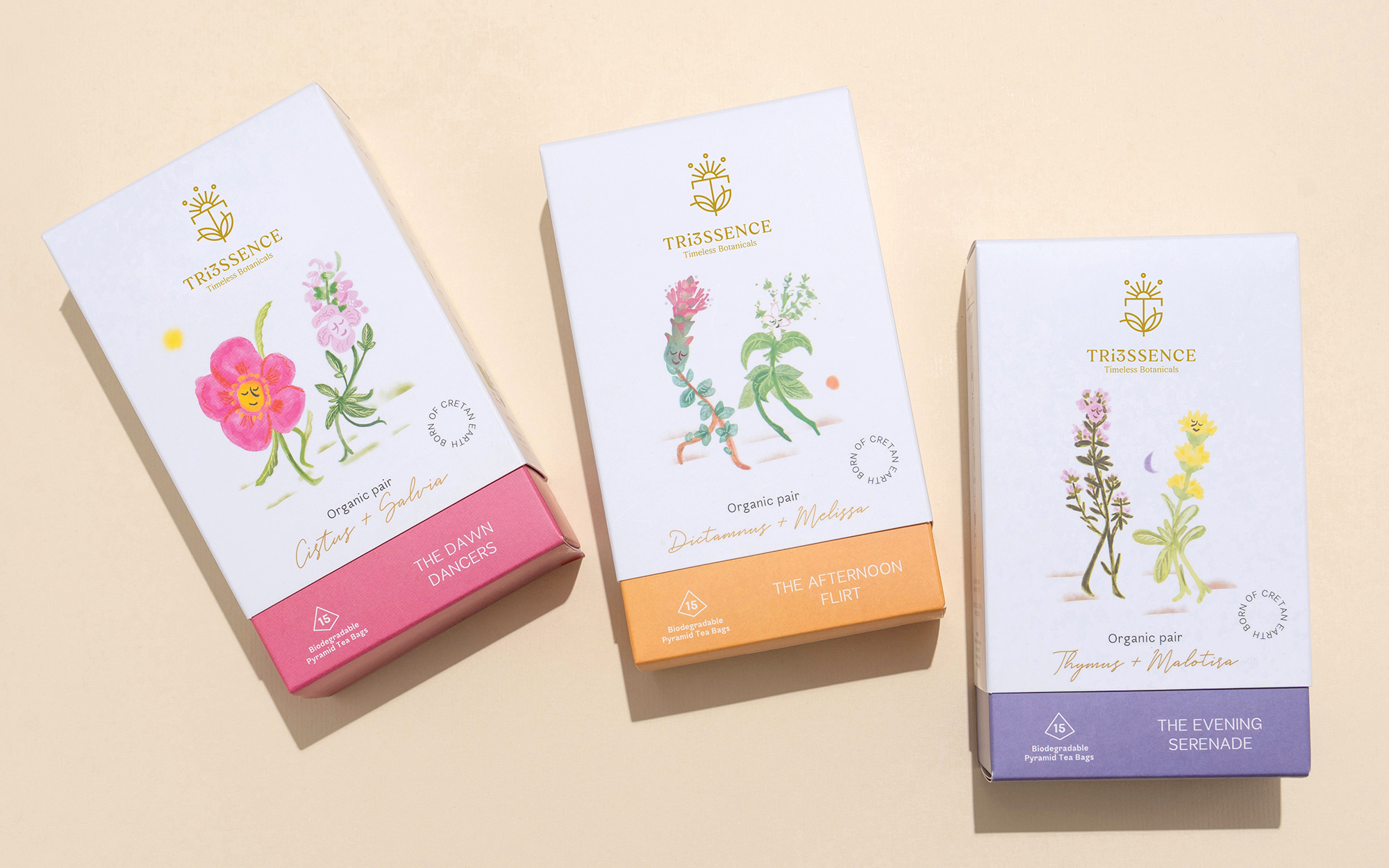
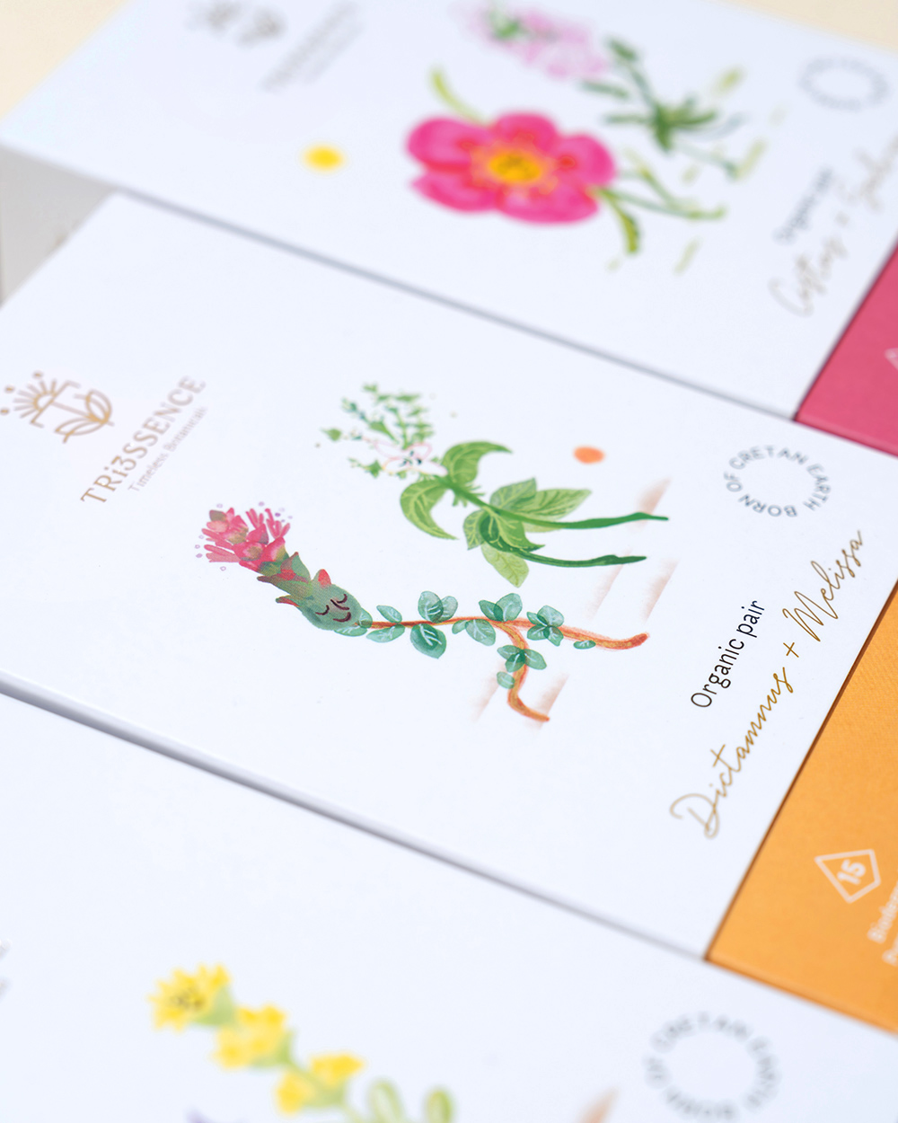
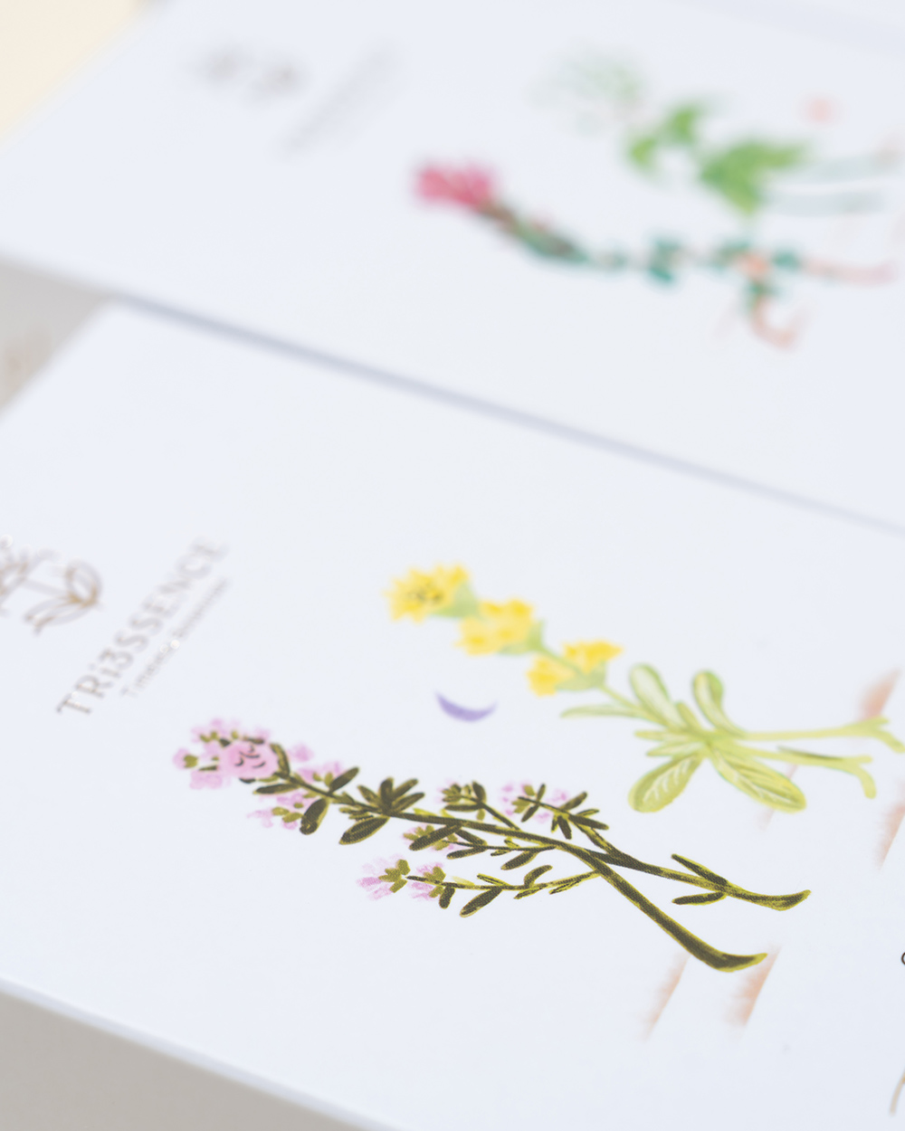
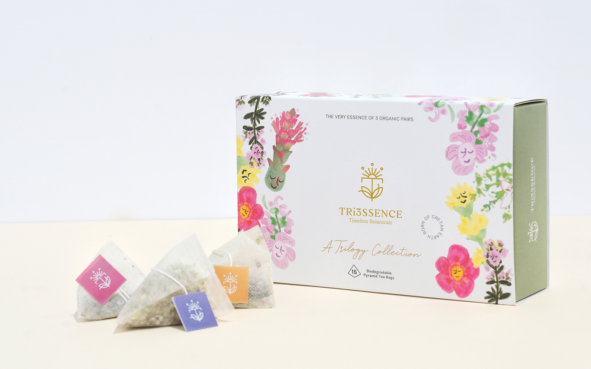
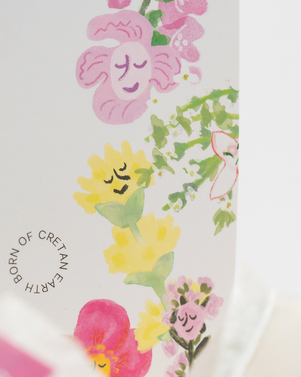
The Core Collection packaging expands this concept through storytelling. Each product features a handcrafted illustration depicting two herbs as anthropomorphic characters, presented as romantic pairs in motion—dancing or flirting. This visual narrative transforms each blend into a love story, making the invisible concept of synergy emotionally tangible.
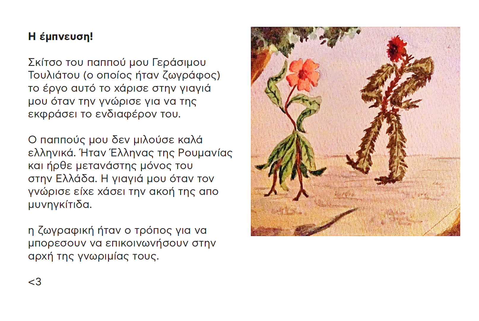
The inspiration behind this project was a painting of the designer’s grandfather, who was an artist. It’s a piece he gave to her grandmother when they first met, as a way to express his interest in her.
The designer’s grandfather didn’t speak Greek well — he was a Greek from Romania and came to Greece alone as an immigrant. Her grandmother, when she met him, had lost her hearing due to meningitis.
Painting became the way they were able to communicate at the beginning of their relationship.
Every package has its own illustration, while the complete collection unites the three pairs into a cohesive system. The result is a packaging experience that combines tradition, emotion, and design consistency, elevating the product beyond a beverage into a sensorial and narrative-driven brand experience.
CREDIT
- Agency/Creative: Sophia Georgopoulou Design
- Article Title: Sophia Georgopoulou Design Unveils Tri3ssence Timeless Botanicals Through a Poetic Botanical Brand Identity
- Organisation/Entity: Freelance
- Project Type: Packaging
- Project Status: Published
- Agency/Creative Country: Greece
- Agency/Creative City: Athens, Greece
- Market Region: Europe
- Project Deliverables: Brand Guidelines, Brand Identity, Logo Design, Packaging Design, Packaging Guidelines
- Format: Box
- Industry: Food/Beverage
- Keywords: organic, botanicals, tea, logo, brand, crete, greece, flowers, illustration, pair, love, dance, storytelling, synergy, sophiagdotcom, athens
-
Credits:
Illustrator: Natalia Mavrota
Photographer: George Pavlakos


