


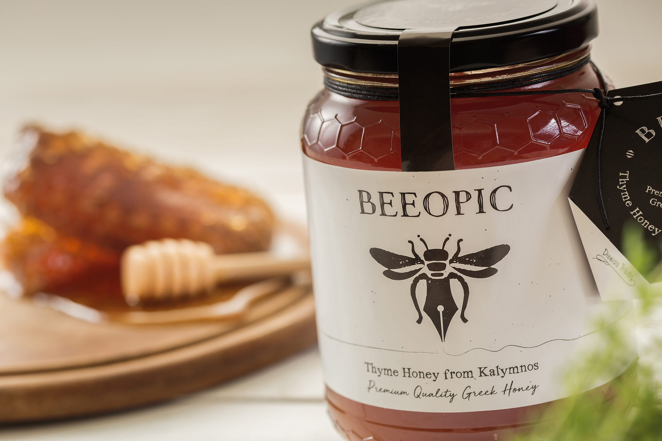

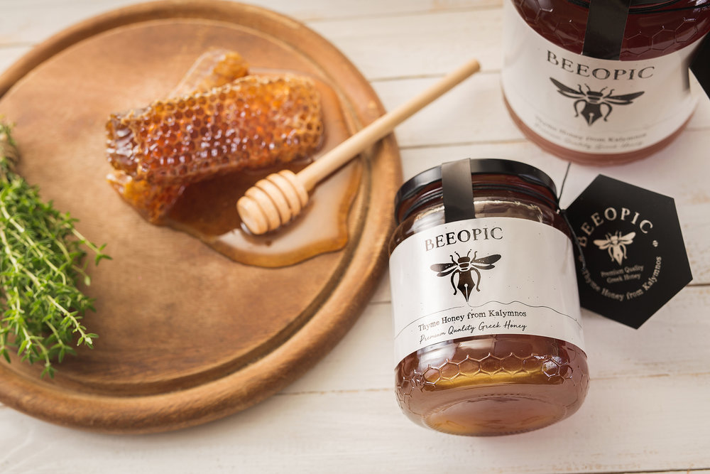
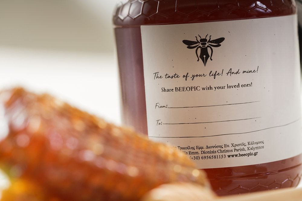
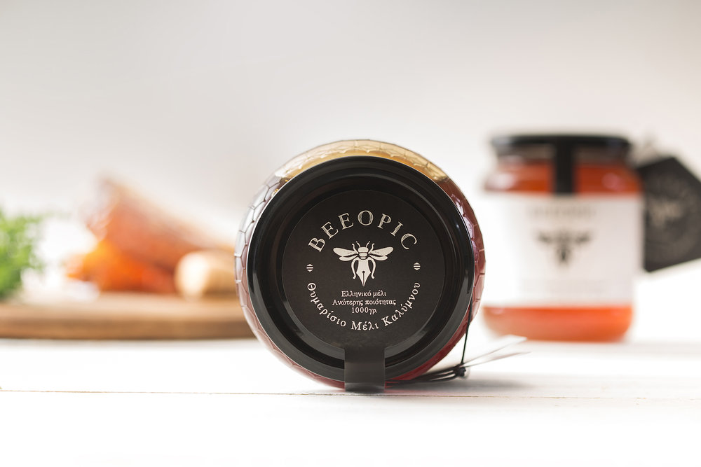
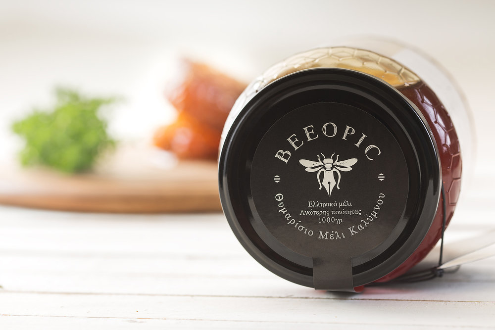
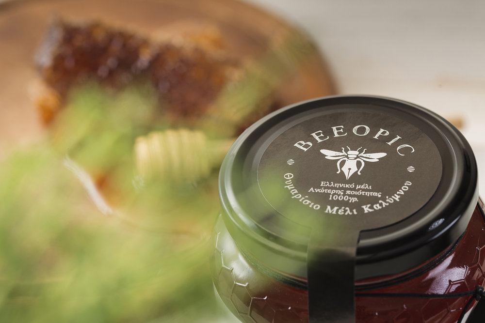
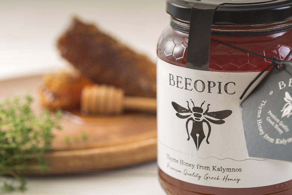
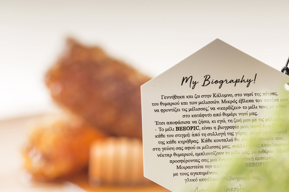
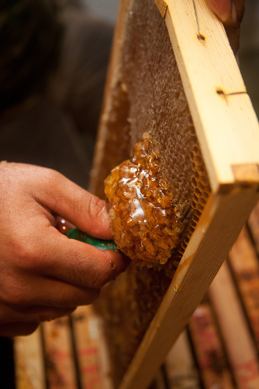
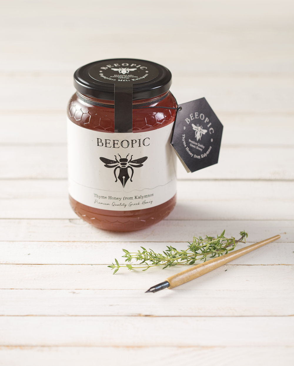
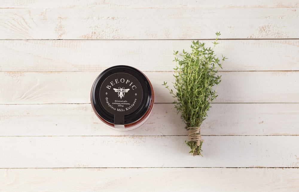
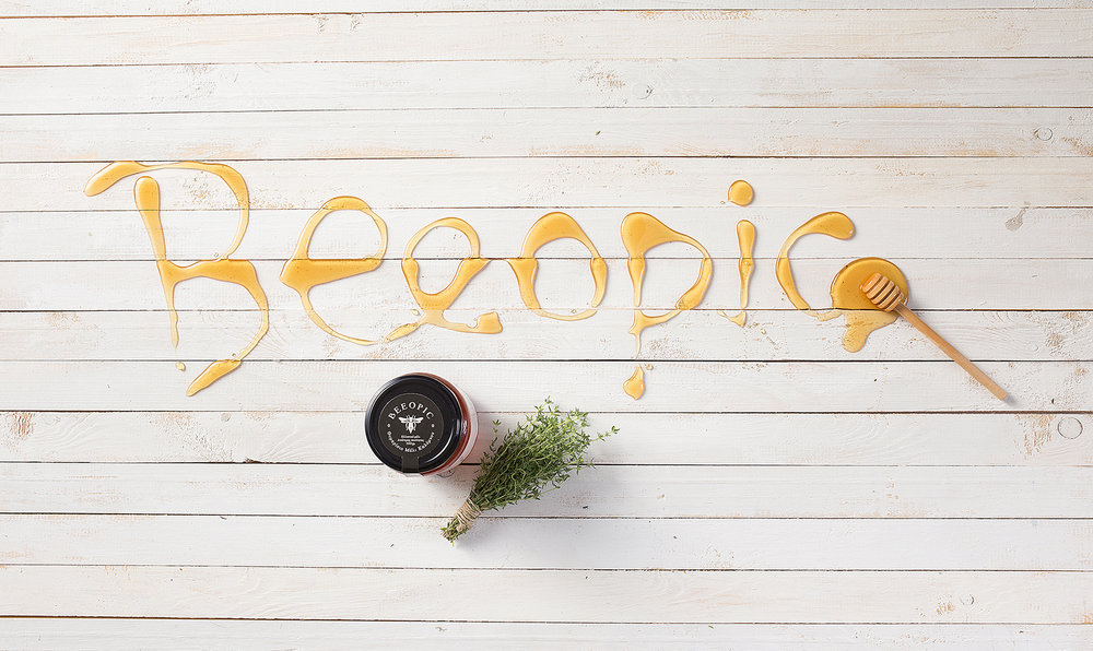
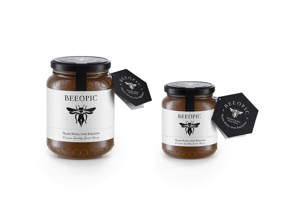
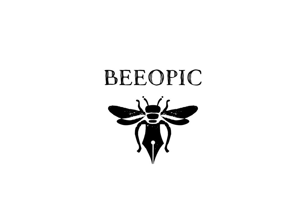
” Beeopic – Thyme Honey from Kalymnos, GreeceThe brief: The client, a beekeeper, asked us to create a brand name, logotype and packaging for a Thyme’s honey from the island of Kalymnos. In the briefing we were informed about the dedication beekeeping demands in order to achieve high quality honey.The creative concept: In the briefing stage we came to understand that practically beekeeping is not just a business but a lifestyle, one that demands the beekeeper to follow his beehives needs and we decided to explore the idea of the brand name narrating his life with the bees. This is how the name BEEOPIC was born, a play on the English word biopic which is used to describe a cinematic or television biography of a person.The design: Following the creative concept that dictates the brand name narrating beekeeper’s life we took a leap and decided that the design should depict the idea that the bee itself “writes” his life. By choosing this idea we came up with a design that shows a bee with its lower part of the body being a fountain pen. The rough design of bee-pen along with the tense logotype in black and white create an overall strong and clear impression to the consumer. The packaging also carries a small brochure that follows the brand’s aesthetics and provides biographical information about the beekeeper and the way he sees his life with the bees.”


CREDIT
- Agency/Creative: Sophia Georgopoulou | Design
- Article Title: Sophia Georgopoulou | Design – Beeopic Thyme Honey
- Project Type: Packaging
- Format: Jar
- Substrate: Glass


