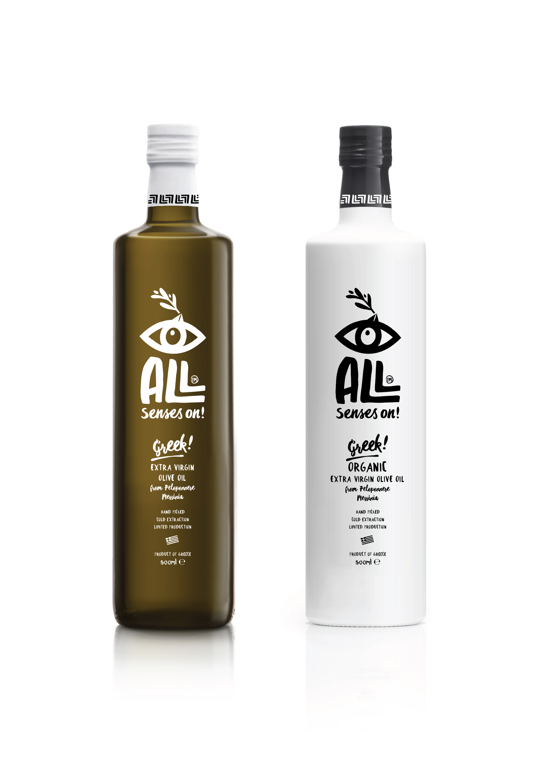
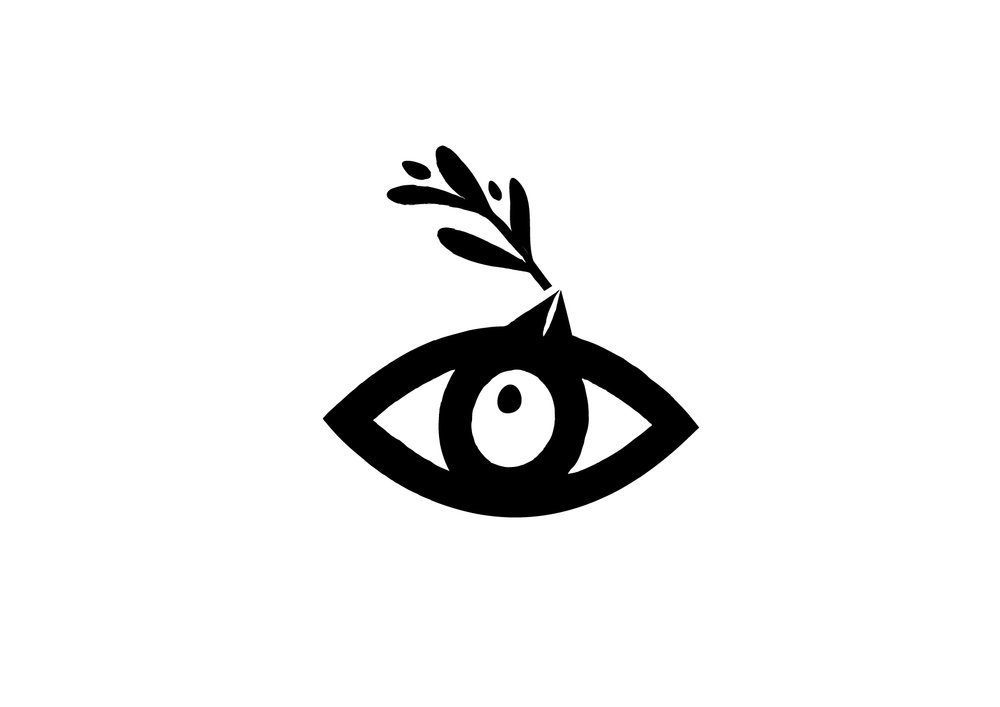
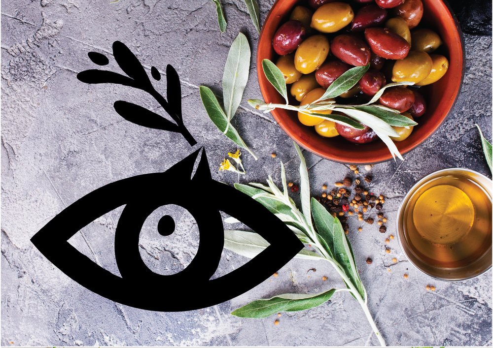
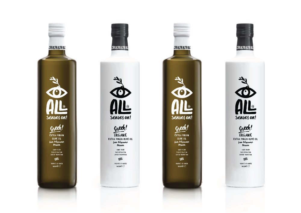
” Olive oil is the quintessential Greek product. Greek export-minded producers for some time now have come to realise that a good product combined with a good brand identity can open doors in the export markets.When approached by the owners of what came to be ‘All Senses On’, we went back to the basics for inspiration. Olive Oil is primal – it has been part of the Greek life and psyche for millennia, and in that sense we would like to see a visual code that is primal and timeless – not obviously linked to a certain era and certainly not folklore-like old ‘Greekness’.Thus we created a primal symbol, combining an eye and the beak of a bird bearing an olive branch, basic, raw visual codes that transcend time and are recognizable across cultures worldwide. Our name in turn was inspired from the essence of what great olive oil should be all about: engaging all senses at once in a delightful dance. The open, alert eye is the representative of the senses in the logo but also suggests the great scrutiny and care that is driven into the choice of the products, a point that is made in every occasion of the brand’s communication.Different, unique but still close to heart because of all the familiar elements involved and the true feelings evoked, the brand identity of ‘All Senses On’ distances itself from the expected in the most meaningful of ways.”

CREDIT
- Agency/Creative: Sophia Georgopoulou | Design
- Article Title: Sophia Georgopoulou | Design – All Senses On! Greek Extra Virgin Olive Oil
- Project Type: Packaging
- Format: Bottle
- Substrate: Glass


