


Walk into most real estate agency websites and you’ll find the same thing. A hero image of a gleaming apartment. A suited agent smiling with arms crossed. Copy that says something about “your journey” or “your dream home.” It’s a formula the industry has followed for decades, and nobody has thought to question it.
Until now.
When Savvi Property came to us, they were a brand new player entering one of Australia’s most crowded and sceptical markets. But they weren’t a typical real estate agency, and they didn’t want to look like one. Their buyers were Gen Z and millennials — first home buyers navigating a genuinely emotional, high-stakes decision — and they were completely underserved by the way the industry was talking to them.
So we asked a simple question: what if we stopped looking at other real estate brands for inspiration, and started looking at lifestyle brands instead?
Sell the lifestyle, not the listing.
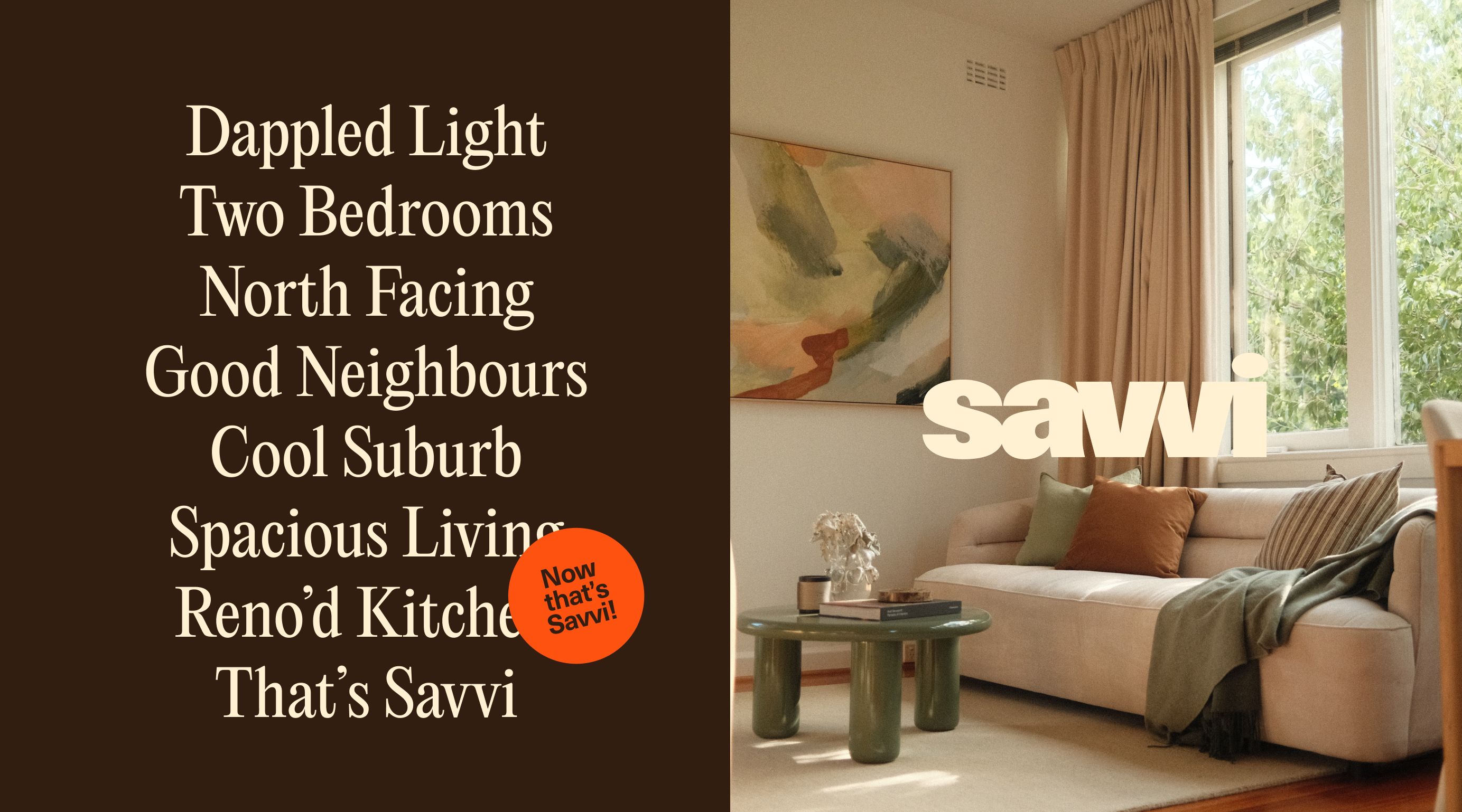
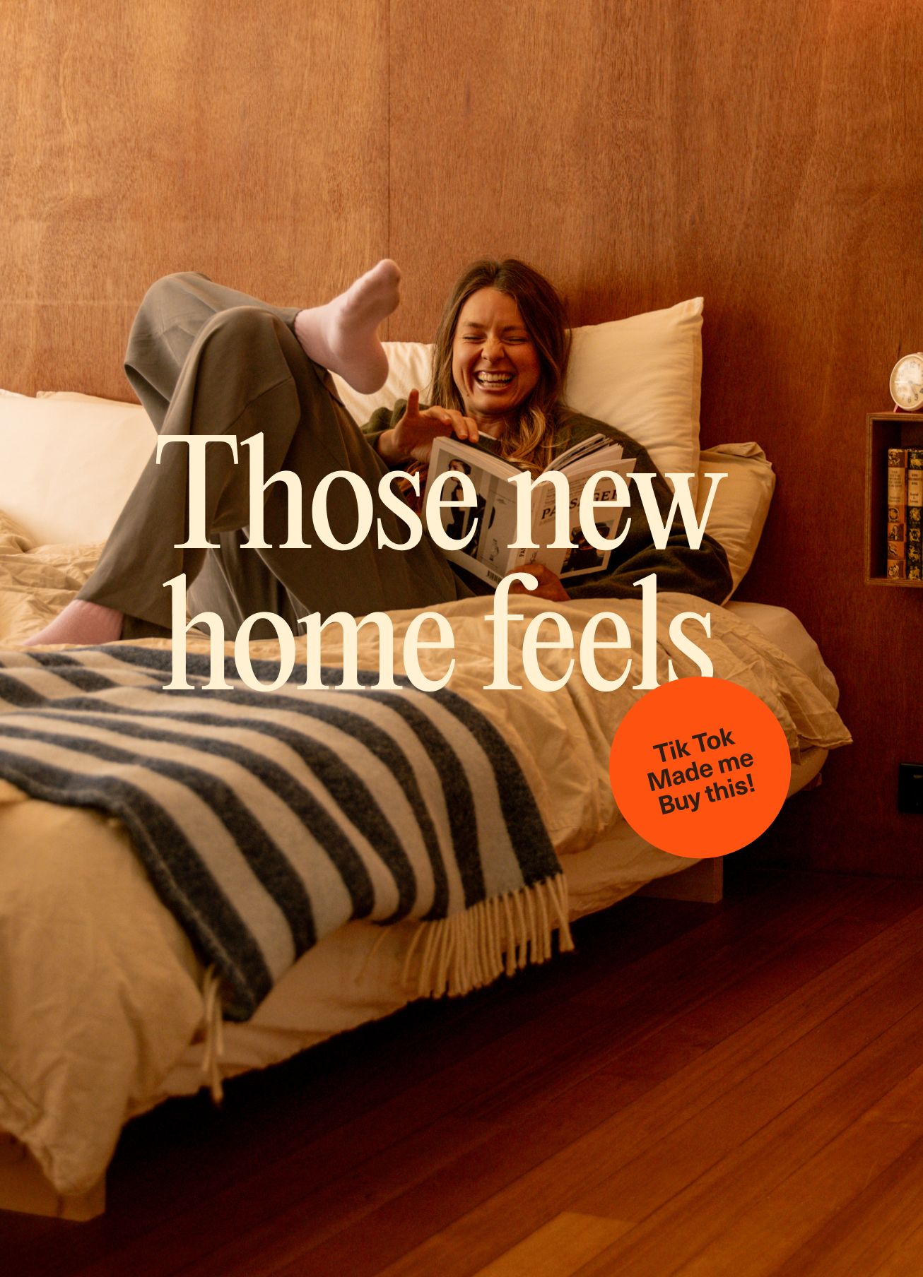
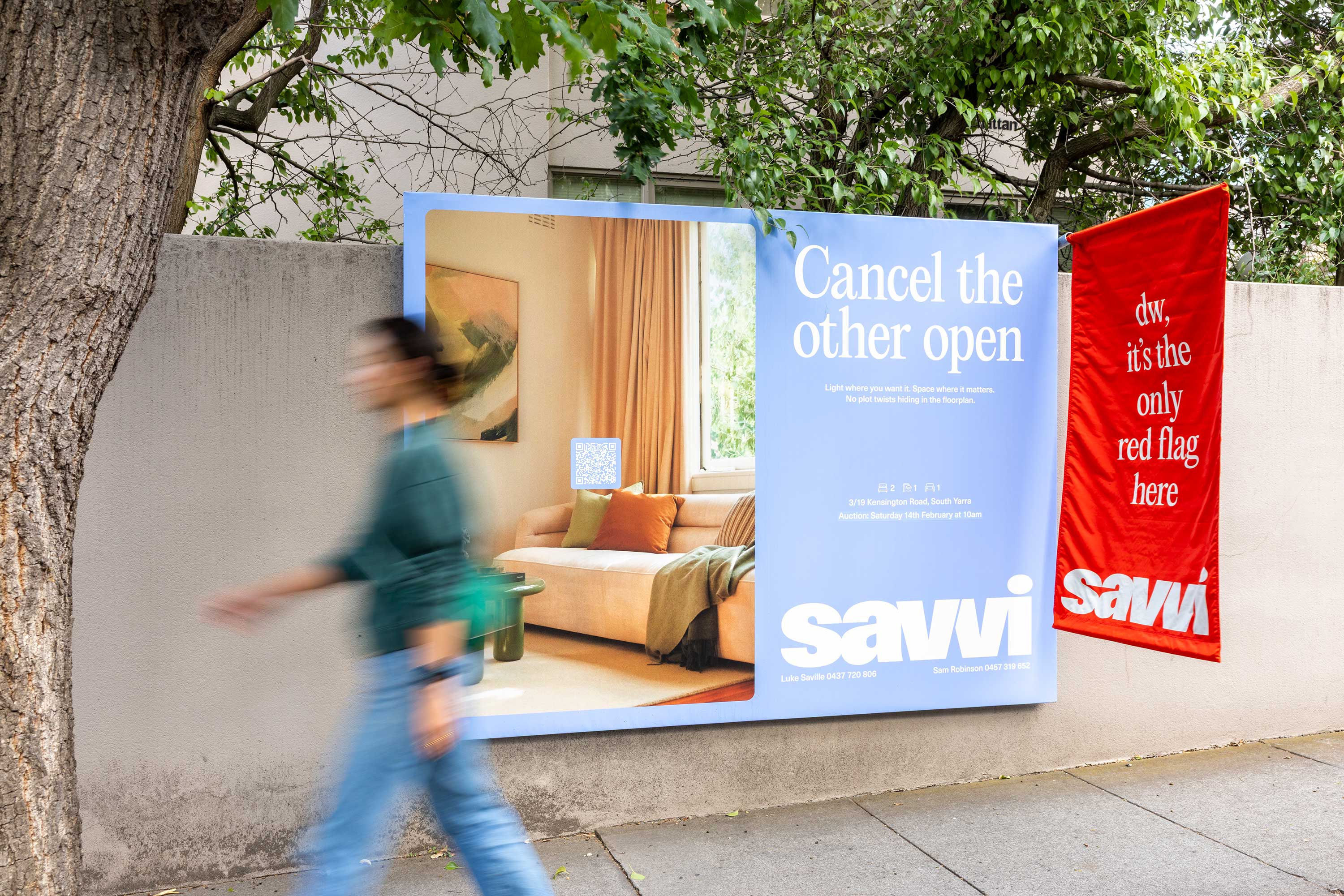
The first thing we threw out was the obsession with the property itself. Polished renders, wide-angle shots of empty rooms, feature lists. None of it was connecting with buyers who were more interested in how their life would feel than how many square metres they were getting.
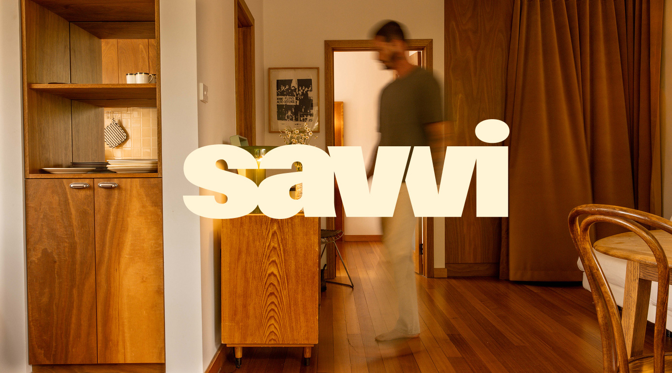
We shifted the lens entirely. Instead of photographing apartments, we photographed the suburb. The coffee shop around the corner. The Saturday morning farmers market. The walk to the train. Savvi wasn’t selling an apartment, it was selling a lifestyle, and everything we shot had to reflect that.
It sounds obvious when you say it out loud. Lifestyle brands have been doing this forever. Nike doesn’t sell shoes, they sell the feeling of pushing yourself. Airbnb doesn’t sell accommodation, they sell belonging. Real estate has just been too stuck in its own conventions to make the same leap.
Ditch the clichés, find a real voice
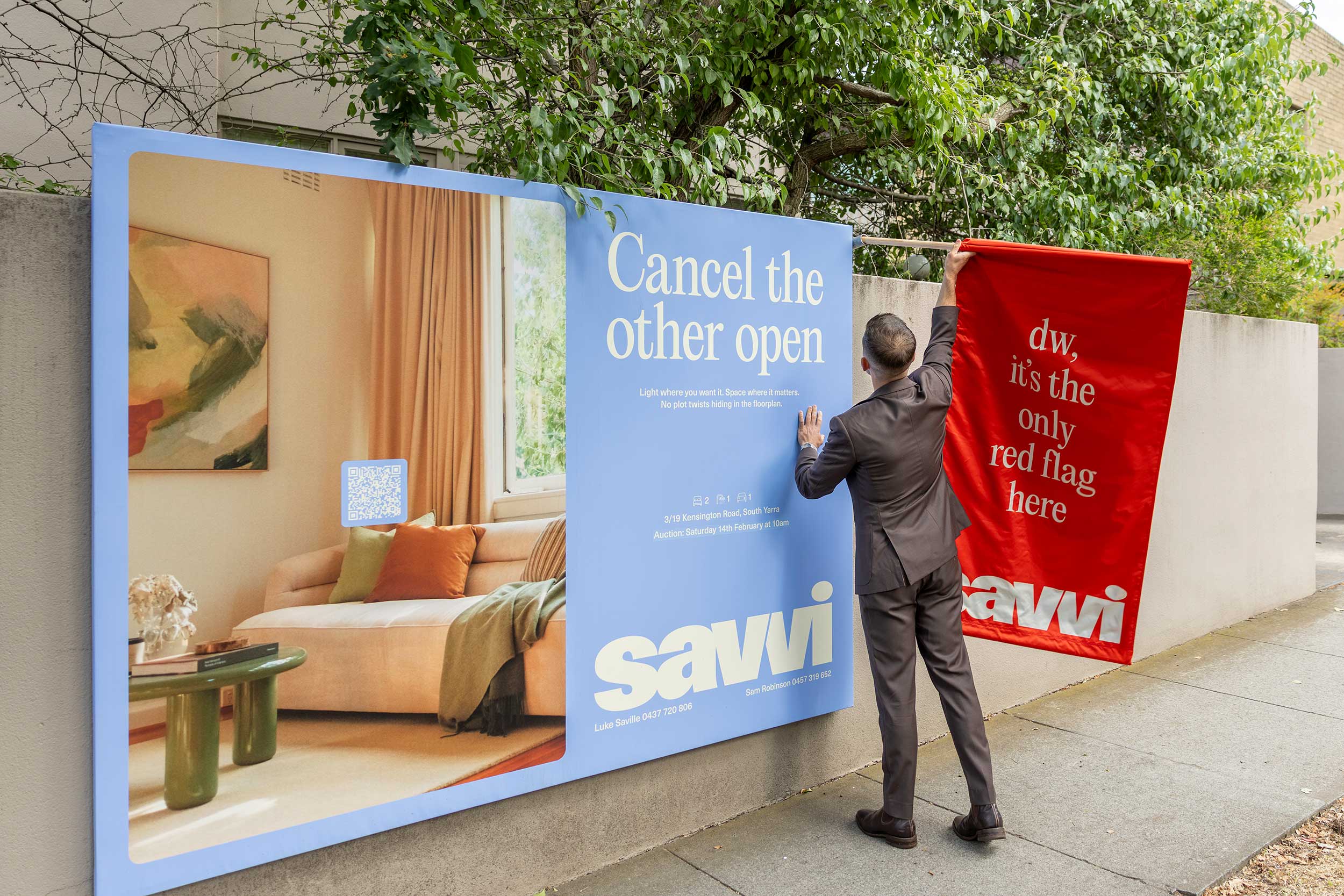
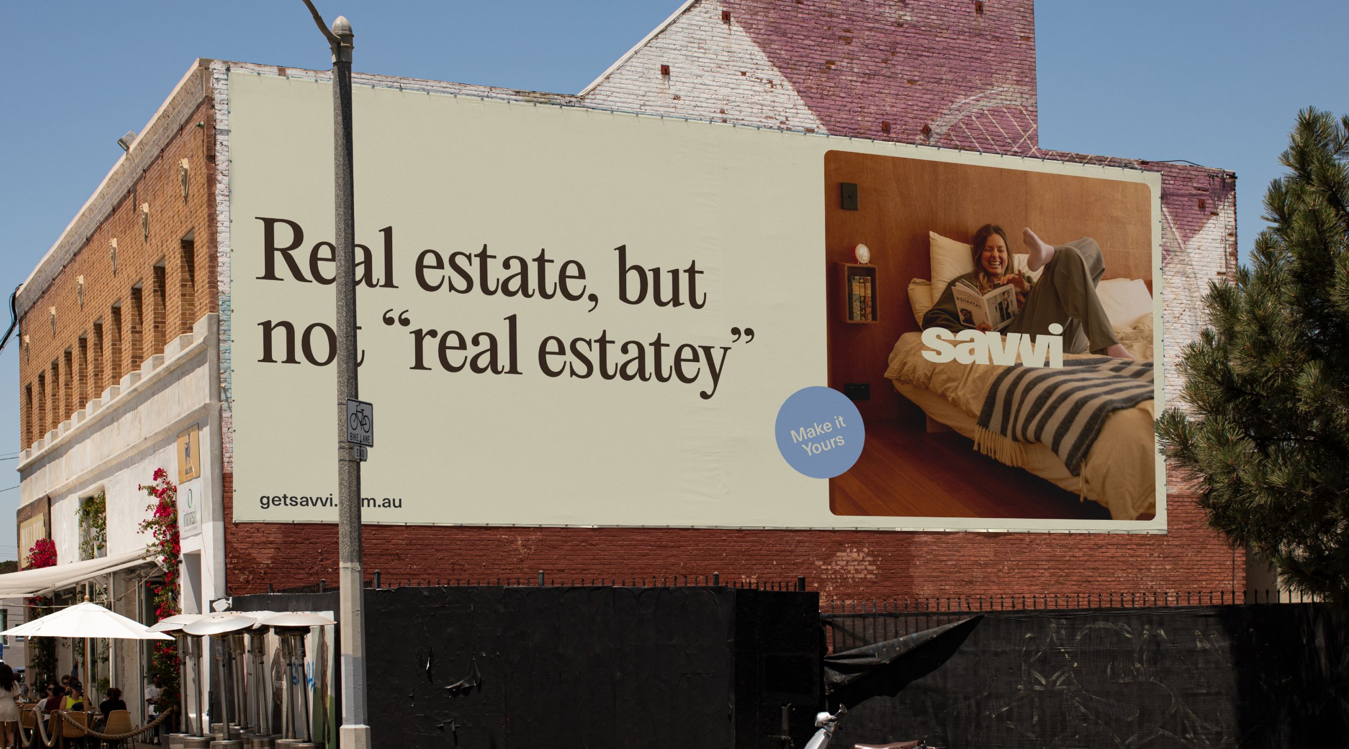
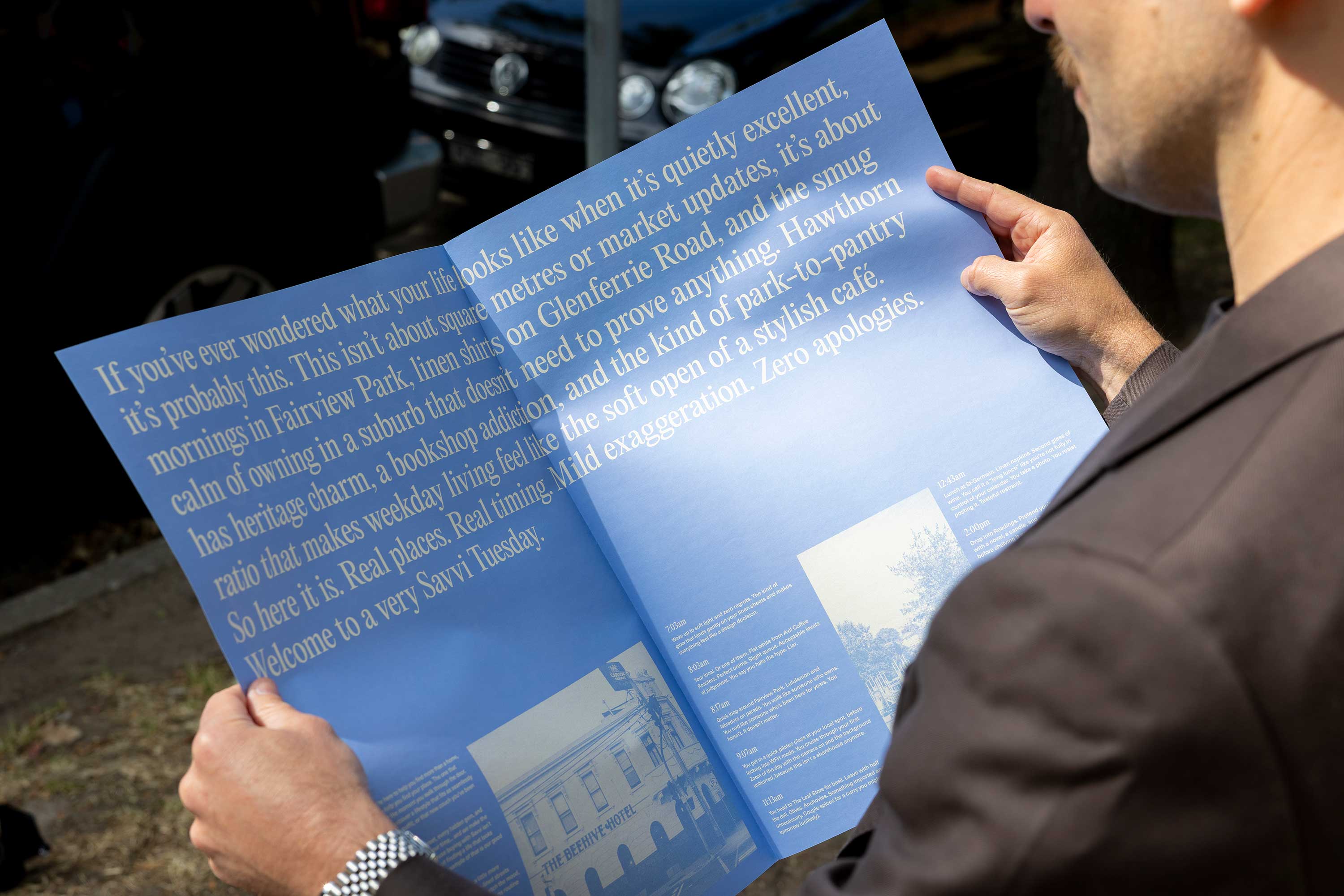
The second thing we tackled was tone of voice. Real estate copy is riddled with the same tired phrases: “luxury living,” “don’t miss out,” “your forever home.” It’s copy that talks at people rather than with them.
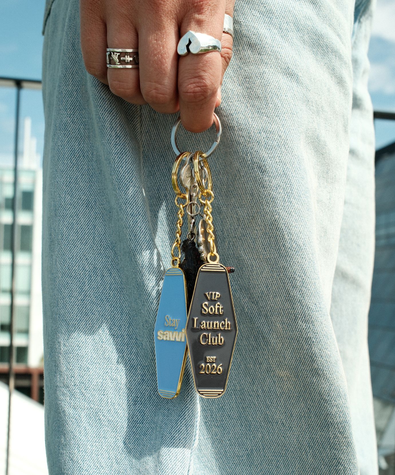
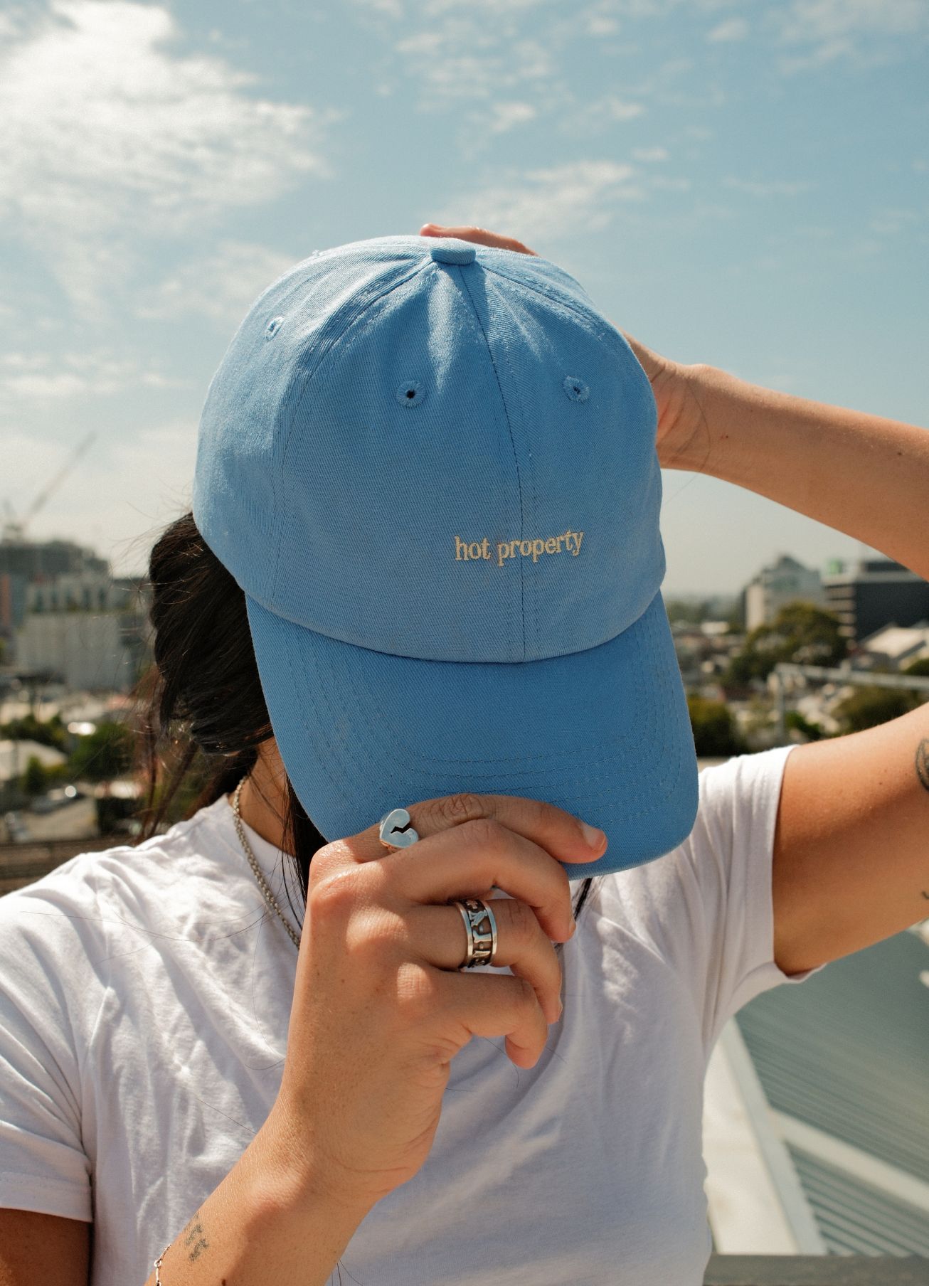
Savvi’s audience had grown up online. They could smell inauthenticity from a mile away. So we wrote copy that actually sounded like a person talking, warm, a little cheeky, and refreshingly honest about what buying your first apartment actually involves. Stressful. Exciting. Confusing. All of it.
That tone carried through everything, the website, the signage, the social content. And the response was immediate. People noticed that Savvi felt different. Not just visually, but in how it made them feel.
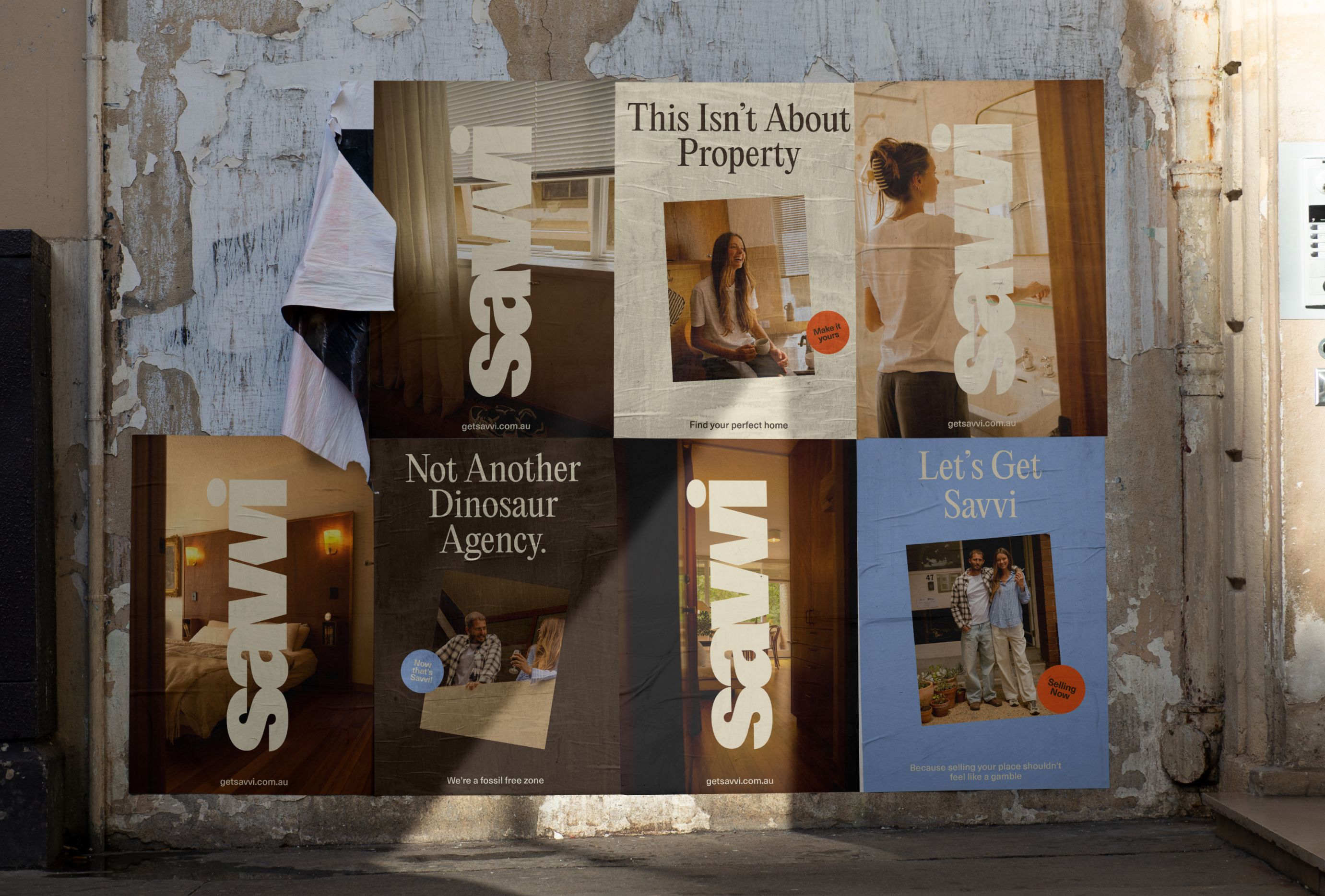
Show real people, not archetypes
The third shift was in how we portrayed the agents themselves. The crossed-arms headshot is practically a rite of passage in real estate. It signals authority, professionalism, trust. Except it doesn’t, not anymore, and certainly not to a younger buyer who associates that look with someone trying to sell them something they don’t need.
We photographed Savvi’s agents like actual humans. Candid, approachable, caught mid-laugh rather than mid-pose. The message was simple: these are people you can talk to. People you can relate with.
What the industry can learn
Savvi is proof that the conventions of any industry can be questioned. The real estate category is particularly ripe for it because so little has changed in so long. The brands that will win the next generation of buyers won’t be the ones with the biggest billboards or the most listings. They’ll be the ones that actually connect, that feel human in an industry that rarely does.
Lifestyle brands have always known this. Real estate is just starting to catch up.
CREDIT
- Agency/Creative: Something Great
- Article Title: Something Great Rebrands Savvi Property With Lifestyle First Real Estate Branding for First Home Buyers
- Organisation/Entity: Agency
- Project Type: Identity
- Project Status: Published
- Agency/Creative Country: Australia
- Agency/Creative City: Cremorne
- Market Region: Global
- Project Deliverables: Brand Creation, Brand Identity, Brand Tone of Voice, Design, Photography Styling, Web Design
- Industry: Real Estate
- Keywords: Branding, Visual Identity, Real Estate,
-
Credits:
Creative Director: James Hill


